Mid-Century Modern Wall Art: The Complete 2026 Style Guide
The Heva Team
Art Curators & Interior Design Enthusiasts · May 1, 2026 · 15 min read
There is something about mid-century modern wall art that refuses to feel dated. Born in the optimism of the post-war years, this design language pairs organic forms with bold geometry, earthy palettes with confident color, and creates rooms that feel grounded yet forward-looking. Whether your home is a downtown loft, a 1960s ranch, or a brand-new build, the right mid-century piece can become the visual anchor that makes every other choice feel more intentional.
Ready to browse? Explore our mid-century leaning abstract collection or keep reading for our top picks and the styling rules we use most often.
A Brief History of Mid-Century Modern Design
Mid-century modern is the design vocabulary that emerged in the United States, Scandinavia, and parts of Western Europe between roughly 1945 and 1969. It was shaped by post-war optimism, new manufacturing technologies (molded plywood, fiberglass, injection-molded plastics), and a generation of designers who believed beautiful, functional objects should be available to ordinary households rather than reserved for the wealthy.
The movement absorbed influences from the German Bauhaus school, Scandinavian craft traditions, and the quiet geometry of Japanese architecture. Husband-and-wife team Charles and Ray Eames, alongside Eero Saarinen, Florence Knoll, George Nelson, and Hans Wegner, became the household names of the era. Their furniture pieces (the Eames Lounge, the Tulip Chair, the Womb Chair) are still in production today, more than seventy years later.
The wall art of the period reflected the same ideals: clean shapes, organic curves, earthy palettes, and a willingness to abstract reality into something simpler and more emotionally resonant. Atomic-age starbursts, boomerang motifs, and biomorphic forms (think of an Alexander Calder mobile flattened onto a canvas) sat happily alongside botanical prints and abstract color fields. Painters like Ellsworth Kelly, Mark Rothko, and Helen Frankenthaler shared gallery walls with the bold graphic posters that designers were producing for everything from airline campaigns to international expos.
In our experience, the reason MCM never goes out of style is that it solved a problem most design movements never bother to address: how to make a home feel cheerful, intelligent, and unpretentious all at once. That sweet spot is exactly what 2026 buyers are still hungry for, and it is why our customers tell us a single mid-century piece often becomes the anchor that pulls their whole space together.
Five Defining Characteristics of MCM Wall Art
If you want to spot true mid-century modern wall art versus generic mid-century-adjacent decor, these five traits are reliable markers.
1. Organic, biomorphic shapes
Look for kidney curves, lozenges, amoebas, and softened geometric forms that suggest natural growth rather than rigid mathematics. The Eames-era designers were fascinated by the way an organic curve felt human and alive compared to a perfect circle, and you can see that preference everywhere from the Saarinen tulip table to the cover art of period jazz albums.
2. Atomic and starburst motifs
The space race of the late 1950s and early 1960s gave rise to a whole vocabulary of atomic imagery: spokes radiating from a central point, sputnik-style starbursts, and abstract suns. These were optimistic icons of a future humanity was about to fly into, and they translate beautifully onto canvas as a single bold focal piece.
3. Geometric abstraction with restraint
MCM geometry tends to be quieter than full Bauhaus geometry. Think soft circles overlapping, color blocks divided across a canvas, or three or four pure shapes living in harmony rather than a mathematical riot of pattern. For a deeper read on this overlap, our geometric wall art guide walks through the broader pattern family.
4. Earthy, slightly desaturated palettes
Mustard, avocado, walnut, terracotta, teal, and cream are the canonical mid-century tones. Even the brighter colors of the era (poppy red, bright orange) tend to feel slightly aged rather than candy-bright, as if everything is filtered through a faintly sepia lens. This restraint is what keeps the look feeling sophisticated rather than cartoonish.
5. Botanical and natural integration
Mid-century homes pioneered the indoor-outdoor connection that contemporary designers still chase. Monstera leaves, palm fronds, abstract trees, and stylized landscapes were everywhere, often rendered in flat watercolor or block-printed graphics. This thread connects MCM directly to today's biophilic design movement.
The Mid-Century Color Palette
Mid-century color is the secret weapon of the whole aesthetic. The palette feels warm and lived-in even when the shapes are bold, which is why MCM rooms photograph beautifully but also feel comfortable to actually live in.
Our recommended five-color foundation:
- Walnut brown: the deep, slightly red-toned brown of authentic mid-century furniture. Grounds a room and reads as instantly vintage even in small doses.
- Mustard or ochre: a warm yellow that adds optimism without feeling juvenile. Looks especially good against teal or charcoal.
- Teal or peacock: the blue-green that defines the era. Reads as both vintage and modern, and works as either a major or minor accent.
- Terracotta: the soft, dusty orange that connects MCM to its Mexican Modernist cousins (the work of Luis Barragan, in particular).
- Cream or off-white: the breathing room that lets the other four colors sing without competing for attention.
If your walls are already painted in a warm neutral, you have a head start. Color research from the broader color psychology literature consistently associates warm earthy palettes with feelings of stability, comfort, and welcome. That is exactly the emotional register MCM was engineered to produce, which is why the look has aged so gracefully.
For a deeper dive on building a whole room around earthy tones, our earth-tone wall art guide walks through specific pairings, room by room, and includes a few combinations that even seasoned decorators get wrong.
Mixing MCM With Other Modern Styles
One reason mid-century has such staying power is that it mixes generously with neighbouring aesthetics. Here is how to make those pairings work in real rooms.
MCM with Scandinavian or Japandi
This is the easiest mix, since both movements share a love of clean lines, natural materials, and restrained palettes. Use MCM as the warmer accent against Scandinavian or Japandi neutrals. A walnut-and-mustard piece on a cream wall, with pale wood furniture and a single linen throw, is essentially a love letter to all three traditions at once.
MCM with contemporary minimalism
Pair a single bold mid-century canvas (atomic starburst, color block, biomorphic abstraction) with otherwise spare furniture and you get a room that feels intentional rather than sterile. The MCM piece does the personality work; the rest of the room can stay quiet, which suits modern minimalism perfectly.
MCM with boho
This pairing works because both movements love organic forms and earthy palettes. Layer a retro tropical or sunburst piece into a textured boho space (rattan, macrame, jute, dried pampas) and the mid-century warmth keeps the boho from drifting into hippie territory. The result reads sophisticated rather than nostalgic.
Where MCM struggles
True mid-century does not blend easily with formal traditional styles (heavy moldings, oil portraits, dark mahogany), full farmhouse-rustic rooms with shiplap and reclaimed wood, or maximalist Victorian decor. The geometry of the MCM era starts to feel visually awkward against curved, ornate detailing, and the earthy palette can read muddy next to formal jewel tones. If you are decorating in any of those traditions, look at our 2026 wall art trends guide for better-fitting alternatives.
Our 6 Top Mid-Century Modern Wall Art Picks
These six pieces from the Heva collection embody different facets of the mid-century vocabulary, from Bauhaus-era geometric ancestry to atomic-age starbursts to the botanical illustration tradition. Each one ships within the US, arrives ready to hang on standard drywall, and is sized for the most common American wall dimensions.
1. Bauhaus Geometric Shapes Canvas Wall Art
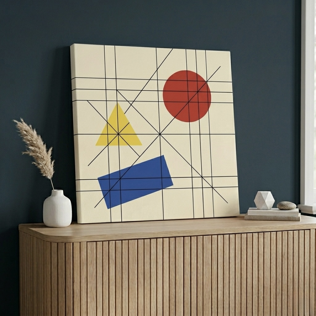
This piece traces the direct lineage from the German Bauhaus school to the mid-century American living room. Its trio of pure shapes (square, circle, triangle) rendered in primary red, yellow, and blue is essentially a quotation of the foundational color theory taught at the original Bauhaus. The flat, confident composition works best in spaces that already have warm wood tones, where the saturated primaries pop without feeling cold. Try it in a home office where you want a hit of intelligent energy, in a child's room aimed more at smart than cute, or above a low credenza in a modern living room.
See the Bauhaus Geometric Shapes Canvas
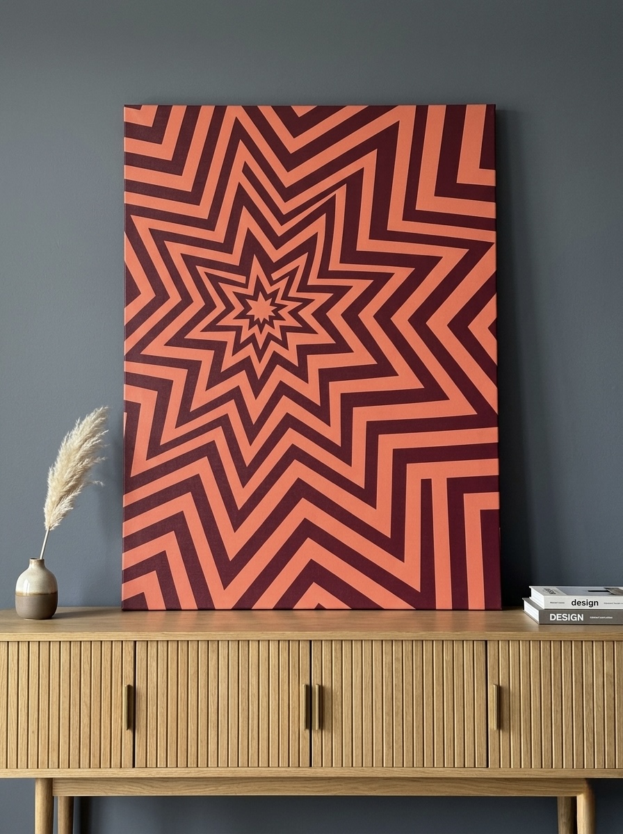
2. Geometric Starburst Canvas Print
This is the atomic starburst at its boldest, a coral-red sun radiating with the optimism that defined late-50s and early-60s American design. The op-art-leaning rendering gives it real visual movement, which makes it surprisingly hypnotic in person rather than purely graphic. We love it as a single statement piece in a dining room, a small bar nook, or above a credenza in an entryway where guests greet it head-on. Pair with walnut wood and a mustard or olive accent and the room reads instantly mid-century without trying.
View the Geometric Starburst Canvas
3. Color Block Grid Abstract Canvas Wall Art
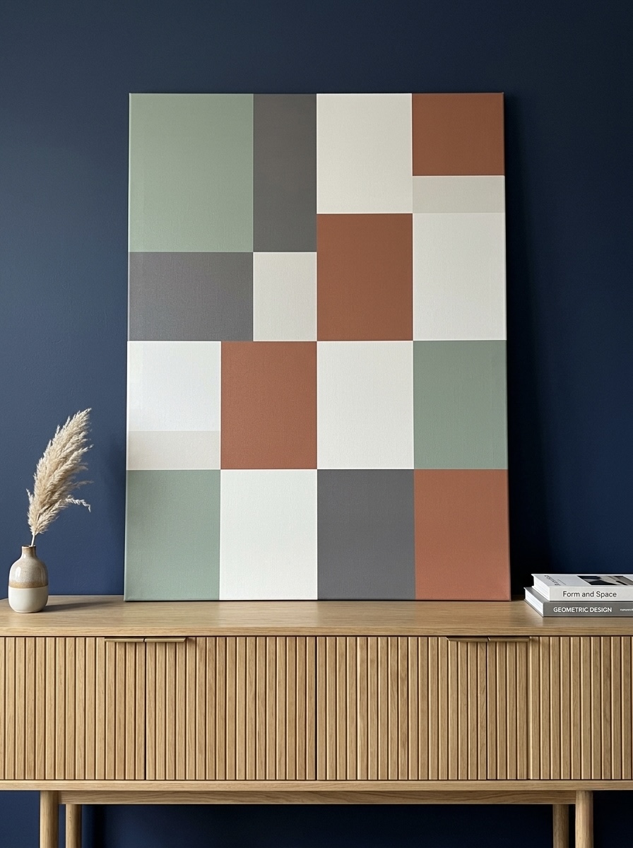
For anyone who finds the brighter mid-century palette a little too much, this color-block piece is the quieter alternative. Its grid of sage, terracotta, charcoal, and cream is essentially a curated swatch of the entire MCM earth palette compressed into one canvas. It plays especially well on sage or cream-painted walls, and it behaves like a sophisticated neutral, meaning you can layer in textured pieces (rattan baskets, linen throws, ceramic vessels) without anything competing for attention. A great anchor for living rooms that want warmth without obvious vintage costume.
Browse the Color Block Grid Abstract
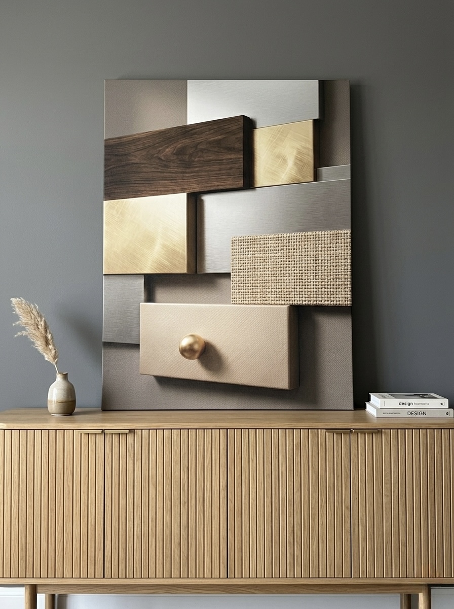
4. Geometric Texture Panels Canvas Wall Art
Where most mid-century pieces lean toward flat color, this design adds an essential third dimension: texture. The walnut, gold, charcoal, and cream panels evoke the layered grain of authentic mid-century cabinetwork (the Eames credenzas, the Saarinen tabletops) translated into pure abstraction. It is our favorite recommendation for tall hallways, formal living rooms, and master bedrooms that need warmth and quiet sophistication in equal measure. The vertical orientation makes it especially useful in narrow spaces where landscape pieces overwhelm.
Discover the Geometric Texture Panels Canvas
5. Retro Tropical Sunburst Canvas Wall Art
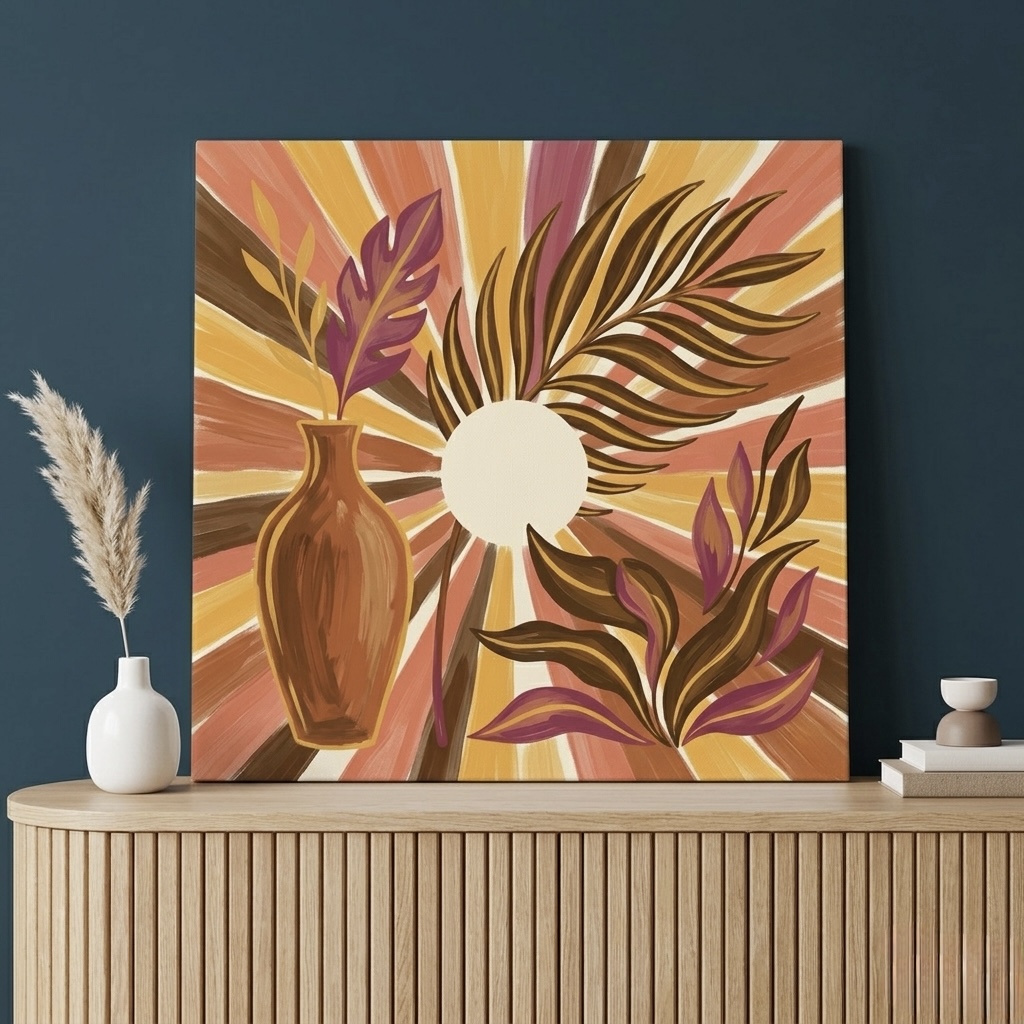
This piece sits at the intersection of MCM and bohemian, with a stylized tropical vase silhouetted against a terracotta sunburst. It carries the same atomic-sun motif you would have seen on a 1962 Heath ceramic mug, but reframed in a softer, dustier palette that feels right at home in a 2026 interior. Hang it in a sunroom, a reading nook, or anywhere a room needs an injection of golden-hour warmth. It also pairs beautifully with houseplants, since both the vase silhouette and the live foliage echo each other.
Shop the Retro Tropical Sunburst Canvas
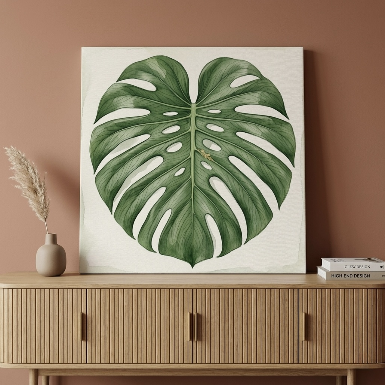
6. Monstera Leaf Canvas Wall Art
Mid-century homes pioneered the houseplant-as-decor look that today's interior designers still copy. This single-leaf monstera, rendered in flat watercolor against a clean white ground, is a direct descendant of the botanical illustrations that hung in 1960s American living rooms. It is the right choice for spaces that already have visual complexity elsewhere, since its quiet palette refuses to compete. Excellent in a bedroom, an entryway, or a small bathroom that needs a hit of green without paint.
Explore the Monstera Leaf Print
Sizing and Placement Guide
Mid-century proportions can be tricky to dial in. The original era loved long, low furniture (think credenzas, low-slung sofas, tulip dining tables) which means the wall above is often a horizontal canvas of empty space. Here is how to size and hang mid-century wall art so it looks intentional rather than marooned.
For a single statement piece above a sofa or credenza:
- Aim for the canvas to span 60 to 75 percent of the furniture width below it. If your sofa is 213 cm (84 inches) wide, target a canvas between 130 and 160 cm (51 to 63 inches) wide.
- Hang the centre of the canvas 145 to 152 cm (57 to 60 inches) from the floor. This is gallery-standard eye level and works for almost every household.
- Leave 15 to 25 cm (6 to 10 inches) of breathing room between the top of the furniture and the bottom of the canvas. Mid-century furniture lives close to the ground, so the art should not feel marooned far above it.
For a paired or triptych arrangement:
- Space pieces 5 to 10 cm (2 to 4 inches) apart. The MCM era favored tighter pairings than gallery-wall maximalism.
- If the pieces are different sizes, anchor them along a horizontal centerline rather than aligning their tops or bottoms. This keeps the eye moving across the wall.
- Keep the dominant colors in dialogue. Two unrelated palettes hung side by side will read as accidental rather than curated.
For a small atomic or starburst piece:
- These tend to look best at 30 by 30 cm (12 by 12 inches) up to 60 by 60 cm (24 by 24 inches). Beyond that, the radiating motif can feel overwhelming and start to dominate everything around it.
- If you want larger impact with the starburst look, choose a 90 by 60 cm (36 by 24 inches) landscape orientation rather than scaling up the square.
Our broader wall art size guide covers additional ratios for unusual rooms, awkward corners, and rooms with very high ceilings. And if you are decorating a smaller apartment, our small spaces guide has tips that work especially well with mid-century proportions.
Five Common Mid-Century Modern Mistakes
- Treating MCM as a costume rather than a system: A single starburst clock, a Sputnik chandelier, and a tulip side table do not add up to mid-century modern. The movement was about a coherent way of thinking, organic shapes, restrained palettes, integration of art and life, not just a checklist of period objects. Choose pieces because they share that DNA, not because they are recognizably "mid-century."
- Using saturated primary colors everywhere: Bauhaus primaries (red, yellow, blue) are part of the MCM lineage, but the actual mid-century interior was usually built on warm earth tones with a single brighter accent. A whole room of Bauhaus primaries will read as a kindergarten, not a 1962 living room. Use bold color sparingly and let the earth tones carry the bulk of the palette.
- Hanging the canvas too high above low furniture: Because mid-century sofas and credenzas sit lower than modern furniture, art that is hung at the standard 152 cm (60 inches) from the floor often ends up looking abandoned. Drop it 5 to 10 cm (2 to 4 inches) so the visual relationship between art and furniture stays intact.
- Pairing MCM with rustic farmhouse pieces: Distressed wood, shiplap, mason jars, and chunky farm tables fight directly with mid-century geometry. The two traditions come from completely different value systems (mid-century celebrates progress and manufacturing; farmhouse celebrates pre-industrial craft). If you love both, commit to one in the main public rooms and let the other live in a single accent space.
- Choosing oversized starburst motifs: The atomic starburst is one of the most recognizable MCM motifs, which means a giant one on the wall can tip the room from "stylish" to "theme restaurant" almost instantly. Keep starbursts to small or medium scale (under 75 cm or 30 inches across) and let the motif feel like a wink rather than a billboard.
Frequently Asked Questions
What years count as mid-century modern?
Most design historians define mid-century modern as the period between roughly 1945 and 1969, with the peak of the movement falling between 1950 and 1965. Some sources extend the window slightly (1933 to 1965 in a few academic sources), but the postwar definition is by far the most widely used and the one most decorators mean when they use the term.
Is mid-century modern the same as Scandinavian?
They are close cousins but not identical. Both movements share clean lines, natural wood, restrained palettes, and a love of organic forms. American MCM tends to use slightly bolder colors (mustard, teal, coral red) and embraces atomic and space-age motifs. Scandinavian design leans paler, lighter, and more rooted in folk-craft traditions. The two mix together so easily because they emerged from overlapping influences in the same decades.
What rooms suit mid-century modern wall art best?
Living rooms are the natural home for MCM, since the movement was built around the postwar American living room as the centre of family life. Dining rooms work well for bolder atomic and starburst pieces, home offices benefit from the geometric clarity, and bedrooms suit the calmer botanical and color-block pieces. The only rooms where MCM struggles are formal traditional dining rooms and farmhouse-style kitchens, where the geometry fights the architecture.
What wall colors pair best with mid-century modern art?
Cream, soft white, warm beige, and pale sage are the safest backgrounds and let MCM color carry the room. Charcoal grey or deep navy walls create dramatic contrast for gold-toned or walnut pieces. Avoid pure cool white (it makes the warm palette look muddy) and avoid bright primary-painted walls, which fight the art directly. Our beige walls guide and white walls guide have specific paint-and-art pairings.
Can I mix vintage MCM art with new mid-century-style prints?
Absolutely, and most decorators do. Genuine vintage pieces from the 1950s and 60s carry character that new art cannot quite replicate, but they are also expensive and rare in good condition. The most successful approach is to use one or two vintage pieces as conversation anchors and surround them with high-quality new prints that share the same palette and shape language. Heva canvases use modern UV-resistant inks and a 350 gsm canvas weight, which means new pieces will hold their color longer than most original prints from the era.
Is mid-century modern still on-trend in 2026?
It is, and it has been continuously since the early 2000s revival. Pinterest and major design publications have shown sustained search interest in mid-century styling for more than two decades, with no signs of fatigue. The 2026 evolution leans toward warmer, dustier palettes (more terracotta, less avocado green) and more botanical integration, which is exactly the direction many of our customers are buying in. For a broader view, see our trending wall art styles 2026 guide.
Quick Reference: Mid-Century Modern Wall Art
| Product | Best For | Dominant Colours | Link |
|---|---|---|---|
| Bauhaus Geometric Shapes Canvas Wall Art | Home office, kids room, modern living room | Red, yellow, blue, cream | View piece |
| Geometric Starburst Canvas Print | Dining room, entryway, bar nook | Coral red, orange, burgundy | View piece |
| Color Block Grid Abstract Canvas Wall Art | Living room, bedroom, dining room | Sage, terracotta, charcoal, cream | View piece |
| Geometric Texture Panels Canvas Wall Art | Hallway, formal living room, master bedroom | Walnut brown, gold, cream, charcoal | View piece |
| Retro Tropical Sunburst Canvas Wall Art | Sunroom, reading nook, boho living room | Terracotta, gold, purple | View piece |
| Monstera Leaf Canvas Wall Art | Bedroom, bathroom, entryway | Green, white | View piece |
Mid-century modern endures because it gets the basics right: warm color, clean shape, an honest love of materials, and a quiet faith that everyday rooms deserve real beauty. Browse the full Heva mid-century leaning collection to find the piece that anchors your space. Every canvas ships within the US, arrives ready to hang, and is printed on 350 gsm gallery-grade canvas built to outlast the decade.


