Earth Tone Wall Art for Rustic Living Room Decor
The Heva Team
Art Curators & Interior Design Enthusiasts · April 1, 2026 · 16 min read
Discover earth tone wall art that brings warmth and calm to any room. Terracotta, amber, and rich brown prints for grounded interiors.
If there is one thing we have watched happen steadily across homes in 2026, it is the quiet exit of cool gray and the triumphant return of the earth. Terracotta, burnt sienna, camel, warm white, and deep ochre are no longer accent choices -- they are the foundation of the most grounding, restorative interiors we see. Earth tone wall art is at the center of that shift, anchoring rooms with color that feels honest, warm, and deeply human.
This guide covers everything: what counts as a true earth tone, the science behind why these colors calm us, how to pair art with terracotta walls or linen sofas, and exactly which prints from our gallery will do the job beautifully. Whether your space is a sun-drenched living room or a cozy bedroom corner, you will leave here knowing precisely what to hang and where.
Ready to browse? Explore the full collection now: Shop Earth Tone Wall Art
The Earth Tone Palette Explained
The phrase "earth tone" gets stretched to mean almost any neutral, which causes a lot of decorating mistakes. In our experience, a true earth tone palette has a very specific character: it draws from soil, clay, stone, bark, and dried botanicals. It is warm -- never cool. If a color reads gray, blue-gray, or icy white under natural light, it is not an earth tone.
Core Earth Tones for Wall Art
- Terracotta and burnt sienna -- fired-clay reds with orange warmth, the most iconic earth tones of the 2020s. These colors evoke sun-baked pottery and open desert landscapes.
- Camel and amber -- golden-brown tones that sit between honey and cognac. Supremely versatile: they work on light walls and dark walls alike.
- Warm white and linen -- off-whites with a yellow or pink undertone, not a blue one. Think unbleached cotton, raw plaster, or aged paper.
- Ochre and mustard -- deeper yellows pulled toward brown. These appear frequently in landscape art as the color of dry grass, autumn leaves, and golden-hour light.
- Sage and warm olive -- muted greens that lean yellow-brown, not blue-green. Sage bridges the gap between botanical and earth tone territory perfectly.
- Chocolate and espresso -- deep warm browns that anchor a palette. In art, these appear as shadow in forest scenes, bark texture, and rich mountain shadow.
What is conspicuously absent from this list: cool gray, slate, pale lavender, and any white with a blue or green undertone. Those are beautiful colors in their own right, but they belong to a completely different palette family. Mixing them with earth tones is the single most common decorating mistake we see.
For more on building a coherent color story in your home, read our guide on choosing wall art colors that pop.
Why Earth Tones Work: The Science Behind the Warmth
The appeal of earth tone wall art is not just aesthetic -- it is physiological. Research in color psychology consistently shows that warm, muted tones derived from nature trigger measurable reductions in cortisol levels and perceived stress. Terracotta in particular has been studied for its ability to create feelings of nurturing, grounded stability, and safety.
According to color researchers and interior psychologists, earth tones work through two reinforcing mechanisms:
1. Biophilic Color Recognition
Human beings evolved surrounded by soil, stone, bark, and warm light. Our nervous systems recognize these colors as signals of a safe, resource-rich environment. When we see ochre, terracotta, or warm brown in our living space, the brain interprets those signals subconsciously -- producing a relaxation response that cooler, artificial colors do not trigger. This is the foundation of biophilic design: bringing the color language of nature indoors.
For a deeper look at this topic, read our post on biophilic design and nature wall art for wellness.
2. Visual Anchoring
Earth tones provide what designers call "visual weight" -- a sense that the room has substance and gravity. In a space dominated by pale or cool colors, art can feel like it is floating. Earth tone wall art roots the eye, creating natural focal points that make a room feel considered and complete. In our experience, a single piece with strong terracotta or amber tones can do more to make a living room feel finished than an entire shelf of accessories.
The Color Psychology Institute's 2026 color trends report confirms this shift, noting that warm neutrals and earth tones dominate because they respond directly to consumers' desire for spaces that feel calming and emotionally restorative.
Separately, Forest Homes' analysis of the 2026 design shift from cool gray to earth-rooted interiors documents how biophilic color palettes have moved from trend to mainstream design standard -- with earth tones now appearing in every segment from luxury to everyday home decor.
You can explore the full research angle in our post on the psychology of colors in wall art.
Pairing Earth Tone Art With Your Space
Knowing which art to choose is only half the task. The other half is knowing where to put it and what it should live alongside. We have found that the most successful earth tone interiors follow a few consistent pairing principles.
Terracotta Walls + Amber and Ochre Art
If your walls are painted in a terracotta, clay, or warm rust tone, the instinct is to contrast with neutrals -- and that works. But we have found that an even more striking approach is tonal layering: hang art that draws amber, gold, or ochre from within the same warm family. The result is a room that feels cohesive rather than decorated. Think of landscape prints with golden-hour light, canyon scenes, or autumn forest paintings. These echo your wall color without copying it.
Linen Sofas + Botanical and Wildlife Prints
Natural linen and cotton upholstery in undyed or warm-white tones creates a perfect blank canvas for earth tone art. Wildlife prints with warm autumn backdrops -- a deer in a golden forest, a raccoon among russet leaves -- bring texture and life without competing with the furniture. The principle here is that linen reads as an earth tone itself, so art that shares its warmth will feel native to the space rather than imposed on it.
Dark Wood + Mountain Landscape Art
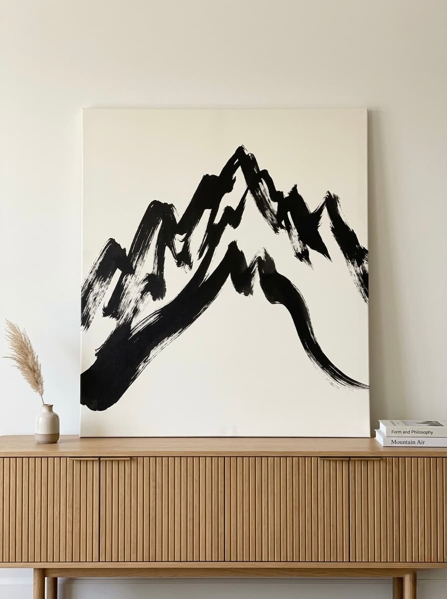
Walnut, oak, and dark stained timber all carry brown and amber undertones that pair naturally with mountain landscape art. Misty valley scenes at sunrise, fjord paintings, and alpine reflections all share a palette of warm grays, amber, and deep green that complements dark wood without fighting it. The contrast between the organic texture of the wood and the painted landscape art creates a gallery-quality moment in any room.
Warm White Plaster + Portrait and Cultural Art
Warm white or raw plaster walls are increasingly popular in 2026 interiors. Against this backdrop, bold portrait art with amber and terracotta tones becomes a powerful focal point. A single large-format portrait print -- especially one with rich ochre and warm brown skin tones -- becomes the defining statement of the room.
For more on creating these kinds of considered interiors, see our guide on bringing nature indoors with wall art.
6 Earth Tone Wall Art Picks From Our Gallery
Every piece below was selected for its authentic earth tone palette, print quality, and ability to anchor a warm interior. All are available as gallery-wrapped canvas prints.
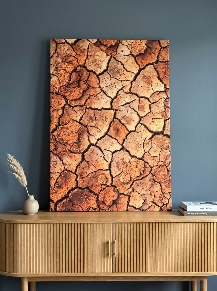
1. Canyon Strata Canvas Wall Art
This impasto landscape print captures the layered drama of canyon geology -- burnt sienna, terracotta, and warm ochre stacked in thick, expressive strokes. The texture reads as almost sculptural from a distance, giving it a presence that photography-based prints rarely achieve. We have found it works beautifully above a natural stone fireplace or anchoring a reading nook with warm wood shelving.
Best for: Living rooms, studies, entryways with terracotta or camel walls
Earth tone palette: Burnt sienna, terracotta, warm ochre, sand
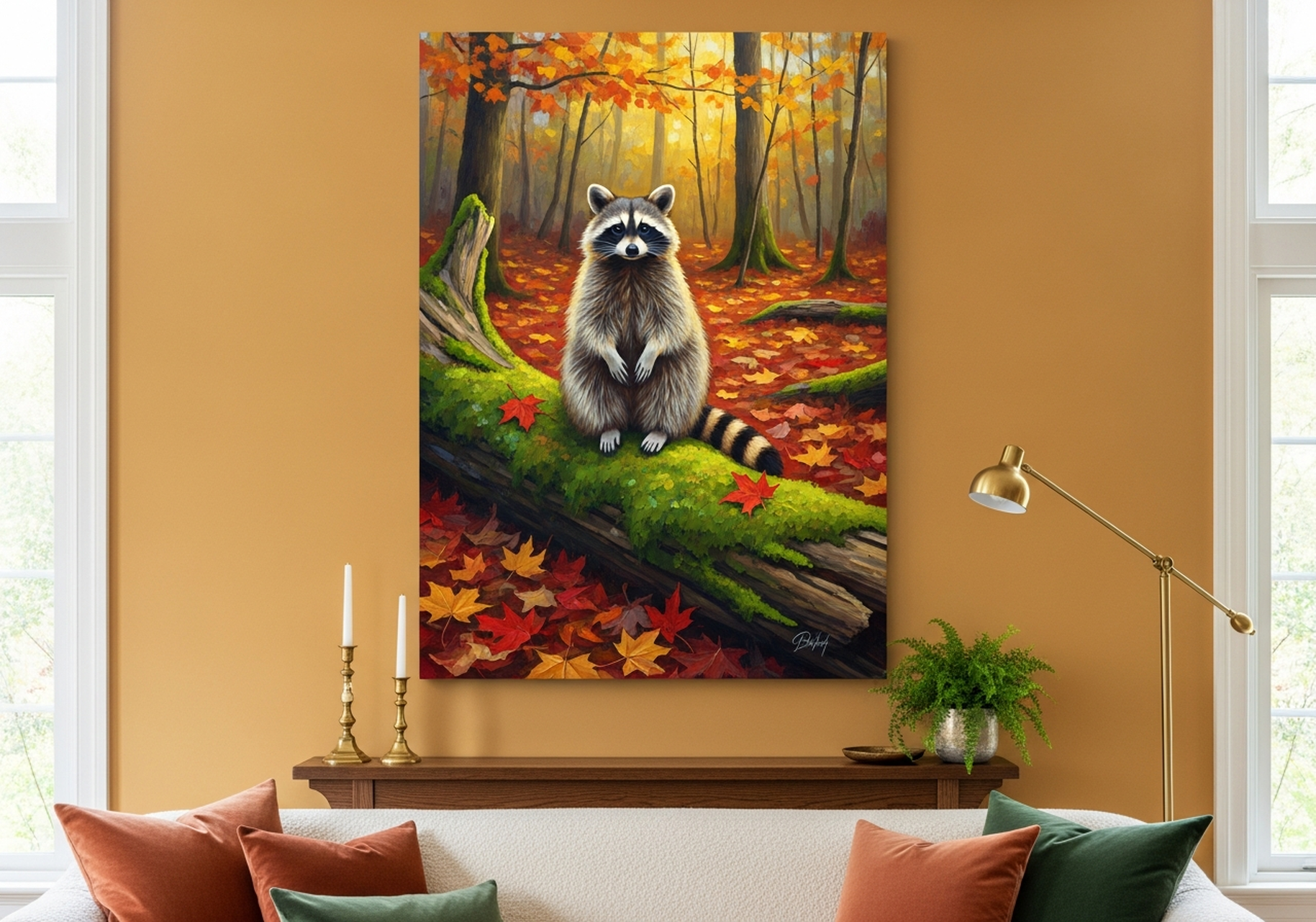
2. Raccoon Autumn Woodland Canvas Wall Art
Painted in the tradition of oil-style wildlife portraiture, this piece places a raccoon amid an autumn woodland backdrop saturated with amber, rust, and warm brown. The animal subject brings an intimacy that pure landscapes cannot, making it a particularly strong choice for cottage-style living rooms or cozy bedrooms that lean rustic. In our experience, wildlife art in an earth tone palette is one of the most reliably beloved categories among customers who value warmth over minimalism.
Best for: Cottage living rooms, bedrooms, reading rooms
Earth tone palette: Amber, rust, warm brown, autumn gold
3. Lynx Winter Birch Forest Canvas Wall Art
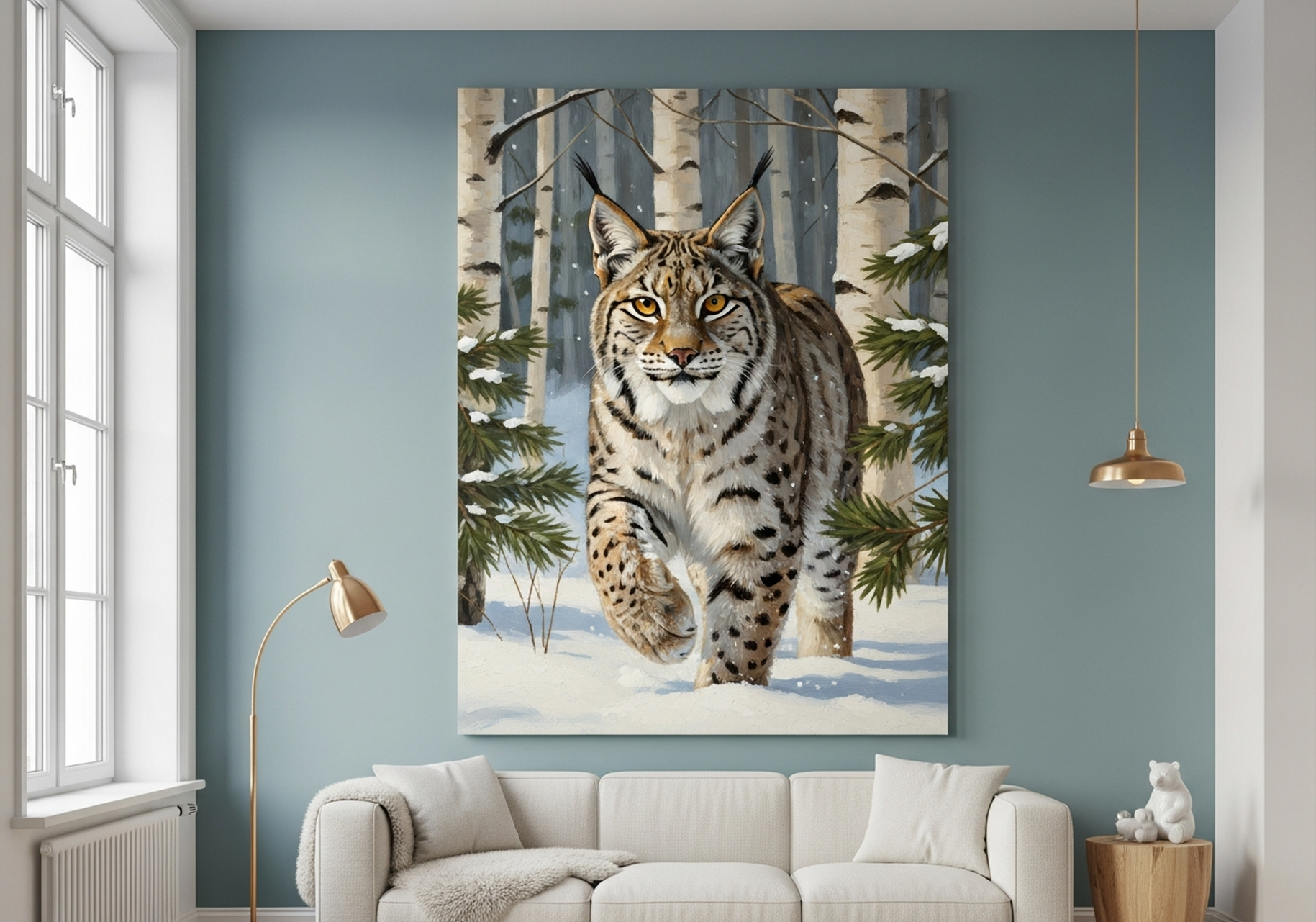
The warm whites and ivory tones of a birch forest in winter make this lynx portrait one of the most versatile pieces in our earth tone range. Where many "neutral" artworks veer cool and gray, the warm beige of birch bark and the golden cast of winter light keep this firmly in earth tone territory. It sits beautifully against linen walls, warm white plaster, and camel or taupe paint -- adding wildlife drama without disrupting a calm, grounded palette.
Best for: Nordic-inspired rooms, bedrooms, linen-toned spaces
Earth tone palette: Warm ivory, birch beige, caramel, soft amber
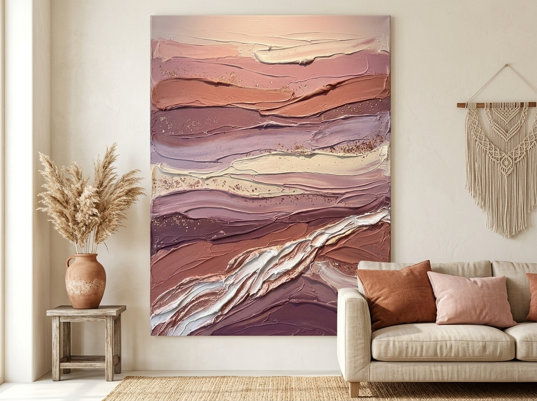
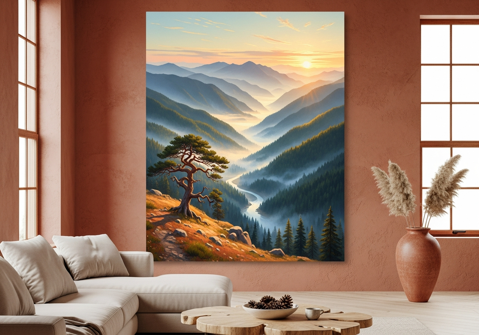
4. Misty Mountain Valley Sunrise Canvas Wall Art
Sunrise over a mountain valley is one of the most consistently requested subjects in our gallery, and this oil-style landscape delivers it with exceptional warmth. The golden-hour palette -- amber, warm ochre, and hazy violet that leans toward brown rather than blue -- makes it an ideal earth tone landscape even with its expansive sky. We have found that oversized versions of this piece transform dining rooms and living rooms equally well, creating a sense of depth and natural light in any orientation.
Best for: Living rooms, dining rooms, open-plan spaces
Earth tone palette: Amber, warm ochre, golden haze, soft warm violet
5. Deer Stag Autumn Forest Canvas Wall Art
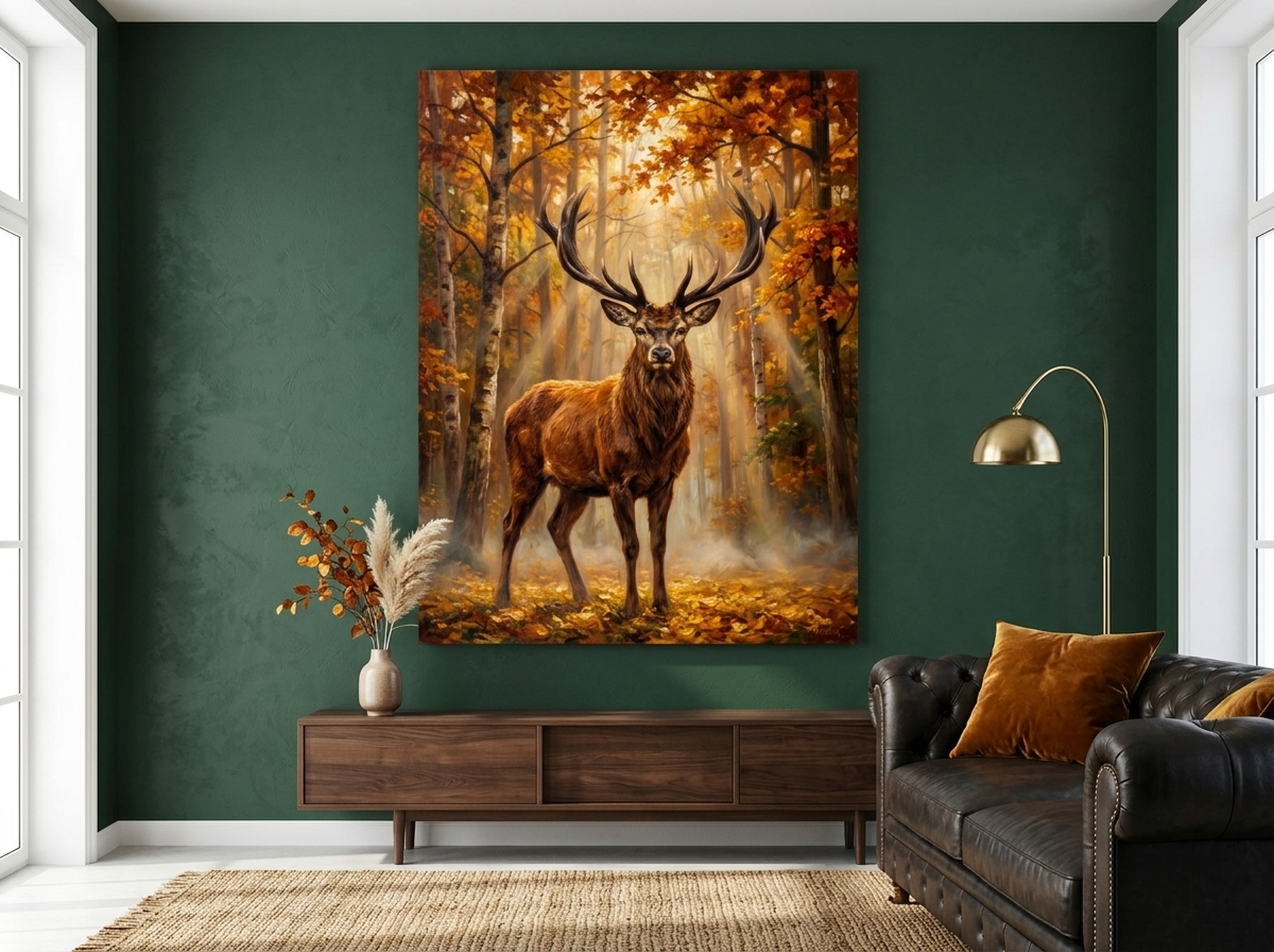
Few subjects carry the same natural authority as a deer stag in full autumn color. The palette here -- rich amber, deep forest brown, and warm golden foliage -- is one of the most complete earth tone compositions in our collection. It is the kind of art that works in a grand entryway as readily as it does above a bed, and in our experience it tends to become the defining piece of whichever room it enters. The stag's upright posture and the warm surrounding forest create both energy and stillness simultaneously.
Best for: Entryways, master bedrooms, statement living room walls
Earth tone palette: Rich amber, forest brown, deep ochre, warm gold
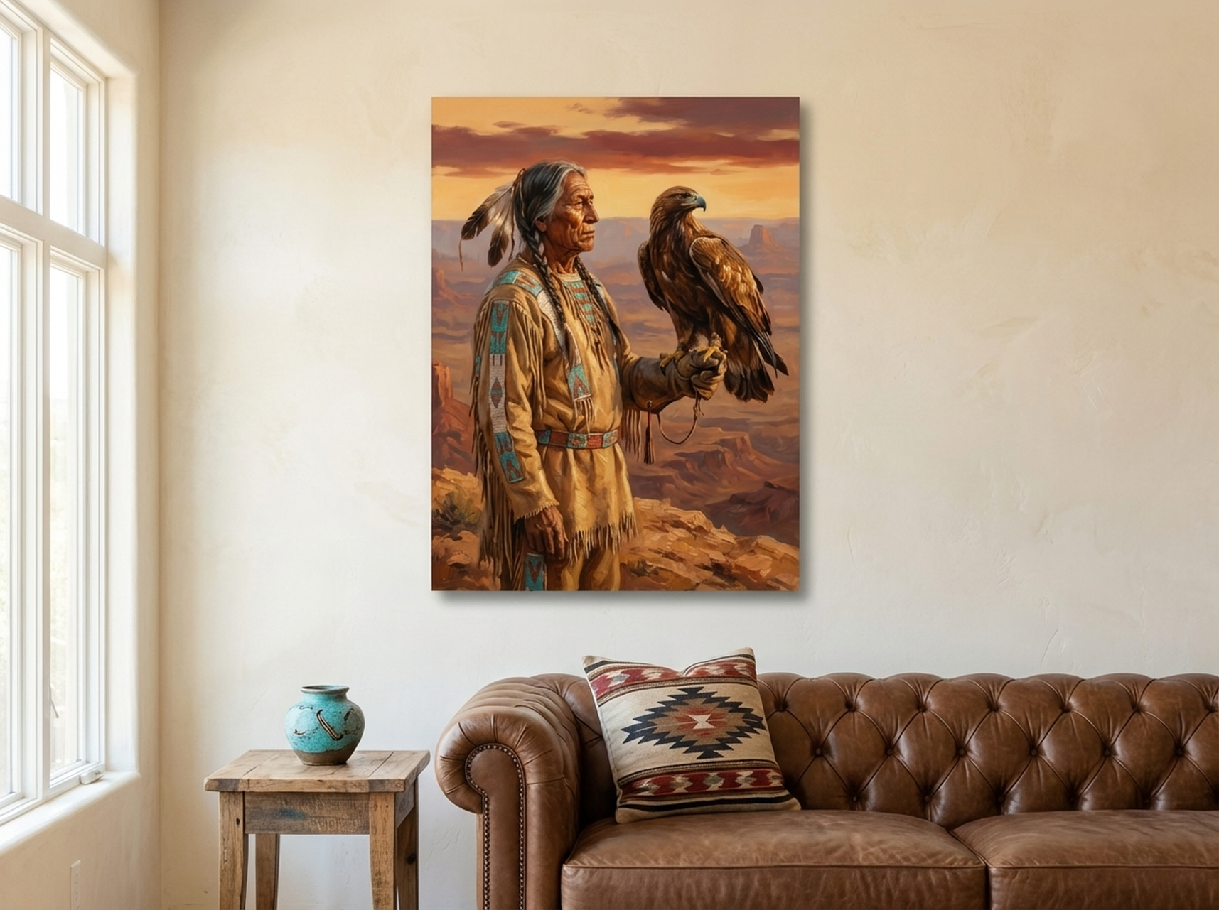
6. Native American Elder Eagle Spirit Canvas Wall Art
This is among the most emotionally powerful pieces in our earth tone range. Painted in a rich amber and terracotta palette, the portrait combines cultural depth with a color story that is almost perfectly calibrated for warm interiors. The amber and ochre tones resonate strongly with terracotta accent walls and natural wood furniture. It reads best as a solo statement piece on a warm white or raw plaster wall, where the palette can breathe and the subject commands full attention. We have seen this print transform otherwise ordinary living rooms into spaces with genuine character.
Best for: Living rooms, home offices, warm plaster or terracotta feature walls
Earth tone palette: Amber, terracotta, ochre, warm sienna
For more on selecting the right wildlife art for a nature-inspired interior, see our post on wildlife wall art for the living room.
Placement Guide: Where and How to Hang Earth Tone Art
The right art on the wrong wall at the wrong size will underperform every time. Here is what we have learned from helping hundreds of customers place their prints.
Height
Hang the center of your artwork at eye level: approximately 145-150 cm (57-59 inches) from the floor. In rooms where you are primarily seated -- living rooms, dining rooms -- you can drop this to 135-140 cm (53-55 inches) so the art reads comfortably from a seated position.
Size by Room
- Living room sofa wall: Art should span 55-70% of the sofa's width. For a 220 cm (87 inch) sofa, that means art in the 120-155 cm (47-61 inch) wide range, or a gallery wall that spans the same.
- Above a bed: Target 60-75% of the bed's headboard width. For a standard queen (160 cm / 63 inches), aim for 95-120 cm (37-47 inches) wide.
- Entryway: A single vertical piece works best -- 60-90 cm (24-35 inches) wide and at least 75 cm (30 inches) tall creates the right sense of arrival.
- Dining room: Art should sit 20-30 cm (8-12 inches) above the top of a buffet or sideboard, and span approximately 75-80% of the furniture's width.
Spacing for Gallery Walls
Keep gaps between frames consistent at 5-8 cm (2-3 inches) for a curated look. Wider gaps of 10-15 cm (4-6 inches) give a more relaxed, airy arrangement. In our experience, consistent gap sizing matters more than frame uniformity -- you can mix frame styles and sizes freely as long as your spacing is disciplined.
For a complete sizing guide, read our post on how to choose the right wall art size for your living room.
5 Common Mistakes to Avoid With Earth Tone Wall Art
- Mixing cool neutrals with earth tones. Cool gray, slate, and blue-white paints will fight your earth tone art rather than complement it. If you have cool-toned walls and want to introduce earth tone art, repaint at least the feature wall with a warm white or warm greige (a beige-gray that leans warm) before hanging.
- Going too small. Earth tone art depends on presence. A small print in a rich terracotta and amber palette will read as an afterthought. For living rooms and bedrooms, size up -- a piece that feels slightly large in the store will feel exactly right on the wall.
- Hanging too high. The most common hanging mistake across all art categories. Center at 145-150 cm (57-59 inches) from the floor, not at ceiling height. Art that floats near the ceiling disconnects from the furniture and from the people in the room.
- Building an all-warm palette without contrast. Earth tones need a counterpoint to avoid feeling heavy. A small amount of warm white, natural linen, or sage green gives the eye somewhere to rest. In a fully terracotta room, a botanical print with sage leaves and warm white negative space can be the relief the space needs.
- Using artificial or cool-toned lighting. Earth tone art under cool LED lighting loses up to half its warmth. Always use bulbs rated 2700K-3000K (warm white) to maintain the richness of amber, sienna, and ochre tones in your prints. In our experience, the single biggest transformation a customer can make to an existing earth tone art installation is switching to warmer bulbs.
- Ignoring the wabi-sabi principle. Earth tones belong to an aesthetic of natural imperfection -- they look best in rooms that embrace texture, age, and organic materials. Highly polished, perfectly symmetrical rooms can make even the richest earth tone art feel out of place. Add linen cushions, a jute rug, or raw wood elements to let the art breathe. Read more about this in our post on wabi-sabi wall art and the beauty of imperfection.
Frequently Asked Questions About Earth Tone Wall Art
What colors count as earth tones?
Earth tones are colors derived from natural soil, clay, stone, and organic matter. This includes terracotta, burnt sienna, camel, amber, ochre, mustard, warm brown, espresso, sage, warm olive, and off-whites with yellow or pink undertones. The key rule is warmth: earth tones always lean warm, never cool or gray.
How do you decorate with terracotta?
Terracotta works best as a feature wall color paired with warm white or linen on surrounding walls. Choose art in amber, ochre, and warm brown tones that echo the terracotta without duplicating it. Add natural textures -- linen, jute, wood, ceramic -- and use warm-white lighting at 2700K to 3000K. Avoid cool gray, silver, or blue accents, which will fight the warmth.
What wall art goes best with earth tone interiors?
Landscape art with golden-hour or autumn palettes, wildlife prints in warm woodland settings, abstract art with impasto terracotta and sienna texture, and portrait art in amber and ochre tones all work exceptionally well. The key is selecting art whose dominant colors fall within the warm half of the color wheel -- no cool grays or blue-greens.
Are earth tones still in style for 2026?
Yes. 2026 has seen the definitive shift from the cool gray and stark white interiors that dominated the 2010s to warmer, more grounded palettes. Terracotta, ochre, amber, and warm brown are now mainstream rather than trend-forward, which means they have genuine staying power. Rooms built around earth tones in 2026 will remain current for years.
How large should earth tone wall art be for a living room?
For a sofa wall, art should span 55-70% of the sofa width. For a standard 220 cm (87 inch) sofa, that means art between 120-155 cm (47-61 inches) wide, either as a single piece or a gallery wall arrangement. Hang the center at 145-150 cm (57-59 inches) from the floor, or 135-140 cm (53-55 inches) for seated rooms.
Can earth tone wall art work in small rooms?
Absolutely. In small rooms, earth tone art should be used as a singular statement rather than a gallery wall. One well-sized piece with a warm palette creates depth and intimacy without overwhelming the space. Choose art with some light values -- warm ivory, amber, or golden tones -- rather than very dark browns, which can make a small room feel smaller.
Quick Reference: Earth Tone Wall Art at a Glance
| Product | Earth Tone Palette | Best Room | Link |
|---|---|---|---|
| Canyon Strata | Burnt sienna, terracotta, ochre | Living room, study | View |
| Raccoon Woodland | Amber, rust, warm brown | Cottage living room, bedroom | View |
| Lynx Birch Forest | Warm ivory, birch beige, amber | Nordic-inspired room, bedroom | View |
| Misty Mountain Sunrise | Amber, warm ochre, golden haze | Living room, dining room | View |
| Deer Stag Autumn | Rich amber, forest brown, gold | Entryway, bedroom | View |
| Native American Elder | Amber, terracotta, ochre, sienna | Living room, home office | View |
Find Your Earth Tone Anchor Piece
The right art does not just decorate a room -- it defines it. Earth tone wall art brings warmth, psychological grounding, and a connection to the natural world that no amount of furniture or paint can replicate on its own. Whether you are starting from scratch or adding the final layer to an already warm interior, our collection has the piece that will make it complete.