Wabi-Sabi Wall Art: Beauty in Imperfection
The Heva Team
Art Curators & Interior Design Enthusiasts · April 1, 2026 · 19 min read
Discover wabi-sabi wall art that celebrates imperfection. Organic textures, muted tones, and handcrafted beauty for interiors that feel calm, natural, and intentional.
There is a crack in the old ceramic bowl. A weathered knot in the driftwood frame. A smear of ink that did not go where the brush intended. In most design philosophies, these are flaws to be corrected or hidden. In wabi-sabi, they are the whole point. This ancient Japanese aesthetic asks a quiet but radical question: what if imperfection is not something to fix, but something to treasure? Wabi-sabi wall art carries that philosophy directly into your home, turning your walls into a meditation on time, texture, and the quiet beauty of things that are honestly, beautifully incomplete.
If you have been searching for art that feels calm rather than loud, grounded rather than glossy, and soulful rather than mass-produced, wabi-sabi is your answer. Ready to browse? Explore our full wabi-sabi wall art collection and find a piece that speaks in the language of stillness.
What Is Wabi-Sabi? The Japanese Philosophy of Beautiful Imperfection
Wabi-sabi is one of the most important and least understood concepts in Japanese aesthetics. The term combines two separate ideas: wabi, which once meant the melancholy of living alone in nature, and sabi, which referred to the beauty that comes with age and wear. Over centuries, particularly through the influence of the Japanese tea ceremony tradition beginning in the 15th century, these ideas merged into a single worldview: that objects, spaces, and moments are most beautiful when they carry the honest marks of time and impermanence.
The concept was largely unknown in the Western world until 1994, when American designer and author Leonard Koren published Wabi-Sabi: for Artists, Designers, Poets and Philosophers. In fewer than 100 pages, Koren introduced Western readers to a philosophy that contrasts sharply with the classical European ideal of beauty as perfection, symmetry, and permanence. His book became a touchstone for designers worldwide and sparked decades of interest in Japanese-inspired interiors, natural materials, and the art of intentional simplicity. You can read more about Koren's foundational work on the Wikipedia overview of wabi-sabi.
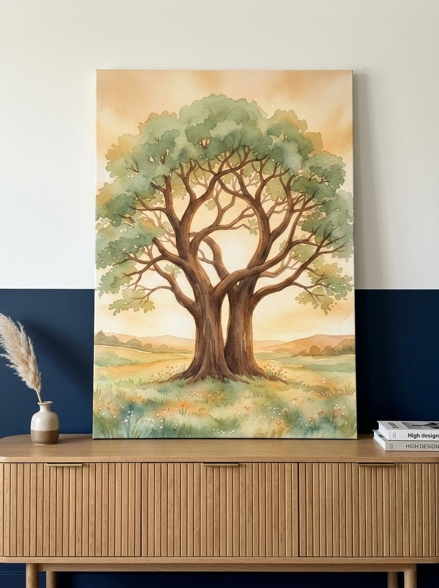
The three core principles of wabi-sabi are: nothing lasts, nothing is finished, and nothing is perfect. Applied to wall art, this means seeking pieces that feel organic rather than manufactured, that show the hand of the maker, that embrace asymmetry and texture, and that invite quiet contemplation rather than immediate impact. A wabi-sabi canvas is not meant to shout across the room. It is meant to reward the person who stops and looks closely.
In our experience, clients who discover wabi-sabi art often describe a shift in how they see their whole home. Once you start noticing the beauty in an imperfect brushstroke or an uneven grain of wood, the pressure to create a "perfect" interior begins to lift. That is the deeper gift of this philosophy.
Wabi-sabi connects naturally to other Japanese concepts like mono no aware (the bittersweet awareness of impermanence) and ma (the art of negative space). These ideas run through Japanese landscape painting, ikebana flower arranging, and the design of traditional tearooms, all of which have influenced contemporary wabi-sabi wall art. For a deeper look at how Japanese aesthetics connect to mindfulness and wellness in interior design, the Interior Design Institute's guide to wabi-sabi principles is an excellent resource.
Wabi-Sabi vs Japandi: What's the Difference?
If you have been exploring calm, nature-inspired interiors, you have almost certainly encountered both wabi-sabi and Japandi. These styles are often mentioned together, and they do share important values: both favour natural materials, muted colour palettes, and a rejection of excess. But they are distinct philosophies, and understanding the difference will help you choose art that truly fits your space.
Japandi is a contemporary hybrid. It blends Japanese minimalism with Scandinavian (particularly Danish) functionalism. The result is a style that is clean, ordered, and highly resolved. Japandi interiors tend to feature straight lines, geometric forms, carefully curated objects, and a palette that leans toward cool greys, warm whites, and soft blacks. Everything has its place. The beauty comes from precision and intentionality. Our guide to Japandi wall art for calm, minimal spaces explores this style in depth.
Wabi-sabi, by contrast, is not a contemporary design trend but an ancient philosophy. It does not seek order; it accepts disorder. Where Japandi admires a perfectly smooth ceramic, wabi-sabi admires the same ceramic after it has chipped and been repaired with gold lacquer (the Japanese art of kintsugi). Where Japandi uses muted tones for aesthetic harmony, wabi-sabi uses earthy, darkened tones because those are the colours of wood left in the rain, of stone worn smooth by a river, of ink absorbed into rough paper.
The practical difference in wall art is this: Japandi art tends to be more graphic and structured, with clear composition and intentional negative space. Wabi-sabi art tends to be more gestural, textured, and asymmetrical, with visible brushwork, organic shapes, and a feeling of spontaneity. Both styles complement natural materials like linen, wood, and clay. But wabi-sabi art will always feel slightly more raw, more weathered, more honestly human. You can also explore how these principles overlap with Japanese wall art for zen modern homes for more context.
We've found that many of our customers choose wabi-sabi art not because they have a rigidly wabi-sabi interior, but because they want one piece that introduces depth, soul, and a sense of time into an otherwise modern space. A single textured botanical print or a landscape with visible brushwork can do exactly that.
Choosing Wabi-Sabi Art: Textures, Tones and Forms
Selecting wabi-sabi wall art is less about matching colours to a mood board and more about responding to a feeling. That said, a few practical considerations will help you choose a piece that works beautifully in your specific space.
Texture First
Wabi-sabi art prioritises tactile quality, even in a two-dimensional canvas print. Look for visible brushwork, areas of impasto (thick paint application), watercolour bleeds, ink washes, or paper textures that catch the light. A canvas that looks slightly different depending on the angle of the light is a strong wabi-sabi choice. Smooth, flat digital prints tend to work against the aesthetic.
Colour Palette
The wabi-sabi palette draws from the natural world in its quieter moments: stone grey, clay terracotta, bark brown, moss green, cloud white, and aged ink black. Gold appears often, referencing kintsugi. Avoid bright primary colours and high-contrast graphic compositions. Instead, look for tones that seem to have depth and age, colours that feel as though they have been worn in rather than applied.
Form and Subject
Wabi-sabi subjects include: botanicals (especially single flowers, branches, or seed pods), birds in natural settings, water and stone landscapes, weathered figures, and abstract natural forms. Symmetry is not required, and asymmetry is often preferred. A single branch painted off-centre, with the rest of the canvas breathing, is more wabi-sabi than a perfectly centred composition.
Sizing for Your Wall
For a standard living room or bedroom feature wall, we recommend a canvas between 80 cm and 100 cm wide (approximately 31 to 39 inches). This is large enough to anchor the space without overwhelming it, which matters in a wabi-sabi interior where restraint is valued. For smaller rooms or gallery walls, 50 cm to 60 cm wide (approximately 20 to 24 inches) works well. Allow at least 15 cm (6 inches) of wall space above and below the frame to let the piece breathe. For specific placement guidance, visit our post on bedroom wall art ideas that set the mood.
Hang the centre of the canvas at approximately 145 cm to 152 cm from the floor (57 to 60 inches), which corresponds to the average eye level for a standing adult. In rooms where you primarily sit, such as a dining room, lower this by about 10 cm (4 inches) so the art is viewed at seated eye level.
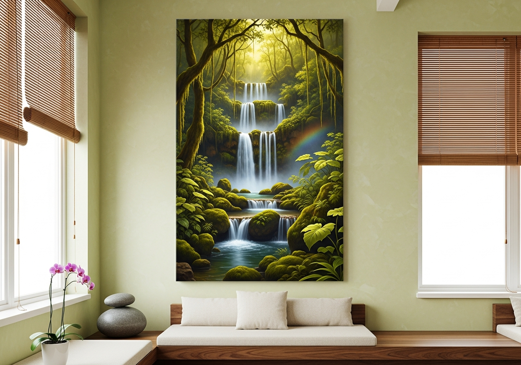
The Waterfall Canvas above illustrates the principle beautifully: moving water is never twice the same, and art that captures flowing, organic movement carries that quality of impermanence into your home. For more ideas on bringing natural subjects into your interior, see our post on nature wall art that brings the outdoors inside.
Our Top 6 Wabi-Sabi Wall Art Picks
We've curated six pieces from our collection that each embody a different dimension of the wabi-sabi aesthetic. Whether you are drawn to botanical stillness, bird studies, or elemental landscapes, there is something here for every wabi-sabi interior.
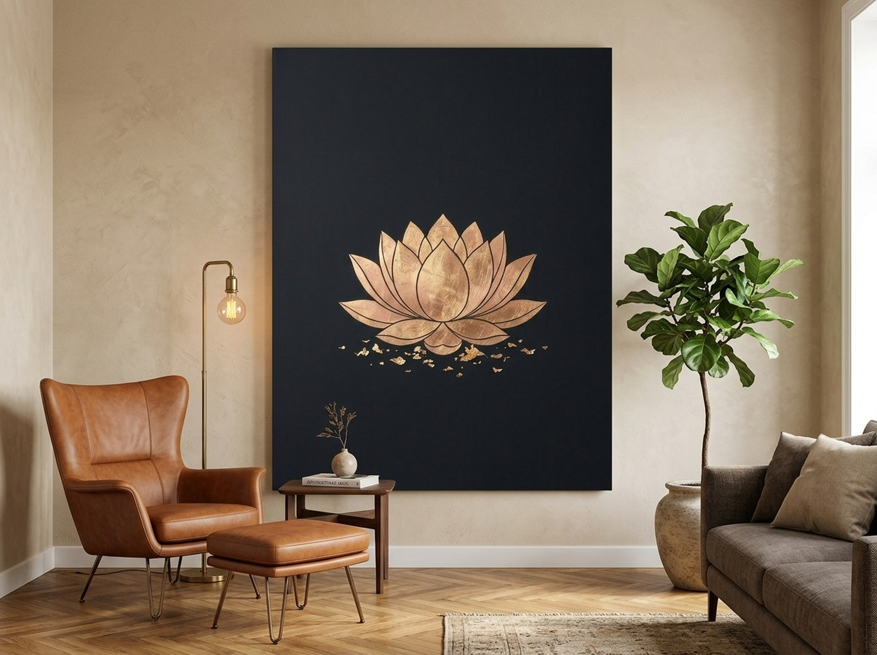
1. Lotus Flower Canvas Wall Art | Gold Leaf Black Minimalist
The lotus is one of the most resonant symbols in both Zen Buddhism and wabi-sabi philosophy: it grows in muddy water and emerges pristine, embodying the beauty that arises from imperfect conditions. This canvas renders the lotus in minimalist ink with delicate gold leaf accents on a deep black ground, evoking the refined simplicity of a Japanese ink painting. The gold references kintsugi, the art of repairing with gold, reminding us that breakage and healing are part of an object's history rather than something to conceal. In our experience, this piece works especially well in bedrooms and meditation spaces, where its quiet presence encourages stillness. The high-contrast palette makes it equally effective in Japandi and wabi-sabi interiors, and the gold detail catches warm evening light beautifully. We recommend hanging it at 60 cm wide (24 inches) on a textured plaster or limewash wall for maximum effect.
2. Sea Turtle Canvas Wall Art | Ocean Wildlife Minimalist Painting
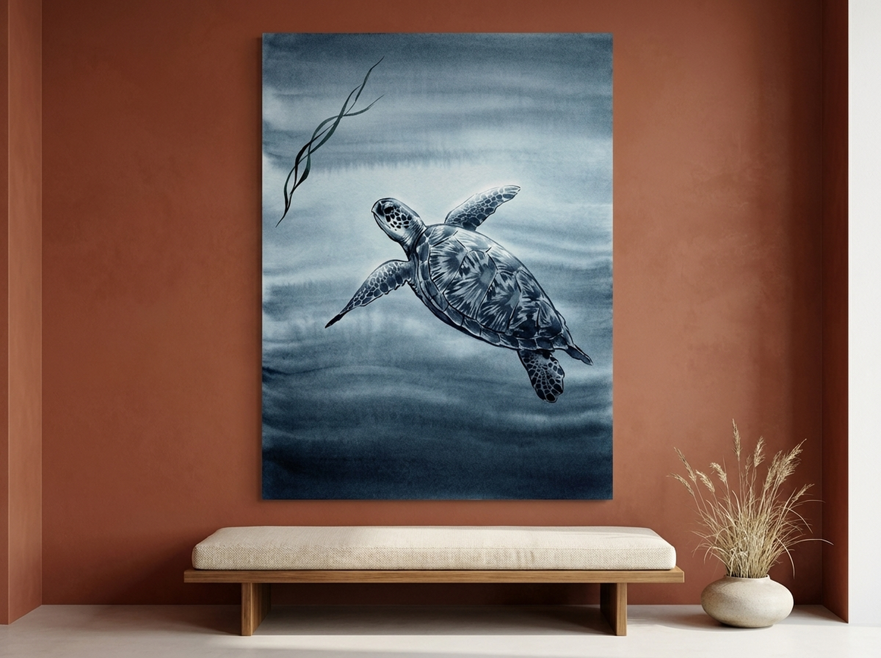
The sea turtle is an ancient animal, and its ancient-ness is part of its wabi-sabi appeal. This minimalist painting captures the creature in flowing, unhurried brushwork against a muted ocean ground, emphasising the qualities that make turtles so meditative to watch: their patience, their slowness, their complete indifference to urgency. The pared-back palette of ocean blues and soft greens fits naturally into wabi-sabi bathrooms, where the combination of water, natural light, and organic art creates a genuinely restorative atmosphere. We've found that this piece works particularly well in spaces with natural linen textiles, rattan accessories, and stone or wood surfaces. Its open composition, with generous negative space, invites the eye to rest rather than search, which is exactly the intention of wabi-sabi decor. Available in multiple sizes to suit everything from a compact bathroom wall to a full feature installation.
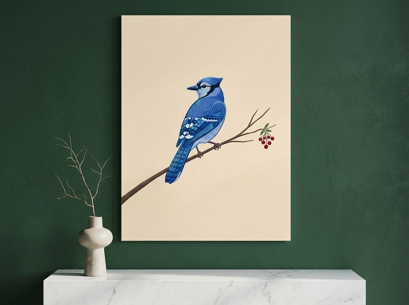
3. Blue Jay Canvas Wall Art | Minimalist Bird Painting for Living Room
Bird studies have been central to Japanese and East Asian art for centuries, and the blue jay brings that tradition into a Western context with quiet confidence. This minimalist painting captures the bird in a moment of stillness, rendered with an economy of line that reflects the Japanese concept of ma, meaning productive negative space. The blue of the jay's plumage is vivid but not jarring; it sings against the neutral ground without disrupting the overall calm of the composition. In our experience, bird art of this kind is one of the most versatile categories of wabi-sabi wall art, working equally well in living rooms, studies, and hallways. The piece carries a suggestion of the natural world without literally reproducing a photographic scene, which is a hallmark of wabi-sabi artistic sensibility. Pair it with warm timber furniture and natural fibre cushions for a fully realised wabi-sabi corner. For further inspiration on biophilic design principles, see our post on biophilic design and nature wall art for wellness.
4. Kingfisher Canvas Wall Art | River Bird Painting for Garden Room
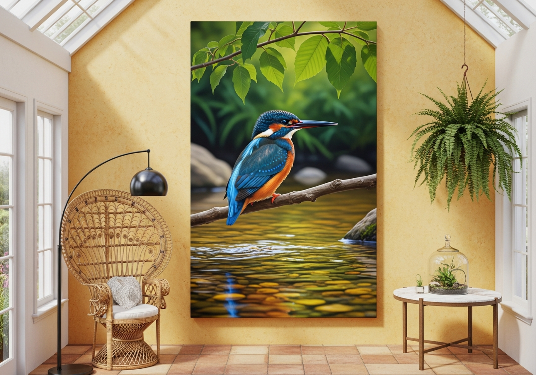
The kingfisher is a creature of edges: it lives where water meets land, movement meets stillness, and the ordinary world meets something unexpectedly brilliant. That liminal quality makes it a perfect subject for wabi-sabi art. This canvas places the kingfisher in a naturalistic setting with muted, earthy greens and browns that ground the jewel-bright bird in the textures of the real world. The composition uses soft, atmospheric backgrounds that suggest a landscape without spelling one out, allowing the viewer's imagination to complete the scene. We've found that this piece performs beautifully in garden rooms, sunrooms, and conservatories, where it bridges the interior and the garden outside the window. It also works well in hallways and kitchens where a touch of natural colour is welcome without the commitment of a more dominant statement piece. The kingfisher's posture, alert and composed, brings a sense of focused presence to any room it inhabits.
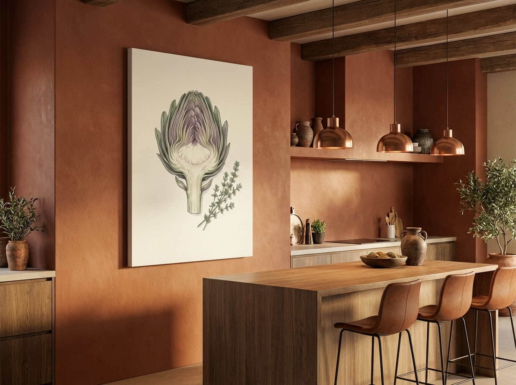
5. Artichoke Botanical Canvas Wall Art | Kitchen Vegetable Print for Dining Room
The artichoke is one of nature's most architecturally interesting vegetables, and its layered, overlapping form is a gift to artists working in a wabi-sabi idiom. This botanical print renders the artichoke with the careful observation of a natural history illustration but the gestural looseness of a studio study, sitting perfectly between precision and spontaneity. The earthy olive greens and warm greys of the palette are as close to wabi-sabi's natural colour world as a kitchen print can get. In our experience, botanical prints of edible plants or garden subjects work particularly well in kitchens and dining rooms, where they connect the ritual of eating with the natural origins of food. This piece also pairs beautifully with our minimalist bird studies and landscape canvases in a gallery wall arrangement, since the shared earthy palette creates cohesion without matching too rigidly. A 50 cm by 70 cm (20 by 28 inch) format is ideal for a kitchen splashback wall or dining room side wall.
View the Artichoke Botanical Canvas
6. Canyon Strata Canvas Wall Art | Impasto Landscape Print | Earth Tone
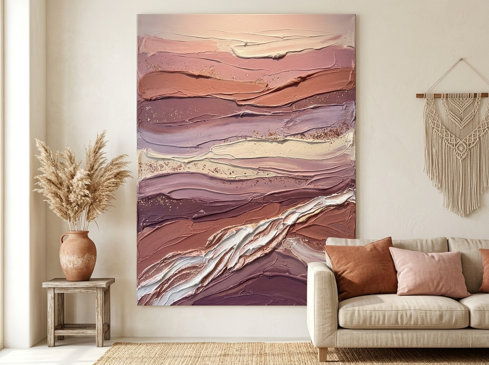
If any subject embodies wabi-sabi's reverence for time, age, and geological impermanence, it is canyon strata. The layered rock faces of ancient canyons are literally records of time passing, millions of years of sediment compressed and revealed by erosion. This impasto canvas print captures those layers in rich terracotta, burnt sienna, and warm ochre tones, with visible texture that suggests the thickness of paint on a real studio canvas. The impasto technique, where paint is applied thickly so it stands slightly off the surface, is one of the most effective ways to bring genuine tactile quality into a printed canvas, and we've found it to be among the most popular choices for customers seeking that wabi-sabi sense of physical, material presence. This piece is ideally sized at 80 cm by 80 cm (31 by 31 inches) or larger, to give the landscape sufficient scale to feel immersive. It works in living rooms, studies, and dining rooms, and pairs naturally with terracotta pots, raw clay ceramics, and linen or jute textiles. For more earth-tone inspiration, explore our post on minimalist wall art and the less-is-more approach.
How to Place Wabi-Sabi Art in Your Home
Placement is as important as the piece itself in a wabi-sabi interior. Here are our specific recommendations for each room type.
Living Room
The living room is the most common location for a statement wabi-sabi canvas. Hang the piece on the wall behind the sofa, centred horizontally over the furniture. The bottom of the frame should sit approximately 20 to 25 cm (8 to 10 inches) above the sofa back. For a standard 2-metre (78-inch) sofa, choose a canvas between 100 cm and 130 cm wide (39 to 51 inches). Avoid hanging the canvas so high that it feels disconnected from the furniture below. In a wabi-sabi interior, art should feel settled and grounded, not floating.
Bedroom
Above the bed is the natural focal point of any bedroom, and wabi-sabi art thrives here. Choose a canvas that is roughly two-thirds the width of your bed: approximately 100 cm to 130 cm (39 to 51 inches) for a king-size bed, and 80 cm to 100 cm (31 to 39 inches) for a double. Hang the bottom of the frame 20 to 30 cm (8 to 12 inches) above the headboard. Botanical prints, bird studies, and soft landscape canvases all work well in bedroom contexts, as they create a sense of calm rather than stimulation.
Bathroom
Wabi-sabi and bathroom design are a natural fit: the presence of water, steam, natural stone, and unfinished textures aligns perfectly with the philosophy. Choose a smaller piece, 40 cm to 60 cm wide (16 to 24 inches), and hang it at eye level from a standing position. Ensure the canvas is hung on a wall that does not receive direct water splash. Ocean subjects, water subjects, and botanicals all translate beautifully into bathroom settings.
Hallway and Entryway
The entryway sets the tone for the entire home. A single wabi-sabi canvas in the hallway immediately signals the aesthetic of what lies beyond. Choose a piece that is proportionate to the wall: in a narrow hallway, a canvas 30 cm to 50 cm wide (12 to 20 inches) in a vertical format works well. In a wider entryway, you have room for something more substantial. Bird studies and single-subject botanicals are particularly effective here, as their contained compositions work well in the relatively small visual field of a hallway.
Gallery Wall
Wabi-sabi gallery walls differ from conventional ones. Rather than a tightly spaced, visually busy arrangement, a wabi-sabi gallery wall uses generous spacing, a restrained palette, and subjects that share a common mood (nature, texture, quietness) rather than a common colour. Leave at least 8 to 10 cm (3 to 4 inches) between frames. Mix canvas sizes but keep the overall arrangement asymmetrical and uncrowded. Three to five pieces is typically the right number; more than seven starts to feel un-wabi-sabi.
5 Common Wabi-Sabi Decorating Mistakes
- Buying too many pieces at once. Wabi-sabi is a philosophy of restraint. Filling every wall immediately with art, even very good art, contradicts the spirit of the aesthetic. Start with one or two pieces and live with them for a while before adding more.
- Choosing art that is too colourful or graphic. Bright reds, electric blues, and high-contrast geometric prints are the opposite of wabi-sabi. Even if you love colour, reserve it for other rooms and let your wabi-sabi spaces breathe in the earth tones where this philosophy is most itself.
- Hanging art too high. A very common mistake in all interiors, but particularly disruptive in wabi-sabi spaces, which depend on a sense of groundedness. Follow the 145 to 152 cm (57 to 60 inch) centre-height rule and resist the instinct to push art upward.
- Matching everything too precisely. If every element in the room is the same shade of warm grey, the room will feel sterile rather than serene. Wabi-sabi embraces slight mismatches: a canvas that is a slightly different temperature of neutral than the sofa, a frame material that contrasts gently with the wall. These small variations are what give wabi-sabi spaces their warmth and life.
- Confusing minimalism with emptiness. Wabi-sabi is not about having nothing. It is about having only what is genuinely meaningful and beautiful. A room that feels like a show home, bare and unoccupied, is not wabi-sabi. A room that feels like it has been carefully gathered, with a few beloved objects, some natural materials, and one piece of art that stops you in your tracks, that is wabi-sabi.
Frequently Asked Questions About Wabi-Sabi Wall Art
- What does wabi-sabi mean in simple terms?
- Wabi-sabi is a Japanese philosophy that finds beauty in imperfection, impermanence, and incompleteness. In interior design, it means choosing objects and art that feel natural, handmade, and honest rather than polished, perfect, and mass-produced. It is the aesthetic of things that have character, age, and a visible connection to the natural world.
- What kind of art is considered wabi-sabi?
- Wabi-sabi art typically features natural subjects (botanicals, birds, landscapes, water), organic or asymmetrical compositions, muted earthy colour palettes, and visible texture or brushwork. Ink paintings, watercolours, impasto canvas prints, and Japanese-influenced minimalist studies all fall within the wabi-sabi aesthetic. The common thread is that the art should feel honest and uncontrived rather than slick and commercial.
- How is wabi-sabi different from minimalism?
- Minimalism is a design philosophy focused on the reduction of elements to the essential. Wabi-sabi is a philosophy focused on the beauty of imperfection and impermanence. They often coexist: both favour restraint and reject excess. But minimalism can produce cold, clinical spaces, while wabi-sabi always tends toward warmth, texture, and a sense of organic life. A minimalist room might have nothing; a wabi-sabi room has a few things, each of which carries meaning and beauty.
- What colours work best for wabi-sabi wall art?
- The wabi-sabi colour palette is drawn from the natural world: clay terracotta, stone grey, bark brown, moss and sage green, aged parchment, cloud white, and deep ink black. Gold appears as an accent, referencing the kintsugi tradition. Avoid bright, saturated hues and high-contrast graphic palettes. The goal is a colour feeling of age, quiet, and organic depth rather than freshness and brightness.
- Can I use wabi-sabi art in a modern or contemporary interior?
- Absolutely. In our experience, a single wabi-sabi canvas is often most striking in a contemporary space, where its texture and organic quality contrast beautifully with cleaner architectural lines. You do not need to commit to a full wabi-sabi interior to benefit from the philosophy. One piece of art that carries this spirit can bring warmth, depth, and a sense of human craft to even the most modern room.
- What size canvas should I choose for a wabi-sabi interior?
- For a main feature wall in a living room or bedroom, aim for a canvas between 80 cm and 120 cm wide (31 to 47 inches). For smaller rooms, alcoves, or gallery wall inclusions, 40 cm to 60 cm wide (16 to 24 inches) is appropriate. In a wabi-sabi interior, one well-chosen, generously sized canvas is almost always more effective than several smaller pieces competing for attention. Let the art breathe.
Quick Reference: Our Top Wabi-Sabi Wall Art Picks
| Canvas | Best Room | Key Wabi-Sabi Quality | Link |
|---|---|---|---|
| Lotus Flower | Gold Leaf Black | Bedroom, meditation space | Kintsugi gold, symbolic depth | View |
| Sea Turtle | Ocean Minimalist | Bathroom, coastal living room | Negative space, ancient presence | View |
| Blue Jay | Minimalist Bird | Living room, study, hallway | Ma (negative space), natural observation | View |
| Kingfisher | River Bird | Garden room, kitchen, hallway | Liminal beauty, earthy palette | View |
| Artichoke Botanical | Kitchen Print | Kitchen, dining room | Organic form, natural world connection | View |
| Canyon Strata | Impasto Landscape | Living room, study, dining room | Geological time, tactile impasto texture | View |
| Waterfall | Tropical Zen | Bathroom, zen living room | Impermanence, flowing natural movement | View |
| Ronin Samurai | Cherry Blossom Ukiyo-e | Living room, Japanese-inspired space | Transience (cherry blossom), Japanese heritage | View |
Closing: Find Your Wabi-Sabi Piece
Wabi-sabi is not a trend. It is a centuries-old invitation to see differently: to notice beauty in the worn, the organic, the unhurried. When you hang a piece of wabi-sabi wall art in your home, you are not just adding decoration. You are making a small commitment to a quieter, more attentive way of living. You are choosing to look at the crack in the glaze and find it beautiful.
We've assembled this collection because we believe that the most meaningful art is not the kind that impresses at a glance, but the kind that reveals itself slowly, over weeks and months of living with it. Every piece in our wabi-sabi collection has been chosen for exactly that quality of depth, patience, and honest beauty.
Browse our complete wabi-sabi wall art collection and find the piece that asks you to slow down. For further reading on the principles behind this aesthetic, we recommend the Robern guide to wabi-sabi style and the Cle Tile introduction to wabi-sabi design principles.