Watercolor Wall Art: Soft, Dreamy Style for Every Room
The Heva Team
Art Curators & Interior Design Enthusiasts · May 2, 2026 · 12 min read
Watercolor canvas prints add soft, dreamy character to any room. Six picks plus styling rules for bedrooms, kitchens, bathrooms, and quiet reading nooks.
Watercolor wall art has a way of slowing a room down. The soft edges, the gentle gradients, the places where pigment fades into pale paper — these pieces feel less like decoration and more like a quiet exhale on the wall.
If your home feels a touch too sharp or a touch too sterile, a softly painted canvas is often the simplest fix. The medium adds atmosphere where polished prints add only graphic punch.
This guide covers everything we have learned styling these pieces for our customers' homes: which palettes hold up in real rooms, how to size and hang dreamy artwork without making it feel washed out, and six of our favourite picks for bedrooms, kitchens, bathrooms, and quiet reading nooks.
Ready to browse? Explore our full painted-canvas collection — or keep reading for our top picks and the styling rules our team uses every day.
What You Will Find in This Guide
Why Soft Painted Art Feels So Calming
Watercolor is the oldest paint medium humans still use. It is a transparent pigment bound by gum arabic and thinned with water until it flows.
Britannica's entry on the medium traces its modern form to 18th-century Britain, where artists like J. M. W. Turner pushed it into something atmospheric rather than illustrative.
That history matters in your home. Unlike acrylic or oil, the technique lets the paper or canvas breathe through the pigment. Light bounces off the white substrate, passes through the colour, and bounces back to your eye.
The effect reads as soft, even when the subject is dramatic. In our experience, this is why these pieces work in rooms where bolder art would feel exhausting.
A bedroom with a busy textile, a bathroom that already has tile patterning, a kitchen with open shelving — these rooms have visual noise. A painted canvas adds a focal point without competing.
The science backs it up. Britannica's overview of colour notes that desaturated tones — which the medium naturally produces — register as low-arousal stimuli, the same family of cues we associate with rest and recovery.
That is why a misty grey-green forest scene reads as restorative, while the same forest in saturated digital colour reads as alert.
Palettes That Actually Work in Modern Homes
Not every painted piece flatters every room. After helping customers style hundreds of homes, we have seen four palettes hold up best in 2026 interiors.
Soft pastels (blush, lavender, butter yellow, pale mint). These read sweet without going saccharine. They suit nurseries, primary bedrooms, and any space anchored by white or cream walls.
The trick is one dominant pastel and two supporting tones — never four pastels fighting for attention.
Earthy neutrals (cream, sand, sage, warm tan). The most versatile palette of all. Earthy pieces slot into farmhouse, Japandi, coastal, and wabi-sabi rooms with no friction.
If you are not sure which palette to start with, start here.
Moody jewel tones (deep teal, plum, oxblood, navy). Saturated colour in this medium still reads softer than other paints because the pigment thins and lightens at the edges.
These pieces give you drama without weight — perfect for studies, libraries, and dimly lit primary bedrooms.
Monochrome ink wash (charcoal, slate, black on cream). The most modern direction in soft-painted art right now. Japanese sumi-e and Western ink wash both fall here, and they pair beautifully with concrete, oak, and brushed brass.
Our Japandi guide explores why monochrome washes anchor that style so well.
One rule we repeat to customers: pull two colours from the painting and place them somewhere else in the room — a cushion, a throw, a vase, a candle. That repetition is what turns a hung canvas into integrated decor.
Six Watercolor Wall Art Picks for Every Room in 2026
These are the pieces our team reaches for again and again when styling specific rooms. Each one solves a particular problem — a bedroom that feels too stark, a kitchen that needs warmth, a corner that wants quiet rather than colour.
1. Pastel Watercolor Clouds for the Dreamy Bedroom
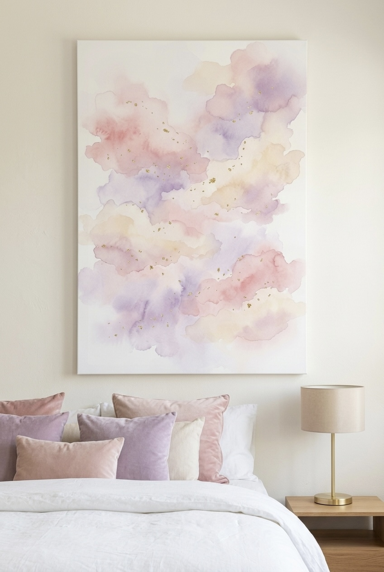
Cloud studies are some of the most enduring subjects in this medium — Turner painted dozens of them in the 1820s.
The Tate's Turner archive shows just how much atmosphere you can wring from soft pigment alone. This piece updates that tradition with a cream, pink, and lavender wash touched with gold flecks.
It works best above a bed dressed in white, oat, or pale linen — the canvas reads as an extension of the bedding rather than a separate object.
We size this one at 24 by 36 inches (61 by 91 cm) over a queen headboard, or 30 by 40 inches (76 by 102 cm) over a king. Pair it with a brushed brass sconce and a single ceramic vessel on the nightstand for a room that feels like a luxury hotel suite.
For more room-specific ideas, our bedroom wall art guide walks through pairings room by room.
Browse the Pastel Watercolor Clouds canvas
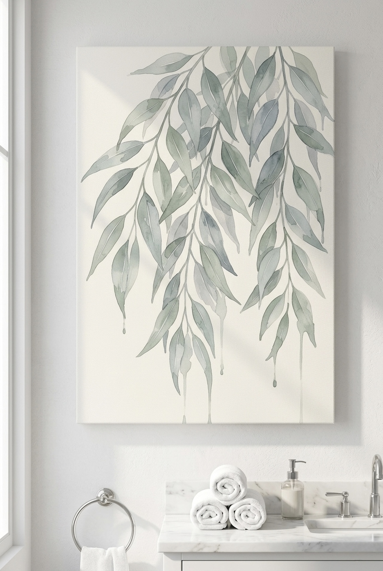
2. Eucalyptus Branches for a Spa-Like Bathroom
Eucalyptus is the most consistently calming botanical we sell, and the painted version is even softer than the photographic kind.
The sage-grey leaves on cream paper read as living humidity itself — which is exactly what you want in a bathroom that already runs steamy.
The Royal Horticultural Society notes that eucalyptus has long been associated with respiratory ease, and there is something about looking at that silhouette in a hot shower that reinforces the feeling.
Hang the portrait orientation on the wall opposite the vanity so it is the first thing you see when you finish brushing your teeth.
Our bathroom wall art guide covers humidity-safe sizing in more detail.
See the Eucalyptus Branches print
3. Misty Pine Forest with Eagle for a Calm Living Room
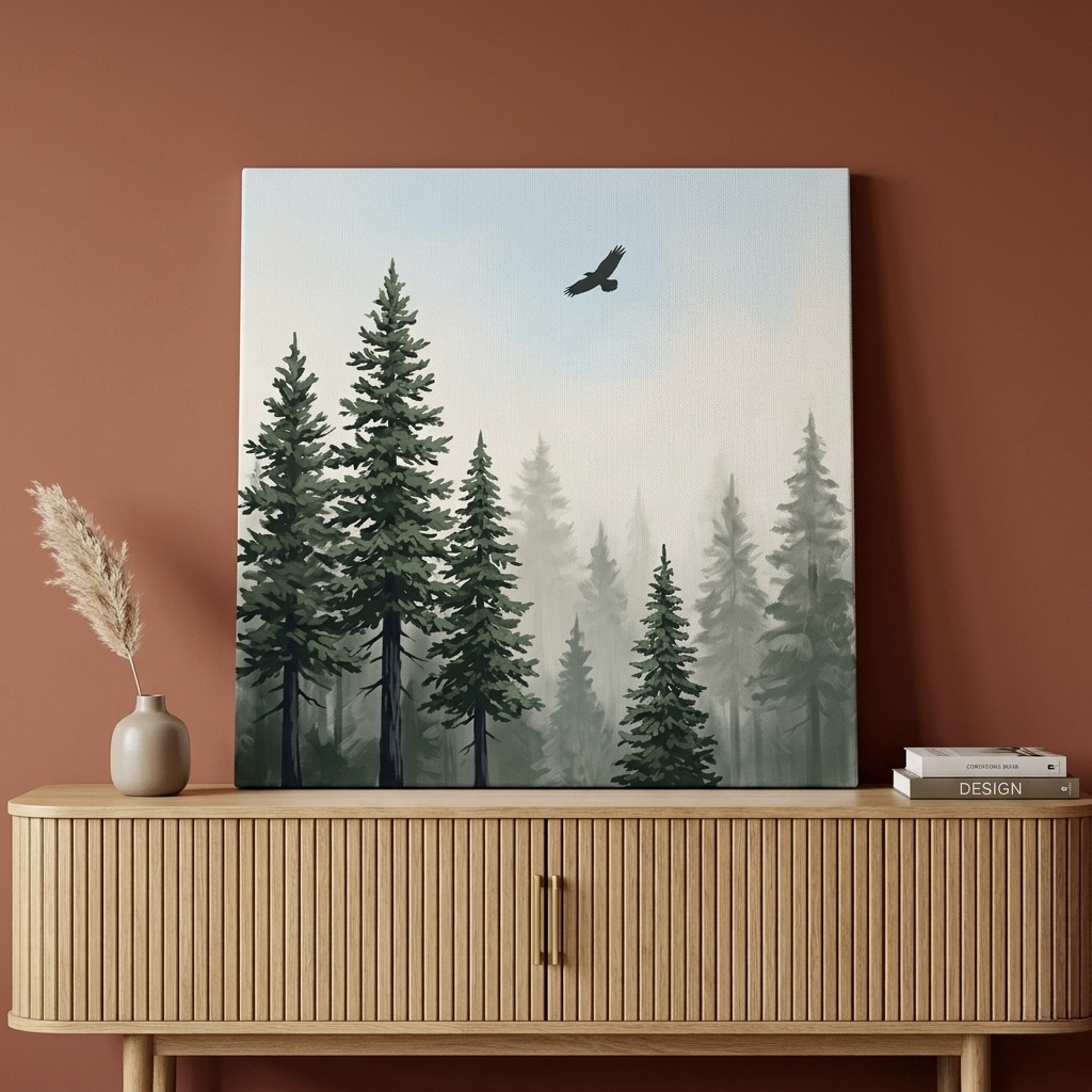
Painted landscapes are easy to get wrong — too sharp and they look like postcards, too washed and they look unfinished.
This forest scene gets the balance right: dense green pines fade into grey mist, with a single eagle holding the eye at the top of the canvas.
Our customers tell us it is the piece that finally made their living room feel like a retreat. It anchors a sofa wall beautifully at 30 by 40 inches (76 by 102 cm).
Stand the room's accent colour up against it — sage cushions, a forest-green throw, a single ceramic plant pot — and the room pulls together in an afternoon.
For more on landscape choices, our piece on abstract versus landscape art walks through which to pick when.
View the Misty Pine Forest canvas
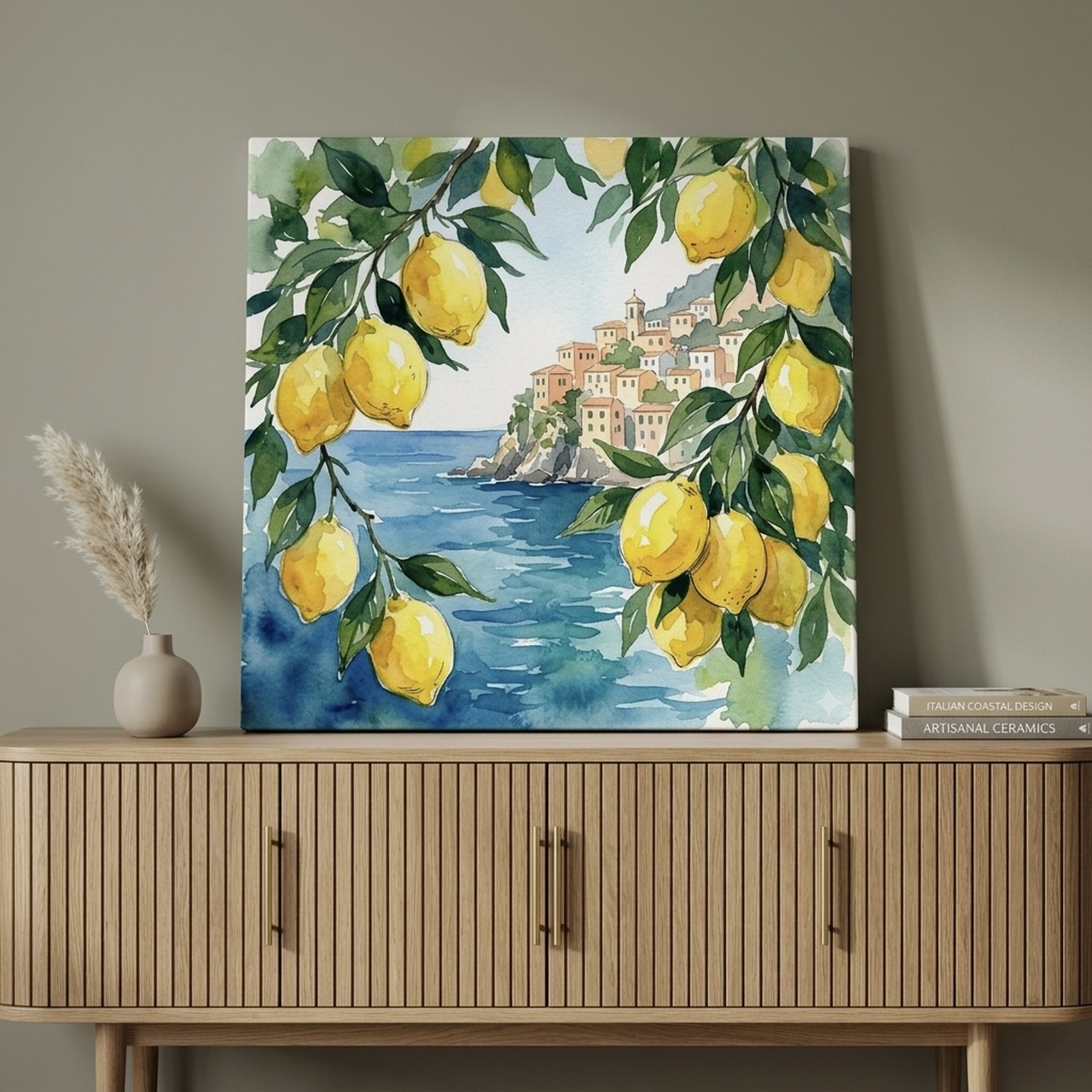
4. Amalfi Coast Lemon for a Sunlit Kitchen
If your kitchen lacks a window — or has a window onto a brick wall — a coastal scene in soft pigment is the cheapest way to add light.
The yellow lemons and blue Mediterranean in this piece carry an actual brightness; place it across from a north-facing kitchen and the whole room reads warmer within a week.
We hang this one above a console, between two shelves, or on a narrow strip of wall next to a fridge — anywhere it can be a small daily mood lift.
Pair it with a yellow ceramic pitcher or a bowl of real lemons for a quiet wink.
Our farmhouse kitchen guide has more ideas for layering soft art with kitchen textures.
Discover the Amalfi Coast Lemon print
5. Twilight Gradient for a Modern Bedroom Refresh
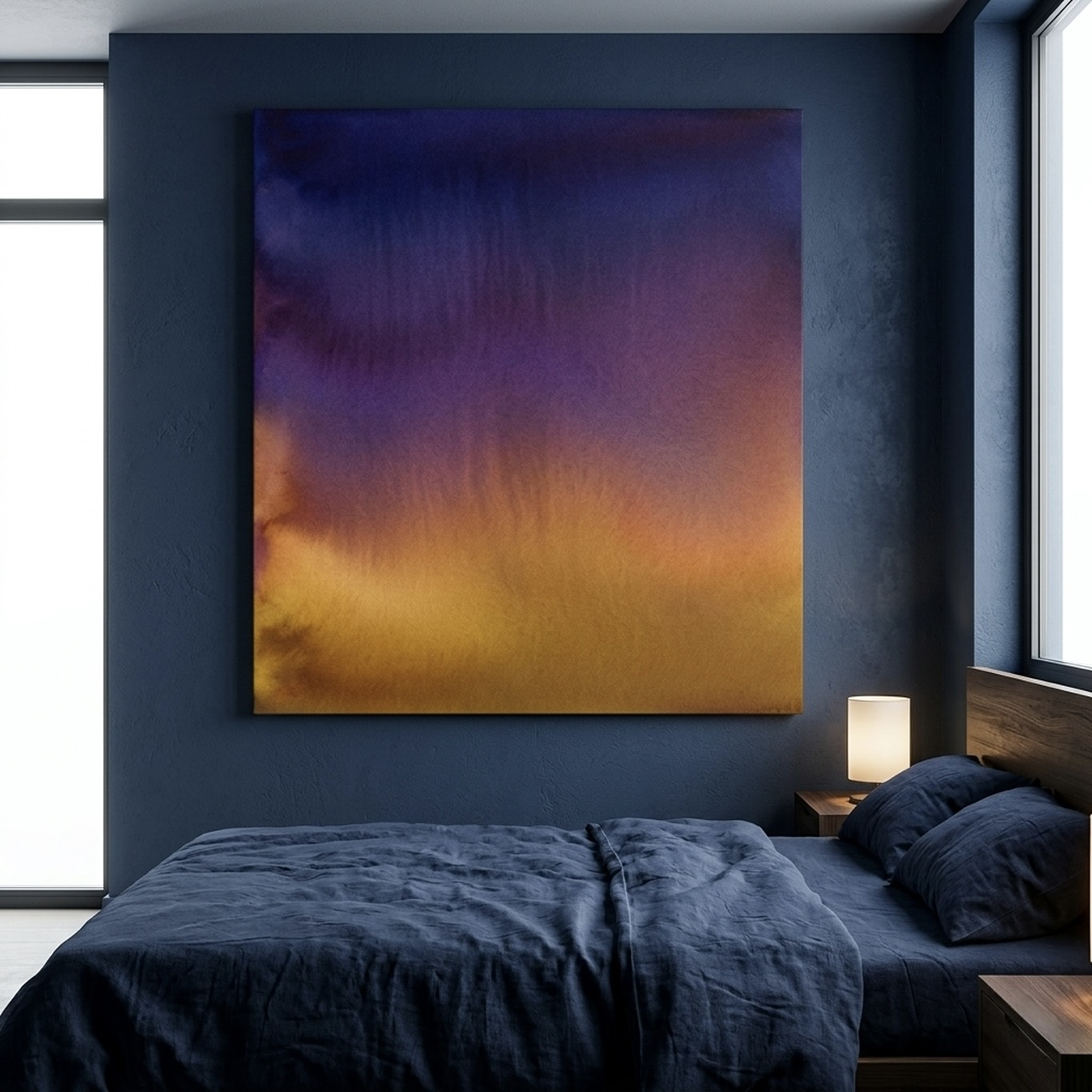
Pure abstract painting in this medium is having a real moment in 2026, and this twilight wash is the cleanest expression of it.
The colours move from a deep aubergine at the top through pink and orange to a final blue at the base — the sky over the desert at the moment the sun finishes setting.
It suits a primary bedroom that has gone quiet — neutral linens, a single nightstand lamp, a textured rug.
Because the canvas itself carries so much colour, the rest of the room can stay almost monochrome and still feel rich.
Our abstract art styles guide goes deeper on how soft-painted abstracts differ from acrylic ones.
Shop the Twilight Gradient canvas
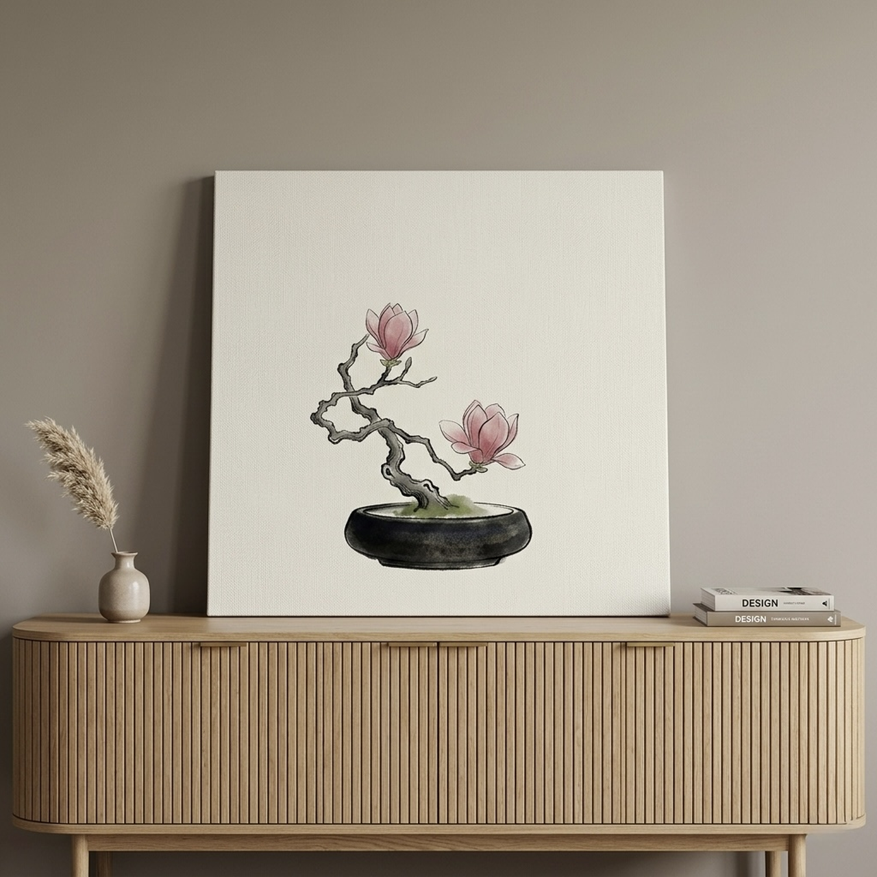
6. Magnolia Bonsai for a Zen Reading Corner
Some painted pieces are about fields of colour. This one is about restraint.
The Japanese tradition teaches that a single branch and a few blossoms — placed on mostly empty paper — say more than a full bouquet.
The Tate's primer on watercolour notes that this kind of selective composition is what gives the medium its meditative quality.
Hang the magnolia bonsai over a linen armchair, beside a tall floor lamp, in the corner you read in. The wide negative space invites the eye to slow down — which is exactly what a reading corner should do.
Customers often pair it with a small olive tree on the floor for a layered, calming nook.
View the Magnolia Bonsai print
How to Hang and Style Soft-Painted Pieces
These artworks have one styling rule that the loudest acrylic abstracts can ignore: they need air.
Crowd a soft canvas with a dozen frames around it, and the gentle edges that make it feel calm will read as accidental. Here is how we space, light, and pair them in real homes.
Hang centre at 57 to 60 inches (145 to 152 cm) from the floor. This is the standard gallery height most museums use, and it works at home too.
For pastel and soft-pigmented pieces specifically we lean toward the higher end (60 inches / 152 cm) because the muted palette can disappear when hung too low against busy furniture.
Leave 6 to 10 inches (15 to 25 cm) of space above sofas and beds. Closer than that and the canvas reads as a headboard accessory rather than an art piece.
Further than that and the wall above the furniture starts to feel empty. Our above-the-sofa placement guide goes deeper on this measurement.
Use 2700K to 3000K warm white light, not cool white. The pigment is most flattering under warm light — the exact range museums use for paper-based art.
Cool white (4000K and up) makes the cream substrate look grey and washes out the soft tones. A small picture light or a warm wall sconce 6 inches above the frame is ideal.
Match the canvas's white to the wall's white when possible. The substrate is rarely pure white — it usually leans cream, ivory, or warm grey.
When the wall behind matches that undertone, the piece reads as part of the wall and the painted area pops forward. A cool blue-white wall behind a cream-toned canvas is the most common reason a beautiful piece looks "off" in someone's living room.
Pair soft art with natural materials, not high-gloss. Linen, oak, rattan, ceramic, brushed brass — all of these read as cousins to the medium.
Lacquer, chrome, and polished marble fight that softness. If the room is full of glossy finishes, choose a piece with a heavier ink line (sumi-e style) so the contrast carries.
Common Mistakes to Avoid
1. Treating every soft-painted piece as automatically nursery-friendly. Pastels are not the same as juvenile prints. A blush-and-cream cloud canvas is sophisticated; a cartoon giraffe is not.
We have found that adults often default to "nursery" colours for their own bedrooms when what they actually want is the muted version. Choose pastels with no figurative cuteness if you want grown-up dreamy.
2. Hanging a soft canvas on a saturated accent wall. A pastel piece on a forest-green or oxblood feature wall almost always disappears.
The pigment is too gentle to compete with a saturated background. If you want art on a moody wall, choose oil-style or graphic prints. Save softer media for white, cream, sage, dove grey, or pale blue walls.
3. Buying too small. Pieces under 16 by 20 inches (41 by 51 cm) read as decorative postcards rather than focal art on a typical wall.
The medium needs room to breathe. If your wall is more than 6 feet (183 cm) wide, scale up to at least 24 by 36 inches (61 by 91 cm).
4. Mixing soft art with high-contrast neighbours. A painted piece next to a black-and-white photograph will get visually drowned.
If you must gallery-wall a soft piece, surround it with other gentle work — botanical line drawings, linen-mounted typography, more painted art. Keep the contrast dialed down.
5. Forgetting that soft pigment reads differently in different light. A piece that looks luminous in a sunlit shop can look flat in a north-facing room with cool overcast light.
Always check the room's light at noon and at 7 p.m. before committing to a spot. If the room is dim, lean toward art with more saturated tones — twilight gradients, jewel-toned florals, ink washes — rather than the palest pastels.
Frequently Asked Questions
Is watercolor wall art a current trend or a long-term style?
Both. The medium has been a steady decorating choice for a decade because it pairs with so many room styles. The 2026 update is more abstract gradients and ink-wash monochromes alongside the classic florals — which means the category is broadening, not fading. A piece you buy today will not look dated in five years.
Will painted canvas prints fade in sunlight?
True paper paintings in this medium are sensitive to UV. Canvas reproductions — like the ones we make — use pigment-based inks rated for 75 to 100 years of indoor display when kept out of direct, prolonged sun. We still recommend hanging any soft-pigment piece on a wall that does not get more than three hours of direct sun a day, and rotating pieces between rooms every couple of years if your home is very bright.
Should soft-painted art be framed or unframed?
Either works, but framing usually gives this kind of art more presence. A simple oak or cream float frame echoes the gentle palette and keeps the piece feeling intentional. If you go unframed canvas, choose one with deep wrap edges so the painted image continues around the sides — that small detail is what separates polished from flat.
What rooms should I avoid for this style of art?
Soft pigment struggles in two rooms: very dark basements and very busy children's playrooms. In a basement, the muted palette reads as flat under cool fluorescent light. In a busy playroom, the calm of the medium is wasted because the room itself is the focal point. Save soft art for rooms where you want quiet to win.
Can I mix soft-painted pieces with photography or oil-style prints?
Mixing media is fine if you balance the visual weight. The trick is to give a softer piece its own wall or its own clear breathing room rather than placing it directly beside a high-contrast photograph. In a gallery wall, alternate it with neutral typography or botanical line drawings — pieces that bridge the softness rather than compete with it.
What size canvas should I buy for a primary bedroom?
Above a queen bed, 24 by 36 inches (61 by 91 cm) reads correctly. Above a king bed, scale up to 30 by 40 inches (76 by 102 cm) or hang a pair of 18 by 24 inch (46 by 61 cm) pieces with 2 to 3 inches between them. Small bedside artwork should be at least 12 by 16 inches (30 by 41 cm) — anything smaller looks lost.
Quick Reference Table
| Product | Best For | Dominant Colours | Link |
|---|---|---|---|
| Pastel Watercolor Clouds | Primary bedroom over the bed | Cream, pink, lavender, gold | View piece |
| Eucalyptus Branches | Bathroom or powder room | Sage, cream, soft grey | See print |
| Misty Pine Forest with Eagle | Living room over the sofa | Forest green, mist grey, charcoal | Explore canvas |
| Amalfi Coast Lemon | Kitchen or breakfast nook | Lemon yellow, sea blue, terracotta | Browse lemon art |
| Twilight Gradient | Modern primary bedroom | Aubergine, pink, blue, orange | Shop gradient print |
| Magnolia Bonsai | Reading nook or zen corner | Pink, sage, cream, soft black | Discover bonsai art |
This style of wall art is one of the few decor categories where doing less actually means more — softer pigments, calmer rooms, longer-lasting style.
Whether you start with a single dreamy cloud canvas above your bed or build out a quiet reading nook around a Japanese magnolia, the medium rewards restraint. Browse the full Heva soft-painted collection when you are ready to bring some softness home.


