Bedroom Wall Art Ideas That Set the Mood
The Heva Team
Art Curators & Interior Design Enthusiasts · March 28, 2026 · 15 min read
How to choose bedroom wall art by mood: romantic, calming, serene, cozy, energizing, and dreamy. Expert picks with colour psychology and placement tips.
Your bedroom should be a sanctuary, a place where stress dissolves the moment you walk in. But too many bedrooms feel flat, impersonal, or simply unfinished. The missing ingredient? Bedroom wall art that deliberately sets a mood. Whether you want a space that feels deeply romantic, serenely calm, warmly cozy, or gently energizing, the right piece of art on your wall does the heavy lifting that paint colour and furniture alone cannot achieve.
This guide is different from a general bedroom decorating roundup. We are not covering modern bedroom styles or matching art to furniture trends. Instead, we focus entirely on mood: the emotional atmosphere your bedroom wall art creates, the psychology behind why it works, and six specific pieces that each anchor a distinct feeling. By the end, you will know exactly how to choose art that turns your bedroom into the emotional retreat you actually need.
Ready to browse? Explore our full bedroom wall art collection, or keep reading for our top picks and expert tips.
What You Will Find in This Guide
- The Psychology of Mood in Bedroom Wall Art
- How Colour Drives Bedroom Atmosphere
- Placement Rules: Where Art Has the Most Emotional Impact
- Pick 1: Romantic Mood -- Cherry Blossom Sculptural Relief
- Pick 2: Calming Mood -- Wolf Moonlit Forest
- Pick 3: Serene Mood -- Waterfall Tropical Forest
- Pick 4: Cozy Mood -- Birch Forest Autumn Trees
- Pick 5: Energizing Mood -- Fluid Abstract Landscape
- Pick 6: Dreamy Mood -- Woman Peony Fashion Editorial
- Sizing Your Bedroom Wall Art Correctly
- Common Mistakes to Avoid
- Frequently Asked Questions
- Quick Reference Table
The Psychology of Mood in Bedroom Wall Art
Art does not just decorate a wall. It actively shapes how you feel in a room. A 2021 systematic review published in PMC (the National Library of Medicine) found that visual art engagement meaningfully improves emotional well-being, including reduced anxiety and improved mood regulation. In a bedroom, where you begin and end every day, that effect compounds over time.
In our experience working with hundreds of customers choosing bedroom wall art, the single biggest mistake people make is picking a piece based solely on whether it "matches the bedding." That approach treats art as wallpaper. Instead, ask yourself: How do I want to feel when I lie down at night and when I open my eyes in the morning? That question leads to dramatically better choices.
We have found that bedroom moods generally fall into six categories: romantic, calming, serene, cozy, energizing, and dreamy. Each responds to different subjects, colour palettes, and artistic techniques. A moody moonlit landscape creates an entirely different emotional baseline than an airy floral still life, even when both are hung in the same spot above the headboard. Understanding this distinction is the key to bedroom wall art that genuinely transforms your nightly experience.
How Colour Drives Bedroom Atmosphere
Colour is the fastest shortcut to mood. According to Psychology Today, colours influence physiological responses: warm tones like rose and amber gently raise energy, while cool blues and greens slow the heart rate and promote relaxation. For bedroom wall art, this means your colour choice is not cosmetic. It is functional.
Here is how specific colour families map to bedroom moods:
- Romantic: Deep rose, blush pink, cream, and gold. These colours evoke warmth and intimacy. A canvas dominated by soft pinks and metallic gold accents creates an atmosphere that feels luxurious without being overwhelming.
- Calming: Slate blue, teal, silver, and charcoal. Cool tones signal safety and stillness to the brain. Research from the Sleep Foundation confirms that blue-toned bedrooms are associated with longer sleep duration.
- Serene: Emerald green, white, and natural earth tones. The American Psychological Association notes that nature imagery reduces cortisol and promotes restorative mental states, making green-dominant art ideal for bedrooms where stress relief is the priority.
- Cozy: Warm gold, burnt orange, amber, and russet. These autumnal tones create a sense of enclosure and warmth, perfect for bedrooms in cooler climates or north-facing rooms that lack natural warmth.
- Energizing: Coral, terracotta, and sunrise gold. If you struggle with morning sluggishness, a warm abstract with dynamic movement can provide a gentle visual jolt without the harshness of bright primary colours.
- Dreamy: Champagne, blush, soft beige, and muted pastels. These barely-there hues create a floating, ethereal quality that makes the bedroom feel like a private cloud.
Understanding these colour-mood connections is essential when choosing bedroom wall art. For a deeper exploration of how colour theory applies to wall art selection, read our complete guide to colour psychology in wall art.
Placement Rules: Where Art Has the Most Emotional Impact
Where you hang bedroom wall art matters as much as what you hang. The position determines when you see it, how large it feels, and whether it dominates or supports the room's mood.
Above the headboard is the most impactful position. Art hung here becomes the last thing you see before closing your eyes and the first thing visible when you sit up. For maximum effect, centre the piece horizontally with the bed and position the bottom edge 15 to 20 cm (6 to 8 inches) above the headboard's top rail. A piece that is two-thirds the width of the headboard, roughly 90 to 120 cm (36 to 48 inches) for a queen bed, creates visual balance without crowding the wall.
The wall opposite the bed is your secondary focal point. This is where you look while lying down, so art placed here has the longest viewing time. In our experience, calming or serene pieces work best on this wall because you absorb them passively during rest. Choose a slightly smaller piece here, around 60 to 80 cm (24 to 32 inches) wide, to avoid visual competition with the headboard wall.
Beside the bed, a narrow vertical piece at eye level from the pillow creates a cocoon effect. This position suits dreamy or romantic moods particularly well. Hang the centre of the art at approximately 140 cm (55 inches) from the floor. For detailed hanging instructions for every wall position, see our complete guide to hanging wall art.
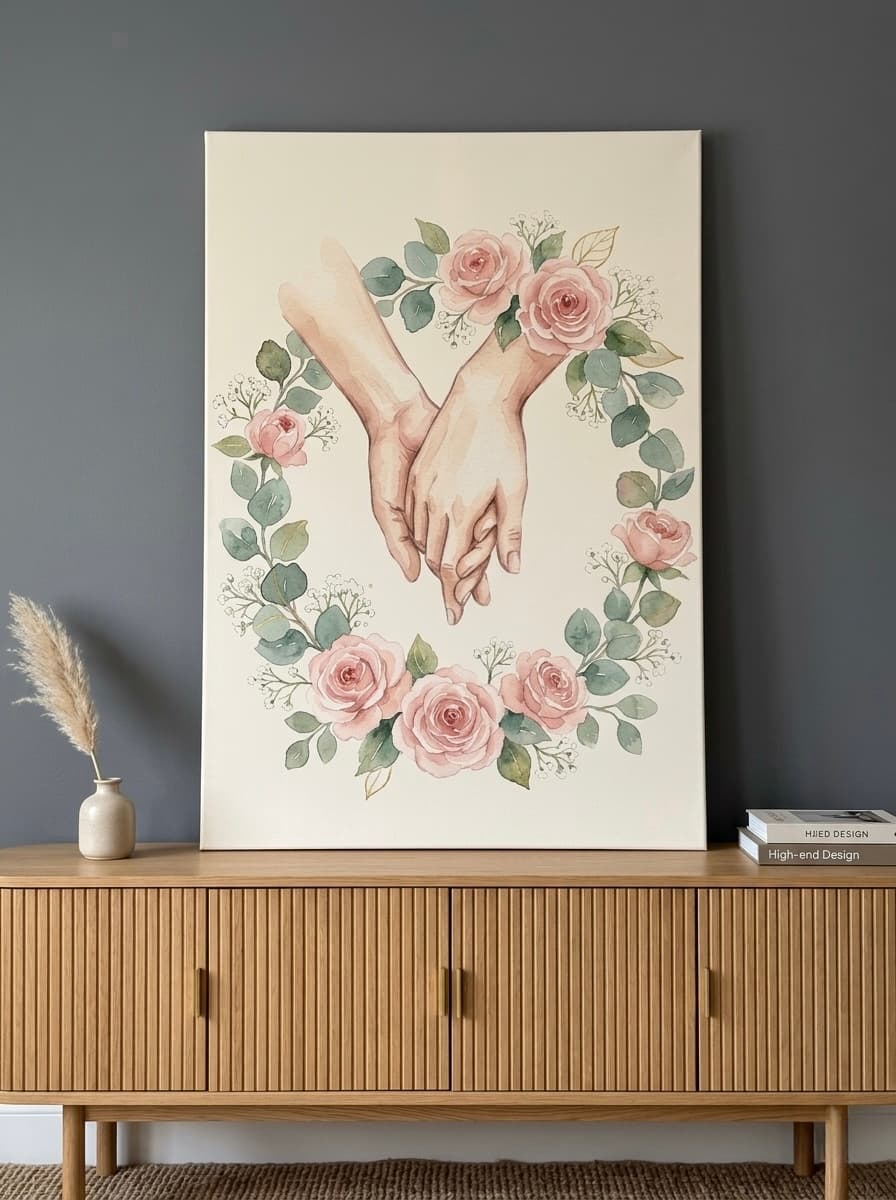
Pick 1: Cherry Blossom Sculptural Relief Canvas -- The Romantic Mood
When a bedroom needs to feel intimate and romantic without veering into cliche, this Cherry Blossom Sculptural Relief canvas delivers exactly the right tone. The raised impasto texture catches side light from bedside lamps, creating subtle shadows that shift throughout the evening. White, cream, and gold tones keep the palette refined and warm without the heaviness of dark romantic colours.
Cherry blossoms carry centuries of symbolic weight: renewal, beauty, and the preciousness of the present moment. Hung above a headboard with warm-white sconces on either side, this piece transforms the entire bed wall into a romantic focal point. The sculptural quality gives it a gallery presence that flat prints simply cannot replicate. Our customers tell us this is the piece that gets the most compliments from guests, because it looks like an original sculpture rather than a print.
Best suited for: master bedrooms, honeymoon suites, or any space where you want softness paired with sophistication. Pairs beautifully with linen bedding in ivory, champagne, or dusty rose.
View the Cherry Blossom Sculptural Relief
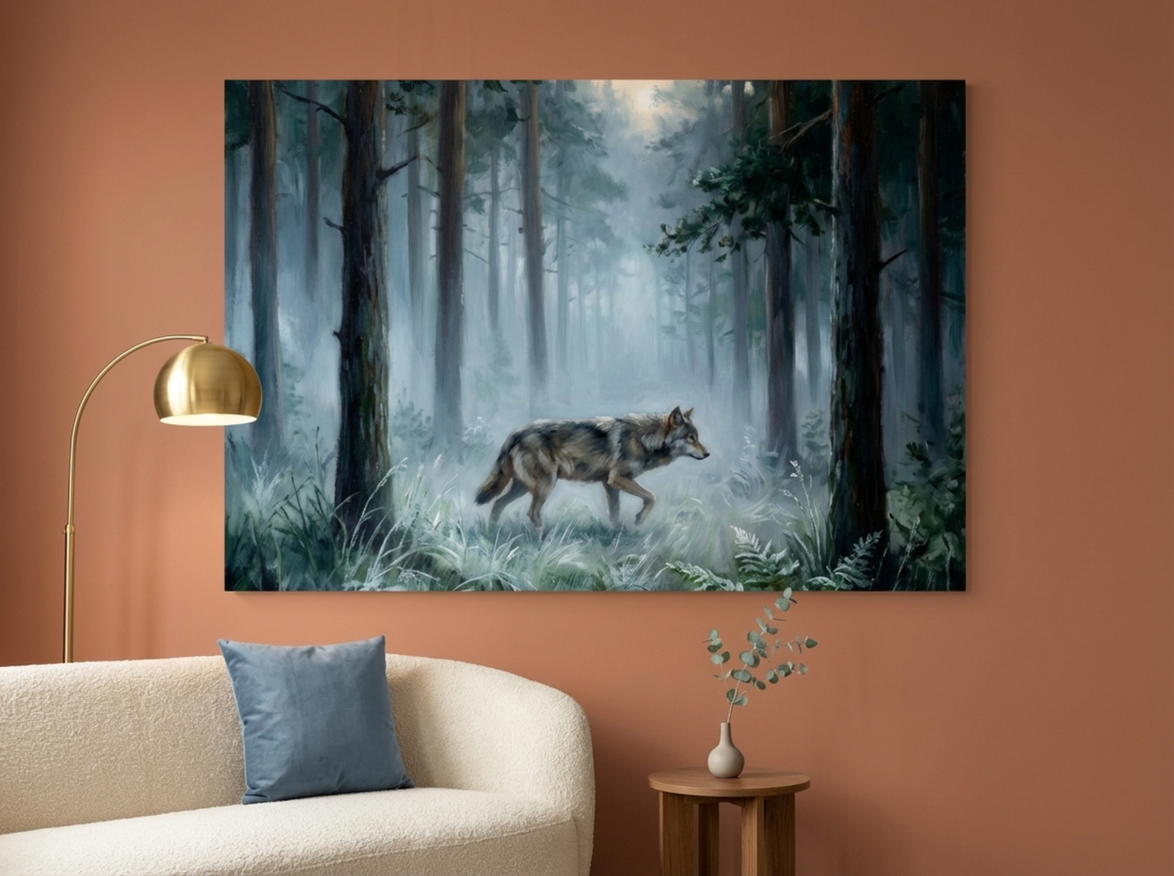
Pick 2: Wolf Moonlit Forest Canvas -- The Calming Mood
For bedrooms that need to feel like a quiet retreat from an overloaded day, this Wolf Moonlit Forest canvas sets an unmistakably calming mood. The palette is built entirely from slate blue, teal, silver, and soft grey, the exact colour range that sleep researchers associate with deeper, longer rest. The misty forest atmosphere creates visual depth that draws the eye gently inward rather than demanding attention.
The lone wolf adds a narrative element without adding visual noise. It suggests solitude, strength, and stillness, qualities that resonate in a personal sleeping space. We have found that nature scenes with a single focal point, rather than busy multi-subject compositions, produce the most calming effect in bedrooms. This piece exemplifies that principle perfectly.
Best suited for: anyone who struggles to "turn off" at night, bedrooms with cool-toned walls (slate, pale blue, soft grey), or spaces where stress reduction is the primary goal. Hang on the wall opposite the bed for passive evening viewing.
Pick 3: Waterfall Tropical Forest Canvas -- The Serene Mood
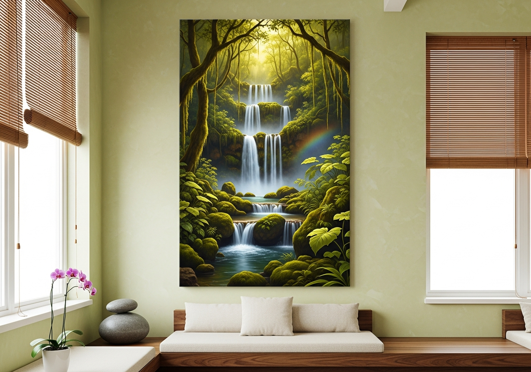

There is a reason spa waiting rooms almost always feature water imagery: flowing water combined with dense greenery triggers a parasympathetic nervous system response that actively lowers cortisol. This Waterfall Tropical Forest canvas brings that same biophilic effect into your bedroom, making the space feel like a private forest retreat.
The vertical composition of the waterfall naturally lifts the eye upward, which is a subtle trick that makes ceilings feel taller. In our experience, this is particularly effective in bedrooms with standard 240 cm (8 foot) ceilings, where a horizontal landscape would emphasize the room's width rather than its height. The emerald green, soft white, and natural brown palette works in virtually every bedroom colour scheme, from crisp white walls to warm sage.
Best suited for: zen-inspired spaces, urban bedrooms that lack any connection to nature, or anyone seeking deep stress relief. This piece provides what Japanese design calls shinrin-yoku (forest bathing) without leaving your bed. For more ways to integrate nature into your home, explore our nature wall art guide.
View the Waterfall Tropical Forest
Pick 4: Birch Forest Autumn Trees Canvas -- The Cozy Mood
Cosiness is the mood that makes you want to burrow deeper under the duvet with a book and a cup of tea. This Birch Forest Autumn Trees canvas achieves that feeling through a palette of liquid gold, amber, burnt orange, and the characteristic white of birch bark. The oil painting style adds visible texture that feels handcrafted and warm, the visual equivalent of a wool throw blanket.
The birch trees create natural vertical lines that add structure without rigidity. Unlike a heavy, dark painting that might feel oppressive in a bedroom, this piece stays luminous. The warm gold tones catch lamplight beautifully, which means it actually looks better in the evening under artificial lighting than it does at midday. We have noticed that customers in northern climates gravitate strongly toward this piece, likely because the autumn warmth compensates for grey skies outside the window.
Best suited for: bedrooms in cooler climates, north-facing rooms, cottagecore or Scandinavian-inspired interiors, or anyone who wants their bedroom to feel like an autumn cabin. Pairs perfectly with mustard, rust, or cream bedding.
View the Birch Forest Autumn Trees
Pick 5: Fluid Abstract Landscape Canvas -- The Energizing Mood
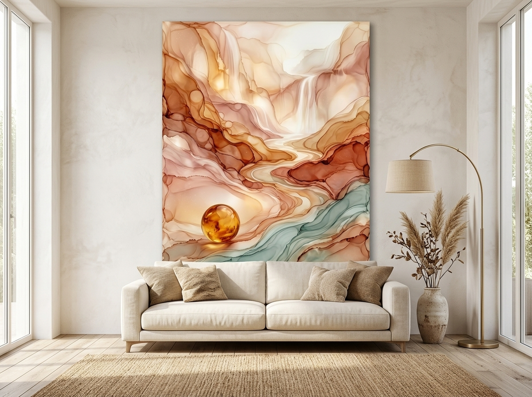
Not every bedroom needs to be a cave of calm. If your mornings are sluggish and you want your bedroom to gently nudge you awake with visual warmth, an abstract piece with movement and sunrise tones is the answer. This Fluid Abstract Landscape canvas combines flowing amber, gold, cream, and hints of teal in sweeping horizontal strokes that suggest a sunrise over open terrain.
The abstract quality is important here. A literal sunrise photograph can feel overly specific, but an abstract interpretation lets your brain fill in the narrative. Some mornings it reads as a golden field, other mornings as a desert horizon. That interpretive flexibility keeps the piece interesting month after month, which matters in a room you see every single day. For a deeper dive into why abstracts work so well in private spaces, check our ultimate guide to abstract wall art.
Best suited for: people who want warm mornings, east-facing bedrooms that catch sunrise light, or any space where you want energy without aggression. The gold and cream base makes it versatile with both warm and neutral colour schemes.
View the Fluid Abstract Landscape
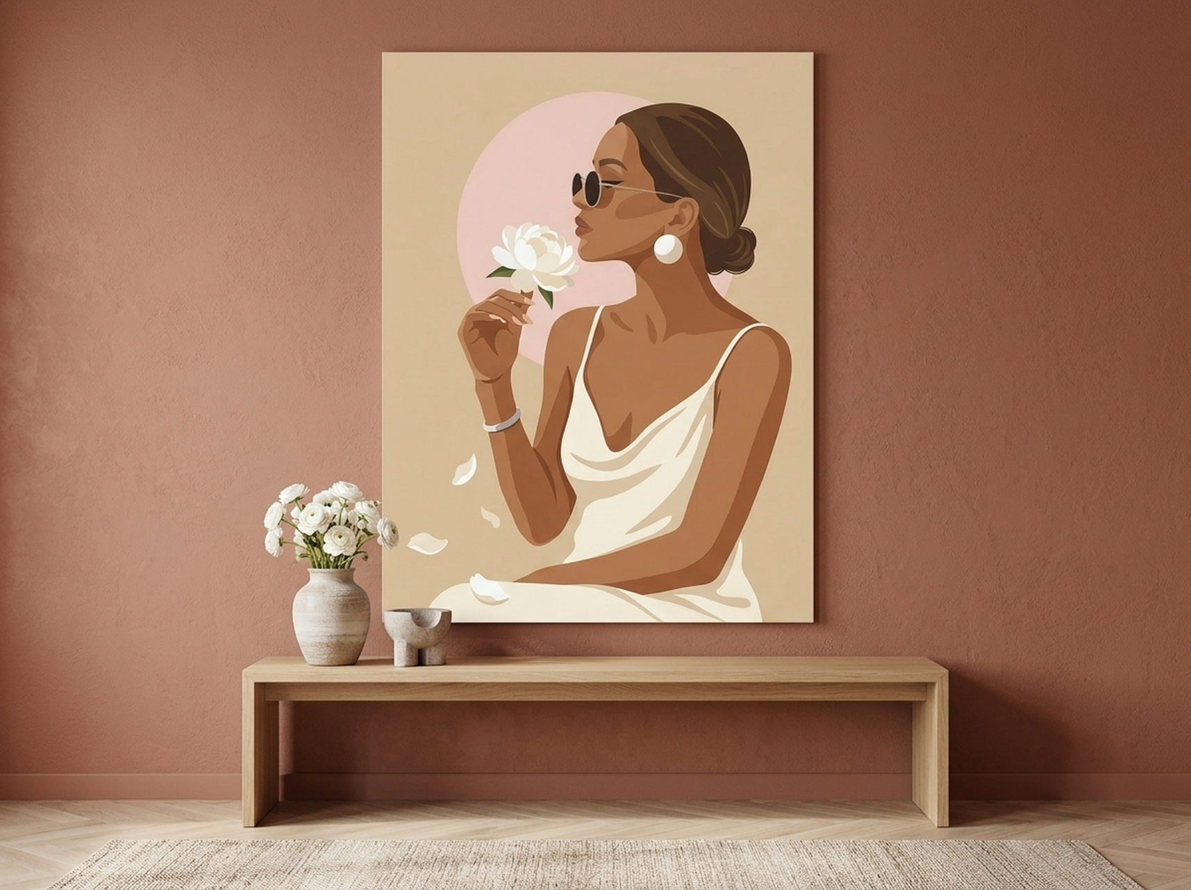
Pick 6: Woman Peony Fashion Editorial Canvas -- The Dreamy Mood
The dreamy mood sits between romantic and calming, a state of soft, unhurried beauty. This Woman Peony Fashion Editorial canvas achieves it through a barely-there palette of champagne, blush, cream, and warm beige. The flat vector style is deliberately minimal, stripping away visual clutter to create a sense of weightlessness that heavy oil paintings cannot match.
Peonies symbolize prosperity, good fortune, and romance in multiple cultures, giving this piece an emotional depth that goes beyond its minimalist surface. The fashion editorial framing adds sophistication without demanding attention. It is the kind of bedroom wall art that makes a room feel curated and intentional rather than decorated. We have found this style particularly popular with customers who prefer a "quiet luxury" aesthetic, where every element whispers rather than shouts.
Best suited for: feminine bedrooms, guest rooms you want to feel boutique-hotel polished, or minimalist spaces that need one statement piece. Works beautifully with white linen, blush velvet, or warm grey bedding.
View the Woman Peony Fashion Editorial
Sizing Your Bedroom Wall Art Correctly
Even the most mood-perfect piece will fall flat if it is the wrong size for the wall. Here are the bedroom-specific sizing rules we recommend based on working with hundreds of bedrooms:
- Above a queen headboard (150 cm / 60 inches wide): Choose art that is 90 to 120 cm (36 to 48 inches) wide. This fills roughly 60 to 80 percent of the headboard width, which reads as intentional rather than accidental.
- Above a king headboard (195 cm / 76 inches wide): Go larger, 120 to 150 cm (48 to 60 inches), or consider a pair of complementary pieces with 5 to 8 cm (2 to 3 inches) between them.
- Opposite the bed: 60 to 90 cm (24 to 36 inches) wide. This wall is a secondary focal point, so the art should support rather than compete with the headboard arrangement.
- Beside the bed (vertical format): 40 to 60 cm (16 to 24 inches) wide and 60 to 90 cm (24 to 36 inches) tall. Centre it at 140 cm (55 inches) from the floor so it aligns with your eye level when propped on a pillow.
For a comprehensive sizing calculator and visual diagrams, read our guide on above-the-bed wall art placement.
Common Mistakes to Avoid
1. Choosing art that matches the bedspread instead of the mood. Colour coordination is fine, but prioritizing mood first and then finding art in a compatible palette produces dramatically better results. A calming blue piece works with a grey duvet, but you chose it for the calm, not the grey.
2. Hanging art too high above the headboard. This is the single most common mistake we see in customer photos. The bottom edge of the frame should sit 15 to 20 cm (6 to 8 inches) above the headboard, not 30 cm or more. When art floats too high, it disconnects visually from the bed and loses its anchoring effect.
3. Using busy, high-contrast art in a sleep space. Your bedroom is not a gallery that needs to stop visitors in their tracks. Art with extreme contrast, chaotic compositions, or jarring colour clashes actively works against relaxation. Save the bold statement pieces for the living room or hallway.
4. Ignoring lighting conditions. A piece that looks stunning under showroom fluorescents may look completely different under the warm 2700K bulbs in your bedside lamps. Always consider how the art will look in evening light, because that is when you spend the most conscious time viewing it. Matte or textured canvases handle low light better than glossy prints, which can produce distracting reflections.
5. Defaulting to a gallery wall when one statement piece would work better. Gallery walls are wonderful in living rooms and hallways, but in bedrooms, the visual complexity can undermine a restful mood. In our experience, one well-chosen, properly sized piece almost always creates a stronger bedroom mood than a collage of smaller frames.
Frequently Asked Questions
What size wall art looks best above a bed?
For a queen bed, aim for a piece that is 90 to 120 cm (36 to 48 inches) wide. The art should cover roughly 60 to 80 percent of the headboard width. For a king bed, increase to 120 to 150 cm (48 to 60 inches). Hang the bottom edge 15 to 20 cm (6 to 8 inches) above the headboard.
Is canvas or framed art better for bedrooms?
Framed canvas is our top recommendation for bedrooms. The frame adds visual weight and a finished look that complements the structured furniture in most bedrooms (headboard, nightstands, dresser). Unframed canvas works well in bohemian or minimalist settings where a more casual, gallery-wrapped look fits the aesthetic.
Can bedroom wall art actually help you sleep better?
Yes. Research published in PMC shows that visual art exposure reduces anxiety and improves mood regulation. In a bedroom context, calming imagery in cool blue or green tones has a measurable physiological effect: reduced heart rate and lower cortisol, both prerequisites for falling asleep faster. The key is choosing art that feels restful rather than stimulating.
What colours should I avoid in bedroom wall art?
Avoid pure red, neon shades, and high-contrast black-and-white patterns if your primary goal is sleep quality. Red stimulates the sympathetic nervous system (the "fight or flight" response), which is the opposite of what you want at bedtime. Muted versions of warm colours, like dusty rose or terracotta, provide warmth without overstimulation.
Should bedroom art be above the headboard or on the opposite wall?
Both positions work, but they serve different purposes. Art above the headboard creates a visual anchor for the room, visible when you walk in. Art on the opposite wall is what you see while lying in bed, so it has the most influence on your pre-sleep mood. Ideally, choose a statement piece above the headboard and a softer, secondary piece on the facing wall.
Frequently Asked Questions
What is the best height to hang art above a bed?
Leave 15 to 25 cm (6 to 10 inches) between the top of the headboard and the bottom of the frame. The centre should sit at roughly eye level when standing.
Should bedroom wall art match the bedding?
It should complement, not match exactly. Pick one or two accent colours from your bedding and find art that includes those tones.
Is it OK to hang art above the bed without a headboard?
Yes. A large piece of wall art can visually replace a headboard. Hang the bottom edge about 76 cm (30 inches) from the mattress top.
What colours are most calming for bedroom art?
Blues, soft greens, warm neutrals, and muted earth tones promote relaxation. Avoid high-contrast black and red combinations, which feel energizing.
Quick Reference Table
| Product | Best For | Dominant Colours | Link |
|---|---|---|---|
| Cherry Blossom Sculptural Relief | Romantic mood, master bedroom | White, cream, gold | View |
| Wolf Moonlit Forest | Calming mood, sleep quality | Blue, teal, silver, grey | View |
| Waterfall Tropical Forest | Serene mood, zen spaces | Green, white, brown | View |
| Birch Forest Autumn Trees | Cozy mood, cold climates | Gold, orange, white, brown | View |
| Fluid Abstract Landscape | Energizing mood, morning warmth | Gold, amber, cream, teal | View |
| Woman Peony Fashion Editorial | Dreamy mood, quiet luxury | Champagne, blush, cream, beige | View |
Set the Mood Tonight
Your bedroom wall art is not a finishing touch. It is the emotional foundation of the room. Whether you gravitate toward the romantic softness of cherry blossoms, the calming stillness of a moonlit forest, or the sunrise warmth of a fluid abstract, the right piece will change how your bedroom feels every single night.
Browse our full bedroom wall art collection to find the piece that matches your mood, or start with one of the six picks above and let it anchor your space. Every canvas ships framed and ready to hang, so the only decision left is which mood you want to come home to.