Wall Art for Couples: Romantic Bedroom Ideas That Bring You Closer
The Heva Team
Art Curators & Interior Design Enthusiasts · May 4, 2026 · 17 min read
Romantic bedroom wall art for couples: six picks that anchor a shared sanctuary, with color psychology, placement measurements, and anniversary gift ideas.
A bedroom shared by two people carries a different weight than any other room in the house. It is the first thing you see together every morning and the last thing you share every night, which means the art on those walls is doing quiet emotional work whether you noticed it or not. The right wall art for couples does not just decorate the room: it sets a tone of softness, partnership, and shared identity that you both feel the moment you walk through the door.
This guide is built specifically for couples, not generic bedroom decor. We focus on the pieces that anchor a shared sanctuary, the color palettes that calm two nervous systems instead of one, and the placement rules that work when both partners need to feel at home in the same space. By the end you will have six concrete picks, exact hanging measurements in cm and inches, and a clear answer to the most common question we hear from couples shopping for art: "Is this a piece we will both still love in five years?"
Ready to browse? Explore our full love and romantic art collection, or keep reading for our top picks and expert tips.
What You Will Find in This Guide
- Why Wall Art Matters in a Shared Bedroom
- The Color Palettes That Calm Couples
- Pick 1: Holding Hands Roses Watercolor
- Pick 2: Garden Bench Roses Romantic Print
- Pick 3: Pastel Watercolor Clouds
- Pick 4: Moon Phases Watercolor Celestial
- Pick 5: Two Trees Growing Together
- Pick 6: And So Together They Built a Life They Loved
- Hanging Wall Art Above the Bed: Exact Measurements
- One Big Piece or a Pair? Pros and Cons
- Common Mistakes Couples Make Choosing Bedroom Art
- Frequently Asked Questions
- Quick Reference Table
Why Wall Art Matters in a Shared Bedroom
The bedroom is the only room in your home dedicated to two specific human needs: rest and intimacy. Get the wall art wrong and the room subtly works against both. Get it right and you have a small space that quietly reinforces the relationship every day, often without either partner being able to articulate why.
The Sleep Foundation emphasizes that visual environment is one of the four bedroom design factors that measurably influence sleep quality, alongside light, sound, and temperature. Cluttered or visually loud walls keep the brain mildly alert. Calm, intentional art does the opposite: it gives the eye one place to land and the mind one cue that the day is winding down.
For couples specifically, art also functions as shared identity. Researchers at the Gottman Institute have shown that strong relationships rely on a steady ratio of small positive interactions to negative ones. The objects you both walk past every day are part of that ratio. A piece of art you both chose, that reflects something you both value, is a quiet positive cue that fires every single night.
In our experience working with couples shopping for their first shared home or a long-overdue bedroom refresh, the pieces that succeed are not the most expensive or the most ornate. They are the ones that feel personal to the relationship: a watercolor that reminds them of the garden where they got engaged, a moon phases print bought for a one-year anniversary, a calligraphy quote that captures something they would say to each other anyway. The art does not need to scream romance. It just needs to belong to both of you.
If you are also rethinking the rest of the room, our guide to bedroom wall art that sets the mood covers six emotional atmospheres beyond romantic, and our deep dive on wall art behind the bed as a headboard alternative walks through the structural side of the same wall.
The Color Palettes That Calm Couples
Color is the single biggest lever in romantic bedroom art, and the science is more specific than most decor articles let on. The American Psychological Association notes that warm, low-saturation colors support relaxation while high-saturation reds and oranges activate the sympathetic nervous system. For a couples bedroom, that means leaning into muted, layered tones rather than bold primaries.
Four palettes consistently work for couples across age, taste, and home style:
- Blush and sage: blush pink for warmth and softness, sage green for grounding. Pulls romance back from saccharine into something a designer would call "considered."
- Cream, charcoal, and gold: the timeless palette. Reads luxurious without being cold, warm without being twee. Holds up across seasons and decades.
- Lavender and dusty pink: dreamy and slightly cinematic. Best in bedrooms with plenty of natural light, where the tones can stay airy rather than turn purple at night.
- Earth neutrals with muted gold: tan, beige, soft green, with a warm metallic accent. Reads grown-up and grounded, ideal for couples who outgrew pure pink years ago.
If you have a strong wall color already, work with it rather than against it. Architectural Digest recommends pulling the secondary color of your art directly from your bedding or curtains so the room reads as one composition rather than three competing ones. Couples who skip this step often end up with art that looks fine on its own but visually fights with the rest of the room.
One color to use sparingly: pure red. It looks romantic on a Valentine's Day card and stimulating on a wall above a bed. Psychology Today consistently flags high-saturation reds as energizing rather than restful, which is the opposite of what you want at 11 PM. Burgundy, dusty rose, and terracotta give you the warmth without the wired feeling.
For a deeper dive into the floral side of this palette, our floral wall art guide covers the bloom families that hold up year after year without feeling dated.
Pick 1: Holding Hands Roses Watercolor Canvas
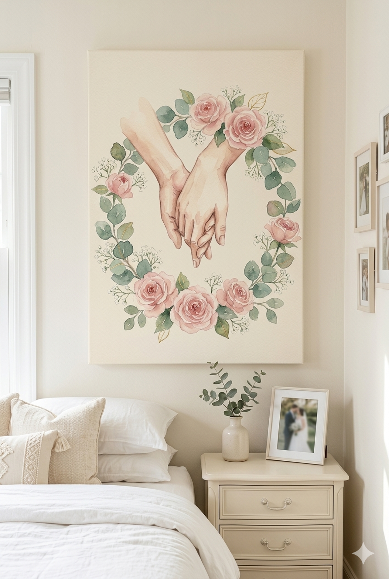
If you only buy one piece for the bedroom, this is the one we point couples toward first. Two hands gently holding a small bouquet of roses, rendered in soft watercolor, reads as an unmistakable romantic gesture without ever crossing into kitsch. The cream, blush pink, and sage palette keeps it warm but quiet, which is exactly what a shared bedroom needs.
What makes this piece work for couples specifically is the gesture itself. Hands holding flowers carry the symbolism of giving, receiving, and small daily kindness. It is the visual version of bringing your partner coffee in bed: ordinary, repeated, deeply meaningful. Couples often tell us they bought this piece for an anniversary and ended up looking at it more often than the photographs on their nightstand.
Best suited for: master bedrooms, primary bedroom refreshes after a move, and anniversary or wedding gifts. Pairs well with linen bedding in ivory or champagne, a sage or off-white wall color, and warm-tone bedside lighting around 2700K to 3000K. Avoid hanging this one against a stark cool-white wall, which flattens the watercolor warmth.
Explore the Holding Hands Roses Canvas
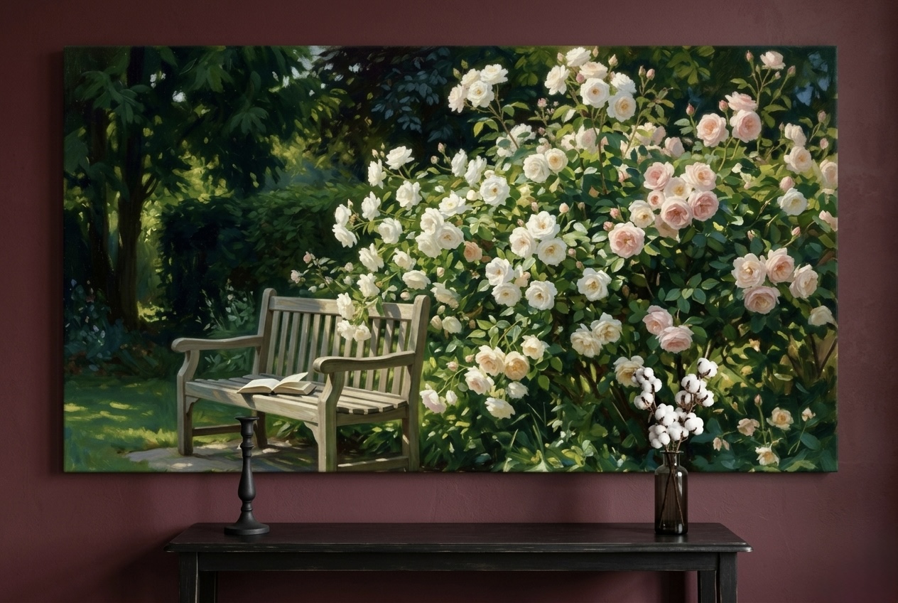
Pick 2: Garden Bench Roses Romantic Print
Where the first pick is intimate and gestural, this Garden Bench Roses canvas tells a quieter story. A wrought-iron bench surrounded by climbing roses in blush, with golden light catching the edges, suggests a private spot the two of you would share on a slow Sunday. It carries romance without making the bedroom feel like a Valentine's display.
The blush pink, creamy white, sage green, and golden light palette is one of the most flexible in the catalog. It works in a bedroom with traditional furniture, in a slightly bohemian space with rattan and linen, and even in a more modern room as the warm counterpoint to clean-line furniture. The painterly brushwork keeps the piece feeling original rather than printed, which matters in a room where you spend hours with the art at close range.
Best suited for: cottagecore, English country, transitional, and warm-modern bedrooms. We have seen couples use this above the bed as a single statement and also flanking a window in matching frames for a balanced look. Pair it with white or natural-linen curtains and a low pile rug in soft sage or cream to build a layered, easy-to-live-in palette.
See the Garden Bench Roses Print
Pick 3: Pastel Watercolor Clouds Dreamy Abstract
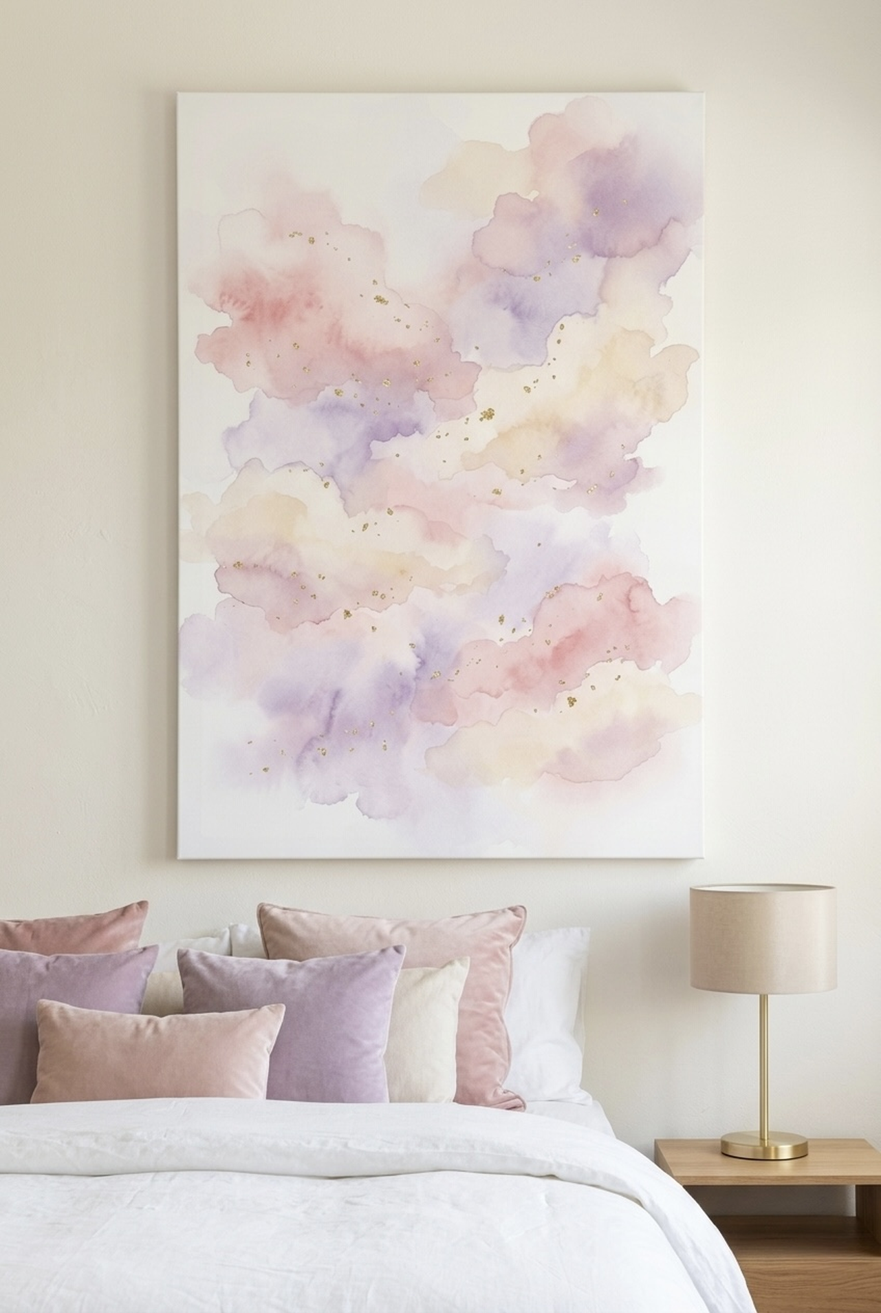
Some couples want the romance without any literal symbols, and that is exactly where this Pastel Watercolor Clouds piece earns its place. Soft swathes of cream, pink, lavender, and gold blend into a dreamy abstract sky that feels both calming and quietly emotional. There are no figures, no flowers, and no quotes, which is the point: the art holds an open mood that you both bring meaning to over time.
Color psychology research, including work cited by the Psychology Today relationships hub, consistently shows that low-saturation, blended palettes lower visual arousal, which is why most luxury hotels lean on cloud-like abstracts in their suites. This piece does the same thing in a residential bedroom: it lowers the volume of the room without removing the warmth.
Best suited for: minimalist, japandi, and modern-romantic bedrooms where you want softness without floral imagery. We particularly recommend this for couples who travel often and want their bedroom to feel like a reset rather than a memorabilia wall. Pair with white or pale-grey bedding, a single warm-metal accent on the ceiling fixture, and blackout curtains in cream linen to reinforce the cloud-quiet feeling.
View the Pastel Watercolor Clouds Print
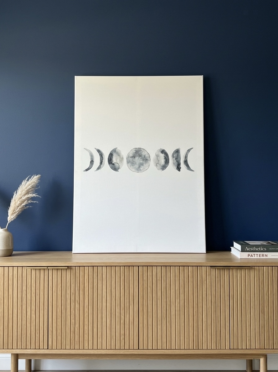
Pick 4: Moon Phases Watercolor Celestial Print
The moon is one of the few romantic motifs that cuts across every culture, season, and decade without aging out. This Moon Phases Watercolor canvas captures the eight classic phases in soft gray and charcoal ink wash on a cream ground, which gives it a museum-archive feeling rather than a wellness-store feeling. For couples, the phases carry an obvious metaphor: relationships go through cycles, and the cycles are the point.
Visually, the piece works hard for very little color budget. Because the palette is restricted to gray, charcoal, cream, and white, it lets the rest of your bedroom palette do whatever it wants. We have placed this above blush pink bedding, deep navy walls, warm cream linen, and even soft sage, and it integrates cleanly each time. That makes it a strong "first art purchase" for couples who have not committed to a fixed color story yet.
Best suited for: modern, japandi, dark-academia, and transitional bedrooms. It is also our most-recommended piece for one-year and five-year anniversaries, where the cyclical symbolism reads naturally without spelling itself out. Hang it horizontally above a queen or king headboard or in a vertical orientation between two windows to mirror the flanking light.
Browse the Moon Phases Watercolor Canvas
Pick 5: Two Trees Growing Together Soft Landscape
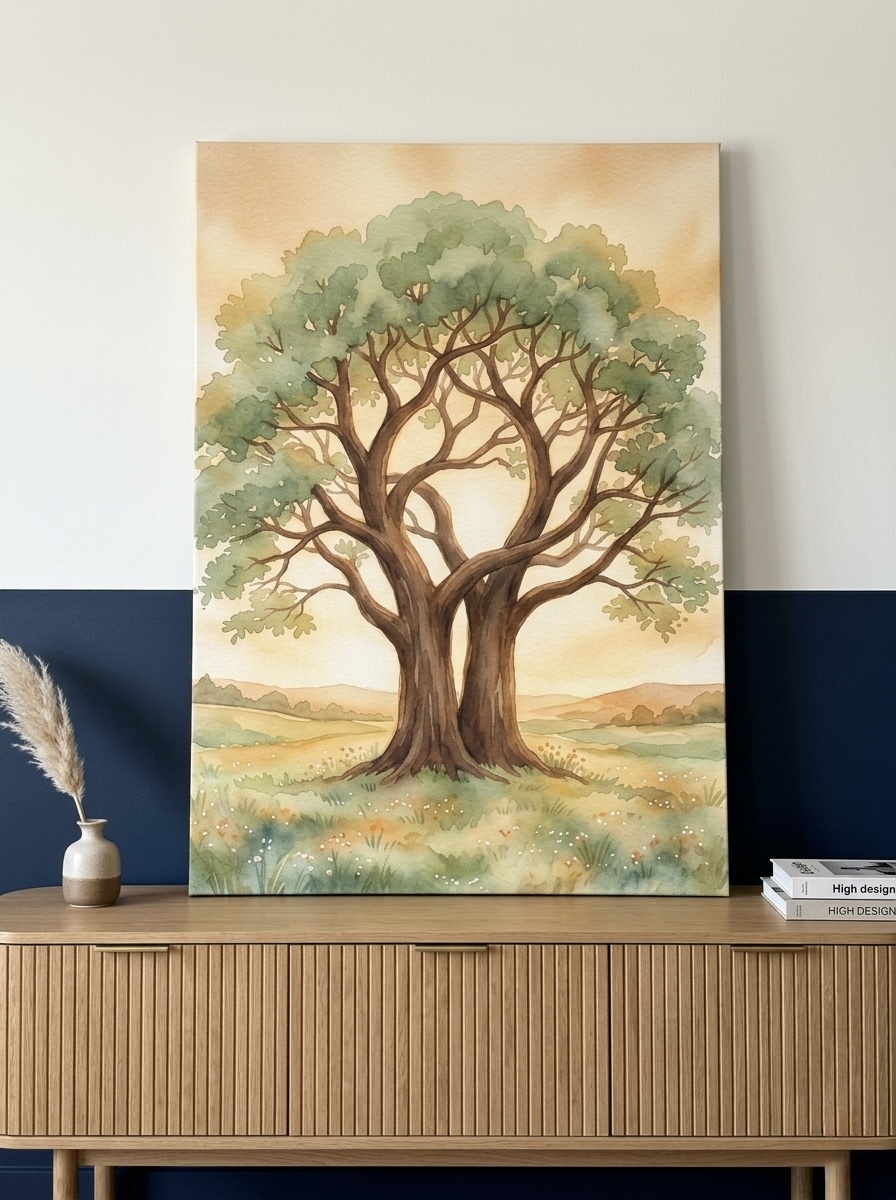
This Two Trees Growing Together canvas is the pick we point to when couples want romance without anything overtly romantic on the wall. Two trees with intertwined trunks and branches stand against a soft cream and beige sky, painted in the kind of restrained watercolor that reads as "art-school" rather than "gift-shop." The symbolism does the work quietly: two distinct living things that keep their shape while growing into one another.
The earth-neutral palette is the most flexible of any pick on this list. Cream, beige, tan, soft green, brown, and warm gold all sit in the muted middle of the color wheel, which means it complements almost any bedding, headboard, or wall color you already own. Couples who have lived together for a while often choose this piece because it reads as grown-up romance rather than honeymoon romance, and it holds up across both early relationship years and decade-plus partnerships.
Best suited for: nature-leaning bedrooms, modern farmhouse, organic modern, and any space with wood furniture or natural fiber rugs. We often see this piece working as the centerpiece of a small gallery wall: the trees in the middle, two smaller botanical prints on either side, all in matching natural-wood frames. For a single-piece installation, hang it large and centered, slightly oversized for the wall to give the trees room to breathe.
Explore the Two Trees Growing Together Print
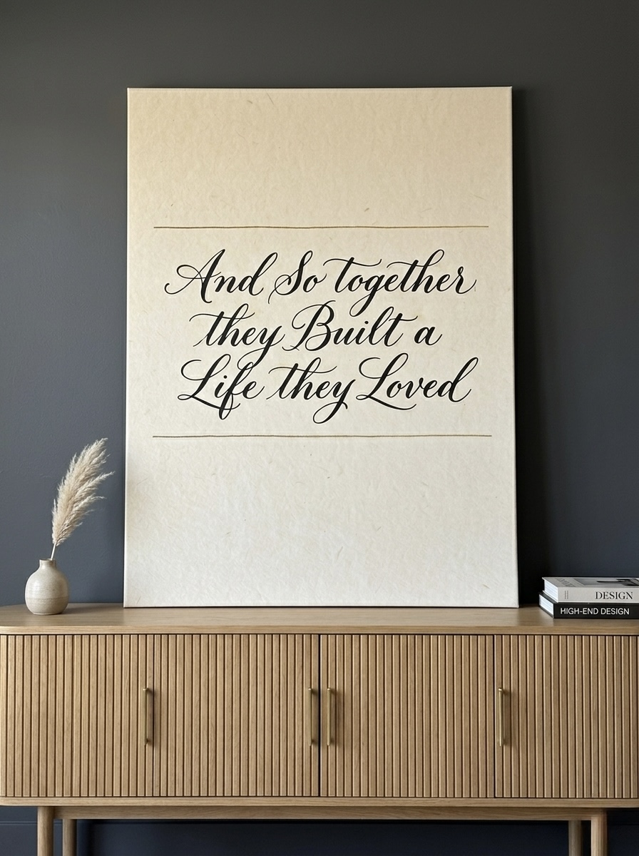
Pick 6: And So Together They Built a Life They Loved Calligraphy
Typography art is hard to do well. Most quote prints lean too heavy on the message and not enough on the design, which is why couples often pass on them. This piece succeeds because the calligraphy itself is the art: elegant, slightly imperfect lettering in cream, black, tan, and brown that you would happily look at even without reading the words.
The phrase, "And so together they built a life they loved," is broad enough to fit any couple at any stage. It is not a cliche about romance. It is a quiet acknowledgment of the daily, deliberate work that long relationships actually involve. That is also why this piece is one of our most popular wedding and anniversary gifts: it captures something the recipients would say about themselves rather than something a stranger projects onto them. Our customers tell us this is the piece their guests stop and read out loud.
Best suited for: romantic-traditional, modern farmhouse, and warm-contemporary bedrooms. It also reads exceptionally well outside the bedroom: above a fireplace mantel, in an entryway, or as the centerpiece of a gallery wall in a primary suite sitting area. If you are shopping for an anniversary or wedding present, our wedding gift wall art guide walks through framing, sizing, and gifting etiquette in detail.
View the And So Together They Built a Life They Loved Quote Print
Hanging Wall Art Above the Bed: Exact Measurements
Most bedroom art problems are not taste problems, they are placement problems. Wrong size, wrong height, or wrong horizontal alignment can make a beautiful piece look awkward, while a perfectly placed piece can rescue a room with mediocre furniture. Here are the measurements that actually work, drawn from interior designers we trust and our own experience with hundreds of customer installations.
Width. The art should cover roughly two-thirds of the headboard width. For a queen bed (152 cm or 60 inch headboard), aim for art that is 100 to 120 cm (40 to 48 inches) wide. For a king bed (193 cm or 76 inch headboard), aim for 130 to 160 cm (52 to 64 inches) wide. Going slightly wider reads as confident; going significantly narrower reads as undersized and is the single most common mistake we see.
Height of bottom edge above the headboard. Leave 15 to 25 cm (6 to 10 inches) between the top of the headboard and the bottom of the frame. Closer than 15 cm starts to feel cramped; further than 25 cm starts to disconnect the art from the bed visually. If your bedroom has 9-foot or higher ceilings, you can push the upper limit a few inches and the proportions still hold.
Horizontal alignment. Center the art on the bed, not on the wall. If your bed is offset from the wall center, the art should follow the bed, even if it ends up off-center within the wall itself. The bed is the dominant object in the room, and the eye reads alignment to the bed first.
Eye level reference. If you are hanging art on a side wall instead of above the bed, the museum standard of 145 cm (57 inches) from floor to center of the piece still applies. In a bedroom, the standard works best for art viewed while standing; for art viewed primarily while lying in bed, drop the center 10 to 15 cm so the piece sits in your line of sight from a propped-up pillow position.
For a more thorough placement guide that covers furniture other than beds, see our wall art above the sofa: size and placement piece, which uses the same proportional logic for living room walls.
One Big Piece or a Pair? Pros and Cons
This is the question we field most from couples once they have narrowed down a style. Both approaches work, but they create different rooms, and one is usually clearly better for a given space.
Single statement piece. A single large canvas above the bed is the simplest approach and usually the most calming. It gives the eye one place to land, scales the room up if you go appropriately oversized, and avoids the symmetry headaches of pair installations. We recommend this approach if your bedroom is on the smaller side (under 14 square meters or 150 square feet), if you have a busy headboard or patterned bedding, or if you want the room to feel like a hotel suite rather than a styled magazine spread.
A matched pair. Two pieces flanking a central element (a window, a small mirror, a sconce) create a more formal, symmetrical look that suits traditional or transitional bedrooms. The visual logic only works if both pieces are the same size and orientation, ideally framed identically, and hung at the same height. For couples, a thoughtful pair has a specific advantage: each partner gets a piece that feels like theirs while the pair as a whole still belongs to the room. We have seen couples successfully pick one piece each and frame them as a deliberate set.
Mini gallery wall above the bed. Three to five smaller pieces in mixed sizes, hung in a balanced arrangement, work in only a few cases: tall ceilings, an oversized king bed, and bedding that is mostly solid colored. If the bedding has a pattern, a gallery wall above it almost always feels too busy. When in doubt for a couples bedroom, default to a single statement piece. It is the lowest-risk choice and the one our customers least often regret.
Common Mistakes Couples Make Choosing Bedroom Art
- Hanging it too high. The most common installation error in any bedroom. If the bottom edge sits more than 25 cm (10 inches) above the headboard, the art floats and looks visually disconnected from the bed. Drop it.
- Buying a piece that is too small. Couples often buy art for the wall they have, not the bed they have. A 60 cm (24 inch) canvas above a king bed looks like an afterthought. Always size the art to the bed, not the wall.
- Choosing only one partner's taste. If one partner picks the art unilaterally, the room subtly stops feeling like a shared space. The fix is not compromise, it is overlap: find the pieces that sit in the Venn diagram of both partners' taste, not the average between them.
- Going too literal on romance. Hearts, kissing silhouettes, and "Mr. and Mrs." prints almost always read as juvenile within a year. Symbolic and abstract pieces age better. The closer the art gets to a greeting card, the faster it dates.
- Ignoring the wall color. A pale watercolor on a stark white wall washes out. A dark piece on a deep wall disappears. Test the contrast before you commit by holding a printed sample (or even a similarly toned blanket) against the wall first.
Frequently Asked Questions
What is the best wall art for a couples bedroom?
Pieces with shared symbolism (hands holding flowers, two trees intertwined, moon phases) and muted, warm palettes (blush, cream, sage, gold) work most reliably. Avoid pure red, neon shades, and overly literal romantic motifs. The best pieces feel like they belong to the relationship, not to a holiday.
What size art should hang above a queen bed?
For a queen bed with a standard 152 cm (60 inch) headboard, choose art that is 100 to 120 cm (40 to 48 inches) wide. The bottom edge should sit 15 to 25 cm (6 to 10 inches) above the headboard. The art should cover roughly two-thirds of the headboard width to feel intentional rather than undersized.
Are romantic quotes a good idea for bedroom wall art?
Quotes work when the calligraphy is the visual focus, not the message. Phrases that describe a couple's ongoing life ("And so together they built a life they loved") age better than declarative slogans like "Love wins." If you can imagine reading the piece silently every night for ten years without rolling your eyes, it will probably hold up.
Should we choose one piece together or each pick our own?
For the wall above the bed, a single piece chosen together almost always reads as more cohesive. For other walls in the bedroom, picking one each (and hanging them as a deliberate pair or in different parts of the room) lets each partner have a piece that feels personally theirs while the room still belongs to both of you.
What is a thoughtful wall art gift for an anniversary?
Pieces with cyclical or growth-based symbolism (moon phases, two trees intertwined, hands holding flowers) work especially well as anniversary gifts because they reference time and partnership rather than a single moment. Calligraphy quotes that describe a long shared life also land well, particularly for milestone anniversaries from year five onward.
Can we hang art directly above the bed in an earthquake-prone area?
Yes, but choose canvas rather than glass-fronted framed prints, use heavy-duty wall anchors rated above the canvas weight, and consider securing the piece with two anchor points instead of one. Lightweight gallery-wrapped canvases are the safest choice over a bed in any region with seismic activity.
Quick Reference Table
| Piece | Best For | Dominant Colors | Link |
|---|---|---|---|
| Holding Hands Roses | Romantic, intimate primary bedroom | Cream, blush pink, sage | View piece |
| Garden Bench Roses | Cottagecore, English country, transitional | Blush, cream, sage, golden light | View piece |
| Pastel Watercolor Clouds | Minimalist, japandi, modern romantic | Cream, pink, lavender, gold | View piece |
| Moon Phases Watercolor | Modern, japandi, anniversary gifts | Gray, charcoal, cream, white | View piece |
| Two Trees Growing Together | Organic modern, modern farmhouse, nature-leaning | Cream, beige, sage, gold | View piece |
| And So Together (Calligraphy) | Wedding and anniversary gifts, traditional-modern | Cream, black, tan, brown | View piece |
Build a Bedroom That Belongs to Both of You
The wall above the bed is the highest-leverage square meter of decor in any home shared by two people. The right piece sets the emotional tone of every morning and every night, often without anyone consciously noticing. Whether you choose the literal romance of holding hands and roses, the symbolic partnership of two trees intertwined, or the calligraphy quote that names what you have built together, the goal is the same: a bedroom that quietly reinforces the relationship every single day.
Browse our full love and romantic art collection to find the piece that feels like yours, or start with one of the six picks above and let it anchor the room. Every canvas ships framed, ready to hang, and prints right here in the United States.