Entryway Wall Art: First Impressions That Last
The Heva Team
Art Curators & Interior Design Enthusiasts · April 1, 2026 · 17 min read
Make a lasting first impression with the right entryway wall art. Size, placement, and style tips for foyers, hallways, and front door spaces that welcome guests beautifully.
Your entryway is the first thing guests see and the last space you pass through every day, which means the art you hang there carries more weight than almost anything else in your home. The right piece can set a mood, reflect your personality, and signal the entire character of your interior before a visitor even reaches the living room. This guide covers everything you need to know about choosing, sizing, and placing entryway wall art, with expert picks from our curated canvas collection to help you get it right.
Ready to browse? Shop our full entryway wall art collection or keep reading for our top picks and expert tips.
Why Your Entryway Art Matters More Than You Think
Research on environmental psychology consistently shows that people form judgments about a space within the first few seconds of entering it. According to Green Metal Roofing's analysis of home design psychology, the brain processes spatial cues subconsciously before conscious evaluation even begins. In a home context, that means the wall directly facing your front door is doing enormous psychological work. An artwork there that is too small reads as tentative. One that is too busy reads as chaotic. One that is perfectly scaled and thoughtfully chosen communicates confidence, warmth, and intention.
Color psychology plays a significant role here. Warm neutrals like amber, walnut, and cream create a sense of safety and welcome. Cool blues and greens suggest calm and order. Deep jewel tones like emerald or navy project a sense of luxury and sophistication. In our experience working with customers across hundreds of entryway setups, we have found that art with a warm-to-neutral palette performs best in spaces where the goal is to feel immediately at ease, while bolder, more graphic pieces work well in entryways that open into larger, more dramatic interiors.
For a deeper look at how interior spaces affect mood, Design Cafe's complete entryway design guide offers excellent guidance on balancing visual impact with functional flow. The key takeaway is that your entryway should feel like a curated introduction, not an afterthought. And the art on the wall is the headline of that introduction.
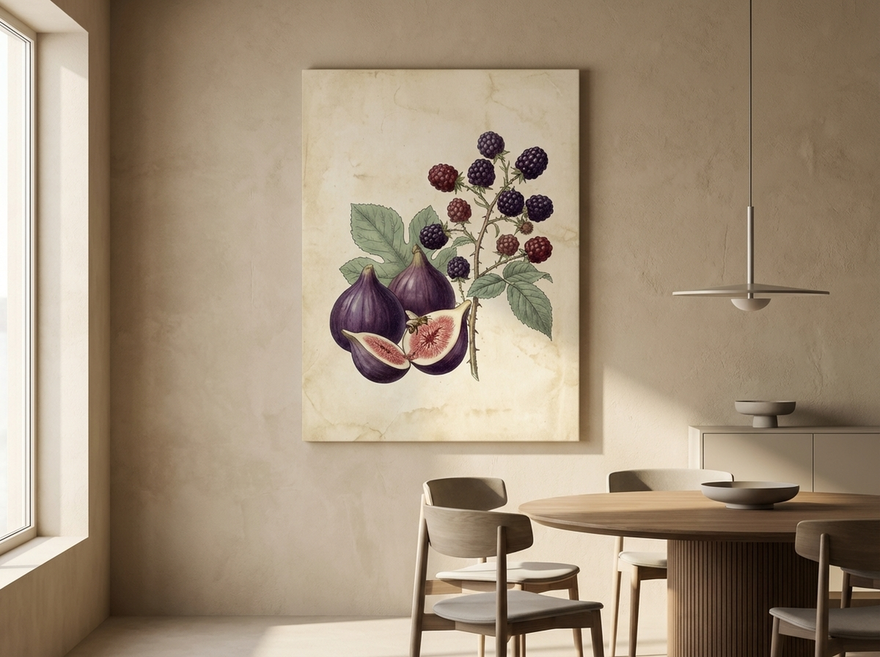
Above: our Figs and Blackberries Botanical Print brings rich, jewel-toned warmth to any entry corridor.
How to Choose the Right Size for Your Entryway
Sizing is where most people go wrong with entryway wall art, and it almost always errs in the same direction: too small. A piece that looks reasonably large in an online thumbnail can feel like a postage stamp once it is hung in a real hallway. The professional rule of thumb is that your art should occupy 57 to 75 percent of the available wall width. For a typical hallway wall of around 120 cm (47 inches) wide, that translates to a canvas between 68 and 90 cm (27 to 35 inches) wide.
Height is equally important. In a standard entryway with a ceiling height of 240 to 270 cm (94 to 106 inches), a single statement piece should ideally measure between 60 and 90 cm (24 to 36 inches) tall. The center of the artwork should hang at approximately 145 to 152 cm (57 to 60 inches) from the floor, which places it at average eye level for most adults. We have found that when art hangs too high, it disconnects from the human scale of the space and feels cold. When it hangs too low, it competes with furniture and feels cluttered.
For narrow entryways measuring less than 90 cm (35 inches) wide, consider a vertically oriented canvas or a tall, narrow print rather than a wide horizontal piece. This draws the eye upward and makes the corridor feel taller and more spacious. For wider foyers above 180 cm (71 inches), a gallery wall arrangement or a large horizontal triptych can fill the space with real impact. See our complete wall art sizing guide for room-by-room measurements, and our gallery wall layout ideas if you are considering a multi-piece arrangement.
One measurement many people overlook is the relationship between the art and any furniture below it. If you have a console table or entryway bench, the bottom edge of the artwork should sit no more than 15 to 20 cm (6 to 8 inches) above the top of the furniture. This visually connects the art to the pieces below it and grounds the whole arrangement. Without that connection, even a perfectly sized canvas can feel like it is floating.
Matching Art Style to Your Home's Personality
The entryway is a threshold, so the art you choose should act as a visual bridge between the outside world and the interior aesthetic you have created. In modern and minimalist homes, clean geometric prints, abstract line work, and monochromatic palettes maintain the sense of order and intentionality that defines the style. In traditional or transitional homes, botanical prints, landscape paintings, and vintage-inspired imagery feel cohesive and grounded. In maximalist or eclectic spaces, the entryway is an opportunity to set the tone with a bold, layered, or unexpected piece that signals there is more visual richness to come.
We have consistently found that motivational typography and uplifting text-based prints work exceptionally well in entryways because they create a micro-ritual: you read them every time you leave or return home. That small moment of engagement and positivity can genuinely shape the emotional tone of your day. For spaces where the priority is pure visual atmosphere rather than words, landscape and nature-based prints bring an organic sense of calm and depth, making even a small hallway feel connected to something larger.
For additional inspiration on how different styles translate across different rooms, our guide to abstract wall art ideas for every room is a useful reference, and our hallway wall art ideas guide covers entrance-specific styling in more detail.
Color coordination matters here too. You do not need to match the art exactly to your wall color or furniture, but there should be at least one or two tones that echo across both. If your entryway has a warm walnut console table, an artwork with amber, gold, or warm gray tones will feel intentional. If your walls are a cool off-white, artwork with cool greens, blues, or clean black-and-white will feel cohesive and calm. The goal is harmony, not matchy-matchy uniformity.
For guidance on lighting your chosen piece once it is hung, our article on how to light wall art like a gallery covers picture lights, track lighting, and natural light management in practical detail.
Our Top Entryway Wall Art Picks
We selected these six pieces specifically with entryway placement in mind: each one makes a strong visual statement at first glance, holds up to daily viewing, and works across a range of interior styles. All are available as framed or unframed canvas prints in multiple sizes.
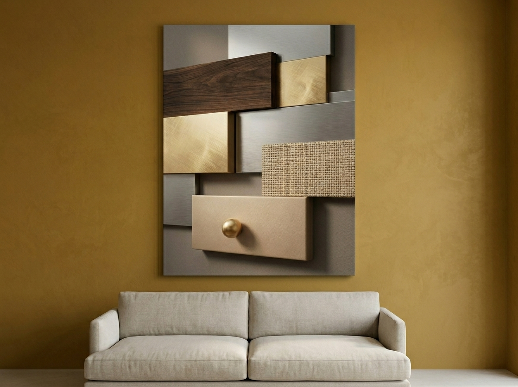
1. Geometric Texture Panels Canvas: Walnut Gold Abstract
If you want your entryway to immediately communicate sophistication, this geometric abstract in walnut and gold tones is the piece to do it. The layered panel structure creates visual depth without chaos, making it ideal for a wall that needs presence without overwhelming a narrow corridor. The warm gold accents catch natural light from a nearby window or door, which means the piece looks different and equally beautiful at different times of day. It pairs exceptionally well with dark wood furniture and brass or matte gold hardware, making it a natural fit for transitional and contemporary-luxe entryways. In larger foyers, consider hanging two panels side by side for a gallery-scale statement that fills the wall from edge to edge.
View the Geometric Texture Panels
2. Rise and Grind Motivational Typography Canvas
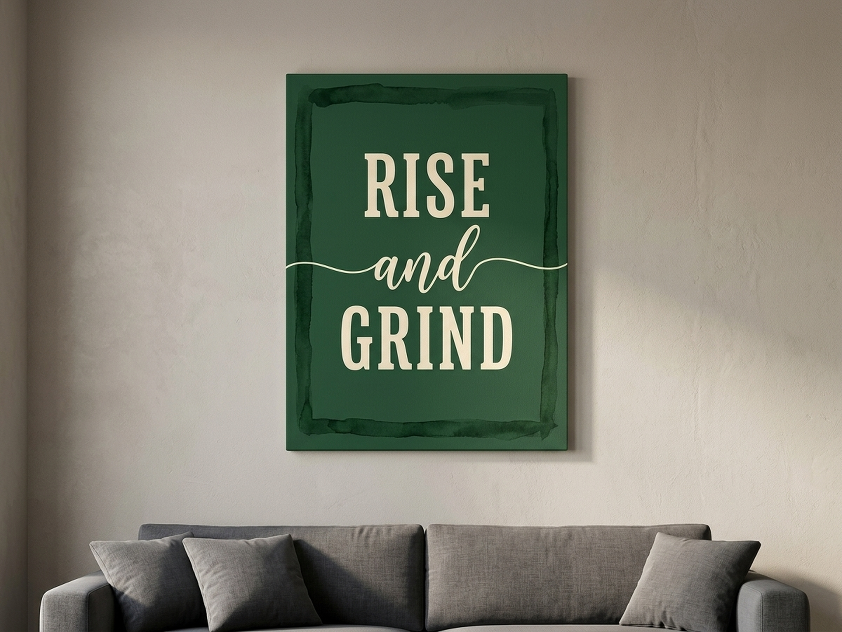
There is a reason motivational typography has become one of the most enduring entryway art trends: it transforms a daily ritual into a moment of intention. This Rise and Grind canvas delivers that message with graphic confidence, using bold letterforms layered over an abstract painted background for a piece that reads as art first and text second. The abstract composition means it does not look like a poster, and the muted palette keeps it from clashing with most existing decor schemes. We have found this piece resonates particularly strongly with customers who use their entryway as a mental transition zone between home life and work life, and it holds up remarkably well to the kind of daily glancing-at that entryway art receives. It is a strong choice for home offices with adjacent entryways or for apartments where the front door opens directly into a living and working space.
View the Rise and Grind Canvas
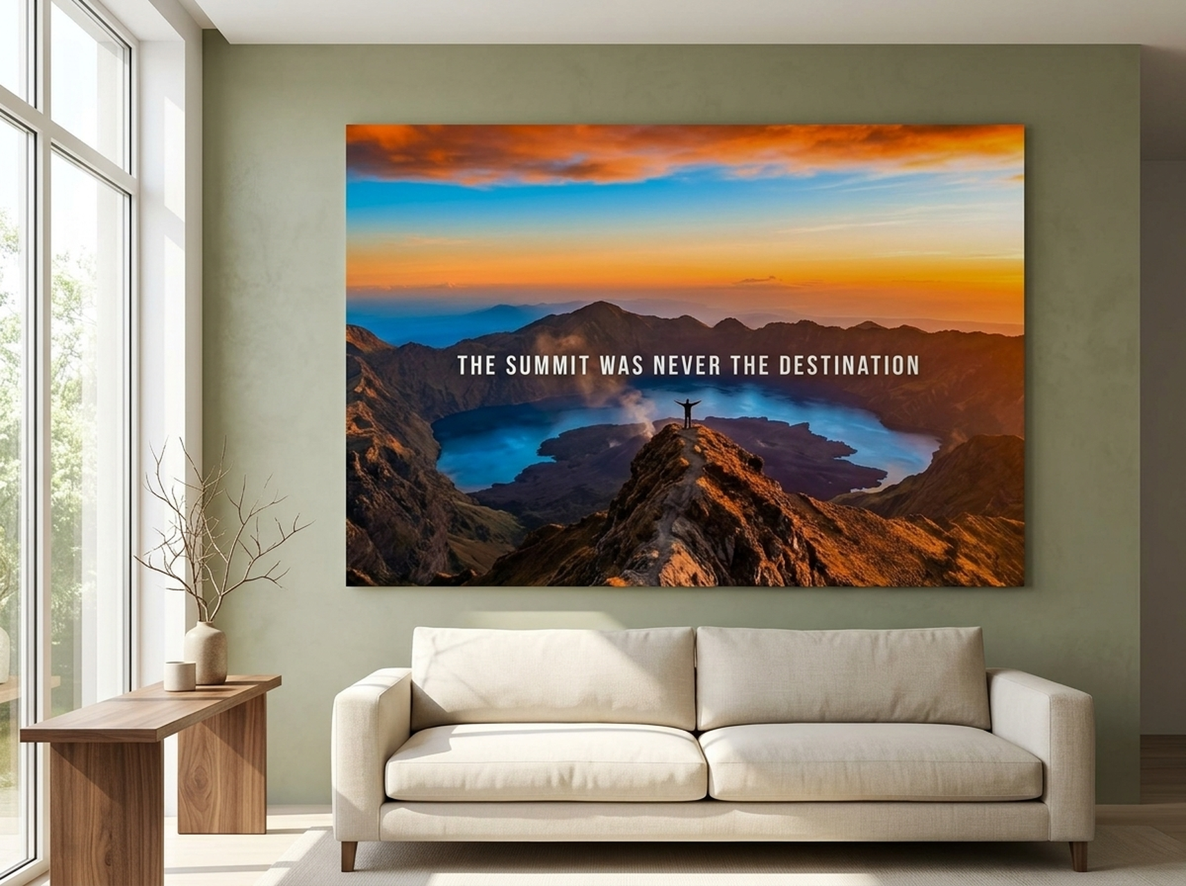
3. Volcanic Summit Landscape Photography Canvas
For entryways that open onto larger living spaces with a connection to the natural world, this Volcanic Summit landscape print delivers immediate drama. The amber and orange palette is warm and energizing without being aggressive, and the wide-open composition creates a genuine sense of scale and horizon that makes any hallway feel less enclosed. We particularly recommend this piece for entryways with limited natural light, where the warm amber tones compensate for cool or dim conditions and make the space feel sunlit even when it is not. It is also one of our best performers in homes with neutral or greige walls, where the warm tones act as the primary color accent in an otherwise restrained palette. Available in framed canvas, it needs no additional matting or hardware to look finished and intentional.
View the Volcanic Summit Canvas
4. Do The Work Motivational Typography Canvas
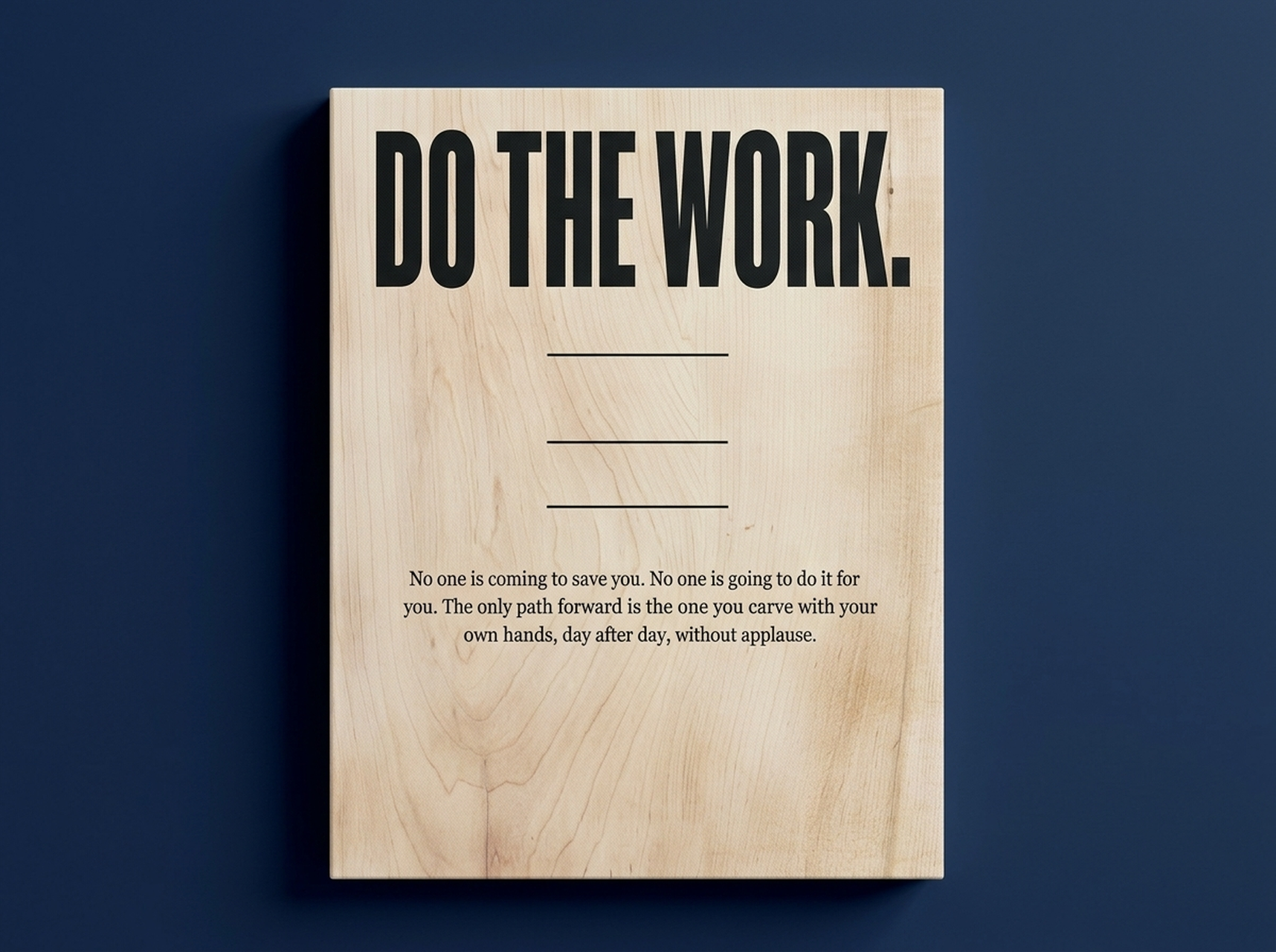
Shorter and more direct than many motivational prints, this Do The Work canvas lands with the kind of quiet authority that actually sticks. The typographic treatment is restrained rather than loud, which means the message reads with weight rather than shout. In our experience, this piece tends to appeal to customers who want the entryway to feel intentional and grounded rather than aspirational and energetic. It works especially well in home gym entryways, studio apartments, and professional home office environments where the daily reminder to focus is a practical as well as aesthetic choice. The abstract background provides visual texture without competing with the text, and the neutral palette makes it versatile enough to pair with almost any existing furniture or wall color scheme.
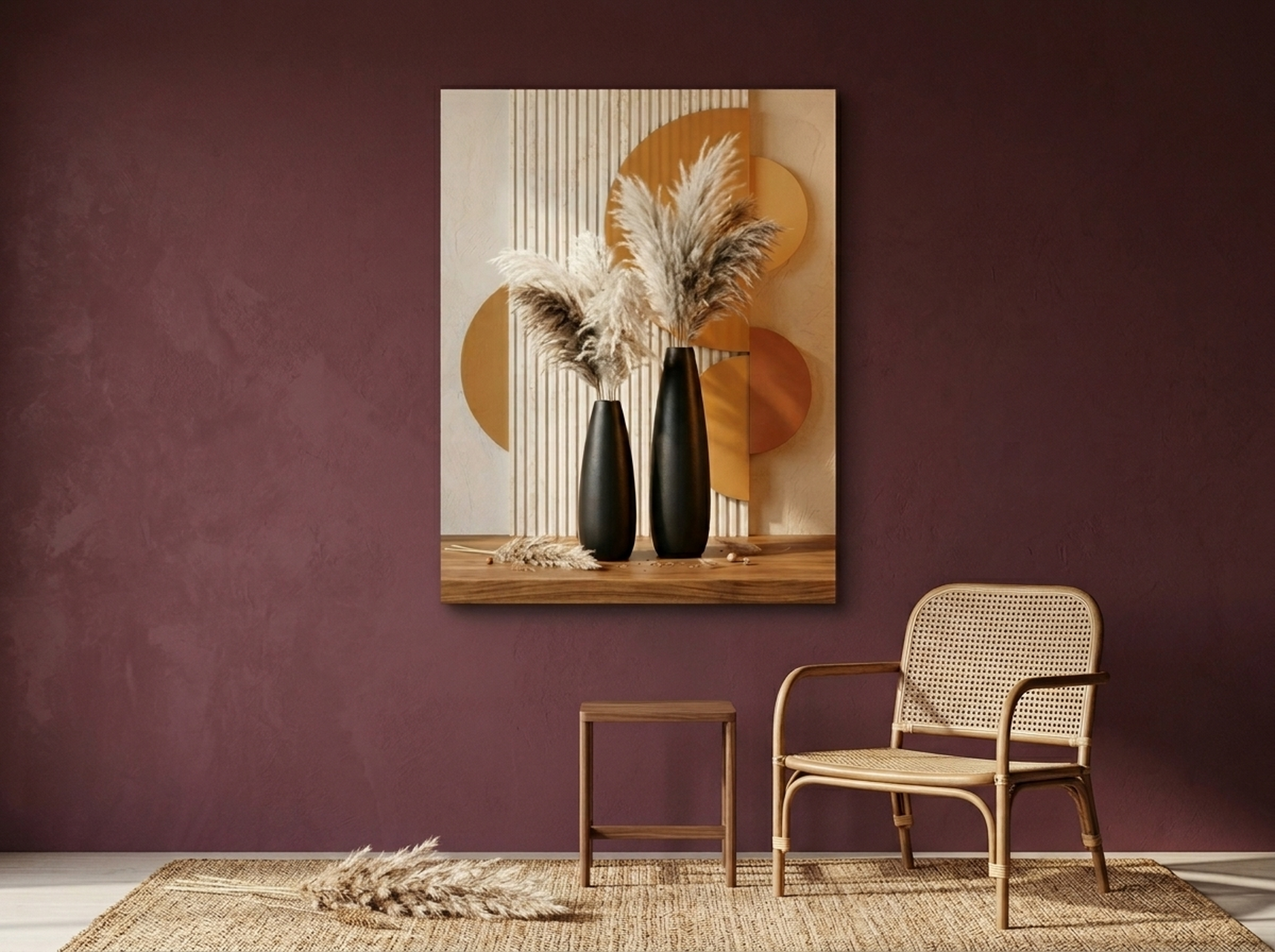
5. Pampas Vases Sculptural Black Gold Canvas
This still-life canvas brings a different kind of elegance to an entryway: quieter and more intimate than a landscape, more grounded than an abstract, it feels like something you might find in a boutique hotel lobby or a carefully curated apartment foyer. The black and gold palette is inherently glamorous, and the sculptural pampas arrangement gives the composition a sense of organic luxury that prevents it from feeling cold or corporate. We have found this piece works beautifully in entryways where there is already a console table with decorative objects, because the art and the furniture seem to be in conversation with each other. It is equally strong as a solo statement piece in a minimalist entry where the surrounding space is kept deliberately spare. If you are styling a rental or staging a property for sale, this is one of our top recommendations for high perceived value at an accessible price point. (source: Architectural Digest)
6. Sunbeam Forest Old Growth Redwood Oil Painting Canvas
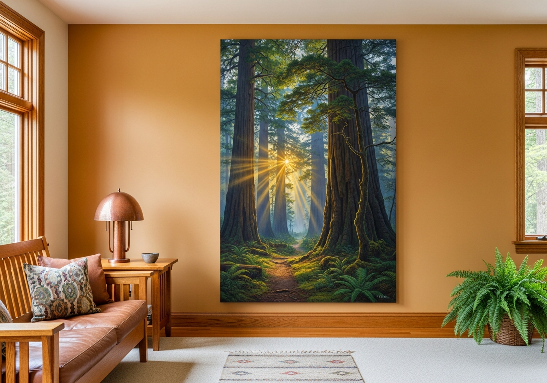
Few images communicate peace and welcome quite as effectively as sunlight filtering through old-growth trees, and this Sunbeam Forest canvas captures that feeling with the depth and warmth of an oil painting. The warm amber and forest green palette makes it one of our most universally flattering entryway pieces because those tones work harmoniously with nearly every wall color and furniture style. We particularly recommend it for entryways in urban homes or apartments where there is little natural connection to green space, because the painting provides a visual moment of nature that genuinely changes how the space feels to move through. It is also a strong choice for families with children, as landscape art creates a sense of calm that sets a positive tone for the whole house. Available as a framed canvas, it arrives ready to hang without any additional framing or matting required.
View the Sunbeam Forest Canvas
Placement Guide: Heights, Spacing, and Lighting
Getting the placement right is as important as choosing the right piece. Here is a practical breakdown of the key measurements and principles we apply when helping customers hang entryway art.
Standard hanging height: The center of the artwork should be at 145 to 152 cm (57 to 60 inches) from the floor. This is the standard used by most galleries and museums and corresponds to average adult eye level.
Above console tables: If hanging art above a console table or sideboard, the bottom edge of the canvas should be 15 to 20 cm (6 to 8 inches) above the table surface. This creates a visual connection between the furniture and the art without crowding either.
Spacing in gallery arrangements: When hanging multiple pieces, maintain 5 to 8 cm (2 to 3 inches) of space between frames. Less than this and the arrangement feels cluttered. More than this and the pieces look disconnected. See our gallery wall layout guide for full instructions on arranging multi-piece displays.
Width relative to wall or furniture: A single canvas should be 57 to 75 percent of the wall width it is hanging on, or 57 to 75 percent of the width of any furniture directly below it. Whichever is narrower should be the reference measurement.
Lighting: Entryways rarely have ideal natural light, so consider adding a picture light mounted on the top of the frame, or a small adjustable track light aimed at the artwork. Warm white light at 2700K to 3000K color temperature brings out the warm tones in most canvas prints and creates a welcoming glow. For a complete guide to art lighting options, see our article on how to light wall art like a gallery.
Mirrors and art together: If you want to combine a mirror with an artwork in the entryway, hang the art as the dominant focal point and position the mirror to one side, slightly lower, so it reads as a complement rather than a competitor. The art leads, the mirror supports.
Checking proportions before you hang: Cut a piece of paper or craft paper to the exact size of your intended canvas and tape it to the wall. Live with it for a day or two before committing. We have consistently found that this simple step prevents regret and saves the cost of return shipping. For additional help with the hanging process itself, our complete guide to hanging wall art covers tools, anchors, and leveling in practical step-by-step detail.
5 Common Mistakes to Avoid
Mistake 1: Choosing Art That Is Too Small
This is the single most common error in entryway decorating. A canvas that measures 30 by 40 cm (12 by 16 inches) will look like a window label on a standard entryway wall. When in doubt, go larger. A piece that feels bold in the store will feel appropriately confident on the wall. If you are genuinely unsure, use the paper template method described above.
Mistake 2: Hanging Too High
People instinctively hang art higher than it should go, possibly because high placement feels more formal. In practice, art hung above 165 cm (65 inches) to center loses its connection to the human body and reads as inaccessible. Keep the center at 145 to 152 cm (57 to 60 inches) unless there is a specific architectural feature (like an arched ceiling or a very tall door frame) that calls for a different approach.
Mistake 3: Ignoring the Relationship with Furniture
An artwork that floats above nothing looks unanchored. Even a small console table, a bench, or a row of hooks below the art creates a visual base that makes the whole arrangement feel intentional. If your entryway has no furniture, consider adding a simple narrow shelf beneath the canvas to ground it.
Mistake 4: Choosing Art That Clashes with the Adjacent Room
Because entryways are transition spaces, the art you choose should bridge the aesthetic of the exterior and the interior. If your living room is a cool, contemporary space with grey and white tones, a very warm, rustic landscape in the entry will feel jarring rather than welcoming. Look at what is visible from the front door and make sure there is a tonal or stylistic thread connecting the two spaces.
Mistake 5: Neglecting Lighting
Even the most beautiful canvas art looks flat and dull in poor light. Entryways are often among the darkest rooms in a home, with limited windows and overhead lighting that casts downward shadows. A simple picture light above the canvas, or a small sconce mounted to either side, can make a dramatic difference. The art becomes a glowing focal point rather than a dark rectangle on the wall.
Frequently Asked Questions
What size wall art is best for an entryway?
For most entryways, a canvas between 60 and 90 cm (24 to 36 inches) wide works well as a single statement piece. The art should cover 57 to 75 percent of the available wall width. In narrow hallways under 90 cm (35 inches) wide, a vertically oriented piece is better than a wide horizontal one. Always use a paper template to test proportions before purchasing.
What type of art works best in an entryway?
Art that creates an immediate emotional response works best because guests only spend a few seconds in the space. Bold abstracts, landscape prints with strong mood, motivational typography, and striking botanical or still-life prints all perform well. Simple, confident compositions with clear color and strong focal points are ideal.
How high should I hang wall art in an entryway?
Hang the center of the artwork at 145 to 152 cm (57 to 60 inches) from the floor. If hanging above console furniture, position the bottom edge 15 to 20 cm (6 to 8 inches) above the furniture surface.
Can I use a gallery wall in a small entryway?
Yes, keep the arrangement tight with 5 to 8 cm (2 to 3 inches) between frames. In very narrow entries, a vertical stack of two or three small canvases works well.
What colors are best for entryway wall art?
Warm neutrals like amber, walnut, cream, and soft gold create the most welcoming atmosphere. Cool greens and blues suggest calm. The art color should echo at least one or two tones already present in the space.
Should entryway art be abstract or representational?
Both work well depending on your style. Abstract art makes a fast visual impression. Representational art adds warmth and story. Motivational typography works well because the message creates a daily moment of engagement. Choose based on how you want to feel when you move through the space each day.
Quick Reference Table
| Product | Best For | Dominant Colors | Link |
|---|---|---|---|
| Geometric Texture Panels | Contemporary-luxe foyers with dark wood furniture | Walnut, Gold, Warm Grey | View |
| Rise and Grind Typography | Energizing entries, home office adjacents | Neutral, Black, Warm White | View |
| Volcanic Summit Landscape | Low-light entryways, neutral greige walls | Amber, Orange, Deep Brown | View |
| Do The Work Typography | Focused, minimal entries; gym and studio homes | Neutral, Charcoal, White | View |
| Pampas Vases Black Gold | Luxury entries, console table styling, staging | Black, Gold, Cream | View |
| Sunbeam Forest Redwood | Urban homes, family entries, nature lovers | Amber, Forest Green, Gold | View |
The right entryway wall art does not just decorate a space: it defines it, welcomes your guests, and greets you every single day. Whether you choose a bold abstract, a grounding landscape, or an uplifting typography print, the key is to commit to a piece with enough size and presence to make the wall feel intentional. Browse our complete entryway wall art collection to find the piece that makes your first impression exactly what you want it to be.