Black and White Wall Art for Modern Room Decor
The Heva Team
Art Curators & Interior Design Enthusiasts · April 1, 2026 · 14 min read
Black and white wall art suits every interior style. Discover our top monochrome picks for living rooms, bedrooms and minimalist spaces.
High-contrast, graphic wall art has a quality that trends never touch. Whether the decade favours maximalist layering or bare Nordic minimalism, a bold monochrome print holds its ground on any wall. Black and white wall art works because contrast is the most primal visual signal the human eye processes, drawing attention faster than colour, and holding it longer than decoration alone ever could. The pieces in this guide range from ink-dark geometry to nature-inspired silhouettes, but they share one thing: they make a room look intentional the moment you hang them.
Ready to browse? Shop the full black and white collection or keep reading for room-by-room sizing advice, a placement guide and our six favourite high-contrast picks right now.
The Psychology of Contrast: Why Bold Graphic Art Works
The human visual system is wired to detect edges first. Before your brain registers colour, texture or subject matter, it reads contrast ratios. This is not a design opinion; it is neuroscience. Research published by the US National Institutes of Health on interior colour and psychological functioning confirms that high-contrast environments increase alertness and cognitive engagement in ways that low-contrast rooms do not. In practical terms, a bold graphic print commands more attention per square centimetre of wall than any soft watercolour.
What makes contrast-forward art so durable across styles is that it does not compete with colour schemes. A charcoal geometric print reads as neutral on a warm cream wall, a cool grey wall and a deep navy accent wall. It picks up shadows from daylight in the morning and lamp warmth in the evening without looking wrong in either light. In our experience, clients who choose high-contrast art rarely feel the need to redecorate around it when they change their soft furnishings.
There is a counterintuitive truth here: graphic art in bold black and cream tones can actually make a room feel calmer, not busier. The brain resolves the contrast quickly, files it as a focal point, and relaxes. A wall full of competing mid-tone colours takes longer to process and produces low-level visual fatigue. One strong graphic piece organises the wall. Everything else falls into place around it.
Designers at Dezeen's colour theory lookbook consistently show how contrast anchors rooms that would otherwise feel unresolved. The pattern holds across styles from industrial lofts to coastal retreats: one high-contrast focal point ties the room together faster than any amount of accessorising.
Black, White and Beyond: Monochrome Colour Palettes Explained
Pure black and pure white is the highest-contrast pairing available. It reads bold from across a room and photographs well, which matters if you care how your home looks on a screen. But monochrome decorating is a much wider palette than a single binary.
Charcoal and cream is the most liveable version. Charcoal softens the harshness of true black and sits well with warm wood tones, linen upholstery and terracotta accents. Cream warms the white end of the scale and stops a room feeling clinical. This combination works in every lighting condition from direct sunlight to candlelight.
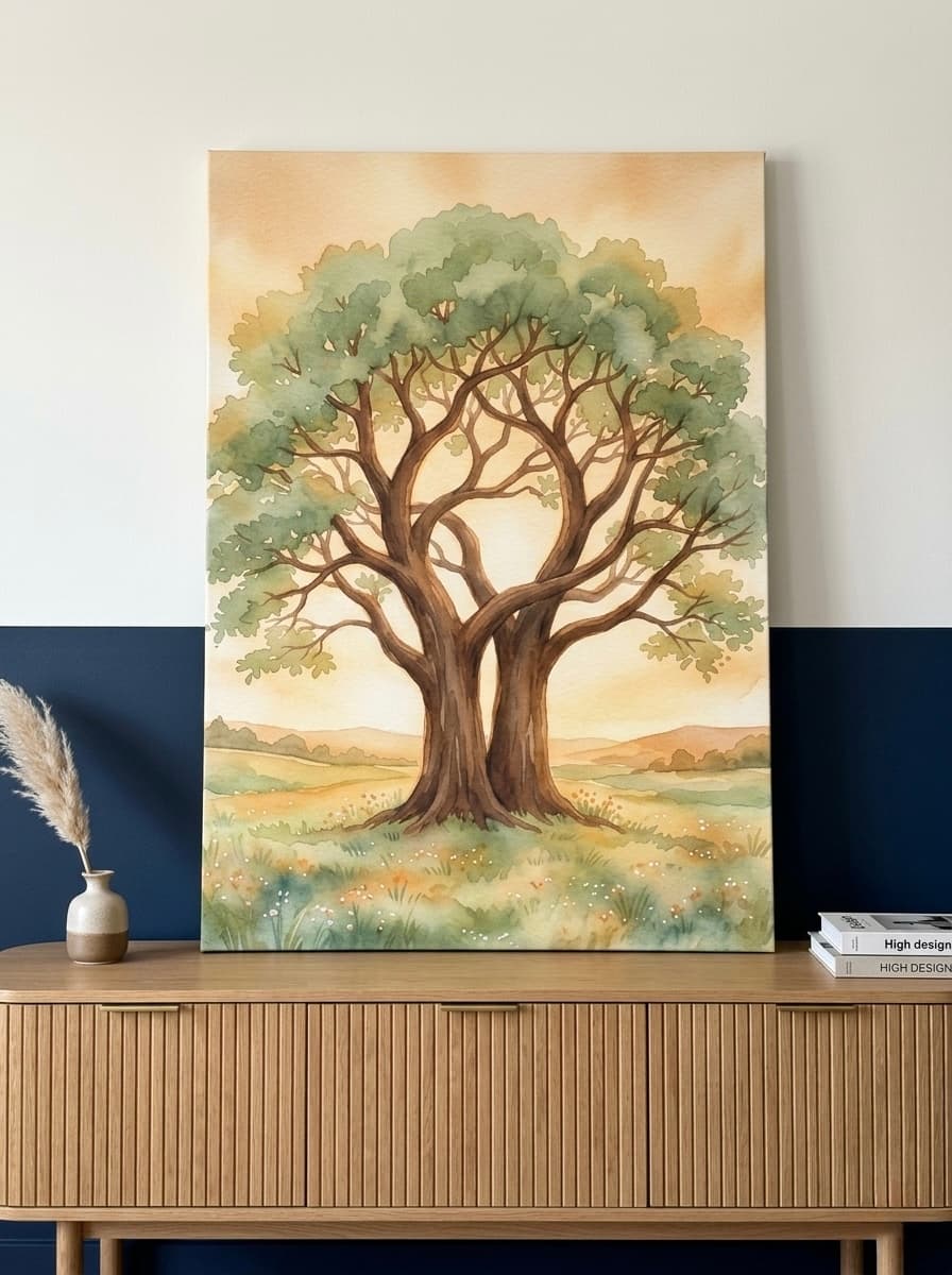
Gold accents are the most effective third tone to introduce. A print with ink-dark linework and a touch of gold leaf reads as monochrome in structure while carrying warmth through the metallic. This is exactly what makes the Lotus Flower Gold Leaf Canvas work in rooms that feel too stark with pure black and white. The gold reads as light, not colour, so the monochrome integrity holds.
Teal and charcoal is another strong pairing often overlooked in monochrome conversations. Because teal is deeply saturated, it behaves like a dark neutral next to lighter walls and reads as part of a high-contrast scheme rather than a break from it. The Giant Cassette Tape Canvas in Charcoal Teal demonstrates how this works at scale. For more ideas on using colour contrast deliberately, the wall art colour guide on this site covers the full range.
According to King Living's guide to monochrome interior styling, the key to a monochromatic space that does not feel flat is texture variation. The same contrast principle that works in the art should run through the room: smooth glass beside rough linen, matte paint beside polished metal. The art anchors the contrast story and everything else supports it.
High-Contrast Art by Room: Bedroom, Living Room, Hallway
Living Room
The living room is where graphic art earns its keep most visibly. The sofa wall is the natural location. For a standard three-seat sofa (approximately 200 to 220 cm / 79 to 87 inches wide), a single canvas measuring 90 by 120 cm (35 by 47 inches) provides a proportional focal point without overcrowding. If you prefer a diptych or triptych arrangement, keep the total width within 80 percent of the sofa length. Two panels of 60 by 90 cm (24 by 35 inches) with a 5 cm (2 inch) gap between them give you width without bulk.
Hang the centre of the canvas at 145 cm (57 inches) from the floor. This is the standard gallery height and the point at which the human eye settles when standing in a room. Do not adjust this for higher ceilings. Higher ceilings call for larger art, not higher placement. For more detail on sizing decisions, the living room art size guide covers every standard scenario.
Bold abstract art and geometric prints both perform well in living rooms because they do not compete with furniture for narrative. They create a focal point rather than telling a story the furniture interrupts.
Bedroom
The bedroom wall above the headboard is the most personal gallery space in a home. Graphic art here should feel grounding rather than stimulating. For a king-size bed (approximately 150 to 160 cm / 59 to 63 inches wide), a single canvas of 80 by 100 cm (31 by 39 inches) sits well. For a super king (approximately 180 cm / 71 inches wide), step up to 100 by 130 cm (39 by 51 inches) or a pair of 60 by 80 cm (24 by 31 inches) panels.
Centre the bottom edge of the canvas 15 to 20 cm (6 to 8 inches) above the headboard top. This keeps the art visually connected to the bed rather than floating. In our experience, the most common bedroom art mistake is hanging the piece too high, which breaks the relationship between bed and wall entirely. For a full breakdown of bedroom placement, the bedroom wall art ideas guide goes deeper on mood and scale.
Hallway
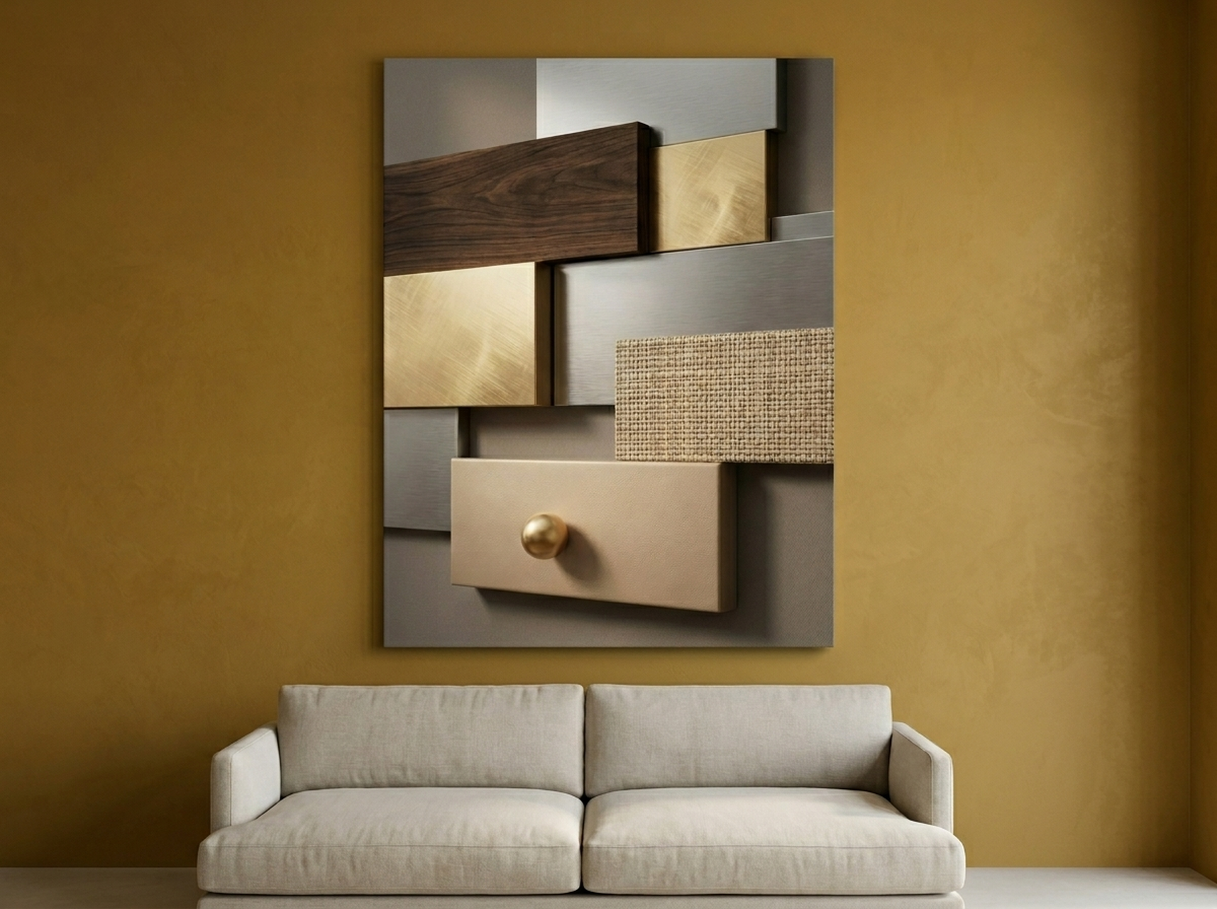
Hallways reward contrast more than any other room. Narrow spaces with limited natural light benefit from high-contrast art because it creates visual depth on a flat wall. A single panel 60 by 90 cm (24 by 35 inches) hung at standard gallery height in a narrow hallway will make the space read as a curated gallery rather than a thoroughfare. For longer hallways (over 300 cm / 118 inches), a series of three identically framed prints in the same contrast palette creates rhythm without chaos. The Geometric Texture Panels Canvas was designed exactly for this kind of extended wall, its layered panel structure feeling at home in a corridor that needs to travel visually.
Six High-Contrast Picks Worth Hanging
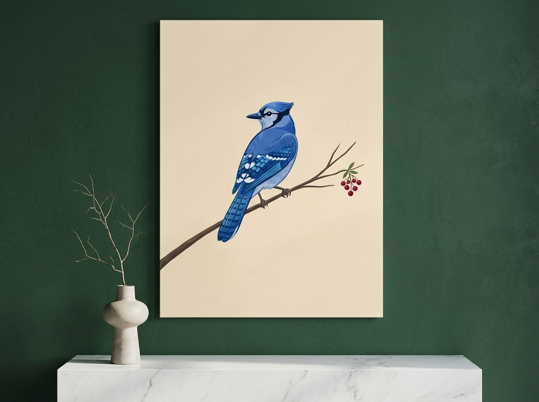
1. Blue Jay Canvas Wall Art
The Blue Jay Canvas is a study in graphic precision. Against a field of white negative space, the bird's silhouette and feather detail are rendered in deep ink tones that read as pure contrast from across a room. The composition leaves 60 percent of the canvas empty, which makes the subject feel larger, not smaller. It suits a minimalist living room or home office wall where you want one bold statement without visual noise. Hang it at 145 cm (57 inches) to centre, on a white or light grey wall, for maximum contrast effect.
2. Sea Turtle Canvas Wall Art
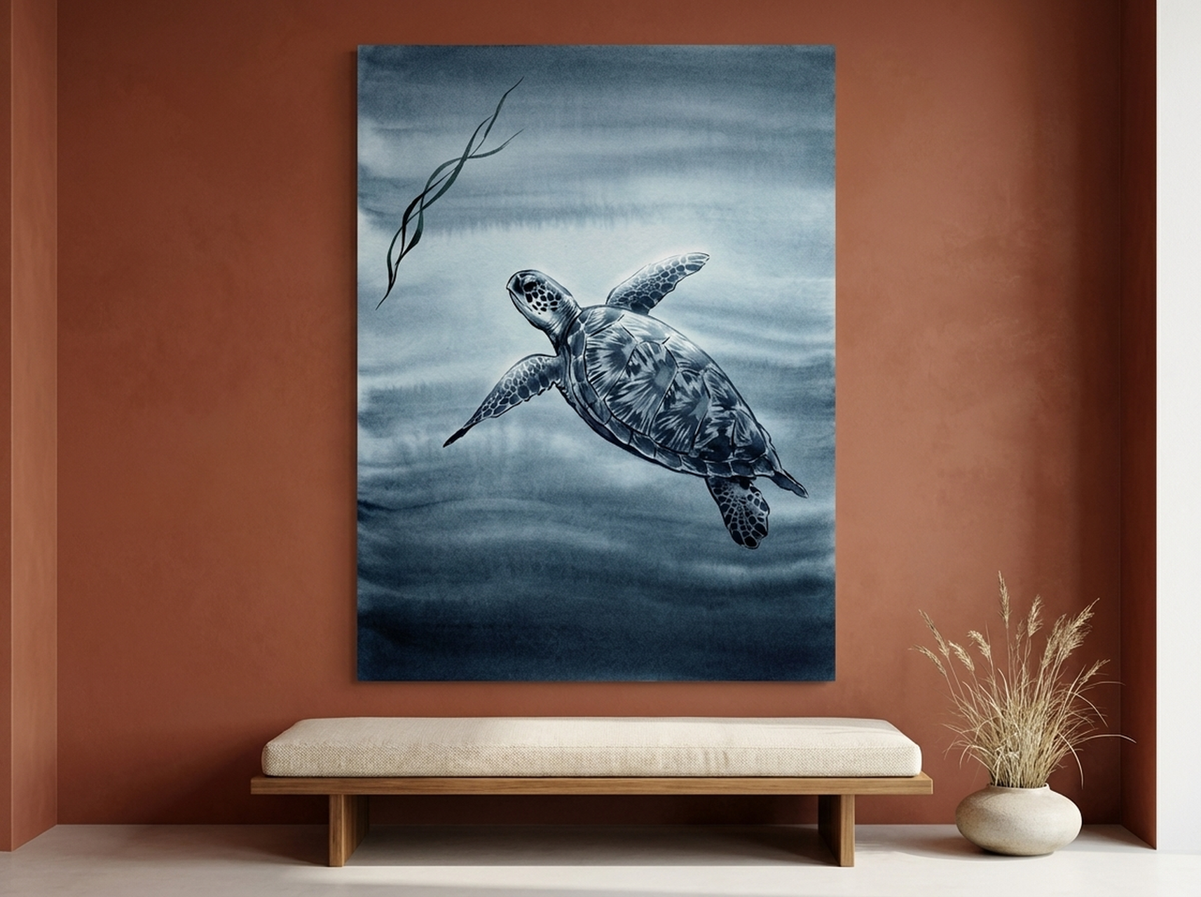
Wildlife art done in graphic linework carries the same bold-contrast energy as geometric abstraction, and the Sea Turtle Canvas proves it. The turtle's shell geometry, rendered in clean dark lines, functions almost as abstract pattern when you stand back from the piece. It is an ideal choice for a bathroom or spa space where you want organic subject matter but need graphic clarity rather than painterly softness. The strong outline holds against pale tile, beadboard and painted brick alike.
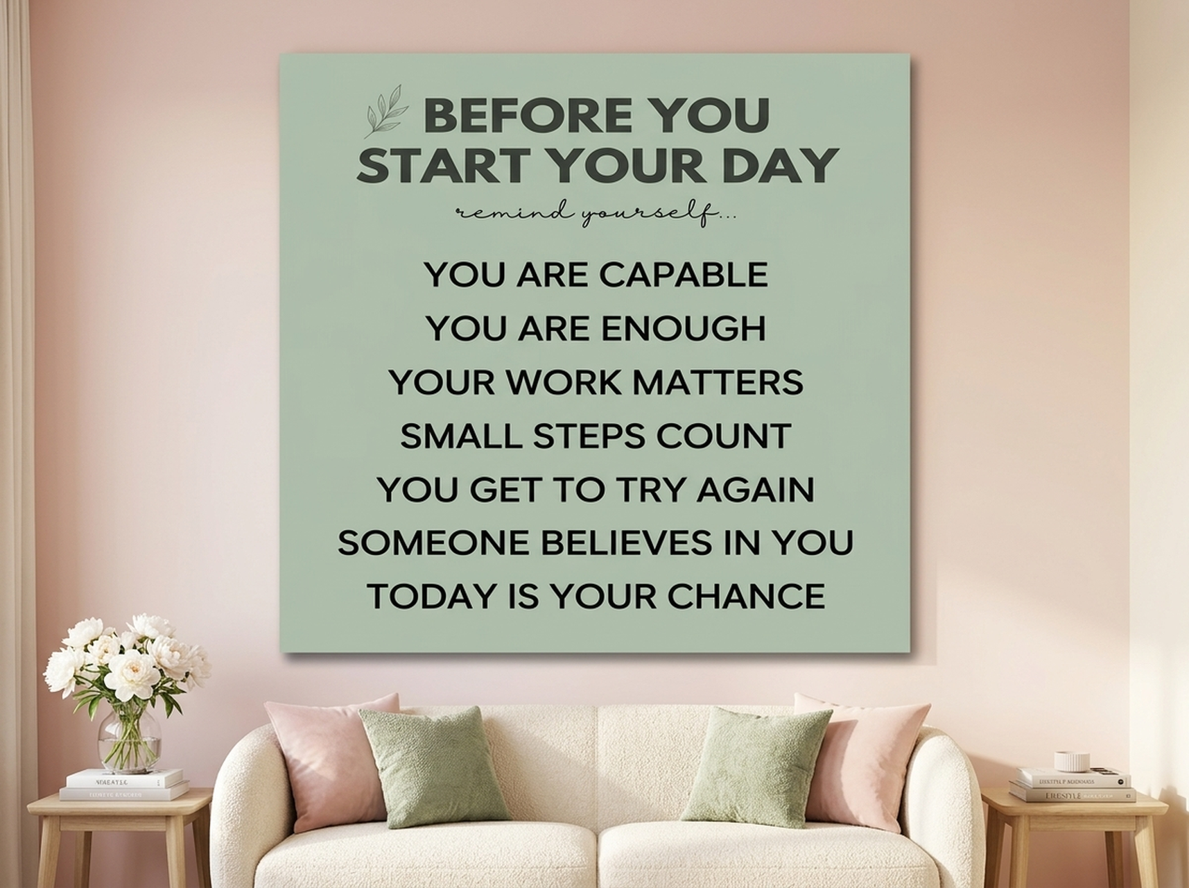
3. Motivational Typography Canvas
Typography prints are inherently high-contrast because letterforms are drawn contrast ratios. The "Before You Leave" Canvas uses bold weight type at a scale that makes the graphic quality as important as the words. Placed in a hallway or entryway, it functions as both a statement and a practical daily reminder. The dark type on a light ground creates a print that reads legibly from across a narrow hall at 90 cm (35 inches) viewing distance. For more ideas on how typography art works in different rooms, see the modern wall art ideas guide.
View the Before You Leave Canvas
4. Giant Cassette Tape Canvas Print
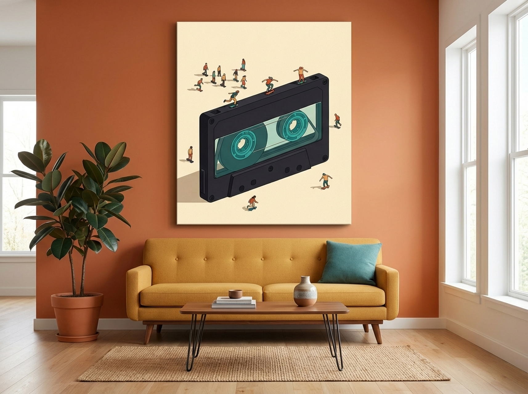
This is the piece for a room that wants graphic boldness with a cultural reference. The cassette tape at monumental scale is a flat graphic object, and at this size it delivers the visual impact of a poster-art tradition in a premium canvas format. The charcoal and teal palette keeps the contrast sharp while the teal functions as a dark neutral rather than a decorative colour. It hangs well in a home office, a teen bedroom, or a media room where you want the art to announce the room's personality from the doorway. The Giant Cassette Tape Canvas is a genuine conversation piece.
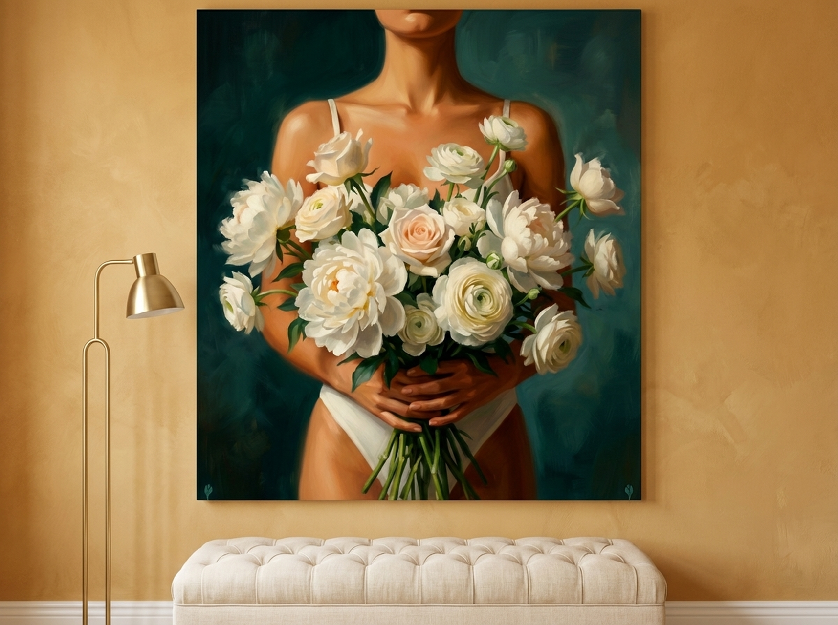
5. Floral Figure Oil Painting Canvas
Contrast is not only about black and white, and this piece demonstrates why. The Floral Figure Canvas places a dark teal figure against a field of white peonies, creating a light-dark dynamic that is as graphically resolved as any ink print. The figurative subject adds depth while the contrast structure keeps it bold. It reads differently from across a room than up close, which is exactly the quality that sustains interest over years of daily viewing. Hang it in a bedroom or sitting room where you want emotional warmth alongside graphic punch. It pairs naturally with pieces from the botanical art collection.
6. Geometric Starburst Canvas Print
Op art is the purest form of contrast-based visual design, and the Geometric Starburst Canvas is a textbook example. The radiating pattern creates optical movement entirely through the placement of light and dark shapes, with no gradients and no blending. The coral red tone intensifies the contrast effect by sitting at the warm end of the spectrum, which advances visually against neutral walls. In a room that feels flat or dimensionless, this piece does the job of a window: it creates the impression of depth and space. The Geometric Starburst Canvas works on any wall colour because the internal contrast ratio carries the whole design. Explore more options in the geometric art collection.
View the Geometric Starburst Canvas
Placement Guide for Maximum Visual Impact
The single most impactful placement decision is the height of the hanging point. The centre of any wall art should sit at 145 cm (57 inches) from the floor. This is the internationally recognised gallery standard, calibrated for average standing eye level. Every museum, gallery and high-end interior designer uses this as the baseline. You adjust for context only when a piece is hung above furniture, in which case you maintain 15 to 20 cm (6 to 8 inches) of clearance above the furniture top and let the gallery rule govern the piece's relationship to the rest of the room, not the furniture height.
Wall colour behind high-contrast art makes a measurable difference. White and off-white walls maximise contrast, letting dark tones advance. Mid-tone grey walls create a gallery effect that reads as sophisticated. Deep colour walls (navy, forest, terracotta) work well with graphic prints if the print contains a light field. Do not hang a predominantly dark print on a dark wall unless you are deliberately creating a moody, low-contrast effect. That can be intentional and effective, but it is the opposite of the bold graphic impact this guide is about.
Lighting is the third variable. A picture light mounted on the frame or a directional spot 60 to 90 cm (24 to 35 inches) above the canvas will cast the print in warm focused light that separates it from the wall surface. In our experience, properly lit wall art in a domestic setting creates the same quality of presence as lit art in a commercial gallery. The difference is not the art. It is the lighting. For inspiration on abstract approaches, read the abstract wall art ideas guide.
5 Common Monochrome Art Mistakes
1. Choosing art that is too small for the wall
A 30 by 40 cm (12 by 16 inch) print on a wall 300 cm (118 inches) wide does not create a focal point. It creates a question mark. High-contrast art earns its impact through scale. Size up to at least 50 percent of the wall width for a single piece, or fill that width with a gallery arrangement.
2. Grouping too many contrasting pieces together
Three bold graphic prints in the same arrangement fight each other for dominance. The eye cannot settle on a focal point when every piece demands equal attention. Pick one hero piece and support it with smaller works that share the palette but carry lower visual weight.
3. Hanging art too high
This is the most widespread placement error in domestic settings. Art hung at picture rail height (typically 220 to 240 cm / 87 to 94 inches from the floor) looks disconnected from the room. Drop the centre of the canvas to 145 cm (57 inches) and the room changes immediately.
4. Ignoring the relationship between art and lighting
A high-contrast canvas in a dark corner loses its impact entirely. The contrast reads in your eye only when the lightest tones in the print are genuinely lighter than the surrounding wall. Without adequate lighting, charcoal and cream become charcoal and dim grey. The print needs light to do its job.
5. Treating monochrome as a starting point rather than an anchor
Monochrome art is not a blank slate you decorate around. It is the anchor. Decide on the print first, then build the room's palette out from its tonal range. Every colour decision becomes easier when you have a high-contrast graphic reference point fixed on the wall. The minimalist wall art guide covers this anchoring approach in detail.
Frequently Asked Questions
What size should black and white wall art be for a living room?
For a standard sofa wall (200 to 220 cm / 79 to 87 inches wide), a single canvas of 90 by 120 cm (35 by 47 inches) is the most common and proportional choice. If you prefer a pair of prints, two panels of 60 by 90 cm (24 by 35 inches) with a small gap between them work well. The total art width should be between 60 and 80 percent of the sofa length. Hang the centre of the canvas at 145 cm (57 inches) from the floor regardless of ceiling height.
Does black and white wall art go with coloured furniture?
Yes, and it often works better with coloured furniture than with neutral furniture. High-contrast graphic art does not compete with colour in the room because it operates on a tonal level rather than a hue level. A bold geometric black and white print next to a teal sofa resolves the room around two contrast anchors rather than creating visual conflict. The key is keeping the print's tonal range wider than any colour in the room.
Is black and white wall art suitable for a bedroom?
Yes. The key is choosing graphic art with a subject matter that reads as restful rather than energising. Botanical prints, bird silhouettes and abstract organic forms all carry the graphic contrast quality while maintaining a settled mood. Avoid very busy geometric or op-art pieces above a bed, as the optical movement can feel stimulating rather than calming. The bedroom wall art ideas guide on this site covers mood-based selection in more detail.
What wall colours work best behind black and white art?
White, off-white and light grey walls maximise contrast and are the safest choice. Mid-tone warm grey or greige walls create a softer gallery effect that suits more traditional interiors. Deep colour walls (navy, forest green, terracotta) can work well if the print has a substantial white or light-field area, as the contrast between the print's lightest tones and the dark wall creates a framing effect. Avoid hanging a predominantly dark print on a dark wall unless a deliberately moody atmosphere is the goal.
How many monochrome prints can I hang in one arrangement?
Two or three is the practical limit for high-contrast prints in a gallery wall. Beyond three bold graphic pieces, the arrangement becomes visually exhausting rather than impactful. If you want a larger gallery wall, include lighter-weight supporting pieces (sketches, botanical studies, small typography) alongside one or two hero high-contrast prints. The supporting pieces should share the tonal palette but carry less visual weight. Browse the black and white collection for pieces that work as both heroes and supporting acts.
Where can I buy high-quality black and white canvas prints?
Heva Unique Art Gallery offers a curated range of high-contrast and monochrome canvas prints, from minimalist wildlife to bold geometric and op-art designs. Every piece is printed on demand to order. Browse the full collection at hevauniqueartgallery.com/shop/black-and-white to filter by style, room and size.
Quick Reference: Which Piece Fits Your Room
| Product | Best For | Dominant Tones | Contrast Style | Link |
|---|---|---|---|---|
| Lotus Flower Gold Leaf Canvas | Bedroom, zen space | Black, cream, gold | Ink linework on light ground | View |
| Geometric Texture Panels | Hallway, living room | Walnut, gold, cream | Layered geometric contrast | View |
| Blue Jay Canvas | Living room, home office | Ink dark, white | Silhouette on white field | View |
| Sea Turtle Canvas | Bathroom, spa room | Deep ink, white | Graphic linework wildlife | View |
| Before You Leave Typography | Hallway, entryway | Black type, white ground | Bold typography | View |
| Giant Cassette Tape Canvas | Media room, teen room | Charcoal, teal | Pop graphic at large scale | View |
| Floral Figure Canvas | Bedroom, sitting room | Teal, white, deep green | Dark figure on light floral field | View |
| Geometric Starburst Canvas | Any room needing depth | Coral red, cream, dark | Op art radial contrast | View |
Bold graphic art has one quality that softer decorative prints do not: it makes a decision. It commits to a focal point, a tonal range and a visual language, and the room organises itself around that commitment. Whether you choose a strict black and white silhouette or a charcoal and teal graphic at monumental scale, the principle is the same. Put the strongest contrast piece on the most important wall and let everything else support it. Browse the full monochrome collection to find the piece that makes that decision for your room.