Luxury Wall Art That Looks Expensive: Expert Picks and Styling Tips
The Heva Team
Art Curators & Interior Design Enthusiasts · March 29, 2026 · 15 min read
Learn which wall art characteristics signal luxury and wealth. From gold leaf accents and dark backgrounds to baroque composition and jewel-tone palettes, discover the art elements that make any room look expensive.
You walk into a room and something feels different. The furniture is nice, sure, but it is the wall art that anchors the entire atmosphere. A single piece of luxury wall art, chosen well and hung with intention, can make a space feel like it belongs in an architecture magazine. The good news? You do not need to spend a fortune. You need to know which visual details signal luxury: gold leaf effects, jewel-tone palettes, baroque-inspired composition, and dramatic scale. This guide breaks down exactly which art characteristics make a room look expensive, and we have picked six pieces that deliver that look for a fraction of what custom gallery art costs.
Ready to browse? Explore our luxury wall art collection, or keep reading for our top picks and expert tips on choosing art that radiates sophistication.
What You Will Find in This Guide
- Why Gold Leaf and Metallic Accents Signal Wealth
- The Power of Dark Backgrounds in Luxury Art
- Baroque Composition: Controlled Drama on Your Walls
- Jewel-Tone Palettes That Elevate Any Room
- Our 6 Luxury Wall Art Picks
- How to Hang Luxury Art for Maximum Impact
- Common Mistakes That Cheapen Expensive-Looking Art
- Luxury Wall Art FAQ
- Quick Reference Table
Why Gold Leaf and Metallic Accents Signal Wealth
Gold has communicated power and luxury for thousands of years, and that association runs deeper than fashion trends. Britannica's overview of gold leaf explains how the technique of hammering gold into sheets thinner than a human hair dates back to ancient Egypt, where it adorned temples and tombs. When you see gold in a painting, your brain immediately connects it to rarity and craftsmanship, even in a printed reproduction.
We have found that art featuring gold tones needs surprisingly little support to look expensive. A single piece with warm metallic highlights against a dark ground can anchor an entire room. The key is reflectivity: gold surfaces catch ambient light, especially in the evening when table lamps and candles create warm pools of illumination. A 76 by 102 cm (30 by 40 inch) canvas with gold-dominant tones can make a 3 by 4 metre (10 by 13 foot) living room feel like a private gallery.
In our experience, the most effective gold-toned art uses gold as an accent rather than a blanket. Think gold borders framing a deeper colour, or gold highlights tracing the contours of a figure. This contrast is what makes the gold pop. When everything is gold, the eye has nowhere to rest. When gold emerges from burgundy, navy, or black, it looks deliberate and refined.
The Power of Dark Backgrounds in Luxury Art
Walk through any major art museum and you will notice a pattern: the pieces that stop you in your tracks often feature dark, almost black backgrounds with subjects that glow from within. This is not coincidence. Baroque painters pioneered a technique called chiaroscuro, placing bright subjects against deep shadow to create drama that feels almost three-dimensional. Caravaggio, Rembrandt, and Vermeer all used this approach, and it remains one of the most reliable ways to make art look expensive.
Dark backgrounds do something practical too. They create visual depth. A painting with a black or navy background appears to recede into the wall, giving the illusion that the art exists in its own space rather than sitting flat on a surface. Interior designers call this the "window effect," and it is one reason why dark-background art works so well in rooms with lighter walls. The contrast draws the eye immediately. In a room with off-white or pale grey walls, a single dark-background piece at 61 by 91 cm (24 by 36 inches) becomes an automatic focal point without competing with the room's furniture.
Our customers tell us that dark-background pieces are the ones that get the most compliments from guests. There is something inherently dramatic about art that uses shadow as a design element. It suggests confidence, a willingness to be bold rather than safe. If you are choosing between two pieces of similar quality, the one with the darker ground will almost always look more expensive on the wall.
Baroque Composition: Controlled Drama on Your Walls
Baroque art and architecture emerged in 17th-century Europe as a reaction to the restraint of the Renaissance. Where Renaissance art prized balance and symmetry, Baroque embraced movement, emotion, and grandeur. Today, that dramatic energy translates directly into wall art that commands attention. Baroque-inspired pieces use diagonal lines, sweeping curves, rich textures, and layered depth to create compositions that feel alive.
You do not need an art history degree to spot baroque influences in modern wall art. Look for asymmetrical arrangements of elements, dramatic use of light and shadow, rich colour saturation, and subjects that seem to move or breathe. A lioness rendered in the baroque style, for example, becomes more than a portrait of an animal. The flowing mane, the intense gaze, the jewel-toned background all work together to create a piece that feels museum-quality.
In our experience, baroque-inspired art works best as a statement piece. One large canvas, ideally 76 by 102 cm (30 by 40 inches) or larger, placed above a sofa or a fireplace mantel. Pair it with simple, modern furniture. The contrast between ornate art and clean-lined furniture is what creates that "curated by a designer" look. If you have read our guide on how luxury wall art makes rooms look expensive, you will see how the surrounding design context amplifies the art's impact. This post dives deeper into the specific artistic elements, the gold leaf, the dark grounds, the jewel-tone palettes, that drive that perception of wealth.
Jewel-Tone Palettes That Elevate Any Room
Emerald green, sapphire blue, ruby red, amethyst purple. These colours share two traits: they are named after precious stones, and they make any room feel more opulent. Jewel tones work because they are saturated but not bright. They have depth and complexity, which the eye interprets as quality. A flat, primary red feels like a poster. A deep, slightly warm burgundy feels like a velvet curtain in a grand hotel lobby.
Colour psychology research consistently links saturated, darker hues with perceptions of luxury and exclusivity. When we choose art for luxury-focused collections, we look for palettes that combine two or three jewel tones with gold or cream accents. This combination, say emerald and gold, or navy and burgundy with touches of bronze, creates rich visual interest without looking busy. Our bestselling luxury pieces tend to use three or four colours maximum, always with at least one warm metallic to tie the palette together.
One practical consideration: jewel-toned art is remarkably versatile. It works against both light and dark walls, though the effect differs. On white or cream walls, jewel-toned art becomes a dramatic focal point. On darker walls (charcoal, navy, forest green), it creates a layered, enveloping atmosphere that feels like a high-end bar or library. If you are interested in how colour choices affect a room's mood, our modern bedroom wall art guide covers palette selection in detail.
Our 6 Luxury Wall Art Picks That Look Far More Expensive Than They Are
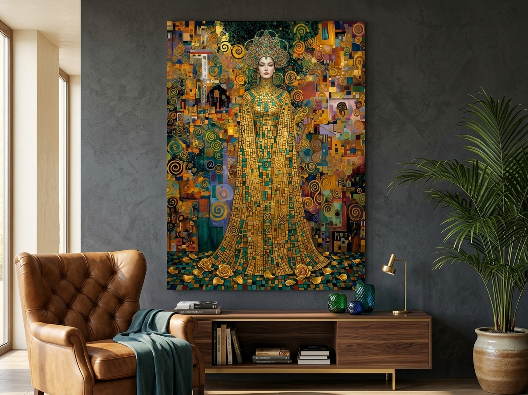
1. Klimt Mosaic Portrait
Inspired by the legendary Gustav Klimt, this mosaic portrait captures the essence of Art Nouveau luxury: intricate geometric patterns, rich gold tones layered over jewel-coloured segments, and a figure that emerges from the decorative surface like a Byzantine icon. The gold-dominant palette with accents of teal, green, and burgundy creates a piece that glows under both natural and artificial light. This is the kind of art that makes guests ask where you found it.
Best suited for a living room above a velvet sofa or a dining room where you want conversation-starting decor. The warm gold tones pair beautifully with dark wood furniture, brass light fixtures, and rich textiles. Hang it at 145 to 152 cm (57 to 60 inches) from the floor to centre for optimal viewing.
View the Klimt Mosaic Portrait →
2. Perfume Bottle in Black and Gold
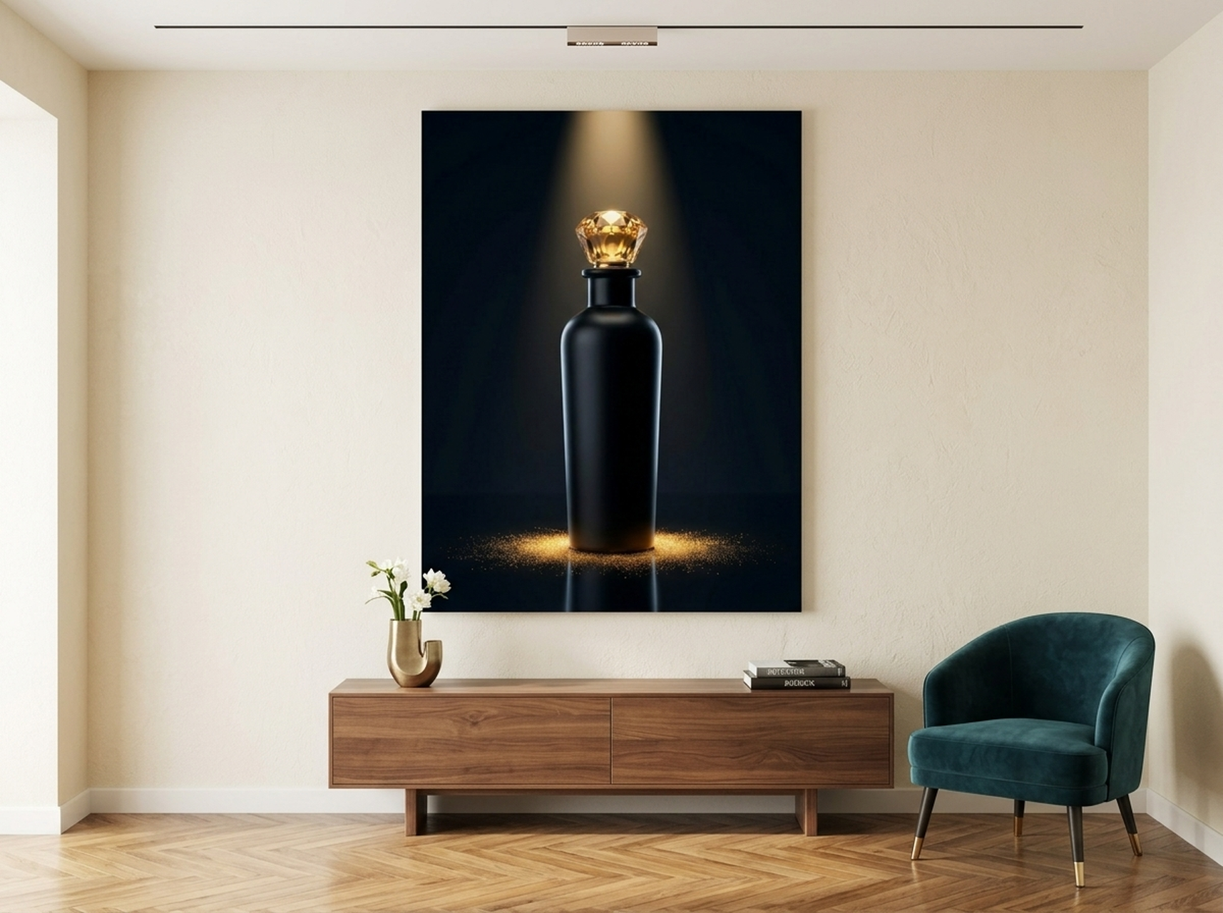
This is dark glamour distilled into a single canvas. The perfume bottle motif immediately signals sophistication, fashion consciousness, and an appreciation for the finer things. The black background absorbs light around the edges while the gold and cream details catch it at the centre, creating that coveted "glowing from within" effect we discussed earlier. It is a masterclass in the power of restraint: just two dominant colours, used with precision.
We have found this piece works exceptionally well in bedrooms, dressing rooms, and powder rooms. The fashion-forward subject matter feels personal and curated, not generic. Position it at eye level in a space with muted, neutral walls to let the dark-light contrast do its work. A black or brushed-gold frame echoes the art's own palette, creating a finished, gallery-quality look.
View the Perfume Bottle Black Gold →
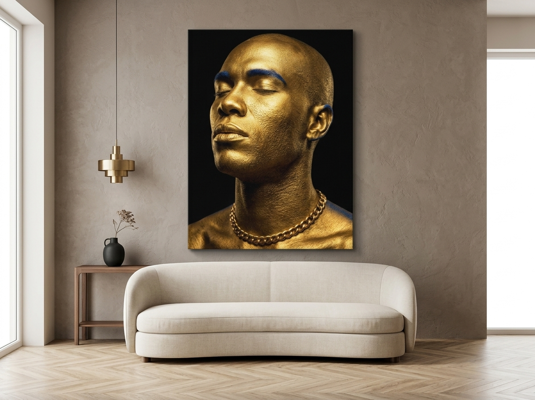
3. Gold King Portrait
This editorial-style portrait is bold, unapologetic, and dripping in metallic grandeur. The golden crown and armour-like detailing reference historical royal portraiture, but the execution is thoroughly modern: graphic lines, high-contrast colour blocking, and a flat black background that pushes the gold forward. It delivers the kind of visual authority that interior magazines stage rooms around.
Ideal for a living room, home office, or entryway where you want to set the tone immediately. The gold-on-black palette is universally flattering and pairs well with virtually any decor style, from maximalist to modern minimal. Our customers with dark accent walls (charcoal, navy, or deep olive) report that this piece looks particularly striking, as the metallic tones appear to float against the wall. Hang it as a standalone statement, 20 to 25 cm (8 to 10 inches) above a console or sideboard.
4. Oversized Rose in Cream and Gold
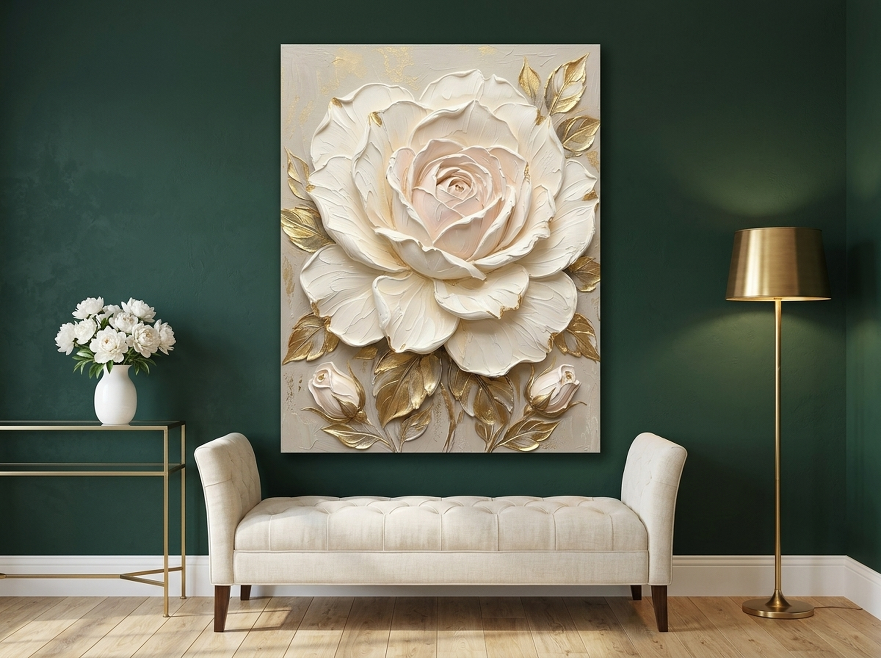
Not all luxury is dark and dramatic. This oversized rose proves that softness and opulence can coexist. The impasto-style brushstrokes create visible texture that makes the canvas look like an original oil painting. Cream, white, and gold tones layer together in a way that feels lush without being overwhelming. The scale of the rose, blown up well beyond life size, transforms a familiar subject into something grand and almost abstract.
This piece shines in bedrooms, master bathrooms, and any space where you want luxury without heaviness. The neutral, warm palette coordinates with linen bedding, marble surfaces, and soft metallics. In our experience, oversized florals read as fine art when the colour palette is restrained and the texture is visible. Hang this above a bed headboard, centred and about 10 to 15 cm (4 to 6 inches) above the top of the headboard, for a designer-worthy look.
View the Oversized Rose Cream Gold →
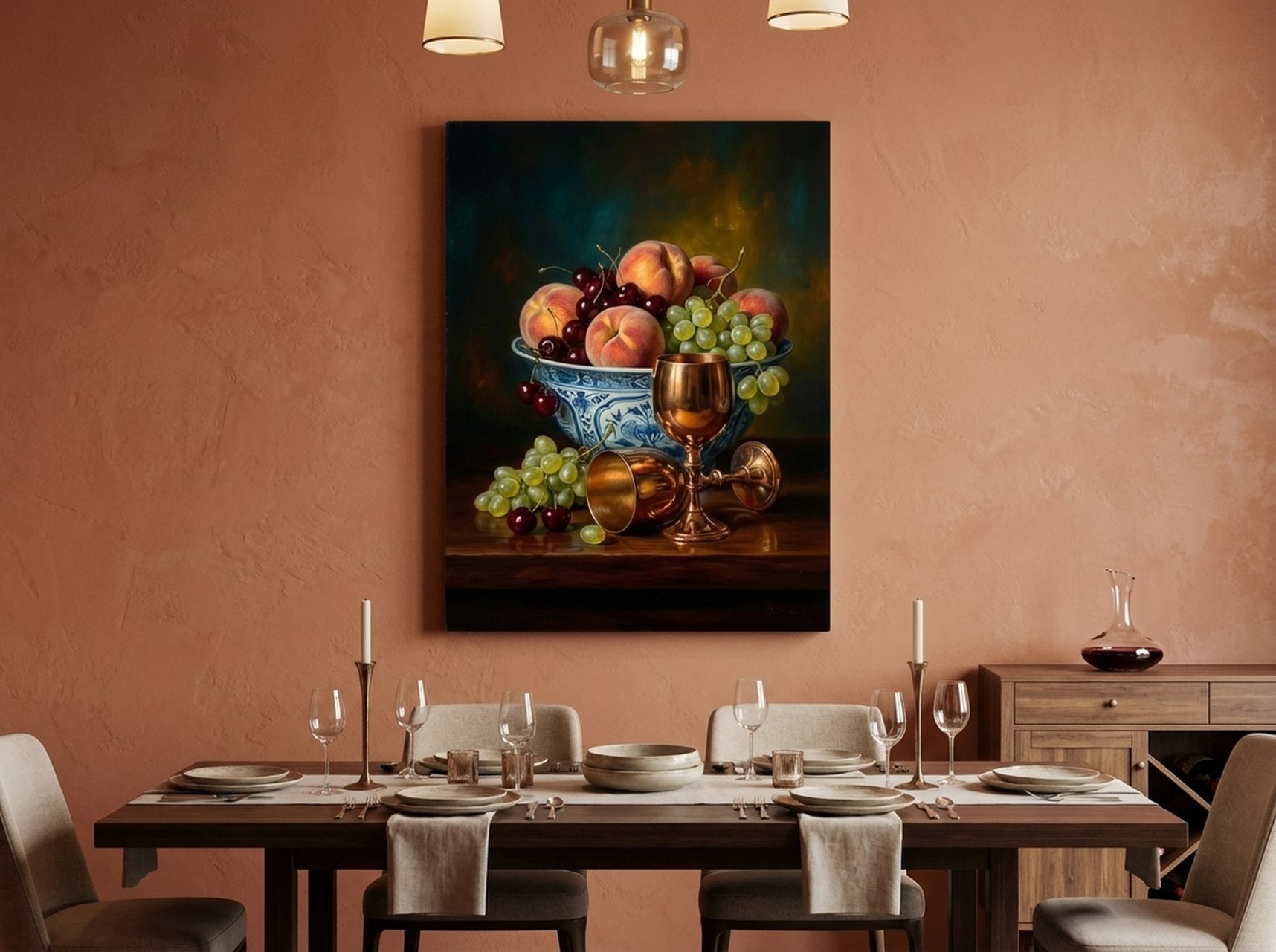
5. Peaches and Cherries Still Life
Dutch Golden Age still life paintings were created specifically to communicate wealth and refinement. Overflowing fruit, rich fabrics, gleaming vessels: every element was chosen to signal abundance. This piece channels that tradition with a dark, moody background, jewel-toned fruit, and the kind of controlled composition that takes skill to execute. The teal, burgundy, and gold palette references the exact colour combinations that Baroque masters used in commissioned works for wealthy European merchants.
A still life like this is perfect for a dining room or kitchen, where the subject matter creates a natural connection to the space. But it also works beautifully in a hallway or study, where its dark, contemplative mood creates atmosphere. Position it where it catches sidelight from a window or a directional lamp. The interplay of shadow and warm tone in the painting will come alive. For more classic and abstract art inspiration, browse our living room abstract art guide.
View the Peaches and Cherries Still Life →
6. Mughal Peacock in Royal Blue and Gold
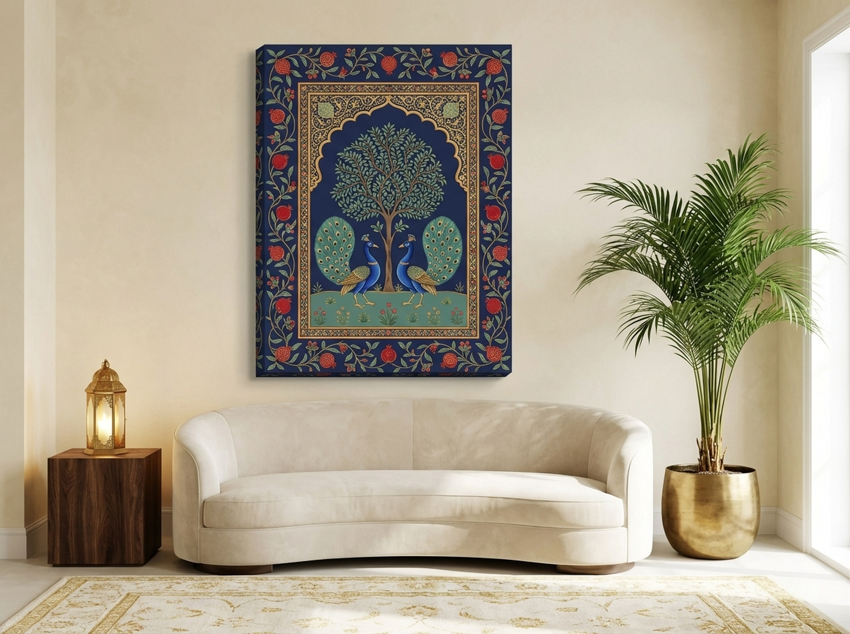
This piece draws from the Pichwai painting tradition of Rajasthan, where artists created elaborate devotional works on cloth using natural pigments and gold leaf. The peacock, a symbol of royalty across multiple cultures, is rendered here against a deep navy background with gold, teal, and terracotta accents. The Tree of Life composition creates a symmetrical, almost architectural quality that reads as both ancient and contemporary. Every detail, from the individual feathers to the delicate branch work, contributes to an overall impression of handcrafted luxury.
The navy-and-gold palette makes this piece remarkably adaptable. It anchors a formal living room with the same ease as it energises an eclectic bedroom. The symmetrical composition means it works especially well centred above a sofa, mantelpiece, or headboard. In our experience, culturally rich pieces like this generate the most engagement from guests because they tell a story. Pair it with brass candleholders, a dark wood coffee table, and a few silk cushions in complementary teal or gold tones.
View the Mughal Peacock Royal Blue Gold →
How to Hang Luxury Art for Maximum Impact
Even the most expensive-looking art can fall flat if it is hung poorly. Here are the specific measurements and techniques that interior professionals use to make wall art look deliberate and curated rather than randomly placed.
Centre height. The centre of the artwork should sit at 145 to 152 cm (57 to 60 inches) from the floor. This is museum standard and works for most ceilings between 240 and 300 cm (8 to 10 feet). In rooms with higher ceilings, you can raise this by 5 to 8 cm (2 to 3 inches), but never go above eye level of your tallest regular visitor.
Above furniture. When hanging art above a sofa, console, or headboard, leave 15 to 25 cm (6 to 10 inches) between the top of the furniture and the bottom of the frame. The art should span roughly two-thirds the width of the furniture piece below it. A 180 cm (72 inch) sofa calls for art that is 100 to 120 cm (40 to 48 inches) wide. Anything smaller looks like an afterthought.
Lighting. This is where most people leave money on the table. A simple picture light mounted above the frame, or a recessed ceiling spotlight angled at 30 degrees, can make a $50 print look like a $500 gallery piece. The light should wash the entire surface evenly without creating a hot spot. LED picture lights with warm white colour temperature (2700K to 3000K) work best for gold-toned and warm-palette art.
Wall colour. Dark art on light walls creates a dramatic focal point. Dark art on dark walls creates moody immersion. Both work, but they create very different atmospheres. If you are going dark-on-dark, make sure the art has at least one bright accent colour (gold, cream, or a jewel tone) so it does not disappear into the wall. For practical room-by-room sizing advice, see our guide to choosing the right wall art size.
Common Mistakes That Cheapen Expensive-Looking Art
Hanging too high. The single most common mistake. Art hung above eye level feels disconnected from the room and its furniture. It floats up there, awkward and untethered. Always measure from the floor to the centre of the piece, not the top.
Choosing the wrong scale. A small piece on a large wall looks like a postage stamp on an envelope. Luxury is about presence, and presence requires scale. If your wall is wider than 250 cm (8 feet), go with art that is at least 76 cm (30 inches) wide. For large feature walls, 100 to 120 cm (40 to 48 inches) is the sweet spot.
Ignoring the frame. The frame is not separate from the art; it is part of the presentation. A flimsy, shiny chrome frame will undermine even the most beautiful canvas. For luxury-looking art, choose matte black, brushed gold, or natural wood frames. Our framed canvases come ready to hang with a frame designed to complement the art rather than compete with it.
Overcrowding the wall. More is not always more. In luxury interiors, negative space, the empty wall around the art, is as important as the art itself. Give a single statement piece at least 30 cm (12 inches) of breathing room on all sides. This isolation makes the piece feel intentional and important, like a sculpture on a pedestal.
Bad lighting or no lighting at all. We mentioned this above, but it bears repeating. Art that sits in shadow communicates nothing. Even a well-chosen piece looks flat and forgettable without directed light. If you cannot install a picture light, position a table lamp so it casts indirect light toward the wall. The difference is transformative.
Luxury Wall Art FAQ
What makes wall art look expensive?
Three elements matter most: palette, composition, and scale. Art with gold or metallic accents, dark backgrounds, and jewel-tone colours (emerald, navy, burgundy) triggers associations with historical wealth and craftsmanship. Baroque-inspired compositions with dramatic light and shadow add visual depth. And scale matters: a single large piece always looks more intentional than several small ones scattered across a wall. Proper framing and targeted lighting amplify all of these signals.
Does luxury wall art have to be original to look expensive?
No. What signals luxury is not the production method but the visual characteristics: the colour palette, the composition complexity, the subject matter, and how it is presented in the room. A well-chosen, high-quality print with gold tones, dramatic lighting, and rich textures, hung at the right height with proper lighting, will outperform an original painting that is poorly chosen or badly displayed. Presentation accounts for at least half the perceived value.
Which rooms benefit most from luxury wall art?
Living rooms and dining rooms get the most impact because guests spend the most conscious attention there. But entryways and hallways are underrated. A single statement piece in an entryway sets the tone for the entire home before a guest reaches the living room. Bedrooms benefit from softer luxury art (think cream-and-gold florals or soft-focus portraits), while home offices can handle bolder, more graphic pieces.
How do I choose between gold-toned and silver-toned luxury art?
Match your existing metal finishes. If your room has brass drawer pulls, gold light fixtures, or warm-toned hardware, gold-toned art will integrate naturally. If your fixtures are chrome, nickel, or stainless steel, silver or cool-toned metallics create a more cohesive look. In a room with mixed metals, lean toward the dominant metal. When in doubt, gold reads as warmer and more traditional, silver as cooler and more contemporary.
Can luxury wall art work in a minimalist space?
Absolutely, and it often looks even better. A single ornate, richly coloured piece in an otherwise minimal room creates a powerful focal point through contrast. The clean lines and neutral palette of minimalist design act like a gallery wall: they put all the attention on the art. Just make sure the piece is large enough to hold its own, at least 76 by 102 cm (30 by 40 inches), so it reads as intentional rather than incidental.
Frequently Asked Questions
How do you make wall art look expensive?
Three things matter: size (go larger than you think), framing (match the room hardware), and placement (centre at 145 cm / 57 inches). Proper lighting adds the final touch.
Is canvas or framed art more luxurious?
Both can look high-end. Gallery-wrapped canvas suits modern spaces. A well-chosen frame in espresso, gold, or matte black elevates any piece in traditional rooms.
What size art looks best in a luxury living room?
Above a sofa, the art should span 60 to 75 percent of the sofa width. In a large room, at least 91 by 122 cm (36 by 48 inches) prevents the wall feeling empty.
Does expensive-looking art have to cost a lot?
No. Quality canvas prints with rich colour depth look just as refined as originals. What matters is print quality, canvas material, and how you style and light the piece.
Quick Reference Table
| Product | Best For | Dominant Colours | Link |
|---|---|---|---|
| Klimt Mosaic Portrait | Living room, dining room | Gold, teal, burgundy | View |
| Perfume Bottle Black Gold | Bedroom, dressing room, powder room | Black, gold, cream | View |
| Gold King Portrait | Living room, home office, entryway | Gold, black, navy | View |
| Oversized Rose Cream Gold | Bedroom, master bathroom | Cream, white, gold | View |
| Peaches and Cherries Still Life | Dining room, kitchen, study | Gold, burgundy, teal | View |
| Mughal Peacock Royal Blue Gold | Living room, bedroom, formal spaces | Navy, gold, teal | View |
Your Walls Deserve to Look Expensive
Luxury wall art is not about spending more. It is about choosing art with the right visual DNA: gold leaf effects that catch the light, dark backgrounds that create depth, baroque-inspired compositions that command attention, and jewel-tone palettes that the eye instantly reads as rich. The six pieces in this guide were chosen because they deliver those signals clearly, and they arrive ready to hang in a frame that complements rather than distracts.
Browse our full luxury wall art collection to find the piece that turns your room from nice to unforgettable.