Japanese Wall Art: Zen Meets Modern
The Heva Team
Art Curators & Interior Design Enthusiasts · March 26, 2026 · 16 min read
From ukiyo-e woodblock prints to wabi-sabi minimalism, Japanese wall art brings centuries of tradition into your modern home. Our guide covers five art traditions, the Japandi trend, colour psychology, and six hand-picked canvases with expert placement tips.
Your walls feel restless. You have tried gallery walls loaded with frames, oversized abstracts that shout for attention, and boho tapestries that collect dust. Nothing quite settles. Japanese wall art offers a different path: art that invites stillness into a room rather than competing with it. This guide covers the artistic traditions behind Japanese-inspired prints, the Japandi trend reshaping modern interiors, and the exact sizing and placement rules that help each piece breathe on your wall.
Ready to browse? Explore our Japanese wall art collection, or keep reading for our top picks and expert tips.
Five Japanese Art Traditions That Shape Modern Wall Art
Japanese wall art is not a single style. It draws from centuries of distinct movements, each with its own philosophy about what a picture should do. Understanding these roots helps you choose art that resonates with your space instead of just looking vaguely Asian.
1. Ukiyo-e (Floating World Prints). These woodblock prints, produced from the seventeenth through nineteenth centuries, depicted landscapes, kabuki actors, beautiful women, and scenes of everyday pleasure. Katsushika Hokusai's The Great Wave off Kanagawa remains one of the most reproduced images in art history. Ukiyo-e compositions use bold outlines, flat areas of colour, and dramatic cropping that influenced Impressionists like Monet and Van Gogh. According to the Encyclopaedia Britannica, ukiyo-e prints were Japan's dominant popular art form for over two centuries. In a modern home, ukiyo-e-inspired prints work best as a single statement piece above a sofa or console table, where the bold lines can command attention without competing elements.
2. Sumi-e (Ink Wash Painting). Where ukiyo-e uses vivid colour, sumi-e reduces the world to black ink and water on paper or silk. The artist grinds ink from a sumi stick, mixes it to varying dilutions, and paints bamboo, mountains, birds, or plum blossoms in flowing, confident brushstrokes. Each mark is final: there is no layering or correcting. This philosophy of decisive, unrepeatable gesture gives sumi-e its meditative quality. We have found that sumi-e-style prints pair naturally with minimalist interiors where clean lines and neutral palettes already dominate.
3. Zen Garden Aesthetics. The raked gravel and carefully placed stones of a karesansui (dry landscape garden) translate into art that uses negative space as a design element. A single rock formation surrounded by empty canvas carries the same quiet authority as an entire garden. These compositions teach an important interior design lesson: the space around the art matters as much as the art itself. Leave at least 15 to 20 cm (6 to 8 inches) of bare wall between a Zen-inspired piece and any shelf, sconce, or adjacent frame.
4. Cherry Blossom (Sakura) Motifs. Cherry blossoms symbolise the fleeting beauty of life, a concept called mono no aware in Japanese philosophy. Sakura art ranges from delicate watercolour branches on white backgrounds to bold, maximalist canvases where hundreds of petals fill the frame. In our experience, cherry blossom prints serve as the most versatile entry point into Japanese wall art because they pair with nearly any colour scheme: pastel bedrooms, grey living rooms, even warm terracotta kitchens.
5. The Great Wave and Ocean Art. Hokusai's wave image inspired an entire genre of Japanese ocean art that continues today. Modern interpretations use deep indigo and foam white, sometimes adding gold leaf or metallic accents to the crests. These pieces carry natural energy and movement, making them ideal for rooms that need dynamism rather than stillness: entryways, dining rooms, and coastal-themed living spaces.
The Japandi Trend: Where Zen Meets Scandinavian Simplicity
Japandi is the design hybrid that refuses to fade. It merges Japanese wabi-sabi philosophy with Scandinavian hygge warmth, creating interiors that feel clean without feeling cold and handcrafted without feeling cluttered. Dezeen, the architecture and design publication, has tracked Japandi as one of the most persistent interior trends of recent years, with continued relevance in 2026.
The Japandi palette centres on soft neutrals: warm whites, sand, oatmeal, charcoal, and muted sage. Art in a Japandi room should reinforce this restrained palette rather than disrupt it. Look for pieces that use no more than three or four colours, with at least one warm neutral as a base tone. A crane rendered in grey and cream ink on an ivory background, for example, adds visual interest without introducing competing colour.
Materiality matters in Japandi spaces. Our framed canvas prints, with their natural texture and solid frame, align with the Japandi emphasis on tactile, well-made objects. The canvas weave catches light differently at various angles, giving the surface a subtle warmth that a flat poster or metal print cannot replicate. For Japandi styling, we recommend hanging one large canvas (76 by 102 cm or 30 by 40 inches) rather than clustering smaller pieces, and positioning it at eye level, which is 145 to 152 cm (57 to 60 inches) from the floor to the centre of the frame.
Japandi rooms also favour asymmetry over perfect symmetry. Instead of centring art precisely between two wall sconces, try placing it slightly off-centre with a low ceramic vase on one side and open space on the other. This deliberate imbalance reflects the Japanese concept of fukinsei, which finds beauty in irregularity, and prevents the room from feeling like a hotel lobby.
Wabi-Sabi Walls: Finding Beauty in Imperfection
Wabi-sabi is the Japanese philosophy that embraces impermanence, imperfection, and incompleteness. In interior design, it shows up as rooms that celebrate the patina of age, the texture of raw materials, and the quiet charm of objects that are not polished to perfection. As Tofugu, the Japanese culture publication, explains, wabi-sabi is rooted in Buddhist aesthetics and has shaped everything from tea ceremony architecture to contemporary design.
For wall art, wabi-sabi means choosing pieces that show the hand of the artist: visible brushstrokes, deliberate drips, unfinished edges, or textures that mimic aged paper. A sumi-e crane with a single imperfect wing stroke carries more emotional weight than a digitally perfected, symmetrical crane. The imperfection signals authenticity and connects the viewer to the moment of creation.
Wabi-sabi art also pairs with specific wall treatments. Limewash paint, raw plaster, natural linen wallcoverings, and even bare concrete provide the textured backgrounds that make Japanese art feel grounded. Avoid placing delicate ink-wash prints on busy wallpaper or brightly painted accent walls. A soft, matte surface in warm white or pale mushroom lets the art speak without competition.
Our customers tell us that wabi-sabi-inspired pieces work especially well in bedrooms and meditation spaces, where the goal is to create a sense of quiet retreat. A single lotus flower canvas in black and gold, hung above a low platform bed with linen bedding, transforms the room into a space that feels intentional and serene.
Colour Psychology of Japanese-Inspired Palettes
The colours in Japanese wall art carry specific emotional and cultural weight. Understanding these associations helps you choose art that supports the mood you want in each room.
Black and white. The foundation of sumi-e. Black and white art creates maximum contrast with minimal visual noise. Research published in the International Journal of Environmental Research and Public Health has shown that exposure to nature imagery, even in monochrome, correlates with reduced perceived stress. A black ink crane or bamboo grove on white canvas brings both Japanese tradition and a calming effect into the room.
Indigo and navy. Japanese aizome (indigo dyeing) dates back to the Edo period. Deep indigo evokes ocean depths, twilight skies, and the iconic blue of Hokusai's wave prints. Navy art reads as sophisticated without being heavy, making it ideal for living rooms and home offices. Pair indigo wall art with natural wood furniture and cream textiles for a grounded, nature-inspired interior.
Red and gold. In Japanese art, red (referred to as aka) symbolises vitality, courage, and celebration. Gold leaf, used extensively in Rinpa school paintings and on folding screens, represents wealth, enlightenment, and the divine. Red and gold art makes a powerful statement in dining rooms and entryways, where you want energy and warmth. A single canvas with gold leaf detailing on a dark background can serve as the centrepiece of a room without needing additional decoration.
Sage green and muted earth tones. These colours connect to the natural landscapes of Japanese painting: mossy temple gardens, bamboo forests, and mountain mist. They work in every room of the home, and they are particularly effective in spaces where you want calm without the starkness of pure black and white. Green tones also support concentration, making them excellent choices for home offices and study areas.
Our 6 Japanese Wall Art Picks
1. Yin Yang Cranes Canvas Wall Art
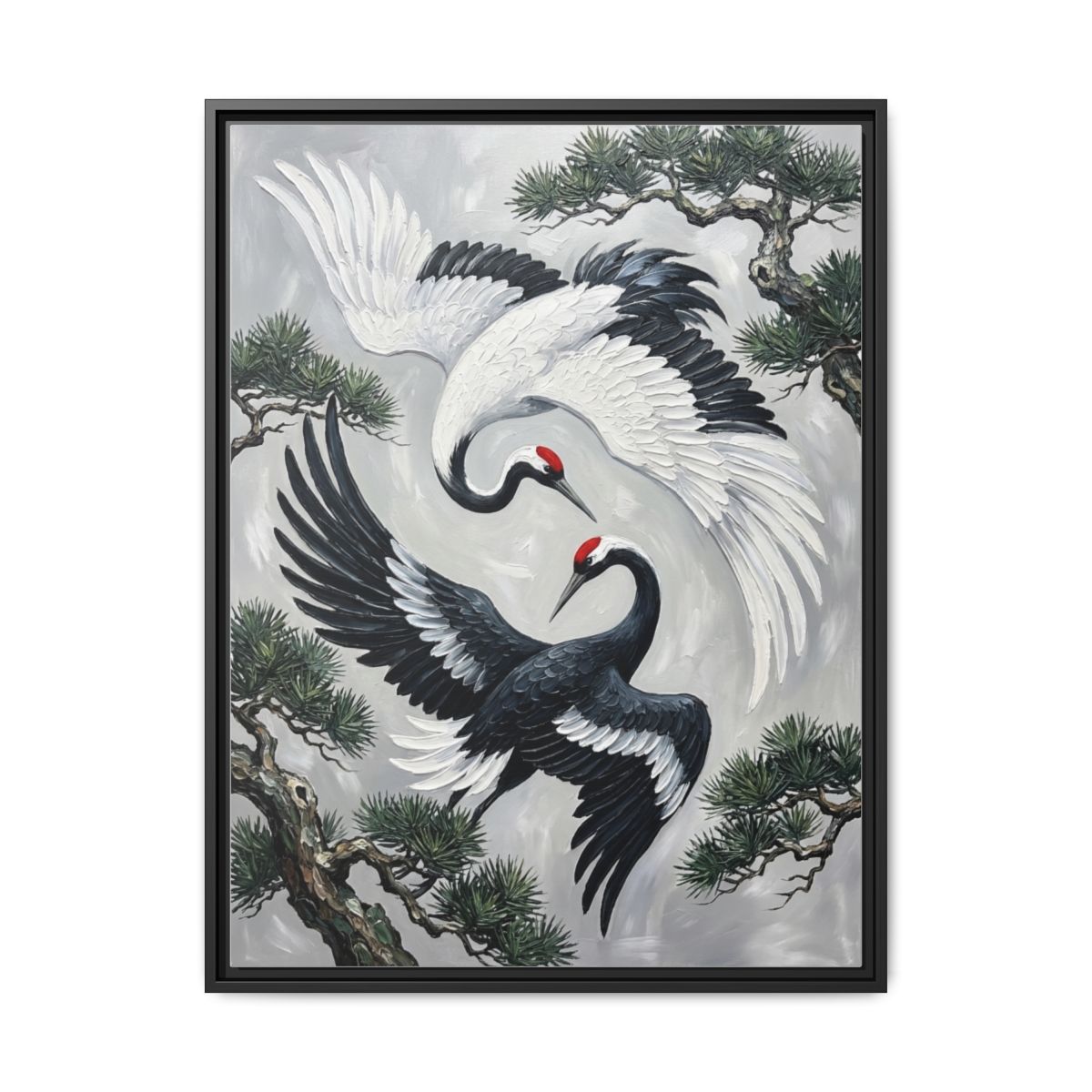

Two cranes circle each other in a yin-yang composition rendered in flowing black ink with a single bold red accent. The piece captures the sumi-e tradition of decisive brushwork while the circular composition adds a contemporary graphic quality that works in both traditional and modern interiors. The red hanko seal-style accent draws the eye to the centre and provides the only colour in an otherwise monochrome palette. Hang this in a living room or meditation space above a low console table for maximum impact. The 76 by 102 cm (30 by 40 inch) size fills a wall section between 120 and 150 cm (47 to 59 inches) wide without crowding.
2. Ronin Samurai Cherry Blossom Canvas Wall Art
This piece merges two iconic Japanese motifs: the solitary ronin warrior and cascading cherry blossoms. The woodblock-style rendering uses muted greys and charcoal with soft pink sakura petals drifting across the composition, creating a balance between strength and delicacy. The ukiyo-e influence is clear in the flat colour planes, bold outlines, and dramatic cropping of the figure. It works beautifully in living rooms, hallways, and home offices where you want art that tells a story. Our customers frequently pair this with dark wood furniture and natural linen textiles for a culturally rich interior.
View the Ronin Samurai Cherry Blossom
3. Lotus Flower Canvas Wall Art
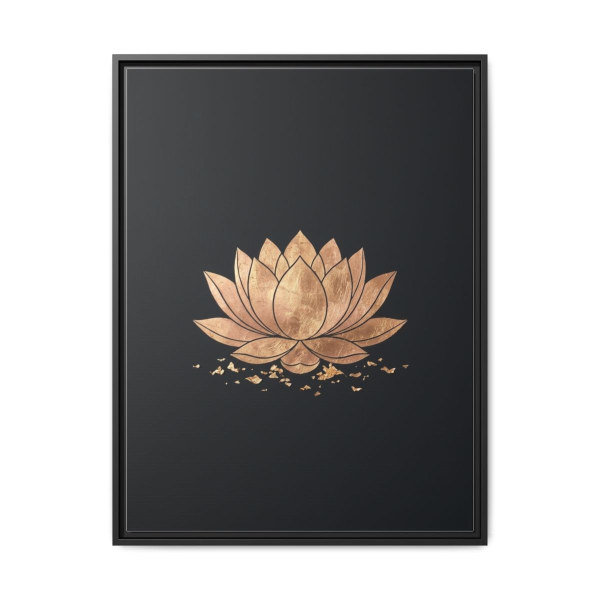

Gold leaf petals unfold against a solid black background in this piece that distils the lotus, a symbol of purity and spiritual awakening across Japanese Buddhism, into its most elemental form. The gold-on-black palette gives the canvas a luxurious presence that works in bedrooms, bathrooms, and spa-like spaces. At 61 by 91 cm (24 by 36 inches), it fits comfortably above a bathroom vanity or bedside, adding warmth without overwhelming smaller rooms. The metallic tones catch ambient light throughout the day, giving the piece a living quality that changes from morning to evening. Pair it with dark charcoal walls and brass hardware for a Zen sanctuary effect.
4. Golden Dragon Canvas Wall Art
The dragon, or ryu, holds a central place in Japanese mythology as a guardian of water, wisdom, and prosperity. This canvas renders the creature in flowing watercolour washes of jade green and shimmering gold, with wisps of cloud and mist trailing from its form. The composition draws from traditional scroll painting, where the dragon emerges from fog to suggest power that is felt rather than fully revealed. This piece makes a bold statement in living rooms, dining rooms, and entryways. The jade and gold palette aligns with feng shui principles that associate these colours with abundance and growth, making it a meaningful choice for spaces where you gather with family and guests.
5. Samurai Armor Canvas Wall Art

A close-up study of samurai armour, this canvas focuses on the intricate construction of a shogun-era helmet (kabuto), face guard (menpo), and layered shoulder plates. Deep blacks, oxblood reds, and burnished gold create a palette that is both masculine and refined. The dark, dramatic mood works in home offices, gaming rooms, and bedrooms with dark accent walls. Unlike full figure portraits, the tight crop on the armour turns the warrior's equipment into an abstract study of pattern and craftsmanship. We have found that this piece pairs well with industrial and dark academia interiors, where the metallic accents in the art echo exposed steel, leather, and aged wood throughout the room. Position it at 145 cm (57 inches) centre height for optimal viewing from a desk chair or sofa.
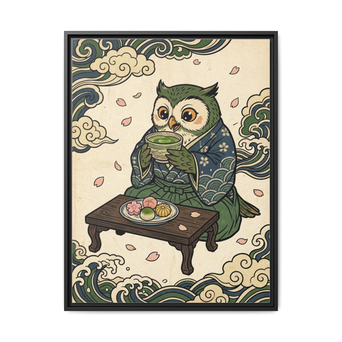
6. Owl and Matcha Tea Canvas Wall Art
A wise owl perches beside a steaming bowl of matcha in this charming ukiyo-e-inspired composition that brings warmth and personality to kitchens, dining rooms, and breakfast nooks. The cream, sage green, and navy palette keeps the mood sophisticated while the whimsical subject matter adds a touch of playfulness. The woodblock-style rendering includes traditional pattern details in the owl's feathers and the ceramic tea bowl, rewarding close inspection. This is the piece for anyone who wants Japanese wall art that sparks conversation rather than quiet contemplation. Hang it at 140 to 145 cm (55 to 57 inches) centre height in a kitchen, slightly lower than standard living room placement, because viewers are typically seated at a counter or table.
Placement and Sizing Guide for Japanese Wall Art
Japanese design principles offer specific guidance on where and how to hang art. These rules differ from standard Western gallery practice in important ways.
The tokonoma principle. In a traditional Japanese home, the tokonoma is a recessed alcove dedicated to displaying a single scroll painting, a flower arrangement, or a ceramic piece. Only one item occupies the space at a time. Apply this principle to your walls by giving each Japanese canvas its own dedicated wall section with generous breathing room on all sides. Allow at least 20 to 25 cm (8 to 10 inches) of clear wall space above and below the frame, and 30 cm (12 inches) or more on each side.
Eye-level hanging. The standard centre height for wall art is 145 to 152 cm (57 to 60 inches) from the floor. For Japanese art in a Japandi or Zen-inspired room, we recommend staying at the lower end of this range, around 145 cm (57 inches), to create a grounded, contemplative feel rather than an elevated gallery mood.
Above furniture rules. When hanging art above a sofa, the bottom edge of the frame should sit 15 to 20 cm (6 to 8 inches) above the top of the sofa back. The canvas width should be between 50 and 75 percent of the furniture width. A 76 cm (30 inch) wide canvas works above a 102 to 152 cm (40 to 60 inch) console table. A 102 cm (40 inch) wide canvas suits a standard 180 to 210 cm (71 to 83 inch) sofa.
Lighting for Japanese art. Avoid direct spotlights that create hot spots on the canvas surface. Japanese art benefits from soft, diffused lighting that mimics natural daylight. A warm white LED picture light (2700 to 3000 Kelvin) mounted 20 cm (8 inches) above the frame and angled at 30 degrees provides even illumination without glare. If you prefer ambient lighting, position a floor lamp 60 to 90 cm (24 to 36 inches) to one side so the light washes across the canvas at a shallow angle. For a detailed lighting walkthrough, see our guide to lighting wall art.
Pairing with furniture. Japanese wall art responds well to natural materials: walnut, oak, and ash wood furniture, stone or ceramic tabletop objects, and natural fibre textiles like linen, cotton, and jute. Avoid pairing delicate ink-wash art with high-gloss lacquered furniture, which creates visual competition. Instead, choose matte or satin finishes that complement the canvas texture. For more on matching art to furniture, read our furniture-matching guide.
Common Mistakes to Avoid
1. Mixing too many Japanese styles in one room. An ukiyo-e samurai print, a sumi-e bamboo scroll, a cherry blossom triptych, and a modern Tokyo cityscape all on the same wall creates visual chaos, not cultural depth. Choose one tradition or colour family per room and build around it. A living room might feature the Yin Yang Cranes as a focal point with no competing artwork on adjacent walls.
2. Hanging Japanese art on busy backgrounds. Patterned wallpaper, textured stone feature walls, and brightly coloured accent walls fight with the subtlety of Japanese composition. These pieces need a quiet backdrop: flat matte paint in white, warm cream, pale grey, or soft sage. The art should be the most detailed element in its visual field.
3. Treating all Asian art as interchangeable. Japanese, Chinese, Korean, and Southeast Asian art traditions have distinct aesthetics, symbols, and histories. A Chinese dragon scroll and a Japanese sumi-e landscape carry different cultural meanings and visual languages. When building a Japanese-themed wall, stay within Japanese traditions or clearly Japandi fusion rather than mixing references from different cultures.
4. Ignoring scale in Zen-inspired rooms. Minimalist and Zen rooms need fewer, larger pieces. A cluster of small 20 by 30 cm (8 by 12 inch) prints contradicts the philosophy of purposeful simplicity. Choose a single canvas of at least 61 by 91 cm (24 by 36 inches), or go larger at 76 by 102 cm (30 by 40 inches) for rooms over 15 square metres (160 square feet). One commanding piece says more than five small ones.
5. Forgetting about viewing distance. Japanese ink-wash art often contains subtle gradients and fine brushwork detail that disappears from across a large room. In a spacious living area, choose pieces with bolder compositions (the Golden Dragon, the Samurai Armor) that read clearly from 3 to 5 metres (10 to 16 feet). Save the delicate, detail-rich pieces (the Lotus Flower, the Owl and Matcha Tea) for more intimate spaces where viewers will be within 1 to 2 metres (3 to 7 feet).
Japanese Wall Art FAQ
What is the difference between ukiyo-e and sumi-e?
Ukiyo-e is a woodblock printing technique that uses multiple carved blocks to apply layers of colour, producing vivid, detailed images of landscapes, people, and scenes of daily life. Sumi-e is ink-wash painting that uses only black ink at varying dilutions, applied with a brush in flowing, often spontaneous strokes. Ukiyo-e is graphic and colourful; sumi-e is monochrome and meditative. Both traditions are well represented in modern Japanese wall art.
Does Japanese wall art work in a modern apartment?
Yes. Japanese art is one of the most adaptable styles for contemporary spaces because its emphasis on clean lines, restrained colour, and negative space aligns naturally with modern interior design. A single ink-wash crane above a mid-century modern credenza, or a bold samurai print in a loft-style living room, creates a focal point that feels both timeless and current. The Japandi trend has made this pairing especially popular.
How do I choose between a bold statement piece and a subtle ink-wash print?
Consider the room's existing visual activity. If you already have patterned throw pillows, a textured rug, and multiple decorative objects, choose a quieter piece like the Yin Yang Cranes or Lotus Flower that calms the space rather than adding more stimulation. If the room is clean and minimal with neutral furniture, you can go bold with the Golden Dragon or Ronin Samurai to serve as the room's primary visual anchor.
What size Japanese wall art should I choose for above a sofa?
The canvas should be 50 to 75 percent of the sofa width. For a standard 200 cm (79 inch) sofa, that means a canvas between 100 and 150 cm (39 to 59 inches) wide. Hang the bottom edge 15 to 20 cm (6 to 8 inches) above the sofa back. A single large piece typically looks more intentional than a row of smaller frames, especially in Zen or Japandi interiors.
Can I mix Japanese wall art with other design styles?
Japanese wall art pairs well with Scandinavian, mid-century modern, industrial, and minimalist interiors. It can also complement boho and eclectic spaces if you limit the Japanese pieces to one or two and let them serve as grounding anchors. Avoid pairing Japanese art with maximalist or country cottage decor, where the aesthetic philosophies directly conflict.
Frequently Asked Questions
What colours work best with Japanese wall art?
Neutral tones work best: warm whites, soft greys, and natural wood. These allow the art to become the focal point without visual competition.
How do I hang Japanese art for a Zen look?
Leave generous negative space around the piece. Hang the centre at 145 cm (57 inches) from the floor. A single large piece creates more calm than a busy gallery wall.
What size Japanese art fits a bedroom?
For above a queen bed, 61 by 91 cm (24 by 36 inches) to 76 by 102 cm (30 by 40 inches) works well. Fill about two-thirds of the headboard width.
Can Japanese wall art work in a modern home?
Absolutely. Japanese minimalism and modern design share the same principles: clean lines, restrained colour, and intentional use of space.
Quick Reference Table
| Product | Best For | Dominant Colours | Link |
|---|---|---|---|
| Yin Yang Cranes | Living room, meditation space | Black, white, red | View |
| Ronin Samurai Cherry Blossom | Living room, hallway, home office | Grey, charcoal, pink | View |
| Lotus Flower | Bedroom, bathroom, spa space | Black, gold, tan | View |
| Golden Dragon | Living room, dining room, entryway | Gold, jade green, cream | View |
| Samurai Armor | Home office, gaming room, bedroom | Black, red, gold | View |
| Owl and Matcha Tea | Kitchen, dining room, breakfast nook | Cream, sage green, navy | View |
Bring Japanese Serenity to Your Walls
Japanese wall art does what few other styles can: it makes a room feel both more alive and more peaceful at the same time. Whether you gravitate toward the bold drama of a samurai print, the meditative calm of an ink-wash crane, or the playful charm of an owl with matcha, each piece carries centuries of artistic tradition into your modern space. The key is choosing one or two pieces that resonate with you, giving them room to breathe on the wall, and letting the art set the emotional tone for the entire room.
Ready to find your piece? Browse our complete Japanese wall art collection and bring the quiet power of Zen tradition into your home.