Color Drenching: Modern Wall Art for Moody Walls
The Heva Team
Art Curators & Interior Design Enthusiasts · April 1, 2026 · 13 min read
Color drenching wraps every surface in one immersive hue, and choosing the right wall art is what makes the look sing instead of disappear. This guide shows you exactly how to pair bold canvases with navy, forest green, terracotta, and other moody paint colors.
Color drenching is the boldest interior design move of 2026. Paint every surface in one saturated hue and you get a room that feels like a mood, not just a space. Charleston designers, Apartment Therapy editors, and everyone scrolling design feeds have declared it the technique of the year. But here is the challenge nobody talks about: once your walls, trim, ceiling, and baseboards all share the same deep navy, forest green, or terracotta, your art can vanish or, worse, clash. This guide tells you exactly which canvas prints create a dramatic, cohesive look on a color-drenched wall, with real measurements, pairing charts, and six hand-picked prints from HEVA Unique Art Gallery.
Ready to browse? Shop the full wall art collection and filter by color or style.
What Is Color Drenching?
Color drenching means painting every surface in a room the same hue, or very close tonal variations of it. Walls, ceiling, trim, baseboards, door frames, and built-ins all receive the same paint. The result is an enveloping, cocoon-like atmosphere that designers describe as immersive and emotionally grounding.
How It Differs from an Accent Wall
An accent wall is a single contrasting panel behind a sofa or bed. Color drenching is the opposite philosophy: it eliminates contrast at the architectural level. According to Swatchbox's deep-dive on monochromatic interiors, a fully drenched room "reduces cognitive labor, creates a continuous visual pathway, and quiets the mind because there is no competition for attention." The art becomes the only source of contrast, which is why choosing the right canvas matters so much.
Why 2026 Is the Year of Color Drenching
The pendulum has swung hard away from greige and white. Moody jewel tones, warm burgundies, forest greens, and deep navy blues dominate the 2026 paint forecast. As covered by Foyr's color psychology guide, saturated hues trigger specific emotional states: blue promotes calm and trust, green restores, deep red energizes and signals luxury. When a room is fully drenched in one of these shades, the psychological effect amplifies. Art then works as a punctuation mark inside that emotional field, not merely decoration.
Want to understand the deeper science behind this? Read our guide on the psychology of colors in wall art.
How to Choose Art for a Drenched Wall
Contrast vs. Tonal Harmony
You have two strategic choices when hanging art on a color-drenched wall:
- High contrast: Art that introduces a color not present in the wall paint, for example a gold-and-cream abstract on a deep navy wall. This makes the canvas "pop" like a window into another world.
- Tonal harmony: Art that shares the wall's color family but in a lighter or more saturated variation, for example a pale dusty rose print on a deep terracotta wall. The piece integrates softly and adds depth without visual shock.
Neither is wrong. High contrast reads as bold and editorial. Tonal harmony reads as sophisticated and layered. The rule: pick one strategy per room and commit.
The "Float" Effect
On a white wall, art sits against a neutral field. On a drenched wall, art floats. The surrounding color acts as a visual mat, drawing the eye to the canvas with more intensity than any frame could. This means mid-sized prints (60 x 80 cm / 24 x 31 in) that might feel modest on a white wall become statement pieces on a deep-colored surface. You generally need less art in a drenched room, not more.
Frame Color Matters More Than Usual
On white walls, a black or natural wood frame reads as a clean contrast. On a drenched wall, a black frame on a dark navy wall can dissolve. Options that work reliably:
- Gold or brass frames on deep tones (navy, forest green, burgundy)
- White or cream frames on earthy midtones (terracotta, olive)
- Floating frameless gallery wraps for a minimal, modern approach
For more on sizing your art to the wall, see our complete guide to wall art sizing.
Specific Color Pairings: Wall vs. Art
Navy Blue Walls
Navy is the most searched color-drenching shade of 2026. It reads as luxurious, calm, and deeply sophisticated. Art that works:
- Gold and warm cream abstracts (maximum contrast, maximum drama)
- Coral and terracotta prints (complementary contrast, warm against cool)
- Black and white line art (graphic punch without competing hues)
- Avoid: dark burgundy or dark forest green art, which can merge with the wall
Forest Green Walls
Forest green is earthy and grounding. It pairs beautifully with warm, natural tones. Art that works:
- Warm terracotta, rust, or amber botanical prints
- Cream and off-white floral canvases
- Gold metallic abstracts
- Avoid: cool-toned blues and purples, which flatten the warmth of the green
Terracotta and Earthy Red Walls
Terracotta is the color of unglazed pottery and Italian villas. Art that works:
- Teal and dusty blue canvases (direct complement for terracotta)
- Cream and sand-toned botanicals
- Black and white photography for a clean editorial break
- Avoid: orange-adjacent art that blends into the wall
Burgundy and Deep Plum Walls
Burgundy is rich and maximalist. Art that works:
- Gold portrait prints (regal and harmonious)
- Dusty pink florals (tonal but lighter)
- Black and white with gold accents
- Avoid: cool gray or silver tones, which can feel cold against warm burgundy
For more on wall art color strategy, read our wall art color guide: colors that pop.
6 Canvas Picks for Moody Color-Drenched Walls
Each print below has been selected for its contrast value, color story, and ability to hold its own against a saturated wall. All sizes shown in both centimeters and inches.
1. Geometric Texture Panels | Walnut Gold Abstract
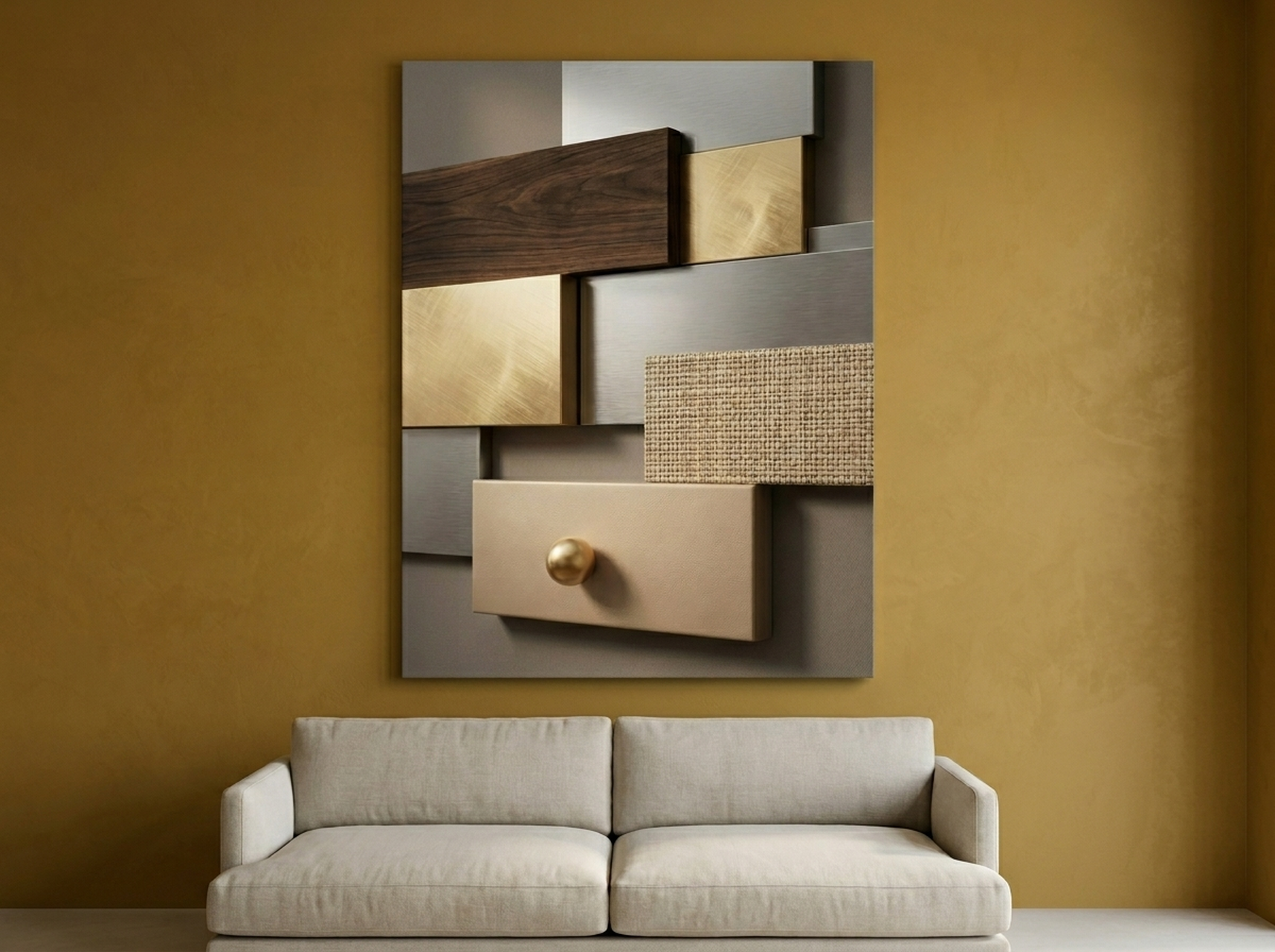
Warm walnut browns and burnished gold tones give this geometric panel print serious staying power on deep-toned walls. On a navy or forest green backdrop, the gold pulls forward dramatically. On a terracotta wall, the warm browns create a sophisticated tonal layer that adds depth without overwhelming. Recommended sizes: 61 x 91 cm (24 x 36 in) for a focused statement, or 91 x 122 cm (36 x 48 in) as an anchor piece. Best for: hallways, living room feature walls, home offices with dark paint.
2. Geometric Starburst | Coral Red Op Art
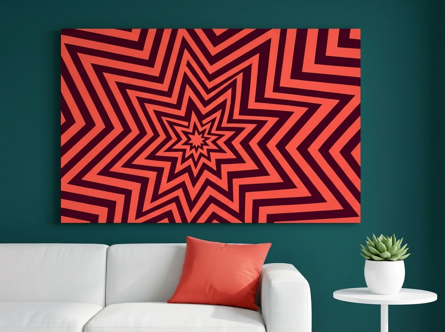
This coral-red retro starburst is one of the highest-contrast choices for a navy or dark teal color-drenched room. The warm coral hits the cool navy like a flare, creating a focal point you cannot ignore. The op-art burst pattern adds visual movement that energizes deep moody spaces instead of sinking into them. Recommended size: 61 x 61 cm (24 x 24 in) square for a graphic, gallery-wall anchor. Best for: living rooms with navy or charcoal drenching, bold maximalist spaces. (source: Architectural Digest)
3. Black Panther Glitch Art | Gothic Vaporwave Dark Floral
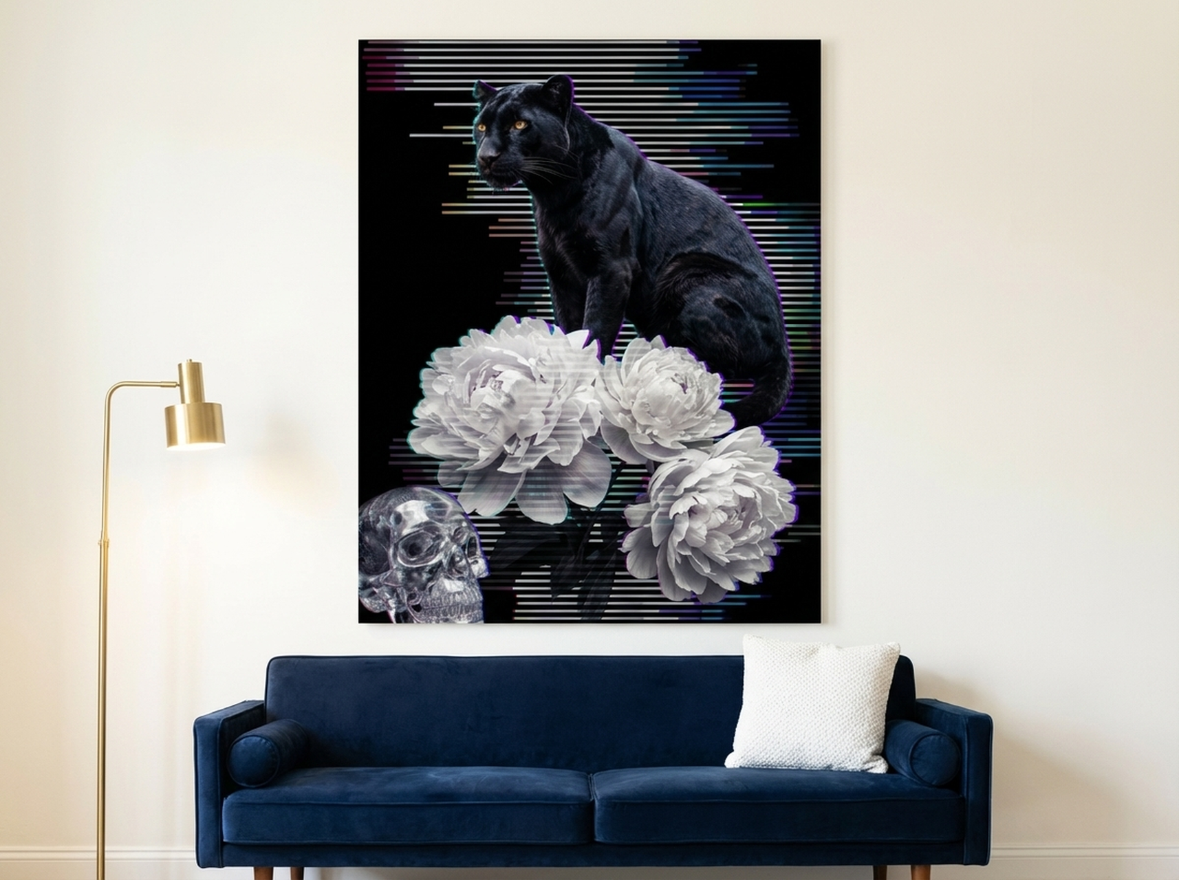
This is the print for full commitment to dark drama. The gothic vaporwave floral palette pulls electric violets, deep pinks, and inky blacks into one canvas that was born to live on a forest green, charcoal, or midnight blue wall. Rather than creating contrast by opposition, it deepens the color story of the drenched room, adding layers of texture and mystery. Recommended size: 76 x 101 cm (30 x 40 in). Best for: dark academic bedrooms, moody reading rooms, maximalist apartments with dark drenching. See also our dark academia wall art guide.
4. Curated Objects Collage | Blush Pink Maximalist
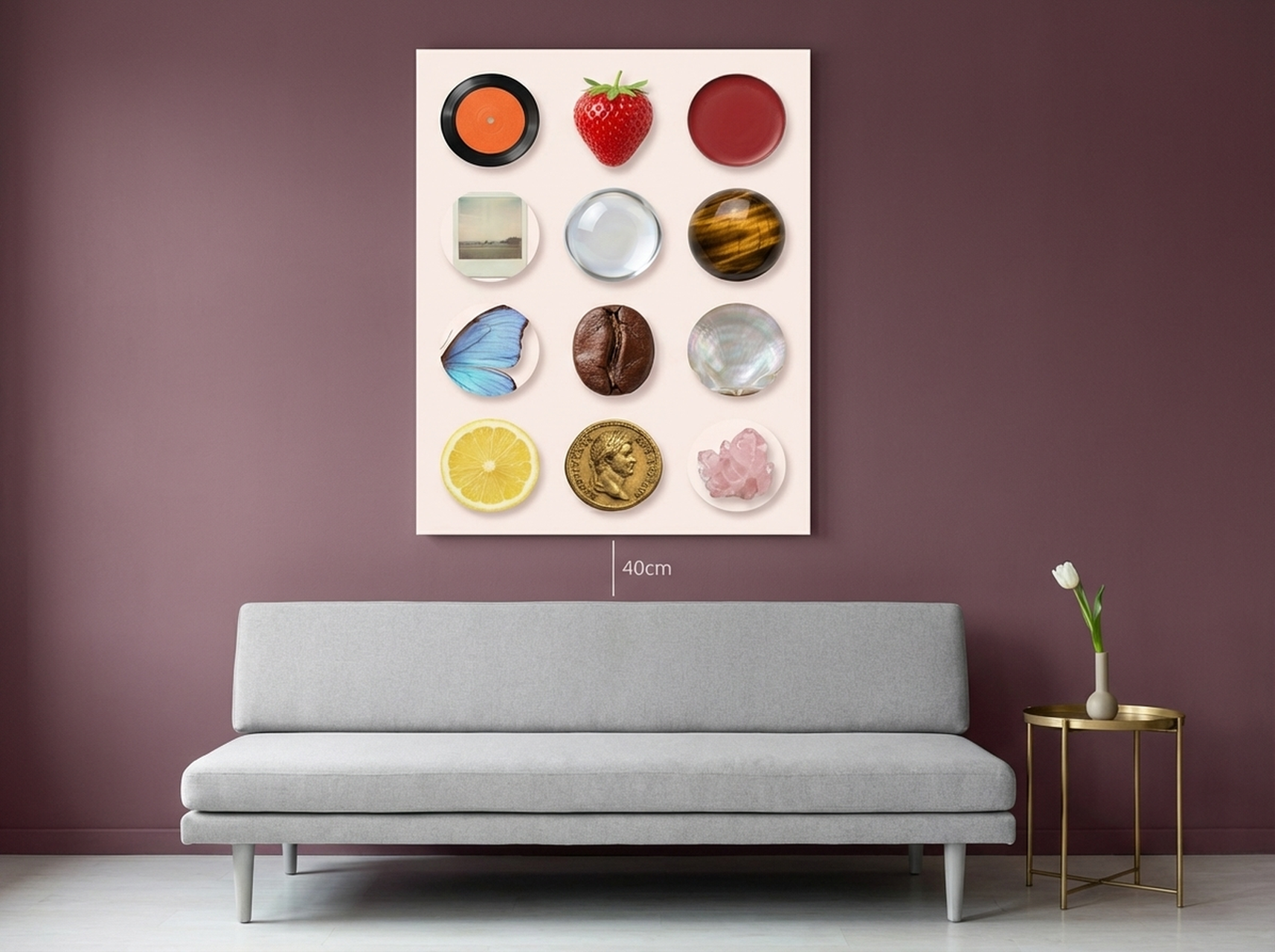
Soft blush and cream tones make this maximalist collage a natural counterpoint to deep burgundy, forest green, or dark terracotta walls. It introduces lightness into a drenched room without breaking the immersive mood, functioning as a breath of fresh air within a saturated space. The layered object composition gives the eye multiple points to land on, which is ideal for larger drenched walls that need visual complexity. Recommended size: 61 x 91 cm (24 x 36 in) or larger. Best for: dining rooms, maximalist bedrooms with rich wall colors, eclectic spaces.
5. Gold King Portrait | Editorial Metallic Black
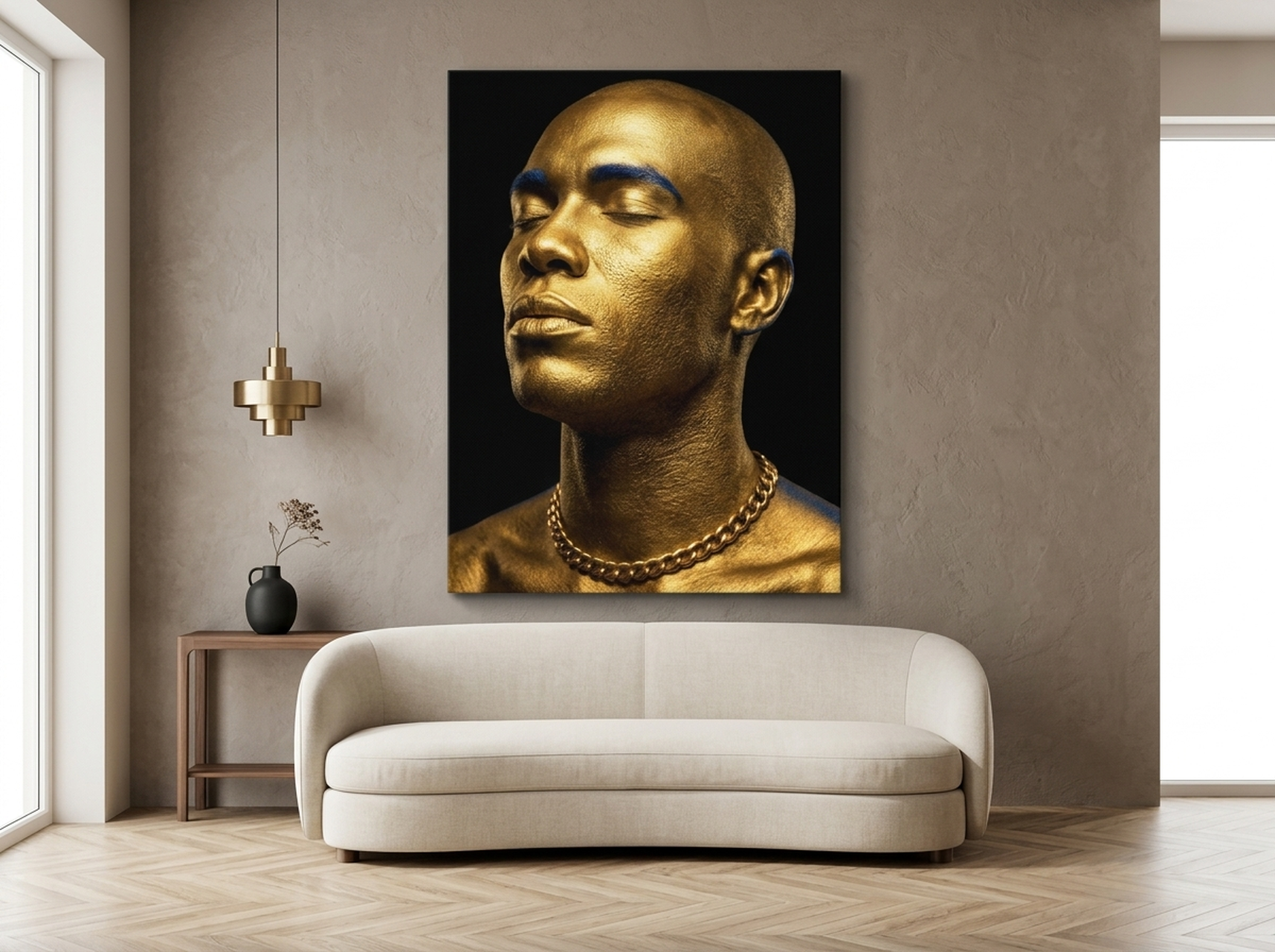
Gold and black is the most reliable high-contrast combination for any dark color-drenched wall. This editorial portrait channels luxury editorial photography with a metallic gold overlay that elevates the piece beyond decoration and into statement art. On a deep navy or charcoal drenched wall, the gold becomes luminous. On burgundy, it reads as regal and intentional. Recommended size: 61 x 91 cm (24 x 36 in) portrait orientation. Best for: entryways, dining rooms, and luxury living rooms with dark drenching. Related reading: quiet luxury wall art guide.
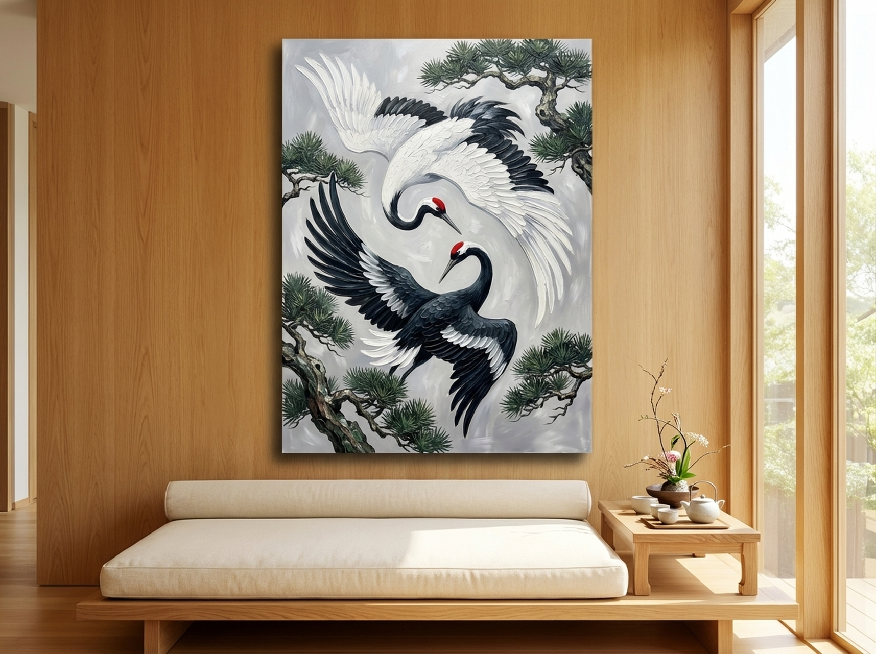
6. Yin Yang Cranes | Japanese Ink Painting Black White Red
This Japanese ink-style yin yang crane composition delivers striking black, white, and red contrast that cuts through any drenched wall without fighting it. The graphic simplicity of the yin yang circle acts as a visual anchor that grounds even the most saturated room. The red accent prevents it from going cold. Ideal for spaces drenched in navy, slate, or forest green. Recommended size: 61 x 61 cm (24 x 24 in) or 76 x 76 cm (30 x 30 in) square. Best for: zen-inspired rooms, open-plan living areas, minimalist moody spaces. For more black and white art ideas, see black and white wall art for any style room.
Placement Guide for Color-Drenched Walls
Hanging art on a drenched wall requires slightly different thinking than hanging on white. The wall actively participates in the composition. Use these guidelines:
Standard Solo Piece
- Center the canvas at eye level: 145 to 152 cm (57 to 60 in) from the floor to the center of the art.
- On a drenched wall, leave at least 30 cm (12 in) of clear wall above furniture. The drenched color itself acts as a visual breathing zone.
- Minimum recommended canvas size on a drenched wall: 61 x 91 cm (24 x 36 in). Smaller pieces can disappear in the saturated field.
Gallery Wall on a Drenched Surface
- Keep gallery walls tighter than on white walls: 5 to 8 cm (2 to 3 in) spacing between frames, versus the 10 cm (4 in) standard on white.
- Treat the entire cluster as one large piece: aim for a total cluster width of 120 to 180 cm (47 to 71 in) on a standard room wall.
- Use consistent frame finishes to avoid visual fragmentation against the drenched surface.
Oversized Statement Piece
- For rooms drenched in very dark shades (navy, charcoal, forest green), an oversized canvas of 91 x 121 cm (36 x 48 in) or larger can command the space without overcrowding.
- Position so at least 20 cm (8 in) of wall remains visible on each side of the canvas to preserve the float effect.
- Lighter canvas backgrounds work best at large scale: cream, gold, or blush tones maximize the contrast punch.
Need more sizing help? Our abstract wall art ideas for every room covers room-by-room sizing strategies.
5 Common Mistakes to Avoid with Color Drenching and Wall Art
1. Hanging Art That Is Too Small
A color-drenched wall has visual mass that small art simply cannot hold its own against. A 30 x 40 cm (12 x 16 in) print that reads as charming on a white wall looks lost on a deep navy surface. Go larger than you think you need.
2. Matching Art Color Too Closely to the Wall
Tonal harmony is a valid strategy, but if the art and wall share exactly the same hue and value, the canvas disappears. You need at least a 30% lightness difference between the dominant wall color and the art's dominant tone. When in doubt, test by holding a print photo against a painted swatch in your lighting conditions.
3. Ignoring Artificial Lighting
Color-drenched rooms change dramatically under artificial light. A forest green that looks earthy and warm in daylight can turn cold and flat under cool LED bulbs. Art colors shift too: warm golds deepen, pastels gray out. Always view your art under the room's actual lighting conditions before committing to placement.
4. Using Too Many Art Pieces
White walls forgive a dense gallery wall. Drenched walls do not. Every additional canvas multiplies visual complexity against an already strong color field. In most color-drenched rooms, one large statement piece or a tightly curated grouping of two to three prints works better than a sprawling gallery wall.
5. Choosing Cold-Toned Art for Warm-Toned Drenching
Cool grays, icy blues, and cool lavenders fight against warm-toned drenching colors like terracotta, burgundy, or rust. The clash reads as a design mistake rather than intentional contrast. For warm drenched walls, keep art in the warm family (gold, cream, warm white, coral, blush) or go to a true neutral (black and white).
Frequently Asked Questions
What art goes with dark walls?
On dark walls, art with light or warm tones creates the strongest visual impact. Gold abstracts, cream florals, coral bursts, and black-and-white photography all read clearly against deep navy, forest green, charcoal, or burgundy. The key is choosing art whose dominant color is at least two to three shades lighter or warmer than the wall paint. Highly saturated art in a contrasting color, such as coral on navy, also works well.
How do you avoid art disappearing on dark paint?
Three tactics prevent art from disappearing on dark paint: (1) Choose art with high contrast relative to the wall, meaning light or warm tones against dark cool paint, or vice versa. (2) Go larger than you would on a white wall. A minimum of 61 x 91 cm (24 x 36 in) is recommended for drenched surfaces. (3) Light the art directly with a picture light, LED strip behind the canvas, or an angled ceiling spotlight. Proper lighting multiplies the contrast of any canvas against a dark wall.
Can you do color drenching in a small room?
Yes, and it often works better in small rooms than large ones. Color drenching in a small space creates an intimate, jewel-box effect by eliminating visual breaks at corners and ceiling lines. The room feels intentional and complete rather than cramped. Use lighter saturated tones, such as dusty sage or warm terracotta, rather than very dark shades if you want the space to feel open. One large-format canvas is typically enough art for a small color-drenched room.
Does color drenching work with abstract art?
Abstract art is arguably the best choice for color-drenched rooms. Abstract canvases introduce color and texture without competing narrative content, so the eye rests on the interplay between the wall and the art rather than reading a specific scene. Geometric abstracts with high contrast tones, and expressionist abstracts with bold brushwork, both perform exceptionally well against saturated drenched walls.
What is the difference between color drenching and an accent wall?
An accent wall uses one painted wall as a contrast point against three neutral walls. Color drenching covers every surface, including ceiling, trim, and baseboards, in the same hue or close tonal variations. Color drenching is a whole-room commitment; an accent wall is a highlight within a neutral room. The psychological effect is completely different: drenching is immersive and enveloping, while accent walls create directional focal points within a larger neutral space.
How many art pieces should you hang in a color-drenched room?
In most color-drenched rooms, less is more. One large statement canvas of 76 x 101 cm (30 x 40 in) or larger anchors the wall without overcomplicating the drenched palette. If you prefer a gallery cluster, limit it to two or three pieces with tight 5 to 8 cm (2 to 3 in) spacing, treated as a single compositional unit. Avoid spreading multiple unrelated pieces across a drenched wall, as the visual competition with the strong background color multiplies quickly.
Quick Reference Table: Art vs. Wall Color
| Canvas | Best Wall Color | Style | Link |
|---|---|---|---|
| Geometric Texture Panels | Walnut Gold | Navy, Forest Green, Charcoal | Abstract, Geometric, Luxury | Shop |
| Geometric Starburst | Coral Red | Navy, Dark Teal, Midnight Blue | Abstract, Op-Art, Retro | Shop |
| Black Panther Glitch Art | Dark Floral | Forest Green, Charcoal, Midnight | Animal, Abstract, Gothic | Shop |
| Curated Objects Collage | Blush Pink | Burgundy, Forest Green, Deep Terracotta | Maximalist, Still-Life | Shop |
| Gold King Portrait | Metallic Black | Navy, Burgundy, Charcoal, Deep Plum | Portrait, Luxury, Editorial | Shop |
| Yin Yang Cranes | Black White Red | Navy, Slate, Forest Green | Cultural, Abstract, Zen | Shop |
Ready to Drench Your Walls in Color?
Color drenching is one of 2026's most powerful interior design moves, and the right canvas art is what elevates it from trendy experiment to timeless room. Whether you anchor a deep navy wall with a gold geometric canvas, punctuate a forest green room with coral op-art, or let a gothic floral print deepen a dark charcoal space, the prints above are designed to hold their own against the boldest paint colors on the market.
Browse the complete collection and filter by color palette, style, or room type at HEVA Unique Art Gallery. Each canvas ships ready to hang, framed in a finish that complements moody, saturated walls.
Still planning your color scheme? Explore our full abstract wall art ideas guide for room-by-room inspiration, or revisit the psychology of colors in wall art to choose a palette that matches your emotional goals for the space.