Quiet Luxury Wall Art: The Art of Subtle Elegance
The Heva Team
Art Curators & Interior Design Enthusiasts · April 1, 2026 · 13 min read
Quiet luxury wall art guide: understated elegance for modern homes. Expert tips on colour, texture, sizing, and 6 curated picks that whisper wealth without shouting it.
Quiet Luxury Wall Art: The Art of Subtle Elegance
Quiet luxury swept through fashion in 2023 -- and by 2026 it has completely redefined what expensive-looking means in home decor. The movement, rooted in old-money understatement rather than conspicuous consumption, asks a radical question: what if the most sophisticated thing you could do was nothing flashy at all?
Nowhere is that question answered more powerfully than in the art you choose to hang on your walls. The right quiet luxury wall art does not announce itself. It does not rely on a recognisable brand, a trending colour, or an obvious status symbol. It simply is -- confident, composed, and quietly extraordinary.
This guide covers everything you need to know: the palette, the textures, the sizing rules, the framing, the mistakes to avoid, and six carefully chosen pieces from our collection that embody the aesthetic perfectly.
Ready to browse the full collection? Explore quiet luxury wall art at HEVA -- or keep reading for the expert guide first.
What Is Quiet Luxury Wall Art?
Quiet luxury -- sometimes called the old money aesthetic -- is the art of appearing wealthy through restraint rather than display. Think Succession's Roy family apartment: almost no art, and what little exists is vast, neutral, and obviously expensive. Think The Row's barely-there garments. Think the Hamptons estate where every surface whispers heritage.
In home decor terms, quiet luxury wall art shares these characteristics:
- No logos, no branding, no obvious status signals. The piece earns attention through quality alone.
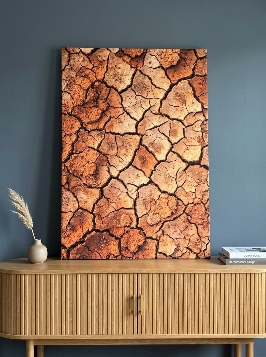
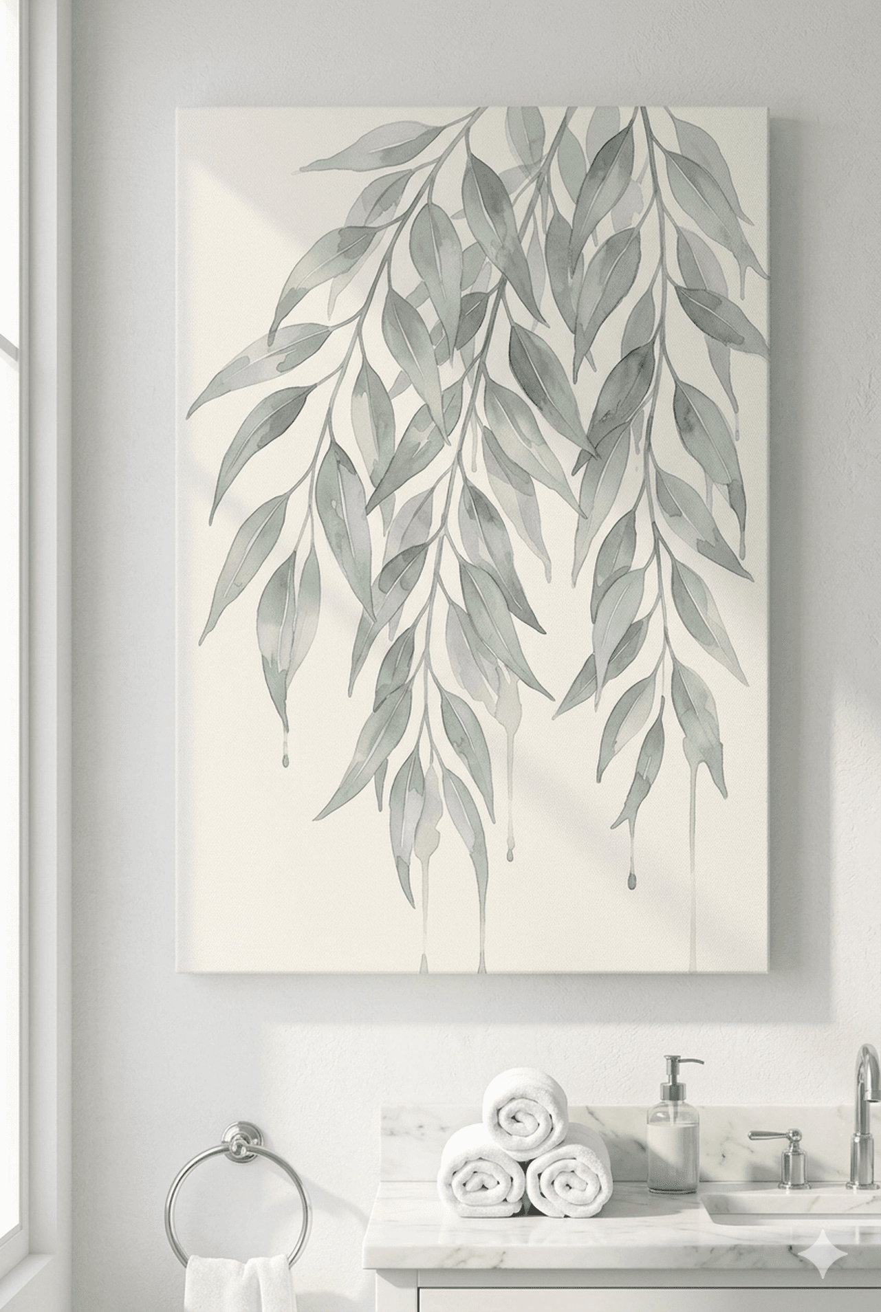
- Neutral or near-neutral palettes. Cream, champagne, warm white, taupe, sage, dusty rose. Colours that age gracefully.
- Abstract, botanical, geometric, or painterly subject matter. Nothing that screams a trend or a season.
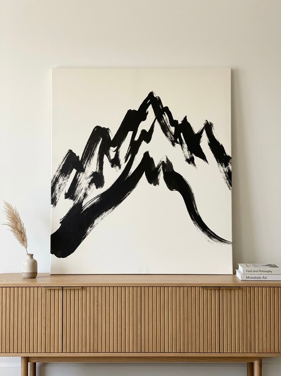
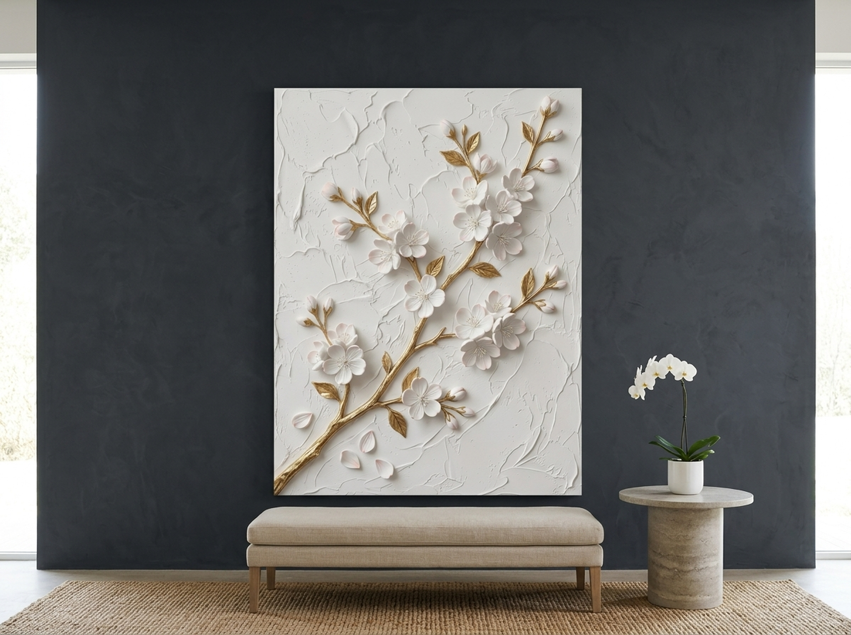
- Textural depth. Impasto brushwork, sculptural relief, woven-looking surfaces -- the kind of quality visible from across the room.
- Intentional scale. One large, considered piece rather than a cluttered gallery wall.
According to the quiet luxury aesthetic, the core tension is between conspicuous consumption (showing off) and connoisseurship (knowing quality when you see it). Wall art is one of the fastest ways to signal which side of that tension you are on.
As we explore in our guide to art that looks expensive at home, the price tag matters far less than the intention behind the choice.
The Quiet Luxury Colour Palette for Art
Colour is where most people either get quiet luxury right or get it badly wrong. The palette is tighter than most decorators expect.
The Core Quiet Luxury Art Palette
- Warm white and cream -- the foundation. Not clinical bright white, but the warmth of aged linen or unpainted plaster.
- Champagne and soft gold -- the metallic note. Brushed, never shiny. Present as an accent, not a dominant colour.
- Taupe and warm grey -- the neutrals. Earthy, grounded, sophisticated without effort.
- Sage -- the organic green. Muted, silvery, not lime. Think dried herbs, not a park in summer.
- Dusty rose and blush -- the soft warmth. A single note of warmth without ever becoming pink-pink.
- Camel and tan -- the leather tones. Referencing saddles, cashmere coats, aged books.
- Charcoal (used sparingly) -- grounding the composition without the harshness of black.
What to Avoid
Bright primary colours, neon accents, high-contrast rainbow palettes, electric blue, and anything that would look at home on a neon sign. Also avoid: stark white-only pieces with no warmth, overly saturated jewel tones used as the primary colour (they work only as an accent in very small doses), and colour-blocking in bold contrasts.
If you are uncertain, ask: would this palette look at home in a neutral cashmere sweater? If yes, it probably qualifies.
Texture Over Pattern: Why Textural Art Outperforms Busy Prints
One of the most useful insights from studying quiet luxury interiors is the consistent preference for texture over pattern. Here is why that matters for wall art selection.
A busy pattern -- bold geometric repetition, maximalist florals, high-contrast graphic prints -- draws the eye and holds it. That attention-seeking quality is the opposite of quiet luxury. The art competes with the room rather than composing it.
Textural art, by contrast, reveals itself gradually. An impasto-painted canvas with thick brushstrokes looks different in morning light than in lamplight. A sculptural relief piece casts soft shadows that shift through the day. A woven-looking or fabric-like print adds warmth without visual noise.
This is why abstract art -- particularly the painterly, process-led kind with visible mark-making -- performs so well in quiet luxury interiors. The texture signals craft and materiality. It rewards the person standing close as much as the person across the room.
For further reading on the power of considered simplicity, see our guide to minimalist wall art and the less-is-more approach.
Sizing for Quiet Luxury: One Large Statement Piece
The gallery wall trend -- a cluster of mismatched prints, frames, and mirrors -- is fundamentally at odds with quiet luxury. It reads as busy, eclectic, and effortful. Quiet luxury values the opposite: calm, edited, considered.
The rule is simple: one large statement piece per wall, not a collection of smaller ones.
Recommended Minimum Sizes
- Living room or bedroom focal wall: 80x100 cm (32x40 in) or larger. In a generous room, 100x120 cm or a diptych.
- Hallway or corridor: 60x80 cm (24x32 in) minimum, oriented vertically to use the height.
- Home office or study: 60x80 cm works well; slightly smaller is acceptable if the piece has strong textural presence.
- Dining room: Scale to the width of the dining table. The art should be roughly two-thirds the table's width, centered above it.
For detailed sizing charts for every room type, our wall art size guide for the living room covers the topic in full.
One important note: hang art slightly lower than you think. The centre of the piece should sit at approximately eye level (around 145-150 cm from the floor), not positioned to fill the upper half of the wall. Art hung too high immediately reads as amateurish and undermines the entire quiet luxury effect.
The Framing Guide: What Works and What Doesn't
Framing is the quiet luxury detail that most people overlook -- and it can make or break an otherwise perfect piece.
Frames That Work for Quiet Luxury
- Natural light wood (oak, ash, pine) -- adds warmth without weight. Works with cream, gold, and botanical palettes.
- Dark walnut or ebony wood -- more dramatic but still refined. Works especially well with neutral abstract art.
- Slim black metal -- clean, contemporary, recedes to let the art speak. Best for modern interiors.
- Brushed or matte gold -- the quiet luxury metallic. Not shiny brass. The finish should look aged or matte rather than bright.
- No frame / gallery wrap canvas -- often the most sophisticated choice. The image wrapping to the sides of a deep-profile canvas reads as confident and minimal.
Frames to Avoid
- Heavy ornate gold frames with embossed detail (they compete with the art and read as old-fashioned rather than old-money).
- Coloured frames in anything other than black, white, or natural tones.
- Thin, cheap-looking white box frames that flatten the image.
- Mismatched frame colours across multiple pieces in the same room (this signals impulsive buying rather than curation).
The framing decision connects directly to what we cover in our guide to how luxury wall art makes a room look expensive: the smallest details carry the heaviest weight. (source: Architectural Digest)
6 Quiet Luxury Art Picks from HEVA
Each of the following pieces was selected for its alignment with quiet luxury principles: understated palette, textural or painterly quality, and the kind of visual confidence that comes from restraint rather than effort.
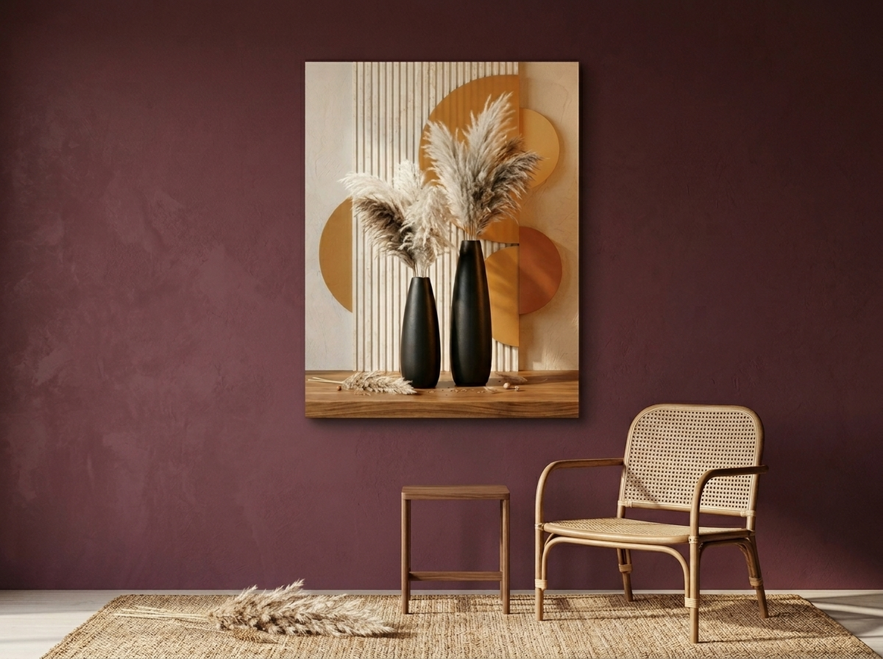
1. Pampas Vases Canvas Wall Art
Sculptural black-and-gold pampas vases rendered with an impasto-style finish. The tall, architectural forms carry the kind of composed confidence that defines quiet luxury: no explanation needed, no logo required. A natural fit for a living room or bedroom that favors restraint over spectacle.
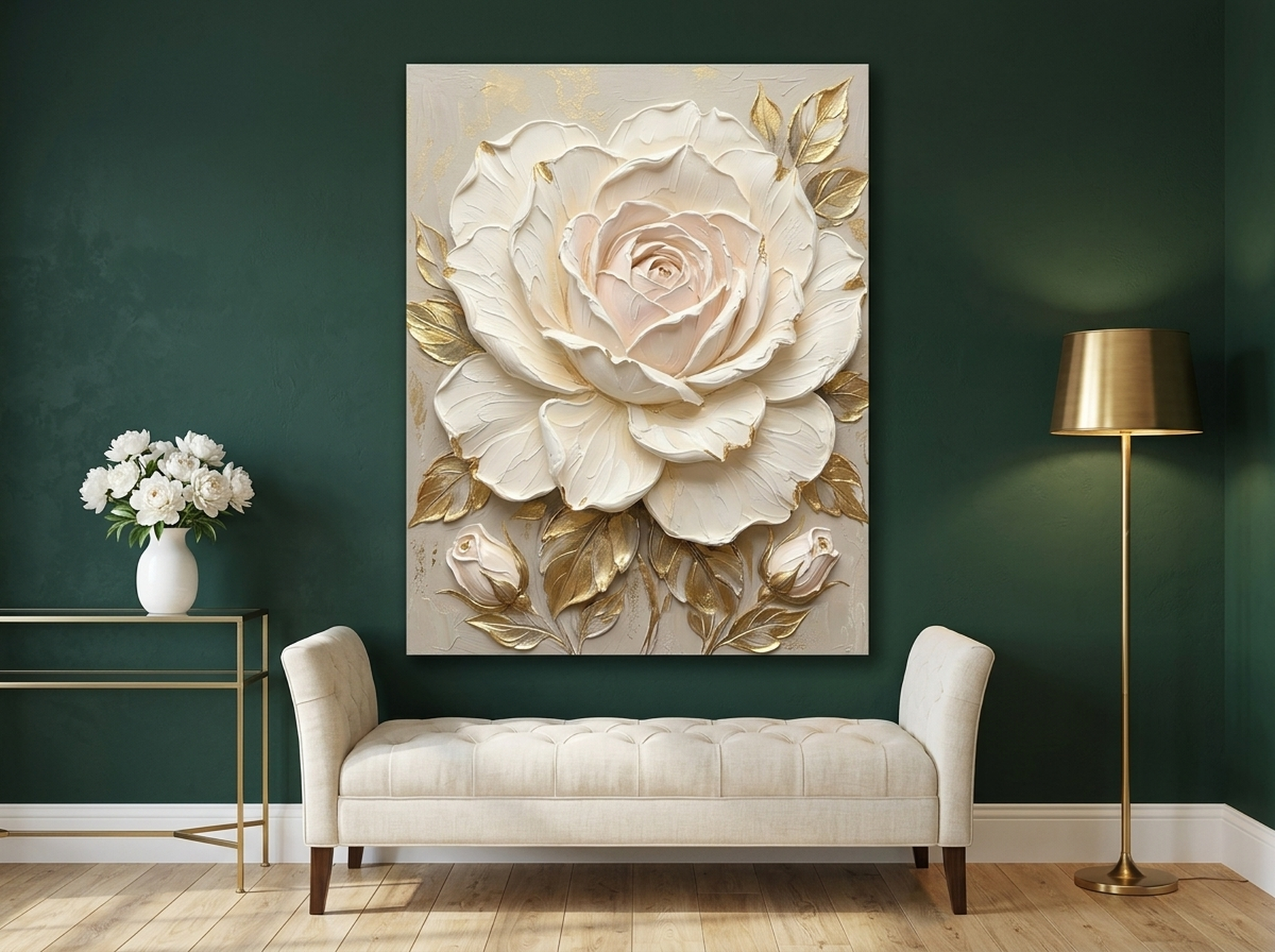
2. Oversized Rose Canvas Wall Art
A single oversized rose rendered in soft cream and champagne gold with thick impasto brushwork. This piece replaces a dozen noisy decorative objects with one quiet statement. The scale commands attention; the palette keeps everything calm. It is the definition of doing more with less.
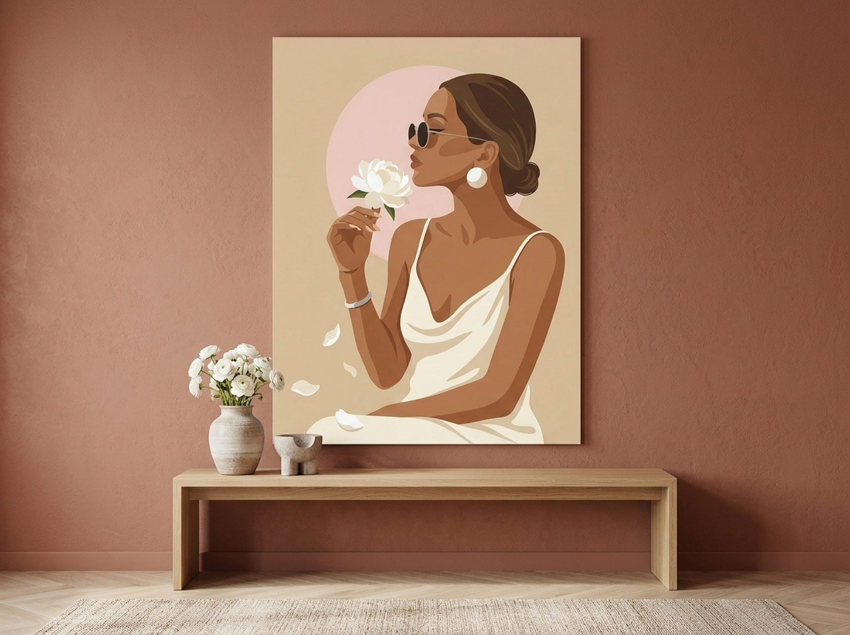
3. Woman Peony Canvas Wall Art
A fashion editorial portrait surrounded by soft peonies in a champagne and blush palette. The flat vector treatment gives it a refined, graphic quality without feeling trendy or dated. This is the kind of art that reads as curated rather than collected -- intentional, unhurried, sophisticated.
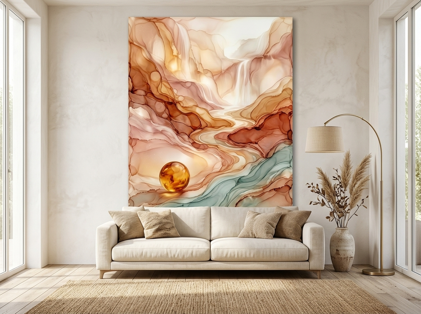
4. Fluid Abstract Landscape Canvas Wall Art
Warm gold, amber, and soft cream tones flow across this abstract landscape in organic, painterly layers. There is no hard subject here -- just color, movement, and depth. That ambiguity is precisely the point. Quiet luxury does not explain itself, and neither does this piece.
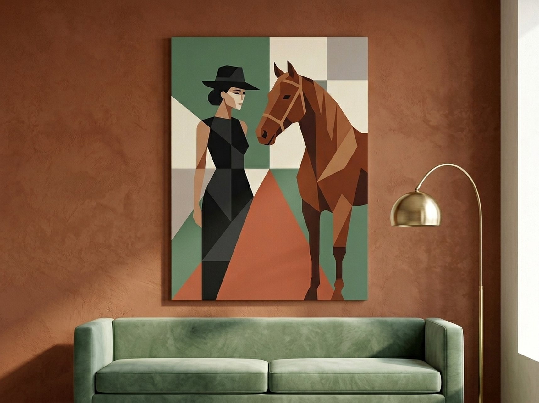
5. Woman and Horse Canvas Wall Art
A geometric abstraction of a woman and horse in sage, terracotta, and cream -- earthy, understated, deeply elegant. The subject evokes old-world equestrian culture, a classic quiet luxury reference point, while the geometry keeps it modern. Ideal for a study, hallway, or any space that rewards a second look.
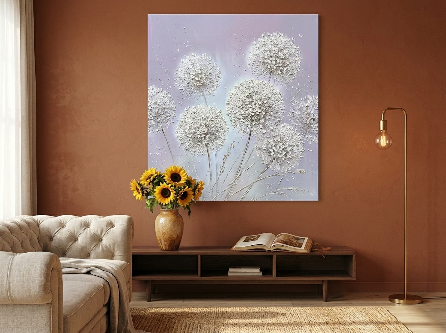
6. Allium Floral Canvas Wall Art
Lavender and silver allium blooms painted with a soft impasto technique against a pale grey background. The monochromatic near-palette creates the kind of tonal cohesion that interior designers spend hours chasing. Understated, refined, and naturally at home alongside warm whites and natural linen textures.
5 Common Quiet Luxury Art Mistakes to Avoid
1. Choosing Art That Is Obviously Cheap-Looking
Quiet luxury is not about spending more money -- it is about choosing art that looks intentional and considered. A poorly printed digital file with visible pixelation, a thin canvas that bends at the corners, or a faded reproduction without depth instantly undermines the aesthetic no matter how neutral the palette. Invest in quality print production and canvas depth.
2. Wrong Frame Choice
A beautiful piece in the wrong frame loses half its impact. Avoid heavy ornate frames, shiny gold, coloured frames, and cheap thin-profile boxes. When in doubt, choose a gallery-wrap canvas with no frame, or a slim natural wood option.
3. Over-Accessorising the Display
Quiet luxury means the art carries the wall alone. Resist the urge to surround it with shelves of books, trailing plants, scattered photo frames, and decorative clocks. Negative space is not empty -- it is the room breathing. Let the single large piece do its work without competition.
4. Choosing Art That Is Too Busy
A botanical print with 40 different species in jewel tones, a detailed cityscape in high contrast, a portrait surrounded by complex graphic elements -- these all violate the quiet luxury principle. The art should have visual breathing room within the piece itself: a single subject, generous negative space, a restrained colour count.
5. Following Trends Too Closely
The fastest way to undermine quiet luxury is to decorate with whatever is trending on social media this season. Quiet luxury art is not trendy -- it is timeless. Abstract works, botanical studies, tonal landscapes, and portrait art in neutral palettes all have a visual language that transcends seasons. See our ultimate guide to abstract wall art for pieces that will look as considered in ten years as they do today.
FAQ: Quiet Luxury Wall Art
What is quiet luxury wall art?Quiet luxury wall art refers to pieces that project understated elegance rather than obvious opulence. Think neutral palettes, abstract forms, botanical prints, and sculptural textures -- art that looks expensive without announcing itself. No logos, no bright colours, no busy patterns.
What colours work best for quiet luxury wall art?The quiet luxury colour palette for art centres on warm whites, champagne, cream, taupe, warm grey, dusty rose, sage, and camel. Metallic accents in brushed gold or bronze add depth without loudness. Avoid bright primary colours, neon tones, or high-contrast rainbow combinations.
How big should quiet luxury wall art be?For quiet luxury, one large statement piece (minimum 60x80 cm / 24x32 inches) almost always works better than a cluster of smaller prints. The single oversized piece reads as confident and curated. Gallery walls can feel busy and dilute the calm, edited feeling that defines the aesthetic.
What kind of frame suits quiet luxury art?The best frames for quiet luxury art are natural light or dark wood (oak, walnut), slim black metal, brushed gold, or no frame at all on a gallery-wrap canvas. Avoid heavy ornate frames, coloured frames, or anything that competes with the artwork. The frame should whisper, not shout.
Can abstract art work for quiet luxury interiors?Absolutely. Abstract art is one of the best quiet luxury choices because it prioritises form, colour, and texture over literal subject matter. Works with organic shapes, soft gradients, or painterly mark-making in a neutral palette are ideal. Avoid abstract art with jarring colour contrasts or overly graphic, poster-like compositions.
Is quiet luxury wall art only for minimalist homes?No. Quiet luxury art works in any interior that values quality over quantity. Whether your home is modern minimalist, classic traditional, Scandinavian, or eclectic, the principle is the same: choose art that feels intentional, refined, and timeless rather than trendy or flashy.
Quick Reference Table
Use this table when making decisions for any room in your home.
| Aspect | Quiet Luxury: Yes | Quiet Luxury: Avoid | Recommended Piece |
|---|---|---|---|
| Colour palette | Cream, champagne, sage, taupe, blush | Neon, electric blue, bright red, bold contrasts | Oversized Rose in Cream and Gold |
| Subject matter | Abstract, botanical, geometric, portrait | Logos, cartoon, slogans, pop art | Fluid Abstract in Gold and Amber |
| Texture | Impasto, sculptural relief, soft gradients | Flat digital prints, overly sharp outlines | Pampas Vases in Black and Gold |
| Sizing | One large piece (60x80 cm minimum) | Gallery wall clusters of small prints | Geometric Woman and Horse in Sage |
| Framing | Natural wood, slim black, brushed gold, unwrapped canvas | Ornate heavy frames, coloured frames | Woman and Peony Champagne Portrait |
| Mood | Calm, composed, timeless | Loud, trendy, attention-seeking | Allium Floral in Lavender and Silver |
For a deeper dive into colour selection, see our wall art colour guide.
Find Your Quiet Luxury Statement Piece
Every piece in the HEVA collection is printed on premium gallery-wrap canvas with archival inks and is available in multiple sizes. Whether you are furnishing a calm bedroom, a refined living room, or a composed home office, there is a piece in the collection that will speak in exactly the right tone: quietly, confidently, and lastingly.