Wall Art for Green Walls: Best Nature Pairings and Color Guides
The Heva Team
Art Curators & Interior Design Enthusiasts · April 2, 2026 · 10 min read
Green walls are having a moment, and it is easy to understand why. Whether you have gone deep with a forest green, warm with sage, or bold with emerald, a green wall is a statement of confidence, a declaration that your home is alive with color and intention. The challenge, and the opportunity, is choosing wall art for green walls that enhances rather than fights with that powerful backdrop.
Browse our nature collection for the perfect green wall pairing.
Understanding Green Wall Types
Not all green walls are created equal, and the specific shade of green you have chosen fundamentally shapes which art will look best on it. Understanding where your wall color sits on the green spectrum helps you make smarter, more confident art choices.
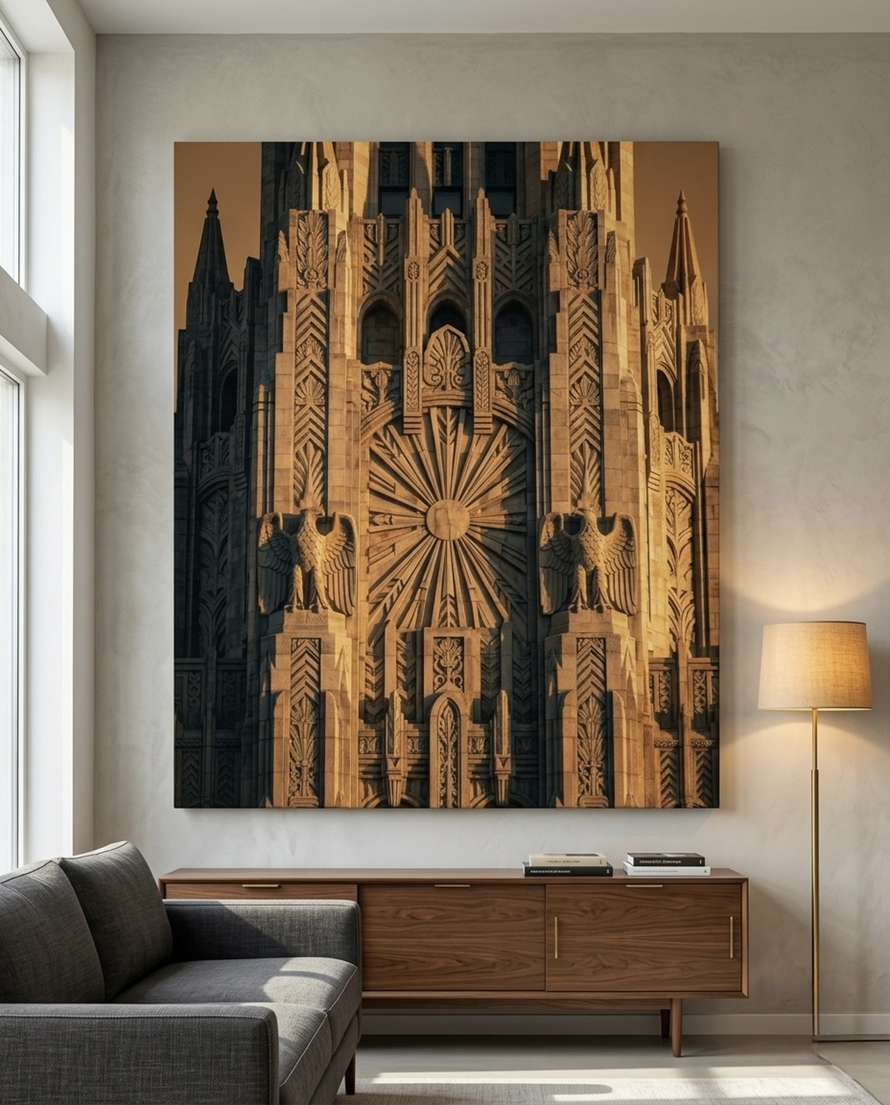
Forest green and hunter green are deep, rich tones that skew cool and dark. These walls have tremendous gravitas and work well in libraries, dining rooms, and home offices. Art on forest green walls needs enough contrast to emerge from the depth: warm golds, creams, and ambers work brilliantly, as do pieces with strong value contrast (light subjects against dark backgrounds). Very dark art, such as deep navy or charcoal, will disappear into forest green walls.
Sage green is one of the most versatile of the greens, warm, soft, and easy to live with. Sage walls are particularly popular in bedrooms and living rooms because they feel calming without being cold. Art choices are broad: earth tones, warm whites, terracotta, dusty blues, and even soft pinks all pair beautifully with sage. The forgiving nature of sage green makes it an ideal choice for those new to colored walls.
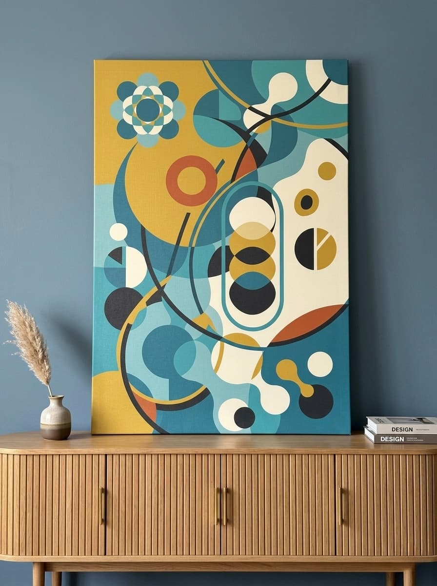
Emerald green is the most jewel-like and dramatic of the common green shades. It pairs magnificently with gold, warm cream, and rich burgundy. Art on emerald walls should feel equally confident: editorial portraits, bold abstract pieces, and richly colored wildlife prints all hold their own against emerald's intensity.
Olive and muted greens have a sophisticated, almost military quality that pairs well with natural textures and earthy tones. These walls suit botanical art, impressionist landscapes, and warm wildlife prints that echo the earthy quality of the color itself.
Best Color Pairings for Green Walls
Green is a complex color with enormous range, and its pairings with art should be chosen thoughtfully to create visual harmony rather than confusion.
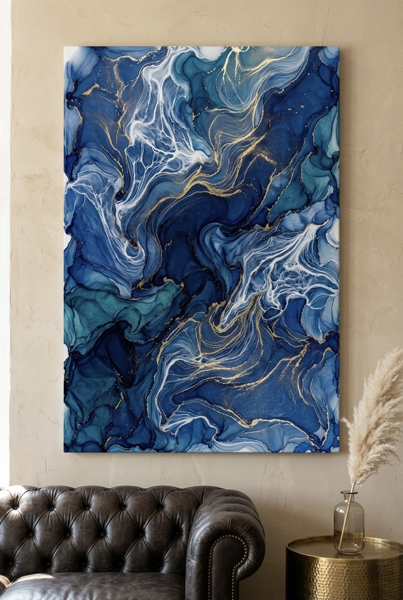
Gold and amber: The classic pairing with green. Gold and amber tones create warmth that beautifully complements the coolness inherent in most greens. Whether in abstract landscapes, botanical prints, or typography art, warm golden tones on green walls create rooms that feel rich, layered, and inviting. This is the most reliably successful color pairing for green walls of any shade.
Cream and warm white: Soft cream tones create breathing room on green walls without the starkness of pure white. Cream-toned art, from street art posters to typography prints, stands out clearly without creating harsh contrast. This pairing is ideal for rooms where you want the green to be present but the art to be equally readable.
Dusty purple and plum: A more unexpected pairing that works particularly well with sage and olive greens. Purple and green are complementary analogous colors (close enough on the color wheel to harmonize, different enough to create interest). Botanical prints, floral art, and landscape pieces that incorporate dusty purple tones create a sophisticated, slightly moody atmosphere on green walls.
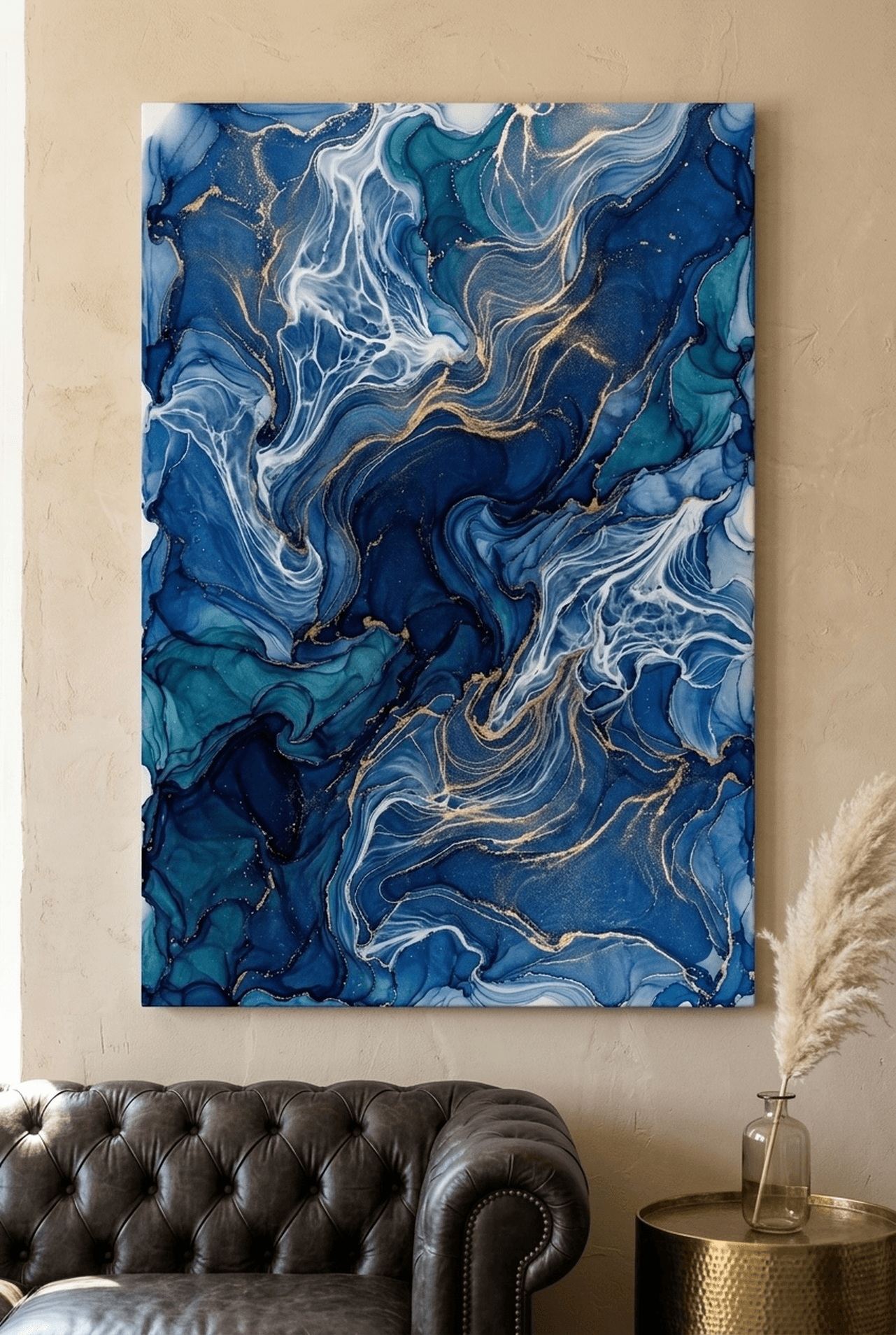
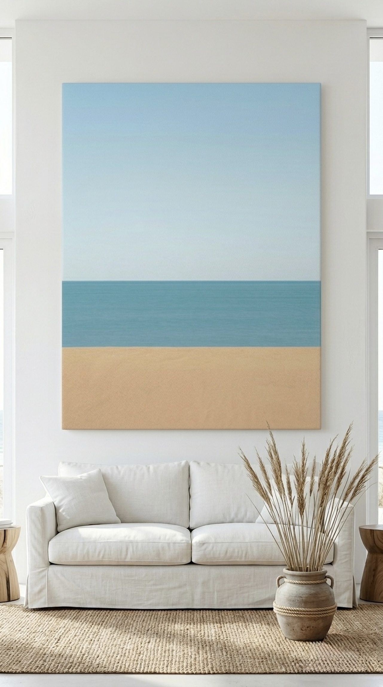
Teal and aqua: Teal-toned art creates a tonal harmony with green walls, using the shared blue base to create depth and variation rather than stark contrast. This is a more advanced pairing that works beautifully in rooms with strong natural light, where the similar tones can be clearly differentiated. Wildlife art featuring birds or marine life in teal tones is particularly effective here.
Warm terracotta and rust: These earthy tones are the opposite of green on the warm-cool spectrum, creating dynamic contrast that energizes a room. Terracotta art on deep forest green walls has a richness that feels almost vintage, like a library stocked with old-world maps and natural history prints.
Art Styles That Work on Green
Beyond color, the style and subject matter of art interacts with green walls in specific ways. Here are the styles that consistently deliver on green-walled spaces.
Wildlife and nature art are the most natural pairing for green walls, literally. The shared natural palette creates an atmosphere of immersion in the natural world, as if the wall itself is the forest and the art opens windows deeper into it. Forest animals, birds of prey, botanical prints, and landscape art all feel entirely at home on green walls. Choose pieces with rich, painterly quality for maximum depth.
Abstract and gestural art works brilliantly on green when the palette incorporates warm tones that contrast with the wall. Bold sweeping abstracts in gold, amber, cream, and warm white stand out dynamically from a green backdrop. Cooler abstracts in blue or grey can also work, but require the presence of warm tones in other elements of the room (furniture, cushions, floor) to prevent the overall feeling from becoming too cold.
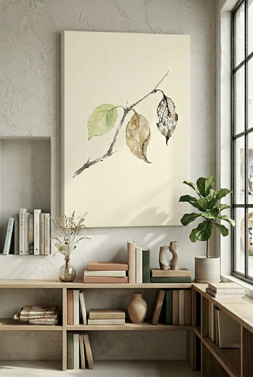
Botanical and herbal prints create a rich layered effect on green walls, doubling down on the natural theme in a way that feels intentional and curated rather than repetitive. The key is choosing botanicals whose palette introduces a different tone: warm amber sunflowers on forest green, or dusty purple artichokes on sage, rather than simply hanging more green-toned art against a green wall.
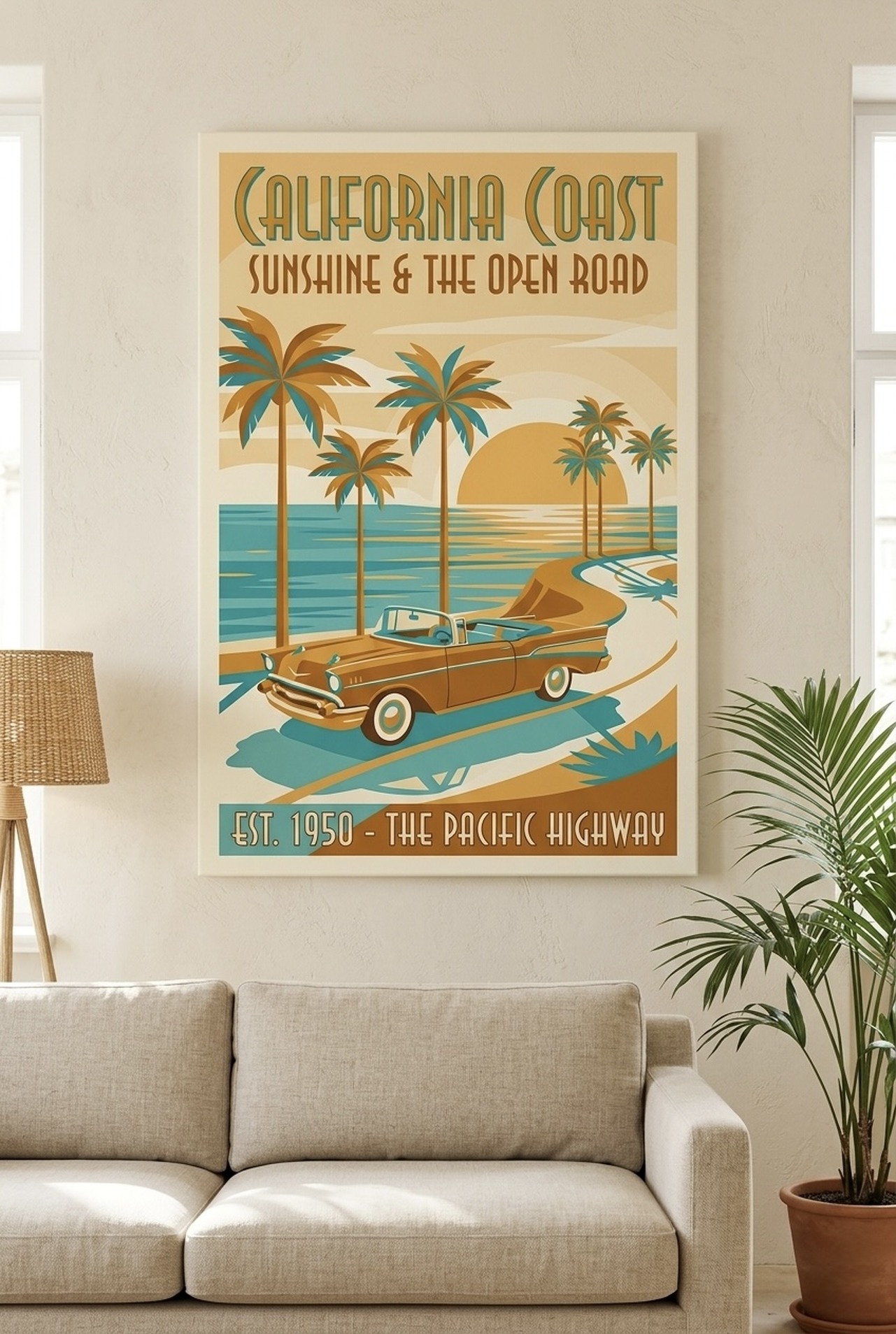
Typographic and motivational art in cream, gold, or warm white creates clean, readable contrast on green walls. Street art and poster-style typography is particularly well-suited to the boldness of green walls, matching their confidence with equal visual energy.
Our Top Picks for Green Walls

Sizing and Placement Guide
Green walls have strong visual presence, so art placement on them requires slightly different thinking than on white or neutral walls.
Fight the tendency to undersize: Because green walls already bring visual energy to a room, there is a temptation to choose smaller, quieter art pieces to avoid overwhelming the space. Resist this. Smaller art pieces on strong green walls disappear into the color. Choose pieces that are large enough to command the wall: at least 20x16 inches (51x41 cm) for smaller walls, and 32x24 inches (81x61 cm) or larger for primary living room walls.
Frame choice matters more on green: A warm natural wood frame softens the contrast between warm-toned art and green walls, creating a unified, organic aesthetic. A gold or brass frame amplifies the richness and warmth. Black frames create crisp, gallery-quality contrast that suits a more modern aesthetic. Avoid cool silver or chrome frames on green walls, as these emphasize the coolness of the green and can make the overall feel cold.
Lighting considerations: Green absorbs more ambient light than white walls, meaning art on green may appear slightly darker without supplemental lighting. Adding a picture light or directional spotlight above key pieces ensures they are properly illuminated and stand out clearly from the wall color. This is especially important for rooms with limited natural light.
Standard hanging heights still apply: Regardless of wall color, the center of your artwork should sit at approximately 57 to 60 inches (145 to 152 cm) from the floor. For above-sofa placement, the bottom of the frame should clear the sofa back by 6 to 8 inches (15 to 20 cm).
5 Common Mistakes to Avoid
- Hanging art that disappears into the wall: Very dark art (deep navy, black, or dark grey) on dark forest green walls creates a muddled effect where neither the wall nor the art can be read clearly. Ensure your art has enough value contrast to emerge from the green background.
- Using too many greens: Green-on-green botanical art on a green wall might seem thematically cohesive, but without contrasting colors it creates a flat, monochromatic effect. Introduce warm amber, cream, or gold to make the botanicals pop.
- Choosing cool silver frames: Silver and chrome frames emphasize the cool undertones in green, making rooms feel clinical. Opt for gold, brass, warm wood, or black frames instead.
- Over-cluttering a green wall: Green walls already have significant visual weight. A gallery wall of 10 to 15 pieces on forest green can quickly become overwhelming. Edit to the strongest three to five pieces, or consider a single large statement piece that matches the wall's confidence.
- Ignoring the opposite wall: When one wall is deep green, the art on that wall and on the opposite wall must work together as a unified whole. What you hang on the neutral walls should reference the colors in the art on the green wall, creating a cohesive room-wide conversation between surfaces.
Frequently Asked Questions
What color art looks best on green walls?
Warm gold, amber, cream, and terracotta art colors create the most beautiful contrast against green walls of all shades. Dusty purple pairs beautifully with sage and olive greens. Avoid very cool tones like pale grey or icy blue, which can make green rooms feel cold and muddy.
Can I hang dark art on dark green walls?
Generally no. Very dark art on dark green walls creates a muddled effect where neither element is clearly readable. For dark forest or hunter green walls, choose art with light or warm-toned subjects that create clear value contrast against the deep background.
What frame color works best on green walls?
Gold, brass, warm natural wood, and black frames all work beautifully on green walls. Gold and brass amplify warmth and richness. Natural wood creates an organic, cohesive look. Black provides crisp contemporary contrast. Avoid cool silver or chrome, which can make the room feel cold.
How large should art be on a green accent wall?
Green accent walls call for large, confident pieces. For a standard living room accent wall, aim for at least 32x24 inches (81x61 cm). In a bedroom above the bed, a canvas that is roughly the same width as the headboard creates a beautifully unified focal point. Do not let the intensity of the wall color intimidate you into choosing something too small.
Does sage green work with the same art as forest green?
Broadly yes, but sage green is more forgiving and pairs with a wider palette. Sage works with warm earthy tones, soft botanicals, coastal blues, dusty roses, and even gentle abstracts. Forest green requires stronger contrast and works best with warm golds, creams, and rich terracotta tones.
Should I match my art to the green in my walls?
No. Matching the exact green of your walls in your art creates a flat, monochromatic effect. Instead, choose art that contrasts with the wall's tone while harmonizing with its warmth or coolness. Warm amber and gold contrast beautifully with cool forest greens, while dusty botanical tones harmonize with sage's warmth.
Quick Reference: Wall Art for Green Walls
| Green Wall Shade | Best Art Colors | Best Art Styles |
|---|---|---|
| Forest and Hunter Green | Warm gold, cream, amber, terracotta | Wildlife, botanical, typographic |
| Sage Green | Soft earthy tones, dusty rose, pale blue | Watercolor, impressionist, minimal |
| Emerald Green | Rich gold, warm cream, burgundy | Editorial portrait, bold abstract |
| Olive and Muted Green | Amber, warm rust, cream | Botanical, impressionist landscape |
| All green shades | Avoid: icy blue, cool grey, pale lavender | Avoid: very dark on very dark |
Green walls deserve art that matches their confidence and depth. Discover the perfect pairing in our nature and wildlife collection at Heva Unique Art Gallery, where every canvas is crafted to complement the homes it inhabits. Ships within the US, arrives ready to hang.