First Apartment Wall Art: Modern Starter Guide
The Heva Team
Art Curators & Interior Design Enthusiasts · March 25, 2026 · 18 min read
Decorating your first apartment? Start here. We show you how to choose wall art that makes a rental feel like home, with budget-friendly picks under $100.
Congratulations on your first place. Those blank white walls can feel overwhelming at first, but this is actually your chance to create a space that feels 100% you. Wall art is the single fastest way to transform a rental from a generic box into a home that reflects your personality, your taste, and where you are in life right now.
Whether your budget is tight or you just don't know where to start, this guide walks you through everything: how to choose the right piece, how to hang it without losing your deposit, and which styles will still look great in your next apartment (and the one after that).
Ready to browse? Explore our full collection of canvas wall art, all printed on premium matte canvas and ready to hang.
The First Apartment Rule: Start With One Statement Piece
The biggest mistake first-time decorators make is buying a lot of small art all at once, then scattering it across walls in a way that looks unsettled. Interior designers and decorators consistently point to the same starting principle: anchor a room with one large statement piece first, then build everything else around it.
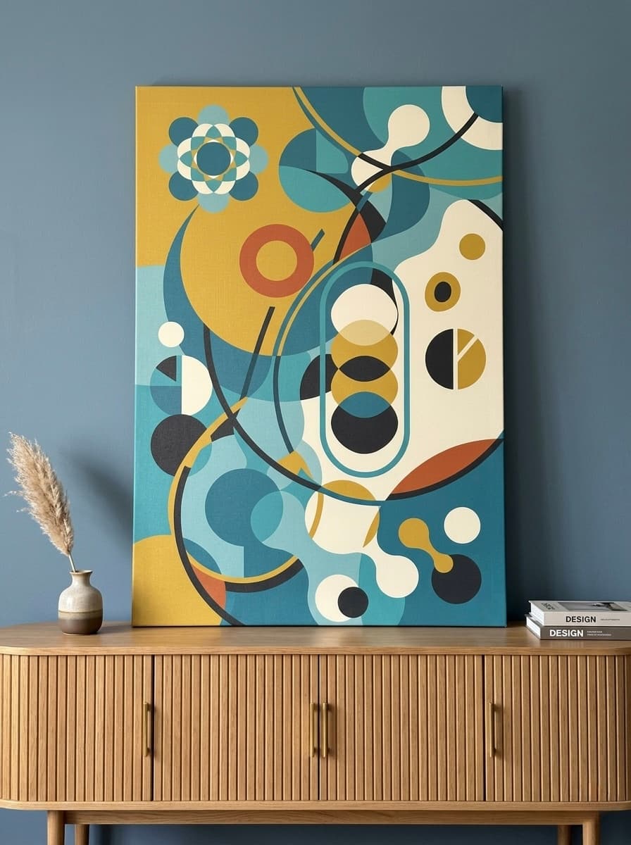
Why does this work? A large-format canvas immediately tells the eye where to look. It creates a visual anchor that makes a room feel intentional and designed rather than assembled at random. According to a 2026 MasterClass guide on apartment decorating, embracing large-format artwork is one of the top design moves for renters and first-time apartment dwellers because a single oversized painting can transform an entire room without requiring any additional decor.
The sweet spot for a first apartment is a canvas measuring around 60 x 80 cm (24 x 32 inches). This size is large enough to command a wall and create that focal-point effect, but it's still easy to handle, straightforward to hang, and proportionate for the living rooms, bedrooms, and dining spaces common to most starter apartments. Go below 50 x 60 cm (20 x 24 inches) on a standard wall and the piece will look lost. Go above 100 x 120 cm (40 x 48 inches) and you may find it overpowers a compact room.
Think of your statement piece as the "voice" of the room. Once it's up, it dictates the color palette you pull from when choosing a throw pillow, a rug, or a lamp. It saves you from the paralysis of decorating from scratch every time you buy something new. Pick the art first, then let everything else follow its lead.
When choosing that first piece, lean toward art with a color that is already present in your rental in its neutral form: warm whites, beige walls, grey carpet. Art in amber, gold, teal, or deep green creates contrast against those neutrals without clashing. Abstract landscape and nature-based compositions are especially effective because they suggest depth and atmosphere, making even a small studio feel more expansive. You can read more about building around a single focal point in our creating a focal point with art guide.
How to Hang Art in a Rental Without Damage
Security deposits are real money. The good news is that hanging art in a rental apartment without damaging the walls has never been easier, and most canvas wall art falls well within the weight limits of modern damage-free hanging solutions.
Command Strips: The Renter's Best Friend
Command Picture Hanging Strips (the Velcro-style interlocking pairs) are the gold standard for rentals. According to Apartment Therapy's command strip guide, large picture hanging strips support up to 4 lbs (about 1.8 kg) per pair, and you can stack multiple pairs for heavier pieces. Most framed canvas prints weigh under 1 kg to 1.5 kg, which means two large strip pairs are more than sufficient for the vast majority of canvas art sold today.
Key tips for getting command strips right:
- Clean the wall surface with isopropyl alcohol first. Dust and grease are the main reasons strips fail.
- Press firmly for 30 seconds and wait one full hour before hanging anything.
- If your walls were recently painted, wait at least 7 days before applying strips to freshly painted surfaces.
- To remove: pull the tab straight down toward the floor (never outward). The adhesive releases cleanly without pulling paint.
- Strips work best between 50 degrees F and 105 degrees F (10 to 40 degrees C). Avoid using them near exterior walls in very cold climates.
Picture Rails and Hanging Systems
Many older apartment buildings (pre-1980s construction) were built with picture rails: a narrow horizontal molding near the ceiling designed specifically for hanging art with hooks and wires. If your apartment has these, use them. They hold significant weight, leave no wall damage whatsoever, and allow you to reposition art without any additional hardware. Run a thin picture rail wire from the molding hook down to the back of your canvas for a clean, gallery-style look.
Leaning Art and Shelf Displays
For very large canvases or situations where you want maximum flexibility, leaning art against a wall or on a deep shelf is completely valid. Propping a large canvas on a console table or media unit is a design choice in its own right, not a compromise. Layer a smaller piece in front of a larger leaned canvas for a curated, collected feel. As detailed in Frame It Easy's renter decor guide, using shelves and ledges is one of the most versatile and deposit-safe methods for displaying wall art in a rental.
Weight Reference for Canvas Art
To give you a practical reference: a standard framed canvas at 60 x 80 cm (24 x 32 inches) typically weighs between 0.8 kg and 1.4 kg depending on the frame material. A canvas at 80 x 100 cm (32 x 40 inches) generally falls between 1.2 kg and 2.2 kg. Both sizes are within safe range for picture hanging strips when applied correctly. Always check the weight printed on the product listing before purchasing strips.
Choosing Art That Grows With You
Your first apartment is likely not your last. The art you choose should be able to move with you, suit different rooms, and not feel dated or too specific to one moment in your life. This is a longer-term investment than most first-time buyers realize, and it's worth thinking about before you commit.
Avoid Hyper-Themed Art
Sports team art, novelty prints tied to a specific pop culture moment, and ultra-trendy design motifs all have a shelf life. They may feel right in your first year of independence, but they rarely age well. When you move into a larger place, share a space with a partner, or simply evolve your taste, theme-specific art becomes awkward or out of place rather than endearing.
Abstract art, nature-based compositions, and typography with timeless messages are the categories that interior designers consistently recommend as "investment pieces." They work in living rooms, bedrooms, home offices, and hallways. They work with rental-white walls, painted accent walls, and wallpapered feature walls. Their versatility is the point. Our earth tone wall art guide covers how neutral-palette pieces in particular tend to suit a much wider range of interior styles over time.
Color Psychology: Neutrals Versus Bolds
The research on color psychology and interior design is consistent: spaces decorated with art tend to feel more emotionally settled than bare-walled rooms. According to findings cited by Peter Lik Fine Art, investing in wall art is an investment in your mental and emotional wellbeing, with studies showing that visual stimulation from art in the home reduces stress, improves focus, and alleviates symptoms of anxiety. A bare wall, by contrast, causes the mind to wander and lose anchor.
For a first apartment where you want versatility, consider these color psychology principles:
- Warm neutrals (amber, gold, cream, terracotta): Grounding, comforting, and easy to layer with both cool and warm furnishings. These tones are among the safest choices for living rooms and bedrooms in a rental context.
- Cool accents (teal, sage, deep blue): Calming and focused. Excellent for a bedroom, home office, or any space where you want a quieter atmosphere.
- Bold contrasts (black and white, deep jewel tones): High-impact but can feel heavy in small spaces. Best reserved for one statement piece in an otherwise neutral room.
When choosing art for a first apartment, the practical advice is to select pieces whose dominant color appears in the warmer-neutral or cool-accent range. These travel well between rooms and pair well with rental-standard beige and white walls without requiring you to repaint or redecorate around them. For more on using art in multi-purpose spaces, see our guide on wall art in open layouts.
Our Top 6 First Apartment Wall Art Picks
Each piece below was chosen for its versatility in a first apartment context: works well with rental-white or neutral walls, does not require matching decor, is available in sizes suitable for a starter space, and is priced accessibly. All are printed on premium matte canvas with an optional frame.
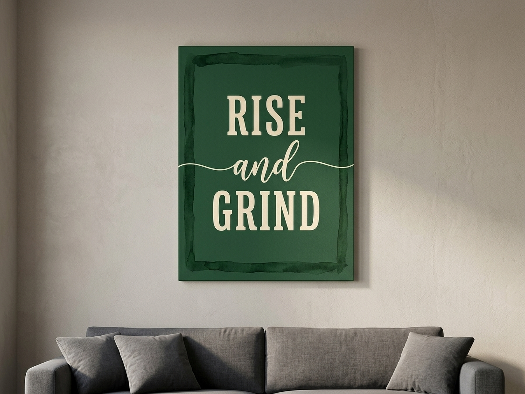
1. Rise and Grind Typography Print
A first apartment is often the space where you are building something: a career, a routine, a sense of self. This typography canvas with its deep forest green palette and bold lettering is a daily reminder that sits well above a desk, behind a sofa, or in an entryway. The dark green tone reads as sophisticated rather than loud and will complement cream, white, grey, or natural wood tones in virtually any rental space. It is one of our most popular pieces for young professionals because it manages to feel both motivating and genuinely decorative. The clean sans-serif font means it works as easily in a minimalist space as in a more layered interior. Read more about using typography art for motivation in our motivational wall art guide.
2. Do The Work Typography Print
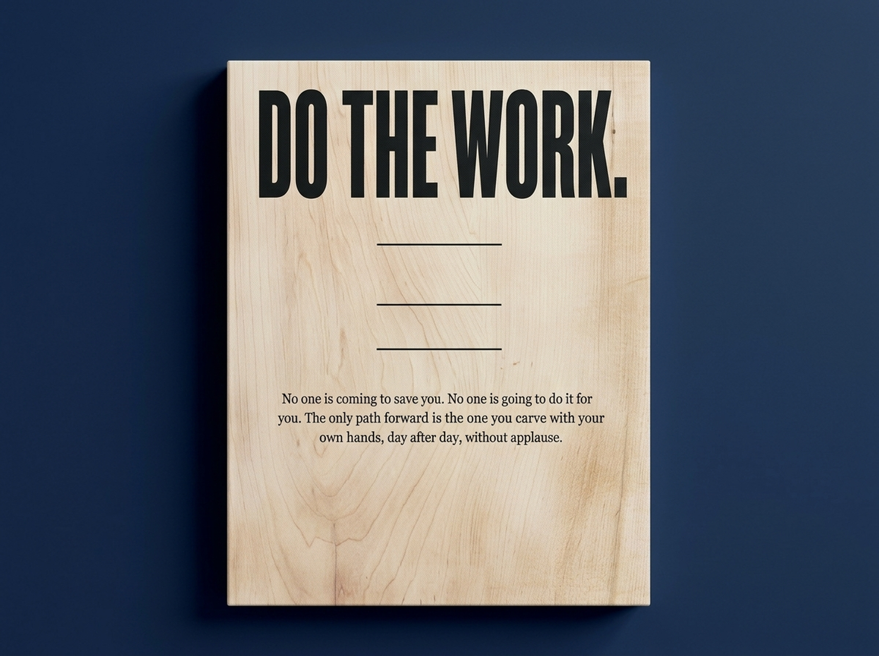
Where the Rise and Grind print is bold, this piece is restrained. The lighter birch and charcoal tones give "Do The Work" a quieter authority that suits a bedroom, reading nook, or home office without feeling aggressive. It is the kind of piece that visitors notice and comment on, but that also simply lives well in a space day after day without becoming visually tiring. The tonal palette of warm off-whites and soft charcoal means it will pair naturally with almost any rental wall color and work just as well in a future apartment as it does in your first one. At 60 x 80 cm (24 x 32 inches), it is an ideal anchor piece for a workspace wall.
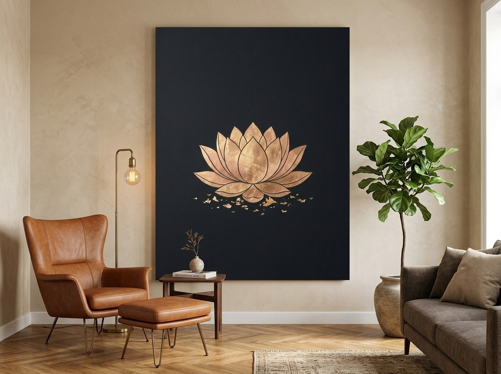
3. Lotus Flower Gold Leaf Minimalist Print
This piece punches well above its price point in terms of visual impact. The single lotus rendered in warm gold on a deep black background creates a gallery-quality effect that looks far more expensive than it is, which makes it ideal for a first apartment where you are trying to achieve a polished aesthetic on a real-world budget. The composition is simple enough to work with other art pieces nearby (making it a strong candidate for a future gallery wall), yet striking enough to stand alone as a statement piece. The black-and-gold palette is one of the most versatile in interior design: it works against white, cream, grey, and even warm terracotta walls, and it suits living rooms, bedrooms, and dining spaces equally well.
4. Giant Cassette Tape Surreal Y2K Print
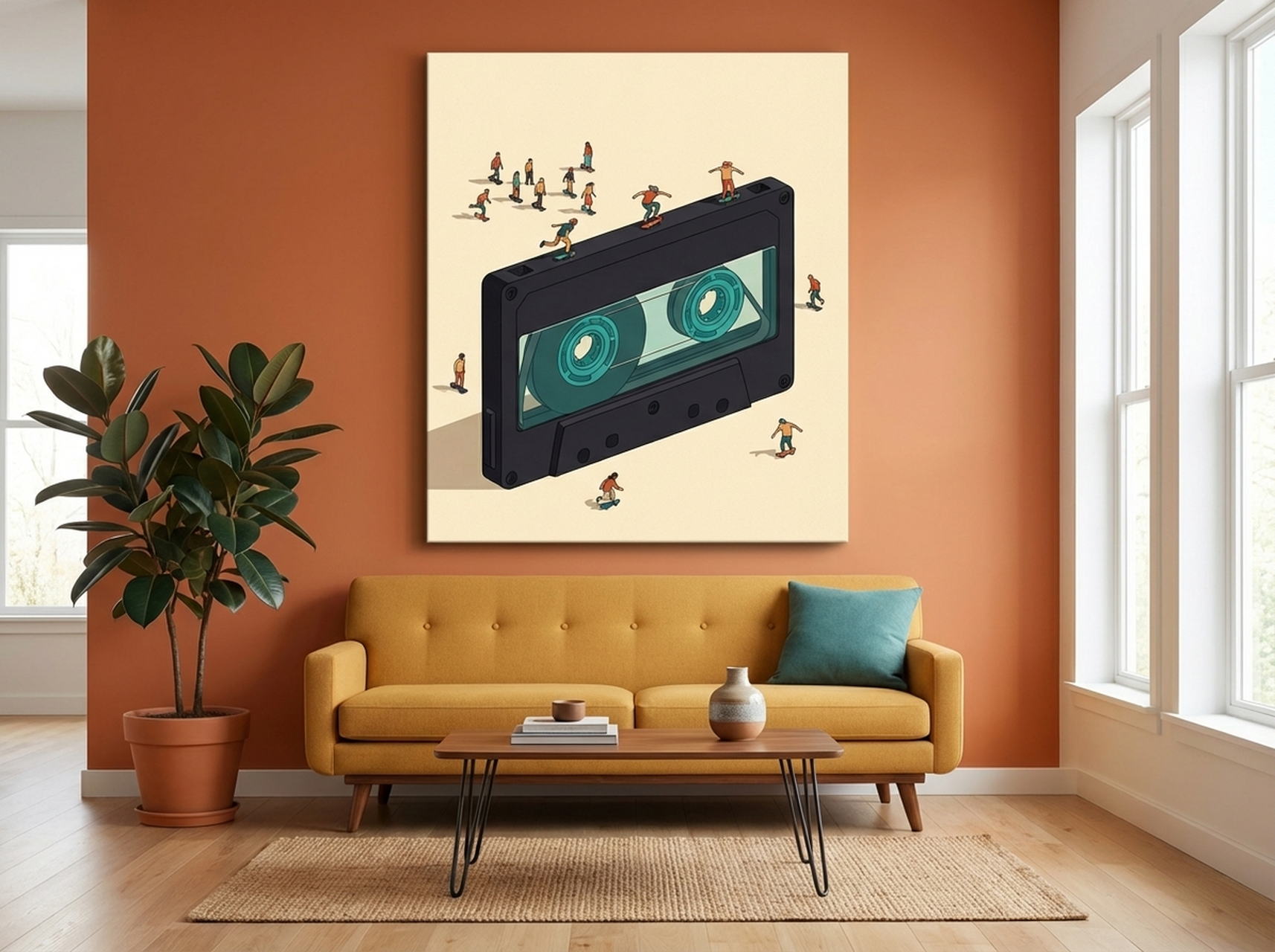
If your first apartment is your space to express something distinctly yours, this is the piece that delivers that. The oversized cassette tape rendered in a surreal, hyper-detailed style is immediately conversation-starting. It works exceptionally well in a living room, a music corner, or a creative studio setup, bringing energy and personality that no generic print can match. Despite its bold subject matter, the charcoal and teal palette is neutral enough to work with most rental wall colors without requiring a total redesign around it. This is also a piece that tends to move rooms easily: it can go from living room to bedroom to home office and feel intentional in each context. It reads as art-savvy rather than theme-specific.
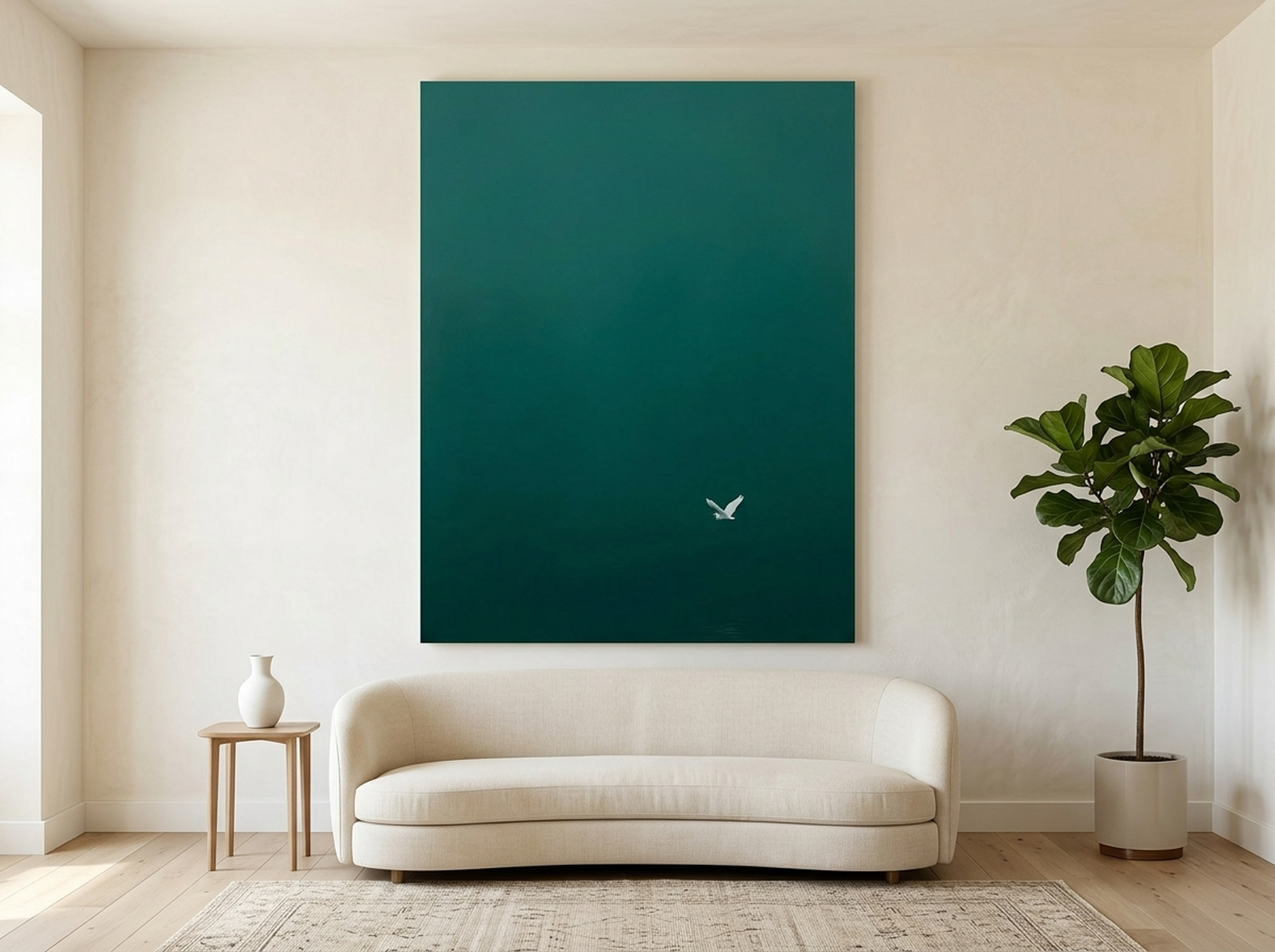
5. Egret Minimalist Bird Print in Teal Green
Nature-based art has long been the decorator's reliable choice for spaces that need to feel calm and settled, and the 2026 biophilic design trend has only reinforced this. This egret print in cool teal and white captures the serenity of a coastal scene without being kitschy or overly coastal-themed. It works equally well in an inland city apartment as it does in a beach-adjacent space, because the minimal composition is about calm and elegance rather than a specific location. In a first apartment bedroom, this piece creates an atmosphere of peace; in a living room, it brings in a grounded natural element. The teal tones pair well with white, grey, warm cream, and navy furnishings and bedding, making it one of the most versatile picks on this list.
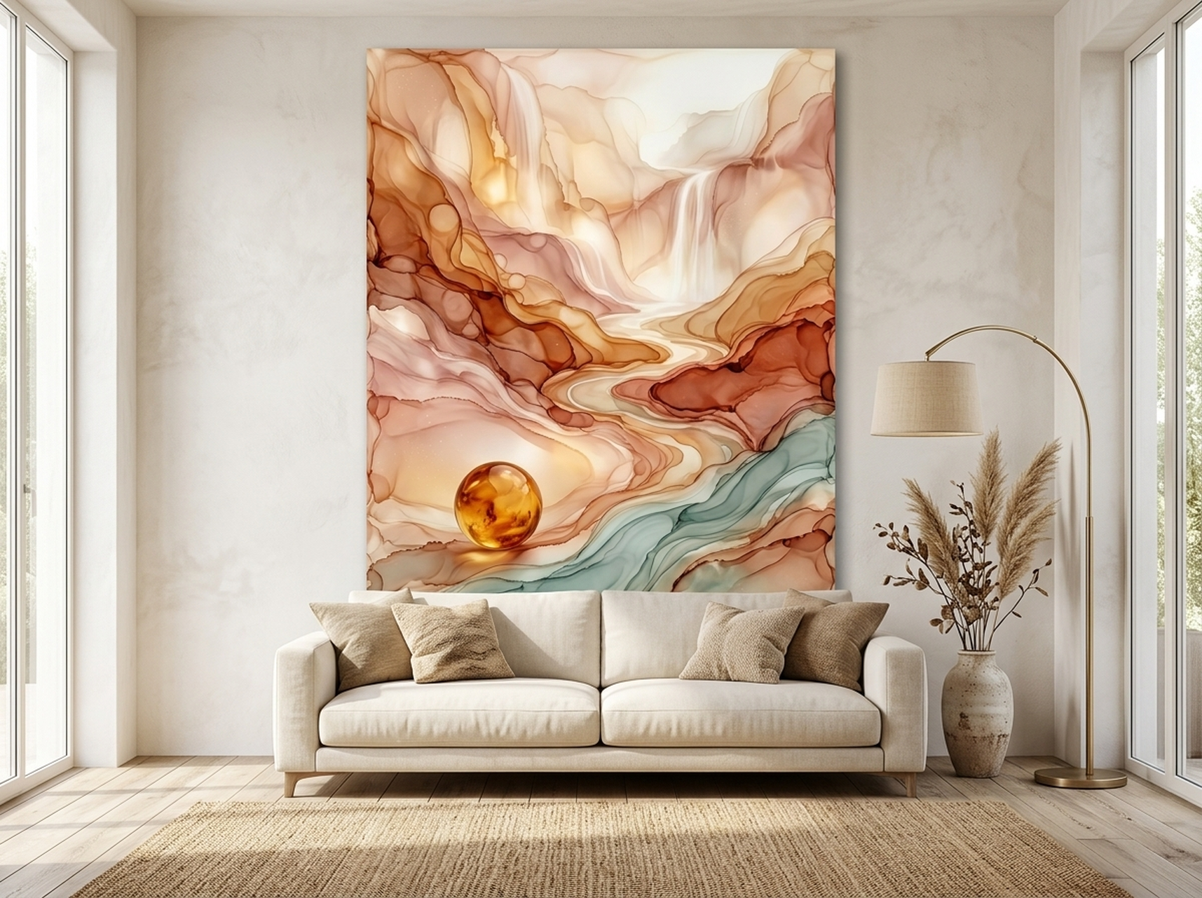
6. Wildflower Meadow Mountain Landscape
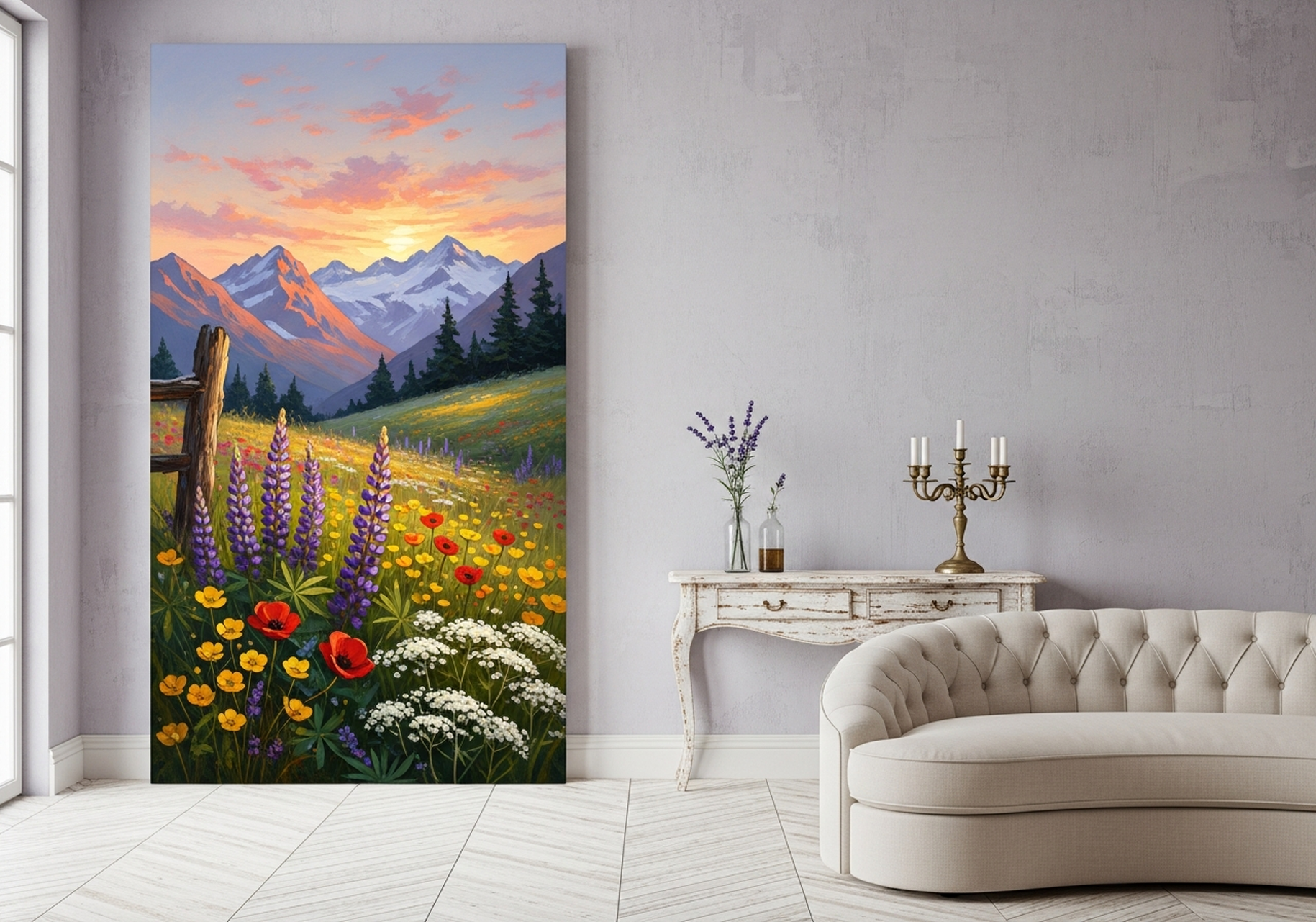
This painterly landscape of a wildflower meadow under mountain light is the kind of piece that earns compliments for years. The layered lavender, gold, and sage tones in this oil-painting-style composition are warm without being overwhelming and suit a very wide range of color schemes. In a first apartment, a landscape like this creates an immediate sense of space and depth: even in a smaller room, the eye travels into the painting and the room feels larger. The subject matter is classic enough to never go out of style, and the impressionistic painterly treatment elevates it well beyond a generic poster. This is the piece you buy in your first apartment and still love in your third. See how earth tones like these work across a full interior in our framed canvas art guide.
5 Common Mistakes First Apartment Decorators Make With Wall Art
- Hanging art too high. The standard rule in interior design is eye level, which means the center of the artwork should sit roughly 145 to 152 cm (57 to 60 inches) from the floor. Most people hang art 15 to 20 cm too high, which makes a room feel disconnected rather than cohesive. When hanging art above a sofa or headboard, leave a gap of about 15 to 25 cm (6 to 10 inches) between the top of the furniture and the bottom of the frame.
- Buying too many small pieces too fast. A collection of 8 x 10 inch (20 x 25 cm) prints scattered across a wall tends to look like indecision rather than curation. Start with one large piece. Then, if you want a gallery wall, build it intentionally over time with pieces that relate to each other in color, tone, or theme.
- Ignoring scale relative to furniture. Art above a sofa should span roughly two-thirds of the sofa's width. Art above a headboard should be proportionate to the bed width. A small canvas above a king-size bed or a large sofa looks as awkward as a large canvas squeezed above a narrow console table.
- Choosing art that matches too precisely. Art that perfectly matches the colors in a room tends to disappear into it. The goal is contrast and complement, not camouflage. If your sofa is grey, choose art with a warm amber or teal accent rather than more grey. The contrast is what creates visual interest.
- Skipping the framed option for cost savings. A canvas print without a frame can look unfinished on a rental wall, particularly in a living room. The frame adds visual weight and makes the piece look more deliberate. Most of our canvas prints are available with a matte black or natural wood float frame at a reasonable upcharge. It is one of the best investments you can make in a first apartment because it transforms a print into a genuine piece of art.
Frequently Asked Questions
What size wall art should I get for my first apartment?
For most first apartment living rooms, the ideal statement piece size is 60 x 80 cm (24 x 32 inches) or 70 x 100 cm (28 x 40 inches). This range is large enough to anchor a wall and create a focal point without overpowering a compact room. For bedrooms, a piece at 50 x 70 cm (20 x 28 inches) above a nightstand or 60 x 80 cm (24 x 32 inches) above a twin bed works well. Always measure your wall and the furniture below it before ordering.
How do I hang wall art without damaging the wall?
Command Picture Hanging Strips are the best option for most rental apartments. The large strips support up to 4 lbs (1.8 kg) per pair, and stacking two pairs handles the weight of most framed canvas prints. Clean the wall surface with isopropyl alcohol first, press the strips firmly for 30 seconds, and wait one hour before hanging. To remove, pull the tab straight down toward the floor. For older apartments, check whether your walls have a picture rail near the ceiling: these support significant weight with no wall contact at all.
What type of art looks most expensive in a small space?
Large-format single pieces consistently look more expensive than collections of small prints. A single canvas at 60 x 80 cm (24 x 32 inches) with a float frame will look more curated and deliberate than five small prints. High-contrast compositions (such as black and gold, or deep jewel tones on white) also read as more premium than soft pastels in a small space. Abstract art and fine-art-style nature prints tend to project the highest perceived value for their actual price.
Should I buy matching art sets for my first apartment?
Matching art sets (two or three prints sold together in coordinating designs) are convenient, but they can make a space feel like it came from a furniture catalog rather than being personally curated. A better approach is to choose one strong statement piece and then add complementary pieces over time that relate through color or mood rather than being obviously from the same set. This approach tends to age better and feel more genuinely yours.
What is the best wall art style for a rental?
Abstract art, minimalist nature prints, and clean typography are the three styles most recommended for rentals because they are versatile enough to look good in any room, on any wall color, and in future apartments as well. Avoid hyper-seasonal, sports-themed, or very trend-specific art that you may outgrow or that may not suit a new space. The 2026 trend toward soft neutral gallery walls and biophilic nature-inspired art aligns well with what works in a rental: calm, versatile, and timeless.
How high should I hang wall art in an apartment?
The center of the artwork should be approximately 145 to 152 cm (57 to 60 inches) from the floor, which places it at average eye level. When hanging art above furniture such as a sofa or headboard, leave a gap of 15 to 25 cm (6 to 10 inches) between the top of the furniture and the bottom of the frame. If you are building a gallery wall, treat the collection as a single unit: the center of the entire arrangement should still sit at eye level.
Quick Reference Table
| Product | Best For | Style | Link |
|---|---|---|---|
| Rise and Grind Typography | Home office, entryway, living room | Bold typography, forest green | View |
| Do The Work Typography | Bedroom, reading nook, desk wall | Quiet typography, birch and charcoal | View |
| Lotus Flower Gold Leaf | Any room, gallery wall anchor | Minimalist, black and gold | View |
| Giant Cassette Tape | Living room, creative studio | Surreal pop art, charcoal and teal | View |
| Egret Minimalist Bird | Bedroom, bathroom, calm spaces | Minimalist coastal, teal and white | View |
| Wildflower Meadow Landscape | Living room, dining room, any wall | Painterly landscape, lavender and gold | View |
Ready to Choose Your First Piece?
Your first apartment is a blank canvas in the most literal sense. The art you choose right now will shape how that space feels every single day: how you start your mornings, how you decompress in the evenings, and what impression you make when someone walks through your door for the first time.
Start with one piece. Choose something in a size of at least 60 x 80 cm (24 x 32 inches). Hang it at eye level using quality command strips or your building's picture rail. Then let it anchor everything else you do with the room.
The whole HEVA collection is curated to work in real homes, including rental apartments on real budgets. Every canvas is printed on premium matte stock that looks significantly more expensive than it is, and each piece ships ready to hang.