Wall Art for Pink Walls: Stylish Color Pairings for 2026
The Heva Team
Art Curators & Interior Design Enthusiasts · May 14, 2026 · 18 min read
Pink walls finally feel grown-up when paired with the right canvas. Six designer-tested color pairings (sage, navy, black-and-gold, cream, white, tonal pink), placement rules, and the exact pieces that turn blush, dusty, and millennial pink walls into curated rooms.
Pink walls used to be a punchline. Today they are one of the most-searched paint trends of 2026, showing up in Manhattan townhouses, design-forward Airbnbs, and the bedrooms of people who do not consider themselves "pink people" at all. The shift happened the moment designers stopped treating blush as a girlish accent and started treating it as a neutral.
The hard part is what comes next. A beautiful pink wall asks one question: what do you hang on it? Choose wrong and the room reads as a Pepto-Bismol bottle. Choose right and your space looks like a curated boutique hotel. This guide covers the six pairings that work every time, plus the placement rules, the common mistakes, and the exact pieces from our gallery that turn a pink wall into a quiet flex.
Why Pink Walls Work (When You Style Them Right)
Pink had its modern reset around 2016, the year Pantone named Rose Quartz one of its dual colors of the year. Almost overnight the conversation shifted from "Barbie pink" to "millennial pink," and designers stopped treating soft pink as a feminine signifier and started treating it as a warm neutral that flatters skin tone and softens harsh natural light.
The reason pink walls are easier to live with than people assume is that pink behaves like a tinted off-white. It pushes the wall slightly forward, adds visual warmth, and gives whatever you hang on it a halo of softness. Cool art looks softer. Black art looks less aggressive. Even loud color reads as intentional instead of accidental.
What pink will not do is take care of itself. A pink wall plus an inherited beige print plus a random framed photo is how rooms end up looking like a dorm. Pink needs a confident anchor on the wall, and that anchor has to bring at least one of two things: contrast (a darker, cooler, or more saturated color) or sophistication (a refined style, a real frame, an obvious sense of point of view).
The "One Strong Note" Rule
Our rule of thumb after styling hundreds of pink rooms for customers is this: pick one strong note and let everything else stay quiet. If your art piece is dramatic black and gold, keep the rest of the room calm. If your art is soft and tonal pink, then your frame, throw pillows, or lamps can carry the contrast. Pink walls fail when every element in the room tries to compete for attention. They succeed when the wall is the stage and a single piece of art is the star.
Know Your Pink: Blush, Dusty, Millennial, and Mauve
Not all pink walls are the same, and the undertone of your specific pink determines which art will glow against it. Hold a sheet of pure white paper against your wall in daylight. The wall will lean in one of four directions.
- Blush (warm, peachy pink): Examples include Benjamin Moore Pink Bliss and Farrow & Ball Setting Plaster. These walls have yellow undertones and love art with warm cream, gold, sage, terracotta, and amber.
- Dusty pink (muted, slightly gray pink): The most designer-friendly pink. Pairs beautifully with deep navy, forest green, charcoal, and rich burgundy art.
- Millennial pink (cool, slightly cooler than blush): The Instagram pink. Works hardest with black and gold, white, soft watercolor, and tonal pink-on-pink art.
- Mauve (pink with strong purple undertones): A richer, moodier pink. Best with bronze, deep wine, forest green, and antique gold accents.
If your wall reads warm, lean into warm-toned art. If your wall reads cool, choose art with cool accents. Mismatched temperature is the single most common reason a pink wall looks "off" even when the art is beautiful on its own.
Six Color Pairings That Make Pink Feel Grown-Up
These are the combinations that work reliably across every shade of pink, every room, and every aesthetic from modern minimalist to coastal grandmother. We have grouped them in order of how forgiving they are. The first two are nearly foolproof. The last two are the highest-reward but require a bit more confidence.
1. Sage Green and Soft Botanical
Green is pink's natural complement on the color wheel, and sage in particular is the gentle version of that contrast. Eucalyptus, olive, and fern greens pull the warmth out of pink and let the room breathe. This pairing reads spa-like in bathrooms, nursery-mature in bedrooms, and quietly fresh in living rooms. Choose art with botanical motifs (single leaves, branches, soft foliage) for the cleanest effect.
2. Navy and Deep Blue
Navy is pink's dressy partner. It grounds the lightness of blush walls and gives the eye somewhere to rest. The combination shows up constantly in editorial design features for a reason: the contrast feels intentional without being shocking. Folk-art florals, navy abstract pieces, or moody seascape paintings all work beautifully against pink.
3. Black and Gold (Modern Glamour)
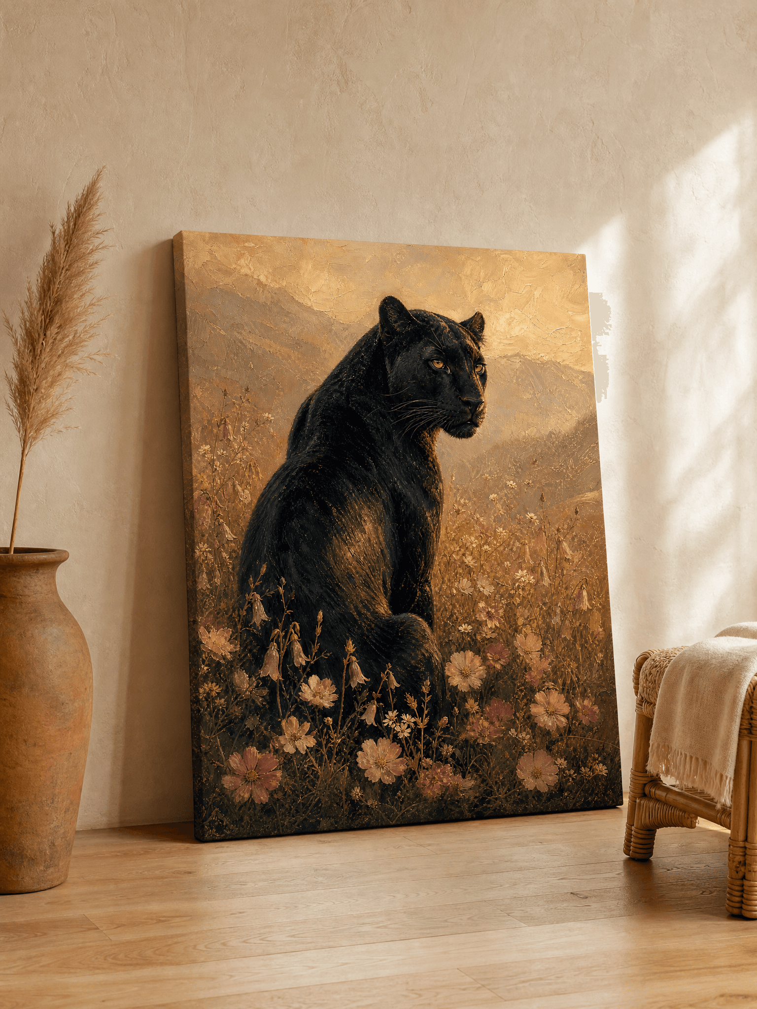
If your pink wall is in a dining room, dressing room, or powder room, this is the pairing that turns it from cute to "where did you find that?" Black anchors the lightness, gold pulls warmth, and the result is unmistakably grown-up. Pink alone can read sweet. Pink with black-and-gold art reads like a member-only club.
4. Cream and Vintage Pastoral
For pink rooms that want to feel collected and slightly old-world, cream and muted vintage tones are the move. Think Provence farmhouse, English cottage garden, or the soft pastorals you would expect to see in a country estate. The pink wall provides the warmth and the cream art keeps everything from feeling too sweet or too saturated.
5. White and Tonal Pink-on-Pink
Tonal layering is the highest-confidence move on a pink wall: matching pink and white art that lets the wall itself be the design statement. This works because it removes contrast as a variable and forces the eye to focus on form, composition, and texture instead. White peonies, single-stem florals, and minimal pink ink-wash pieces all qualify.
6. Statement Pink-on-Pink (Saturated)
The boldest move: art that is more saturated and brighter pink than the wall itself. Done badly, this is a Pepto-Bismol disaster. Done well (with art that includes natural neutrals to break up the pink), it becomes the kind of design choice that ends up on Pinterest. Reserve this pairing for one feature wall, not an entire room.
Six Pieces We Picked for Pink Walls
Every piece below was selected for one of the six pairings above. We have used each of these in real customer rooms, and they all share the same quality: a confident point of view that holds its own against the warmth of pink without competing with it.
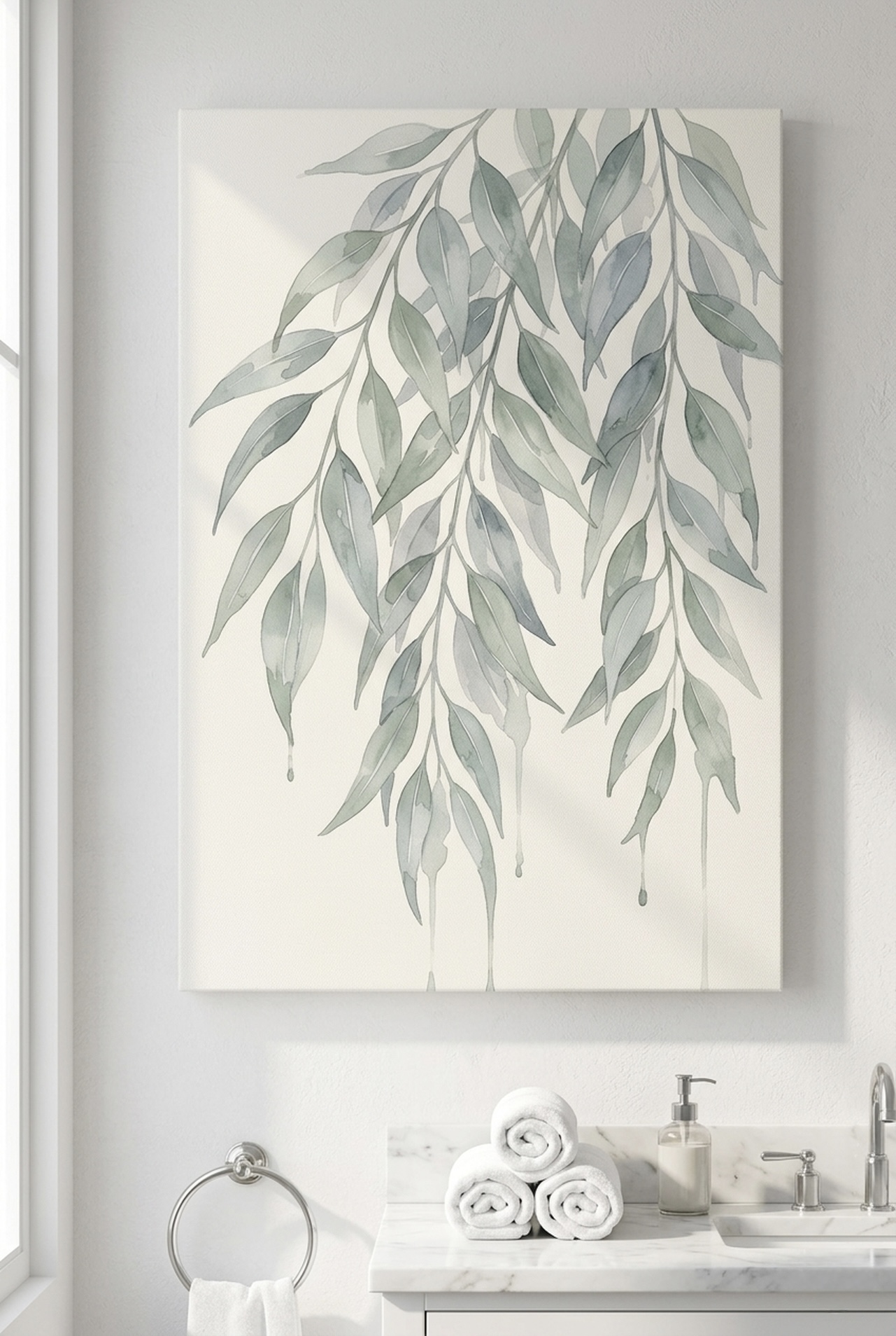
Soft sage on cream with delicate watercolor edges, this single botanical branch is the safest possible pairing for a pink wall. The cool green calms the warmth of the pink, while the cream background bridges the two tones so nothing feels jarring. Hang it solo in a bedroom or stack two of them vertically beside a bed for an elevated symmetrical look. Best on blush, dusty pink, and millennial pink.
Explore the Eucalyptus Branches Canvas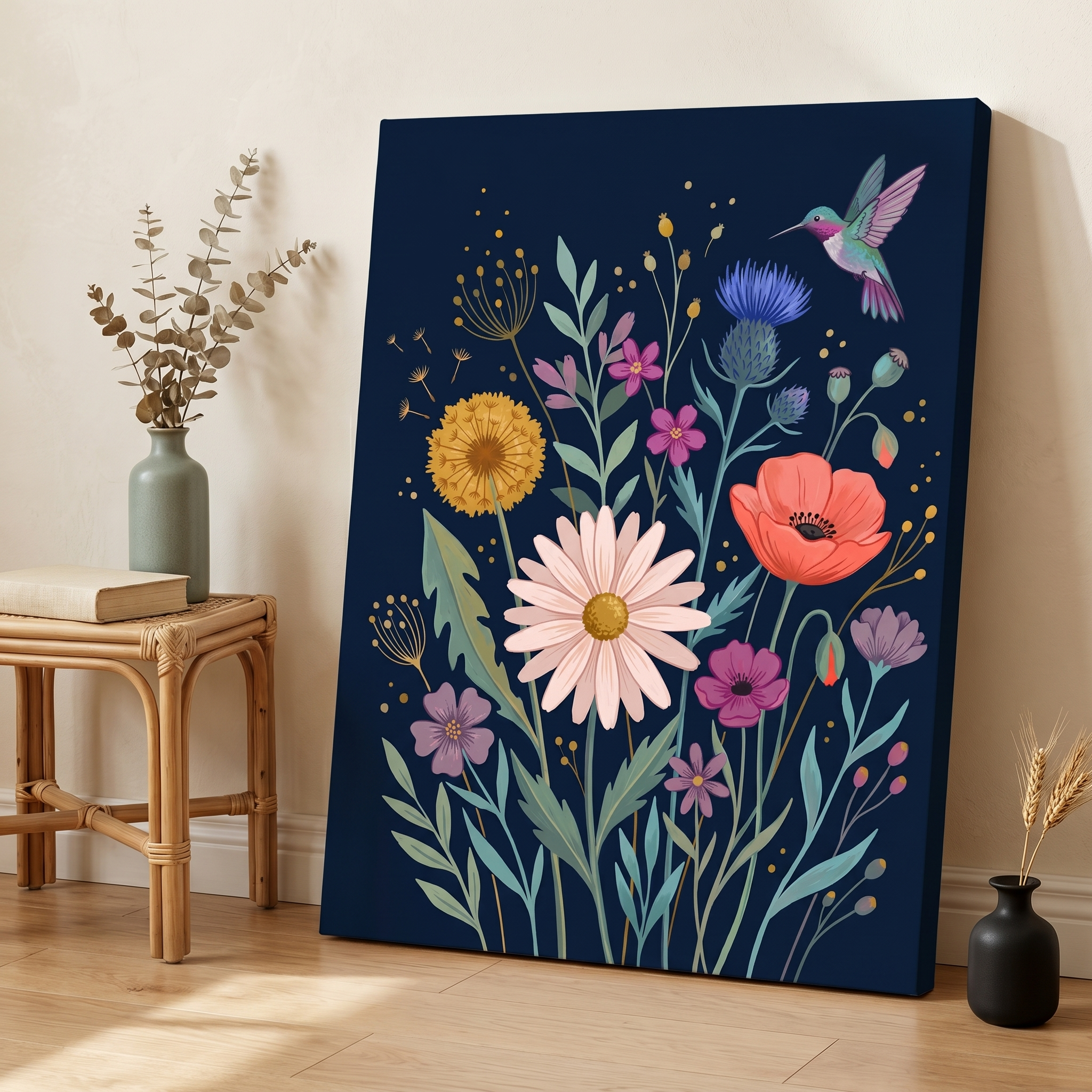
A deep navy background with folk-style wildflowers, a small hummingbird, and the kind of blush accents that pull straight from a dusty pink wall and reflect it back. This is the navy-and-pink pairing distilled into a single canvas, which means it works even in rooms that do not have separate navy upholstery to tie the look together. Particularly strong in dining rooms, reading nooks, and over-bed placements on darker dusty pinks.
See the Folk Wildflower Hummingbird Print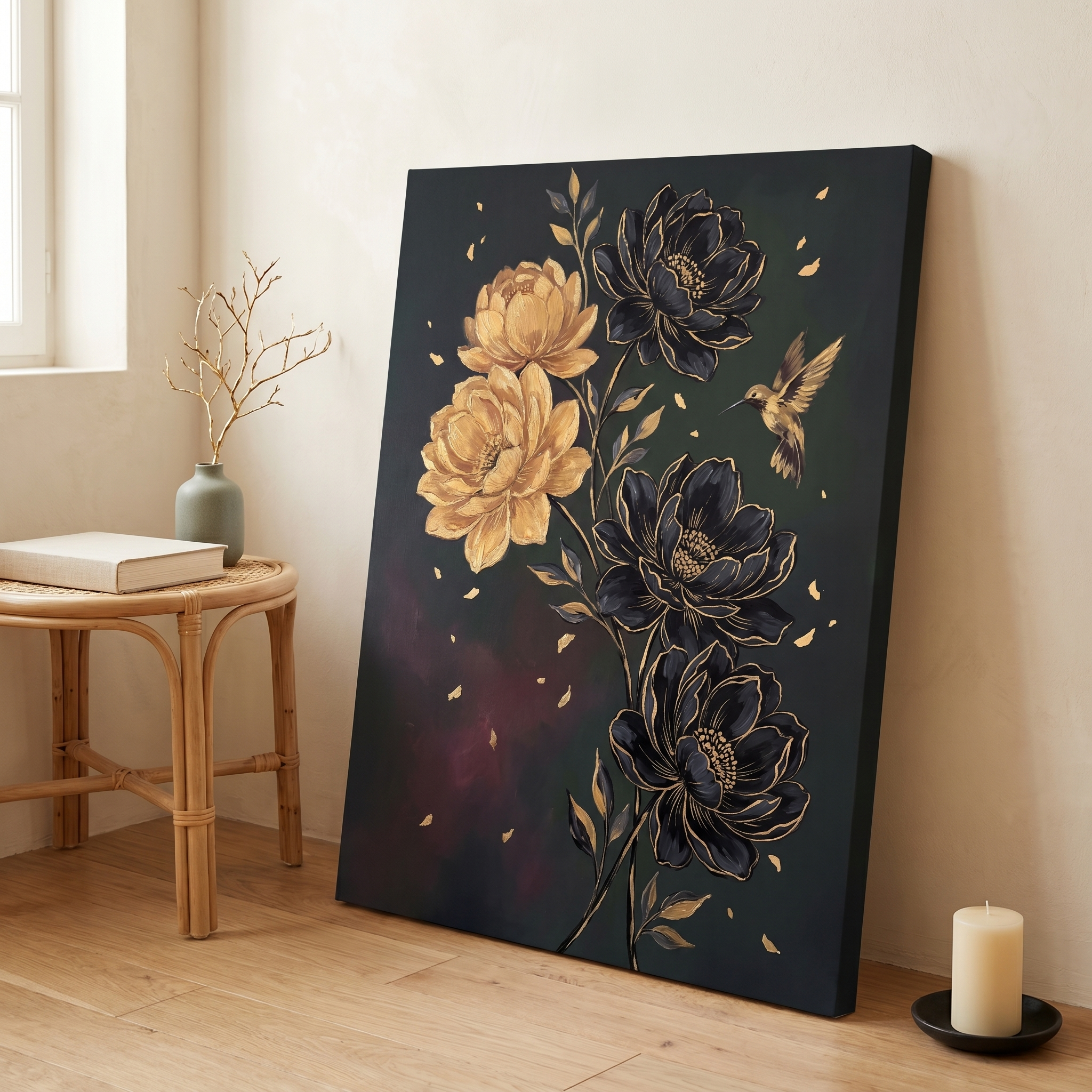
If you want your pink wall to feel like a boutique hotel, this is the piece. Deep black with intricate metallic gold florals and a single hummingbird creates the high-contrast, high-glamour moment that grown-up pink rooms need. Particularly stunning above a vanity, in a dressing room, in a dining nook, or anywhere you want pink to feel intentional rather than cute. Pair with brass hardware or a small black lamp to echo the palette.
View the Black Gold Ornate Floral Canvas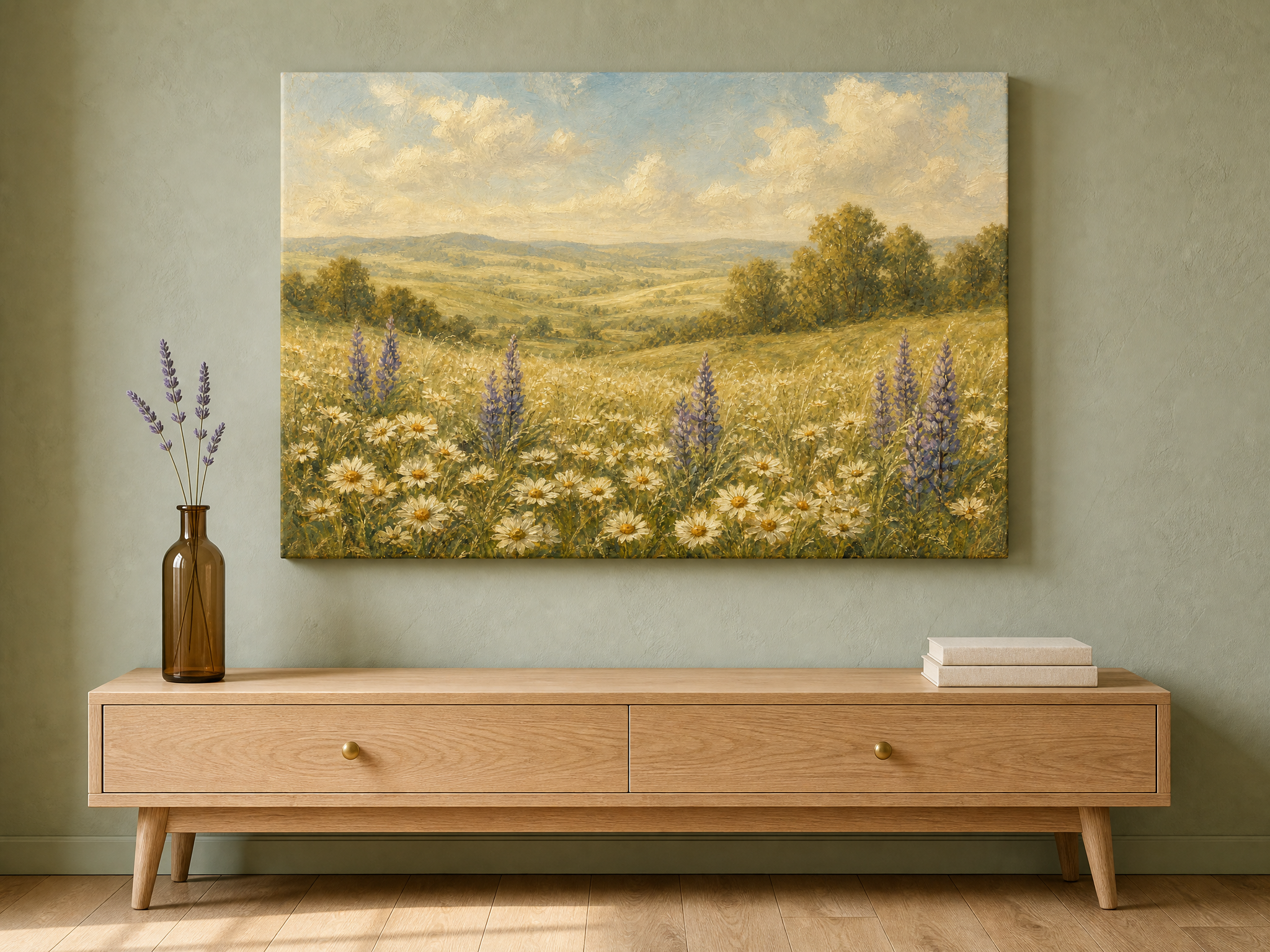
A vintage pastoral meadow in cream, lavender, sage, and soft dove blue. This is the European farmhouse pairing for a pink wall: gentle, collected, and old-world without being fussy. The wide horizontal format makes it perfect for above-sofa and above-headboard placements, and the slight color complexity gives the eye something to linger on without competing for attention with the wall behind it.
Browse the Cream Daisy Lavender Meadow Print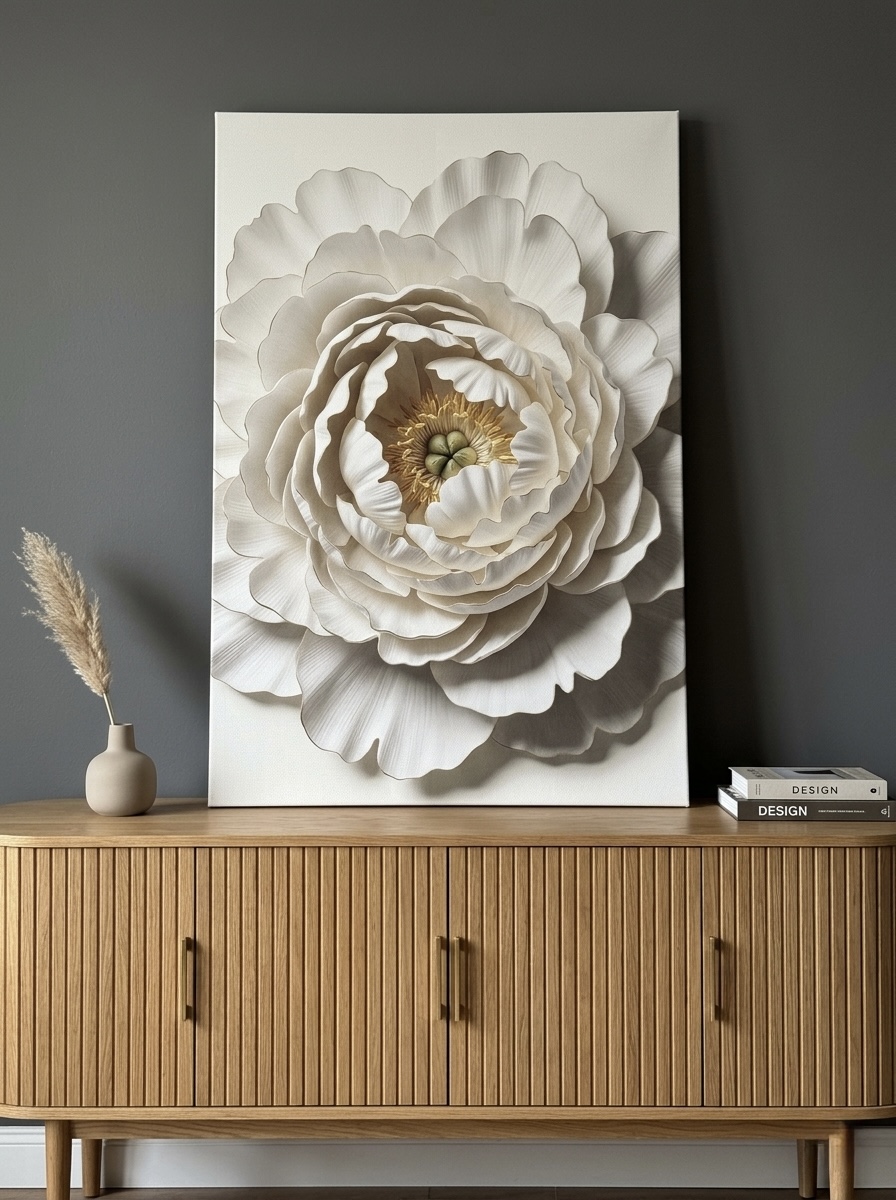
A single, oversized white peony with gentle cream and beige shadows. This is the cleanest tonal pairing for a pink wall: the peony reads as pure form against the soft warmth of the background. Designers love this kind of negative-space floral on pink because it reads luxurious and feminine without being saccharine. Hang it portrait above a vanity, behind a bed, or in a quiet reading corner where the calm of the piece can do its work.
Shop the White Peony Bloom Canvas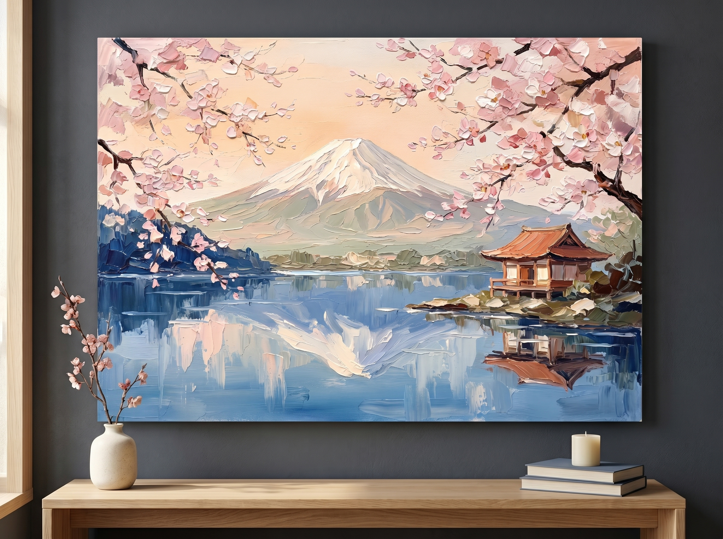
The boldest of the six picks. A textured impasto landscape with cherry blossom pink, soft cream, peach, and a single calming swath of blue lake. Pink-on-pink is the high-confidence move, and this piece nails it because the cream and blue elements break up the pink before it ever has a chance to overwhelm. Best treated as a single feature piece on the strongest wall in the room, not as part of a gallery wall. Stunning above a sofa.
Discover the Cherry Blossom Mountain Lake PrintPlacement Rules with Real Measurements
Pink walls are more forgiving than white walls when it comes to placement, but only up to a point. Hang too small or too low and the art looks lost against the warm color field. Get it right and the room feels like it was designed on purpose.
Standard Hanging Height
Center the art at 145 to 155 cm (57 to 61 inches) from the floor to the center of the canvas. This approximates average eye level and applies regardless of wall color. On pink walls specifically, do not hang any lower than this. Pink visually pulls art down because of its warmth, so erring slightly higher reads better than slightly lower.
Above Furniture
Leave 20 to 25 cm (8 to 10 inches) between the top of a sofa, headboard, or console and the bottom of the art. Any closer and the piece looks like it is sitting on the furniture. Any farther and it floats untethered from the room below.
Sizing to the Wall
Art on a pink wall should span at least two-thirds the width of the furniture it sits above. For a standard 200 cm (78 inch) sofa, that means art at least 130 to 150 cm (52 to 60 inches) wide. For a queen headboard, aim for 90 to 120 cm (36 to 48 inches) wide. King beds need 120 to 150 cm (48 to 60 inches). When in doubt, size up rather than down. Pink walls amplify scale, and undersized art looks lonelier on pink than it does on neutral colors. For a deeper sizing breakdown, see our guide to choosing the right wall art size for your living room.
Frame Choice
Pink walls love three frame colors above all others: natural wood (warms the pink even further, perfect for blush and warm pinks), matte black (creates the high-contrast moment that makes pink feel intentional), and antique gold or brass (the pairing for pink rooms that lean glamorous). Avoid white frames on pink walls. They tend to read flat and slightly sad. Avoid pink-toned frames entirely. They disappear into the wall and erase the art.
Five Common Mistakes to Avoid
- Hanging beige or cream art and calling it neutral. Beige and cream art on pink walls reads as a colorless smudge unless the piece has strong internal contrast (clear shapes, deep tonal range, or one accent color). If you want neutrals, use white, charcoal, or warm cream with deliberate contrast inside the composition.
- Choosing art that is more saturated and brighter than the wall. One of the fastest ways to make pink walls feel juvenile is hanging hot pink, magenta, or fuchsia art on top of soft pink. The saturated piece overwhelms the gentle wall and the room loses its calmness. Save bright pink for accent pillows or a single small piece, not the main canvas.
- Going too small. A 30 by 40 cm (12 by 16 inch) print on a 240 cm (8 foot) pink wall looks like a forgotten postcard. Pink walls amplify scale. Bigger almost always wins.
- Mixing too many pinks in one room. Pink wall plus pink art plus pink throw plus pink lampshade equals visual exhaustion. Pick one anchor pink (usually the wall) and let everything else stay tonal, neutral, or in one of the six pairing categories above.
- Forgetting about lighting. Pink walls shift dramatically under different light. Cool LED bulbs (5000K or higher) turn pink walls gray-purple, ruining the warmth. Stick with warm white bulbs at 2700K to 3000K. Art looks better and the room reads as designed rather than fluorescent.
What Real Buyers Tell Us About Pink Wall Art
Across hundreds of customer conversations, the pattern we hear most often is this: the people who hesitate to commit to a pink wall and then finally do it almost universally say they wish they had done it sooner. The hesitation is rarely about the wall itself. It is about not knowing what to hang on it. Once the wall has one confident piece, the room comes together quickly. The takeaway from our customers is simple: pick the piece first, then commit to the wall. The art removes the guesswork.
A second pattern: customers who came in for a "pink room" piece often left with art that has minimal pink in it. The white peony, the black-and-gold floral, the sage botanical, the navy folk print, and the cream pastoral landscape are all top sellers among pink-wall customers. The pink is in the wall. The art adds the contrast. That is the formula that works.
Pink Walls in Specific Rooms
Bedrooms
Bedrooms are the most natural home for pink walls. Pink is a soothing color biologically (the famous Baker-Miller pink study showed that exposure to a specific shade of pink reduced aggression and heart rate in test subjects) and that quality translates beautifully to a space designed for rest. Above the bed, choose either tonal pink-on-pink florals (calming, romantic) or a single moody contrast piece in navy or black-and-gold (sophisticated, more masculine-friendly for shared bedrooms). For more pairing ideas for the bedroom specifically, see our headboard alternatives guide.
Living Rooms
Pink in a living room is bolder than pink in a bedroom because the room is used by more people more visibly. The safest path is dusty pink walls (the most neutral of the four shades) paired with navy, sage, or black-and-gold art. Avoid millennial pink in living rooms unless you are committing to a fully designed Instagram-ready aesthetic. For more living-room-specific pairings, our 2026 living room buyer's guide goes deeper.
Dining Rooms and Powder Rooms
These are the showpiece rooms where pink walls earn their reputation. In a small, contained, less-frequently-used space, you can commit harder. Deep blush walls plus black-and-gold art plus brass sconces is a near-foolproof formula for a powder room that makes guests stop and look. In dining rooms, anchor with a single oversized statement piece rather than a gallery wall.
Home Offices
Pink home offices are increasingly popular, especially with creative professionals working from home. The trick is choosing art that signals "professional" rather than "girl boss." That means navy, charcoal, deep green, or sophisticated black-and-gold pieces. Skip the affirmation prints and the bright florals. The pink wall already brings the warmth. The art should bring the gravity.
Why We Think Pink Walls Are Here to Stay
Trends come and go, but the underlying reason designers reach for pink keeps showing up across decades. Editorial features on pink rooms from major design publications continue to grow year over year, and the version of pink that designers actually use, the soft, slightly muted, slightly warm pink, is not really a trend at all. It is a warm neutral that flatters skin tone, makes natural light feel more inviting, and softens harsh architecture. Those qualities do not go out of style.
What does change is the art we hang against pink. In 2026 we are seeing a clear move away from saccharine pink-on-pink toward confident contrasts: black, gold, navy, sage, and tonal cream. The pink wall stays. The art evolves. That is why we think investing in a single high-quality piece for a pink wall makes more long-term sense than buying a stack of trend-driven small prints. One great canvas outlasts five trendy ones.
Quick Reference Table
| Product | Best Pink Shade | Dominant Colours | Link |
|---|---|---|---|
| Eucalyptus Branches | Blush, dusty, millennial | Sage, cream, white | View |
| Folk Wildflower Hummingbird | Dusty pink, mauve | Navy, blush, coral, mustard | View |
| Black Gold Ornate Floral | Millennial, blush | Black, gold, wine, sage | View |
| Cream Daisy Lavender Meadow | Blush, mauve | Cream, lavender, sage, dove blue | View |
| White Peony Bloom | Millennial, blush | White, cream, gold, beige | View |
| Cherry Blossom Mountain Lake | Dusty, blush | Pink, blue, cream, peach | View |
Frequently Asked Questions
What is the best color art for pink walls?
The best art colors for pink walls are sage green, navy blue, black with gold accents, and warm cream. These four pairings work on every shade of pink from blush to dusty to mauve, and they create the contrast pink needs to feel sophisticated rather than juvenile. Avoid overly saturated pinks or hot magenta art on top of soft pink walls, as the brighter color overwhelms the gentle wall.
Do pink walls look childish?
Pink walls only look childish when they are styled like a child's room. Pair a pink wall with sophisticated art (black and gold florals, navy folk pieces, or moody pastoral landscapes), grown-up furniture, brass or matte black hardware, and warm 2700K lighting, and pink reads as designer-level intentional. The childish association comes from saccharine pairings, not from pink itself.
Can you put black and white art on pink walls?
Yes, black and white art works beautifully on pink walls, especially dusty pink and mauve. The high-contrast monochrome cuts through the warmth of pink and gives the eye a place to rest. For best results, choose black and white art with rich tonal gradients rather than stark graphic contrast, and pair with a black, brass, or natural wood frame.
What frame color should I choose for art on a pink wall?
Natural wood, matte black, and antique brass or gold are the three frame colors that consistently work on pink walls. Natural wood warms the pink even further and reads cottagecore or coastal. Matte black creates high-contrast modern energy. Brass or gold reads glamorous and slightly vintage. Avoid white frames (they look flat on pink) and avoid pink-toned frames entirely (they disappear into the wall).
How big should art be on a pink wall?
Pink walls amplify scale, so err on the larger side. Above a sofa, choose art that spans at least two-thirds the width of the sofa (around 130 to 150 cm or 52 to 60 inches for a standard sofa). Above a queen bed, 90 to 120 cm (36 to 48 inches) wide. Above a king bed, 120 to 150 cm (48 to 60 inches). A small 30 by 40 cm print looks lost on a pink wall in a way it would not on white.
Does pink go with sage green art?
Sage green is one of the best pairings for pink walls. Green is pink's natural complement on the color wheel, and the muted, slightly gray quality of sage softens the contrast so it reads as gentle harmony rather than competing color. Botanical art featuring eucalyptus, ferns, or olive branches in sage tones works on every shade of pink from blush to mauve.
Your Pink Wall Deserves a Confident Anchor
The right canvas turns a pink wall from cute to curated. Browse our full floral and botanical collection and find the piece that makes your room finally feel finished.
Shop Floral Wall Art