Wall Art for Gray Walls: Perfect Color Pairings and Styling Guide
The Heva Team
Art Curators & Interior Design Enthusiasts · March 27, 2026 · 18 min read
Discover exactly which art colors and styles work best on gray walls. From warm greige to cool charcoal, this complete guide covers color theory, placement measurements in cm and inches, product recommendations, and the 5 mistakes to avoid when decorating gray-walled rooms.
Gray walls are the ultimate decorator's secret weapon. Whether you've painted your living room a soft dove gray, a bold charcoal, or anything in between, you have the perfect neutral canvas for art that truly sings. Gray doesn't compete. It collaborates. It lets your chosen artwork become the undisputed star of the room while providing a sophisticated, timeless backdrop that never goes out of style.
But here's where many homeowners get stuck: what color art actually works on gray walls? The question seems simple, yet the answer is wonderfully nuanced. Warm grays and cool grays behave very differently, and the art you choose can either harmonize beautifully or create an unexpected clash that leaves the whole room feeling off.
This guide cuts through the confusion. You'll learn exactly how to read your gray walls, understand color theory as it applies to your specific shade, and choose artwork that transforms your space from "nice" to genuinely stunning. We'll cover every gray from the palest silver to the deepest slate, and we'll show you real examples of art pairings that work.
Ready to find your perfect piece? Browse our Abstract Wall Art Collection featuring pieces handpicked to complement gray walls beautifully.
Understanding Your Gray Walls
Before you can choose the right art, you need to understand exactly what you're working with. Not all gray is the same, and this distinction matters more than most people realize.
Warm Gray vs. Cool Gray
Hold a pure white piece of paper next to your wall in natural daylight. Does your gray look slightly purple, blue, or green by comparison? You have a cool gray. Does your wall look slightly beige, taupe, or brownish? That's a warm gray, sometimes called "greige."
This distinction is crucial because warm grays and cool grays have different undertones that interact with art colors in completely different ways. A warm gray wall will make certain blues look muddy, while a cool gray wall can make warm terracottas and mustards absolutely vibrate with energy.
Light Gray vs. Dark Gray
Light grays (think dove, silver, pearl) have a reflective quality that works beautifully with both bold saturated artwork and soft pastel pieces. They're forgiving and versatile. Dark grays and charcoals create a dramatic, moody backdrop that makes lighter art colors pop with incredible intensity. Mid-tone grays sit in a sweet spot where almost anything works, provided the undertones align.
How to Determine Your Gray's Undertone
The paper test works well in natural daylight, but here's another method: look at your wall in the evening under warm artificial light. If your gray walls suddenly look taupe or brownish, you have warm undertones. If they look distinctly purple, lavender, or blue-gray, you have cool undertones. Some grays are truly neutral, meaning they shift very little under different light conditions. These neutral grays are the most flexible and forgiving when it comes to art selection.
The Light Factor
North-facing rooms receive cool, indirect light all day long, which will emphasize the cool undertones in any gray paint. South-facing rooms get warm, bright light that can warm up even the coolest gray significantly. This means your perfect art pairing in a north-facing bedroom might look completely different in your south-facing living room, even if the walls are painted the same color. Always evaluate art pairings in the actual room where they'll hang, at the time of day when you most use that space.
Color Theory for Gray Walls
Gray is one of the most versatile neutrals in the design world precisely because it sits at the intersection of so many color relationships. Understanding how different colors interact with gray opens up a world of possibilities.
Colors That Pop on Gray Walls
Navy Blue: One of the most reliable pairings in interior design. Navy creates a sophisticated, classic contrast against both warm and cool grays. The darkness of navy provides visual weight and grounding while the blue undertones harmonize with gray's natural cool quality. Navy art on gray walls reads as intentional, curated, and timeless.
Teal and Peacock Blue: These blue-greens create an energetic, contemporary contrast that works especially well against light to mid-tone grays. Teal has enough green to warm it up slightly, making it work on both warm and cool gray backgrounds. It's a sophisticated choice that feels modern without being cold.
Terracotta and Burnt Orange: This might surprise you, but terracotta is one of the best contrasts for cool gray walls. The warm, earthy orange is complementary to blue-gray in a way that creates natural visual tension. This pairing feels organic and grounded, referencing the natural landscape where clay earth meets overcast sky.
Mustard and Gold: Yellow-adjacent colors create warmth and optimism against gray backdrops. Mustard specifically has enough depth to avoid looking harsh, and its earthy quality keeps it from feeling jarring. Gold tones, especially in metallic frames or gilded abstract art, add a layer of luxury that gray walls amplify beautifully.
Black and White: The most graphic option, creating strong visual contrast that suits contemporary and minimalist interiors. Black and white art on gray walls creates a monochromatic harmony where the gray serves as the middle tone in a sophisticated grayscale composition.
Colors That Harmonize with Gray
Sage Green: Soft, muted greens sit in the same cool-neutral family as gray, creating a restful, nature-inspired palette. Sage art on gray walls feels serene and spa-like, perfect for bedrooms and bathrooms.
Blush and Dusty Rose: Soft pinks add warmth to cool gray walls without overwhelming the neutral quality of the space. This combination reads as sophisticated and romantic rather than feminine or frilly.
Silver and Light Blue: These near-neutrals create a tonal, layered look where art and wall seem to exist in the same color family at different intensities. The effect is subtle and elegant, letting texture and form carry the visual interest.
Colors to Use with Caution
Certain yellows and lime greens can clash with cool-toned grays, creating a slightly sickly undertone. Very bright, saturated reds can also feel jarring unless balanced with other colors in the composition. This doesn't mean these colors can never work, it simply means you need to be more intentional about the specific shade and how it relates to your particular gray.
Art Styles That Shine on Gray
Gray walls don't just accommodate any art style equally. Certain styles come alive against gray in ways that other neutral backdrops can't match.
Minimalist Art
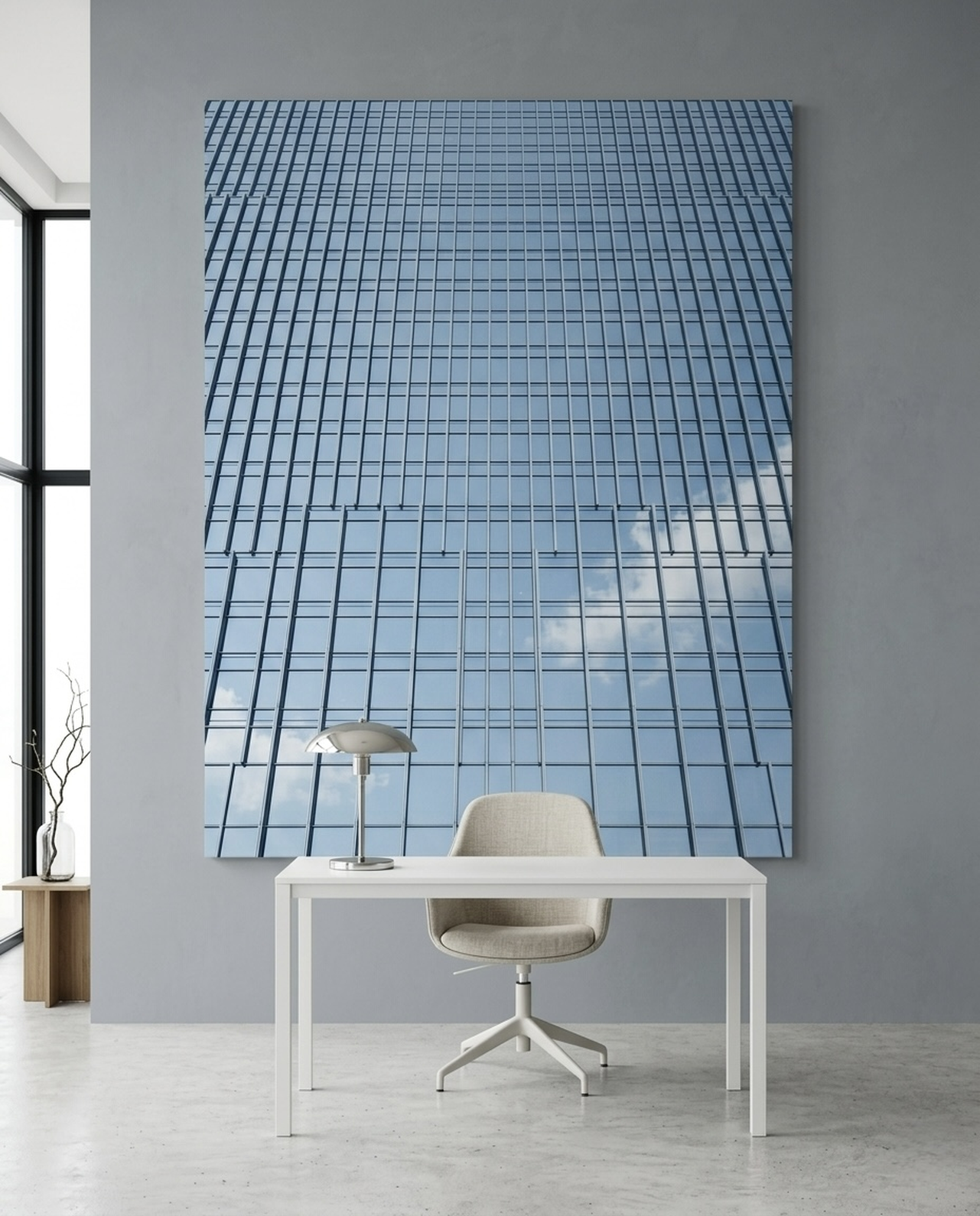
Gray walls and minimalist art are a natural pairing. The restrained, intentional quality of minimalism resonates with the quiet sophistication of gray. Single-subject pieces on clean backgrounds, geometric abstracts with limited palettes, and line drawings all gain clarity and purpose when displayed against gray. The wall recedes, and the artwork's inherent graphic quality comes forward.
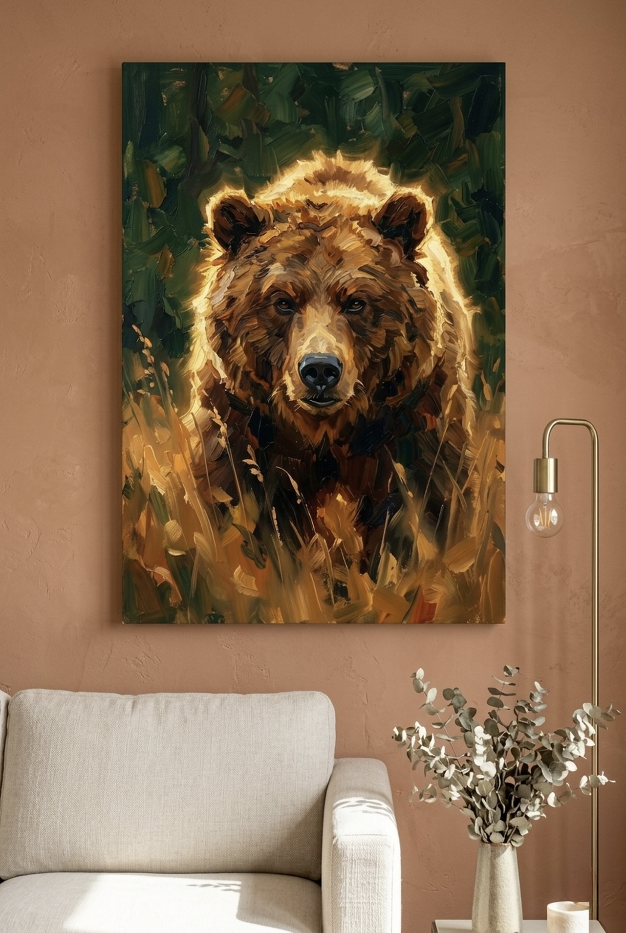
Nature and Wildlife Art
Wildlife prints have an organic relationship with gray that stems from nature itself. Many animals have gray, silver, or slate tones in their natural coloring. Birds, wolves, marine life, and woodland creatures all feel at home against gray backgrounds, as though they're simply being viewed in their natural, overcast habitat. This naturalistic quality makes wildlife art one of the most cohesive choices for gray-walled spaces.
Abstract Art
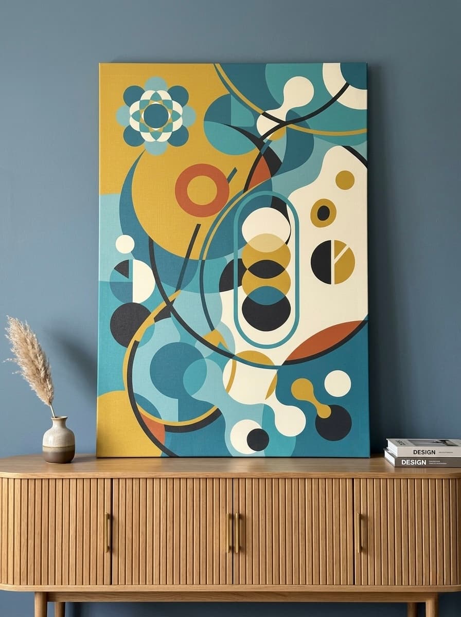
Abstract works with multiple colors particularly benefit from gray wall backgrounds because gray doesn't compete with any of the colors in the composition. Every hue in an abstract piece gets to be its truest self without the wall color muddying the visual conversation. Abstract art on gray walls is endlessly versatile and always feels curated.
Moody Atmospheric Work
Atmospheric paintings, those with misty backgrounds, foggy landscapes, and soft-focus subjects, share a visual vocabulary with gray that creates seamless transitions between wall and artwork. The piece seems to emerge from the wall itself, extending the room's atmosphere into the art.
Featured Art Pairings for Gray Walls
Here are six exceptional pieces, each selected for their proven ability to transform gray walls from backdrop to brilliance.
Wolf Canvas Wall Art | Atmospheric Moonlit Forest Painting
This atmospheric wolf painting is one of the most compelling choices for gray-walled spaces. The silver-blue palette of the moonlit forest shares color DNA with gray walls, creating a seamless visual transition where the room's atmosphere extends directly into the artwork. The wolf himself emerges from the mist with presence and intention, commanding attention without disrupting the room's quiet mood. On a cool gray wall especially, the steel-blue tones in this piece create a monochromatic symphony of sophistication.
The atmospheric depth of this painting means it rewards close looking. The longer you study it, the more detail emerges from the forest haze. This quality makes it ideal for spaces where you spend time, like living rooms, offices, and reading nooks. Against gray, the luminous quality of the moon actually glows, seemingly lit from within.
Pair this piece with silver or brushed nickel hardware, cool-white textiles, and perhaps a dark navy accent pillow to echo the painting's deepest tones. On a charcoal gray wall, this Wolf Canvas Wall Art creates a truly immersive, dramatic environment.
View This Print
Egret Canvas Wall Art | Minimalist Bird Print | Teal Green Canvas
The minimalist egret in flight against a teal-green background is a masterclass in how to use a strong accent color on gray walls. The teal canvas creates a deliberate, contained burst of color that energizes a gray wall without overwhelming it. The egret's white form provides contrast within the piece itself, creating a layered visual experience that stays interesting from across the room and up close.
Teal is one of gray's best partners in the color wheel, sitting in the blue-green range that complements gray's natural coolness. The result is a pairing that feels sophisticated and intentional, like a color combination a professional interior designer would choose. This piece works beautifully in living rooms, master bedrooms, and modern dining rooms where you want a focal point that feels organic rather than forced.
Style this Egret Canvas Wall Art with natural textures like linen, rattan, and light wood tones to create a coastal-modern vibe that feels effortlessly collected. A slim black or natural wood frame would complement the piece beautifully.
View This Print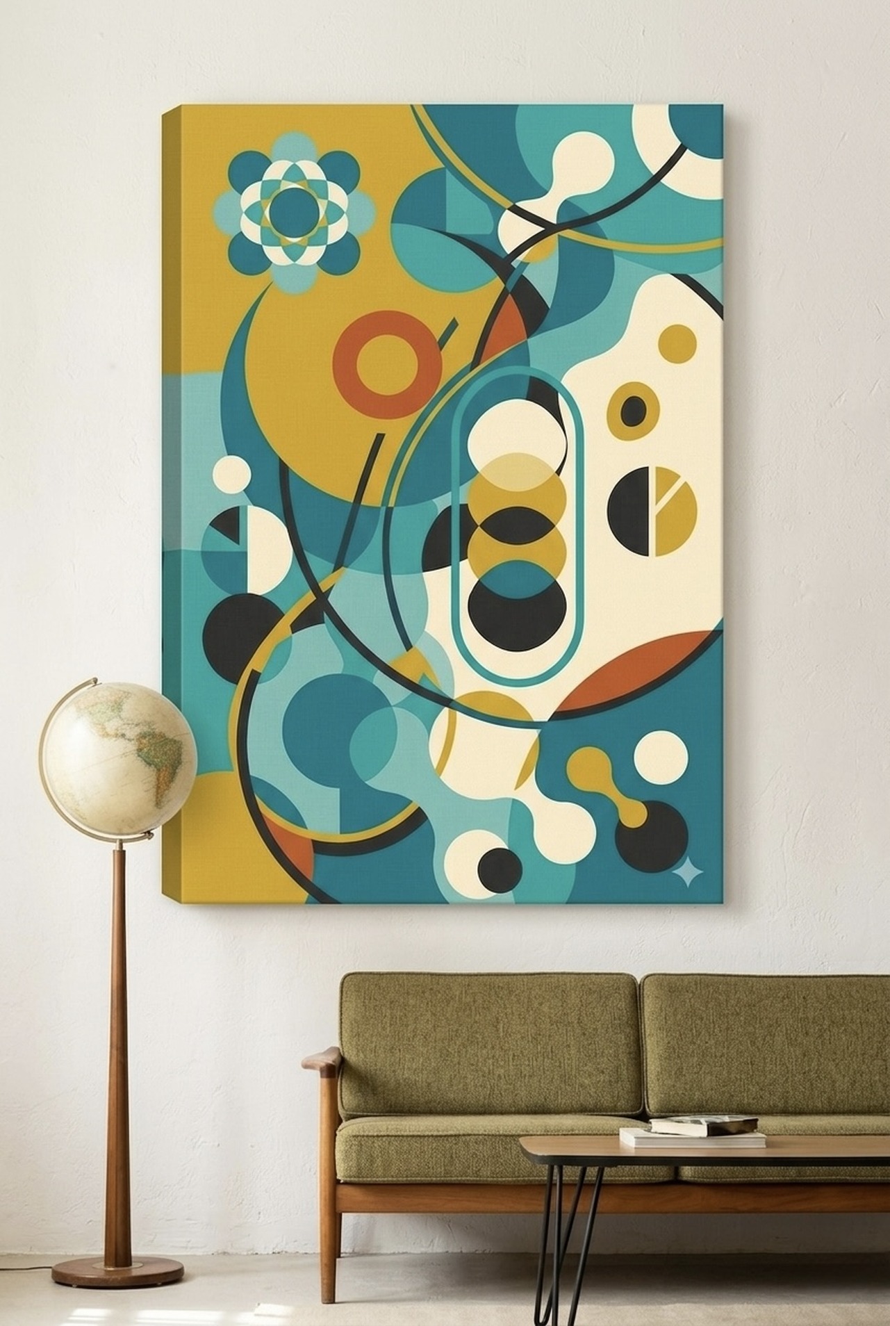
Sea Turtle Canvas Wall Art | Ocean Wildlife Minimalist Painting
Few art subjects feel as naturally at home on gray walls as ocean wildlife. This minimalist sea turtle painting in grey-blue tones creates a tonal relationship with gray walls that feels completely organic, as though the ocean itself is peeking through your wall. The turtle's serene movement through calm water translates into a room presence that is meditative and calming, making this an exceptional choice for bedrooms, spa-style bathrooms, and any space where you seek rest and restoration.
The grey-blue palette is particularly successful on both warm and cool gray walls. Against a warm greige, the blue-gray of this piece provides a welcome cooling counterpoint. Against a cool slate gray, the piece deepens and extends the room's ocean-like quality into something truly immersive. Either way, the effect is sophisticated and serene.
This Sea Turtle Canvas Wall Art pairs exceptionally well with natural materials like sea glass accents, whitewashed wood, and woven textures for a coastal vibe that never feels kitschy or overdone.
View This Print
Leopard Print Canvas Wall Art | Terracotta Animal Print Decor
This terracotta leopard print canvas is the bold move that transforms a gray room from tasteful to unforgettable. The warm, earthy terracotta creates a striking complementary contrast against cool gray walls, referencing the natural tension between clay earth and overcast sky. The animal print pattern adds texture and movement to what could otherwise be a very calm palette, injecting energy and a sense of adventure into the space.
Terracotta on gray is one of the interior design world's most reliable color pairings right now, and this piece delivers that combination in a bold, graphic way that makes a statement. The leopard print motif straddles the line between nature-inspired and fashion-forward, making it work in everything from maximalist eclectic interiors to surprisingly restrained contemporary spaces where it serves as the single bold accent.
Style this Leopard Print Canvas Wall Art with warm-toned accessories like amber glass, warm wood furniture, and rust-colored textiles to create a cohesive palette that makes the gray walls feel luxuriously warm rather than cold.
View This Print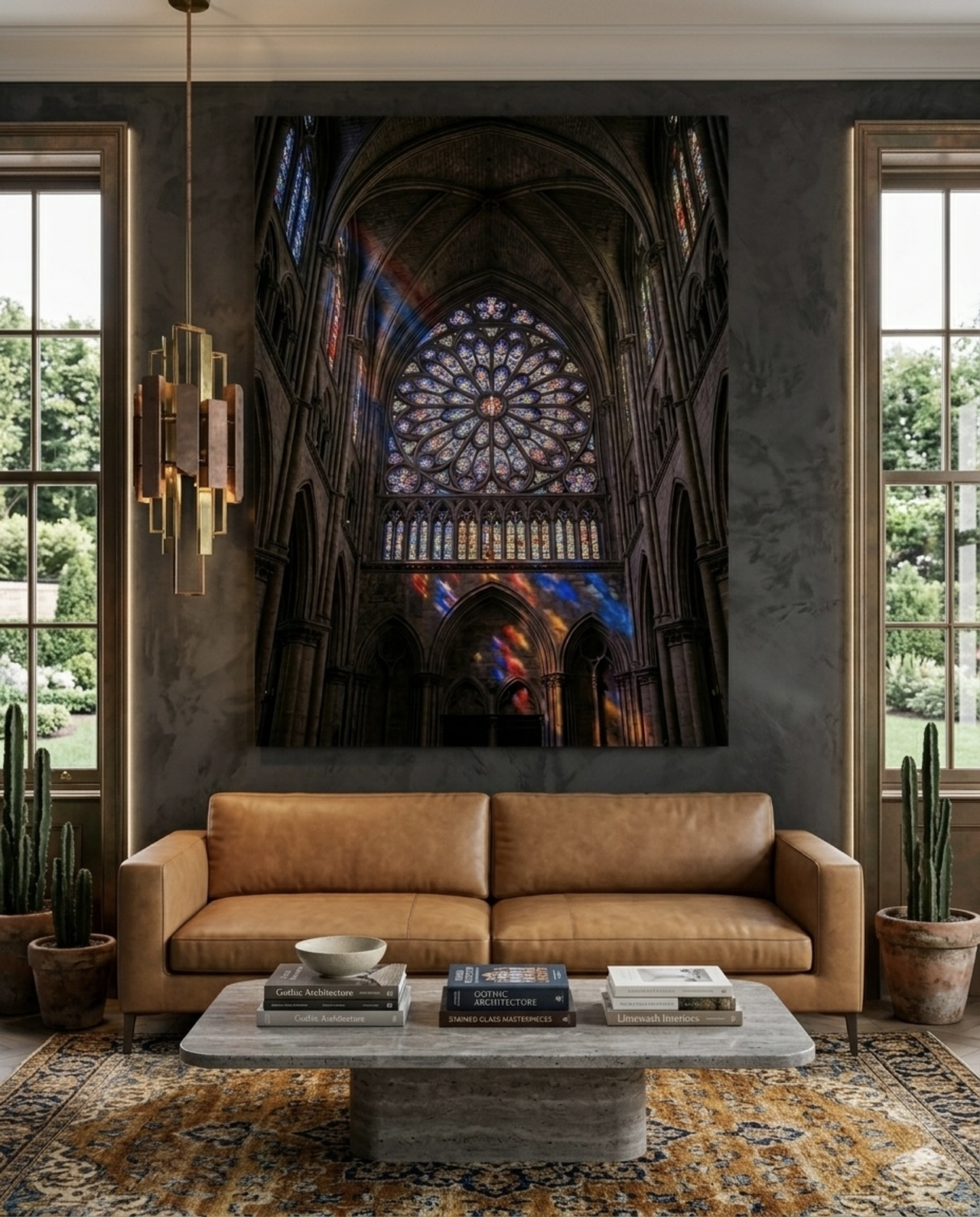
Stay Wild Moon Canvas Print | Navy Blue Wall Art | Grunge Typography
Navy and gray is one of interior design's most enduring partnerships, and this Stay Wild Moon print brings that classic combination to life with a grunge typography treatment that feels contemporary and personally expressive. The cream and navy palette provides a graphic punch against gray walls while the vintage-inspired typography adds character and depth to the composition. The moon motif connects this piece to something elemental and timeless.
What makes this piece particularly successful on gray walls is the navy's relationship to gray's undertones. Navy blue deepens and enriches the visual experience, making even a light gray wall feel more substantial and intentional. The cream tones provide brightness and prevent the combination from feeling heavy or oppressive, creating a balanced, dynamic composition that works in bedrooms, living rooms, and creative workspaces alike.
Display this Stay Wild Moon Canvas Print in a gallery wall with other black and white or navy-toned pieces for a cohesive, curated look, or let it stand alone as a powerful single statement piece.
View This Print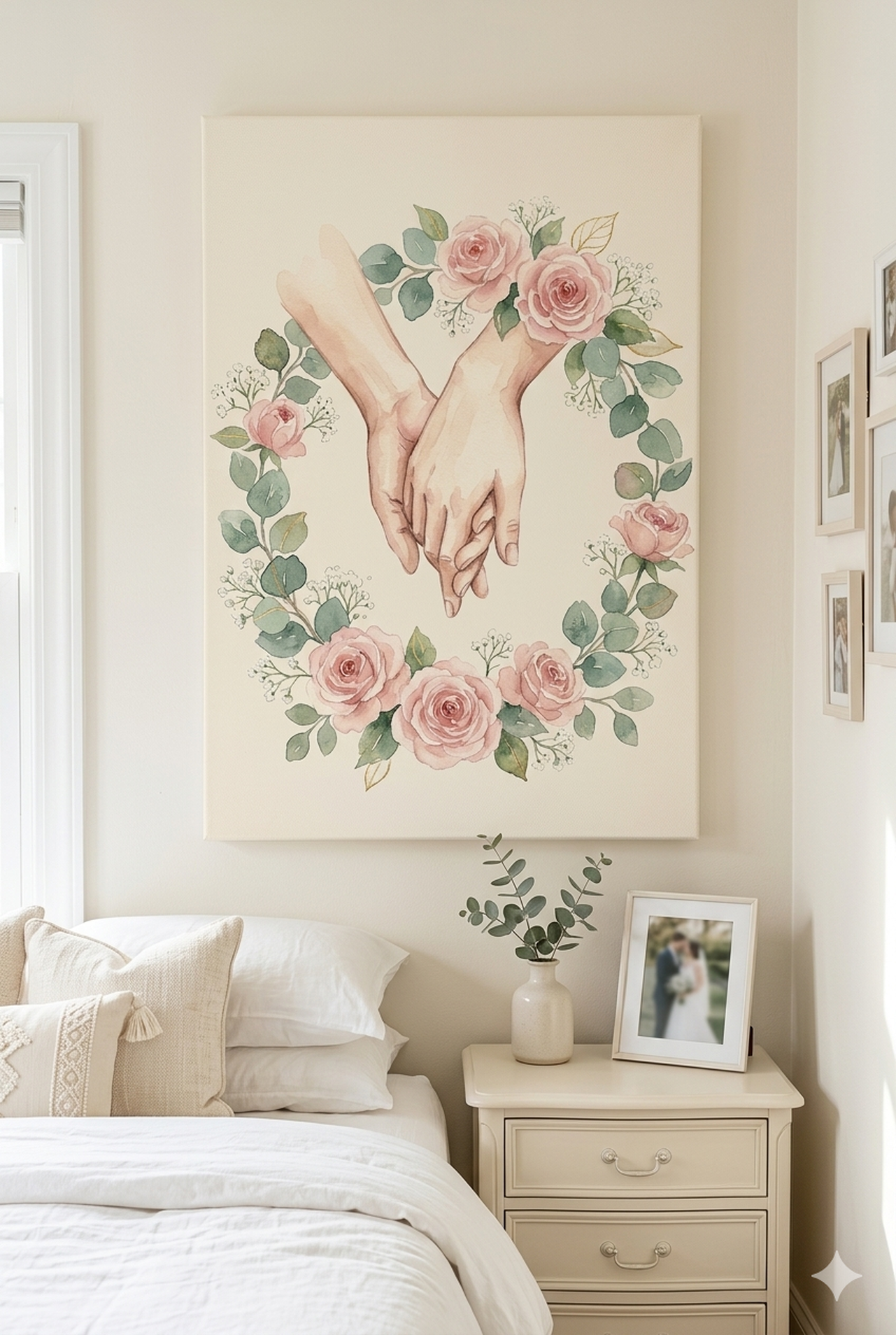
Canyon Strata Canvas Wall Art | Impasto Landscape Print | Earth Tones
This impasto canyon strata painting in rose and terracotta earth tones represents one of the most dramatic and satisfying pairings you can achieve on gray walls. The warm, layered earth tones create an immediate visual contrast against cool gray backgrounds, with the textural quality of the impasto technique adding tactile interest that flat-print art simply cannot match. The geological layers of the canyon strata reference something primal and enduring, bringing the grandeur of the American Southwest into your living space.
The rose-terracotta palette pulls warm tones out of even the coolest gray walls, making the room feel suddenly sun-kissed and alive. This is transformative color theory in action: cool walls plus warm art creates a room that feels balanced and dynamic rather than cold or static. The impasto texture adds visual depth that makes the piece look different from different viewing angles and under different light conditions throughout the day.
Hang this Canyon Strata Canvas Wall Art as a large statement piece in a living room or dining room where its earth-toned warmth can counterbalance the gray walls' natural coolness. Pair with warm-wood furniture and terracotta accents to reinforce the palette.
View This PrintPlacement Guide: Sizing and Positioning Art on Gray Walls
Choosing the right art is only half the battle. Where and how you hang it makes an enormous difference in the final result. Gray walls are particularly revealing when it comes to placement mistakes because their neutral quality provides no camouflage for awkward sizing or poor positioning.
Hanging Height
The standard rule is to center artwork at eye level, which for most adults is approximately 145 to 155 cm (57 to 61 inches) from the floor to the center of the artwork. This measurement applies to standalone pieces, the center of a gallery wall grouping, and the visual center of a diptych or triptych. On gray walls, proper hanging height is especially important because the clean, neutral background emphasizes any deviation from the standard, making too-high or too-low art look particularly awkward.
When hanging art above furniture like sofas or sideboards, position the bottom of the frame approximately 15 to 25 cm (6 to 10 inches) above the furniture's top surface. This creates a visual connection between the piece and the furniture while leaving enough breathing room to avoid a crowded, stacked look.
Sizing for Your Wall
For main walls and large feature walls with gray paint, choose artwork that reads appropriately large in the space. Large focal pieces should be 90 to 150 cm (36 to 60 inches) wide to make genuine visual impact. Undersized art on a large gray wall looks like an afterthought and fails to anchor the space the way the wall demands.
For hallways and corridors with gray walls, smaller accent pieces work beautifully. Aim for pieces that are 45 to 60 cm (18 to 24 inches) wide for narrow corridor walls. A series of small pieces at regular intervals creates a gallery-corridor effect that transforms what could be a transitional non-space into a curated experience.
Gallery Wall Proportions
When creating a gallery wall on gray, arrange pieces before hanging by laying them on the floor first. The overall grouping should cover roughly two-thirds to three-quarters of the available wall space, leaving balanced margins on all sides. For a sofa wall, the gallery grouping should be approximately the same width as the sofa, with slight variations acceptable in either direction.
Mix sizes within the grouping but maintain consistent spacing between frames: 5 to 8 cm (2 to 3 inches) between frames for a curated gallery feel, or 10 to 15 cm (4 to 6 inches) for a more airy, breathing arrangement. On gray walls, black frames create the most graphic, intentional look. Natural wood frames feel organic and warm. White frames, while elegant, can create a slightly washed-out effect against very light gray walls.
5 Common Mistakes to Avoid When Pairing Art with Gray Walls
- Hanging art too small for the wall. A single 20 x 25 cm (8 x 10 inch) print on a large gray wall looks lost and unintentional. Gray walls need appropriately scaled art to feel complete. When in doubt, size up rather than down.
- Ignoring your gray's undertone when choosing art colors. Buying art without considering whether your gray is warm or cool is the single most common mistake. A terracotta piece that looks stunning on a cool gray wall might clash with a warm greige. Always identify undertones first.
- Hanging art too high. Art hung at picture-rail height (near the ceiling) is a common mistake driven by the instinct to "use the wall space." Keep art centered at 145 to 155 cm (57 to 61 inches) from the floor regardless of where the ceiling is.
- Choosing art that exactly matches rather than complements. If your gray wall has blue undertones and you choose blue artwork to "match," the result is flat and color-less. Choose colors that create contrast and dialogue with your gray rather than echo it exactly.
- Leaving frames to chance. The frame is part of the art's relationship with your gray wall. A mismatched frame can undermine even the most perfect art choice. Gold frames add warmth to cool gray spaces. Black frames create graphic drama. Natural wood adds organic warmth. Choose deliberately.
Quick Reference Table
| Gray Shade | Best Art Colors | Recommended Style | Mood Created |
|---|---|---|---|
| Light / Dove Gray | Navy, blush, sage, teal | Minimalist, watercolor | Airy, serene, fresh |
| Warm Gray / Greige | Terracotta, mustard, olive | Nature, landscape, abstract | Cozy, earthy, inviting |
| Cool Gray / Blue-Gray | Terracotta, gold, warm cream | Wildlife, atmospheric | Modern, dynamic, balanced |
| Mid-tone Gray | Black, white, navy, teal | Graphic, typography, minimalist | Sophisticated, curated |
| Charcoal / Dark Gray | White, cream, silver, light blue | Atmospheric, moody, dramatic | Bold, immersive, luxe |
| Silver / Cool Light Gray | Deep teal, forest green, wine | Nature, wildlife, botanical | Organic, calming, elegant |
Frequently Asked Questions
What color art goes with gray walls?
The best colors for art on gray walls depend on your gray's undertone. Cool grays pair beautifully with terracotta, mustard, and warm earth tones for contrast, or with navy and teal for a sophisticated tonal look. Warm grays (greige) work exceptionally well with blues, greens, and cooler-toned art. Mid-tone and neutral grays are the most flexible and work with almost any color palette.
Does black and white art look good on gray walls?
Yes, black and white art looks excellent on gray walls. The gray wall acts as a natural middle tone in the grayscale range, creating a sophisticated monochromatic composition. Black and white photography, graphic prints, and line drawings all benefit from gray wall backgrounds, gaining clarity and presence without color competition.
What size art should I hang on a gray wall?
For main gray walls, choose large focal pieces 90 to 150 cm (36 to 60 inches) wide. For corridors and accent walls, 45 to 60 cm (18 to 24 inches) works well. Hang all art with the center at 145 to 155 cm (57 to 61 inches) from the floor for proper eye-level positioning. Avoid undersizing art on gray walls, as the neutral background makes small pieces look especially lost.
Is terracotta art good for gray walls?
Terracotta is one of the best art colors for gray walls, especially cool or blue-gray walls. The warm, earthy orange creates a striking complementary contrast that feels natural and intentional. Terracotta on gray references the visual tension between clay earth and overcast sky, creating a palette that feels grounded and sophisticated. It works particularly well in living rooms and dining rooms.
What art style works best on gray walls?
Minimalist, wildlife, atmospheric, and abstract art styles all perform exceptionally well on gray walls. Minimalist art benefits from gray's clean backdrop that lets graphic forms stand out. Wildlife and nature art has a natural relationship with gray's neutral, earthy quality. Atmospheric paintings share visual DNA with gray's misty quality. Abstract art gets to display every color in its palette without competition from the wall.
Should art match or contrast with gray walls?
Art should create dialogue with your gray walls rather than match exactly. Pure matching creates a flat, colorless result. Instead, choose colors that either complement gray through contrast (warm terracotta against cool gray) or harmonize through tonal relationship (navy deepening gray's depth). The goal is visual interest and intentionality, not camouflage.
Find Your Perfect Art for Gray Walls
Gray walls deserve art that truly sings. Browse our curated collection of canvas prints designed to complement every shade of gray, from the palest dove to the deepest charcoal.
Shop Wall Art for Gray Walls