Wall Art for Blue Walls: Stunning Color Matches That Create Atmosphere
The Heva Team
Art Curators & Interior Design Enthusiasts · March 28, 2026 · 15 min read
Blue walls create drama and depth. Discover the art styles, color pairings, and placement strategies that turn a blue wall into an extraordinary design statement, with measurements in cm and inches.
Blue walls carry an energy that few other colors can match. Whether you have chosen a deep navy that feels like midnight, a cobalt that crackles with intensity, a calm slate that whispers sophistication, or a fresh teal that bridges blue and green, your walls are making a bold statement. The question is: what artwork do you put on them?
Get the pairing wrong and your art disappears into the wall or fights against it. Get it right, and your room transforms into something extraordinary, with every piece of art amplified by the blue behind it and the wall itself elevated by what hangs on it.
This guide covers everything you need to know about choosing, pairing, and placing art on blue walls, from color psychology to specific style recommendations, precise measurements for placement, and the six products from HEVA UNIQUE ART GALLERY that work beautifully in blue-walled spaces.
Ready to find your perfect piece? Browse our curated wall art collection and filter by color and style to find your ideal match.
The Psychology of Blue Walls
Before choosing art, understanding what your specific shade of blue is doing to your space will help you make better decisions about what to hang on it.
Navy Blue
Navy is the most dramatic of the blue family. It absorbs light, making a room feel more intimate and cocoon-like. Spaces with navy walls feel anchored and serious, with a nautical confidence that suggests authority and refinement. Navy pairs beautifully with warm metals, aged wood, and crisp whites. Art for navy walls needs either strong contrast to pop, or rich tones that deepen the luxurious atmosphere.
Cobalt Blue
Cobalt is vibrant and electric. It does not recede; it advances toward you. A cobalt wall creates a gallery-like energy, making it the ideal backdrop for statement art. Cobalt amplifies colors placed next to it, so warm art tones like gold, amber, and terracotta appear even more vivid against cobalt than they would against a neutral wall.
Teal
Teal sits at the intersection of blue and green, giving it a dual personality. It feels both coastal and sophisticated, both calm and adventurous. Teal walls work exceptionally well with nature-inspired art because the color itself references water and foliage. Gold accents shine warmly against teal, while coral and terracotta create a striking complementary contrast.
Pale Blue and Sky Blue
Soft blues are the most versatile of the family. They open up a space, making rooms feel larger and more airy. Pale blue walls are forgiving; they accept almost any art style without clashing. They work especially well with soft botanical prints, watercolor landscapes, and serene photography. The challenge with pale blue walls is ensuring your art has enough visual weight to stand out against the light background.
Slate and Steel Blue
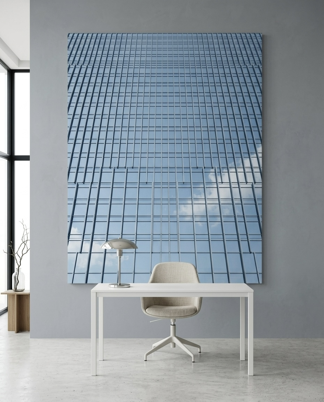
Slate blues have a gray undertone that grounds them in the neutral spectrum while still reading as distinctly blue. They feel modern and architectural, and pair naturally with industrial-inspired art, abstract pieces, and black-and-white photography. Slate walls also work beautifully with warm wood tones and aged metals.
Color Pairings That Sing with Blue
Color theory is your foundation for choosing art on blue walls. Here are the pairings that reliably create stunning results.
Gold and Amber: Classic Contrast
Gold is the natural complement to blue. The warm luminosity of gold against the cool depth of blue creates maximum visual interest without clashing. This pairing has been used for centuries in everything from royal decor to Renaissance paintings, and it works just as powerfully in a modern living room. Look for art with golden tones, warm amber accents, or gilded frames. The darker your blue wall, the more dramatically gold will glow against it.
White and Cream: Clean and Classic
White art on blue walls creates a fresh, coastal, or Scandinavian aesthetic. The contrast is sharp and clean. Cream tones soften the pairing slightly, giving it a warmer, more lived-in feel. White and cream work particularly well as frame colors on blue walls, allowing the artwork itself to be any color without competing with the wall.
Green: Nature Harmony
Blue and green share the cool side of the color wheel, making them natural companions. Art featuring lush greens, emerald tones, or jungle imagery creates a layered, immersive nature experience when displayed on blue walls. The two colors reference the natural world together: sky and forest, ocean and mangrove, river and canopy.
Black: Drama and Definition
Black accents on blue walls create an intensely dramatic look. Black frames against navy walls, or artwork featuring strong black elements against a cobalt backdrop, feel theatrical and sophisticated. This pairing suits gallery walls and statement pieces equally well.
Terracotta and Rust: Warmth Against Cool
The earthy warmth of terracotta against cool blue creates one of decorating's most satisfying contrasts. It evokes Mediterranean coastal towns, Moroccan interiors, and Santa Fe adobe homes. This pairing works especially well in dining rooms and kitchens, where the warmth of terracotta adds appetite-stimulating energy against the calming blue.
Coral and Orange: Bold Pop
For those who want maximum color impact, coral and orange against blue walls deliver high-energy contrast. Orange sits directly opposite blue on the color wheel, making them true complementary colors. Used thoughtfully, this pairing creates spaces that feel vibrant and alive. The key is allowing one color to dominate: let the blue wall be the backdrop and the orange or coral appear in accents within the artwork rather than overwhelming the space.
Art Styles for Blue Walls
Beyond color, the style and subject matter of your art shapes how it interacts with blue walls.
Dramatic Seascapes and Water Art
Blue walls and water-themed art share an obvious connection that feels intentional rather than coincidental. Crashing waves, misty waterfalls, and still coastal scenes all extend the blue atmosphere of the room into the artwork itself. The effect is immersive and meditative.
Mythological and Epic Art
Large-format mythological pieces, ancient deity reliefs, and epic figure studies carry the gravitas needed to hold their own against bold blue walls. The scale and drama of these pieces match the ambition of a dark blue feature wall.
Nature and Landscape Photography
Mountain ranges, fjords, forests, and volcanic landscapes bring the grandeur of the natural world into your space. On a blue wall, landscape art creates a window-like effect, extending the room visually and making it feel connected to an expansive outdoor world.
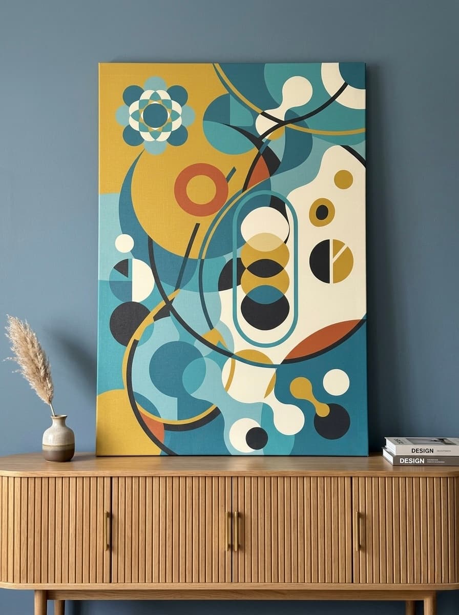
Abstract Art
Abstract pieces in warm tones work brilliantly on blue walls. The non-representational quality of abstract art lets the colors do the work. A large abstract canvas in amber, gold, and cream on a navy wall creates dynamic tension that anchors the entire room.
Gold-Accented and Gilded Pieces
Any artwork featuring gold leaf, gold detailing, or golden color tones becomes more precious against blue. The mutual enhancement of these two colors is why so much traditional Eastern and European art combined them. This principle applies equally to contemporary art.
Featured Art Pieces for Blue Walls
These six pieces from HEVA UNIQUE ART GALLERY have been selected specifically for their compatibility with blue walls, each addressing a different shade, room type, and decorating goal.
Poseidon Stone Relief Canvas Wall Art | Greek God Ocean Waves Print
Mythological grandeur meets oceanic energy. The stone relief aesthetic and silver-blue tones of this Poseidon piece create an extraordinary visual conversation with blue walls. On a navy or cobalt feature wall, the ancient Greek god of the ocean feels completely at home, turning your living room into something that feels like a curated gallery crossed with a classical museum.
Shop Poseidon Art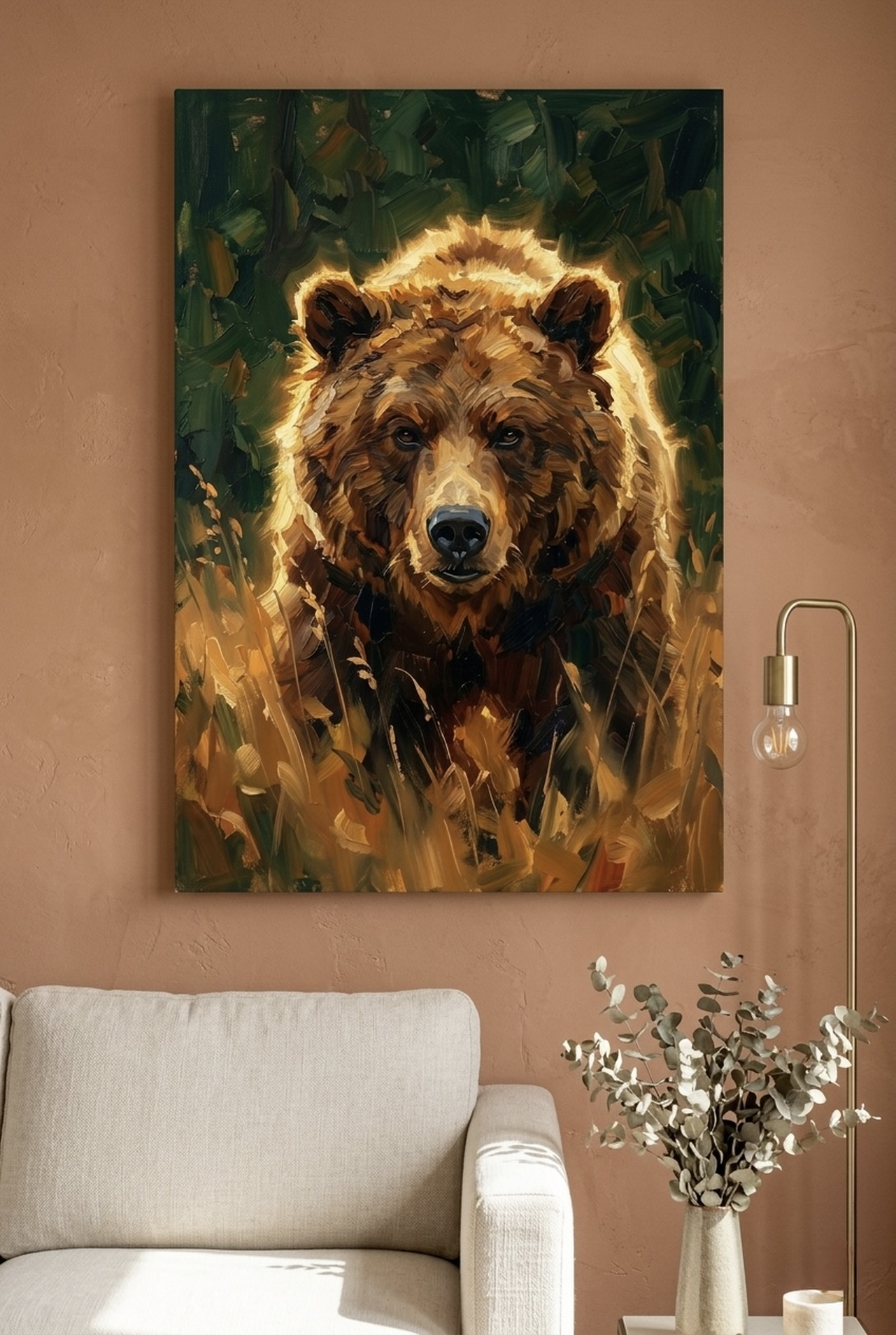
Waterfall Canvas Wall Art | Tropical Forest Painting Framed Print
Emerald greens and gold tones cascade through this painterly waterfall piece, creating a lush tropical atmosphere that complements teal and slate blue walls particularly well. The movement and energy of falling water introduces dynamic contrast against a still blue backdrop. This is the piece for anyone whose blue wall leans toward the green-blue range of teal or slate.
Shop Waterfall Art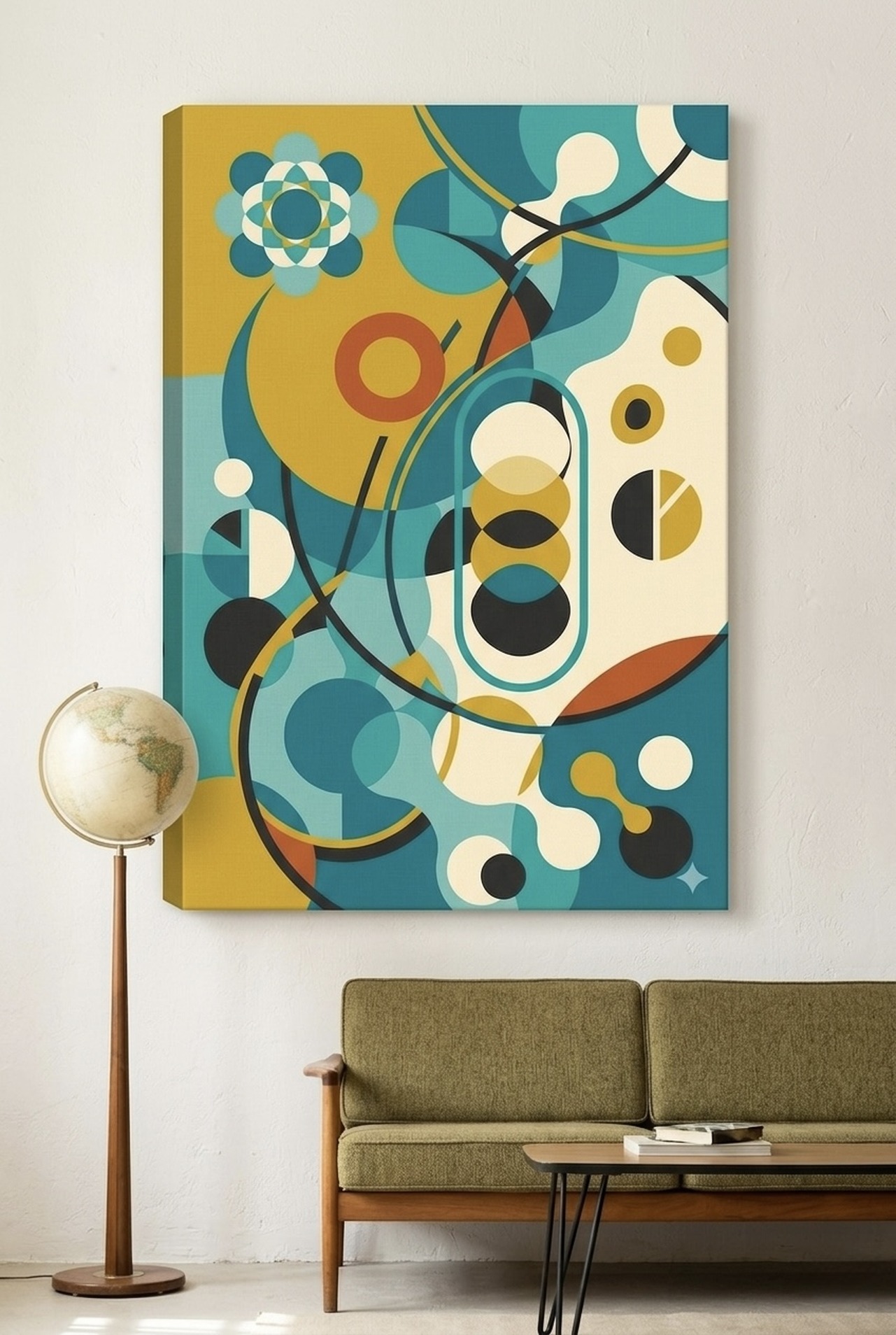
Landscape Canvas Wall Art | Norwegian Fjord Mountain Painting
Pale blue fjord waters and teal-tinged mountain reflections make this Norwegian landscape a natural choice for blue walls of every shade. The horizontal expanse of the fjord composition gives it an almost cinematic quality, and its cool tones create a tone-on-tone layering effect on blue walls that feels intentional and sophisticated. For a bedroom with dusty blue or pale blue walls, this piece delivers serenity without monotony.
Shop Fjord Art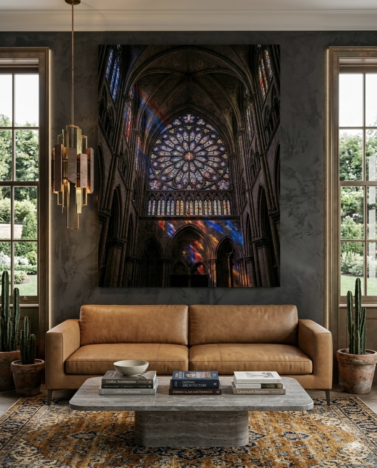
Klimt Urn Trio Canvas Wall Art | Gold Mosaic Jewel Tone Print
Gustav Klimt understood the power of gold against jewel tones, and this trio of decorative urns in his signature gold mosaic style is one of the most impactful art choices for navy or cobalt blue walls. The rich jewel tones, including deep blues and emerald greens within the design itself, harmonize with your wall while the gold mosaic creates luminous contrast. This is the statement piece for a dining room or formal living space with a dark blue feature wall.
Shop Klimt Art
Volcano Canvas Wall Art | Volcanic Summit Landscape Photography Print
This is the bold play: amber and orange volcanic fire against a blue wall. The complementary contrast of warm amber-orange against cool blue is one of the most visually exciting pairings in color theory, and this volcanic summit photography delivers it with photographic intensity. On a teal or navy wall, the volcanic glow appears almost incandescent. This piece works particularly well in home offices and studios where you want energy and inspiration radiating from the walls.
Shop Volcano Art
Golden Dragon Canvas Wall Art | Chinese Watercolor Painting Print
Jade and gold tones swirl through this traditional Chinese watercolor dragon composition. The jade-green undertones in the artwork create harmonic resonance with teal and blue-green walls, while the golden dragon itself provides dramatic contrast. Chinese imperial art has long combined gold and jade on blue, and this piece brings that centuries-old wisdom into contemporary decorating. It is equally stunning in a hallway, living room, or meditation space with blue walls.
Shop Dragon ArtPlacement Guide with Measurements
Choosing the right art for your blue wall is only half the battle. Placement determines whether the result looks intentional and professional or haphazard and accidental. Follow these measurements for results that look like they were styled by an interior designer.
Feature Wall Behind Sofa
The most common placement for statement art on a blue wall. Your art should span 120 to 160 centimeters (48 to 63 inches) wide, or roughly two-thirds the width of your sofa. Hanging art too narrow over a sofa is one of the most common decorating mistakes. If a single piece feels too wide, a diptych or gallery grouping that spans the same width works equally well.
Bedroom Feature Wall
For art centered above or flanking a bed headboard, aim for 90 to 130 centimeters (36 to 51 inches) wide for a queen bed, and 110 to 150 centimeters (43 to 59 inches) for a king. The art should feel like it belongs to the bed, not floating disconnected above it.
Dining Room
Dining room art typically goes on a side wall rather than above a table. Aim for 75 to 120 centimeters (30 to 48 inches) wide. Scale down slightly from living room proportions, as dining rooms are often used in intimate lighting where large-scale drama is less necessary.
Center Height from Floor
The center of your artwork should sit at 145 to 155 centimeters (57 to 61 inches) from the floor. This places the visual center at average eye level for a standing adult. In rooms where people are primarily seated (dining rooms, living rooms), you can hang art slightly lower, at 137 to 145 centimeters (54 to 57 inches) from floor to center.
Gap Above Furniture
Leave 15 to 25 centimeters (6 to 10 inches) between the top of your furniture (sofa back, headboard, console table) and the bottom of your art. Less than 15 centimeters makes the art look like it is sitting on the furniture; more than 25 centimeters severs the visual connection and makes the art look disconnected from the room.
Gallery Walls on Blue
If you are creating a gallery wall on a blue feature wall, keep the outer boundary of the gallery within the proportions above for the room type. Lay out your arrangement on the floor first. On dark blue walls, use lighter-colored frames (white, cream, natural wood) so individual pieces remain visible. On pale blue walls, darker frames (black, charcoal, dark wood) create better definition.
5 Common Mistakes When Hanging Art on Blue Walls
1. Choosing Art That Disappears
Dark art on dark blue walls is a common mistake. A piece that blends into the wall neither complements nor contrasts: it simply vanishes. Unless you are deliberately creating a tone-on-tone layered effect with very different values and textures, ensure your art has enough contrast in either color or value to be clearly visible against your blue wall.
2. Hanging Art Too High
People hang art too high in almost every room. The impulse to hang art at ceiling level is nearly universal and almost always wrong. Stick to the 145 to 155 centimeter center-height rule and resist the urge to go higher. Art hung at the correct height creates a connection between the artwork and the room; art hung too high floats untethered above everything else.
3. Going Too Small
A small piece of art on a large blue feature wall looks lost and accidental. Blue walls are bold statements; the art on them needs to match that boldness. A single large canvas is almost always more impactful than several small ones scattered across a blue wall.
4. Ignoring the Frame
The frame is part of the art-wall interaction on blue walls. A black frame on navy can disappear entirely. A gold frame on navy glows with distinction. Consider the frame as an active design element, not just packaging. On pale blue walls, warm wood frames add organic warmth; on dark blue walls, white or metallic frames add clarity and definition.
5. Matching Instead of Complementing
Art that is the same shade of blue as your wall matches instead of complementing, and the result is flat and uninteresting. Look for art that uses your wall color as one element within a larger palette rather than mirroring it exactly. A piece with blue, gold, and white against a blue wall is far more dynamic than a purely blue piece against a blue wall.
Frequently Asked Questions
What color art looks best on navy blue walls?
Gold and warm amber tones create the most striking contrast against navy blue walls, as the warm-cool complementary relationship between gold and blue produces maximum visual impact. White and cream art also works beautifully for a crisp, nautical aesthetic. Terracotta adds earthy warmth, and jewel tones in emerald or deep red create a layered, luxurious look.
Can I put colorful art on a blue wall without it clashing?
Yes, with the right approach. Choose art where blue is one of several colors rather than competing with your wall color. Warm-toned art in amber, gold, terracotta, or coral works best because these colors are complementary to blue on the color wheel. Avoid art that is predominantly a slightly different shade of blue, as this creates subtle conflict rather than harmony.
What art style works best on teal walls?
Teal walls are particularly receptive to nature-inspired art (waterscapes, tropical landscapes, botanical prints), gold-accented pieces (Klimt-style mosaics, gilded Asian art), and vibrant complementary pieces in coral or rust. The blue-green character of teal means it harmonizes with both water art and lush green botanical art equally well.
How large should art be on a blue feature wall?
For a living room blue feature wall behind a sofa, your art should be 120 to 160 centimeters (48 to 63 inches) wide. For a bedroom, 90 to 130 centimeters (36 to 51 inches) wide. Single large canvases almost always make more impact on bold blue walls than collections of small pieces.
Does black and white art work on blue walls?
Black and white art can work well on slate blue and pale blue walls, where the neutral values of the artwork complement the muted quality of the wall color. On strong navy or cobalt blue, black and white art can look stark or hospital-like. For those stronger blues, adding warmth through art tones typically produces better results.
Should I use the same blue in my art as my wall?
Generally, no. Art that exactly matches your wall color blends in rather than standing out. Instead, look for art that incorporates your wall's blue as one color among several. A piece with blue, gold, and cream against a blue wall creates a layered effect where the colors reference each other without competing. The exception is deliberate tone-on-tone decorating, where art in slightly lighter or darker blues creates a sophisticated monochromatic effect.
Quick Reference: Blue Wall Art Pairings
| Blue Shade | Best Art Colors | Ideal Style | Atmosphere |
|---|---|---|---|
| Navy | Gold, White, Terracotta | Mythological, Gilded, Epic | Dramatic, Refined, Anchored |
| Cobalt | Amber, Coral, Cream | Abstract, Bold Landscapes | Electric, Gallery-Like, Vibrant |
| Teal | Gold, Coral, Emerald | Nature, Tropical, Asian Art | Coastal, Sophisticated, Alive |
| Pale Blue | Warm Neutrals, Soft Green | Botanical, Watercolor, Photography | Airy, Serene, Spacious |
| Slate Blue | Black, Warm Wood, Rust | Abstract, Industrial, B&W | Modern, Architectural, Grounded |
Blue walls reward bold choices. The homeowners who get the most from a blue feature wall are the ones who lean into contrast rather than retreating from it, who hang art large enough to hold its own, and who treat color as the powerful design tool it is.
Whether your walls are the deep drama of navy, the electric intensity of cobalt, the versatile warmth of teal, or the serene openness of pale blue, there is art that will elevate them from a color choice to a complete aesthetic experience.
Find your perfect match. Shop our full wall art collection and filter by color to discover art that will make your blue walls extraordinary.