Gold and Black Wall Art: The Luxury Combo Guide
The Heva Team
Art Curators & Interior Design Enthusiasts · May 13, 2026 · 14 min read
Gold and black is the pairing designers reach for when a room needs to feel finished and editorial. Six canvas picks, the 80/20 ratio rule, and where to hang them for maximum impact.
Gold and black is the color combination interior designers reach for when a room needs to feel finished, expensive, and a little theatrical without trying too hard. The pairing has been doing heavy lifting in homes for four centuries, from Baroque palaces to Hollywood Regency apartments to the editorial Pinterest moodboards saved by every couple closing on a first home in 2026.
This guide pulls together the design rules our team uses for gold and black wall art, six canvases we keep recommending to customers building this look at home, and the small placement tricks that separate a polished room from a costume-shop attempt at glam.
Ready to browse? Visit our luxury wall art collection, or keep reading for our top picks and the styling rules a glossy magazine spread will not spell out for you.
What You Will Find in This Guide
- Why Gold and Black Is the Most Reliable Luxury Combo
- The Color Psychology Behind the Pairing
- The Ratio Rule: How Much Gold, How Much Black
- Our 6 Favorite Gold and Black Canvas Picks for 2026
- Where to Hang Gold and Black Wall Art for Maximum Impact
- Room-by-Room Styling Tips
- Common Mistakes to Avoid
- Gold and Black Wall Art FAQs
- Quick Reference Table
Why Gold and Black Is the Most Reliable Luxury Combo
The gold-and-black story did not start on Pinterest. According to Britannica's overview of Baroque art and architecture, 17th-century European designers leaned hard on gilded ornament against deep, shadowy backgrounds to make rooms feel both reverent and theatrical under candlelight. Three centuries later, the pairing came back through Art Deco in the 1920s, then again through Hollywood Regency in the 1930s and 1940s, before landing in the editorial-luxe Instagram feeds of today.
What keeps designers returning to it is mathematics, not nostalgia. Black absorbs almost all visible light. Gold reflects it warmly. Place the two side by side and you create the highest possible contrast ratio in a space, which is the single fastest way to draw the eye to the wall where the art lives.
In our experience styling living rooms, the easiest way to age a beige sofa from forgettable to intentional is a single dark-and-gilded canvas hung above it. The combination forgives a lot. It works against off-white walls, against deep paint colors, even against busy gallery layouts where a quieter palette would get lost.
The Color Psychology Behind the Pairing
Black and gold do different jobs for the eye, which is why the pairing reads as balanced rather than aggressive. The team at Color Psychology notes that black is read by most viewers as sophisticated, formal, and authoritative, which is why luxury brands lean on it so heavily for packaging and storefronts. Gold, by contrast, reads as warm, generous, and high-status, but only in moderation. Too much gold tips into garish, the way a costume crown reads differently from a vintage gilded frame.
The reason the two work so well together comes down to temperature. Black is neutral and infinitely adaptable. Gold is warm. When you place a warm hue against a deep neutral, the warm tone glows. That is the whole illusion the pairing trades on.
If you are building this look in a room that already runs cool (think gray sofa, marble coffee table, chrome lamp), gold and black wall art is the most efficient way to introduce warmth without rethinking every other furnishing. We see this work especially well in modern condos and rentals where the existing finishes lean industrial.
The Ratio Rule: How Much Gold, How Much Black
The biggest mistake beginners make with this palette is going 50-50. Equal parts gold and black reads loud and cheap. The classical proportion that designers from Baroque onward have used is closer to 80-20, with black holding the majority of the visual weight and gold doing the accent work.
Apply that ratio to your wall art and rooms snap into place. A canvas with a black background and gold leaf accents in roughly an 80-20 ratio will feel expensive without ever feeling shouty. The same canvas at 50-50 ends up reading like hotel-lobby art from 2004.
The same ratio extends to the room. If your art is gold-and-black, keep the rest of the metallics in the space limited to a single accent (a lamp base, a side table leg, a picture light). When every fixture is gold, the art has nothing to anchor.
For practical measurements, a typical mid-size canvas runs 60 to 90 cm wide (24 to 36 inches). At that scale, our recommendation is to keep gold elements covering no more than a third of the painted surface area. The rest can be black, charcoal, or a deep secondary like wine, navy, or olive.
Our 6 Favorite Gold and Black Canvas Picks for 2026
The pieces below were picked from our 2026 catalog because each one nails a different mood inside the gold-and-black palette: editorial, ornate, minimalist, regal, dramatic, and quiet. If you are buying a single canvas for a feature wall, pick the mood that matches the rest of the room first, then the size.
1. The Statement Bloom: Black Gold Ornate Floral Hummingbird Canvas
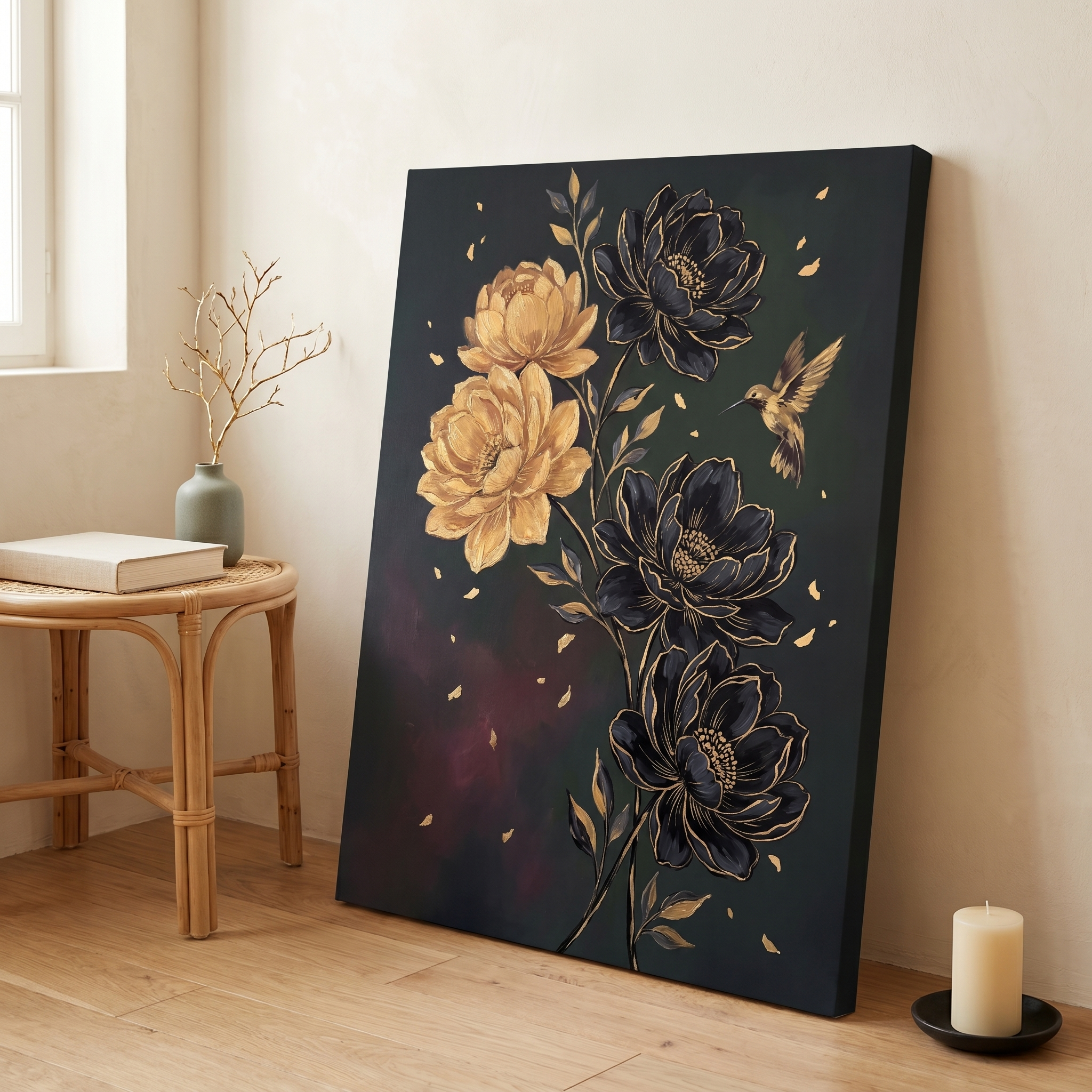
The black backdrop here behaves like a stage curtain. It pushes the gilded floral motif forward, then a single jeweled hummingbird breaks the symmetry so the piece never settles into pure decoration. Wine and sage secondary tones keep it from reading too cold, which is exactly why this canvas works above a bed or a long console more than it works in a kitchen.
We have placed this one above tufted velvet headboards in deep emerald, against unpainted plaster walls, and even in a tiled powder room where it stood up to the steam beautifully. The ornate floral framing borrows directly from the Baroque rooms we mentioned earlier, which is what gives the piece its quiet authority. Try it at 60 by 90 cm (24 by 36 inches) above a queen bed for a dressed-but-not-shouting bedroom feel.
Explore the Hummingbird Floral Canvas
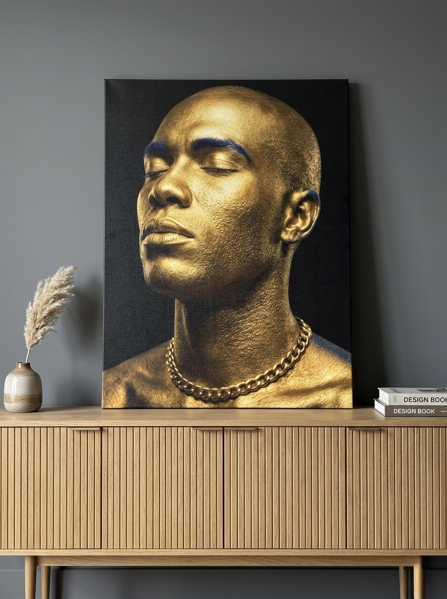
2. The Editorial Statement: Gold King Portrait Canvas
Portrait-format art does something black-and-gold landscapes cannot: it forces the eye upward and creates a vertical column of attention in the room. This gilded face emerging from a near-black ground reads more like a sculpture-in-paint than a traditional portrait, which is why we recommend it for spaces that already feel modern.
The blue undertone running through the metallic finish keeps the gold from feeling brassy or cheap. Hang this one in a study, a home office, or beside a tall window where afternoon light can catch the gold surface and shift the canvas throughout the day. At 50 by 70 cm (20 by 28 inches), it sits perfectly between a tall lamp and a leather chair.
3. The Minimalist Pick: Lotus Flower Gold Leaf Black Canvas
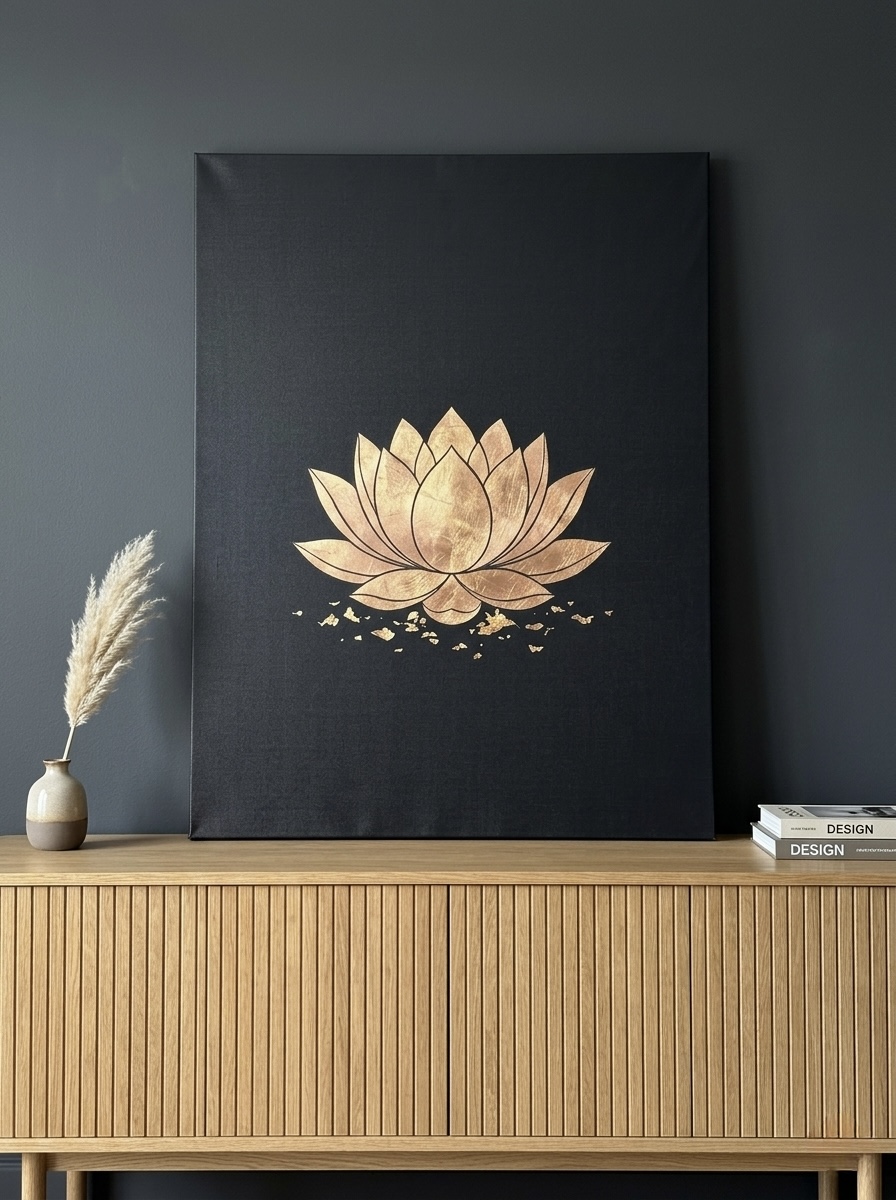
If the ornate floral feels like dressing for dinner, this one is dressing for tea. The composition is mostly negative space. A single gold-leaf lotus sits low in the frame, leaving roughly seventy percent of the canvas in solid black. Tan and cream secondaries soften the contrast just enough that it reads as calming rather than stark.
This is our go-to recommendation for bedrooms that lean into Japandi or wabi-sabi influences, where the gold needs to read as warmth rather than glitz. The lotus motif borrows from Japanese symbology, where the flower stands for rebirth out of stillness, and the black gives that symbol the gravity it deserves. The minimalist approach also pairs naturally with the gold-leaf restraint of kintsugi, the Japanese practice of repairing broken ceramics with gold lacquer, which our team finds a more elegant reference point than European glamour for this kind of canvas.
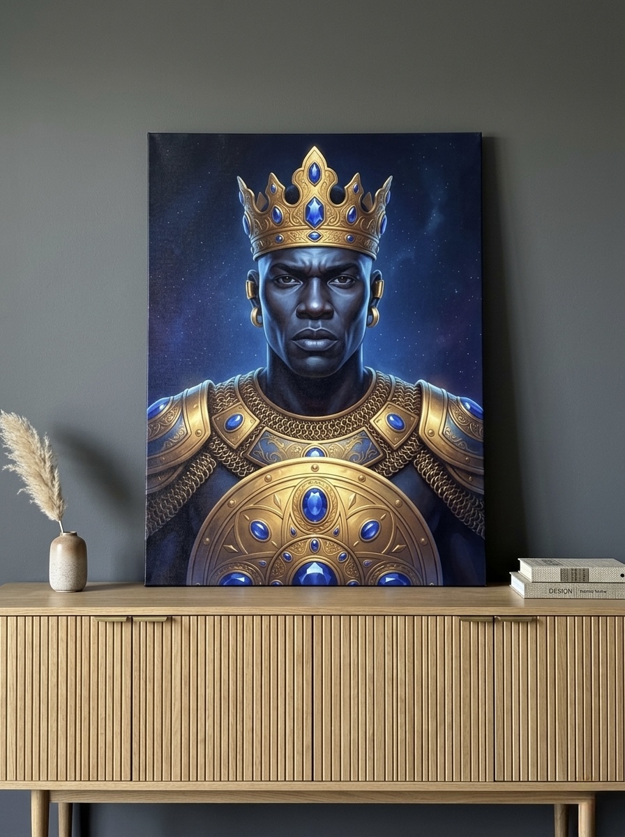
4. The Regal Statement: African Warrior King Gold Armor Canvas
This one is for buyers who want their gold to do narrative work, not just decorative work. The figure is depicted in molten gold armor against a navy-and-black background, which gives the piece three layers of value: deep navy, true black, and warm metallic gold. The result reads as cinematic.
We recommend this canvas as a single statement piece on a feature wall, not as part of a gallery arrangement. Pair it with deep moody paint colors (warm charcoal, near-black green, oxblood) and minimal competing decor. Customers tell us this canvas is one of the few pieces in our catalog that elicits comments from every guest who walks into the room. For more on building a room around this kind of single dramatic anchor, our team has written separately about wall art for dark moody interiors.
Browse the Warrior King Portrait
5. The Dramatic Wildlife: Roaring Lion Bold Oil Canvas
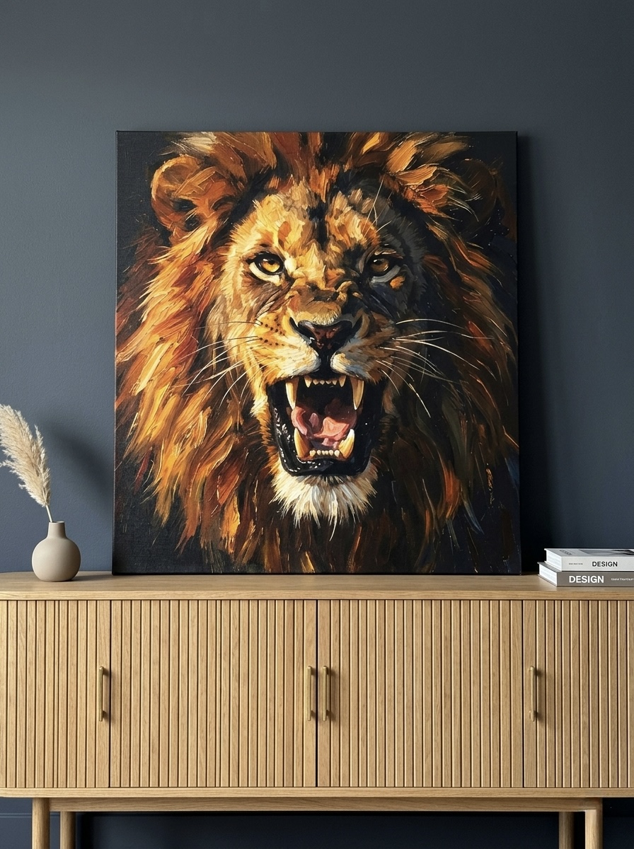
Lions sit in the visual shorthand for power for almost every culture on the planet, which is why this oil-painted canvas works in spaces that need to project confidence without leaning into anything religious or political. The painterly treatment, all amber, gold, and deep charcoal, keeps the piece warm so it does not feel cold or corporate.
Our customers most often place this one in a home office, a study, or a media room. The orange-and-gold highlights against the dark background pair particularly well with leather seating and walnut shelves. For executives building a home office that holds up to video calls, we have a separate guide on video call backgrounds and WFH wall art that uses this canvas as an example.
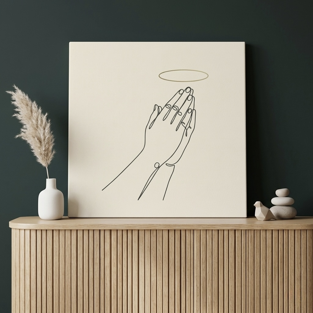
6. The Quiet Spiritual Pick: Praying Hands Golden Halo Canvas
This pick widens what gold-and-black can do. The composition uses cream as the dominant background, then anchors with a single golden halo above clasped praying hands rendered in confident black line art. The cream takes the edge off, so even buyers who associate gold-and-black with formality can read this canvas as serene.
It is the canvas we recommend most often when a customer wants the visual sophistication of the palette but does not want their bedroom or entryway to read as a hotel lobby. Hang at eye level above a small console, a prayer corner, or any nook where stillness is the goal. Faith-themed buyers may also enjoy our companion piece on Christian wall art for every room for room-by-room placement help.
View the Praying Hands Halo Canvas
Where to Hang Gold and Black Wall Art for Maximum Impact
Placement does as much work as the art itself with this palette. Gold needs light to do its job. Without a light source nearby, the metallic ink or paint surface reads as muddy brown, and you lose half the contrast that made you pick the piece in the first place.
Three rules our team applies on every install:
- Hang within 1.5 meters (5 feet) of a light source. Lamps, sconces, or a sunny window all count. Picture lights mounted above the frame work best because they cast warm raking light that wakes up the gold leaf.
- Center the piece at 145 to 150 cm (57 to 60 inches) measured to the artwork's midpoint. This is gallery standard and is roughly the average human eye level. Going higher makes the room feel cold; going lower makes the room feel cluttered.
- Leave breathing room of at least 15 to 20 cm (6 to 8 inches) between the art and any furniture below it. Crowding the canvas onto a sofa or headboard kills the drama you paid for.
If you are working with a wall that has no natural light, install a battery-powered picture light directly above the canvas. The warm LED color temperature (somewhere between 2700K and 3000K) will flatter the gold surface in the same way candlelight flattered Baroque interiors.
Room-by-Room Styling Tips
Living Room
The living room is the easiest place to land this palette because the room is usually built around a sofa, which gives the canvas a natural anchor. Pick one large piece (90 cm wide or wider, roughly 36 inches and up) and hang it centered above the sofa. Avoid splitting your gold-and-black moment across multiple smaller frames; the impact dilutes fast.
Pair the canvas with warm neutrals on the lower half of the room (camel leather, walnut, oat-colored linen) so the eye is drawn upward to the wall. If your living room is small, our team has a separate guide on best wall art for living rooms in 2026 with size-by-room recommendations.
Bedroom
Above-bed placement is where this palette earns its keep. The headboard wall is the focal wall in almost every bedroom layout, and a gold-and-black canvas turns that wall into a finished room without the cost of a custom headboard. Hang the canvas roughly 15 to 20 cm above the top of the headboard, centered on the bed.
Keep bedding tonal (deep walnut linen, cream cotton, near-black velvet pillows) and the canvas does the rest. Our most popular pairing is the Lotus Flower Gold Leaf above a queen bed dressed in pale oat linen, which softens the moodiness without diluting it.
Entryway and Hallway
The first wall a guest sees sets the tone for the whole home. Gold-and-black art in an entryway reads as confident hospitality. We recommend one tall portrait-orientation canvas above a slim console or bench, paired with a single gold-toned mirror across the way to bounce the light back.
Avoid the temptation to fill the wall edge to edge; entryway art works best with generous negative space around it. A 50 by 70 cm canvas on a six-foot wall reads as more expensive than three smaller frames stacked together.
Dining Room
A gold-and-black canvas above a buffet or sideboard makes the dining room feel ready for actual entertaining. Hang the art at seated eye level (about 135 to 140 cm, or 53 to 55 inches, measured to the midpoint), since that is the height your guests will see it from when they sit down to dinner. Warm-toned pendant lighting overhead helps the gold do its job.
Common Mistakes to Avoid
Even with a forgiving palette, there are five missteps that turn this look from sophisticated to dated almost instantly.
- Going gold-on-gold. Stacking a gold-framed canvas against a gold-leafed wallpaper or three gold accent pieces in the same sightline overwhelms the eye. Pick one gold moment per wall and stop.
- Mixing gold tones. Yellow gold, rose gold, and brass all live in this palette, but mixing two of them in the same room reads as accidental rather than collected. Pick one tone and commit.
- Skipping a light source. The single most common reason customers tell us a piece looks "different than it did online" is because they hung it on a dim interior wall with no fixture nearby. Gold needs light. Build it in.
- Going too small. Black-and-gold art swallows visual impact when undersized. A 30 by 40 cm canvas above a six-foot sofa looks like a postage stamp. Scale up to at least sixty percent of the furniture below.
- Pairing with cool-white walls. True bright white walls fight the warmth of gold. Warm white, cream, soft mushroom, or any of the moody paint colors (deep charcoal, near-black green) flatter the palette far better.
Gold and Black Wall Art FAQs
Is gold and black wall art going out of style in 2026?
No. The palette has been in continuous rotation in luxury interiors for roughly four centuries, from Baroque ceilings to Hollywood Regency apartments to current editorial-luxe spaces. Specific stylings come and go (heavy gold leaf maximalism is quieter right now, minimalist gold-on-black is louder), but the underlying combination is essentially evergreen.
Does gold and black wall art work in small rooms?
Yes, but with two adjustments. Pick a single canvas rather than a gallery wall, and choose a piece with generous negative space (the Lotus Flower or Praying Hands Halo from our picks above both work). The black ground does shrink the apparent depth of a small room slightly, so balance it with light-toned furniture and one good lamp nearby.
What wall colors look best behind gold and black art?
Warm white, cream, soft mushroom, and any moody paint color (deep charcoal, oxblood, near-black green, navy) all flatter the palette. Cool stark white fights the warmth of gold and should be avoided. If your walls are bright cool white and you cannot repaint, hang the art with a warm-LED picture light to compensate.
Can I mix gold and black wall art with silver decor?
It is possible but tricky. The classic rule is to commit to one metal per room. If your hardware, lamps, and frames are all silver or chrome, a gold-and-black canvas can read as out of place. If you must mix, treat the canvas as the only gold element and balance with at least three silver touches elsewhere so the metals stay in conversation rather than competing.
What size gold and black canvas should I buy for above the sofa?
The canvas should span roughly sixty to seventy-five percent of the sofa's width. For a standard three-seater sofa at about 210 cm (84 inches), that means a canvas of 130 to 160 cm (51 to 63 inches) wide. Going smaller makes the wall feel under-decorated; going larger crowds the seating area. For a deeper breakdown by furniture size, see our above-the-sofa size and placement guide.
How do I clean a gold-leaf canvas without damaging the finish?
Dust with a soft dry microfiber cloth, working in one direction only. Avoid water, glass cleaner, or any solvent, all of which can cloud or strip metallic surfaces. If a canvas is hung in a kitchen or near a fireplace, dust it more often, since cooking residue and soot dull gold faster than other particulates.
Quick Reference Table
| Canvas | Best For | Dominant Colors | Link |
|---|---|---|---|
| Black Gold Ornate Floral Hummingbird | Bedroom, glam statement wall | Black, gold, wine, sage | View |
| Gold King Portrait | Study, home office, modern entry | Black, gold, blue | View |
| Lotus Flower Gold Leaf Black | Calm bedroom, meditation nook, Japandi spaces | Black, gold, tan, cream | View |
| African Warrior King Gold Armor | Living room feature wall, cultural decor | Navy, gold, blue, charcoal, black, silver | View |
| Roaring Lion Bold Oil | Home office, study, media room | Gold, orange, black, brown, charcoal | View |
| Praying Hands Golden Halo | Quiet entryway, prayer corner, serene bedroom | Cream, gold, black | View |
Gold and black is a palette that rewards restraint. Pick one canvas, give it room to breathe, add one warm light source nearby, and the rest of the room will rise to meet it. For more on building a luxury feel without overspending, our team has a companion piece on luxury wall art that looks expensive at home.
Ready to find the right piece for your space? Browse our full luxury wall art collection for more options in the gold-and-black palette, framed in your choice of color and ready to ship within the United States.