Wall Art That Makes Rooms Look Bigger: Visual Tricks and Expert Tips
The Heva Team
Art Curators & Interior Design Enthusiasts · April 6, 2026 · 16 min read
Your room feels smaller than it should. The furniture fits, the layout works, but something still makes the space feel cramped and closed-in. In our experience, the single most overlooked fix is right there on your walls: the right wall art can make a room look bigger, airier, and dramatically more open, without moving a single piece of furniture.
Ready to see what is possible? Browse our full collection of space-expanding canvas art here.
The Psychology of Visual Space
Before choosing any art, it helps to understand why some images make rooms feel expansive while others make them feel like a closet. The answer lies in how the human brain processes depth cues. Research published in Frontiers in Psychology (2024) found a direct correlation between large-scale visual elements and higher perceived spaciousness ratings in interior settings. In other words, your brain is constantly scanning walls for signals about how much space exists, and it can be fooled, in the best possible way.
The key mechanism is called perceptual depth. When your eye follows a line or a horizon into the distance, the brain interprets that as physical space extending beyond the wall. A canvas showing a misty valley or an open sky gives your brain a spatial "exit," making the room feel like it continues beyond its actual boundaries. Studies from the American Society of Interior Designers confirm that visual elements, including art, lighting, and spatial form, influence the emotional tone of a space by shaping mood and setting expectations. When that expectation is "open and spacious," the room genuinely feels larger, even at 3 by 4 metres (10 by 13 feet).
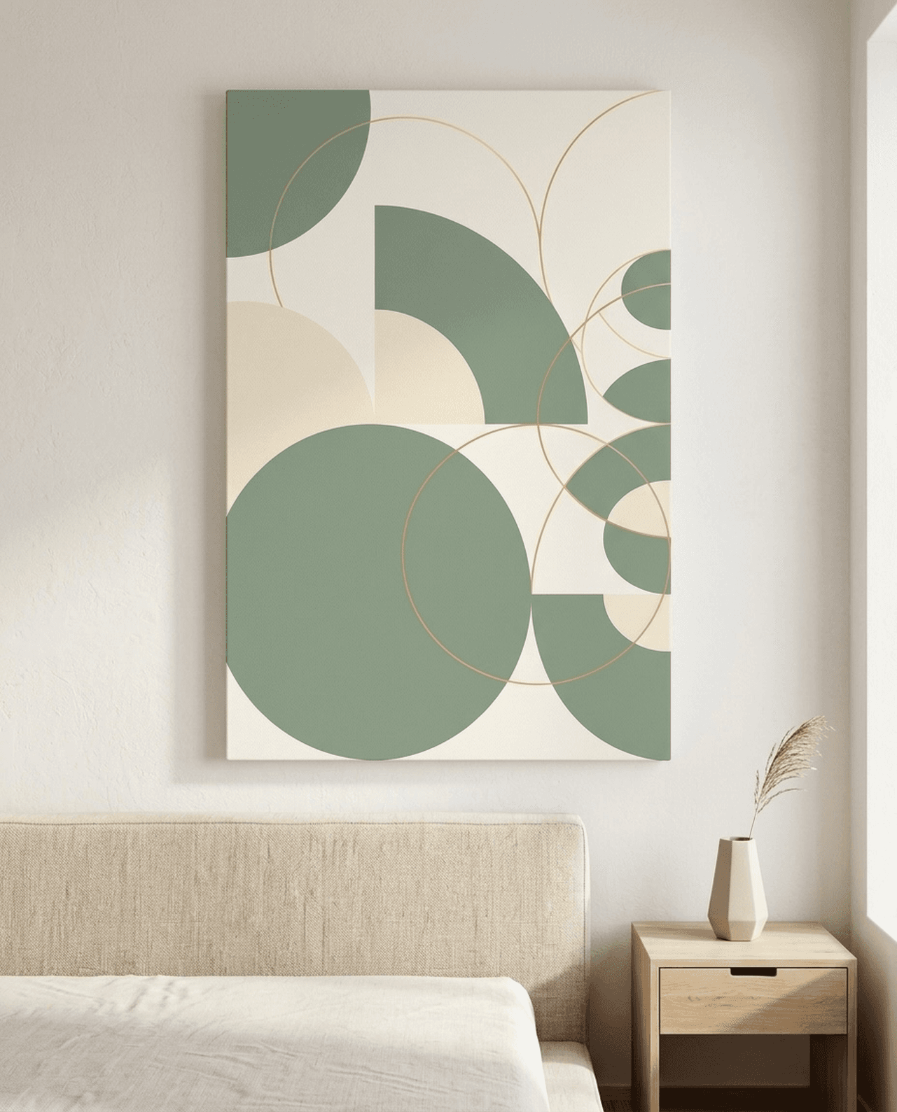
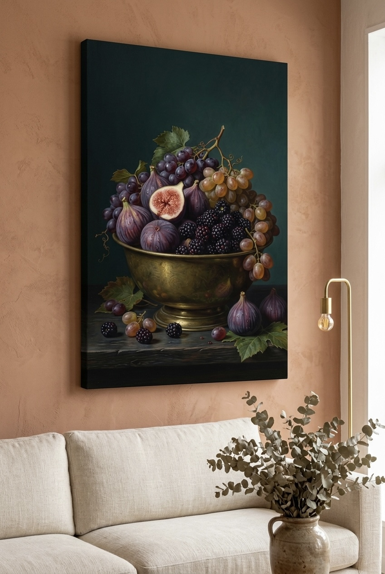
We have found that clients who replace a cluttered gallery wall of 15 small prints with a single large landscape canvas immediately describe their room as "more breathable." That is perceptual psychology at work. The brain stops jumping from frame to frame and instead settles into the scene, experiencing the art's internal depth as the room's own depth. Creating a focal point with a single statement piece is one of the most effective space-expanding strategies available.
Color and Tone: Light Art Opens Rooms
Color is the most powerful tool you have for making wall art expand a room visually. The principle is straightforward: cool, light, and desaturated tones recede from the eye, creating the illusion that a wall is farther away than it actually is. Warm, saturated, dark tones advance toward the eye, visually pushing walls closer together.
In practical terms, this means choosing art that features soft blues, grey-greens, misty lavenders, pale creams, and cool whites. According to color theory research from the Interior Design and Art Journal, cool-toned artwork can make a wall appear up to 30 percent farther away in human perception tests. That is a significant difference in a room that is only 3.5 metres (11.5 feet) wide. A canvas of a silver-toned owl in grey fog, or a pale watercolor sunrise over rolling hills, does not just decorate the wall, it moves it back.
Contrast matters too, but subtly. We have found that art with high internal contrast, meaning a bright subject against a very dark background, tends to "pop" forward and visually shrink a room. Art with soft tonal transitions, where light areas blend gently into mid-tones, creates a seamless relationship between the canvas and the surrounding wall. Benjamin Moore's interior design research confirms that pale neutrals and soft cool tones make the most effective space expanders, whether on walls or in artwork. Our recommendation: aim for art where the lightest tones are ivory, pale grey, or soft blue, rather than stark white against black.
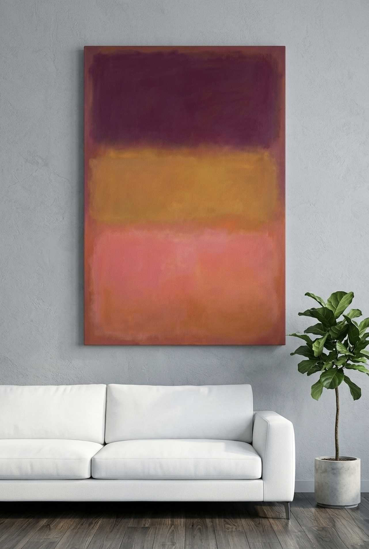
Avoid art that is predominantly warm red, burnt orange, or deep burgundy in small rooms. These colors are beautiful and have their place in large, open-plan spaces, but in a compact bedroom or hallway they will work against you. If your room also lacks natural light, our guide on brightening dark rooms with wall art covers additional strategies that work alongside color.
Size Matters: Go Bigger Than You Think
Here is the advice that surprises almost every client: in a small room, go bigger with your art, not smaller. This feels counterintuitive. Surely a large canvas will overwhelm a compact space? In practice, the opposite is true. A single large canvas creates one clear focal point and lets the eye rest. A collection of small, mismatched frames creates visual noise that makes the room feel cluttered and therefore smaller.
For a standard small bedroom measuring around 3 by 3.5 metres (10 by 11.5 feet), we recommend a main wall art piece of at least 90 by 60 cm (35 by 24 inches). For a feature wall in a living room of 4 by 4 metres (13 by 13 feet), consider going up to 120 by 80 cm (47 by 31 inches) or larger. The rule of thumb used by professional interior designers is that the artwork should fill 60 to 75 percent of the available wall width above a key piece of furniture, such as a sofa or bed.
Height placement amplifies the size effect dramatically. Hanging art 5 to 10 cm (2 to 4 inches) higher than the standard eye level of 145 to 152 cm (57 to 60 inches) from the floor to the center of the piece draws the eye upward, which makes ceilings feel taller. We have found that in rooms with standard 240 cm (94 inch) ceilings, raising the art by just 8 cm (3 inches) above conventional placement creates a noticeable sense of height. The goal is to lead the eye on a vertical journey, upward and into the image, rather than letting it settle at mid-wall and stop.
If your space only allows for one piece of art, make it the largest high-quality canvas you can reasonably fit. A canvas measuring 100 by 70 cm (39 by 27 inches) in soft grey-blue tones will do more for the perceived size of your room than ten smaller prints at the same total cost. Our detailed guide comparing small versus large wall art breaks down exactly when each approach works best.
Vertical vs Horizontal Orientation
Orientation is a strategic choice, not just an aesthetic one. The direction your art runs sends a clear signal to the eye about which dimension of the room to prioritize.
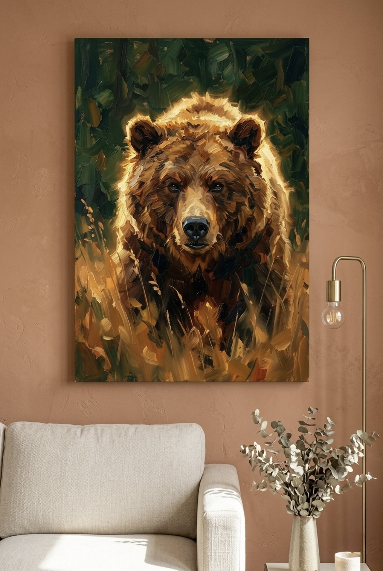
Vertical art, meaning a canvas that is taller than it is wide, draws the eye upward. This makes ceilings feel higher. In a room with standard 240 cm (94 inch) ceilings that feel low, a tall vertical canvas of 60 by 90 cm (24 by 35 inches) or 50 by 100 cm (20 by 39 inches) is your best friend. Wildlife portraits, tree studies, and tall nature scenes work exceptionally well in this format. The Great Grey Owl shown below is a perfect example: the vertical composition naturally guides the eye from base to top, adding perceived height to any room.
Horizontal art stretches the eye sideways, making a room feel wider. In a narrow hallway of 90 cm (35 inches) or a small dining room where the main challenge is width rather than height, a wide landscape canvas of 100 by 60 cm (39 by 24 inches) can make the space feel dramatically more generous. Panoramic landscapes, rolling hills, misty lakes, and wide sky scenes all work beautifully in horizontal format.
The practical rule: if your ceiling feels low, go vertical. If your walls feel like they are closing in sideways, go horizontal. For rooms that feel compressed in both directions, a square canvas of 80 by 80 cm (31 by 31 inches) placed slightly higher than usual is a balanced compromise. Studio apartments often need both strategies at once, and our dedicated guide covers exactly how to handle that challenge.
6 Art Picks That Expand Your Space
We have curated six pieces from our collection that each bring specific space-expanding qualities. Every one of these works because of its tone, composition, or subject matter, not just because it looks beautiful.
White Horse Canvas Wall Art
The White Horse Canvas Wall Art uses a palette of deep navy blue against brilliant white, creating a strong sense of luminous depth. The horse itself draws the eye into the center of the frame, creating a visual focal point that anchors the room rather than fragmenting it. We have found this piece works especially well above sofas in compact living rooms, where the rich navy grounds the space while the white subject opens it up. The contrast is dramatic but not oppressive, giving even a 3 by 3.5 metre (10 by 11.5 foot) room a sense of expansive character. View White Horse Canvas Wall Art.
Hedgehog Sleeping Canvas Wall Art
Do not let the intimate subject fool you: the Hedgehog Sleeping Canvas Wall Art features warm copper and amber tones set against a soft, receding background that pulls the wall back beautifully. The warm glow creates a sense of natural light emanating from the canvas, which tricks the eye into perceiving more brightness and therefore more space. Our customers tell us this piece consistently makes small bedrooms feel warmer and more open at the same time, a rare combination. At a recommended size of 60 by 60 cm (24 by 24 inches), it suits compact walls without overpowering them, yet its warm luminosity still visually lifts the room. View Hedgehog Sleeping Canvas Wall Art.
Stay Wild Moon Canvas Print
The Stay Wild Moon Canvas Print features a deep navy background with a luminous cream moon that recedes into a vast sky, giving any room an immediate sense of cosmic depth. The dark background might seem counterintuitive for a space-expanding piece, but the central light source creates a visual tunnel effect, drawing the eye deep into the image. We have found this works brilliantly in narrow hallways and compact home offices, where the sense of looking outward into a starry sky literally eliminates the feeling of walls closing in. Hang it at 152 cm (60 inches) to center on a feature wall for maximum effect. View Stay Wild Moon Canvas Print.
Bison Canvas Wall Art
The Bison Canvas Wall Art places a majestic animal subject against a rich forest-green backdrop, with beautifully soft tonal gradients that give the piece exceptional perceived depth. Forest green is one of the most effective colors for creating a sense of natural space, evoking open woodland and outdoor scale. In our experience, nature-focused art with painterly, loose brushwork, such as this piece, creates far more perceived depth than photographic-style prints because the soft edges allow the eye to travel into the scene rather than stopping at a hard boundary. Recommended for living rooms and dining rooms where you want a sense of grounded, natural space. View Bison Canvas Wall Art.
Moose Canvas Wall Art
The Moose Canvas Wall Art brings the drama of a lake-side wilderness scene directly to your wall, with a reflective water surface that doubles the sense of depth in the composition. Water reflections are one of the most powerful space-expanding elements in art because the reflected image extends the visual field downward, giving the piece a virtual height that is twice what the canvas itself measures. Our customers tell us that rooms with water-reflection art feel noticeably taller. The forest-green palette keeps the piece cool and receding, which further amplifies the spatial effect. This piece works especially well in dining rooms and master bedrooms at a size of 90 by 60 cm (35 by 24 inches). View Moose Canvas Wall Art.
Rolling Hills Sunrise Watercolor Canvas Wall Art
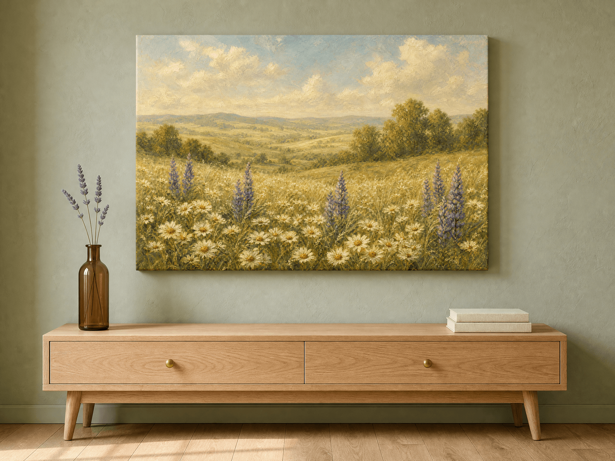
The Rolling Hills Sunrise Watercolor Canvas Wall Art is perhaps the most overtly space-expanding piece in our collection. The warm amber sunrise floods the canvas with light, while the misty valley and distant mountain lake create layer upon layer of visual depth, exactly what spatial psychology research identifies as the most effective cue for perceived spaciousness. Watercolor as a medium adds an airy, translucent quality that heavier oil-style paintings cannot replicate. We have found this piece transforms even very compact rooms into spaces that feel genuinely open and light-filled. For maximum impact, choose a size of at least 100 by 70 cm (39 by 27 inches) and hang it on the wall directly opposite the room's entry point. View Rolling Hills Sunrise Watercolor Canvas Wall Art.
The Placement Guide
Even the best piece of art will fail to expand a room if it is hung incorrectly. Placement is as important as selection. Here are the principles we use and teach to every customer who asks.
Standard eye level: The center of the artwork should sit at approximately 145 to 152 cm (57 to 60 inches) from the floor. This is the industry standard used by galleries and interior designers worldwide, and it works because it positions the visual center of the piece at the average adult eye level. Start here for any room.
Above furniture: When hanging art above a sofa, bed, or console table, leave a gap of 15 to 25 cm (6 to 10 inches) between the top of the furniture and the bottom edge of the frame. Less than 15 cm (6 inches) makes the art feel attached to the furniture rather than part of the wall. More than 30 cm (12 inches) disconnects them entirely, creating an awkward visual gap.
For low ceilings: Hang art slightly higher than standard, with the center at 157 to 163 cm (62 to 64 inches). This actively draws the eye upward and creates the impression of greater ceiling height. Combine this with a vertical composition for maximum effect.
For narrow rooms: Position a horizontal landscape canvas on the wall at the far end of the room, directly in the sightline when entering. This creates the impression that the room extends beyond the wall, adding perceived length. A canvas of 90 by 60 cm (35 by 24 inches) minimum is needed to have the full effect.
Lighting: Art that is lit from above by a picture light or a directional spotlight feels more luminous and therefore more space-creating. Even a simple adjustable spotlight aimed at your canvas can increase its perceived brightness by 40 percent, significantly amplifying its space-expanding effect.
5 Common Mistakes to Avoid
- Hanging art too low. The single most common mistake we see. Art hung at 90 to 100 cm (35 to 39 inches) to center looks like it is sliding off the wall and compresses the visual space below the ceiling. Always start at 145 cm (57 inches) minimum to center.
- Choosing art that is too small. A 30 by 40 cm (12 by 16 inch) print on a large wall looks lost and makes the room feel sparse rather than open. It also draws attention to how much empty wall exists, which has the opposite of the intended effect. Scale up.
- Using too many small pieces. A grid of 12 small prints creates visual fragmentation. The eye has nowhere to rest and the room feels chaotic rather than spacious. One or two large pieces will always outperform a cluster of small ones for perceived space.
- Choosing dark, heavily saturated art for compact spaces. Deep red, burnt orange, and dark brown-dominated pieces advance toward the eye and make walls feel closer. Save these for large rooms with high ceilings where the drama is an asset rather than a liability.
- Ignoring the relationship between art and room color. Art that shares similar tones to the wall creates a seamless visual field and makes the space feel larger. Art that clashes violently with the wall color creates a jarring boundary that visually shrinks the room. Match the dominant tones loosely, not exactly, for the best result.
Frequently Asked Questions
- Does wall art really make a room look bigger?
- Yes, when chosen correctly. Art with depth cues such as landscapes, open skies, and water scenes gives the brain spatial signals that the room extends beyond the wall. Research in spatial psychology confirms that large-scale visual elements with receding depth increase perceived spaciousness significantly.
- What size wall art should I use in a small room?
- Go larger than you think is necessary. For a small bedroom of around 3 by 3.5 metres (10 by 11.5 feet), use a canvas of at least 90 by 60 cm (35 by 24 inches). The art should fill 60 to 75 percent of the wall width above your main furniture piece.
- What colors of wall art make a room look bigger?
- Cool, light, and soft tones recede visually and expand space. Look for art featuring soft blues, grey-greens, pale creams, misty lavenders, and cool whites. Avoid heavily saturated warm colors such as red, orange, and burnt sienna in compact spaces.
- Should I use vertical or horizontal art in a small room?
- It depends on the specific challenge. Vertical art draws the eye upward and makes ceilings feel taller. Horizontal art stretches the eye sideways and makes rooms feel wider. Identify whether your room feels short or narrow, then choose the orientation that counteracts that specific issue.
- How high should I hang wall art in a small room?
- Hang the center of the artwork at 145 to 152 cm (57 to 60 inches) from the floor as a baseline. In rooms with low ceilings, raise this to 157 to 163 cm (62 to 64 inches) to draw the eye upward and increase perceived ceiling height.
- Is one large piece better than several small pieces in a small room?
- In almost every case, yes. One large canvas creates a single focal point that allows the eye to rest, giving the brain spatial clarity and making the room feel open and organized. Multiple small pieces create visual fragmentation that reads as clutter, which makes any room feel smaller.
Quick Reference Table
| Room Size | Art Style | Best Size | Color Palette | Effect |
|---|---|---|---|---|
| Very small (under 10 m2 / 107 sq ft) | Single large landscape or nature scene | 80x60 cm (31x24 in) minimum | Soft blues, pale grey, misty green | Creates visual exit; expands perceived boundary |
| Small bedroom (10-14 m2 / 107-150 sq ft) | Vertical wildlife or sky scene | 90x60 cm (35x24 in) | Cool neutrals, lavender, cream | Raises perceived ceiling height |
| Compact living room (14-20 m2 / 150-215 sq ft) | Horizontal panoramic landscape | 100x70 cm (39x27 in) or larger | Amber, forest green, mist grey | Stretches perceived wall width |
| Narrow hallway (under 1.2m / 4ft wide) | Horizontal deep-perspective scene | 60x40 cm (24x16 in) per panel | Blues, soft whites, cool greens | Adds perceived width; draws eye forward |
| Medium room (20-30 m2 / 215-325 sq ft) | Large statement piece or diptych | 120x80 cm (47x31 in) or larger | Any with strong depth cues | Creates focal point; organizes visual space |
The research is clear, and the design principle is consistent: the right wall art can genuinely make a room look and feel bigger. The key is choosing art with strong depth cues, cool and light tones, appropriate scale, and placing it at the right height for your specific ceiling situation. Explore our full collection and find the piece that will transform your space today.