Jewel Tone Wall Art: Rich, Dramatic Picks for Bold Interiors
The Heva Team
Art Curators & Interior Design Enthusiasts · April 1, 2026 · 18 min read
Discover jewel tone wall art in sapphire, emerald, and amethyst. Bold dramatic prints that make any room feel rich and luxurious.
Jewel tones are having a major moment in 2026. Sapphire blue, emerald green, amethyst purple, ruby red, and deep topaz gold have moved from fashion runways into living rooms, bedrooms, and dining spaces across the country. If you want your home to feel rich, dramatic, and unmistakably bold, jewel tone wall art is the single fastest upgrade you can make. Unlike muted neutrals or pastel palettes that whisper, jewel tones announce themselves with confidence. They transform a plain wall into a focal point, a forgettable room into one people remember long after they leave.
Ready to browse our full collection? Shop all wall art at HEVA Unique Art Gallery and find the piece that speaks to your boldest design instincts.
What Are Jewel Tones in Interior Design?
Jewel tones take their names directly from precious gemstones. Sapphire is a deep, saturated blue. Emerald is a rich, full-bodied green. Amethyst is a luminous violet-purple. Ruby is an intense, warm red. Topaz stretches from golden amber to electric blue. What all jewel tones share is high saturation combined with medium-to-deep value. They are never washed out, never pastel, never gray-adjacent. They carry light differently than other colors, which is why rooms decorated with jewel tones often feel warmer and more dimensional even under ordinary lighting.
In interior design, jewel tones have historically appeared in Victorian parlors, Moroccan riads, and Art Deco interiors precisely because of this light-carrying quality. A sapphire velvet sofa or an emerald-painted accent wall creates visual depth that no beige surface can replicate. Understanding how color affects a room is the foundation of using jewel tones successfully. When you bring jewel tone wall art into a space, you are importing that same depth and dimensionality onto a vertical surface, which is often the most underutilized design asset in any room.
Jewel tones pair beautifully with brass, gold, and warm metallic hardware. They also work against black, deep charcoal, and cream. What they resist is being placed next to competing bright colors at the same saturation level. Give jewel tone art room to breathe and it will reward you with a visual gravity that pulls every other element in the room into orbit around it.
The Psychology of Jewel Tone Colors
Color psychology research consistently links deep, saturated hues to emotional intensity and perceived value. A 2022 study published in the journal Color Research and Application found that rooms featuring high-saturation colors scored significantly higher on measures of "perceived luxury" and "emotional engagement" compared to rooms with neutral or low-saturation palettes. Jewel tones land squarely in the zone where color becomes an emotional experience rather than just a visual backdrop.
Sapphire blue specifically activates feelings of calm confidence and authority. It is the color of deep water and open sky, simultaneously grounding and expansive. Emerald green connects to growth, abundance, and the natural world. Research in environmental psychology notes that green hues reduce cortisol levels more reliably than almost any other color. Amethyst purple carries associations with creativity, spirituality, and elevated taste, which is why it appears so frequently in studios, meditation rooms, and creative workspaces. Ruby red is the color of passion and energy, making it ideal for dining rooms and social spaces where you want conversation to flow and energy to stay high.
When you choose jewel tone wall art, you are not just picking a color you like. You are selecting a specific emotional register for the room. A sapphire canvas in a home office signals focus and seriousness. An emerald botanical print in a living room says you value life and growth. An amethyst abstract in a bedroom creates the sense that sleep is a sacred, intentional act. For those interested in a more restrained luxury approach, jewel tones can be deployed in smaller doses as accent pieces rather than room-filling statements.
The key insight from color psychology is that saturation drives emotional intensity more than hue does. Two rooms can both use blue, but a pale powder blue creates tranquility while a deep sapphire creates drama. If you want your space to feel bold and memorable, lean into the saturation. Do not dilute the jewel tone by choosing a version that is closer to a dusty mid-tone. Commit to the depth and the color will do its work.
How to Pair Jewel Tone Art with Your Existing Decor
The most common mistake people make with jewel tone wall art is treating it like an afterthought. They buy a sofa, paint the walls, choose a rug, and then try to find art that fits what already exists. Jewel tone art works best when it is given the status of an anchor piece, the element that every other decision references. That said, if you already have a furnished room and want to add jewel tone art, there are reliable strategies for making it work.
Against neutral walls: Jewel tones pop most dramatically against white, off-white, warm cream, and light gray walls. The contrast between the unsaturated wall and the saturated canvas creates the visual tension that makes jewel tone art feel powerful. If your walls are already a mid-tone color, jewel tone art can still work if the two colors are separated on the color wheel. A deep sapphire canvas against a warm taupe wall creates a cool-warm contrast that is sophisticated and dynamic.
With wood tones: Jewel tones and natural wood are an almost universally successful combination. The warmth of walnut, oak, or teak wood grounds the intensity of a jewel-toned canvas and prevents it from feeling cold or austere. A sapphire print above a walnut credenza, an emerald canvas flanked by oak shelving, or an amethyst piece above a teak bed frame all achieve a balance between boldness and warmth that feels genuinely livable.
With metals: Brass and gold frames amplify the richness of jewel tones. They share the same sense of luxury and weight. Brushed brass floating frames around sapphire or emerald prints are a combination that appears in the best-designed rooms on design platforms. Black metal frames work too, particularly with ruby red or amethyst art where you want to emphasize drama over warmth. Avoid chrome and polished silver with jewel tones unless you are deliberately going for a modern, high-contrast look. (source: Architectural Digest)
With textiles: Velvet, silk, and linen textures all complement jewel tone art. If you have a velvet sofa in a neutral color, jewel tone art above it creates a coherent sense of luxury across multiple surfaces. If your sofa is already a jewel tone (deep green, navy, burgundy), choose wall art that uses the same color family but in a different application. A navy sofa paired with an abstract sapphire canvas creates tonal harmony rather than competition. Dark academia aesthetics lean heavily on this kind of deep tonal layering and are a natural companion to jewel tone art strategies.
6 Jewel Tone Wall Art Picks from HEVA
Every piece below was selected for its jewel tone credentials: deep saturation, rich color, and the visual weight that makes bold interiors feel intentional rather than accidental.
1. Virgin Mary Stained Glass Canvas
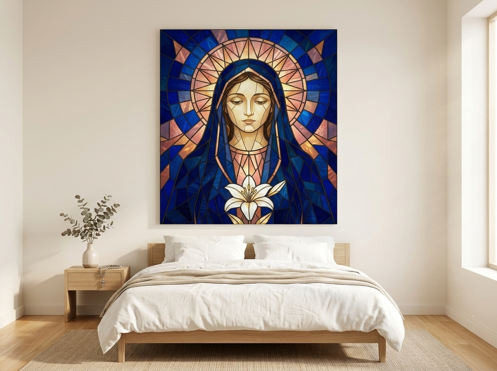
This canvas translates the ancient jewel tone tradition of cathedral stained glass into a modern print format. Navy blue, deep gold, and rose form a composition that is simultaneously spiritual and intensely decorative. Stained glass windows were historically the most expensive, most jewel-saturated objects that most people would ever encounter, and this piece carries that legacy into contemporary home decor. It works beautifully in living rooms, entryways, and any space where you want art that carries genuine visual weight and cultural resonance. The navy and gold combination is particularly effective against cream or off-white walls, where the contrast elevates both the art and the room.
Shop Virgin Mary Stained Glass Canvas
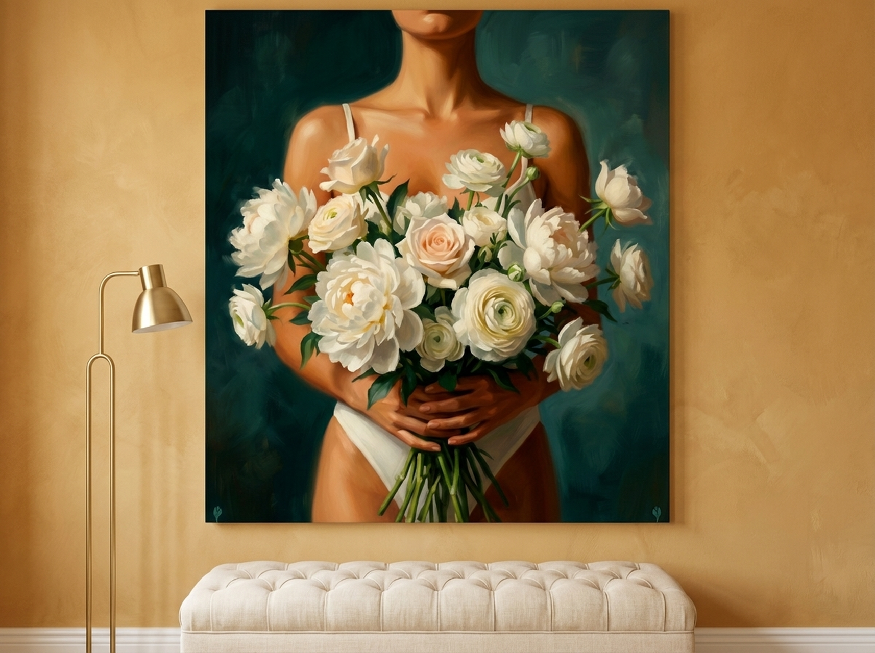
2. Floral Figure Oil Painting in Teal
Teal sits at the intersection of sapphire blue and emerald green, making it one of the most versatile jewel tones in the color family. This floral figure piece brings teal's full depth to a feminine, expressive composition that reads as both contemporary and classically painterly. The oil painting style gives the surface texture and visual complexity, so the canvas rewards close inspection as much as it commands attention from across the room. In bedrooms, this piece functions as an anchor above a bed frame. In living rooms, it introduces an organic softness that stops jewel tone decor from feeling overly formal or masculine.
Shop Floral Figure Oil Painting
3. Gold King Portrait
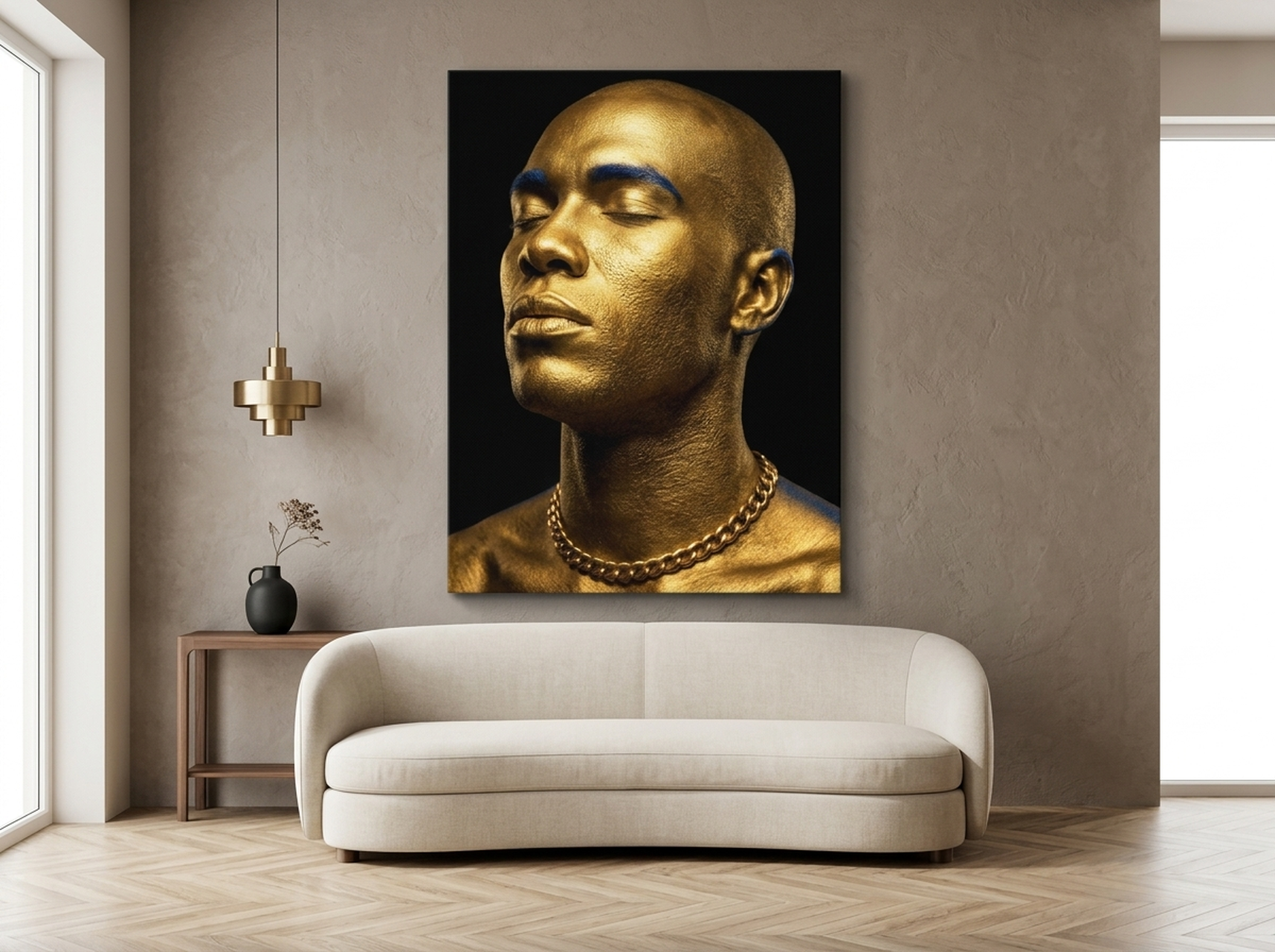
Gold is a jewel tone unto itself, and this editorial portrait maximizes that truth. The deep black background and the metallic gold of the subject create a combination that is pure luxury theater. Portrait art carries a long history of power and status, from royal oil paintings to contemporary editorial photography, and this piece channels that tradition with a modern sensibility. Place it in an office, dining room, or entryway where you want the art to communicate authority and ambition. The high contrast between black and gold means it works against almost any wall color, making it one of the most room-flexible pieces in this list.
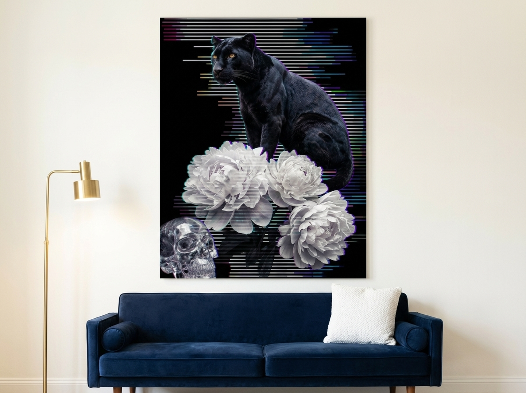
4. Black Panther Glitch Art
Gothic vaporwave aesthetics bring jewel tones into a digital, contemporary context, and this Black Panther glitch art piece is one of the most striking examples in the HEVA collection. Deep purples, electric blues, and rich blacks create a visual frequency that feels genuinely unlike anything a big-box retailer carries. This is art for rooms that are not afraid of themselves. It belongs in home offices, gaming rooms, creative studios, and any space where the person living there wants their decor to signal that they have a specific, committed aesthetic point of view. Dark academic and gothic interior styles are the natural home for this piece, though it can function as a striking contrast element in more conventional modern spaces as well.
5. Curated Objects Collage Canvas
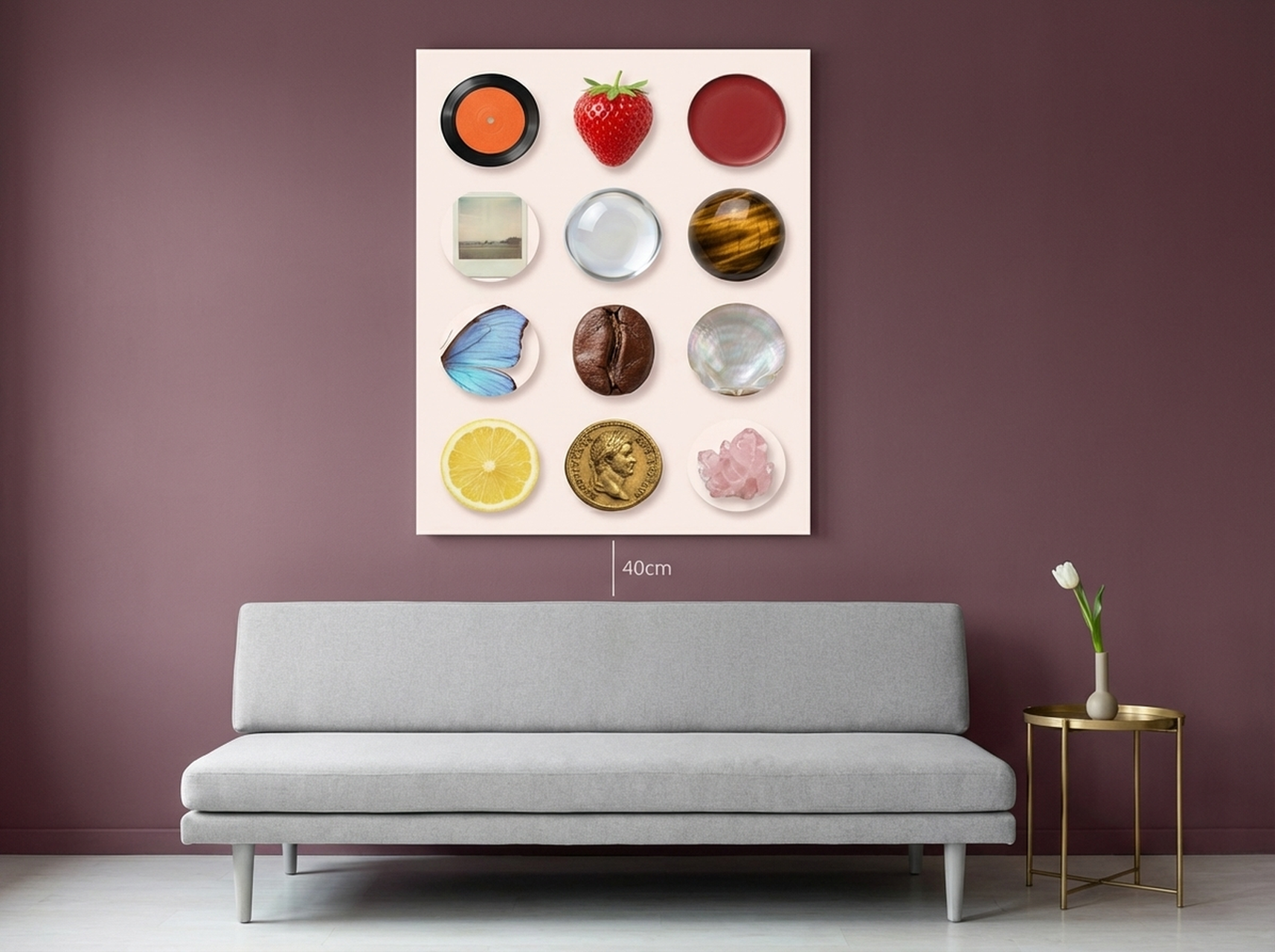
Maximalist design and jewel tones are natural allies, and this curated objects collage demonstrates why. A blush pink foundation anchors a collection of richly detailed objects that collectively create the feeling of a jewel box brought to wall-sized scale. This piece works for living rooms, eclectic bedrooms, and any space where the design philosophy is "more is more." It also functions as a conversation starter because the composition rewards extended looking. Maximalist wall art achieves its effect through layered detail, and this collage delivers that in full measure. For rooms that already have multiple patterns and textures, this piece provides a visual anchor without competing with individual elements. (source: Elle Decor)
Shop Curated Objects Collage Canvas
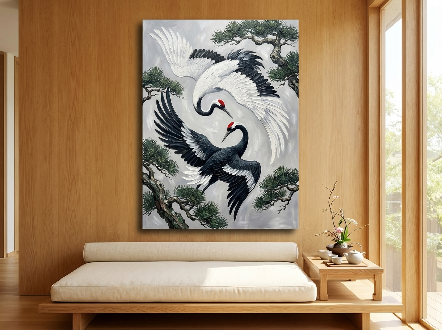
6. Yin Yang Cranes Japanese Ink Painting
This yin yang cranes piece demonstrates that jewel tone drama does not require pure pigment saturation. The deep, inky tones of traditional Japanese brush painting carry their own version of jewel tone richness: concentrated, intentional, and visually dense in a way that commands respect. Cranes in Japanese art tradition symbolize longevity, good fortune, and grace, so this canvas brings symbolic weight alongside its visual impact. It works in living rooms, meditation spaces, and bedrooms where the goal is to create a sense of serene drama. Abstract and Eastern-influenced art styles have seen significant interest growth through 2025 and into 2026, and this piece positions your home squarely within that cultural conversation.
Shop Yin Yang Cranes Japanese Ink Painting
Placement Guide: Size and Position for Jewel Tone Wall Art
Jewel tone art performs best when it is given appropriate scale. A small jewel tone print on a large wall loses its impact and reads as timid rather than bold. Here are the sizing guidelines that work for the most common placement scenarios:
Above a sofa (living room focal wall): The canvas should span roughly 55 to 65 percent of the sofa's width. For a standard 84-inch (213 cm) sofa, that means art between 46 and 55 inches (117 to 140 cm) wide. The bottom edge of the frame should sit 6 to 8 inches (15 to 20 cm) above the sofa back. For jewel tone art specifically, erring toward the larger end of the range amplifies the color impact.
Above a bed (bedroom): Art above a bed should be proportional to the headboard width. For a queen bed (60 inches / 152 cm wide), aim for canvas width between 36 and 48 inches (91 to 122 cm). For a king bed (76 inches / 193 cm wide), between 48 and 60 inches (122 to 152 cm). Hang so the bottom edge is 4 to 6 inches (10 to 15 cm) above the headboard top, or 8 to 10 inches (20 to 25 cm) if the headboard is very tall.
On an accent wall (no furniture anchor): When hanging jewel tone art on a wall without furniture below it, the center of the canvas should sit at eye level, which for most rooms means the center point lands at 57 to 60 inches (145 to 152 cm) from the floor. A single large jewel tone piece on an empty accent wall creates a gallery-quality focal point that requires no additional decoration to feel complete.
In a gallery wall arrangement: Jewel tone pieces work best as the dominant anchor in a gallery wall rather than as one of many equal-sized prints. Start with the largest jewel tone canvas as your center piece, then build outward with smaller pieces in complementary neutral tones. This lets the jewel tone do its work without the composition becoming visually chaotic.
In narrow spaces (hallways, entryways): Vertical format jewel tone art in narrow spaces creates the illusion of greater height. For a hallway 36 to 48 inches (91 to 122 cm) wide, a single vertical canvas 18 to 24 inches (46 to 61 cm) wide and 30 to 40 inches (76 to 102 cm) tall creates a strong first impression without overwhelming the passage.
5 Common Mistakes to Avoid with Jewel Tone Wall Art
1. Hanging too high. The most universal wall art mistake applies doubly to jewel tone pieces because the color impact depends on the art being in your direct line of sight. Art hung too high disconnects from the furniture arrangement below it and loses the visual conversation it needs to have with the rest of the room. Keep the center of the canvas at or near 57 to 60 inches (145 to 152 cm) from the floor in standard ceiling height rooms.
2. Choosing a frame that competes with the art. Ornate, heavily detailed frames can fight with jewel tone art for visual attention. Let the color do the work. Floating frames in black or brushed brass, or simple gallery-style frames in wood tones, support the art without competing with it. Reserve ornate frames for neutral or muted art where the frame's detail fills the visual complexity role. (source: Dezeen)
3. Using jewel tone art in a room that is already visually overloaded. Jewel tones need breathing room. If every surface in a room is already occupied by objects, patterns, or competing colors, adding jewel tone art will create visual noise rather than drama. Clear some space before hanging jewel tone art. Even removing two or three objects from surrounding shelves can create the breathing room the color needs to register properly.
4. Treating all jewel tones as interchangeable. Sapphire and amethyst are both jewel tones, but they have completely different emotional signatures and pair with different room elements. Research the specific psychology of the color you are considering before purchasing. Match the emotional register of the art to the intended function of the room. Do not place high-energy ruby red art in a bedroom where you are trying to create calm, and do not put cool sapphire art in a dining room where you want warmth and conviviality.
5. Buying art that is too small. This is the most common jewel tone mistake. People accustomed to living with neutral art often underestimate how much size is needed to give color the space to be felt. A 12x16 inch jewel tone print on a standard living room wall will look like a postage stamp. When in doubt, go one size larger than your instinct suggests. Jewel tone art that seems "a little big" in a showroom almost always looks exactly right on a home wall.
Frequently Asked Questions About Jewel Tone Wall Art
What rooms work best for jewel tone wall art?
Living rooms, dining rooms, home offices, and bedrooms all work well for jewel tone wall art. The key is matching the specific color and its psychological associations to the room's function. Sapphire and teal work in offices and bedrooms for their calming yet energizing qualities. Emerald and gold work in dining rooms and living spaces for their warmth and social energy. Amethyst is ideal for creative spaces and bedrooms. Ruby red works in dining rooms and social areas where high energy conversation is desired.
Can I use jewel tone wall art in a small room?
Yes, and often to great effect. The common fear is that bold color will make a small room feel smaller, but research on color and spatial perception suggests that high-saturation art used intentionally in a small room creates the impression of a designed, curated space rather than a cramped one. The key is using one jewel tone piece rather than multiple competing colors, and keeping the surrounding decor relatively simple so the art can anchor the room without adding visual clutter.
What colors pair best with jewel tone wall art?
Jewel tones pair best with neutrals (white, cream, warm gray, black), natural wood tones, and metallic accents (brass, gold, black metal). For multi-color rooms, consider using a single jewel tone as the dominant color and letting everything else be neutral or tonal. If you want to use two jewel tones together, choose colors that are adjacent on the color wheel (sapphire and emerald, amethyst and ruby) rather than directly complementary, which can feel competitive rather than harmonious.
How do I know if a jewel tone canvas is a true jewel tone or just a dark color?
True jewel tones are high saturation and medium-to-deep in value. They retain their chromatic identity even when viewed in low light, which is why they look different from dark neutrals. A dark navy that reads as gray in dim lighting is not a jewel tone. A sapphire that holds its blue depth even in candlelight is. When shopping online, look at product images taken under different lighting conditions if possible, or check customer photos to see how the piece looks in actual home environments.
Is jewel tone wall art a trend or a lasting design choice?
Jewel tones have appeared in interior design records going back thousands of years, from ancient Egyptian blue faience tiles to Byzantine mosaics to Victorian parlors to Art Deco interiors to contemporary maximalist design. While specific trends shift over time, the underlying appeal of rich, saturated color as a luxury signal has never disappeared from design history. 2026 represents a particularly strong cultural moment for jewel tones, but investing in quality jewel tone art is not a trend-chasing decision. It is a decision to bring a timeless design tradition into your home.
How do I clean and maintain canvas wall art?
Canvas wall art requires minimal maintenance. Dust lightly with a soft, dry microfiber cloth every few months. Avoid wet cleaning unless the canvas surface is a genuine oil painting, and even then use only a slightly damp cloth with extreme care. Keep canvas art out of direct sunlight, which can fade even deep jewel tones over time. For wrapped canvas prints, the sides of the canvas collect dust more than the face, so include them in your occasional dusting routine. With basic care, quality canvas prints maintain their color depth for decades.
Quick Reference Table: Jewel Tone Art by Room and Effect
| Room | Best Jewel Tone | Emotional Effect | Recommended Size | HEVA Pick |
|---|---|---|---|---|
| Living Room | Sapphire, Emerald | Confident, welcoming | 24x36 in (61x91 cm) or larger | Virgin Mary Stained Glass |
| Bedroom | Teal, Amethyst | Serene, intimate | 20x30 in (51x76 cm) to 30x40 in (76x102 cm) | Floral Figure Oil Painting |
| Dining Room | Gold, Ruby | Warm, social, energetic | 24x36 in (61x91 cm) | Gold King Portrait |
| Home Office | Sapphire, Deep Purple | Focused, authoritative | 18x24 in (46x61 cm) to 24x36 in (61x91 cm) | Black Panther Glitch Art |
| Maximalist Space | Mixed jewel tones | Layered, abundant | Gallery wall anchor 24x30 in (61x76 cm)+ | Curated Objects Collage |
| Meditation / Zen Space | Deep ink tones, teal | Grounded, contemplative | 20x28 in (51x71 cm) to 24x36 in (61x91 cm) | Yin Yang Cranes Ink Painting |
Make Your Walls Unforgettable
Jewel tone wall art is not a decorating trend. It is a design philosophy: the belief that spaces should make you feel something, that walls are not a neutral backdrop but an active participant in how a room feels to live in. Every sapphire, emerald, amethyst, and gold canvas in the HEVA collection was chosen because it carries that philosophy forward. These are pieces that earn their place on your wall by doing something neutrals simply cannot do: they make the room feel like it was designed, not assembled. Browse the full collection at HEVA Unique Art Gallery and find the jewel tone piece your home has been waiting for.