Japandi Wall Art: The Calm, Earthy Style Guide for 2026
The Heva Team
Art Curators & Interior Design Enthusiasts · May 10, 2026 · 15 min read
Japandi wall art mixes Japanese wabi-sabi with Scandinavian calm. Seven canvas picks, color rules, and hanging tips for the 2026 Japandi look.
Most wall-art trends are loud. Japandi is the opposite — a slow, pared-back fusion of Japanese aesthetics and Scandinavian design that has quietly become the most-requested style on our site in 2026. It is the look behind every editorial bedroom you keep saving on Pinterest: cream walls, oak frames, one branch on a canvas, nothing else competing for attention.
This guide explains what Japandi actually is, how to choose canvas art that reads as authentically Japandi rather than generic minimalist, and which seven pieces from our catalog we recommend most often when customers describe this exact mood. You will leave with a color rule, a sizing rule, a hanging rule, and a shortlist.
Ready to browse? Visit our neutral and botanical collection, or keep reading for our seven top Japandi picks, the four design pillars behind the style, and the placement rules we have refined across hundreds of customer rooms.
What You Will Find in This Guide
- What Japandi Actually Is
- The Four Design Pillars of Japandi
- The Japandi Color Palette
- Seven Japandi Canvas Picks From Our Catalog
- How to Hang and Size Japandi Art
- Common Japandi Mistakes to Avoid
- Japandi Wall Art FAQ
- Quick Reference Table
What Japandi Actually Is
Japandi is the deliberate marriage of two design traditions that already shared a worldview. Japanese interiors have always honored wabi-sabi — the beauty of imperfection, asymmetry, and natural aging. Scandinavian interiors arrived at a parallel idea through hygge: warmth, simplicity, and a deep respect for craftsmanship and natural light.
The fusion took hold in the late 2010s, when design editors noticed that the spare oak-and-paper rooms coming out of Copenhagen and Stockholm looked uncannily like the tea-room interiors of Kyoto. Both traditions love light wood, hand-thrown ceramics, paper, linen, and one piece of art rather than ten. The blend gave Japandi its signature mood: editorial calm without the coldness of strict minimalism.
In our experience, customers who ask for "Japandi" art usually mean one of three things: a single botanical branch in muted watercolor, an abstract palette-knife earth-tone composition, or a Japanese-inflected subject like cherry blossom or bamboo rendered in modern restraint. Every pick in this guide falls into one of those buckets.
The Four Design Pillars of Japandi
1. Natural materials over synthetic finishes
Japandi prizes raw oak, ash, linen, hemp, paper, stone, and clay. On a canvas, this means matte finishes rather than glossy varnishes, light wood floating frames rather than ornate gilded ones, and printing on cotton-linen blends when possible. The art should look like an object you could touch, not a slick poster.
2. Asymmetry and empty space
Japanese composition almost always leaves more empty space than filled space. A Japandi canvas might have one branch in the lower third and nothing else for two-thirds of the canvas. That negative space is the piece — not a flaw. When you hang Japandi art, do not be tempted to fill the empty quadrant with a smaller frame; let the breathing room work.
3. A palette of three to four colors total
The most authentic Japandi rooms use no more than three or four colors across the entire space, including walls, furniture, textiles, and art. A typical palette is cream walls, oak floors, a black accent, and one muted natural color like sage or terracotta. Your canvas should pull from this same shortlist, not introduce a new color family.
4. One statement piece, not a gallery wall
This is the rule Japandi shares with traditional Japanese tea-room design: one piece of art per wall, sometimes per room. The art is meant to be contemplated rather than collected. If you have been thinking about a gallery wall, save that approach for a different room and let Japandi be the wall with a single, deliberate canvas.
The Japandi Color Palette
If you only memorize one rule from this guide, make it this one: the Japandi palette is warm neutrals plus one earth accent. The dominant tones are cream, soft beige, taupe, oat, and warm white. The accent — used sparingly — is one of charcoal, soft sage, terracotta, muted ochre, or aged gold. Black appears as a thin line, never as a block.
What does not belong: cool blue-grays, jewel tones, pastel pinks and mints, primary red or yellow, or any high-saturation color. Even navy — beloved in coastal and farmhouse styles — feels foreign in a true Japandi room. When in doubt, ask whether the color could appear on a piece of unbleached linen or aged paper. If yes, it works.
Pantone has reinforced the broader cultural shift toward muted earth tones in its recent Color of the Year selections, and the trend forecasts published across the home-decor industry in 2026 have leaned heavily into mushroom, mocha, and warm taupe — all native Japandi territory. The style is no longer niche.
For deeper reading on warm-toned palettes that pair well with Japandi, we keep our earth tone wall art guide as a companion resource. Many of the same rules transfer cleanly.
Seven Japandi Canvas Picks From Our Catalog
Each of the seven canvases below was chosen for its on-palette colors, on-style composition, or on-spirit subject matter. We have listed them in rough order from softest and most botanical to boldest and most graphic, so you can scan to the mood that matches your room.
1. Eucalyptus Branches Watercolor Canvas
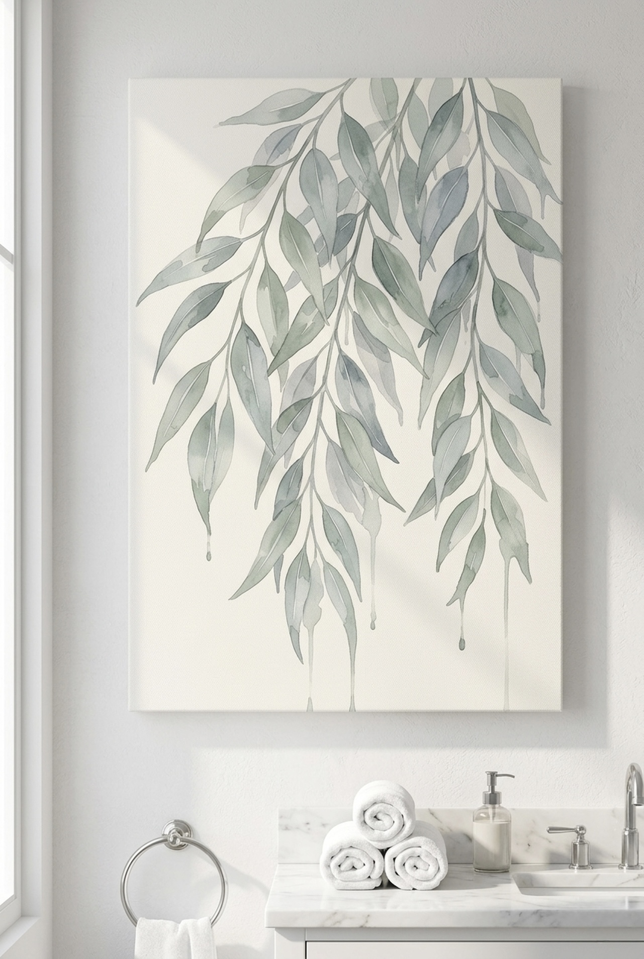
Few subjects translate Japandi as gently as eucalyptus on a pale wash. The pendulous silver-green leaves sit on a cream ground with the kind of restraint the style asks for. There is space around the branches, the brushwork is loose, and nothing in the composition shouts for attention.
We recommend this canvas above a low platform bed in sizes 18x24 inch (45x60 cm) or 24x36 inch (60x90 cm). Hang it slightly off-center over a single nightstand for a more Japanese reading, or centered over the headboard for a Scandinavian balance. It also pairs beautifully with linen bedding and an oak frame.
See the Eucalyptus Branches Canvas →
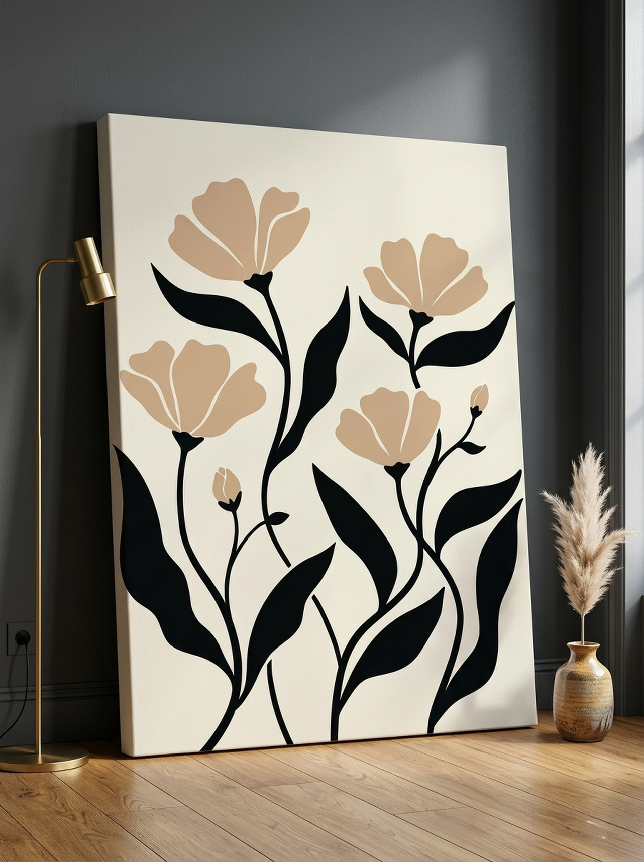
2. Minimalist Botanical Flowers Matisse-Style Print
This Matisse-leaning line drawing on cream is one of the cleanest entry points into Japandi we sell. The single-color black linework gives a Japanese ink-painting silhouette, while the open negative space and balanced composition borrow directly from Scandinavian graphic design.
Try it at 16x20 inch (40x50 cm) over a console or 24x36 inch (60x90 cm) above a reading chair. Pair it with a single ceramic vase below and one trailing pothos for the layered-but-edited look the style is built around. Our customers tell us it works in almost any room.
Browse the Minimalist Botanical Flowers Print →
3. Japanese Woodblock Bamboo Canvas
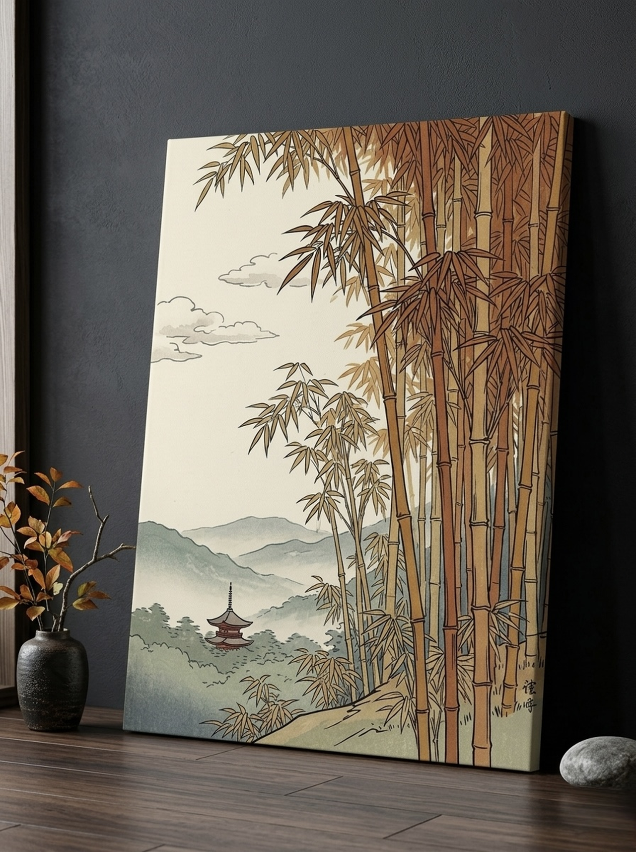
When you want one piece that signals the Japanese half of Japandi without crossing into souvenir territory, a woodblock-style bamboo canvas is the safest pick. The warm amber base reads as parchment, the sage stems break up the warmth, and the composition has the quiet asymmetry of a traditional kakemono scroll.
We have placed this piece most successfully in entryways and small home offices, where its vertical orientation echoes a hallway or a single wall. In a 12x18 inch (30x45 cm) format it sits at eye level above a slim bench; in 24x36 inch (60x90 cm) it can anchor a long entryway wall.
Explore the Japanese Woodblock Bamboo Print →
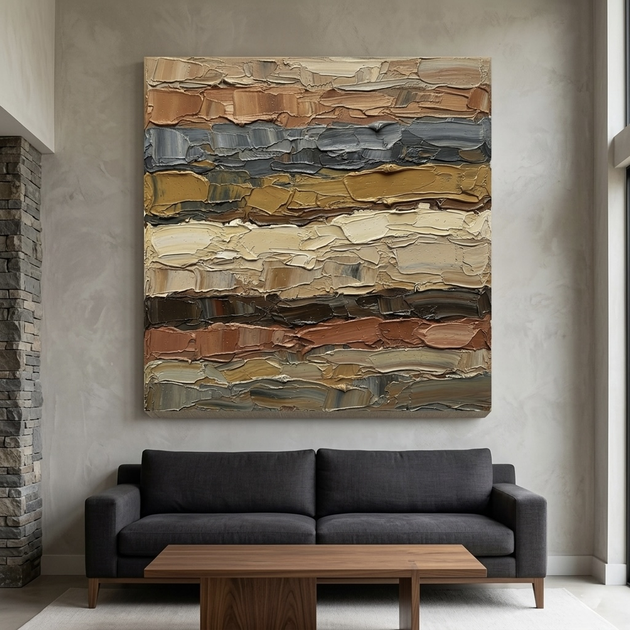
4. Earth Tones Abstract Palette Knife Canvas
Japandi is not always quiet. The palette knife on this abstract gives it the wabi-sabi texture the style loves, with terracotta and brown layered into cream so the eye keeps finding new ridges. It is the rare abstract that looks hand-made rather than mass-printed.
Hang this one above a low natural-linen sofa at 30x40 inch (75x100 cm) or larger. Leave 15 to 20 cm (6 to 8 inches) of breathing room between the top of the sofa cushion and the bottom of the frame. Skip the gallery cluster here, since this piece carries the wall on its own.
View the Earth Tones Abstract Canvas →
5. Two Trees Growing Together Watercolor Landscape
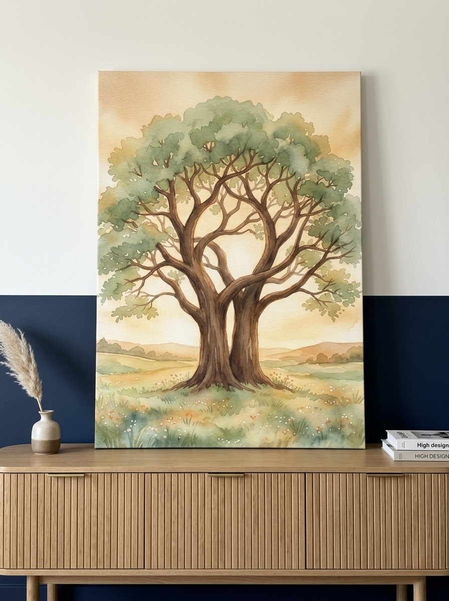

Two intertwined trees rendered in soft watercolor — this is Japandi at its most romantic. The composition keeps the palette in muted cream and tan, with green and gold so faded they read as memory. The piece carries narrative weight without competing with the calm of the room.
We suggest 18x24 inch (45x60 cm) for above a bedside chair, or 24x36 inch (60x90 cm) for a master bedroom focal wall. Anniversary couples often pick this one as a quiet symbol of partnership. It also reads beautifully framed in light oak rather than walnut, to keep the lightness.
Discover the Two Trees Growing Together Canvas →
6. Autumn Leaf Branch Delicate Watercolor Canvas
A single branch drifting across cream space is a quintessential Japandi composition. The watercolor wash keeps every color muted, the soft greens and browns fold into the wall, and the slight imperfections in the brushwork carry the wabi-sabi spirit of finding beauty in the unfinished.
Place this piece above a small writing desk or a guest-room dresser in 12x18 inch (30x45 cm) or 18x24 inch (45x60 cm). It also works exceptionally well in pairs, hung 8 cm (3 inches) apart, when you want a slightly more layered Scandinavian feel rather than the single-piece Japanese reading.
Find the Autumn Leaf Branch Canvas →
7. Gold Brush Strokes Minimalist Abstract Canvas
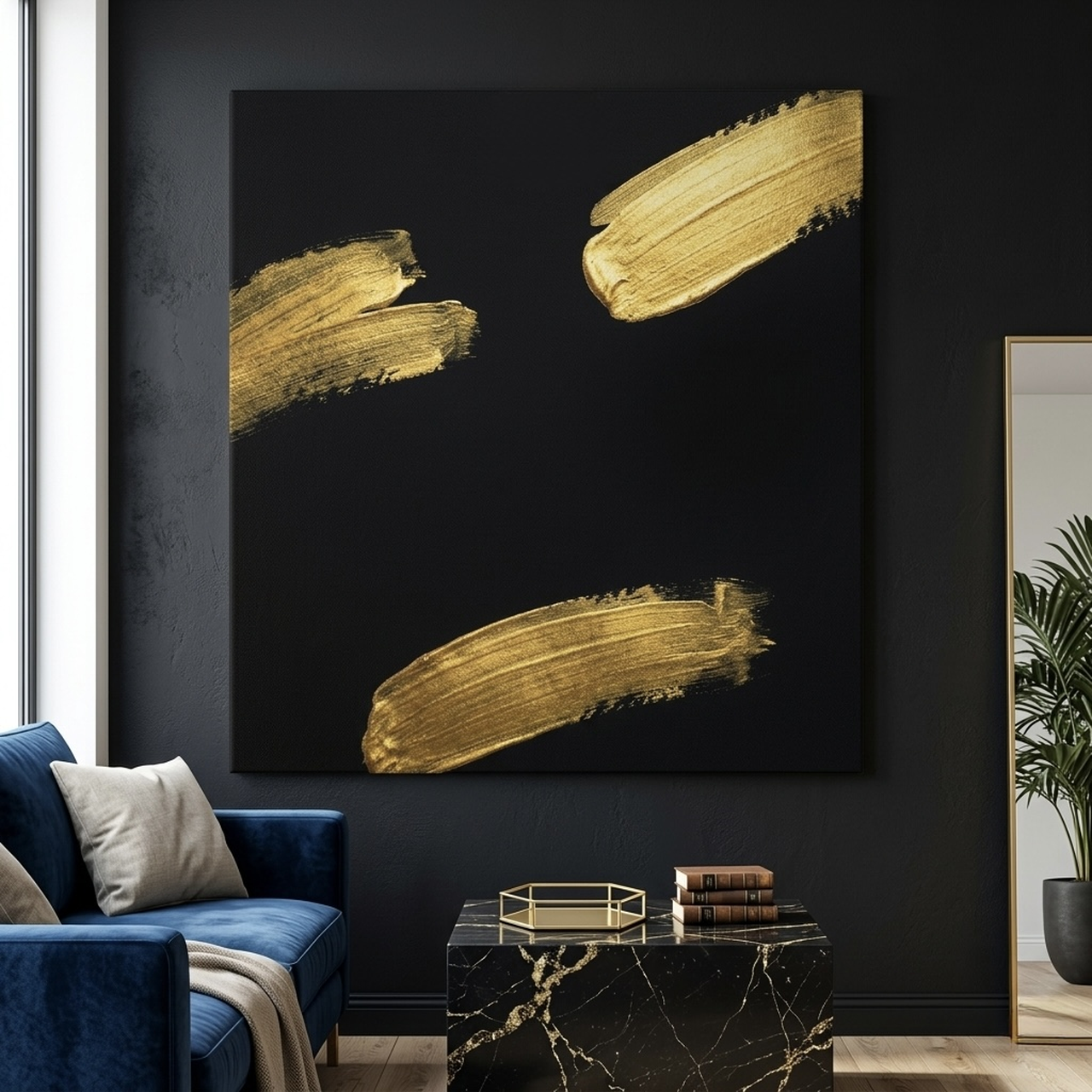
When you want to push Japandi toward its more luxurious end, a single metallic gesture on cream does the work. The gold brushwork has the spirit of a sumi-e ink mark while reading as Scandinavian gold-accent design. It is restrained, deliberate, and luxurious without being loud.
This canvas is at its best above a dining table or in a formal entry at 24x30 inch (60x75 cm) or larger. Pair it with a linen runner, two ceramic candleholders, and nothing else on the surface. The art only works if the table beneath it is also editorially edited.
Shop the Gold Brush Strokes Canvas →
How to Hang and Size Japandi Art
Japandi hanging is closer to museum hanging than to typical residential practice. The single most important measurement is the center of the canvas relative to the floor: aim for 145 to 152 cm (57 to 60 inches) from the floor to the vertical midpoint of the artwork. This is slightly lower than most homeowners instinctively hang, and it is the reason editorial Japandi rooms feel right.
When the canvas hangs above a piece of furniture, leave 15 to 20 cm (6 to 8 inches) of breathing room between the top of the sofa, headboard, or console and the bottom of the frame. Closer than that, the composition feels crowded; farther, the art floats unmoored. Our wall art size guide covers room-by-room sizing in full detail.
For canvas dimensions, the Japandi rule is "two-thirds the width of what is below it." A 180 cm (72 inch) sofa wants a single canvas roughly 120 cm (48 inches) wide. A 100 cm (39 inch) console wants a canvas around 65 cm (26 inches) wide. Diverging from this ratio is what makes most rooms feel slightly off, even when nothing is obviously wrong.
Orientation matters too. Portrait orientation reads more Japanese — it echoes the proportions of a traditional tatami mat and a hanging kakemono scroll. Landscape orientation reads more Scandinavian and pairs better with sofas and low credenzas. Square works in both readings and is the safest choice when you are not sure.
Common Japandi Mistakes to Avoid
We have rescued enough Japandi rooms now to see the same five errors on repeat. Avoid these and you will be ahead of most homeowners trying this style for the first time.
Mistake 1: Mixing cool gray with warm cream
Cool gray drains the warmth that makes Japandi feel inviting. If your walls already lean cool, choose a canvas with warm cream and brown rather than one with charcoal or slate. The rest of the palette will follow the art and the room will pull warm again.
Mistake 2: Choosing high-gloss frames
Glossy black or lacquered white frames reflect light in a way that fights the matte, hand-made spirit of Japandi. Use unfinished oak, ash, pine, or genuine matte black. Floater frames also tend to read more Japandi than traditional flush-mounted frames.
Mistake 3: Hanging in pairs when one piece would do
Pairs of matching canvases default toward Scandinavian, but they rarely look Japandi. If you want two pieces, choose two different subjects in the same palette and let them speak to each other rather than mirror each other. A single, larger canvas almost always reads more Japandi than two smaller matched ones.
Mistake 4: Adding too many natural objects
Pampas grass plus dried branches plus a tall trailing vine plus a ceramic vase plus a single piece of art turns Japandi into Restoration Hardware. Edit the room down: one canvas, one plant, one ceramic. The discipline is the design.
Mistake 5: Treating it like minimalism
Stripping a room to white walls, white furniture, and one canvas is minimalism, not Japandi. The warmth, the hand-made texture, and the organic imperfections are the point. Keep the linen throw on the bed, the slight variation in the oak grain, the visible brushstrokes on the canvas.
Bridging Japandi with adjacent styles
Japandi pairs unusually well with mid-century modern furniture and with abstract canvas art. If you are styling a room that mixes two aesthetics, our guide on mixing wall art styles, our mid-century modern wall art guide, and our abstract canvas art styles guide together give a workable framework. For lovers of the Japanese half specifically, our ukiyo-e art prints guide covers the historical pieces that inspired much of modern Japandi.
Japandi Wall Art FAQ
What exactly is Japandi style?
Japandi is a hybrid design philosophy that fuses Japanese wabi-sabi minimalism with Scandinavian hygge warmth. Both traditions value natural materials, restrained color palettes, and functional simplicity, but Japan brings asymmetry and imperfection while Scandinavia brings light woods and cozy softness. Together they create rooms that feel calm, lived-in, and quietly elegant.
What colors work best for Japandi wall art?
Stay within a tight palette of warm neutrals: cream, soft beige, taupe, charcoal, muted sage, terracotta, and the occasional touch of black or gold. Japandi rooms typically use no more than three to four colors total, including the walls and furniture. Bright primary colors and saturated jewel tones break the calm and should be avoided.
Where should I hang Japandi art in my home?
Japandi art shines in bedrooms, dining areas, entryways, and home offices, where the calm aesthetic supports rest and focus. Avoid filling every wall: one carefully chosen piece per room, hung at eye level (roughly 145 to 152 cm or 57 to 60 inches from the floor to the center of the canvas), is more on-brand than a gallery wall cluster.
What is the difference between Japandi and minimalism?
Strict minimalism strips a room to its bare structural essentials, often using stark whites, hard lines, and zero ornamentation. Japandi keeps the editing discipline of minimalism but adds warmth: natural textures, organic shapes, soft handmade imperfections, and earthy tones. A Japandi room feels inviting; a strict minimalist room often feels austere.
Can Japandi work in a small apartment?
Yes, and it is often the best style for small spaces. The pale palette opens up walls visually, the editing instinct reduces clutter, and a single statement canvas reads as intentional rather than busy. In our experience, a 16x20 inch (40x50 cm) or 18x24 inch (45x60 cm) piece works well in studios and one-bedroom apartments without overwhelming the wall.
What frame finish is best for Japandi canvas art?
Choose light natural oak, ash, or unfinished pine for the Scandinavian half of the equation, or matte black for a Japanese reading. Avoid glossy lacquers, ornate gold leaf, or distressed farmhouse finishes, which fight the clean Japandi line. Our framed canvas options include all three on-brand finishes.
Quick Reference Table
| Canvas | Best For | Dominant Colors | Link |
|---|---|---|---|
| Eucalyptus Branches Watercolor Canvas | Bedroom, master bath | Cream, sage, soft gray | View piece |
| Minimalist Botanical Flowers Matisse-Style Print | Living room, reading nook | Black, cream, beige | View piece |
| Japanese Woodblock Bamboo Canvas | Entryway, home office | Amber, rust orange, sage green | View piece |
| Earth Tones Abstract Palette Knife Canvas | Living room above sofa | Brown, terracotta, cream, beige | View piece |
| Two Trees Growing Together Watercolor Landscape | Master bedroom, dining nook | Cream, beige, soft gold, green | View piece |
| Autumn Leaf Branch Delicate Watercolor Canvas | Bedroom, guest room | Cream, green, brown, tan | View piece |
| Gold Brush Strokes Minimalist Abstract Canvas | Dining room, formal entry | Gold, black, cream, metallic | View piece |
The Calm Wall, Ready When You Are
Japandi is not a passing trend. It is the long answer to a decade of maximalist, over-styled, anxiety-inducing rooms. A single piece of on-palette canvas art is the fastest way into the style, and the most forgiving — if you ever decide to evolve the room, a Japandi canvas still reads beautifully against farmhouse, modern, boho, or coastal transitions. Start with one piece, give it room to breathe, and let the rest of the room catch up.
Browse the full Japandi-leaning collection when you are ready, or revisit our product picks above. Whichever canvas you choose, hang it slightly low, leave it room, and let the wall finally breathe.