How to Mix Wall Art Styles Like a Pro: The Complete Decorating Guide
The Heva Team
Art Curators & Interior Design Enthusiasts · April 18, 2026 · 13 min read
Mixing wall art styles creates a more personal, layered home than any single-style collection. Learn the 3 unifying principles, which styles pair best, and how to build a cohesive gallery wall from scratch.
Your walls do not have to follow a single style guide. The most beautiful, personality-filled spaces in the world layer African patterns next to Japanese ink paintings, set minimalist line art beside bold abstract canvases, and let bohemian warmth sit comfortably alongside sleek modern pieces. When you learn to mix wall art styles with intention, your home stops looking like a showroom and starts feeling like a story.
The secret is not luck or an expensive designer. It comes down to a few repeatable principles that even first-time decorators can apply immediately. This guide gives you every tool you need to build a gallery wall that is cohesive, expressive, and genuinely your own.
Explore our diverse canvas art collection
The Art of Mixing Styles: Why Rules Are Meant to Be Broken
Interior design used to operate under strict matching rules. Every piece of furniture coordinated with every other. Art collections followed a single movement or period. Rooms had one clearly defined style and stuck to it from floor to ceiling. That era is over, and designers everywhere are relieved.
Today, the most celebrated interiors are intentionally eclectic. A quick scroll through any top interior design publication, from Architectural Digest to Dezeen, reveals homes that mix contemporary abstract paintings with vintage African textiles, Japanese ceramics with Scandinavian furniture, and bohemian macrame with sleek minimalist photography.
This shift happened for a simple reason: matching everything feels sterile. When every piece in a room agrees, the space becomes predictable. It has no tension, no surprise, nothing to draw the eye back after the first glance. Layered spaces, by contrast, reveal new details over time. They feel lived in, personal, and alive.
Mixing wall art styles also reflects how most of us actually accumulate art. We fall in love with a piece at a market, inherit something meaningful from family, pick up a print while traveling, and commission something custom. Real collections are built over years and across continents. Trying to match them all to one style means leaving the most meaningful pieces out.
The good news is that mixing styles is not about ignoring all structure. It is about understanding which rules to bend and which principles to keep. When you mix with intention, every combination looks deliberate rather than accidental. The sections below give you a concrete framework to do exactly that.
Research from the Colour Affects Institute confirms that color harmony is processed by the brain within milliseconds. This means that even wildly different art styles feel unified when they share a color palette. Understanding this one principle changes everything about how you approach a gallery wall.
The 3 Unifying Principles: Color, Scale, and Theme
When you mix wall art styles, three invisible threads can hold everything together: color, scale, and theme. You do not need all three working simultaneously. Even one strong unifying principle is enough to make a diverse collection feel curated rather than chaotic.
Principle 1: Color
Color is the most powerful unifier because it works across every style boundary. A terracotta leopard print, a teal abstract canvas, and a black-and-white line drawing can coexist harmoniously if they all share even one accent color from your room's palette.
Practical tip: before buying any piece, photograph your existing art and furniture together. Identify the two or three colors that appear most often. Any new piece that echoes at least one of those colors will integrate naturally, regardless of its style.
Use the 60-30-10 color rule as your guide. Sixty percent of your wall should feel like a neutral background (white, cream, warm gray). Thirty percent comes from your dominant art colors. Ten percent is your accent, the boldest or most unexpected color you introduce. This ratio keeps mixed styles from overwhelming each other.
Principle 2: Scale
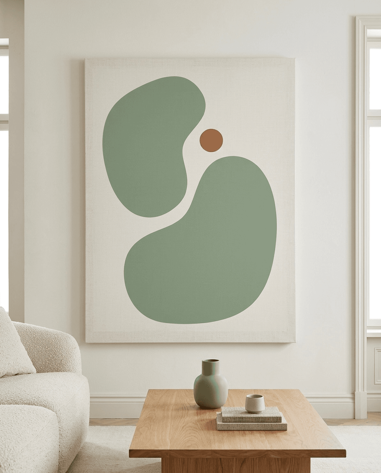
Scale creates hierarchy and rhythm on a wall. Without it, equally sized pieces of wildly different styles compete rather than converse. With it, the eye moves naturally from a large anchor piece through medium works to small accents, reading the wall like a well-structured sentence.
Practical tip: choose one piece as your anchor. It should be noticeably larger than everything else on the wall. A good anchor size for a living room is 24x36 inches (61x91 cm) or larger. Everything else should be clearly smaller, creating a deliberate size hierarchy.
When mixing styles, let your most visually complex piece be the largest. A bold abstract painting draws the eye first, then the viewer discovers the quieter ink wash or minimalist line art placed nearby. This sequencing makes the wall tell a story.
Principle 3: Theme
Theme is the narrative thread that connects pieces whose colors and scales differ. It can be as broad as "nature" (covering botanical prints, landscape paintings, and animal art) or as specific as "golden hour light" (connecting sunset photography, warm abstract washes, and amber-toned illustrations).
Practical tip: write down the mood or story you want your wall to tell before you start. Words like "calm and rooted," "adventurous and global," or "feminine and fierce" give you a filter for every purchase decision. If a piece does not fit the theme, it does not matter how beautiful it is on its own. A themed wall needs every member of the collection to pull in the same emotional direction.
For further reading on color theory in interior spaces, the Pantone Color Fundamentals guide provides an excellent foundation that applies directly to art curation.
Style Combination Guide: What Works Together
Some style combinations have natural chemistry. Others require a stronger unifying principle to work. The table below summarizes the most reliable pairings and notes what makes them successful.
| Primary Style | Pairs Well With | Why It Works | Unifying Element Needed |
|---|---|---|---|
| Abstract | Bohemian, Minimalist, African | Abstract color fields complement pattern and simplicity equally | Shared color palette |
| African | Boho, Earth-Tone Abstract, Global | Rich patterns and warm earth tones anchor earthy eclectic collections | Warm color palette, natural materials |
| Japanese Ink | Minimalist, Scandinavian, Zen Abstract | Negative space and brush textures echo minimalist restraint | Neutral backgrounds, black accents |
| Bohemian | Abstract, African, Floral, Celestial | Boho tolerates pattern and color mixing naturally | Layered textures, warm neutrals |
| Minimalist Line Art | Abstract, Japanese, Botanical | Simple lines provide breathing room next to complex works | Consistent frame finish, neutral tones |
| Floral | Feminine Abstract, Impressionist, Boho | Organic forms and soft colors integrate across romantic styles | Soft color palette, similar scale |
| Celestial/Watercolor | Boho, Minimalist, Abstract | Soft washes feel ethereal alongside bold or minimal works | Color echo, mood alignment |
| Urban/Cityscape | African, Global, Abstract, Photography | Cultural specificity adds depth and contrast to abstract works | Warm tones, travel narrative theme |
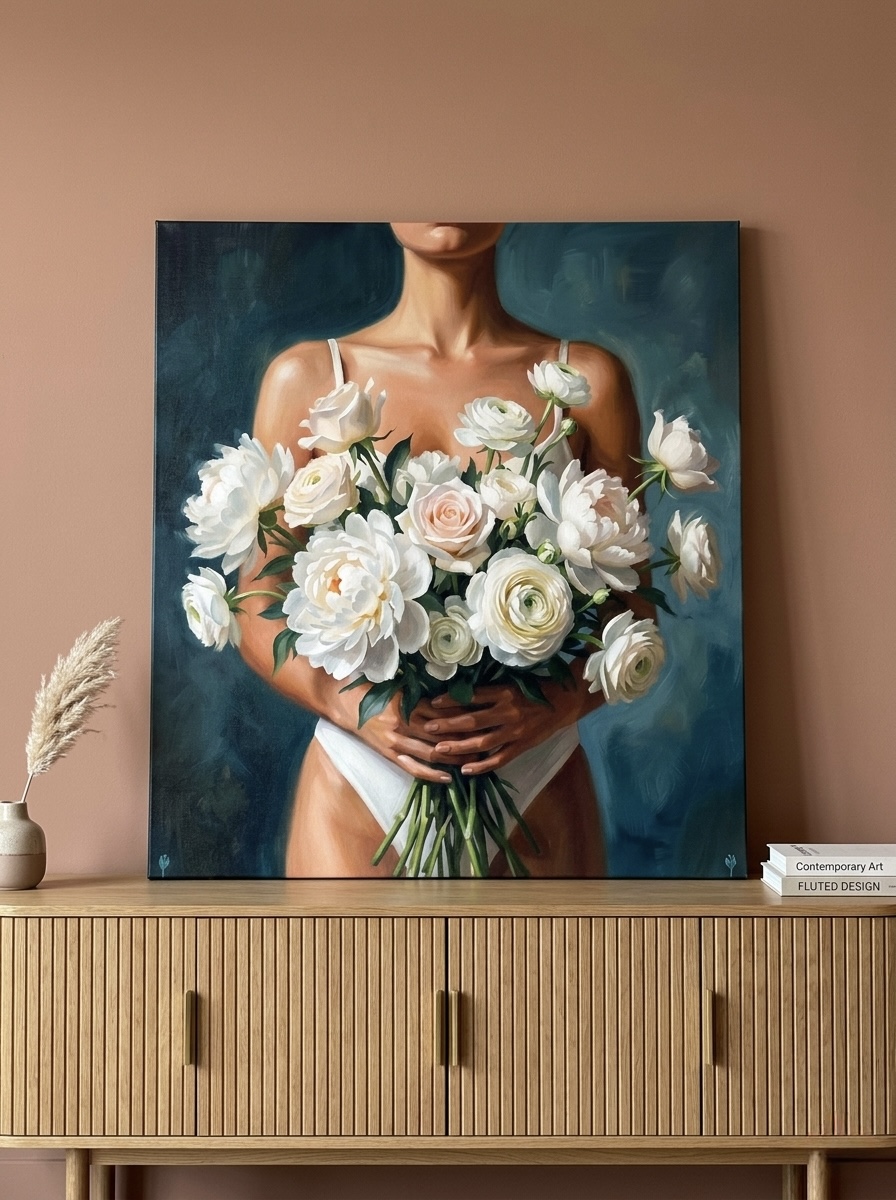
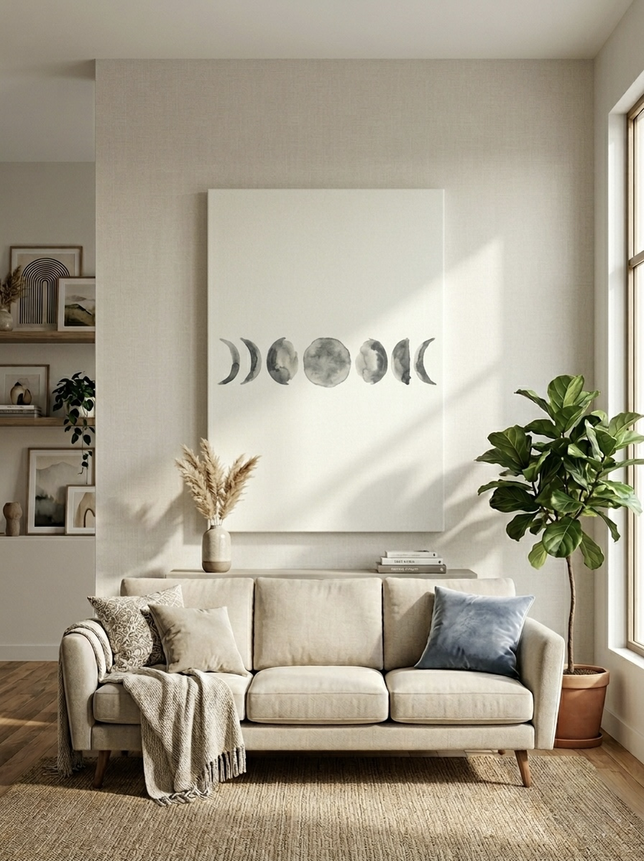
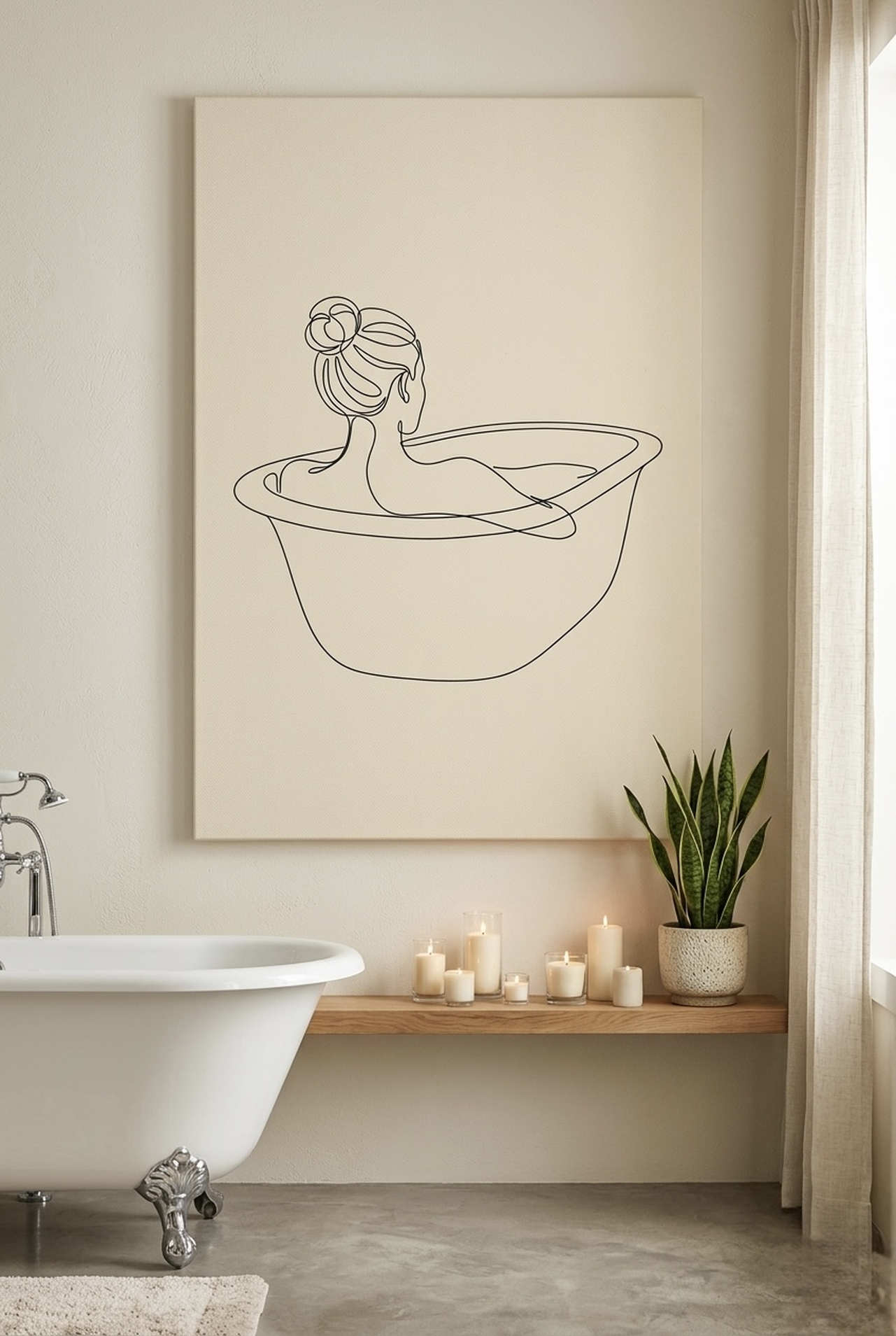
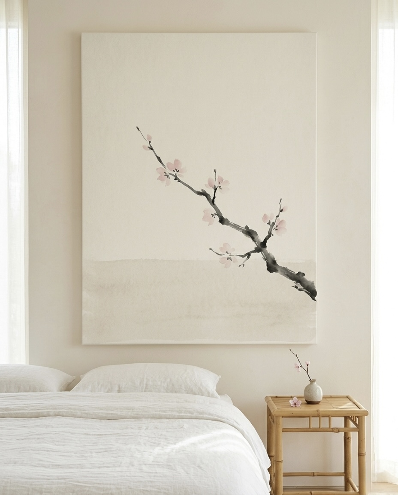
Art That Inspires: Real Style Combinations to Try
Seeing mixed styles in action is the fastest way to build your confidence. These pieces from our collection show exactly how different aesthetics can share a wall and create something extraordinary together.
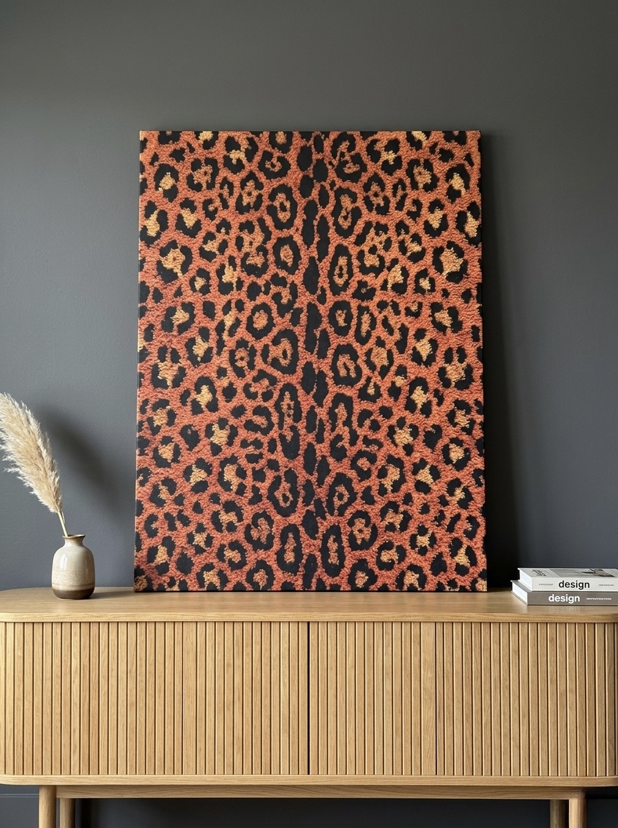
Boho Meets African: Warmth and Pattern
Pair a bold animal print with earthy terracotta tones against a neutral wall. The key is keeping your background color consistent so the patterns can speak without competing.
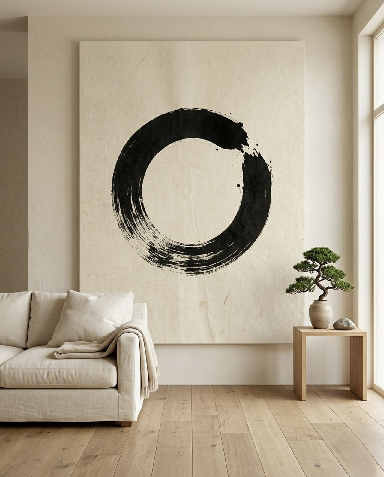
Japanese Minimalism Meets Floral Maximalism
A simple brushstroke circle next to a lush floral figure creates instant visual tension in the best possible way. The restraint of one piece lets the other breathe and shine.
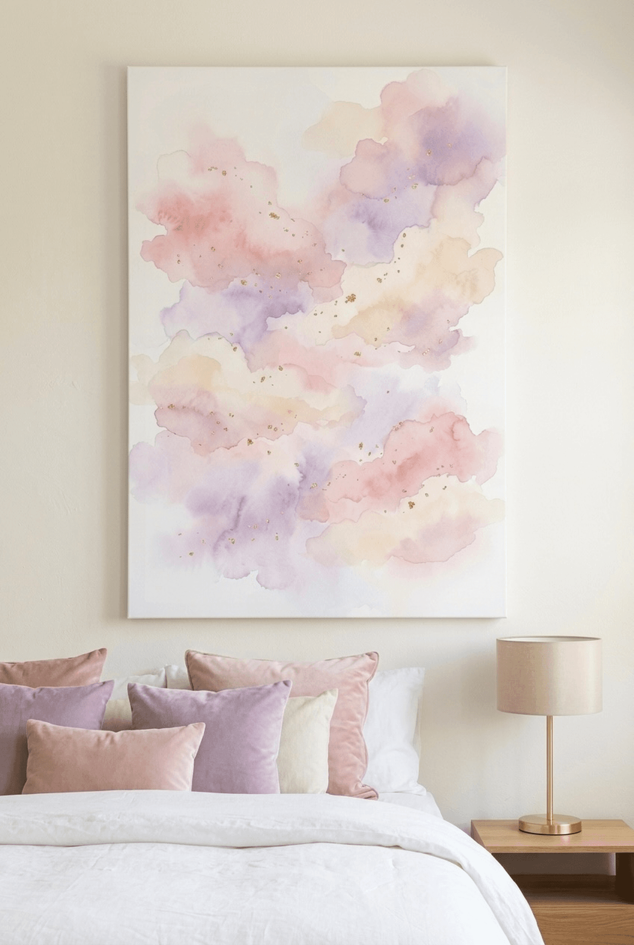
Minimalist Line Art and Celestial Watercolor
Two quiet pieces can create a gallery wall that feels curated and intentional. Choose works that share a mood even when their subject matter differs completely.
Creating a Cohesive Gallery Wall
The physical arrangement of your art matters as much as the selection. Even the best combination of styles will feel chaotic if the pieces are hung at inconsistent heights or spaced unevenly. Follow these placement principles to build a gallery wall that looks professionally designed.
Step 1: Define Your Wall Zone
Start by identifying the usable hanging zone. The center of any art piece should sit at 57 to 60 inches (145 to 152 cm) from the floor. This is the standard museum hanging height and the average human eye level. For gallery walls with multiple pieces, treat the center of the entire arrangement as the 57-inch (145 cm) mark.
Step 2: Establish Spacing Rules
Consistent spacing is what separates a gallery wall from a jumbled collection. Choose one gap size and stick to it throughout the arrangement. For a tight, editorial look: keep gaps at 2 to 3 inches (5 to 8 cm). For a relaxed, airy feel: allow 4 to 6 inches (10 to 15 cm) between frames.
Step 3: Map Your Layout on the Floor
Before a single nail goes into the wall, arrange all your pieces on the floor. Photograph the arrangement from above. This lets you test compositions, swap positions, and identify gaps or imbalances without any commitment. Spend 20 minutes on the floor arrangement and save yourself hours of patching holes in the wall.
Step 4: Trace and Transfer
Trace each frame on brown paper or newspaper. Cut out the shapes and tape them to the wall in your chosen arrangement. This paper mockup lets you see exactly how the final gallery will look before you hammer anything. Adjust until the composition feels right, then nail directly through the paper.
Recommended Gallery Wall Sizes by Room
| Room | Wall Width | Recommended Gallery Span | Anchor Piece Size |
|---|---|---|---|
| Living Room | 10 to 14 ft (305 to 427 cm) | 6 to 9 ft (183 to 274 cm) | 24x36 in (61x91 cm) or larger |
| Bedroom | 8 to 12 ft (244 to 366 cm) | 4 to 6 ft (122 to 183 cm) | 20x30 in (51x76 cm) |
| Hallway | 4 to 6 ft (122 to 183 cm) | Full wall width minus 12 in (30 cm) | 12x16 in (30x41 cm) |
| Home Office | 6 to 10 ft (183 to 305 cm) | 4 to 7 ft (122 to 213 cm) | 18x24 in (46x61 cm) |
5 Style Mixing Mistakes That Ruin the Look
Even with the right principles in place, a few common errors can undermine a mixed-style gallery. Here are the five mistakes decorators make most often and how to avoid each one.
- Ignoring color entirely. Mixing styles without any color thread produces a wall that looks like a storage room rather than a curated collection. Always identify at least one shared color before hanging anything. Even a single recurring accent, like deep teal or warm terracotta, is enough to create visual harmony.
- Using the same size for every piece. A gallery wall where every frame is 12x16 inches (30x41 cm) lacks hierarchy and rhythm. The eye has no natural place to land. Include at least one piece that is significantly larger than the rest to anchor the arrangement and give the viewer a starting point.
- Mixing too many frame finishes. Two or three frame finishes, like black, natural wood, and white, can coexist with intention. But four or more finishes scattered randomly across a wall adds visual noise that competes with the art itself. Choose your frame palette before you start and commit to it.
- Hanging everything at different heights without a system. Random hanging heights make a gallery wall feel unstable. Everything should align to a consistent center-line or share a common top or bottom edge. Both approaches work. No consistent alignment does not.
- Adding pieces that share no element with the rest. When you fall in love with a piece that shares no color, scale relationship, or thematic thread with your existing collection, hold off. Introduce it only after identifying which element will connect it to the rest. If you cannot find one, it may need its own dedicated wall where it can stand alone as a statement piece.
Frequently Asked Questions
Can you mix different art styles on the same wall?
Yes, absolutely. Mixing art styles creates a more personal, layered look than matching sets. The key is to unify pieces through shared colors, a consistent frame finish, or a complementary theme so the wall reads as intentional rather than random.
What art styles go well together?
Abstract pairs beautifully with bohemian, minimalist, and African art. Japanese ink work complements minimalist and Scandinavian styles. African patterns work alongside boho and earthy abstract pieces. The best combinations share at least one unifying element: color, mood, or scale.
How many art pieces should I put on one wall?
For a gallery wall, aim for 5 to 9 pieces on a standard wall (roughly 10 to 14 feet wide, or 300 to 430 cm). For a focal point above a sofa or bed, 1 large piece or a triptych works best. Odd numbers tend to feel more organic and balanced.
Should all art on a gallery wall be the same size?
No. Varying sizes creates visual interest and hierarchy. Anchor your gallery with one large piece (24x36 inches, or 61x91 cm, is a common choice), then surround it with medium and small works. Matching sizes can feel rigid and flat.
Do art frames need to match when mixing styles?
Frames do not need to match exactly, but choosing one or two frame finishes creates cohesion. Black frames unify almost any combination of styles. Natural wood frames soften and warm a collection. Mixing gold, black, and natural together can work if the art itself provides the unifying thread.
How do I start building a mixed-style gallery wall?
Start with one anchor piece you love, then build outward. Choose a second piece in a contrasting style that shares at least one color with the first. Lay all pieces on the floor before hanging to test arrangements. Work from the center outward and keep gaps between 2 and 3 inches (5 to 8 cm) for a tight gallery look.
Quick Reference: Style Compatibility Matrix
Use this matrix as a fast decision tool when adding a new piece to your collection. A check mark means the combination works reliably. A circle means it works with a strong unifying element. An X means the combination is challenging and rarely successful without a professional design intervention.
| Style | Abstract | African | Japanese | Boho | Minimalist | Floral | Celestial |
|---|---|---|---|---|---|---|---|
| Abstract | - | ✓ | ◯ | ✓ | ✓ | ◯ | ✓ |
| African | ✓ | - | ◯ | ✓ | ◯ | ◯ | ◯ |
| Japanese | ◯ | ◯ | - | ◯ | ✓ | ◯ | ✓ |
| Boho | ✓ | ✓ | ◯ | - | ◯ | ✓ | ✓ |
| Minimalist | ✓ | ◯ | ✓ | ◯ | - | ◯ | ✓ |
| Floral | ◯ | ◯ | ◯ | ✓ | ◯ | - | ✓ |
| Celestial | ✓ | ◯ | ✓ | ✓ | ✓ | ✓ | - |
Key: ✓ = Works reliably | ◯ = Works with strong unifying element | Use these as starting points, not hard limits.
The beauty of mixing wall art styles is that there is always room for experimentation. The principles in this guide give you the confidence to make intentional choices, but your own eye and instincts are the final authority. Start with one pairing, live with it for a week, and let the wall evolve as your collection grows.
Every piece in your gallery should feel like it belongs there, even when it comes from a completely different tradition or aesthetic. That is the mark of a truly skilled decorator: not following one style, but knowing how to let many styles share the same story.
Ready to start building? Browse our full canvas art collection and find the pieces that will define your next gallery wall. We ship within the US, and every canvas arrives ready to hang.