Colorful Wall Art: 10 Vibrant Picks to Energize Any Room
The Heva Team
Art Curators & Interior Design Enthusiasts · March 31, 2026 · 13 min read
Your walls hold untapped potential. A single piece of colorful wall art can shift the entire feeling of a room, from flat and forgettable to vibrant and alive. Whether you are drawn to bold abstract strokes, intricate patterns, or richly layered compositions, color is one of the most powerful tools in interior design. And the good news? You do not need to repaint a single wall to feel the difference.
This guide walks you through the psychology behind color in home decor, how to choose colorful art without tipping into visual chaos, our ten favorite vibrant canvas picks, and a practical room placement guide so your new art lands exactly right.
Ready to browse our colorful canvas collection? Start here.
The Psychology of Color in Home Decor
Color is not decoration. It is communication. Research in environmental psychology consistently shows that the hues surrounding us influence mood, energy levels, and even cognitive performance. When you choose colorful wall art, you are making a deliberate choice about how a room feels, not just how it looks.
Here is a quick breakdown of what the major color families tend to evoke in interior spaces:
- Warm reds and corals raise energy and stimulate conversation. They work especially well in dining rooms and social spaces where you want a lively, welcoming atmosphere.
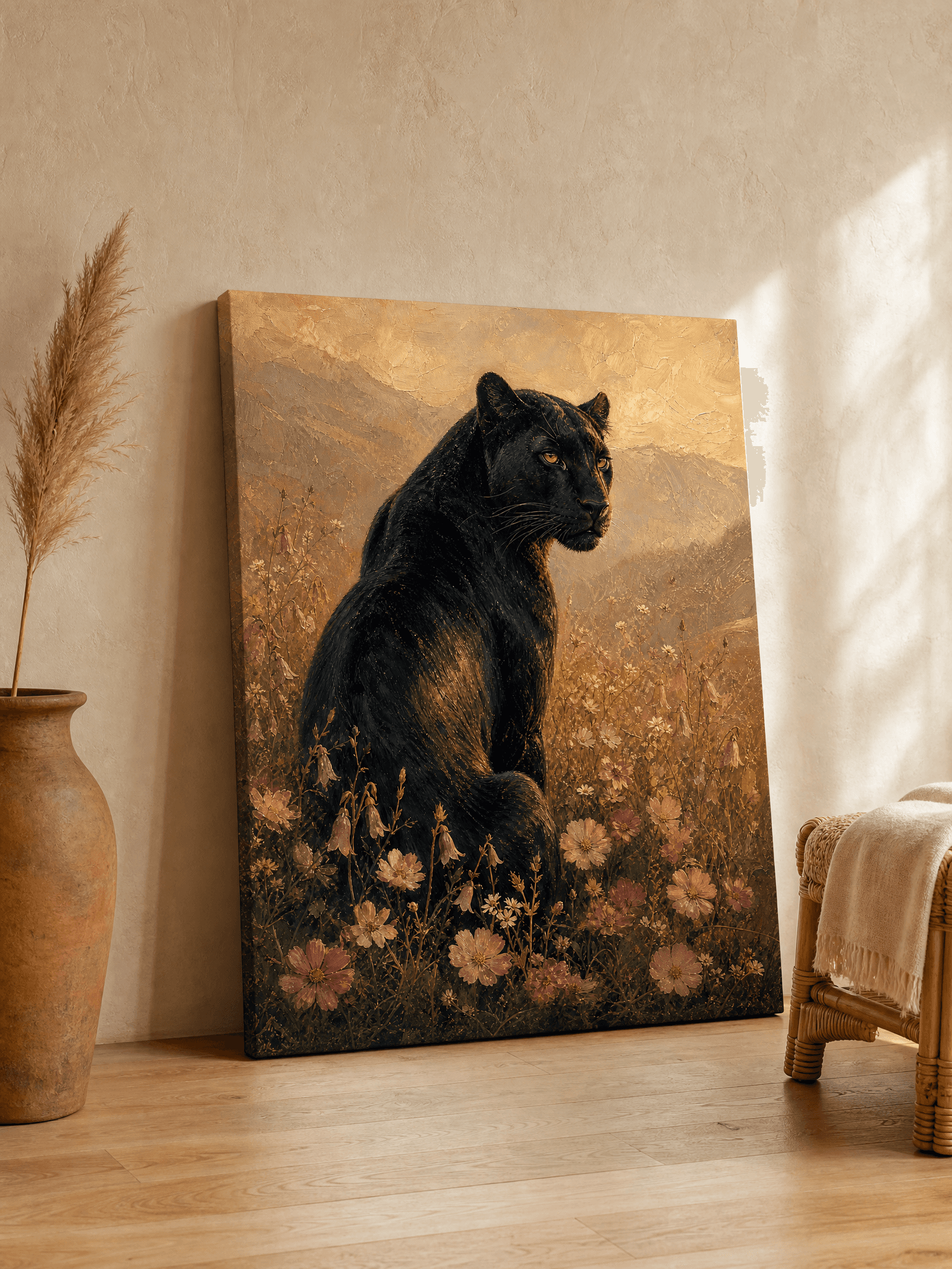
- Amber and gold tones bring warmth and optimism without the intensity of red. They pair beautifully with natural wood and create a sense of abundance.
- Blues and teals promote calm and focus. Bedrooms and home offices benefit most from cool-toned art.
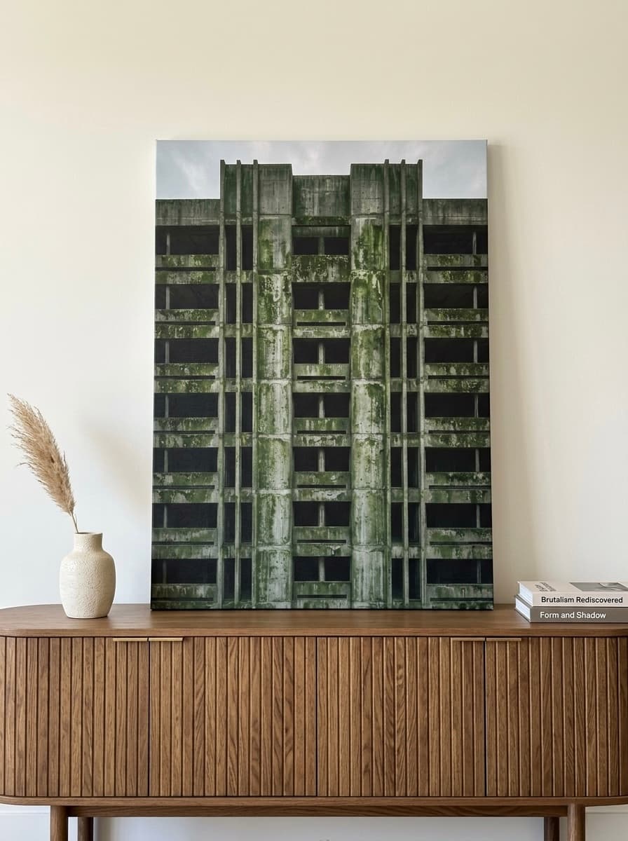
- Greens connect the room to nature and create a refreshing, balanced feeling. Emerald and forest greens in particular add depth and richness.
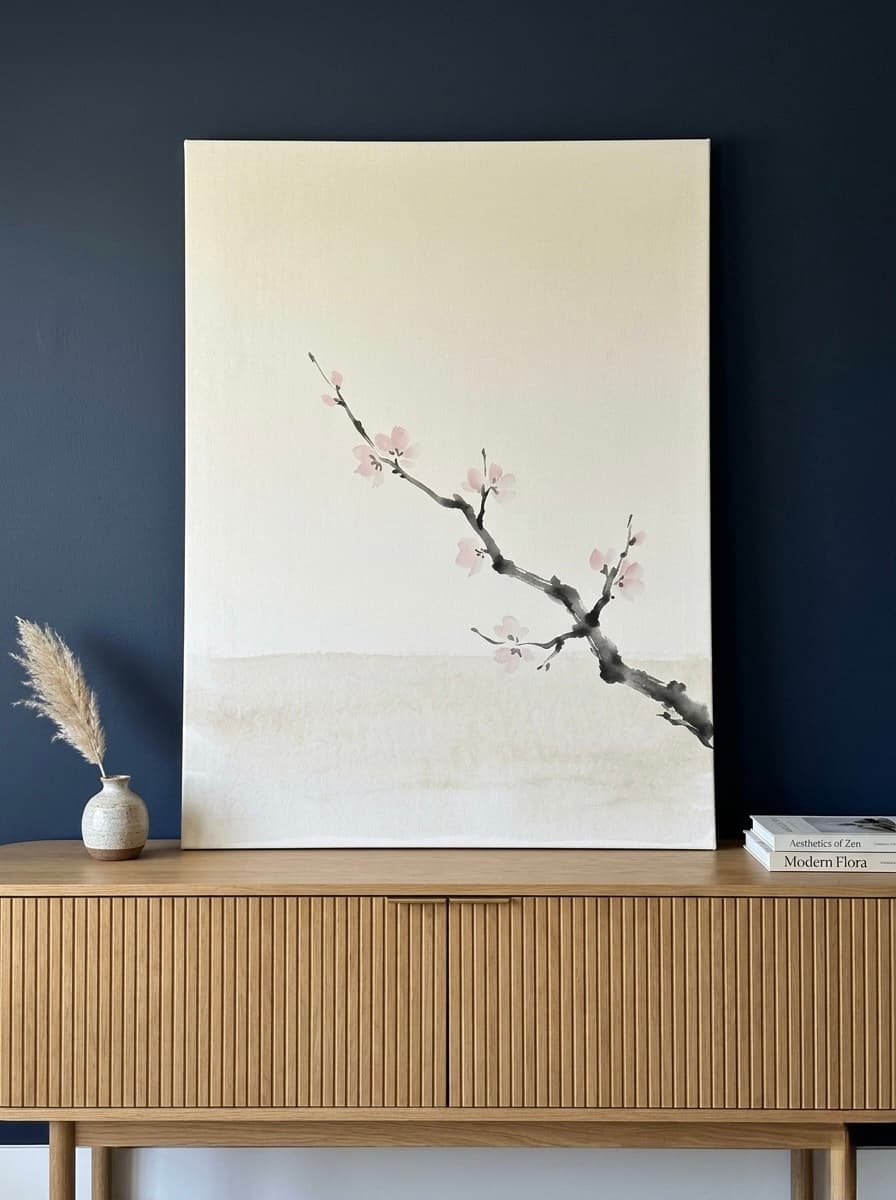
- Blush and dusty pinks are softer and more versatile than you might expect. They add warmth without aggression and layer beautifully with neutrals.
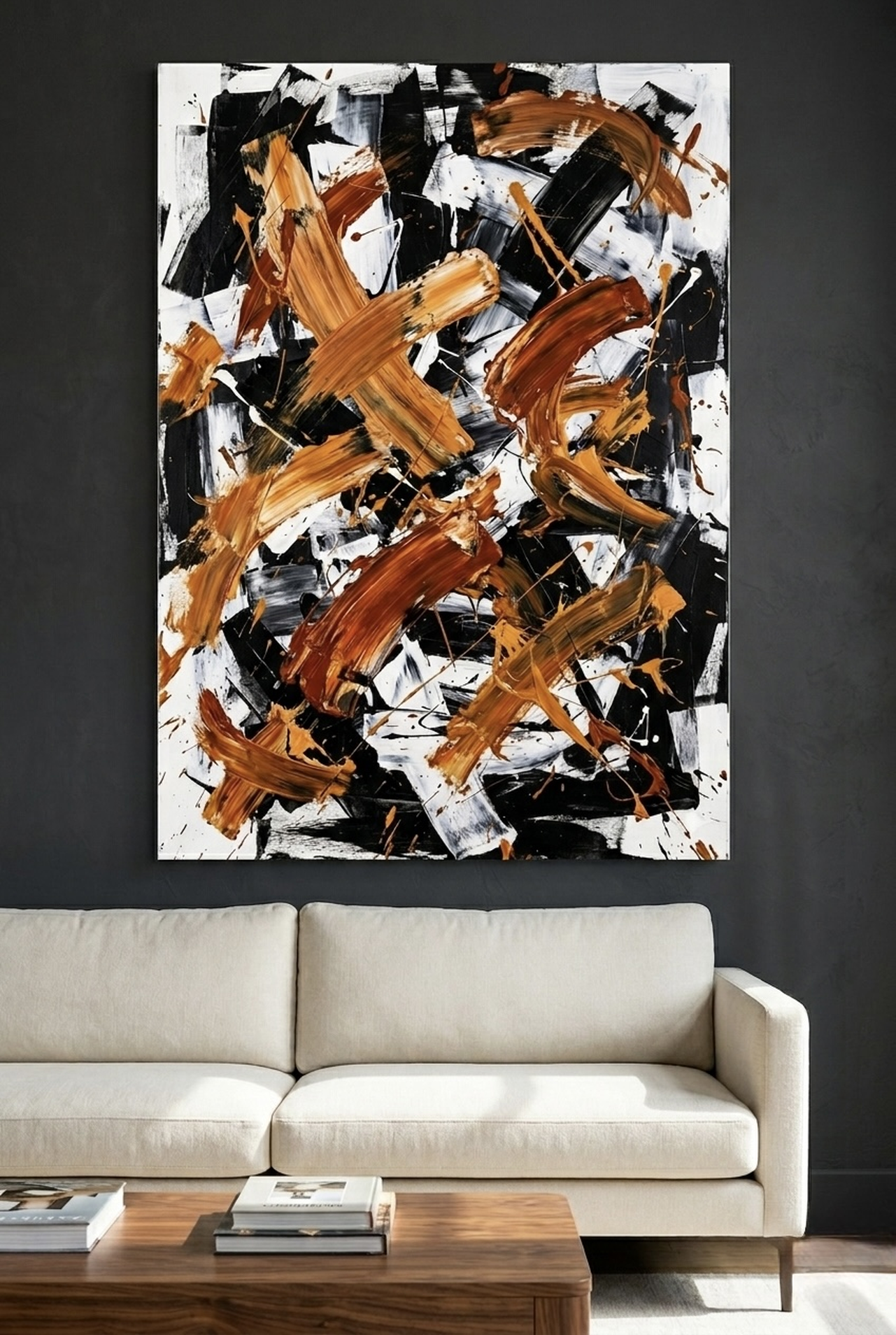
- Multi-color compositions carry the energy of several hues at once. The key is how they are balanced within the piece itself.
According to color psychology research published by ScienceDirect in a study on color and interior preference, participants consistently rated rooms with intentional color accents as more emotionally engaging and aesthetically satisfying than neutral-only rooms. The art on your walls is one of the easiest ways to introduce that intentional color without a full renovation.
The Pantone Color Institute, which sets global color trend standards, has long emphasized that color choice in living spaces directly impacts psychological wellbeing. Their annual Color of the Year research consistently shows that consumers gravitate toward rooms that feel expressive and personalized over those that feel safe but sterile.
The takeaway: do not be afraid of color. Be intentional about it.
How to Choose Colorful Art Without Overwhelming a Room
The most common hesitation people have about colorful wall art is the fear of going too far. What if it clashes? What if it feels chaotic? These are valid questions, and the answers come down to a few simple principles.
1. Let the art be the anchor, not an afterthought
Instead of buying art to match your existing furniture, choose the art first and build around it. Pick up one or two accent colors from the piece and echo them in throw pillows, a vase, or a rug. This approach creates visual cohesion without making the room feel matchy-matchy.
2. Balance saturation across the room
If your canvas is bold and richly saturated, keep surrounding elements quieter. Neutral walls, natural wood furniture, and simple textiles let the art breathe and hold visual attention without competition.
3. Consider the room's light source
Natural north-facing light reads cooler and can make warm-toned art pop. South-facing rooms flood with warm light, which makes cool blues and greens feel especially refreshing. Check your room's orientation before committing to a palette.
4. Scale matters as much as color
A small colorful print in a large room gets lost. Go bigger than you think. For a standard living room wall, a canvas between 60 x 90 cm (24 x 36 inches) and 100 x 150 cm (40 x 60 inches) is the sweet spot. For a gallery wall, group pieces so the total arrangement reads as one large unit.
5. Use the 60-30-10 rule
This classic interior design principle divides color into three tiers: 60% dominant (usually your walls or floor), 30% secondary (furniture, textiles), and 10% accent (art, accessories). Your colorful canvas sits comfortably in that 10% accent tier and pulls the whole palette together.
For more inspiration on bold decor approaches, see our guide to maximalist wall art and bold, beautiful decor.
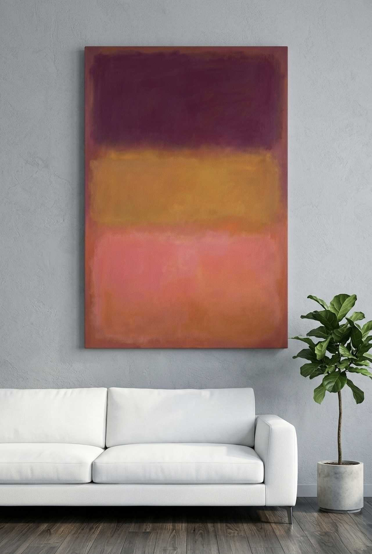
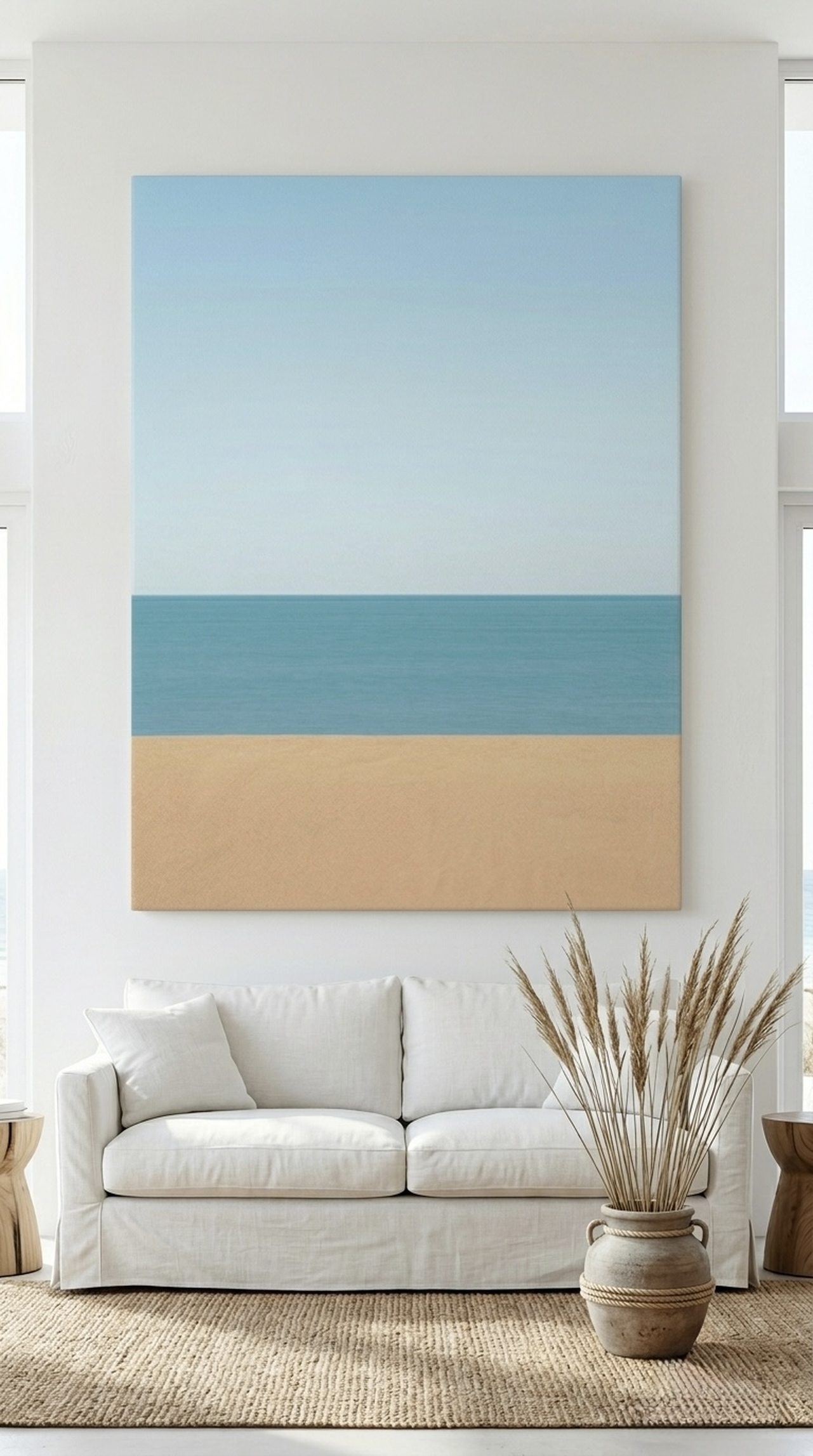
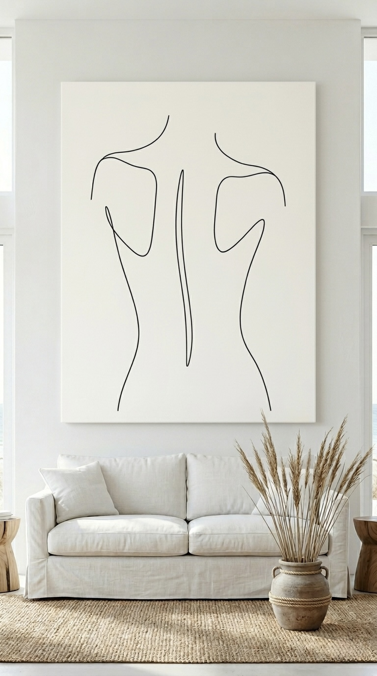
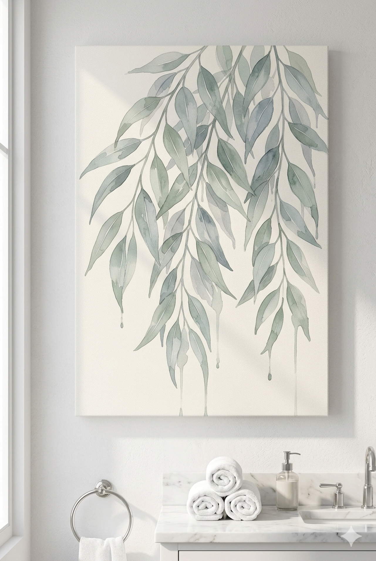
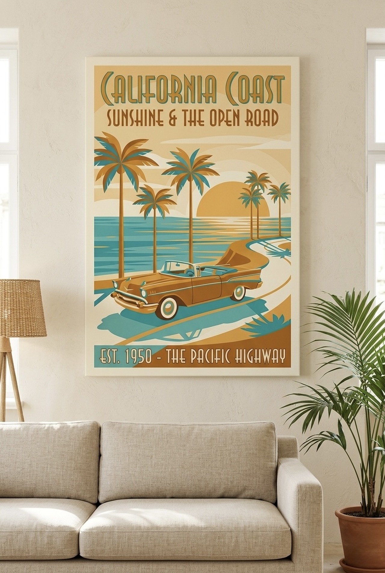
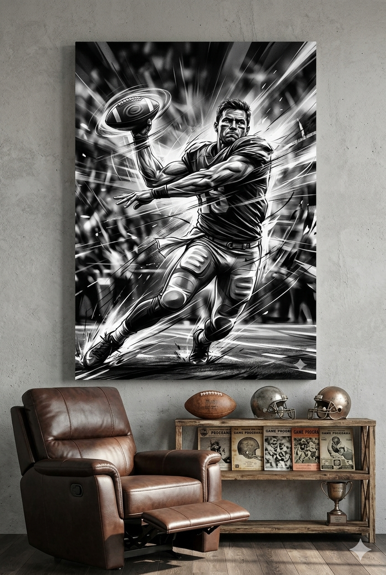
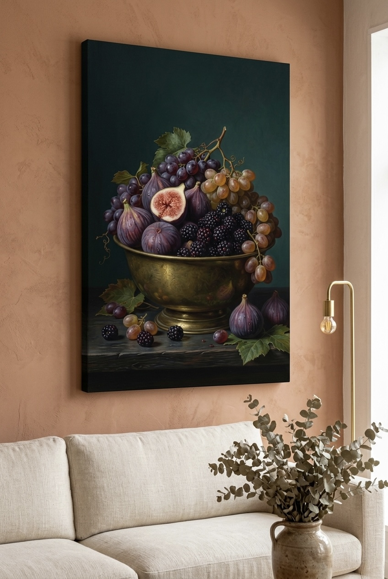
Our Top Colorful Canvas Picks
We curated six of our most vibrant, eye-catching canvas prints from the HEVA collection. Each one brings a distinct energy, making it easy to find the right match for your space and personal style.
Want to explore more options in this style? See our full guide to abstract wall art ideas for every room.
Room Placement Guide
Choosing the right canvas is half the work. Placing it correctly is the other half. Here is a room-by-room breakdown with recommended canvas sizes in both centimeters and inches.
Living Room
The living room is the most common destination for colorful wall art, and rightly so. This is where guests gather and where you spend the most time. Hang your canvas at eye level, which typically means the center of the piece sits at approximately 145 to 152 cm (57 to 60 inches) from the floor. For a sofa wall, choose a canvas that is about two-thirds the width of the sofa. A standard 2.4 m (8-foot) sofa pairs well with a canvas between 90 x 60 cm (36 x 24 inches) and 150 x 100 cm (60 x 40 inches).
Bedroom
Above the bed is prime real estate for colorful art. Position the bottom edge of the canvas 20 to 25 cm (8 to 10 inches) above the headboard. For a queen bed, a canvas around 120 x 60 cm (48 x 24 inches) works well. For a king, go wider: 150 x 75 cm (60 x 30 inches) or consider a diptych arrangement. Blush pinks, deep teals, and muted golds tend to work especially well in bedroom contexts.
Kitchen and Dining Room
These rooms benefit from cheerful, appetite-stimulating colors. Warm tones like coral, amber, and terra cotta work well here. Smaller pieces around 40 x 50 cm (16 x 20 inches) to 60 x 80 cm (24 x 32 inches) are often sufficient, as kitchen walls tend to be fragmented by cabinets and appliances. Hang 15 cm (6 inches) above counter level or centered on any free wall panel.
Home Office
Your home office deserves more than a motivational poster. A single striking canvas, 60 x 90 cm (24 x 36 inches) or larger, hung directly in your sightline from the desk can significantly improve focus and mood. Cool greens and deep blues promote concentration. Warm gold tones add motivation and energy.
Hallway and Entryway
First impressions happen here. A bold, colorful piece in the entryway sets the tone for your entire home. Vertical formats work best in narrow hallways. Aim for a canvas around 30 x 90 cm (12 x 36 inches) to 50 x 120 cm (20 x 48 inches) for a strong vertical statement. Op art patterns and jewel-tone pieces are particularly effective in this application. See also our guide to jewel-tone wall art for rich, dramatic decor.
Bathroom
Often overlooked, bathrooms are ideal for smaller art moments. A 20 x 30 cm (8 x 12 inches) to 30 x 40 cm (12 x 16 inches) canvas adds a spa-like or boutique hotel quality. Choose art that includes blues, greens, or soft botanical motifs for a serene, refreshing effect.
5 Common Mistakes with Colorful Wall Art
Even with great taste, it is easy to make avoidable missteps. Here are the five most common mistakes people make when hanging colorful wall art, and how to sidestep each one.
Mistake 1: Hanging art too high
The single most widespread hanging error. Most people hang art at standing eye level, which is too high when you are mostly seated in a room. Drop it lower than feels natural. The center of the piece should sit at approximately 145 to 152 cm (57 to 60 inches) from the floor in most living and dining spaces.
Mistake 2: Going too small
A small canvas on a large wall looks like a postage stamp. If your wall is wider than 2 m (6.5 feet), think in terms of gallery arrangements or canvases larger than 90 cm (36 inches) on at least one side. When in doubt, go one size up.
Mistake 3: Matching instead of coordinating
Trying to find art that exactly matches your cushions or rug usually results in a room that looks like a showroom, not a home. Instead, pull one or two accent colors from the art and echo them loosely in soft furnishings. Slight variation creates depth and interest.
Mistake 4: Ignoring the room's existing undertones
White walls are not all the same white. Some lean warm, others cool. Before buying colorful art, identify whether your walls have warm (yellow, beige, pink) or cool (grey, blue, green) undertones. Pair warm-toned art with warm walls and cool-toned art with cool walls for a harmonious result.
Mistake 5: Treating colorful art as a risk
Color is not a gamble. It is a choice. The only real risk is playing it so safe that your home ends up feeling generic. Colorful wall art is one of the most reversible, non-destructive, and affordable ways to transform a space. The downside is minimal. The upside is a room that actually feels like you.
Frequently Asked Questions
What colors in wall art make a room feel larger?
Light, cool tones such as soft blues, pale greens, and lavenders tend to recede visually, creating a sense of expanded space. Abstract pieces with a lot of negative space or atmospheric washes of color are especially effective in smaller rooms. Avoid very dark, heavily saturated canvases on small walls unless you are intentionally going for a dramatic, cozy effect.
Can I mix colorful wall art with neutral decor?
Absolutely, and this is actually the most popular and effective approach. Neutral walls, furniture, and textiles serve as a quiet backdrop that lets vibrant art take center stage. Think of your neutral decor as the frame and your colorful canvas as the jewel inside it.
How many colorful pieces should I have in one room?
As a general rule, one to three colorful pieces per room is sufficient. If you use more, make sure they share at least one common color to tie the arrangement together. A consistent palette across several pieces creates harmony rather than chaos.
What is the best size for a colorful canvas in a living room?
For most living rooms, a canvas between 90 x 60 cm (36 x 24 inches) and 120 x 90 cm (48 x 36 inches) reads well on a standard wall. If you have high ceilings or a large feature wall, scale up to 150 x 100 cm (60 x 40 inches) or create a gallery arrangement of smaller pieces. Always measure the wall and mock up the size with paper before buying.
Is colorful wall art appropriate for a home office?
Yes, and research increasingly supports it. Studies on workplace environments show that access to natural color and visual stimulation improves creative thinking and reduces fatigue. A single vibrant canvas in your direct sightline can make a meaningful difference in how productive and motivated you feel during a long work session.
How do I choose colorful wall art that will not go out of style?
Focus on pieces with strong compositional structure, not just trendy colors. Abstract art with clear geometric or organic form, high-quality printing, and a timeless subject (nature, pattern, texture) tends to age well. Avoid art that references a specific trend cycle too directly. When the composition is strong, the color palette can be refreshed with surrounding accessories without ever needing to replace the art itself.
Quick Reference Table
| Room | Recommended Size | Best Color Families | Hanging Height (center) |
|---|---|---|---|
| Living Room | 90 x 60 cm (36 x 24 in) to 150 x 100 cm (60 x 40 in) | Warm amber, coral, jewel tones, multi-color | 145 to 152 cm (57 to 60 in) |
| Bedroom | 120 x 60 cm (48 x 24 in) to 150 x 75 cm (60 x 30 in) | Blush, teal, deep blue, muted gold | 20 to 25 cm (8 to 10 in) above headboard |
| Kitchen / Dining | 40 x 50 cm (16 x 20 in) to 60 x 80 cm (24 x 32 in) | Coral, terra cotta, amber, lavender | 15 cm (6 in) above counter or centered |
| Home Office | 60 x 90 cm (24 x 36 in) and larger | Cool greens, deep blues, warm gold | 145 to 152 cm (57 to 60 in) |
| Hallway / Entryway | 30 x 90 cm (12 x 36 in) to 50 x 120 cm (20 x 48 in) vertical | Jewel tones, bold patterns, rich reds | 145 cm (57 in) |
| Bathroom | 20 x 30 cm (8 x 12 in) to 30 x 40 cm (12 x 16 in) | Blues, greens, soft botanicals | 145 cm (57 in) or centered above fixture |
Bring Color Home
Color transforms a room faster and more affordably than almost any other design decision. Whether you are drawn to the golden warmth of an abstract landscape, the rhythmic precision of geometric patterns, or the layered richness of an Iznik tile composition, the right canvas is waiting for your wall.
Every piece in the HEVA collection is printed on premium matte canvas with archival inks, built to hold its color for decades. We ship within the US so your walls can be transformed no matter where you are in the world.