Neutral Wall Art: Calm, Sophisticated Decor That Never Goes Out of Style
The Heva Team
Art Curators & Interior Design Enthusiasts · March 31, 2026 · 14 min read
Your home deserves to feel like a deep breath. Not every wall needs a statement piece that shouts for attention. Sometimes the most powerful design choice you can make is one that creates stillness, pulls a room together, and lets everything else breathe. That is exactly what neutral wall art does. Whether you live in a bold maximalist space or a quietly curated Scandinavian interior, a well-chosen neutral canvas has a rare quality: it belongs everywhere, suits every season, and never demands to be replaced.
If you have been searching for the kind of art that feels intentional without feeling loud, calm without feeling boring, and sophisticated without feeling cold, you have landed in the right place. Explore our full collection and find the piece that was made for your walls.
Why Neutral Wall Art Works in Every Room
Interior designers have known for generations that neutral tones carry a kind of visual intelligence. They do not compete. They do not date. They do not clash. Instead, they absorb the energy of a room and give it back as calm. This is why neutral wall art has become one of the most searched categories in home decor, and why it continues to hold its ground against every passing trend.
The Psychology of Neutral Spaces
Research in environmental psychology consistently shows that spaces dominated by low-saturation colors reduce cortisol levels and promote a sense of safety and ease. When you hang a piece of neutral art, you are not just making an aesthetic decision. You are shaping how you and your guests feel the moment they walk into the room. A grey-toned crane watercolor or a sand-hued bird study quietly signals: this is a place to exhale.
Versatility Across Design Styles
One of the most practical reasons to choose neutral wall art is its ability to transcend decorating styles. Consider these pairings:
- Scandinavian and Japandi interiors: Neutral art in cool grey or warm linen tones slots seamlessly into the clean lines and natural material palettes these styles favor. See our related guide: Scandinavian Wall Art: Clean, Calm Style and Japandi Wall Art: Calm, Minimal Spaces.
- Transitional homes: If your furniture mixes periods and styles, neutral art provides the visual common ground that makes the mix look intentional.
- Rental-friendly decorating: Renters who cannot paint walls find that neutral canvas art warms a white or beige wall without introducing a color scheme they will have to reverse when they move.
- Nurseries and children rooms: Soft neutral art grows with the child, transitioning from a calming nursery backdrop into a simple, tasteful element of a teenager room without feeling out of place.
Longevity: The Case for Timeless Over Trendy
Trend-driven decor has a cost. A bold emerald abstract bought in 2019 may feel dated by 2024. Neutral art does not work that way. The warm ivory crane watercolors you hang today will feel equally at home in your next apartment, your first house, and the home you eventually settle into. That longevity makes neutral art genuinely cost-effective over time.
Best Neutral Color Palettes for Wall Art
Not all neutrals are created equal. Choosing the right undertone for your wall art can mean the difference between a piece that feels harmonious and one that feels oddly out of place. Here is a breakdown of the most common neutral palettes and how to use them well.
Warm Neutrals: Cream, Sand, Linen, and Taupe
Warm neutrals have yellow, orange, or red undertones. They create a sense of coziness and work particularly well in rooms that receive cool north-facing light, where they compensate for the blue cast. If your existing furniture leans toward natural wood, rattan, or terracotta accents, warm neutral art will feel cohesive and grounding.
Best rooms: living rooms, dining rooms, kitchens, cozy reading nooks.
What to look for: sandy backgrounds, linen-toned subjects, ivory line art, warm sepia illustrations.
Cool Neutrals: Steel Grey, Slate, and Blue-Grey
Cool neutrals carry blue or green undertones and feel crisp, modern, and expansive. They work beautifully in rooms with white walls, stainless steel fixtures, or mid-century furniture with clean angles. A grey-toned wildlife painting, for instance, can anchor a contemporary bedroom without introducing any color tension.
Best rooms: bedrooms, home offices, bathrooms, modern living rooms.
What to look for: grey wildlife art, monochrome botanical prints, steel-blue ocean scenes.
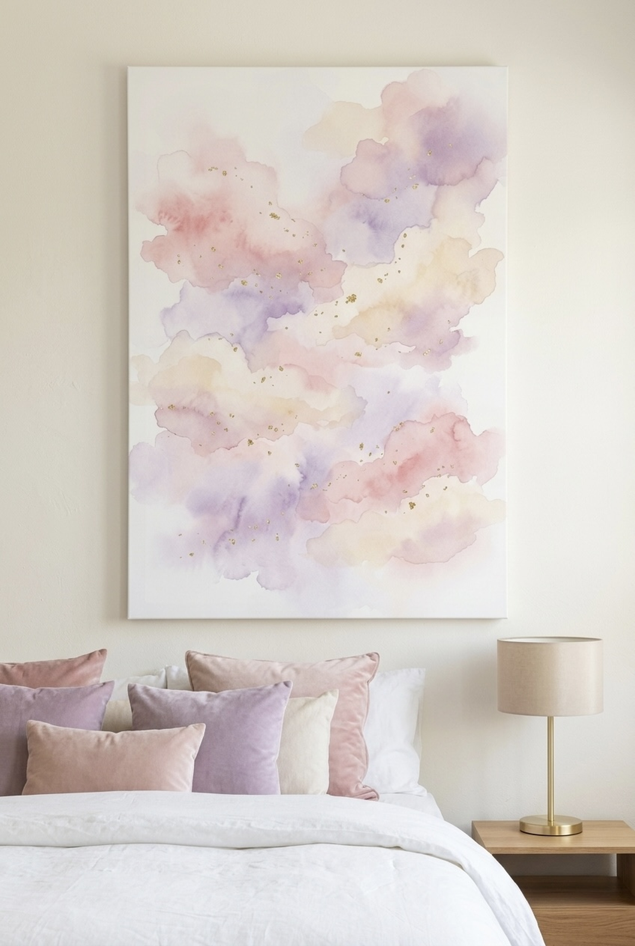
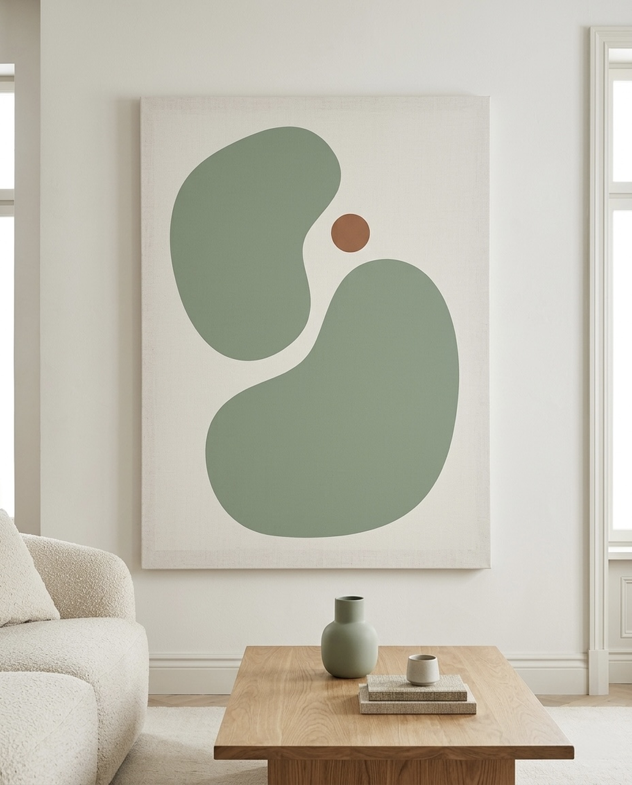
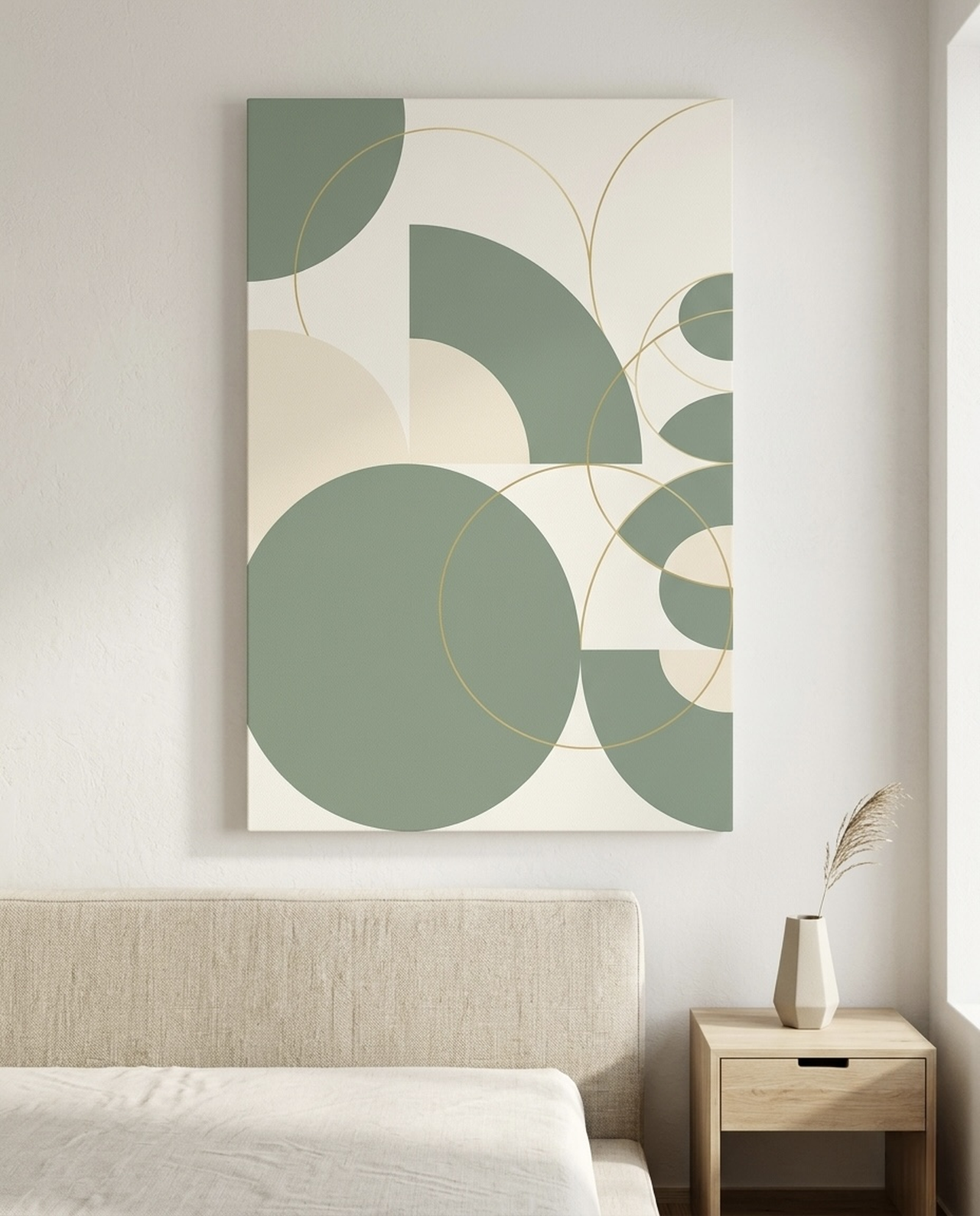
Soft Greens: Sage, Moss, and Muted Olive
Sage and muted olive occupy an interesting middle ground. They read as neutral in context, particularly when they appear as backgrounds or large washes rather than bright botanical accents. These tones connect interior spaces to the natural world and pair beautifully with linen, natural oak, and any shade of white from warm alabaster to cool bright white.
Best rooms: bedrooms, bathrooms, sunrooms, entryways.
What to look for: sage-background animal portraits, moss-toned abstract washes, muted botanical studies.
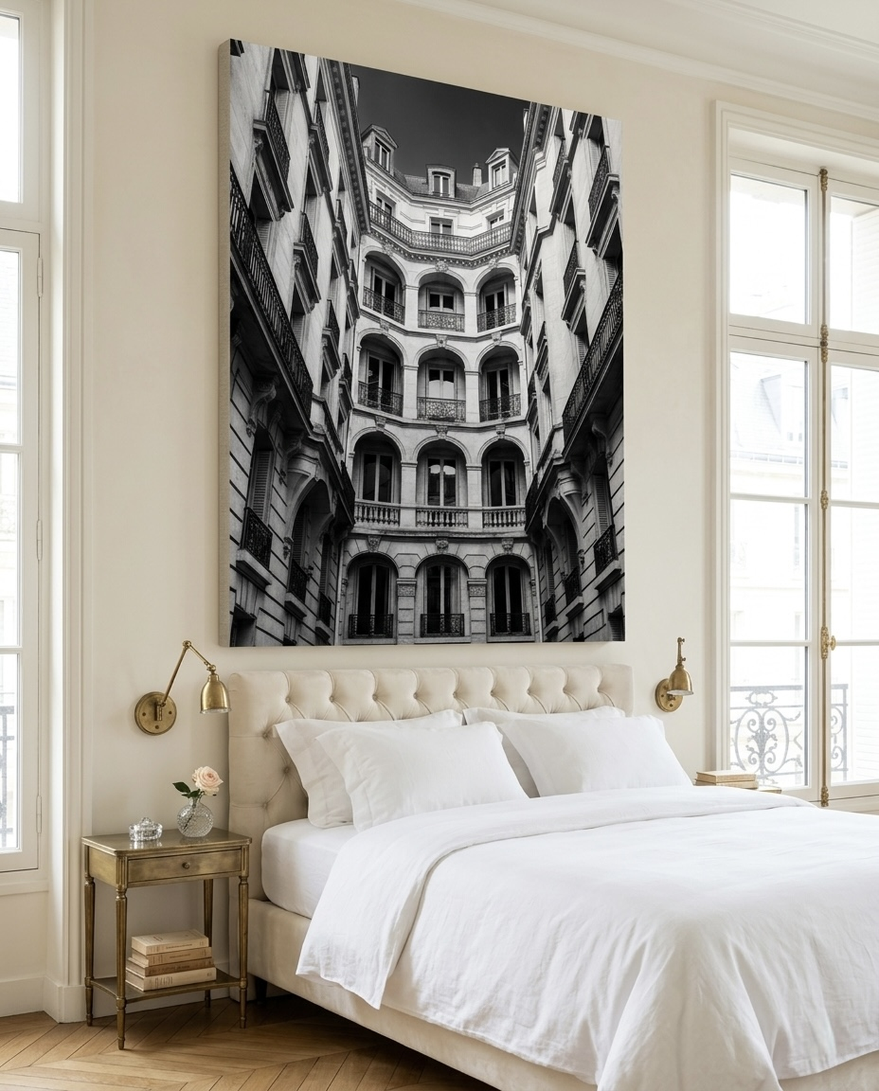
Black and White
The ultimate neutral. A black-and-white canvas has zero color temperature, making it inherently compatible with any palette. A bold monochrome piece can serve as a graphic accent in a colorful room or as the primary visual anchor in a pure white-and-grey space. Minimalist black-on-white typography or line art in this palette also reads as sophisticated and intentional at any scale.
Best rooms: any room, any style.
What to look for: monochrome wildlife, black ink on white, white subject on black background.
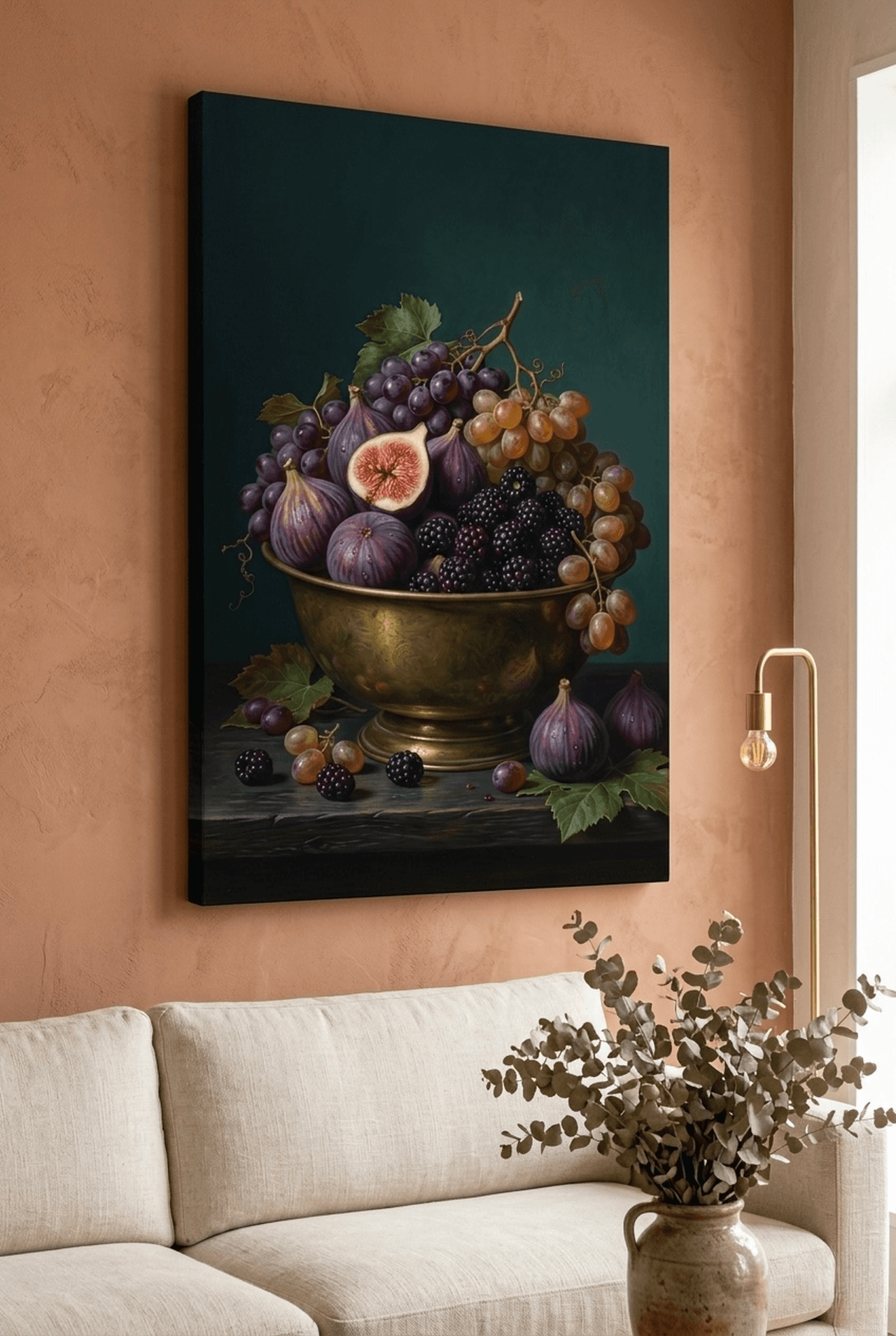
Gold Accents within a Neutral Palette
A neutral piece with gold leaf or gold-toned details deserves its own mention. The gold does not make the art colorful in the traditional sense. Instead, it adds warmth and texture within an otherwise quiet palette. A lotus rendered in gold on black, for example, still reads as a neutral-leaning piece in a room because the overall effect is rich and restrained rather than vibrant.
Our Top Neutral Canvas Picks
Every piece below was selected for its palette, its ability to blend into diverse interior styles, and its quiet staying power. Each is available as a framed canvas print ready to hang, with multiple sizes to suit your wall.
A study in restraint. This minimalist blue jay on a warm sand background captures just enough detail to feel alive while keeping the palette firmly in neutral territory. Perfect for a reading nook, entryway, or bedroom where you want nature without vivid color. The sand background plays particularly well with natural linen, rattan, and warm wood tones.
This piece brings the tranquil elegance of Japanese watercolor tradition into a contemporary neutral palette. The cool grey wash and delicate ink lines make it feel meditative rather than decorative. Hang it in a bedroom or home office where clarity and calm are the goal. It pairs beautifully with white, grey, or sage surroundings. For more inspiration along these lines, see our guide to Japandi wall art.
Black and gold: two of the most timeless neutrals in design. This lotus rendered in gold leaf on a deep black background creates a sense of luxurious calm. It works in bedrooms, meditation rooms, and sophisticated living areas. The gold picks up candlelight and warm lamp tones beautifully, making it a piece that shifts character from day to evening.
Typography art in neutral tones occupies a special category: it carries meaning and visual weight without introducing color. This "Be Still" scripture piece on a linen-sage background feels immediately calming. It suits bedrooms, nurseries, prayer rooms, and any space where the intention is peace. The soft palette ensures it complements rather than dominates. For bedroom-specific ideas, see our guide to bedroom wall art that sets the mood.
An impressionist fawn portrait in soft sage tones is one of those rare pieces that feels right from nursery through adulthood. The loose, painterly brushwork gives it artistic depth, while the muted sage palette keeps it firmly neutral. Parents who want art that will grow with their child without needing to be replaced will find this a particularly sound choice.
This minimalist sea turtle on a grey-blue wash brings a coastal atmosphere without the kitschy nautical cliches. The cool, muted palette works in bathrooms, coastal bedrooms, or any room where you want the suggestion of open water without the saturated blue of typical ocean art. It is quiet, graceful, and perfectly poised between nature and abstraction.
Placement Guide: Sizing and Hanging Tips
Even a perfect piece of neutral wall art will underperform if it is hung at the wrong height or chosen in the wrong size. These guidelines are drawn from professional interior styling practice and apply whether you are placing a single statement piece or building a gallery wall.
Eye-Level Rule
The center of your artwork should sit approximately 145 to 150 cm (57 to 59 inches) from the floor. This is the average human eye level and is the standard used by most galleries. In rooms where most activity happens at seated height, such as a dining room or living room with a sofa, consider dropping this slightly to 135 to 140 cm (53 to 55 inches) so the art is comfortable to view from a seated position.
Art Above a Sofa
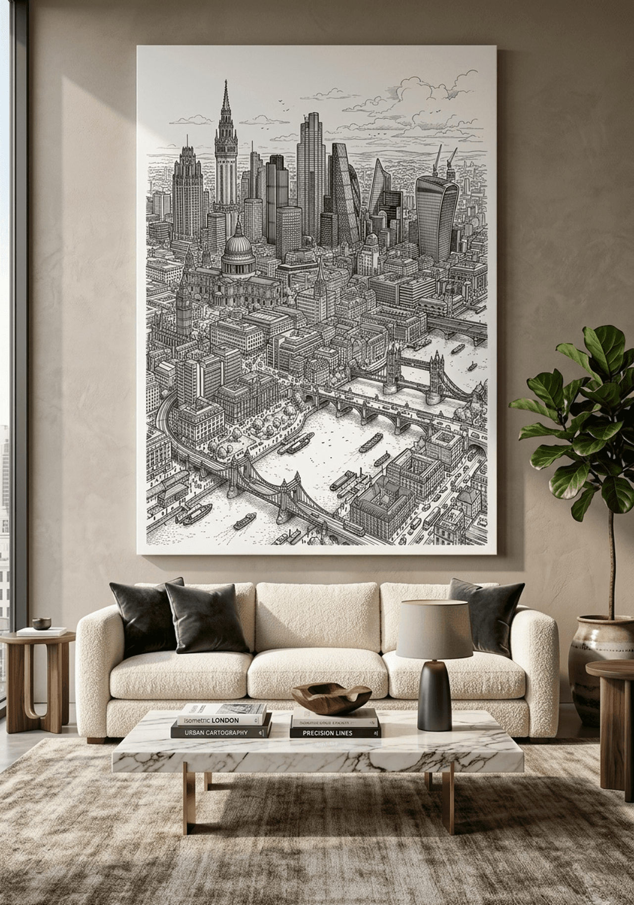
The most common placement error in living rooms is hanging art too high. For art hung above a sofa, the bottom edge of the frame should sit 15 to 20 cm (6 to 8 inches) above the sofa back. The art should span roughly two-thirds to three-quarters the width of the sofa below it. For a standard 200 cm (79 inch) sofa, that means artwork of about 130 to 150 cm (51 to 59 inches) wide, either as a single piece or a grouped arrangement.
Single Canvas Sizing by Room
| Room | Recommended Size (cm) | Recommended Size (inches) |
|---|---|---|
| Small bedroom or nursery | 30 x 40 cm to 50 x 60 cm | 12 x 16 in to 20 x 24 in |
| Standard bedroom | 50 x 60 cm to 60 x 80 cm | 20 x 24 in to 24 x 32 in |
| Living room focal wall | 60 x 80 cm to 80 x 100 cm | 24 x 32 in to 32 x 40 in |
| Entryway or hallway | 30 x 40 cm to 40 x 50 cm (vertical) | 12 x 16 in to 16 x 20 in (vertical) |
| Bathroom | 20 x 25 cm to 30 x 40 cm | 8 x 10 in to 12 x 16 in |
| Home office | 40 x 50 cm to 60 x 80 cm | 16 x 20 in to 24 x 32 in |
Gallery Walls with Neutral Art
Gallery walls composed entirely of neutral art feel cohesive and sophisticated in a way that mixed-color arrangements rarely achieve. To build one:
- Choose a unifying thread: all pieces in similar tones, or all wildlife subjects, or all the same frame color.
- Lay pieces on the floor first to test the arrangement before making holes.
- Keep gaps between frames consistent: 5 to 8 cm (2 to 3 inches) for a tight modern look, 10 to 15 cm (4 to 6 inches) for an airy, curated look.
- Treat the arrangement as a single rectangle: it should follow the same proportional rules as a single large piece.
Lighting Neutral Art
Neutral art responds beautifully to warm lighting. A simple picture light mounted on the frame, or a directional ceiling spot at 30 degrees from the wall, will bring out the subtle texture and depth of a canvas print. Avoid cool white LED lighting directly on neutral art, as it can make warm tones appear flat and greyish.
5 Common Mistakes with Neutral Wall Art
Mistake 1: Going Too Small
A small piece on a large wall does not read as neutral art. It reads as an afterthought. When in doubt, go one size larger than feels comfortable. A canvas that fills 50 to 60 percent of the available wall width will look confident and intentional. Anything smaller risks looking lost, no matter how beautiful the art itself is.
Mistake 2: Choosing a Neutral That Clashes with Your Undertones
A warm cream canvas on a wall painted in a cool blue-grey will create a subtle but persistent visual tension. Before buying neutral art, identify whether your walls, floor, and major furniture pieces lean warm or cool. Then choose art with a matching undertone. When in doubt, true warm grey or soft charcoal reads well in almost any space because it bridges both camps.
Mistake 3: Hanging Too High
This is the single most common hanging error. Art hung too high disconnects visually from the furniture below it and creates an awkward dead zone on the wall. Stick to the eye-level rule: center of art at 145 to 150 cm (57 to 59 inches) from the floor, and for above-sofa placement, bottom edge 15 to 20 cm (6 to 8 inches) above the sofa back.
Mistake 4: Ignoring Frame Choice
A beautiful neutral canvas in the wrong frame can undermine the entire effect. Natural wood frames warm up cool-toned art and ground it in organic materials. Matte black frames sharpen and define, adding a modern graphic edge. Avoid shiny metallic or heavily ornate frames on minimalist neutral art, as the contrast creates visual noise rather than harmony.
Mistake 5: Treating Neutral as Boring
The most common mistake is also the most conceptual: assuming that neutral means plain. The best neutral wall art carries tremendous depth. The visible texture of a canvas, the layered tones in a watercolor wash, the negative space in a minimalist animal study. These are not simple pieces. They are quiet pieces, and quiet is not the same as boring. Allow yourself to look longer at neutral art before dismissing it. The more you look, the more it gives back.
Frequently Asked Questions
- What colors count as neutral wall art?
- Neutral wall art typically features colors like ivory, cream, beige, taupe, warm grey, cool grey, sage green, soft blush, and black-and-white. These tones work because they do not compete with existing furniture or accent colors in a room.
- Can neutral wall art work in a colorful room?
- Yes. Neutral art acts as a visual anchor in a colorful room. It provides breathing room for the eye and prevents decor from feeling chaotic. Choose a neutral that picks up one undertone from your dominant accent color for best results.
- What size neutral canvas art should I choose for a living room?
- For a sofa wall, a single canvas of 60 x 80 cm (24 x 32 inches) or larger tends to feel intentional rather than lost. If you prefer a gallery wall, combine three pieces ranging from 30 x 40 cm (12 x 16 inches) to 50 x 60 cm (20 x 24 inches) for a balanced arrangement.
- How do I hang neutral wall art so it does not look too plain?
- Layer texture around the piece. A linen curtain, woven throw, or organic ceramic vase near the art adds warmth without adding color. Also consider the frame: a natural wood or matte black frame gives even simple neutral art a finished, purposeful look.
- Is neutral wall art a good gift?
- Neutral wall art is one of the safest and most appreciated home decor gifts precisely because it blends into almost any existing style. Canvas prints with natural, botanical, or wildlife subjects in soft tones are particularly well received as housewarming, wedding, or birthday gifts.
- Do neutral canvas prints go out of style?
- No. Neutral tones have remained a constant in interior design for decades because they are rooted in timeless principles: balance, calm, and versatility. Unlike trendy accent colors, a well-chosen neutral piece will continue to complement your space through multiple redecorating cycles.
Quick Reference Table
| Neutral Palette | Undertone | Best Room Match | Pairs Well With |
|---|---|---|---|
| Cream and ivory | Warm yellow | Living room, dining room | Natural wood, rattan, terracotta |
| Sand and linen | Warm beige | Bedroom, entryway | Linen textiles, warm oak, dried botanicals |
| Warm grey / greige | Warm grey | Any room | White, charcoal, natural wood |
| Cool grey / slate | Cool blue | Bedroom, home office | White walls, stainless, mid-century furniture |
| Sage green | Soft green-grey | Bedroom, bathroom, nursery | Linen, natural oak, white, blush |
| Black and white | None (true neutral) | Any room, any style | Everything |
| Black with gold | Warm metallic | Bedroom, living room, dining | Dark furniture, marble, warm lighting |
Ready to Find Your Neutral Canvas?
The right piece is waiting for your wall. Browse the full collection of handcrafted neutral canvas prints at Heva Unique Art Gallery. Every piece is printed on museum-quality canvas, framed and ready to hang, and Ships within the US. Whether you are looking for a serene bedroom focal point, a calming living room anchor, or a timeless gift that anyone will love, you will find it here.