Trending Wall Art Colors for 2026: The Complete Palette Guide
The Heva Team
Art Curators & Interior Design Enthusiasts · April 13, 2026 · 18 min read
Discover the hottest wall art color trends for 2026. From sage green and warm terracotta to deep navy and soft blush, find the perfect palette to transform your walls and elevate every room.
Your walls are the largest canvas in your home, and the colors you choose shape how every room feels from the moment you walk in. In 2026, the design world is embracing palettes that feel grounded, expressive, and deeply personal. From soft sage greens to rich burgundy and dusty terracotta, this year's wall art color trends are all about creating spaces that resonate emotionally.
Whether you are redecorating a living room, refreshing a bedroom, or finally committing to that bold statement wall, understanding 2026's dominant color palettes will help you make confident, lasting choices. This guide covers every major trend, with room-by-room advice and hand-picked wall art to bring each palette to life.
Ready to browse? Explore the full collection of abstract wall art that matches these 2026 color trends: Shop Abstract Wall Art
2026's Dominant Color Palettes
2026 brings a clear shift toward palettes rooted in nature and emotional warmth. According to Benjamin Moore's 2026 Color of the Year, Silhouette AF-655, this year celebrates the tension between bold depth and understated elegance. Meanwhile, BEHR's 2026 palette pairs grounded earth tones with elevated, calming hues for interiors that feel simultaneously timeless and fresh.
Here are the four palettes dominating 2026 wall art and interior color conversations:
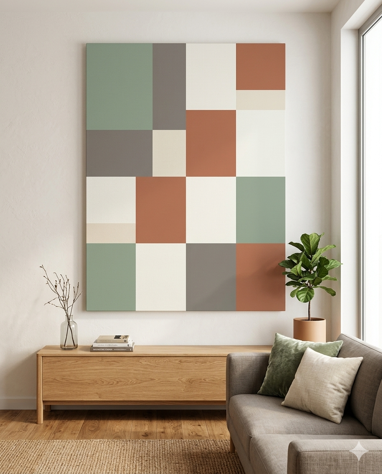
Sage Green: Calm, Organic, Restorative
Sage green is the undisputed color of the moment. Soft, dusty, and deeply organic, it reads as neutral in most spaces while still adding unmistakable warmth. Wall art with sage-toned abstracts, botanical patterns, or muted landscapes pairs perfectly with linen sofas, warm wood tones, and natural stone surfaces. This is the palette for anyone craving a home that feels like a deep exhale.
Sage green works especially well in bedrooms and living rooms. It reads cool enough in bright light but settles into a cozy warmth under ambient lighting. Pair sage-toned art with cream, ivory, and warm white walls to let the color breathe without overwhelming the space.
Warm Terracotta: Earthy, Artisanal, Inviting
Terracotta is having its biggest year yet in 2026. Inspired by sunbaked clay, Mediterranean ceramics, and Southwestern landscapes, this palette spans from soft peach-clay all the way to deep burnt orange-brown. Wall art in terracotta tones adds instant warmth and an artisanal, handmade quality to any room. According to colorpsychology.org's 2026 color guide, warm earthy hues like terracotta are deeply connected to security, rootedness, and human connection.
This palette pairs beautifully with dark wood furniture, jute rugs, and woven textiles. It thrives in dining rooms, kitchens, and entryways where a welcoming, grounded energy is the goal. Avoid pairing terracotta wall art with cool gray or stark white walls; instead, opt for warm whites, warm beige, or deep mocha tones.
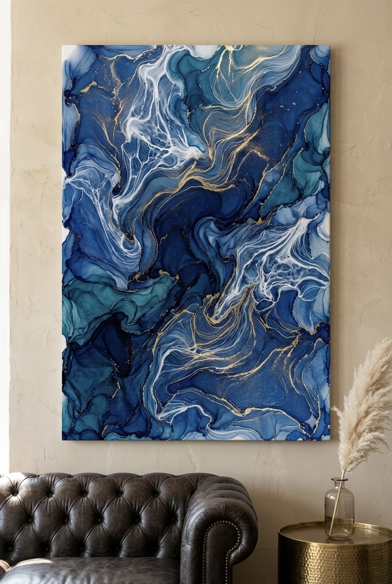
Deep Navy: Sophisticated, Dramatic, Anchoring
Deep navy is no longer just for nautical themes or corporate offices. In 2026, inky navy-blue wall art is becoming a go-to choice for those who want to add drama, depth, and a sense of focused luxury to their spaces. When paired with gold, brass, or warm copper accents, navy wall art commands attention without feeling cold or unwelcoming.
Navy works best as a bold anchor piece in a room with lighter surrounding walls. Consider large-format navy abstract canvas art above a sofa or bed. The dark depth creates a visual focal point and makes surrounding lighter colors feel more vibrant by contrast. This is a palette for confident decorators who are not afraid to commit to a statement.
Soft Blush: Romantic, Modern, Versatile
Soft blush and dusty rose tones are evolving in 2026, moving away from millennial-pink cliches toward something more sophisticated and intentional. The 2026 version of blush reads closer to warm mauve, aged rose, or pinkish-nude, with enough depth to feel adult and refined. Wall art in these tones pairs well with charcoal, warm gray, and deep olive accents.
Blush-toned wall art adds a quietly romantic quality to bedrooms and reading nooks. It pairs surprisingly well with darker, more dramatic furniture and metallics. Think blush abstract canvas alongside a black iron bed frame, dark velvet headboard, and aged brass lighting for a look that feels genuinely current in 2026.
How to Match Wall Art Colors to Your Interior
Choosing wall art colors is not about matching your sofa exactly. The best results come from a thoughtful relationship between art, wall color, and accent tones. The goal is harmony, not uniformity. Here are the principles that professional interior designers use when selecting wall art for 2026 interiors.
The 60-30-10 Color Rule
This classic interior design principle divides your room's color into three zones: 60% dominant color (walls and large furniture), 30% secondary color (upholstery, rugs, curtains), and 10% accent color (accessories, art). Your wall art should ideally pull from either the 30% secondary or 10% accent zone, creating cohesion without becoming camouflage against the wall.
For a room with warm white walls and sage green furniture, wall art that incorporates both sage tones and a contrasting accent like terracotta or gold will create visual interest while tying the room together. The art should feel like a conversation with the room, not a repetition of it.
Undertone Matching
Every color has an undertone: warm, cool, or neutral. The most common decorating mistake is mixing undertones without intention. A cool gray wall next to warm terracotta wall art will feel slightly off even if neither is a wrong choice on its own. Before selecting wall art, identify whether your walls lean warm (yellow, red, or beige undertones) or cool (blue, green, or gray undertones).
For warm-toned walls and furniture, choose wall art that celebrates warm hues: terracotta, ochre, warm navy, or earth tones. For cool-toned spaces, lean toward art with cooler blues, sage greens, soft grays, or dusty purples. When in doubt, a piece with both warm and cool tones will bridge the gap naturally.
Contrast Creates Impact
The strongest wall art moments happen through contrast. A large abstract canvas in deep navy placed against a soft cream or warm white wall will draw the eye immediately and create a genuine focal point. Low-contrast pairings (ivory art on cream walls) can feel elegant but often read as flat in photographs and in person alike.
In 2026, designers are leaning into intentional contrast rather than playing it safe. Consider choosing wall art that features at least one color that does not appear elsewhere in the room. This creates a sense that the art was chosen with purpose, not just placed to fill a wall.
For more on how abstract art and landscape art differ in their color approaches, see our guide: Abstract vs. Landscape Wall Art: The Best Choice for Your Space.
Color Psychology: What Your Wall Art Says About You
Color is not just visual. It is physiological and psychological. The colors you choose for your walls and wall art influence your mood, energy levels, perceived room temperature, and even your appetite. Understanding color psychology helps you make intentional choices that support how you actually want to feel in each room.
Green: Balance, Renewal, Growth
Green is the color most closely associated with nature, balance, and restoration. In interior spaces, green wall art creates a sense of calm and groundedness. Lighter greens like sage feel refreshing and open, while deeper greens like forest or hunter feel rich and enveloping. Green wall art is an excellent choice for home offices, bedrooms, and wellness spaces where focus and serenity matter.
Blue: Trust, Depth, Contemplation
Blue is the most universally preferred color globally, and in 2026 it is reaching new sophistication levels. Deep navy and indigo wall art creates a sense of intellectual depth and confidence, while softer blues feel calming and open. Blue is particularly powerful in dining rooms and bedrooms, where it encourages both conversation and rest without feeling aggressive or jarring.
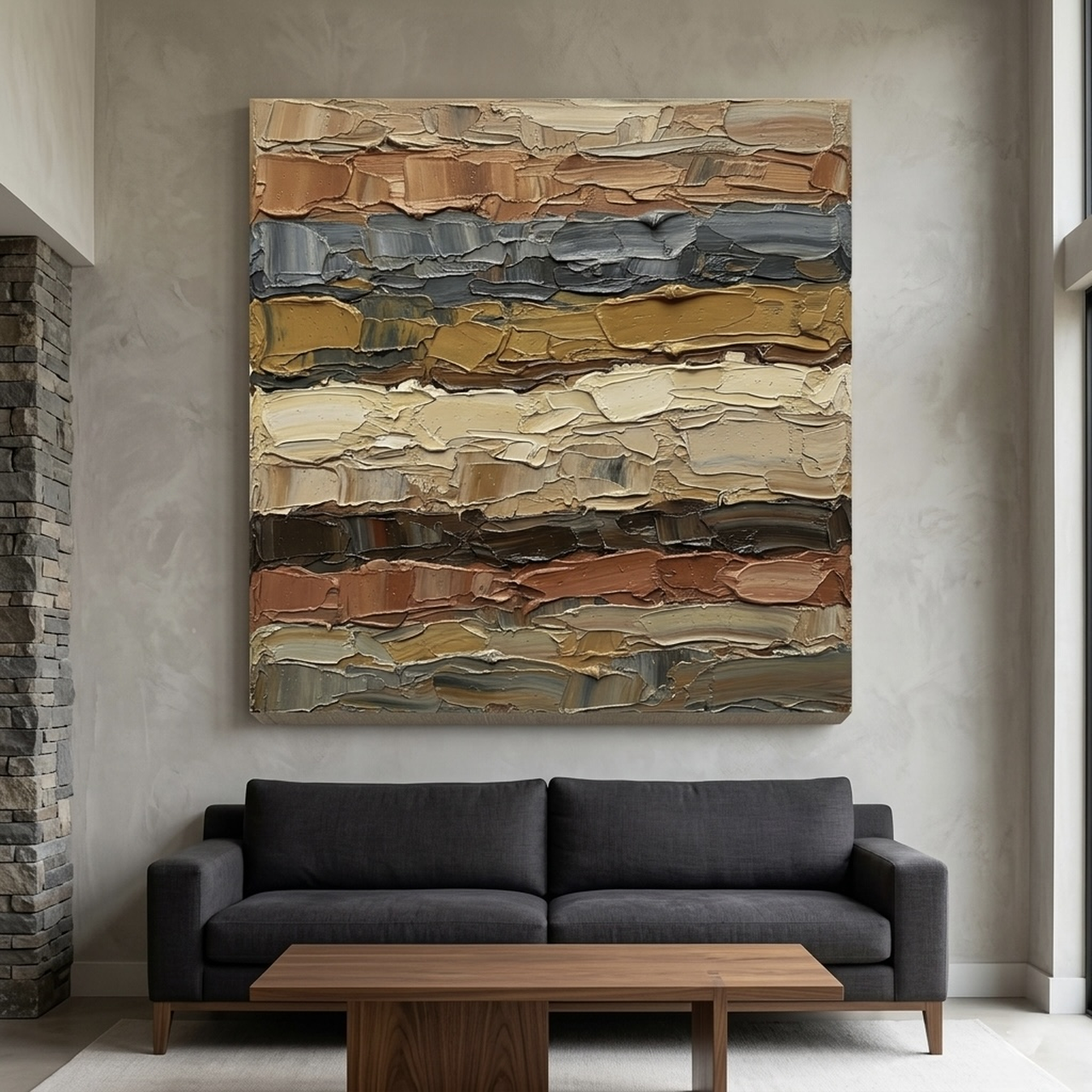
Terracotta and Orange: Warmth, Energy, Connection
Earthy orange and terracotta tones stimulate warmth, social energy, and appetite. This is why terracotta-toned wall art is so effective in dining rooms and kitchens. These hues create an immediate sense of invitation and vitality. Unlike pure bright orange, which can feel overwhelming, terracotta reads as sophisticated and organic, making it accessible even in traditionally formal spaces.
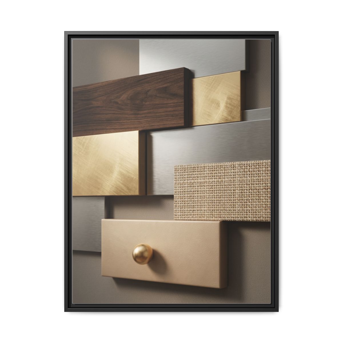
Gold and Ochre: Abundance, Optimism, Luxury
Gold and ochre tones carry associations with warmth, abundance, and elevated taste. Wall art that incorporates gold, warm yellow, or ochre accents instantly adds a sense of richness to a space. These tones work beautifully as accent colors within larger abstracts, providing visual warmth without dominating the overall composition. In 2026, warm gold is becoming the neutral that everyone actually wants to live with.
Blush and Mauve: Romance, Softness, Modern Femininity
Blush-toned wall art creates an atmosphere of warmth and quiet romance. In 2026, these tones are being used in ways that feel sophisticated rather than saccharine, often paired with darker, moodier accents to create genuine visual tension. Blush wall art in a bedroom or reading nook sends a signal of intentional, curated taste rather than a default choice.
Read more about how to use warm color palettes in your home: Earth Tone Wall Art: How to Create Warm, Inviting Interiors.
Room-by-Room Color Pairing Guide
Different rooms serve different purposes, and the wall art color trends for 2026 offer a perfect palette for every space. Here is how to apply this year's dominant hues room by room, with specific guidance on scale, tone, and placement.
Living Room: Bold Anchors and Layered Neutrals
The living room is the most versatile space for wall art color experimentation in 2026. This year, designers recommend choosing a single bold anchor piece as the primary focal point, then building the room's palette around it. Deep navy, rich terracotta, or warm sage green abstracts work beautifully above sofas or on feature walls opposite the main seating area.
For living rooms with neutral walls, choose wall art that introduces the dominant accent color of your entire room. If your cushions and throws use warm terracotta tones, a large terracotta or earth-toned abstract canvas will tie the space together with confidence and intention.
Bedroom: Calm, Restorative, Personal
The bedroom demands a different energy from the living room. Here, the goal is rest, restoration, and personal sanctuary. In 2026, the strongest bedroom wall art color trends lean toward soft sage green, dusty blush, deep navy, or muted warm neutrals. Avoid highly saturated or energetic colors like bright red or electric orange, which can interfere with sleep quality and restful mood.
A large abstract canvas above the bed is the most impactful placement choice. For a 2026-forward bedroom, consider a soft sage green or cool blue-gray abstract that draws the eye without demanding constant attention. The art should feel like a presence, not a performance.
Dining Room: Warmth, Appetite, Social Energy
The dining room is the ideal space for warmer, more dramatic wall art colors. Terracotta, deep burgundy, warm gold, and rich navy all perform exceptionally well in dining spaces. These tones stimulate both appetite and conversation, creating the kind of warm, enveloping energy that makes meals feel like true occasions.
Scale matters here. A large-format piece on the wall behind the dining table creates an intimate, restaurant-quality atmosphere. Choose art with enough visual complexity to reward extended viewing across a long dinner, not just a quick glance.
Home Office: Focus, Inspiration, Confidence
For 2026 home office spaces, the most effective wall art colors are those that support focused, energized work without creating anxiety. Deep navy, forest green, and warm earth tones like olive and umber all perform well in these spaces. Avoid pure white or very light pastel art in home offices, as these can feel visually empty and fail to anchor the workspace energy.
Geometric and abstract wall art in deep, saturated tones creates a sense of professional confidence and creative intention. It signals that the space is deliberately designed for serious, inspired work. For geometric options, see our guide: Geometric Wall Art: Modern and Minimal Ideas for Every Room.
Entryway and Hallway: First Impressions, Welcome Energy
The entryway sets the tone for your entire home. In 2026, the strongest entryway wall art color choices are those that create immediate warmth and visual interest. Terracotta, warm ochre, deep navy, or bold geometric abstracts all create excellent first impressions. The entryway is the one space where a smaller, more intensely colored piece often outperforms a large neutral abstract.
Placement Guide with Measurements
Getting the color right is only half the equation. Where and how you hang your wall art shapes how the colors read in the room. Here is a practical placement guide with measurements in both centimeters and inches for every major room type.
Standard Eye-Level Hanging Height
The center of your artwork should hang at approximately 145 to 152 cm (57 to 60 inches) from the floor. This is the standard gallery height and aligns with average eye level for adults when standing. Use this as your baseline for all wall art placement unless the furniture arrangement or ceiling height suggests otherwise.
Above the Sofa
Wall art hung above a sofa should sit 15 to 25 cm (6 to 10 inches) above the sofa's back. The width of the art should span roughly 50 to 75 percent of the sofa's width. For a standard 200 cm (79 inch) sofa, this means art that measures roughly 100 to 150 cm (39 to 59 inches) wide. Artwork that is too narrow above a wide sofa will look visually unanchored and awkward.
Above the Bed
For bedroom wall art above the headboard, leave 15 to 20 cm (6 to 8 inches) of space between the top of the headboard and the bottom edge of the art. The artwork should be approximately two-thirds the width of the bed. For a standard queen bed at 152 cm (60 inches) wide, target art that is approximately 100 to 120 cm (39 to 47 inches) wide.
Dining Room Feature Wall
A dining room feature wall works best with art that occupies roughly 60 to 70 percent of the wall's width. Center the piece both horizontally on the wall and vertically, treating the wall as a frame for the art. For standard 244 to 274 cm (96 to 108 inch) wide dining room walls, art in the 150 to 180 cm (59 to 71 inch) range creates a commanding, restaurant-quality statement.
Entryway and Hallway
In narrow hallways, art should not exceed the visual width of the hallway. Keep pieces at or below 60 cm (24 inches) wide in hallways narrower than 120 cm (47 inches). Center the art on the wall above any console tables or benches, leaving at least 15 to 20 cm (6 to 8 inches) of clearance above the furniture surface.
5 Common Mistakes with Wall Art Colors
Even with the best color palettes in hand, it is easy to make avoidable placement and pairing errors. Here are the five most common wall art color mistakes in 2026 interiors, and how to fix each one.
Mistake 1: Matching Too Perfectly
Choosing wall art that exactly matches your furniture or wall color creates a flat, monotone appearance. Art should complement, not camouflage. If your sofa is sage green, choose art that incorporates sage but also introduces a contrasting tone like terracotta, gold, or navy to create visual depth and interest. The best art feels related to the room but not absorbed by it.
Mistake 2: Going Too Small
Undersized wall art is one of the most common and easiest mistakes to make. A small canvas on a large wall looks lost, tentative, and out of proportion. When in doubt, size up. In 2026, designers consistently recommend choosing art that feels slightly larger than your instinct suggests. The oversized, confident placement is almost always the stronger visual choice.
Mistake 3: Ignoring Undertones
Mixing warm and cool undertones without intention creates spaces that feel subtly off even when the individual elements are beautiful. A cool blue-gray abstract on a wall with warm cream or beige undertones will create a quiet tension that visitors sense but cannot name. Always identify the undertone family of your walls before choosing wall art colors.
Mistake 4: Hanging Too High
Art hung too high is the single most common placement mistake in homes. The center of your art should sit at approximately 145 to 152 cm (57 to 60 inches) from the floor. When art is hung at ceiling height or even 20 cm too high, it disconnects from the furniture below and loses its grounding effect on the room's composition.
Mistake 5: Treating All Rooms the Same
Each room in your home serves a different function and therefore benefits from a different wall art color strategy. What works in a high-energy dining room (warm terracotta, rich navy) may feel overwhelming in a bedroom meant for rest (soft sage, muted blush). Apply the room-by-room color psychology principles from this guide rather than applying one palette uniformly throughout your home.
Frequently Asked Questions
What are the top wall art color trends for 2026?
The top wall art color trends for 2026 include sage green, warm terracotta, deep navy, soft blush and mauve, warm gold and ochre, and rich burgundy. These palettes reflect a broader interior design shift toward nature-inspired, emotionally resonant colors that create spaces which feel calm, grounded, and personal.
How do I choose wall art colors that match my existing interior?
Identify the undertone family of your walls and dominant furniture colors first, then choose wall art that either complements or intentionally contrasts those tones. Use the 60-30-10 rule as a guide: your art should incorporate colors from the secondary or accent zones of your room's palette rather than repeating the dominant wall or furniture color exactly.
Is sage green wall art still trending in 2026?
Yes. Sage green is one of the strongest and most enduring wall art color trends for 2026. Its organic, calming quality works across a wide range of interior styles, from modern minimalist to warm maximalist. Sage green wall art pairs beautifully with warm wood tones, natural linen, terracotta accents, and warm white walls.
What color wall art works best in a bedroom?
For bedrooms in 2026, the best wall art colors are those that feel calming and restorative: soft sage green, muted blush or mauve, cool dusty blue, and warm neutrals like taupe and cream. Avoid high-saturation or energetically stimulating colors like bright red or electric orange in sleeping spaces, as they can interfere with relaxation and sleep quality.
Can I mix multiple color trends in one room?
Yes, but do so with intention. The most successful mixed-palette rooms in 2026 use one dominant palette from this guide as their anchor and pull one or two accent colors from complementary trends. For example, a room anchored in sage green can effectively incorporate warm gold and terracotta accents for a layered, nature-inspired look that feels sophisticated rather than chaotic.
What size canvas art works best for 2026 color palettes?
For 2026's bolder, more confident color palettes, larger formats almost always outperform small pieces. A canvas that spans 50 to 75 percent of the wall's width creates the grounded, intentional look that defines current interior design. For most living rooms and bedrooms, this means choosing pieces in the 60 cm to 120 cm (24 to 47 inch) range or larger, depending on your wall dimensions.
Quick Reference Table
| Color Palette | Best Rooms | Pairs With | Mood / Effect |
|---|---|---|---|
| Sage Green | Bedroom, Living Room, Home Office | Warm white, linen, warm wood, terracotta accents | Calm, restorative, organic |
| Warm Terracotta | Dining Room, Kitchen, Entryway | Dark wood, jute, warm beige, mocha | Warm, artisanal, welcoming |
| Deep Navy | Living Room, Dining Room, Bedroom | Gold, brass, cream, warm white, copper | Dramatic, sophisticated, anchoring |
| Soft Blush / Mauve | Bedroom, Reading Nook, Hallway | Charcoal, warm gray, deep olive, aged brass | Romantic, refined, modern |
| Gold / Ochre | Living Room, Dining Room, Office | Navy, deep green, chocolate brown, ivory | Abundant, optimistic, luxurious |
| Earth Tones Mix | Any Room | Natural stone, warm wood, cream, terracotta | Grounded, timeless, nature-inspired |
Understanding wall art color trends for 2026 gives you the tools to make bold, confident decorating decisions that will feel relevant and personal for years to come. The palettes this year are not about chasing fleeting novelty; they are about creating spaces that feel genuinely alive and deeply connected to who you are.
From the organic calm of sage green to the dramatic depth of navy, from the artisanal warmth of terracotta to the modern romance of soft blush, 2026's wall art color story is rich, layered, and full of possibility. The right piece of art does more than decorate a wall. It defines the entire energy of a room.
Ready to find your perfect 2026 palette? Browse our full collection of abstract canvas wall art and discover pieces that bring this year's most powerful color trends to life in your home: Explore the Collection