Nursery Wall Art Colors That Soothe Baby: A Calm Decor Guide
The Heva Team
Art Curators & Interior Design Enthusiasts · April 17, 2026 · 16 min read
Discover the best nursery wall art colors to create a calm, soothing space for baby. Expert guide covering color science, placement tips, and top picks from Heva Unique Art Gallery.
When you are designing your baby's nursery, every choice feels weighted with love. You are building the very first world your newborn will wake up to, nap in, and grow in. Among all the decisions you will make, the art on the walls might seem like a finishing touch, but research into infant sensory development suggests it plays a meaningful role in how calm and settled your baby feels throughout the day and night. The colors surrounding your little one, including the hues in framed canvas art, can either support restful sleep and gentle alertness or subtly overstimulate a developing nervous system. This guide will walk you through exactly which nursery wall art colors soothe babies, which to avoid, and how to choose art that grows beautifully with your child from newborn to toddler.
Browse our calming nursery art collection here.
The Science of Color in Baby Rooms
Understanding how your baby actually perceives color helps you make smarter choices about nursery art. Newborns arrive with immature visual systems, and what they can see evolves dramatically over the first year of life. At birth, babies can only focus on objects about 8 to 10 inches from their face, and their color vision is not yet fully developed. During these first weeks, they are most sensitive to high-contrast black-and-white patterns rather than rich color gradients.
According to the American Optometric Association (AOA), babies typically develop good color vision by around 5 months of age. During the period from birth to 4 months, a baby's eyes are still learning to work together, and visual acuity is limited. By 5 to 8 months, depth perception and color discrimination improve significantly as the two eyes begin coordinating to form a three-dimensional view of the world.
This developmental timeline matters enormously for nursery design. In the newborn phase, the most important visual features are contrast and clarity, but as your baby grows into the 3 to 6 month range and beyond, their awareness of color becomes richer. At this stage, the colors in their visual environment begin to have a genuine impact on their nervous system arousal levels.
Color psychology research consistently shows that cool, muted tones lower heart rate and reduce cortisol levels, while highly saturated warm colors can elevate alertness and increase physiological arousal. For a space where you want your baby to transition easily between wakefulness and sleep, keeping the visual environment soft and low-stimulation is both scientifically sound and practically effective. Pediatric designers and child development specialists often recommend that nursery color palettes stay in the muted, desaturated range, particularly for walls and large focal points such as canvas art. The goal is a space that says rest is welcome here rather than stay awake and explore.
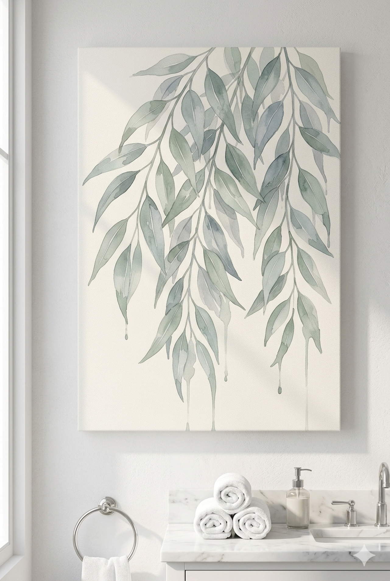
Watercolor and botanical art styles naturally align with this principle. The soft washes of pigment, gentle gradients, and organic shapes found in watercolor paintings create exactly the kind of calm, low-contrast visual environment that supports infant wellbeing. Rather than sharp lines and bold blocks of pure color, watercolor art offers visual interest without visual noise, which is precisely what a developing baby brain thrives on during sleep hours.
Best Colors for Soothing Nursery Art
Choosing art colors for your nursery does not need to be complicated. The palette that works best for baby sleep and calm tends to be naturally beautiful, timeless, and easy to build a cohesive room around. Here is what to look for and why each shade works.
Soft blues and sage greens are consistently ranked as the most soothing colors in interior design research. Blue in particular is associated with lowering heart rate, reducing blood pressure, and encouraging the body to prepare for rest. Sage green carries associations with nature and the outdoors, which have a gentle restorative effect on the nervous system. Both of these colors in their muted, desaturated forms work beautifully as primary tones in nursery art, whether as background washes in watercolors or as the dominant hue in a botanical print.
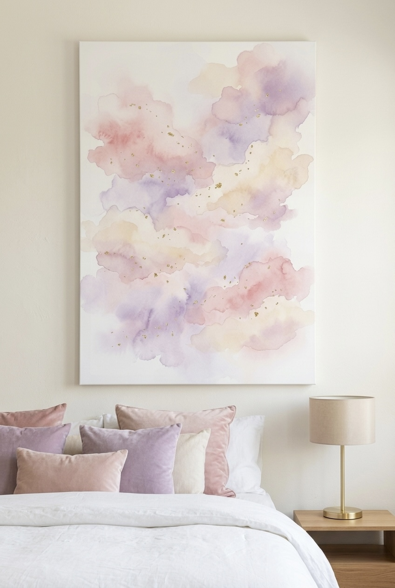
Soft lavender and lilac are wonderful choices for nurseries where sleep is a priority. Lavender has long been associated with relaxation and is one of the most commonly recommended colors by pediatric sleep consultants. Artwork featuring lavender tones, from soft floral paintings to abstract watercolor washes, contributes to a bedroom atmosphere that cues the body toward rest.
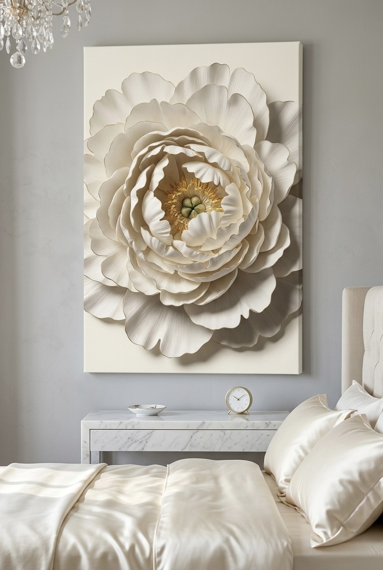
Warm creams, off-whites, and sand tones serve as excellent neutrals in nursery art. These colors create a sense of openness and warmth without any of the hyperactivity that can accompany brighter hues. Art with a cream or natural linen background works well in almost any nursery style, from minimalist Scandinavian to warm cottagecore.
Soft pinks and peachy blush tones add warmth without overstimulation. These hues are naturally calming rather than energizing, and they complement botanical and floral art beautifully. Unlike saturated magenta or hot pink, soft blush reads as gentle and welcoming, making it a lovely choice for mixed-gender nurseries as well.
What to avoid near sleep areas: Highly saturated reds, bright yellows, and neon or electric tones are the colors most likely to elevate alertness and interfere with sleep transitions. These colors have their place in playrooms and activity zones, but for a nursery wall art piece positioned near the crib, they are best saved for when your child is old enough to have a separate play corner. Even artwork with just a few dominant accents in these tones can shift the energy of the room.
When matching nursery art colors to your wall paint, the most successful combinations work by staying within the same tonal family. If your walls are painted in a warm greige or soft white, artwork in sage, botanical green, or soft blush will feel cohesive. If you have gone with a cool pale blue or lavender wall color, artwork in soft teal, watercolor cloud, or moon and stars tones will feel harmonious. The goal is a room where the art and the walls breathe together rather than compete.
You can also find excellent guidance on pairing art with botanical themes in our post on botanical wall art that brings the outdoors inside, which covers nature-inspired palettes in depth.
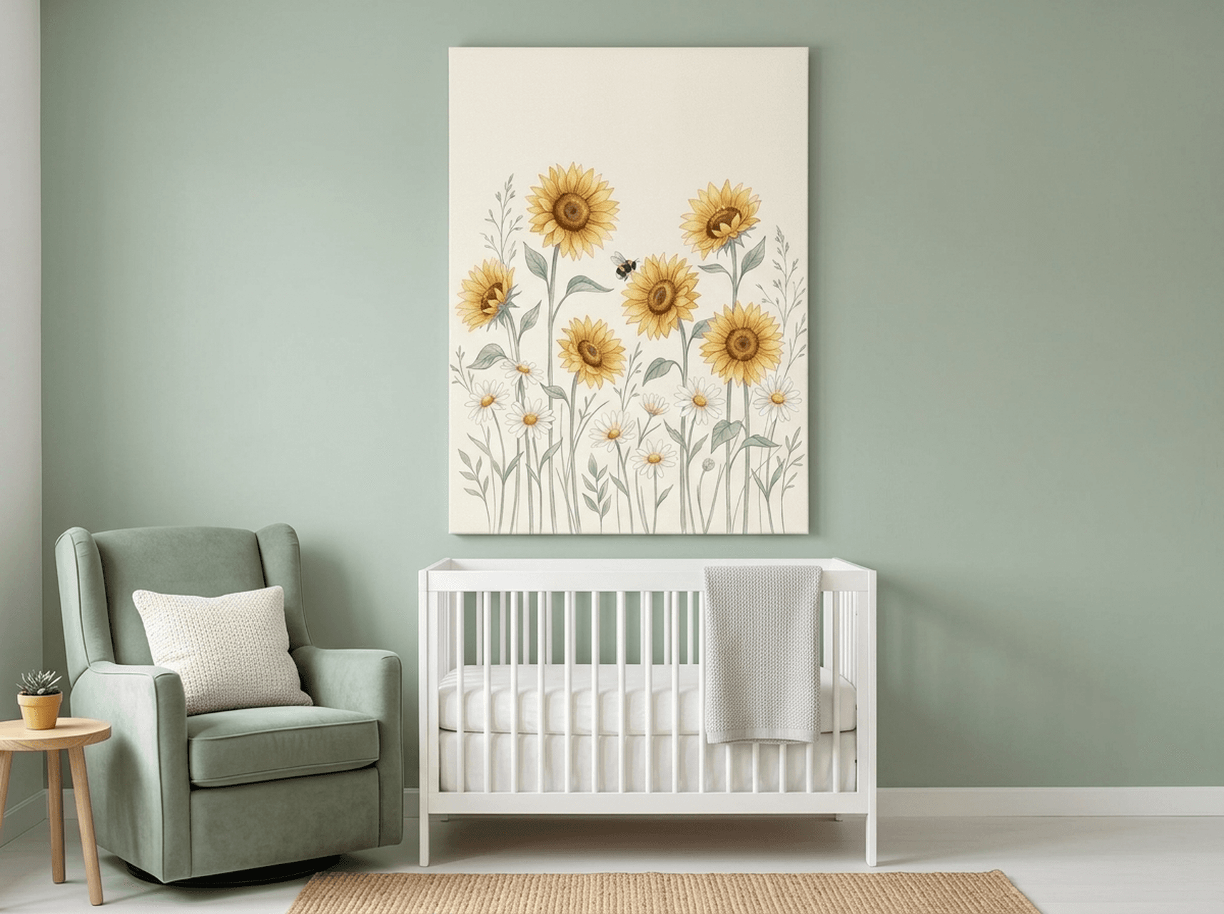
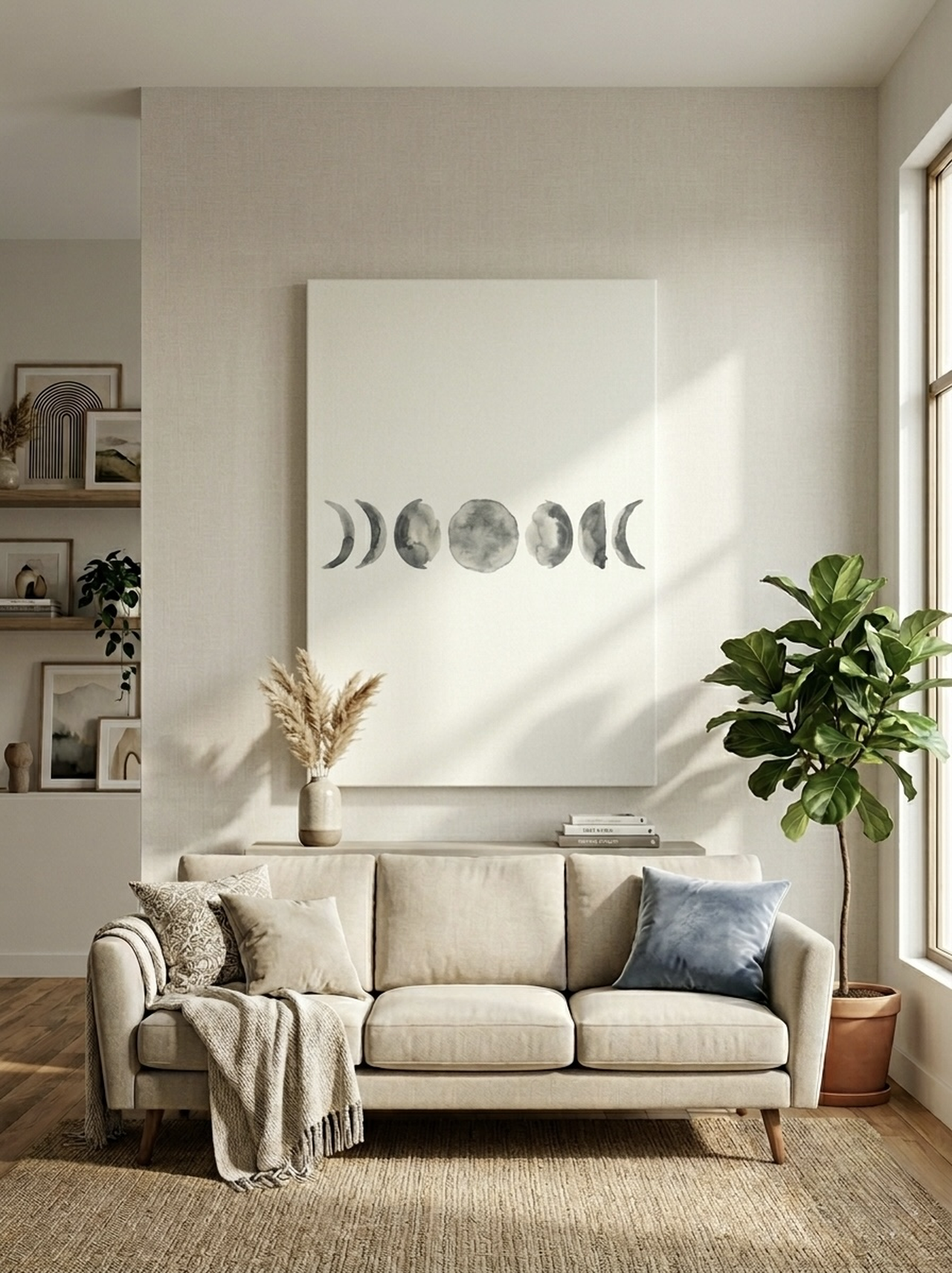
6 Calming Art Picks for Your Nursery
These six pieces from Heva Unique Art Gallery are among our most beloved for nursery spaces. Each one was selected for its soft color palette, nature-inspired subject matter, and the sense of quiet it brings to a room.
For more floral and botanical options that work well in nurseries and bedrooms alike, explore our full guide to timeless floral wall art and bloom print ideas.
Sizing and Placement Guide
Even the most beautifully chosen nursery art can feel off if it is placed at the wrong height or sized incorrectly for the wall. Nurseries have some unique placement considerations that differ from other rooms in the house, primarily because you are designing a space that will be experienced from a crib, a changing table, and a feeding chair, each at different viewing heights and angles.
The crib wall: This is typically the most important display area in a nursery. Art placed above the crib should be positioned lower than you would hang art in a living room. In adult spaces, the center of a piece is often at 57 to 60 inches (145 to 152 cm) from the floor. In a nursery, consider bringing that down to 48 to 52 inches (122 to 132 cm) from the floor, so the art is visible when your baby is awake and looking around in the crib. Always leave at least 12 inches (30 cm) of clearance between the top of the crib mattress and the bottom of any framed piece for safety.
Sizing for the crib wall: A single canvas that is 24 x 24 inches (61 x 61 cm) to 30 x 30 inches (76 x 76 cm) works well as a focal point above a standard crib. If you prefer a gallery wall or two-piece arrangement, keep the total spread to no wider than the crib itself, typically 52 to 54 inches (132 to 137 cm) for a standard crib. Oversized art that extends well beyond the crib can feel visually heavy; a piece that sits roughly within the width of the crib or headboard feels naturally balanced.
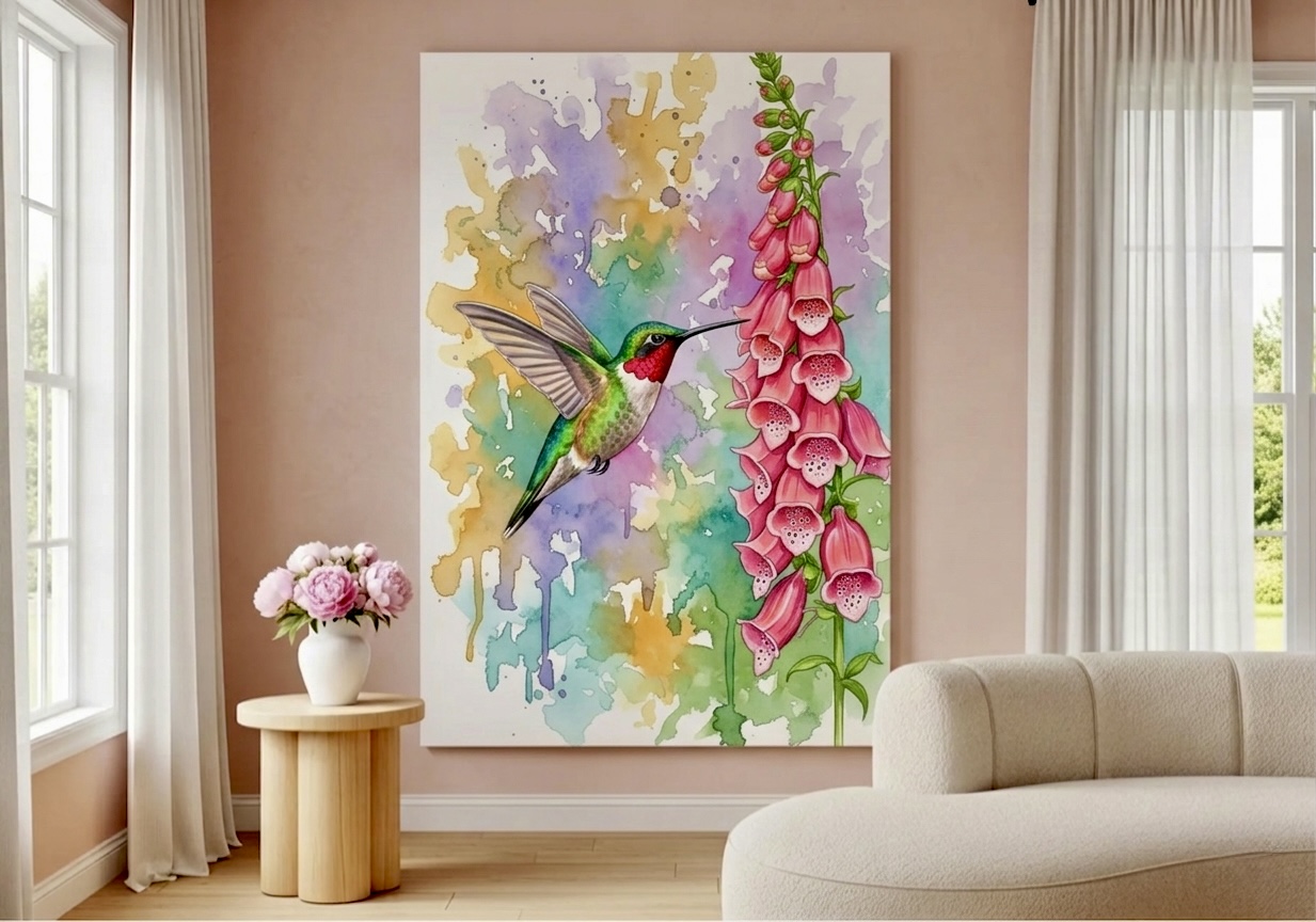
The changing area: Art near the changing table is something your baby will spend a surprising amount of wakeful, focused time looking at. This is actually a wonderful opportunity to place a slightly more visually engaging piece, something with soft botanical detail or a gentle moon and stars design that gives your baby something to visually explore during diaper changes. Hang art here at approximately adult eye level, around 57 inches (145 cm) center, since you are the one primarily viewing this area at full standing height while your baby lies flat.
The feeding or rocking chair corner: If you have a dedicated nursing or rocking chair area, a smaller piece, 12 x 16 inches (30 x 41 cm) to 16 x 20 inches (41 x 51 cm), hung at comfortable viewing height for someone seated creates a cozy corner feeling. A soft botanical print, a delicate floral, or a simple nature watercolor works beautifully here.
Safety considerations: Framed canvas art is among the safest types of wall decor for nurseries. Unlike framed glass, canvas has no breakable elements. Always use appropriate wall anchors rated for the weight of the piece, and for pieces hung directly above where a baby sleeps or plays, check that hardware is secure before leaving the room. Canvas on a wooden stretcher bar is lightweight, making it very manageable for standard drywall anchors.
How many pieces: For a cohesive look without visual clutter, most nurseries do well with one to three pieces of art. One larger statement piece above the crib, a small accent piece near the changing area, and a tiny framed print in the reading corner is a classic arrangement that feels complete without overwhelming the space.
Best Themes for Nursery Wall Art
The theme of your nursery art sets the entire mood of the room and often reflects your hopes for your child's relationship with the world. Here are the themes that consistently work best for nurseries, both for their visual calming properties and their longevity across the infant through toddler years.
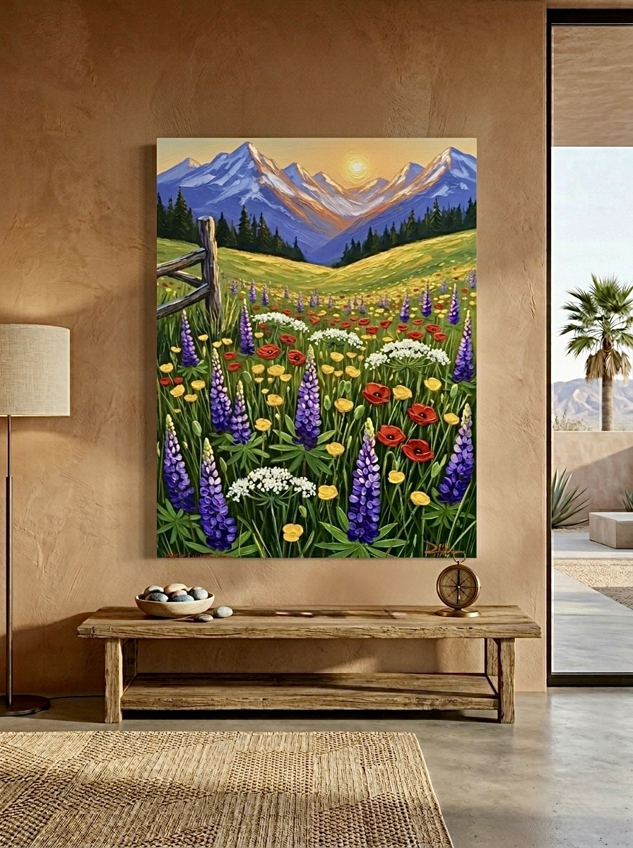
Botanical and floral: This is the most timeless nursery art theme, and for good reason. Soft botanicals, from eucalyptus sprays to delicate peonies to wildflower meadows, bring the healing energy of the natural world into the nursery. The green and earth tones found in botanical art are universally calming, and these pieces tend to feel just as beautiful when your toddler is three years old as they did on the day you hung them. Botanical art also photographs beautifully, making it a favorite in nursery photos and birth announcements.
Celestial and moon phases: Moon and stars themes have become very popular for nurseries because they perfectly balance whimsy with calm. A watercolor moon phases print in soft neutral tones references the rhythms of night and rest in a gentle, story-like way. Celestial art also works across both traditionally gendered and completely gender-neutral nurseries with ease.
Woodland animals: Soft paintings of rabbits, deer, foxes, and birds in muted forest tones bring sweetness and wonder to the nursery without introducing bold or overstimulating colors. Woodland animal art in watercolor style is especially effective because the watercolor medium softens any potential visual sharpness into something gentle and dreamy.
Watercolor abstracts: For parents who prefer a more modern or minimalist aesthetic, soft watercolor abstracts in a limited palette of two to three soothing tones are a wonderful choice. These pieces are visually interesting without being representational, which means they often age the most gracefully as a child grows, transitioning naturally from a newborn nursery into a school-age child's bedroom.
Nature and landscape: Gentle landscape watercolors, soft cloud studies, and simple nature scenes give a nursery a sense of expansiveness. Rather than enclosing the room, landscape art creates the feeling that the walls open outward into possibility, which is a beautiful metaphor for everything a new life brings.
Mixing themes: You can absolutely mix themes in a nursery as long as the color palette remains consistent. A moon phases print alongside a eucalyptus botanical, for example, works beautifully because both share the same muted, desaturated tonal range. The secret is in the color story, not strict theme matching. Choose pieces that feel like they live in the same soft, gentle world, and they will work together naturally.
For more on how art choices carry from nursery into the broader home, see our guide to gender-neutral nursery wall art ideas for 2026.
5 Common Mistakes to Avoid
- Hanging art too high above the crib. Many parents hang nursery art at standard adult eye level, which means a baby lying in the crib cannot see it at all. Lower your art so the center of the piece is roughly at 48 to 52 inches from the floor, bringing it into a baby's actual field of view when they are awake and looking around.
- Choosing art with highly saturated warm colors near sleep zones. That beautiful red poppy print might look stunning on your phone screen, but a dominant red or vivid orange near a sleep area can subtly elevate physiological arousal and make it harder for a baby to settle. Save bold, saturated hues for playrooms and activity spaces.
- Overloading the crib wall with too many pieces. A gallery wall of 6 or 8 small frames above a crib can feel busy and overstimulating. Nurseries benefit from visual simplicity. One or two well-chosen pieces with breathing room around them will always feel more calming than a dense cluster, no matter how cute each individual print might be.
- Buying art that does not coordinate with the room's overall palette. A piece chosen in isolation can clash with your wall color, bedding, or furniture, creating a visual dissonance that makes the room feel unresolved. Before purchasing, hold a photo of the piece next to your wall color chip or take it into the room digitally with a room visualization tool to confirm the tones work together.
- Choosing art for its cuteness factor alone without considering longevity. Nurseries with very literal baby-themed art, cartoon ducks, alphabet blocks, and novelty prints, often need a complete redo by the time a child is two. Investing in classic botanical, watercolor, or nature-themed art means the pieces can migrate from nursery to toddler room to children's bedroom and remain beautiful at every stage.
Frequently Asked Questions
What are the most calming colors for nursery wall art?
The most calming colors for nursery wall art are soft blues, sage greens, muted lavenders, warm creams, and pale blush tones. These desaturated, cool-to-neutral hues lower visual stimulation and support the restful atmosphere babies need for good sleep. Watercolor art naturally achieves these palettes because the medium produces soft washes rather than hard, saturated blocks of color.
When can babies see color well enough for wall art to matter?
According to the American Optometric Association, babies typically develop good color vision by around 5 months of age. Before that, newborns are most sensitive to contrast rather than specific colors. However, the room environment affects caregivers and shapes the overall feel of the space from day one, so color choices matter for your experience and wellbeing as a new parent too, not just your baby's.
Is canvas wall art safe to hang above a crib?
Yes, canvas wall art is among the safest types of nursery decor. Unlike framed glass art, canvas has no breakable components. Use appropriate wall anchors rated for the weight of the piece, ensure hardware is fully secured, and keep a minimum 12-inch clearance between the top of the crib mattress and the bottom of any hanging piece. Canvas on a wooden stretcher bar is lightweight and well-suited for standard drywall mounting.
What size canvas art works best above a standard crib?
For above a crib, a single canvas measuring 24 x 24 inches (61 x 61 cm) to 30 x 30 inches (76 x 76 cm) creates a beautiful focal point without overwhelming the space. If you prefer two pieces side by side, keep the total combined width at or slightly narrower than the crib itself, typically 52 to 54 inches (132 to 137 cm) for a standard crib.
What nursery art themes work for both boys and girls?
Botanical and floral art, watercolor nature scenes, moon and stars celestial themes, and soft woodland animal prints all work beautifully in gender-neutral nurseries. These themes rely on natural subjects and muted palettes rather than traditionally gendered color coding, which means they look equally at home in any nursery. Eucalyptus, wildflower meadow, and cloud watercolor prints are perennial favorites for gender-neutral spaces.
Should nursery wall art match the bedding and furniture?
The art does not need to match exactly, but it should coordinate within the same tonal family. If your crib bedding has a soft sage green pattern and your furniture is natural wood, art in muted greens, botanicals, or warm neutrals will feel cohesive. The goal is a room where all the colors breathe together. Keeping your nursery palette to two or three coordinating tones makes it easy for art to feel intentional rather than random.
Quick Reference Guide
| Color | Effect on Baby's Environment | Best Art Theme | Recommended Canvas Size |
|---|---|---|---|
| Soft Blue | Lowers arousal, promotes rest | Watercolor clouds, sky scenes | 24x24 in (61x61 cm) above crib |
| Sage Green | Nature-calming, reduces stress | Botanical, eucalyptus, fern | 16x20 in (41x51 cm) accent wall |
| Soft Lavender | Promotes sleep, reduces tension | Floral watercolor, abstract wash | 20x24 in (51x61 cm) crib wall |
| Warm Cream / Off-White | Openness, warmth without stimulation | White florals, neutral botanicals | Any size, versatile pairing |
| Soft Blush / Pale Pink | Gentle warmth, nurturing feel | Floral, peony, soft nature scenes | 12x16 in (30x41 cm) feeding area |
| Muted Teal | Calm alertness, balanced energy | Watercolor hummingbird, nature | 16x20 in (41x51 cm) changing area |
Creating a nursery that truly supports your baby's calm and wellbeing is one of the most loving things you can do in those early weeks of preparation. The colors you choose, including the colors in the art on the walls, play a quiet but genuine role in shaping the atmosphere your newborn comes home to. Soft blues, sage greens, botanical tones, and gentle watercolor palettes all contribute to an environment that says you are safe, you are held, rest is welcome here. Whether you choose a single statement piece above the crib or build a small gallery across the changing area and reading corner, the key is softness, cohesion, and a color story that grows beautifully with your child. Explore our full collection of calming nursery art at Heva Unique Art Gallery and find the piece that feels like it was made for your baby's room.