Dining Room Wall Art: Complete Style Guide
The Heva Team
Art Curators & Interior Design Enthusiasts · March 30, 2026 · 17 min read
The complete dining room wall art style guide. Sizing rules, placement tips, and curated picks for casual kitchens to formal dining spaces.
Most homeowners pour thought into the living room gallery wall, the bedroom headboard art, even the bathroom print -- and then leave the dining room completely bare. It is one of the most overlooked rooms in the home for art, yet it is the room where people gather, linger, and connect over food. The right piece of dining room wall art does not just fill empty space -- it sets the mood for every meal, elevates the atmosphere, and turns an ordinary dinner into an experience worth savoring.
Whether you are styling a farmhouse dining room with rustic botanical prints, a modern space with warm earth-tone abstract art, or a boho-eclectic room with cultural portraiture, this guide covers everything: sizing rules, hanging heights, color science, style approaches, and handpicked products from HEVA Unique Art Gallery.
Ready to browse the full collection? Explore dining room wall art at HEVA Unique Art Gallery
Why Art Matters in the Dining Room
The dining room is where human connection happens over food. Psychologists and interior designers alike agree that the visual environment profoundly shapes the dining experience -- affecting mood, conversation, how long people stay at the table, and even how food tastes. A carefully chosen piece of wall art creates an atmosphere of warmth and welcome that no centerpiece or tablecloth can replicate.
Research published by the National Institutes of Health on multisensory dining confirms that the surrounding environment -- including visual elements -- significantly influences the dining experience, from flavor perception to how much time guests spend at the table. A warm, visually engaging dining room encourages people to slow down, enjoy their food more fully, and linger in conversation.
Art is also a conversation catalyst. A striking botanical print, a cultural portrait, or an evocative landscape gives guests something to engage with beyond small talk. In this way, art becomes part of the hospitality itself.
For a full guide on how art transforms living spaces beyond the dining room, see our related post: Nature Wall Art: Bring the Outdoors Inside Your Home.
The Color Science Behind Dining Room Art
Color psychology is particularly powerful in the context of food and dining. Warm colors -- terracotta, deep burgundy, warm gold, ochre, olive green, and earthy cream -- are associated with appetite stimulation, warmth, and social connection. This is not accidental: these are the colors of ripe fruit, aged wine, candlelight, and harvest fields.
A study in the journal Appetite found that ambient color temperature significantly affects dining mood and duration, with warmer color environments encouraging more relaxed, extended meals. In practice, this means that choosing art with warm undertones actively contributes to a better dining experience.
By contrast, cool clinical tones -- stark white, grey, and blue -- can create a sterile, cafeteria-like atmosphere. These colors have their place in modern interiors, but in a dining room they work best as accents or neutrals, not as the dominant mood of your wall art.
Warm palette winners for dining room art:
- Deep burgundy and wine tones
- Warm terracotta and clay
- Aged gold and ochre
- Sage and olive green
- Warm cream and linen
- Rich brown and tan
The 3 Dining Room Art Arrangements
There are three classic approaches to placing art in a dining room, each suited to different room sizes, furniture layouts, and personal styles.
1. Gallery Wall Above the Sideboard or Buffet
A curated gallery wall above a sideboard is the most versatile approach. Arrange 5-9 pieces in a mix of sizes, keeping the overall arrangement aligned with the furniture width (two-thirds to three-quarters of the buffet's length). Mix one large anchor piece (60-90 cm) with medium and small prints. This works beautifully in farmhouse, eclectic, and maximalist dining rooms. For layout inspiration, see our complete Gallery Wall Layout Guide.
2. Single Statement Piece Above the Buffet or on the Feature Wall
One oversized canvas (90-150 cm wide) creates immediate visual impact without complexity. This is the preferred approach for modern, minimalist, and transitional dining rooms where you want the art to anchor the space without competing with other elements. A single warm abstract, a botanical, or a cultural portrait is particularly powerful in this format.
3. Triptych on the Main Dining Wall
Three coordinated panels hung at equal spacing create a dynamic, gallery-like focal point on the main dining wall. A triptych can span 120-200 cm in total width, making it ideal for larger rooms. Choose panels that share a color palette for cohesion. Botanical triptychs, landscape panoramas, and abstract sets are the most popular dining room choices.
Not sure which style fits your space? Our Wall Art Color Guide helps you match art mood to room decor.
Sizing Your Dining Room Art
Getting the size right is the single most important factor in making dining room art look intentional rather than accidental. Here are the core sizing rules:
Standard Dining Wall Dimensions
A typical dining room feature wall is 200-280 cm (79-110 in) wide. In an open-plan home, the "dining zone" wall may be wider, but the same proportional rules apply.
Single Piece Sizing
- Minimum: Art should be at least 100 cm (39 in) wide for a standard dining room wall -- anything smaller reads as decoration rather than art
- Ideal range: 100-160 cm (39-63 in) wide
- Fill ratio: Aim for 60-75% of the wall width
Gallery Wall Sizing
- The entire gallery arrangement should span 60-70% of the wall width
- Leave at least 5-8 cm (2-3 in) between frames
- The tallest piece should not exceed 80-90 cm in height to avoid overwhelming low dining room ceilings
Above Furniture (Sideboard or Buffet)
- Art or gallery arrangement width = two-thirds to three-quarters of the furniture width
- For a 120 cm buffet: aim for 80-90 cm of art width
- For a 180 cm sideboard: aim for 120-135 cm of art width or arrangement
For a deeper dive into sizing for different rooms, see our guide: How to Choose Wall Art Size for Your Living Room (the same principles apply to dining spaces).
How to Hang Art in a Dining Room
Hanging height is where many beautiful pieces fail to land. Follow these specific guidelines:
Standard Eye-Level Rule
Center your art at 145 cm (57 in) from the floor to the middle of the piece. This is the gallery standard and works for standing-height viewing. In dining rooms where guests are seated, you may lower this slightly to 135-140 cm for a more intimate, seat-friendly viewing angle.
Above Furniture
When hanging above a sideboard, buffet, or console table:
- Leave 15-25 cm (6-10 in) of space between the top of the furniture and the bottom of the frame
- Never leave more than 30 cm, or the art will appear disconnected from the furniture
- For gallery walls above a buffet, use the bottom of the lowest frame as your guide, keeping it 15-20 cm above the surface
Avoid Hanging Above the Dining Table
Resist the temptation to center art directly above the dining table -- it competes with the pendant light or chandelier and creates visual clutter. Instead, use the wall opposite the entry point, or the wall that faces diners when seated, for maximum impact.
Leveling Tip
Use painter's tape to mock up your arrangement on the wall before hammering nails. This allows you to adjust placement, spacing, and overall composition without commitment.
Color Palettes That Work in Dining Rooms
Matching your art color palette to your dining room's existing tones creates a cohesive, intentional space. Here are five tried-and-true dining room art color palettes:
Farmhouse Warmth
Cream, sage green, muted terracotta, and warm tan. Perfect for white-painted wood dining rooms with natural textures. Botanical prints, fruit art, and vintage still-lifes thrive in this palette.
Modern Elegant
Black, warm gold, and cream with terracotta accents. Sculptural still-lifes, bold abstract pieces, and cultural portraits work beautifully here.
Mediterranean / Tuscan
Deep burgundy, warm gold, cream, and olive green. Food art, harvest scenes, wine and fruit prints, and Tuscan-inspired landscapes are the natural match.
Boho Eclectic
Warm orange, purple, lavender, earthy brown, and sage. Wildflower landscapes, cultural portraiture, and layered abstract art create the richness this style demands.
Transitional Neutral
Cream, tan, brown, and warm gold. Warm landscapes, nature scenes, and earth-tone abstracts work in this versatile palette that bridges traditional and contemporary.
For a complete breakdown of which colors make art pop in any room, read our Wall Art Color Guide.
6 Dining Room Art Picks from HEVA Unique Art Gallery
Every piece below has been selected for dining room suitability: warm, inviting tones, subject matter that enhances the dining atmosphere, and quality canvas printing that holds up beautifully in a room that sees daily activity.
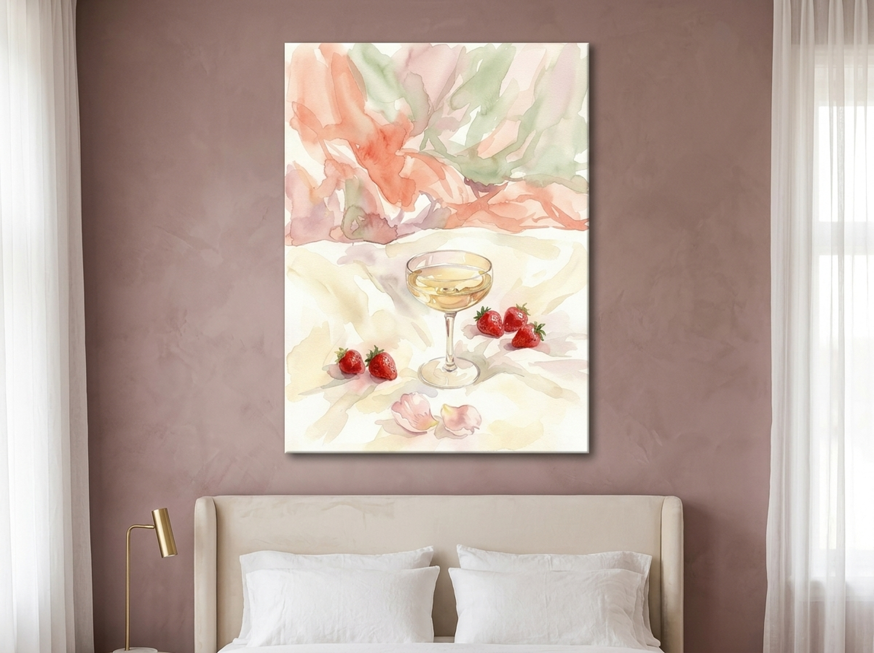
1. Champagne Strawberry Watercolor Print
A lush watercolor still-life of strawberries and champagne rendered in blush, cream, coral, and soft gold. This romantic botanical brings an air of celebration to every dinner. The soft watercolor technique keeps it light and inviting rather than heavy -- ideal above a sideboard or as the centerpiece of a gallery wall in a romantic or glam dining room. The warm cream and gold tones complement natural wood dining tables beautifully.
Best for: Romantic dining rooms, glam interiors, brunch spaces, wine cellars
Color palette: Cream, blush, coral, rose, sage, soft gold
View the Champagne Strawberry Canvas
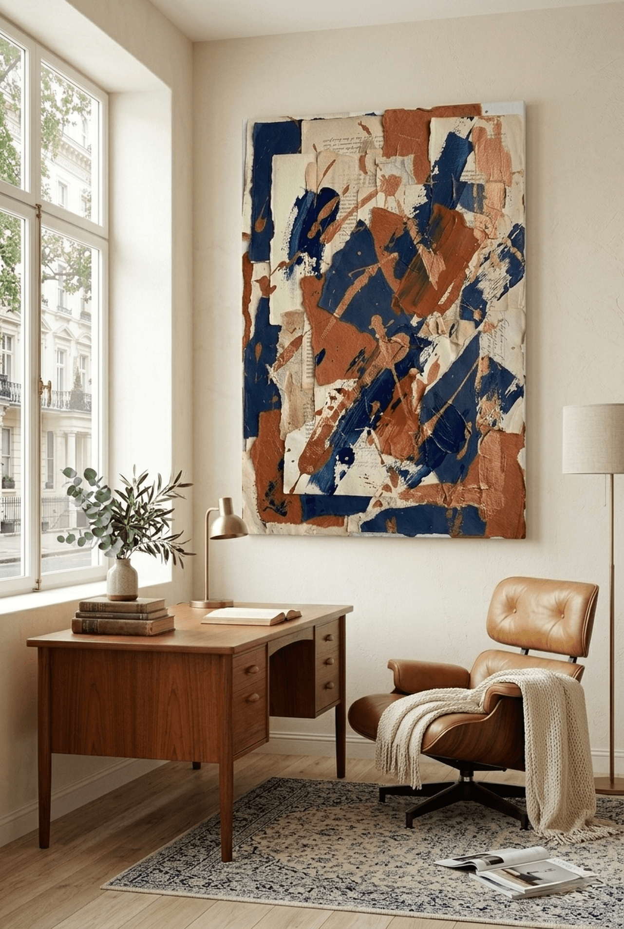
2. Canyon Strata Earth-Tone Abstract
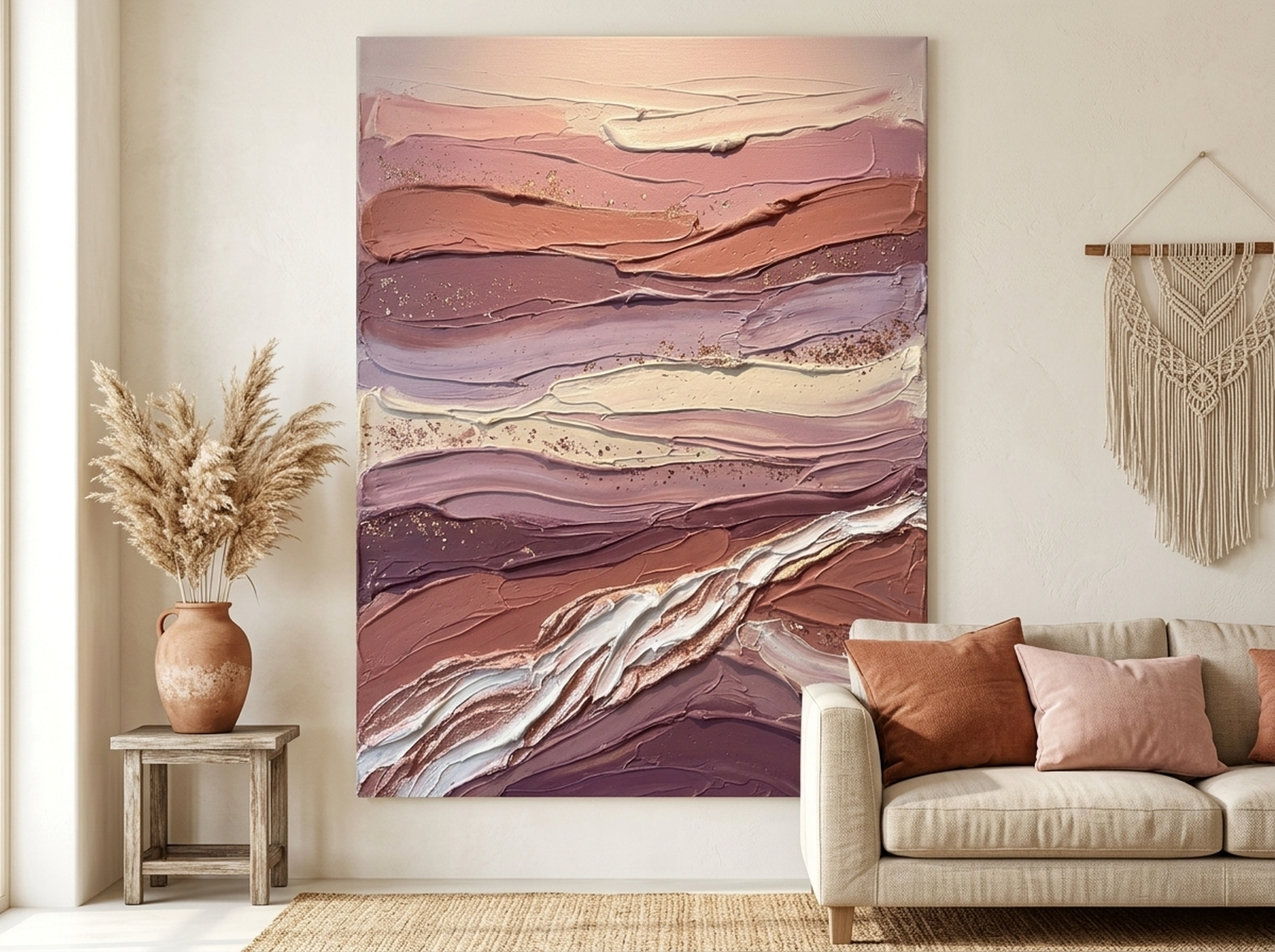

Impasto-style layers of rose, terracotta, burgundy, and cream evoke the warmth of canyon walls at golden hour. This is a statement piece built for modern and transitional dining rooms that want warmth without literal imagery. The textural depth of the painting style makes it even more compelling up close -- perfect for a piece guests will study over multiple dinner conversations. The burgundy and terracotta tones align precisely with the warm palette science recommends for dining environments. (source: Architectural Digest)
Best for: Modern, transitional, and contemporary dining rooms
Color palette: Terracotta, rose, burgundy, tan, cream, warm gold
View the Canyon Strata Abstract
3. African Elder Expressionist Portrait
An expressionist oil painting portrait rich in burgundy, gold, teal, and terracotta. This cultural masterpiece brings depth, warmth, and storytelling energy to the dining table. Cultural portrait art is among the strongest choices for dining rooms because it creates a living presence -- a sense that the room is inhabited by history, wisdom, and character. The rich warm tones work equally well with dark wood furniture, warm white walls, and earthy linen textiles.
Best for: Cultural, eclectic, boho, and maximalist dining rooms
Color palette: Burgundy, gold, brown, teal, terracotta, cream
View the African Elder Portrait
4. Pampas Vases Sculptural Black Gold Still-Life
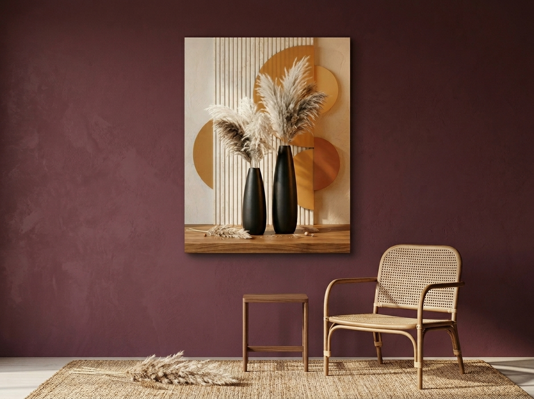
Sculptural black and gold vases filled with dried pampas grass create an elegant, moody botanical still-life. This piece bridges the gap between nature-inspired art and modern luxury decor. The black, cream, gold, and terracotta palette makes it endlessly versatile -- equally at home above a dark-stained buffet in a moody dining room or on a warm white wall in a transitional space. Its vertical composition is particularly effective for narrow dining room walls or as a bookend piece in a gallery arrangement.
Best for: Modern, glam, transitional, and boho dining rooms
Color palette: Black, cream, gold, tan, brown, terracotta
View the Pampas Vases Still-Life
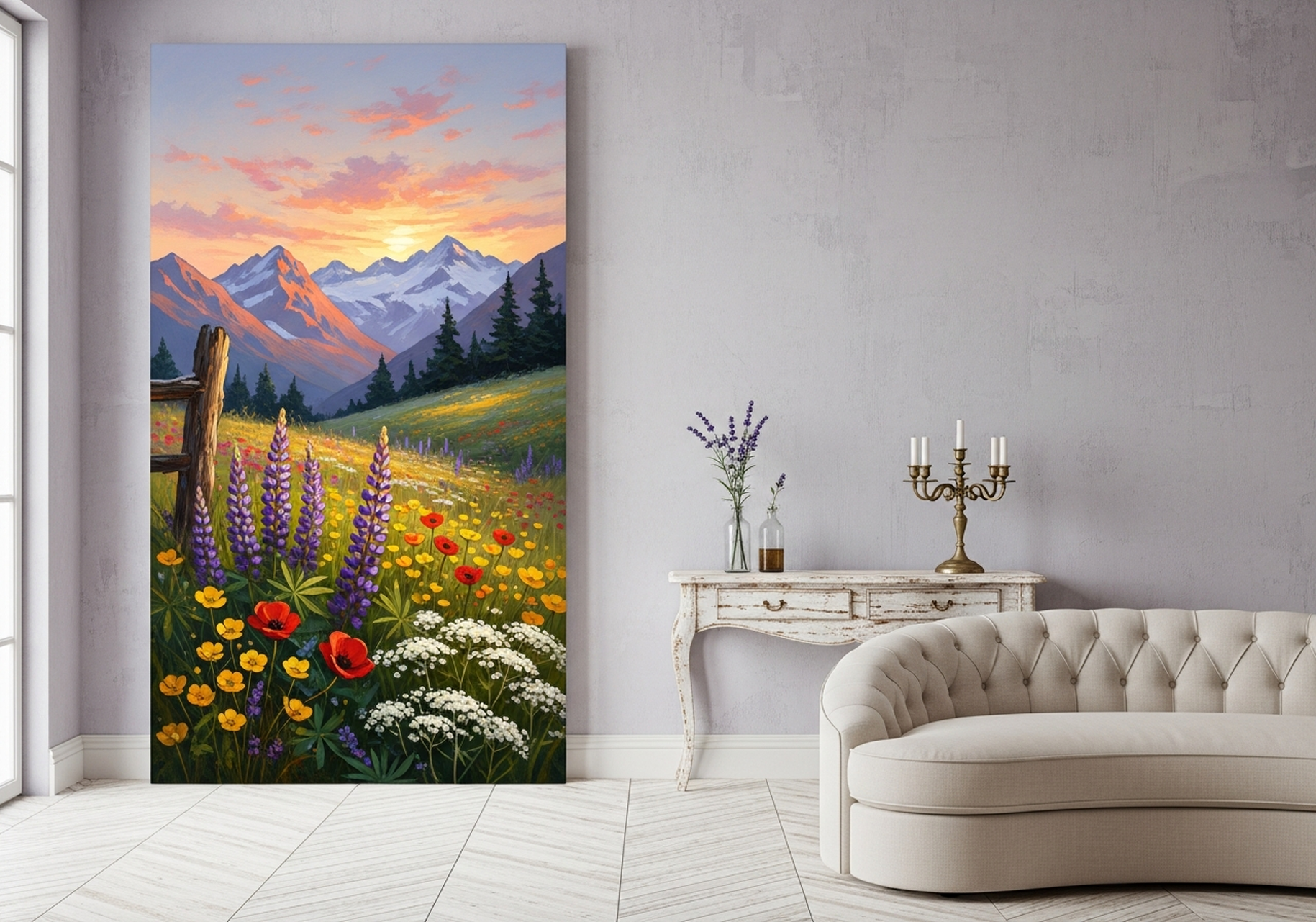
5. Wildflower Meadow Mountain Landscape
A sweeping mountain meadow bursting with wildflowers in purple, lavender, gold, and orange -- this joyful landscape brings the expansive beauty of nature directly to your dining room wall. Landscape art in dining rooms creates a sense of openness and abundance that mirrors the generosity of a shared meal. The warm flower tones and golden light make it ideal for farmhouse, boho, and cottage-style dining rooms. Its panoramic quality works best as a single statement piece on a wide wall.
Best for: Farmhouse, cottage, boho, and nature-inspired dining rooms
Color palette: Purple, lavender, red, yellow, orange, gold
View the Wildflower Meadow Landscape
6. Sunbeam Old-Growth Forest Oil Painting
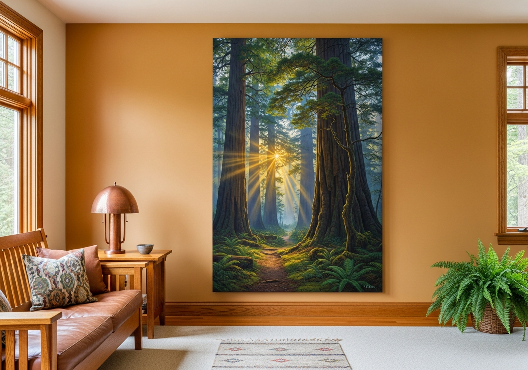
Warm golden light streaming through ancient old-growth redwoods creates a transcendent, cathedral-like atmosphere in this oil painting. The gold, green, and amber palette is simultaneously soothing and awe-inspiring -- qualities that translate beautifully to a dining room intended for relaxed, unhurried meals. This piece suits transitional, nature-inspired, and even rustic dining rooms. Its vertical shafts of light give the canvas an almost spiritual quality that elevates the space without shouting for attention.
Best for: Transitional, rustic, nature-inspired, and contemporary dining rooms
Color palette: Warm gold, green, black, yellow, brown, cream
View the Sunbeam Forest Oil Painting
Looking for more nature-inspired options? Explore our full collection in the post: Nature Wall Art: Bring the Outdoors Inside Your Home
5 Common Dining Room Art Mistakes to Avoid
Even with the best intentions, dining room art frequently goes wrong in predictable ways. Here are the five mistakes most often seen -- and how to fix them.
1. Choosing Cool or Clinical Colors
Stark blues, cold greys, and stark white artworks can make a dining room feel sterile and unwelcoming. The science is clear: warm tones stimulate appetite and social warmth. If you love a cool-toned piece, balance it with warm-toned furniture, textiles, and lighting -- but for the primary art in a dining room, warm earth tones serve you better.
2. Hanging Art Too Small for the Wall
A 40 cm canvas on a 280 cm dining wall looks like a postage stamp. It signals indecision rather than intentionality. If budget is a concern, one well-chosen mid-size piece (90-100 cm) will always outperform a cluster of small pieces that have no visual relationship to each other or the room's scale.
3. Mismatching Art Style with Table Style
A hyper-modern minimalist abstract canvas above a rustic farmhouse dining table creates visual dissonance that guests will feel even if they cannot articulate it. Match the spirit of the art to the spirit of the furniture: organic, worn textures for farmhouse tables; clean geometry for modern tables; layered richness for traditional tables. For farmhouse-specific inspiration, see our guide to Farmhouse Wall Art.
4. Hanging Art Too High
The single most common mistake in every room. Art hung at 180+ cm (where people instinctively reach for a nail) is too high. Use the 145 cm center rule. If art is above furniture, use the 15-25 cm gap rule. Hanging too high makes the room feel disconnected and the art feel like an afterthought.
5. Ignoring the Relationship Between Art and Lighting
Art in a room with warm amber lighting looks completely different from the same piece under cool daylight. Before committing to a final placement, view your chosen art in the room's actual evening lighting -- the context in which most dining happens. Warm golden art looks spectacular under Edison-style warm bulbs. Cool-toned pieces can look washed out or cold under the same conditions.
Frequently Asked Questions
What size art should I put in my dining room?
For a standard dining wall (200-280 cm / 79-110 in wide), aim for art that is 100-160 cm (39-63 in) wide. A single statement piece should fill 60-75% of the wall width. For a gallery wall above a sideboard, the arrangement should span about two-thirds of the furniture's width.
What art style works best in a dining room?
Botanical prints, food and fruit art, warm abstract pieces, landscapes, and cultural portraits all work beautifully in dining rooms. The key is choosing warm tones such as terracotta, burgundy, deep gold, sage, and cream, which are known to create an inviting, appetite-stimulating atmosphere.
How high should I hang art in a dining room?
Center your art at approximately 145 cm (57 in) from the floor -- this is eye level for a standing adult and creates visual comfort when seated. When hanging above a sideboard or buffet, the bottom of the frame should be 15-25 cm (6-10 in) above the furniture surface.
Can I hang a canvas above a dining table?
Hanging art directly above a dining table is not ideal because it competes with the chandelier or pendant light. Instead, place art on the main feature wall opposite the entry, above a sideboard or buffet, or on an accent wall beside the table. This creates better visual flow and keeps the art at comfortable viewing angles while seated.
What colors should I avoid in dining room art?
Avoid cool, clinical tones such as stark blue, grey, and white as dominant colors in dining room art -- research suggests cool colors can suppress appetite and create a sterile mood. Instead choose warm earth tones: terracotta, burgundy, warm gold, ochre, olive green, and cream. These colors create an inviting atmosphere that encourages lingering at the table.
What is the difference between a gallery wall and a statement piece for a dining room?
A statement piece is a single large canvas (typically 90-150 cm wide) that anchors the room with bold impact -- ideal for modern, minimalist, or transitional dining rooms. A gallery wall is an arrangement of 3-9 pieces that tells a layered visual story -- ideal for farmhouse, eclectic, or maximalist spaces. A triptych (three panels) is a middle ground: coordinated impact without complexity.
Quick Reference Table: Dining Room Wall Art Rules
| Element | Recommendation |
|---|---|
| Single piece width (standard wall) | 100-160 cm (39-63 in) -- 60-75% of wall width |
| Hanging height (center of art) | 145 cm (57 in) from floor |
| Gap above sideboard/buffet | 15-25 cm (6-10 in) |
| Gallery wall span | 60-70% of wall width; 2/3 of furniture width if above buffet |
| Frame spacing in gallery | 5-8 cm (2-3 in) between frames |
| Best art styles | Botanical, food/fruit, warm abstract, landscape, cultural portrait |
| Best color tones | Terracotta, burgundy, warm gold, sage green, cream, earthy brown |
| Colors to minimize | Stark blue, cold grey, clinical white as dominant tones |
| Avoid hanging above | Directly above the dining table (competes with chandelier) |
| Top product for farmhouse | Wildflower Meadow Landscape |
| Top product for modern/transitional | Canyon Strata Earth-Tone Abstract |
| Top product for boho/eclectic | African Elder Expressionist Portrait |
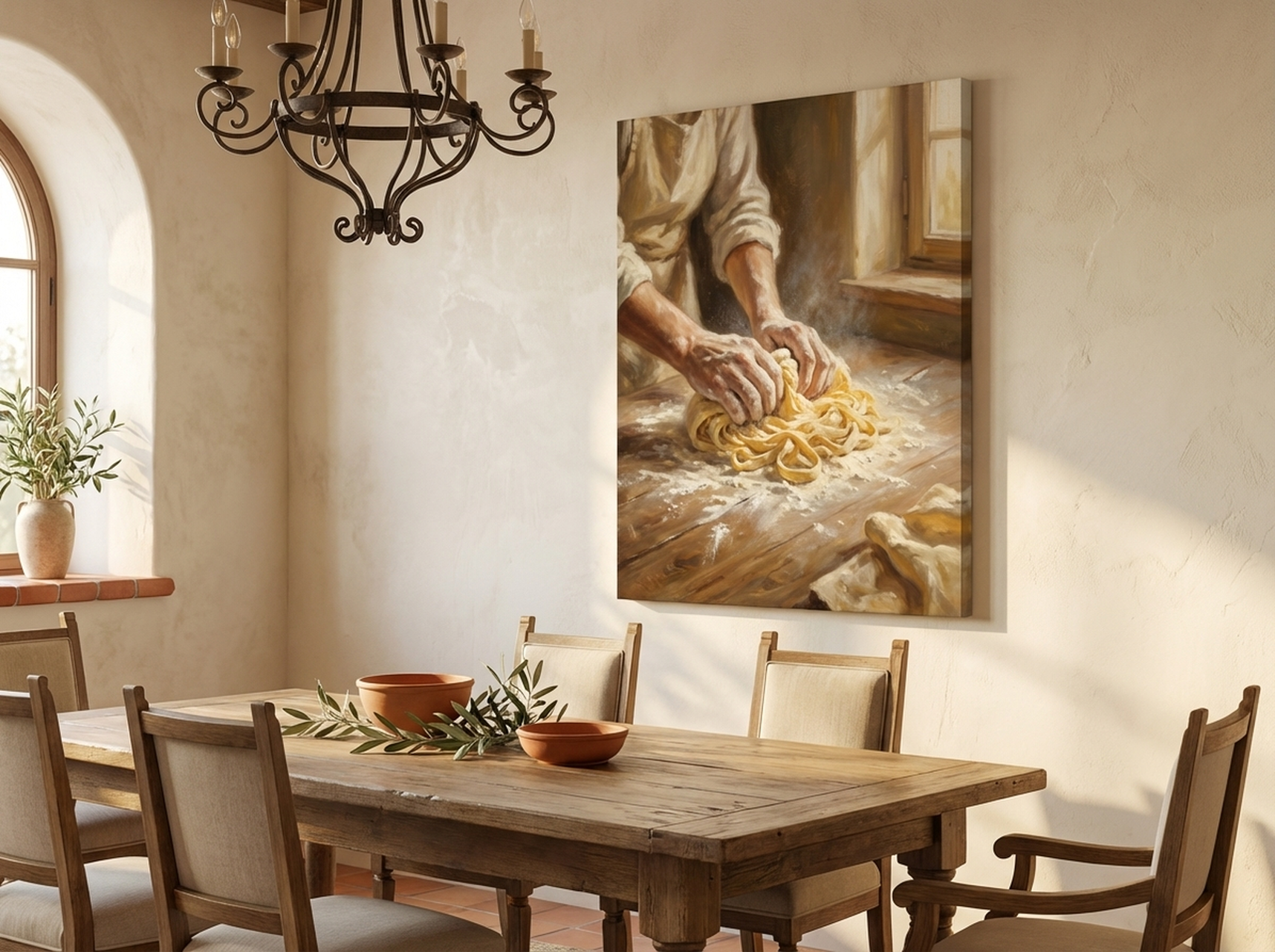
| Top product for Tuscan/food-theme | Pasta Making Tuscan Oil Painting |
| Top product for botanical | Figs and Blackberries Vintage Botanical |
| Top product for glam/luxury | Pampas Vases Black Gold Still-Life |
Bringing It All Together
The dining room is too important a space to leave bare. It is where your family gathers every day, where guests feel welcomed or not, where the mood of the meal is set before a single dish arrives at the table. The right piece of dining room wall art -- warm in tone, correctly sized, thoughtfully placed -- transforms that experience in ways that are felt even if they are not consciously seen.
Whether you choose a bold Tuscan oil painting to honor your love of food and culture, a wildflower landscape that opens the room to the natural world, or a sophisticated earth-tone abstract that anchors a modern space with warmth -- HEVA Unique Art Gallery has the piece that turns your dining room into a destination.
Ready to find your dining room centerpiece?
Browse the full HEVA dining room wall art collection and find the piece that transforms your table.
Also worth exploring before you decide: