Wall Art Placement Mistakes: 9 Common Errors and How to Fix Them
The Heva Team
Art Curators & Interior Design Enthusiasts · May 26, 2026 · 19 min read
Wall art placement is one of the few interior design skills where small mistakes are obvious and small fixes are dramatic. A canvas hung four inches too high makes a room feel awkward. The same canvas dropped to the correct height suddenly anchors the wall. Here are the nine most common placement mistakes, with the exact fix for each.
Wall art placement is one of the few interior design skills where small mistakes are obvious and small fixes are dramatic. A canvas hung four inches too high makes a room feel awkward. The same canvas dropped to the correct height suddenly anchors the whole wall. The frustrating part is that most homeowners never know which of these small choices is off, because the room still functions. It just does not read as polished.
This guide walks through the nine placement mistakes our team sees most often in real US homes, with the exact measurements and fixes for each. Ready to browse? Visit our curated wall art collection for hero pieces sized for every room, or keep reading for the placement rules we use when sizing art in customer homes.
What You Will Find in This Guide
- Mistake 1: Hanging too high
- Mistake 2: Going too small for the wall
- Mistake 3: Wrong placement above the sofa
- Mistake 4: Bad gallery wall spacing
- Mistake 5: Cold lighting on warm art
- Mistake 6: Wrong subject for the room
- Mistake 7: Centering on the wall not the furniture
- Mistake 8: Mismatched frame and room style
- Mistake 9: Forgetting the negative space
- Six canvases that demonstrate each principle
- Wall art placement FAQ
- Quick reference table
Mistake 1: Hanging the Piece Too High
This is the single most common placement error in US homes. The instinct is to hang art near the ceiling so it fills the upper wall. The correct height is much lower than most homeowners think, and the difference is dramatic.
The fix is the museum standard: center the piece at 57 to 60 inches (145 to 152 cm) from the floor, measured to the middle of the canvas. Galleries use this height because it sits at average adult eye level, which is where the human visual system reads images most comfortably. The visual hierarchy principles that underlie gallery design have not changed since the 19th century, and they apply equally well in a living room.
The exception: when art hangs above furniture. In that case, drop the canvas so the bottom of the frame sits 6 to 10 inches (15 to 25 cm) above the top of the furniture, even if the center ends up below 57 inches. A canvas centered at 60 inches floating 24 inches above a sofa looks disconnected. The same canvas hung 8 inches above the sofa back looks like it belongs there.
If you have already drilled holes too high, the easiest fix is to drop the picture hook by the difference and patch the original hole with a 25 cent spackle dot. The patched hole disappears completely behind the new hanging position.
Mistake 2: Going Too Small for the Wall
Undersized art is the second most common mistake, and the reason it happens so often is psychological. Most homeowners buy art based on what they like, not what fits. A 16x20 inch (40x50 cm) canvas might be a perfect piece on its own, but on a 14 foot wall behind a sectional sofa, it reads as an afterthought.
The rule we use: any single canvas should occupy 60 to 75 percent of the width of the furniture beneath it, or the width of the wall it lives on if there is no furniture below. For a standard 84 inch (213 cm) sofa, that means a single canvas 50 to 63 inches wide (126 to 160 cm), which is 24x36 inch territory at the small end and 30x40 inch or larger at the right end. For larger sectionals and oversized sofas, scale up to 36x48 inch or a multi-panel arrangement.
If a single canvas at the correct size feels too expensive, build a tight three piece arrangement totaling the same span. Three 16x20 inch (40x50 cm) pieces hung 2 inches apart give the same visual coverage as a single 50 inch piece, often at lower total cost. For more on size and proportion, our wall art size guide covers every standard furniture pairing with measurements.
Mistake 3: Wrong Placement Above the Sofa
Above-sofa placement is its own category of mistake. The biggest version is centering the canvas on the wall rather than on the sofa. If the sofa is offset to one side of a wider wall, the canvas should center on the sofa, not the wall, because the eye reads the two as a single composition.
The second version is the floating problem mentioned above. The canvas should sit 6 to 10 inches (15 to 25 cm) above the back of the sofa. Anything more and the piece feels disconnected. Anything less and the canvas crowds the cushions. Measure from the top of the cushion line (not the floor) when you set the bottom edge.
The third version is wrong orientation. A horizontal piece above a horizontal sofa is the safe default, and it usually works. But for a low slung mid century sofa with sloped arms, a square format often reads better because the horizontal lines of the sofa do not need reinforcement. For sectionals with a corner, build a gallery wall over the longer side, not the corner. Our team has written separately on full above-sofa placement in our wall art above sofa guide.
Mistake 4: Bad Gallery Wall Spacing
Gallery walls have one technical rule that almost no homeowner follows on the first try: spacing. The correct gap between adjacent pieces is 2 to 3 inches (5 to 7 cm). Tighter than 2 inches and the pieces visually merge. Wider than 3 inches and they read as unrelated frames hung near each other.
The 2 to 3 inch rule applies in both directions. Vertical spacing between two stacked pieces. Horizontal spacing between two adjacent pieces. Diagonal spacing in a salon style asymmetric layout. The rule is hard to internalize because most homeowners think more space looks calmer. It does the opposite. Tight spacing reads as intentional. Generous spacing reads as undecided.
For symmetrical grids of four, six, or nine pieces, keep all spacing identical to the millimeter. Use a paper template (a single sheet of newsprint taped to the wall in the planned arrangement) before driving any nails. For asymmetric salon style arrangements, pick a center piece and arrange the rest around it like a constellation, with 2 to 3 inch gaps maintained everywhere. The Paris Salon hanging tradition from which the modern salon-style arrangement is named used tight spacing precisely because tighter groupings read as a single curated whole rather than a collection of separate frames.
For a deeper breakdown of when to use a single piece versus a gallery wall, see our single piece versus gallery wall guide.
Mistake 5: Cold Lighting on Warm Art
Wall art is half pigment, half light. The same canvas under warm 2700K incandescent light versus cool 5000K LED light reads as two different pieces. Most US homes default to cool LED ceiling lights that flatten warm art, draining the amber from oil paintings and turning rich terracotta into dusty pink.
The fix is dedicated, warm, directional lighting. Add a picture light above the canvas (battery powered or plug in models start at 30 to 50 dollars), or angle a 2700K to 3000K track light at the piece, or place a tall floor lamp behind a sofa aimed up at the wall. Any of these triples the visual presence of a warm toned canvas.
For cool toned art (atmospheric blues, charcoal photography, monochrome line work), the lighting rule reverses slightly. These pieces can take cooler 3500K to 4000K light without going lifeless, but they still benefit from directional rather than ambient illumination. Avoid flat overhead lighting that hits the canvas at 90 degrees, which kills shadow detail in any palette. A small angle (15 to 30 degrees off perpendicular) brings out the brushwork and frame depth on every type of canvas.
For room-level lighting principles that complement art placement, the Apartment Therapy guide to hanging art covers the relationship between lighting and frame height in real lived-in rooms. The lighting choice is more impactful than most homeowners realize.
Mistake 6: Wrong Subject for the Room
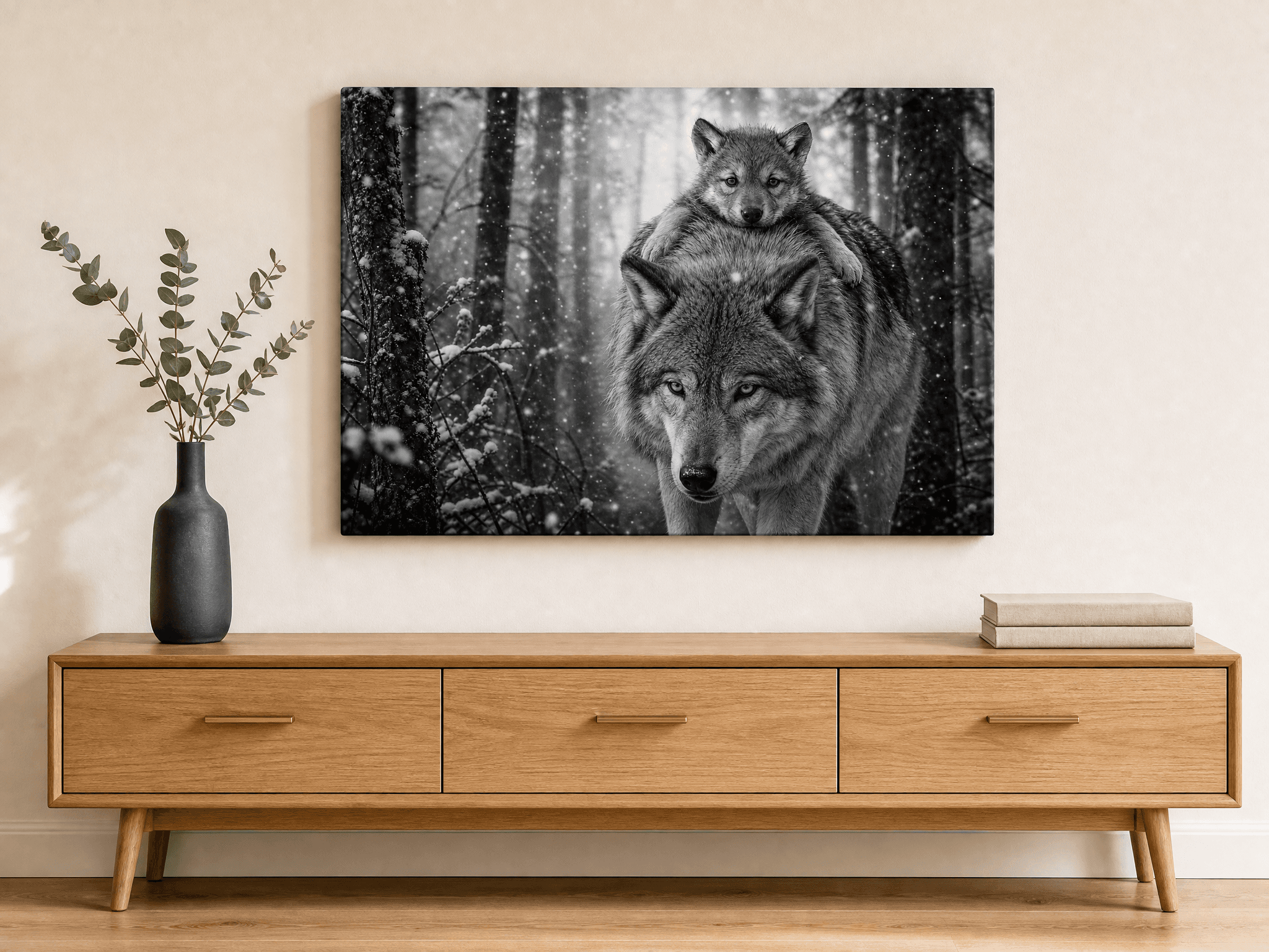
Subject matter and room function should match. A bold roaring lion canvas above a master bed is a common mismatch. The piece is striking, but the activating subject works against the calming function of a bedroom. The same canvas in a home office reads as appropriate and powerful.
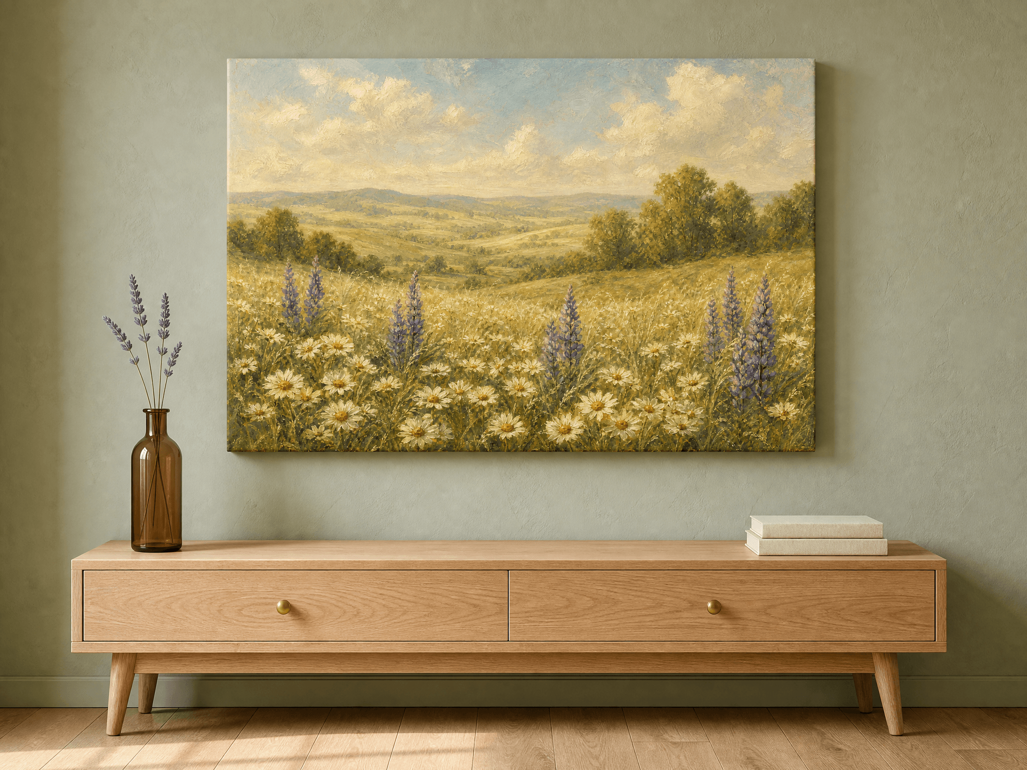
The rough mapping our team follows is straightforward. Activating subjects (predatory wildlife, bold typography, motivational quotes, high contrast abstract, bold portraits) belong in offices, dens, gyms, entryways, and statement walls. Calming subjects (atmospheric landscapes, soft botanicals, watercolor washes, minimalist line work, sumi-e and Japanese ink) belong in bedrooms, bathrooms, meditation spaces, and quiet living rooms.
Neutral subjects (geometric abstracts, color field paintings, organic shapes, MCM patterns) work in almost any room because they do not push an emotional register. They are the safe choice when the room has competing functions or you are buying art for resale or rental.
The mistake usually happens when homeowners buy a single piece they love without considering the room it will live in. The fix is to think about the room first and the piece second. For more on subject-to-room matching by space, see our bedroom wall art guide and living room wall art guide.
Mistake 7: Centering on the Wall Instead of the Furniture
Wall centering and furniture centering are not the same. If your sofa sits off-center on a wall, the canvas should center on the sofa, not the wall, because the human eye reads the sofa and the art as a single visual unit.
The exception is when there is no furniture beneath. For a long blank wall in a hallway or above a staircase, the canvas should center on the wall span. The rule is essentially: center on the strongest visual element below the piece, whether that is furniture, a fireplace, a door, or empty wall.
For staircases, the canvas should follow the angle of the stairs themselves, with each piece in a stair gallery hung at the same vertical distance above the corresponding stair tread. Our staircase wall art guide walks through the exact measurements for a 12 step run.
Mistake 8: Mismatched Frame and Room Style
Frame choice is often treated as a small detail, but it is more impactful than the homeowner thinks. The frame is the visual transition between the canvas and the wall, and a wrong frame breaks that transition.
For minimalist and Scandinavian rooms, choose unframed gallery wrapped canvas or a thin black or white frame (under 1 inch wide). For mid century modern and Japandi rooms, choose thin walnut or natural oak. For traditional, dark academia, and luxury rooms, choose thicker frames in dark walnut, black, or muted gold. For boho and farmhouse rooms, choose distressed wood or natural rattan.
The history of frame design itself is rich. The Britannica reference on picture frames traces frame styles through every major design movement, and you can usually match a frame style to a room style by working backward through the same history. A baroque gilded frame on a modern abstract canvas reads as costume. A thin matte black frame on the same canvas reads as gallery.
Mistake 9: Forgetting the Negative Space Around the Piece
The final mistake is the subtlest. Many homeowners pick the right canvas, hang it at the right height, light it correctly, and still feel the wall looks off. The reason is usually negative space, the area of wall around the piece that is doing visual work whether you notice it or not.
The rule we use: leave at least 6 to 12 inches (15 to 30 cm) of breathing room on either side of the canvas before the next visual element. That could be a wall sconce, the edge of a doorway, a corner, another piece of art, or a tall piece of furniture. Anything tighter and the canvas feels squeezed.
On the other side, negative space should not be excessive either. A single 24x36 inch (60x90 cm) canvas centered on a 12 foot blank wall reads as undersized for the room, even if it is the right size for the furniture beneath. The fix is to either upsize the canvas, add flanking elements (a tall plant, wall sconces, paired smaller pieces), or paint a feature wall behind the piece to compress the visible negative space.
The golden ratio shows up here in a useful way. A canvas that occupies roughly 62 percent of the available wall width tends to feel correct without measurement. If your piece is significantly smaller than that, the negative space is doing too much work. If it is significantly larger, the piece crowds the wall.
Six Canvases That Demonstrate Each Placement Principle
The six pieces below illustrate placement principles from this guide. Each is hand finished, framed, and ready to hang, shipped in protective packaging within the United States. Click any piece to see size options. We offer 12x9 inch (30x23 cm) up to 36x36 inch (90x90 cm), in horizontal, vertical, and square orientations.
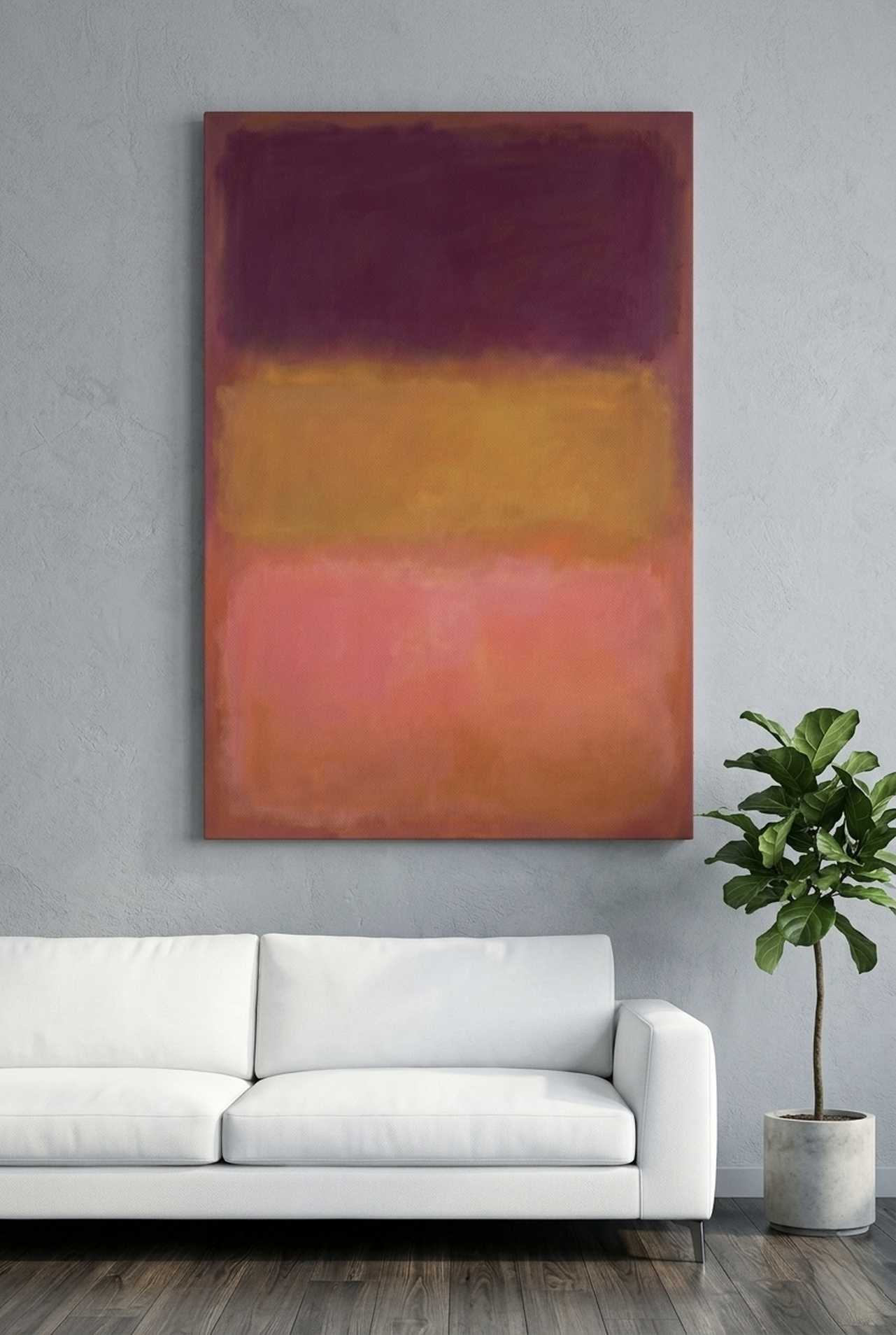
1. Above the Sofa: Color Field Abstract Rothko Style Canvas
This is the piece we recommend first for above-sofa placement because color field abstracts scale well to large sizes without competing for attention. The warm horizontal bands of rust, terracotta, and ochre echo the horizontal line of the sofa back, which reinforces the visual unit of art plus furniture. The flat blocks of color also forgive imperfect lighting better than detailed brushwork.
Hang the bottom edge 6 to 10 inches (15 to 25 cm) above the sofa back, centered on the sofa not the wall. Choose 30x40 inch (75x100 cm) above a standard 84 inch sofa, or 36x48 inch (90x120 cm) above an oversized sectional. The piece pairs naturally with a brass picture light or an arc floor lamp behind one armrest. Explore the Color Field Rothko Canvas.
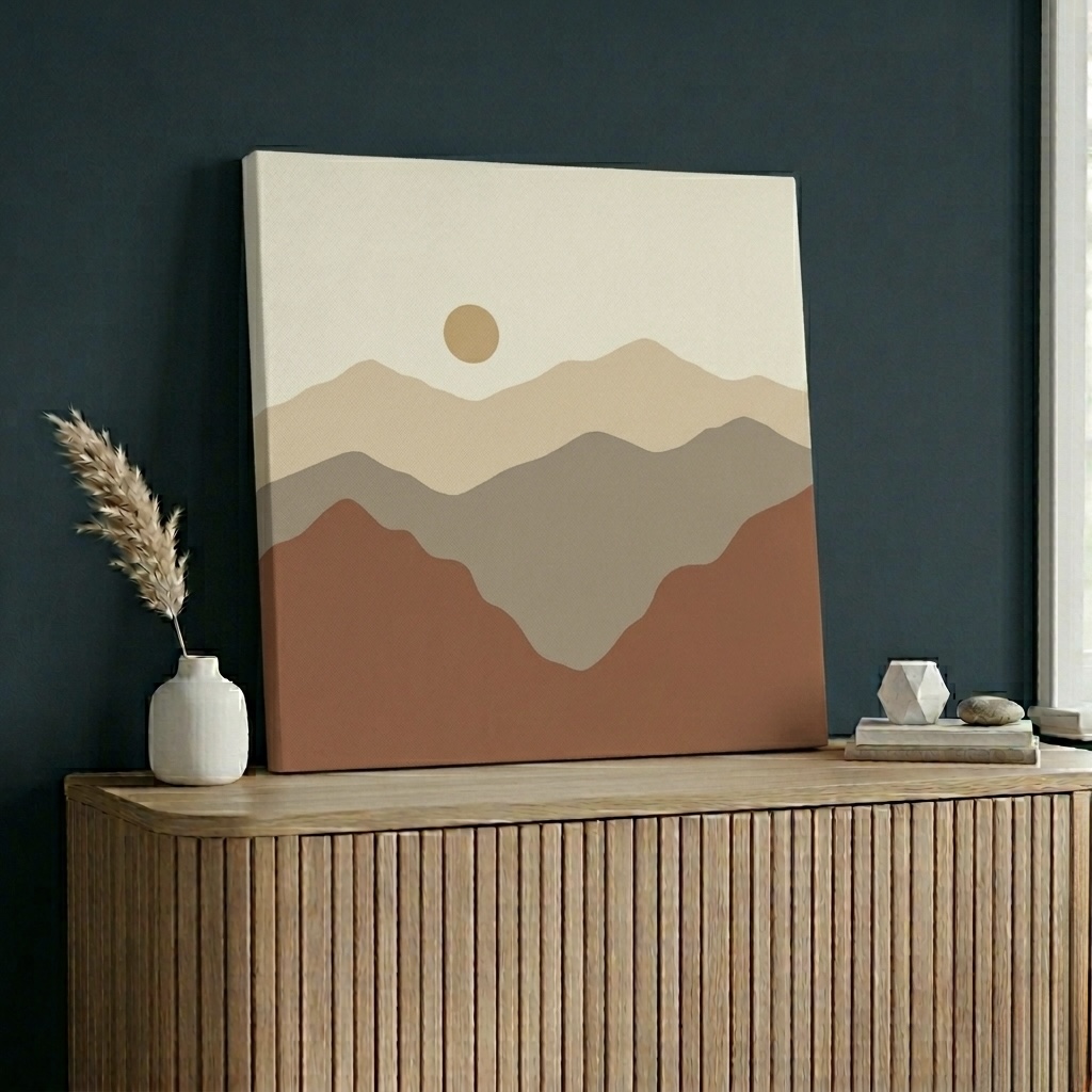
2. Above the Bed: Mountain Ink Brush Sumi-e Canvas
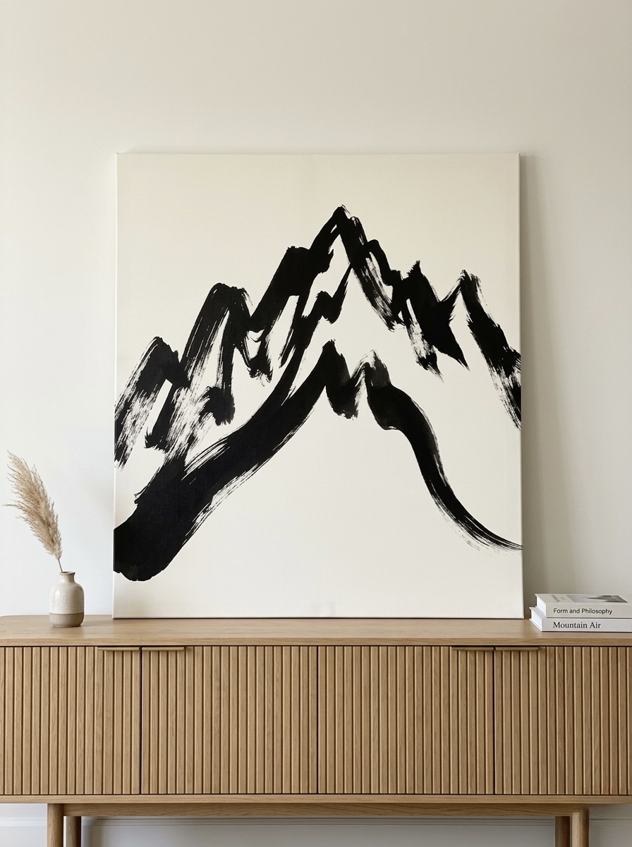
The bedroom test for any canvas is whether the subject calms or activates. A sumi-e mountain in black, white, and cream passes the calm test by every measure: muted palette, minimalist composition, generous negative space, and a subject (mountain) that reads as peaceful rather than dramatic. This is what to hang above a primary bed when you want art that supports sleep.
Hang centered on the headboard, with the bottom edge 6 to 10 inches (15 to 25 cm) above the top of the headboard. The piece should be roughly the width of the headboard, or slightly narrower. Choose 24x36 inch (60x90 cm) above a queen bed or 30x40 inch (75x100 cm) above a king. For more on bedroom placement, see our wall art behind bed guide. See the Mountain Ink Brush Canvas.
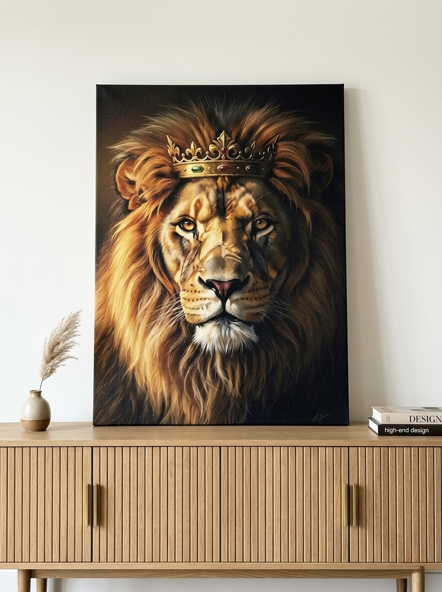
3. In the Entryway or Home Office: Crowned Lion Canvas
An activating subject like the crowned lion belongs in rooms where the visual energy is welcome. Entryways are the highest impact spot: a single bold portrait at 57 inches center sets the tone for the entire home. Home offices are the second-best home, where the leadership symbolism reinforces the room function.
For entryway placement, center the piece on the wall (not on furniture, since most entryways have minimal furniture below) at 57 to 60 inches. Pair with a slim console table and a single brass or matte black lamp. For home office placement, hang behind the desk for video calls or on the opposite wall so you face the piece while you work. Choose 24x36 inch (60x90 cm) for a tight entryway or 30x40 inch (75x100 cm) for a spacious one. Browse the Crowned Lion Canvas.
4. In the Dining Room: Matisse Botanical Cutout Canvas
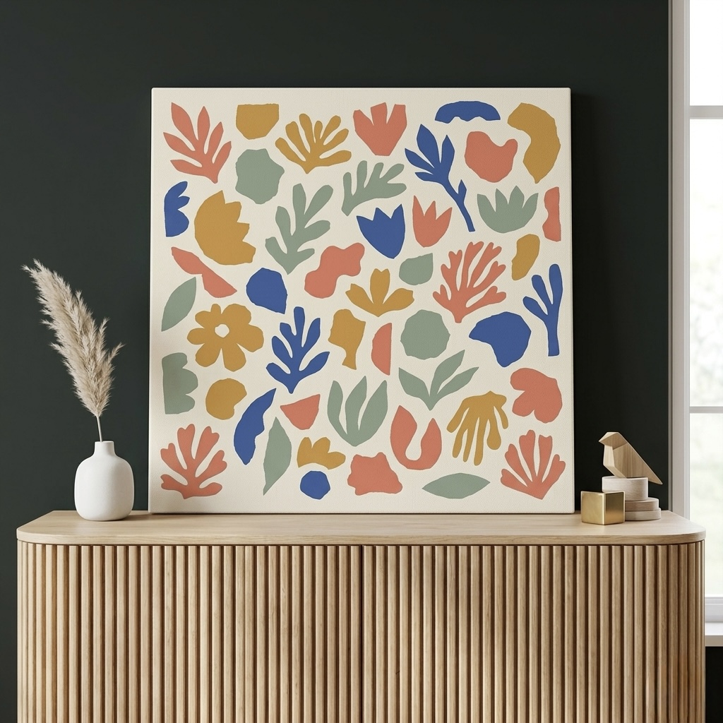
Dining room placement has its own rule: hang along the longer wall above a credenza or sideboard, not directly above the dining table where the canvas competes with the pendant light. The Matisse cutout works particularly well in dining rooms because the warm coral and gold palette flatters skin tones at eye level, which matters when guests are seated facing the wall.
Center the canvas on the credenza beneath, not on the wall. The bottom edge sits 6 to 8 inches (15 to 20 cm) above the credenza surface. Choose 24x36 inch (60x90 cm) above a 60 inch credenza, or build a paired arrangement at 18x24 inch (45x60 cm) for a symmetrical look. For full dining wall treatment, see our dining room wall art guide. View the Matisse Cutout Canvas.
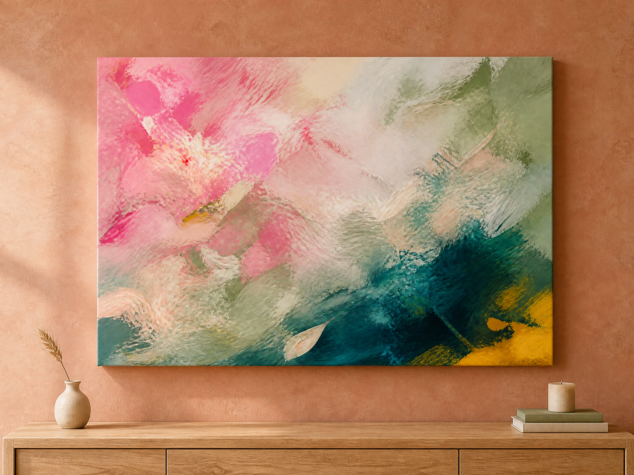
5. As a Gallery Wall Anchor: Pink Sage Abstract Canvas
Salon style gallery walls need an anchor: one piece larger than the rest that the eye lands on first and reads outward from. An abstract expressionist canvas with painterly brushwork makes a strong anchor because the loose brushstrokes do not compete with adjacent pieces the way a detailed portrait or landscape would.
Hang the anchor at 57 to 60 inches center, then arrange three to five smaller pieces around it with 2 to 3 inch (5 to 7 cm) gaps. Mix orientations (one landscape, one portrait, one square) and frame styles slightly to add rhythm without breaking cohesion. Choose 24x36 inch (60x90 cm) for the anchor in most living rooms, or 30x40 inch (75x100 cm) for larger spaces. For more on style mixing, see our how to mix wall art styles guide. See the Pink Sage Abstract Canvas.
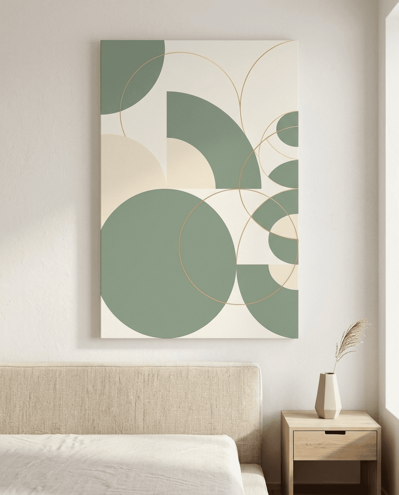
6. For Small Rooms and Bathrooms: Sage Green Geometric Circles Canvas
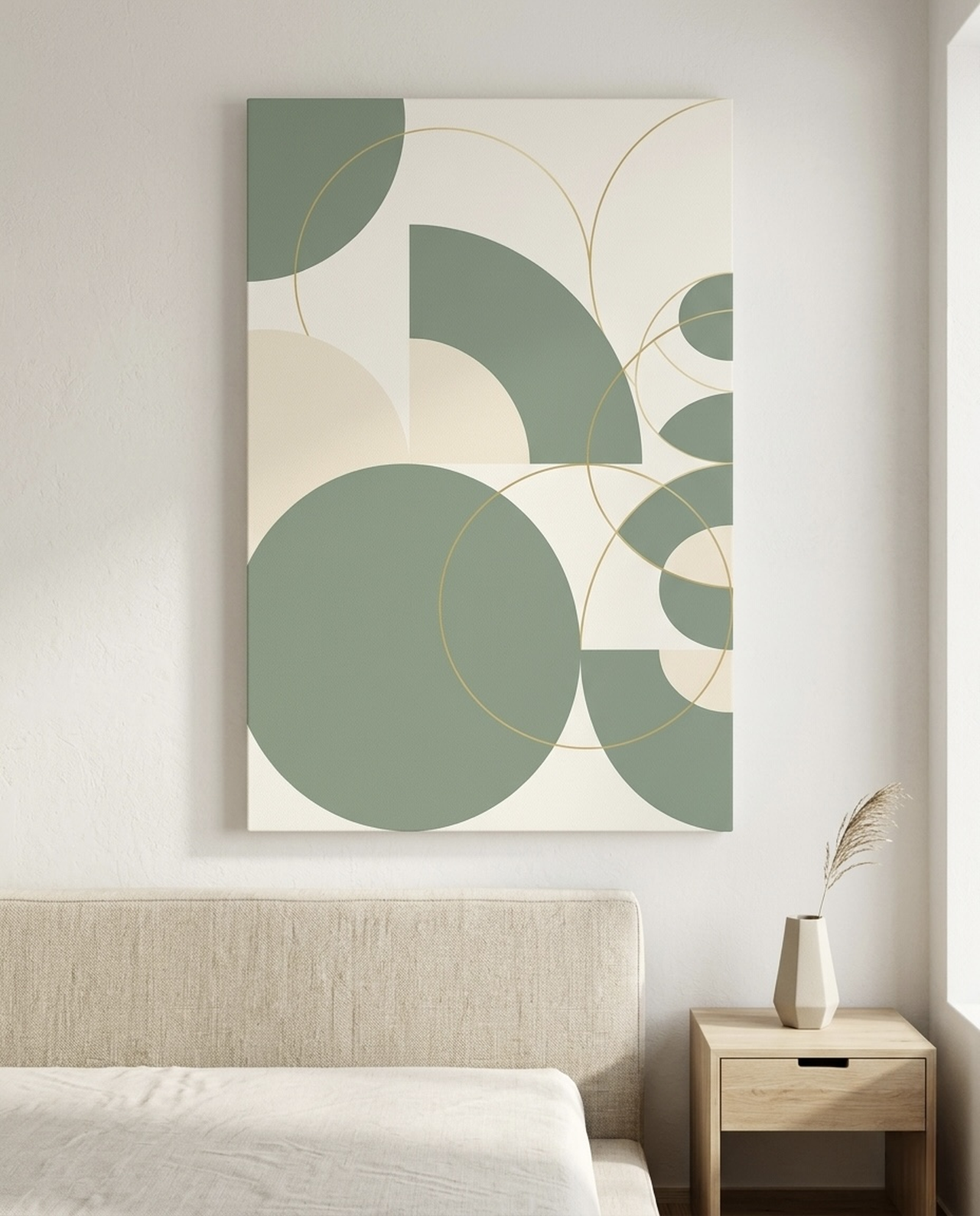
Small rooms (powder rooms, narrow hallways, breakfast nooks) need canvases that scale down without losing impact. Geometric abstracts work because the strong shape vocabulary reads from across the small room without needing a large surface. Soft palettes like sage and cream prevent the piece from overwhelming a tight space.
Hang at 57 inches center if there is no furniture below, or 6 inches above any small piece of furniture or fixture. Choose 16x20 inch (40x50 cm) or 18x24 inch (45x60 cm) for powder rooms and narrow halls. For more on small space placement, see our wall art makes rooms look bigger guide and our bathroom wall art guide. Explore the Sage Geometric Circles Canvas.
Wall Art Placement FAQ
At what height should wall art be hung?
Hang wall art so the center of the piece sits at 57 to 60 inches (145 to 152 cm) from the floor. This is the museum standard used by major galleries because it puts the focal point at average adult eye level. Above furniture, drop that height so the bottom of the piece sits 6 to 10 inches (15 to 25 cm) above the top of the furniture, even if the center ends up lower than 57 inches.
How big should wall art be above a sofa?
Wall art above a sofa should occupy 60 to 75 percent of the width of the sofa beneath it. For a standard 84 inch (213 cm) sofa, this means a single canvas of 50 to 63 inches wide (126 to 160 cm), or a gallery wall totaling the same span. A 24x36 inch piece above an 84 inch sofa is too small and floats. Go up to 30x40 inch or larger for the correct visual weight.
How far apart should canvases be in a gallery wall?
Spacing in a gallery wall should be 2 to 3 inches (5 to 7 cm) between pieces. Tighter spacing reads as a single composition. Wider spacing makes the arrangement look like unrelated frames sharing a wall. For symmetrical grids, keep all spacing identical. For salon style asymmetric arrangements, vary spacing slightly but never exceed 3 inches between adjacent edges.
Why does my wall art look small even though I followed the rules?
Three usual causes. First, the piece is centered too high, so the visual weight floats above the furniture. Second, the frame is too thin for the wall scale, making the piece read as unframed paper. Third, the wall behind is empty, with no picture light, accent table, or paired object to give the canvas context. Fix all three and a borderline-too-small piece often reads as correct.
Can I hang wall art above a TV?
Yes, but only if the TV is not the room primary focal point. The canvas above a TV should be smaller than the TV itself, framed thinly, and chosen in a calm palette that does not compete with the screen. A 16x20 inch (40x50 cm) abstract above a 65 inch TV reads as intentional. A 30x40 inch (75x100 cm) statement piece above the same TV creates two competing focal points and weakens the room.
Is symmetrical or asymmetrical gallery wall arrangement better?
Symmetrical arrangements are easier to get right and read as formal, working best in traditional rooms, dining rooms, and entryways. Asymmetrical salon style arrangements read as collected and lived in, working best in living rooms, hallways, and stair walls. Pick based on the room overall formality, not on what you see most often on Pinterest. Either approach works if the spacing is consistent.
Quick Reference Table
| Placement | Hanging Height | Sizing Rule | Recommended Canvas |
|---|---|---|---|
| Above sofa | 6 to 10 in above back | 60 to 75 percent of sofa width | Color Field Rothko |
| Above bed (headboard) | 6 to 10 in above headboard | Slightly narrower than headboard | Mountain Ink Brush |
| Entryway or home office | 57 in center, museum standard | One bold focal point, 24x36 or larger | Crowned Lion |
| Dining room above credenza | 6 to 8 in above credenza | Slightly narrower than credenza | Matisse Cutout |
| Gallery wall anchor | 57 in center for anchor | Anchor 24x36, satellites 11x14 to 16x20 | Pink Sage Abstract |
| Small rooms and bathrooms | 57 in center or 6 in above fixture | 16x20 to 18x24 | Sage Geometric Circles |
Most wall art mistakes come from following intuition over measurement. The instinct to hang high, to buy small, to center on the wall, to let the ceiling light do the work, is wrong in every case. Once you measure to the museum 57 inch center, size to 60 to 75 percent of the furniture beneath, space gallery walls at 2 to 3 inches, and light each piece directionally with warm light, the difference is dramatic and immediate. Ready to start? Browse our curated wall art collection for hero pieces sized to every room, or visit our wall art size guide and single piece versus gallery wall guide for the next layer of placement detail.