Best Wall Art for Living Room 2026 Guide
The Heva Team
Art Curators & Interior Design Enthusiasts · March 23, 2026 · 15 min read
Discover the 6 best wall art picks for living rooms in 2026, spanning abstract, nature, and luxury styles. Expert advice on sizing, colour psychology, and placement.
Your living room wall is the largest blank canvas in your home, and what you place on it sets the mood for every conversation, every quiet evening, and every gathering you host. The wrong choice fades into the background. The right piece turns a forgettable room into one people remember. This guide spotlights the best wall art for living room spaces in 2026, with six specific picks spanning abstract, nature, and luxury styles, plus expert tips on sizing, placement, and colour coordination so you make a confident choice the first time.
Ready to browse? Explore our full living room wall art collection, or keep reading for our top picks and expert tips.
What You Will Find in This Guide
- Wall Art Trends Dominating Living Rooms in 2026
- Colour Psychology: How Wall Art Shapes a Room's Energy
- The Sizing Rule Every Living Room Needs
- Our 6 Best Wall Art Picks for Living Rooms
- How to Hang and Light Your Wall Art
- Common Mistakes to Avoid
- Frequently Asked Questions
- Quick Reference Table
Wall Art Trends Dominating Living Rooms in 2026
If 2025 was the year of quiet minimalism, 2026 is the year living rooms got their personality back. Designers across the industry are reaching for oversized statement canvases, textured prints, and bold colour palettes that anchor a room rather than blend in. According to Artfully Walls, the biggest shift is toward dimensional, hand-embellished pieces that catch light and add depth, moving far beyond the flat poster aesthetic of previous years.
Three macro trends are reshaping living room walls this year:
Organic Abstraction. Bold colour fields blended with fluid, paint-pour techniques create a sense of movement. Think rich golds, deep teals, and warm terracottas layered into landscapes that feel both natural and artistic. These pieces replace the cool grey minimalism that dominated earlier and add warmth without competing with your furniture.
Nature as Luxury. Botanical prints and forest scenes are being treated as high-end focal points. The 2026 approach pairs photorealistic oil-painting style with generous framing. A sunlit redwood forest or a mountain aurora printed on premium matte canvas can feel as impactful as a piece from a gallery exhibition.
Cultural Maximalism. Intricate patterns from Mughal miniatures, Japanese ukiyo-e, and Islamic geometry are finding a home in modern living rooms. These pieces bring history, colour, and craftsmanship into the space, offering an alternative to the generic abstract prints that fill most home decor stores.
The common thread across all three trends is scale. In 2026, undersized prints look like afterthoughts. A single large canvas measuring 91 by 61 cm (36 by 24 inches) or larger commands attention and eliminates the visual clutter of multiple small frames. As The Coolist notes in their 2026 living room decor report, oversized artwork is now the primary way homeowners are defining their living room personality.
Colour Psychology: How Wall Art Shapes a Room's Energy
The colours on your living room wall do more than look appealing. Research in environmental psychology has consistently shown that colour temperature directly affects perceived comfort. Warm tones like amber, terracotta, and gold make large rooms feel more intimate, while cool tones like navy, teal, and silver make smaller rooms feel open and airy.
For a living room where you host guests and have conversations, art with warm earth tones (golds, browns, deep oranges) creates a welcoming atmosphere. A study published in the journal Color Research and Application found that rooms with warm-toned accents were consistently rated as more inviting and sociable by participants compared to neutral or cool-toned environments.
If your living room doubles as a quiet retreat for reading or working, cooler palettes work better. Navy blues, forest greens, and silvery greys reduce visual stimulation without making the room feel cold. The key is matching your art's dominant colour to the room's primary function.
A practical rule: your wall art should contain at least one colour that already exists in your furnishings (a throw pillow, a rug border, a lampshade). This creates visual cohesion without requiring a full colour match. You can explore this further in our colour psychology in wall art guide.
The Sizing Rule Every Living Room Needs
The most common wall art mistake in living rooms is hanging something too small. A 30 by 20 cm (12 by 8 inch) print above a 213 cm (84 inch) sofa looks like a postage stamp on a billboard. Interior designers use a straightforward ratio: your wall art should cover 55 to 75 percent of the width of the furniture below it.
Above a sofa: If your sofa is 200 cm (79 inches) wide, your art or arrangement should span 110 to 150 cm (43 to 59 inches) wide. A single large canvas in the 91 by 61 cm (36 by 24 inch) range works well for standard sofas. For sectionals wider than 250 cm (98 inches), consider a pair of coordinating prints or a single oversized piece.
Above a fireplace: The art should be narrower than the mantel by at least 10 cm (4 inches) on each side. Hang the bottom edge 10 to 15 cm (4 to 6 inches) above the mantel top. For mantels without a shelf, centre the art at 150 cm (59 inches) from the floor to the centre of the piece.
On an empty wall: For a standalone statement piece on a large blank wall, aim for 60 to 75 percent of the wall's available width. The vertical centre of the art should sit at 145 to 155 cm (57 to 61 inches) from the floor, which aligns with average eye level.
For detailed measurements and hanging techniques, see our complete wall art sizing guide.
Our 6 Best Wall Art Picks for Living Rooms in 2026
1. Geometric Texture Panels - Walnut Gold Abstract Print
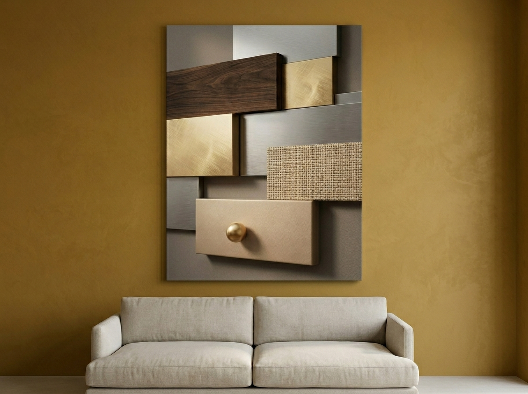
This piece captures the 2026 appetite for texture and dimension. The layered geometric panels in walnut, gold, and silver tones mimic carved wood reliefs, adding depth that flat prints simply cannot match. It reads as sophisticated without being cold, making it ideal for living rooms with mid-century modern or transitional furniture. The neutral metallics coordinate with leather sofas, oak coffee tables, and brass light fixtures equally well. Hang it above your sofa as a solo statement piece or pair it with a single floating shelf below for a curated look.
View the Geometric Texture Panels
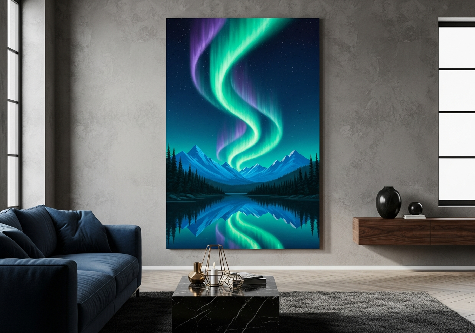
2. Northern Lights Aurora Borealis Mountain Lake
Few subjects stop people mid-sentence the way an aurora does. This canvas translates the shimmering greens and purples of the northern lights into a photorealistic oil painting, complete with a still mountain lake reflecting the colours below. It is a nature scene that feels genuinely luxurious. The deep navy base makes it perfect for living rooms with darker accent walls, while the turquoise and green highlights pull in energy without overwhelming the space. For maximum impact, hang it on a wall that gets evening lamplight; the warm glow will make the aurora colours shift and glow.
View the Northern Lights Aurora
3. Sunbeam Forest - Old Growth Redwood Oil Painting
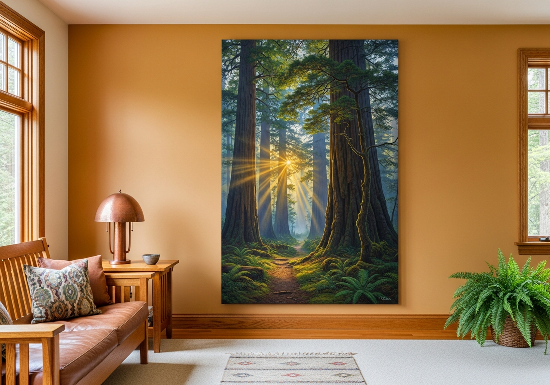
There is a reason forest imagery consistently ranks among the top sellers for living room wall art: it brings calm without boredom. This piece captures golden sunbeams cutting through old-growth redwoods, with deep greens, warm ambers, and soft cream light creating a layered depth that draws the eye inward. The oil painting style gives it a hand-painted look that elevates it beyond typical nature photography prints. It pairs beautifully with green velvet sofas, natural wood furniture, and warm-toned area rugs. If your living room faces north and lacks natural sunlight, this canvas effectively adds the warmth the room is missing. Learn more about bringing outdoor energy indoors in our nature wall art guide.
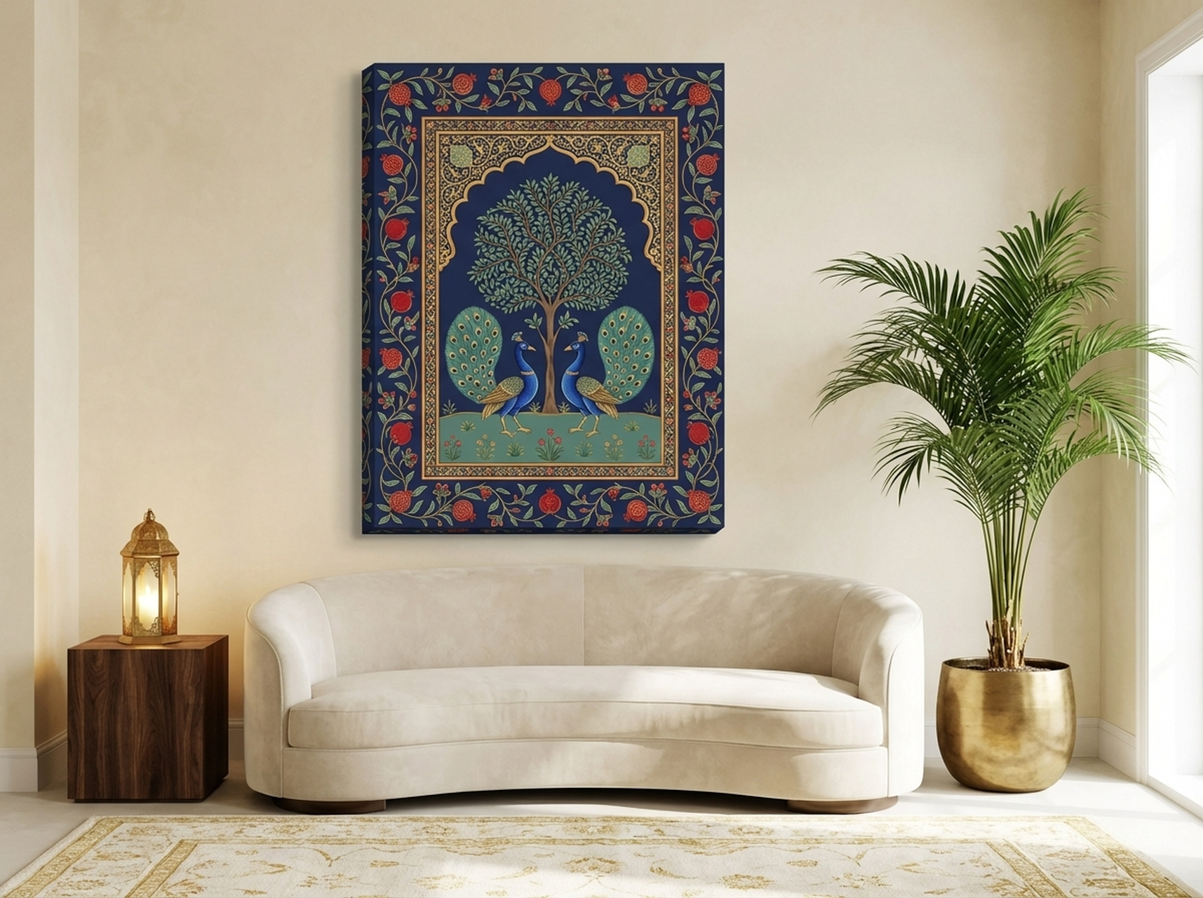
4. Mughal Peacock - Pichwai Indian Art Tree of Life
This piece is where cultural heritage meets luxury decor. Inspired by traditional Pichwai painting from Rajasthan, it features a regal peacock amid a tree of life rendered in deep navy, royal gold, and teal. Every detail, from the intricate feather patterns to the delicate floral border, rewards closer inspection. It suits maximalist living rooms, eclectic spaces, and anyone tired of generic abstract prints that say nothing. The navy and gold palette coordinates effortlessly with jewel-toned throw pillows, brass decor accents, and both light and dark wood furniture. This is a conversation-starting centrepiece, not background filler.
5. Abstract Grizzly Bear - Emerald Gold Expressionist
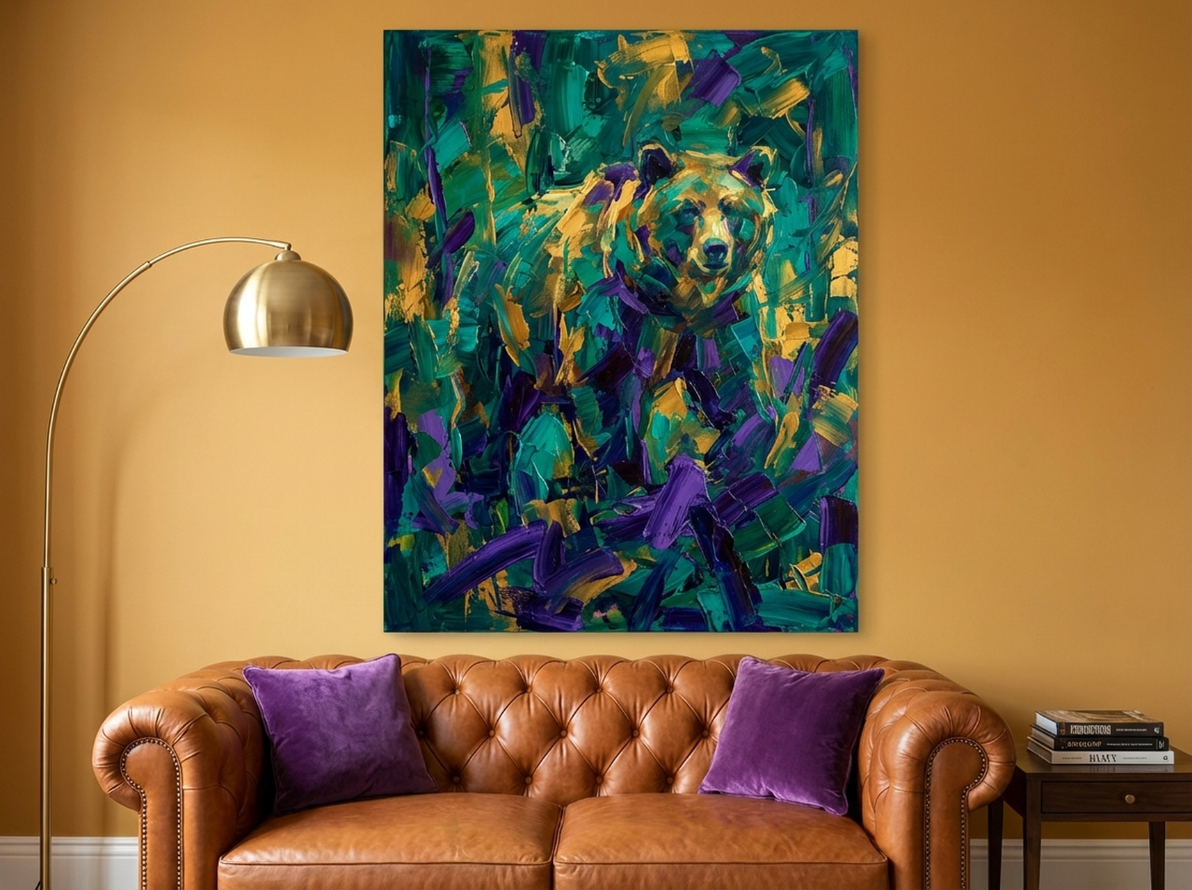
For living rooms that want both the energy of abstract art and the soul of nature, this expressionist grizzly bear delivers both. Thick, confident brushstrokes in emerald, gold, and purple build the bear's form without photographic detail, leaving the viewer's imagination to fill in the rest. It is bold enough to anchor a feature wall yet refined enough for a living room that leans sophisticated rather than rustic. The jewel-tone palette works especially well with dark leather furniture, emerald or mustard accent cushions, and matte black frames elsewhere in the room. If you love abstract art but find purely non-representational pieces too vague, this hybrid approach gives you the best of both worlds. Explore more options in our abstract wall art for living room guide.
View the Abstract Grizzly Bear
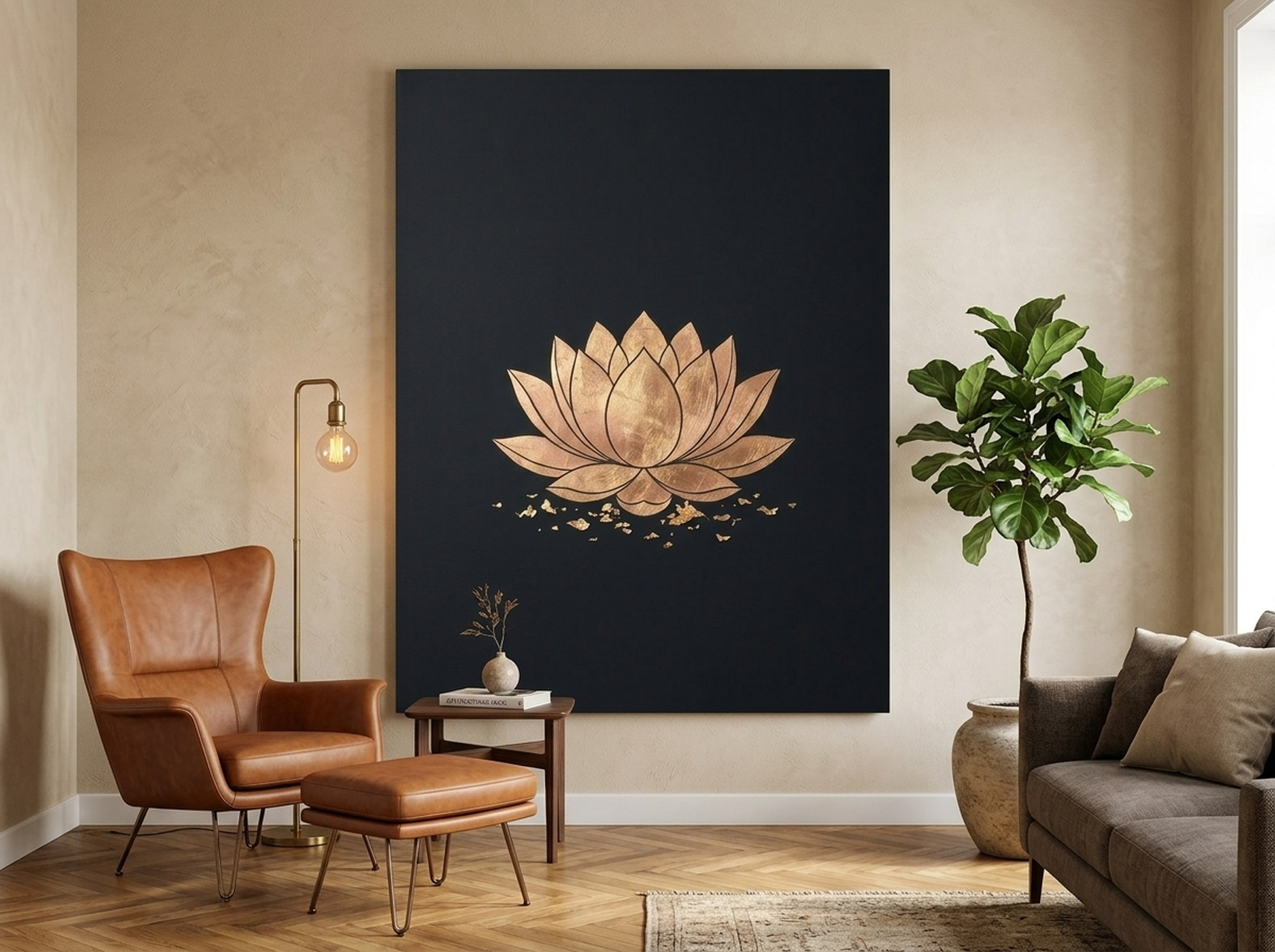
6. Lotus Flower Gold Leaf - Black Minimalist Zen Print
Sometimes restraint says more than excess. This lotus flower print on a deep black background with gold leaf accents embodies the zen minimalist trend that continues to resonate in 2026 living rooms. The simple composition, a single bloom rendered in metallic gold against matte black, creates a meditative focal point. It is ideal for living rooms with a calm, curated aesthetic: think Japandi furniture, neutral linen sofas, and warm wood accents. The black background also makes it remarkably versatile; it complements white walls, charcoal feature walls, and warm beige tones equally. Place it above a console table with a single candle and a small plant for an effortlessly elegant vignette. For more on achieving a high-end look, visit our luxury wall art guide.
View the Lotus Flower Gold Leaf
How to Hang and Light Your Wall Art Like a Professional
Once you have chosen the right piece, hanging height and lighting make the difference between art that looks intentional and art that looks like an afterthought.
The 145 cm Rule. Centre your artwork so the middle of the piece sits at 145 cm (57 inches) from the floor. This is the standard gallery hanging height used by museums worldwide, and it works in residential spaces because it aligns with average standing eye level. If hanging above a sofa, drop this to 135 to 140 cm (53 to 55 inches) to visually connect the art to the furniture below.
Gap Between Sofa and Art. Leave 15 to 25 cm (6 to 10 inches) between the top of your sofa back and the bottom edge of the frame. Less than 15 cm feels cramped; more than 25 cm creates a visual disconnect that makes the art look unrelated to the seating area.
Lighting Makes or Breaks It. A picture light mounted directly above the frame (LED warm white, 2700K to 3000K colour temperature) adds instant gallery-level polish. If you prefer floor or table lamps, position them at a 30-degree angle from the wall to minimize glare. Avoid overhead spotlights that cast harsh shadows, especially on textured or metallic prints like the Geometric Texture Panels or Lotus Gold Leaf featured above.
Secure Mounting. For canvas prints over 5 kg (11 lb), use two picture hooks spaced 25 to 30 cm (10 to 12 inches) apart rather than a single centre hook. This distributes weight evenly and keeps the frame level over time. Always use wall anchors on drywall; a single nail in gypsum board will eventually fail.
Common Mistakes to Avoid
1. Going Too Small. The most frequent error is choosing art that is too small for the wall. A 40 by 30 cm (16 by 12 inch) print above a 200 cm (79 inch) sofa looks lost. Follow the 55 to 75 percent width rule and size up, not down.
2. Hanging Too High. Art hung at 175 cm (69 inches) from the floor centre looks like it is floating away from the room. Bring it down to 145 cm (57 inches) centre, or lower if it is grouped with furniture.
3. Ignoring Colour Relationships. A bright turquoise abstract in a room full of warm browns and beiges creates visual friction. Pull at least one colour from your existing furnishings into the artwork, or choose a piece in a complementary palette. If your sofa is grey, a gold-and-teal abstract creates warmth. If your room is already warm, a cool blue-and-silver nature scene balances it out.
4. Choosing Art Last. Many people furnish the entire room, then scramble to find art that fits. Instead, choose your statement art piece early in the decorating process. It is easier to match throw pillows to a painting than to find a painting that matches throw pillows.
5. Forgetting the Frame Context. A frameless canvas on a stark white wall can look unfinished. If your room has clean, modern lines, a matte black or natural wood float frame adds definition. If the room is more traditional, a wider moulding frame ties the piece to the surrounding architecture. Our 2026 wall art trends guide covers framing options in detail.
Frequently Asked Questions About Living Room Wall Art
What size wall art looks best above a standard sofa?
For a standard three-seater sofa measuring 190 to 210 cm (75 to 83 inches) wide, a single canvas in the 91 by 61 cm (36 by 24 inch) range or a grouping spanning 110 to 150 cm (43 to 59 inches) wide provides the best proportions. The art should cover 55 to 75 percent of the sofa width.
Should living room wall art match the wall colour?
Not exactly match it, but coordinate. Art on a white or light grey wall has maximum freedom; nearly any palette works. On a dark accent wall (navy, charcoal, forest green), choose art with lighter tones or metallics (gold, silver, cream) to create contrast. Matching the wall colour exactly makes the art disappear visually.
Is abstract or nature art better for a living room?
It depends on the atmosphere you want. Abstract art with bold colours energizes a space and draws attention, making it ideal for social living rooms where you entertain. Nature art (forests, mountains, botanicals) calms the room and suits spaces used for relaxation. The pieces in this guide, like the Abstract Grizzly Bear (energizing) and the Sunbeam Forest (calming), show how different the same room can feel based on art choice alone.
How do I mix wall art styles without creating visual chaos?
Use a unifying element. Pick two or three pieces that share a common colour (like gold appearing in both an abstract and a nature print) or a common frame style. Avoid mixing more than two art genres on the same wall. A geometric abstract next to a botanical can look intentional; a geometric abstract next to a portrait next to a landscape next to a text print looks like a yard sale.
Can I hang wall art in a living room with large windows?
Yes, but avoid direct sunlight hitting the print for more than two hours daily. UV exposure fades colours over time. Position art on walls adjacent to, rather than opposite, large windows. If the only available wall gets direct sun, choose a UV-protected glass frame or opt for matte canvas, which shows less fading than glossy prints. Our matte canvas framed prints are designed to resist fading in normal indoor lighting conditions.
What is the best wall art material for living rooms?
Matte canvas with a float frame offers the best combination of visual impact, durability, and value. It reduces glare from lamps and overhead lighting, hides minor wall imperfections behind it, and looks more premium than paper prints. All the pieces featured in this guide are printed on archival-quality matte canvas with a solid frame, ready to hang straight out of the box.
Quick Reference Table
| Product | Best For | Dominant Colours | Link |
|---|---|---|---|
| Geometric Texture Panels | Modern and mid-century living rooms | Walnut, gold, silver | View |
| Northern Lights Aurora | Dark accent walls, dramatic spaces | Navy, turquoise, green, purple | View |
| Sunbeam Forest | North-facing rooms, nature lovers | Gold, green, amber, cream | View |
| Mughal Peacock | Eclectic and maximalist interiors | Navy, gold, teal, terracotta | View |
| Abstract Grizzly Bear | Bold statement walls, art lovers | Emerald, gold, purple | View |
| Lotus Flower Gold Leaf | Zen minimalist and Japandi rooms | Black, gold, cream | View |
Find the Piece That Finishes Your Living Room
The best wall art for your living room is the piece that makes you stop scrolling and start imagining it on your wall. Whether you gravitate toward the organic warmth of the Sunbeam Forest, the modern dimension of the Geometric Texture Panels, or the cultural richness of the Mughal Peacock, every canvas in our collection is printed on archival matte stock and arrives in a solid frame, ready to hang in minutes.
Browse the full living room wall art collection and find the centrepiece your room has been waiting for.