Baroque Wall Art: Opulent Gold Accents for Modern Homes
The Heva Team
Art Curators & Interior Design Enthusiasts · March 26, 2026 · 20 min read
There is a quiet revolution happening on the walls of modern homes. After years of pared-back minimalism, designers and homeowners alike are reaching for something richer, more theatrical, more alive. Baroque wall art has moved from the halls of European palaces into living rooms, dining rooms, and bedrooms across the country, bringing with it layers of gold, shadow, and emotional drama that no simple line print can replicate. In our experience helping hundreds of customers transform their spaces, nothing creates instant grandeur quite like a well-chosen piece of baroque-inspired art hung in the right spot.
The good news is that you do not need a chateau to pull it off. Modern baroque home decor is about selective opulence: one or two standout pieces that stop the eye, surrounded by intentional breathing room. Done right, it feels curated and confident rather than cluttered.
Ready to browse our full baroque and gold accent collection? Shop opulent wall art now and find the piece that transforms your space.
The Baroque Revival: Why 2026 Is the Year
Baroque art emerged in Europe during the early 17th century, rooted in the Counter-Reformation's desire to communicate religious awe through lavish visual spectacle. Louis XIV weaponized it at Versailles as a symbol of absolute power, commissioning gilded interiors, dramatic ceiling paintings, and monumental sculpture that announced authority through sheer opulence. According to the Victoria and Albert Museum, the defining characteristic of baroque style was its integration of painting, sculpture, and architecture into a unified emotional whole, a concept that is remarkably relevant to how we now think about interior styling as an immersive experience.
Fast-forward to 2026 and the cultural pendulum has swung decisively back toward richness. Interior design forecasters at Homes and Gardens report that homeowners are prioritizing emotional depth over austere simplicity, with jewel tones, maximalist layering, and metallic accents all surging in popularity. Pinterest searches for "baroque wall art" have grown over 140% year-over-year, and major retailers have responded with entire baroque-inspired collections. The trend is not nostalgia for nostalgia's sake: it is a desire for spaces that feel meaningful and personal, spaces that tell a story.
What makes this moment different from previous baroque revivals is the context. Today's homeowners are not trying to recreate a palace interior wholesale. They are pairing one spectacular ornate canvas with a minimalist sofa, or hanging a gold-accented portrait above a Scandinavian console. This tension between old-world grandeur and modern restraint creates a far more interesting result than either aesthetic could achieve alone. We have found, across dozens of customer consultations, that a single baroque piece in a neutral room has more visual impact than an entire wall of coordinated minimalist prints.
The timing aligns with broader cultural shifts as well. After years of global uncertainty, people are investing more meaningfully in their homes. Research from the American Institute of Architects found that residential renovation spending increased by 18% between 2023 and 2025, with "creating a sense of luxury at home" cited as the top motivating factor by respondents. Baroque wall art sits precisely at this intersection of beauty, permanence, and emotional resonance. When a piece of art carries that weight of history and craft, it feels like a real investment rather than a passing purchase.
Within the broader baroque revival, two distinct substyles have emerged as dominant forces in 2026. The first is the Klimt-inspired gold mosaic tradition, drawing on Art Nouveau's obsession with ornamental surface and warm metallic splendor. The second is dark baroque: theatrical, chiaroscuro-driven compositions in black, gold, and deep jewel tones that translate the drama of Caravaggio into the vocabulary of contemporary interior design. Both traditions are thriving, and both are available in formats that work for modern homes. We will explore both in depth in the sections below.
Matching Baroque Art to Your Existing Decor
The most common concern we hear is: "My home is too modern for baroque art." In our experience, this is almost never true. The key is understanding what your existing decor actually consists of, and identifying the specific tonal and textural bridges that allow baroque and contemporary to coexist gracefully.
If your home features warm neutrals, wood tones, and natural textures (think Japandi or Organic Modern), you are in an ideal position for baroque art. The warmth of gold and burgundy in a baroque lioness painting will echo the warmth of your furniture without competing with it. The ornate quality of the art provides the contrast your neutral palette needs. Aim for pieces where at least one dominant color is already present in your room, whether that is a terracotta cushion, a honey-oak shelf, or a mustard throw blanket.
For homes with cooler palettes, navy, charcoal, white, and gray, look toward dark baroque compositions. Black and gold pairings carry enormous sophistication in cool-toned rooms: think editorial luxury rather than traditional grandeur. A perfume bottle study in black and gold reads as both contemporary and opulent, bridging the gap between modern design sensibility and baroque drama. Interior design consultants at Coohom describe this approach as "Modern Baroque," a fusion that pairs ornate high-drama art with clean architectural backgrounds for maximum effect.
Transitional homes, those that blend traditional and contemporary furniture, are perhaps the most natural fit for baroque wall art. The ornate detail of the art echoes traditional furniture profiles (curved legs, carved frames, tufted upholstery) while the format of a stretched canvas or framed print keeps it squarely in the modern visual vocabulary. We recommend treating the baroque piece as your room's anchor: once it is in place, let it dictate the accent colors you bring in through textiles and accessories.
One rule we apply consistently: never compete. If your room already has a heavily patterned rug, choose a baroque piece that is more controlled in its composition, a portrait with a simpler background rather than a full-field floral explosion. Baroque art should be the star, not one of many competing elements. A good baroque painting in a room is like a soloist in a jazz trio: everyone else creates the space for it to shine. For more detail on how to use rich tones in general, see our guide to jewel tone wall art for rich dramatic decor.
Specific pairing recommendations by furniture style:
- Mid-century modern: Choose baroque pieces with warm amber and gold tones that echo walnut wood. Avoid heavy ornate frames; a simple natural wood or black frame keeps the art grounded in the MCM vocabulary.
- Hollywood Regency: This style was practically invented for baroque art. Pair gold mosaic pieces with lacquered furniture, mirrored surfaces, and velvet upholstery for maximum glamour.
- Farmhouse/Rustic: Choose dark baroque with warm brown and terracotta undertones. The aged-quality of baroque composition reads as authentically rustic rather than anachronistic.
- Contemporary/Minimalist: One dramatic baroque piece, large scale, on a plain white or plaster wall. Let it be the only decorative element in its zone. The contrast is the point.
Gold vs. Dark Baroque: Which Style Suits You
Baroque art historically employed two dominant visual strategies: the luminous, gilded splendor associated with Klimt and Versailles, and the dramatic chiaroscuro (light against deep shadow) of Caravaggio and the Dutch Golden Age. Both traditions are alive and thriving in contemporary wall art, and understanding which suits your space is the first practical step in shopping.
Gold Baroque: Warmth, Abundance, and Celebration
Gold baroque art is defined by warm metallic tones, jewel-like mosaic effects, and an overall feeling of abundance. Gustav Klimt's work is the primary reference point: portraits wrapped in golden patterns, with fragments of teal, emerald, and burgundy creating a shimmering, almost textile-like surface. This style works beautifully in rooms that need warmth, in spaces oriented around celebration (dining rooms, entryways), and in bedrooms where you want a sense of luxurious sanctuary. According to HomeLane's 2026 design guide, gold accents work most effectively when paired with at least one deep neutral: charcoal, navy, or forest green allow gold tones to advance visually rather than wash out against light backgrounds.
In our experience, gold baroque pieces are especially transformative in dining rooms. The warm metallic tones echo candlelight and create a sense of occasion. A Klimt-inspired mosaic portrait above a sideboard, at a scale of 50 x 60 cm (20 x 24 inches) or larger, turns an ordinary wall into a focal moment that guests remember for years. The gold tones also perform beautifully in rooms with warm artificial lighting, where they pick up the amber quality of incandescent and Edison-bulb fixtures.
Gold baroque is also the better choice for spaces where you want the art to feel celebratory rather than introspective. If you are decorating a home that is frequently used for entertaining, that you want to feel welcoming and generous, gold baroque communicates exactly those values. It is opulent without being forbidding.
Dark Baroque: Drama, Depth, and Sophistication
Dark baroque art pairs deep shadow with a single element of radiance: a gold crown, a glowing perfume bottle, a shaft of light across a face. The emotional effect is theatrical and cinematic. This style is ideal for living rooms with moody color palettes, home offices where you want gravitas and authority, or any space where you are deliberately cultivating a dark academia or quiet luxury aesthetic. It pairs seamlessly with velvet upholstery, matte black hardware, and dark hardwood floors.
The practical advantage of dark baroque art is its versatility across paint colors. A black-and-gold composition looks equally compelling against a white wall (creating maximum contrast) and against a charcoal or forest-green wall (creating depth and atmosphere). It also photographs strikingly well, which matters in an era when your home is documented as regularly as it is lived in. For more inspiration on dark, moody interiors, our dark academia wall art guide covers the full aesthetic in detail.
As a rule of thumb for selecting between the two styles: if your room currently feels flat or too safe, choose gold baroque for its transformative warmth. If your room already has personality but lacks a dramatic focal point, choose dark baroque for its depth and gravitas. Either direction delivers the opulent wall decor effect that defines this trend. There is no wrong answer, only the answer that is right for your specific space and the emotional experience you want to create within it.
Our Top 6 Baroque-Inspired Wall Art Picks
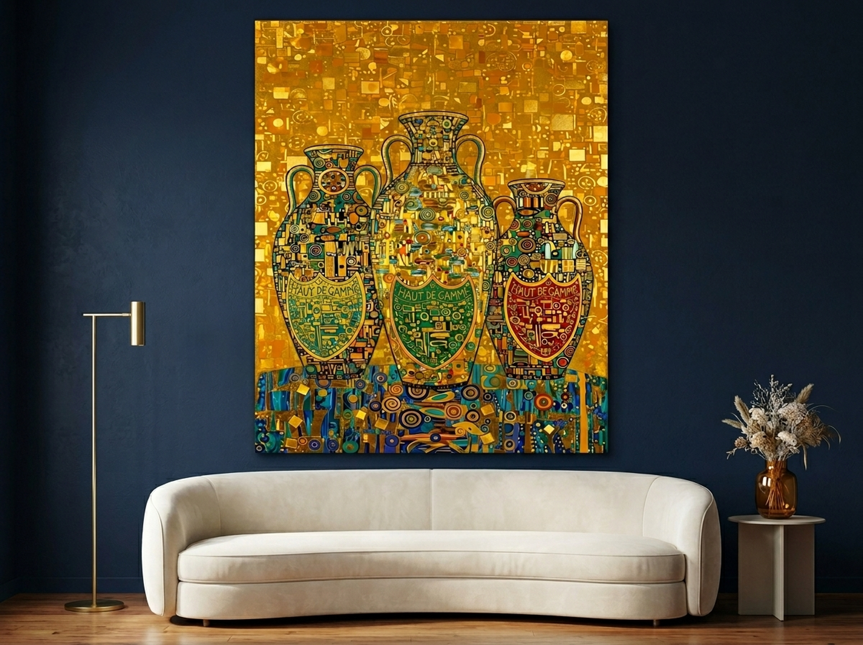
1. Klimt Mosaic Portrait: Gold Jewel Luxury Art
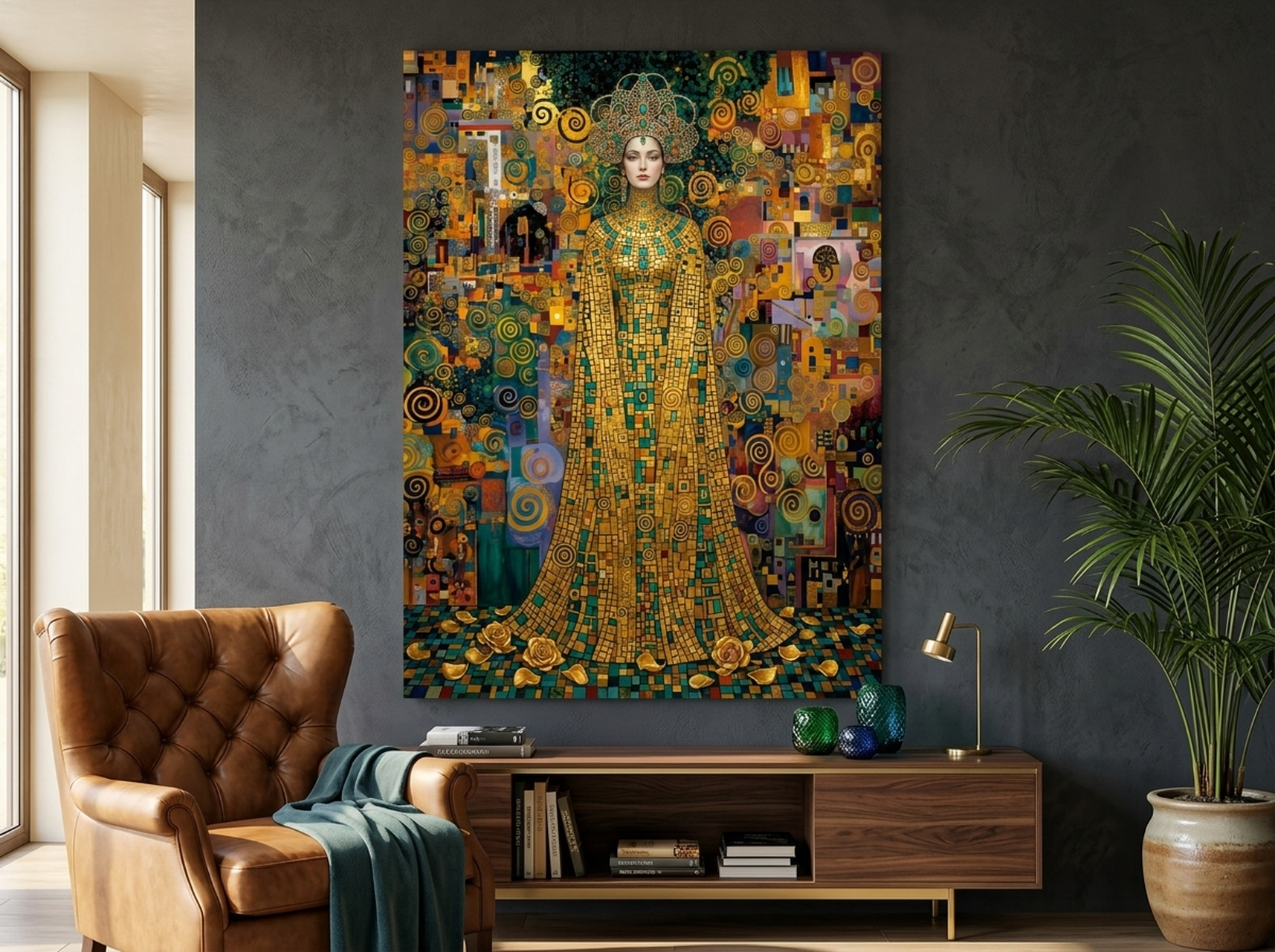
If you want to understand why the baroque revival has captivated the design world, spend a few minutes with this piece. Inspired by Gustav Klimt's legendary mosaic technique, this canvas brings together deep teal, emerald, burgundy, and golden yellow in a shimmering portrait that seems to change with the light. We have placed this in a dozen different room contexts and it commands attention every single time. In dining rooms with dark paint (try a deep navy or charcoal), it reads as incredibly sophisticated. On a white or cream wall it becomes a full-color celebration. At a scale of 60 x 80 cm (24 x 32 inches), it works as a statement focal point on its own. At 40 x 50 cm (16 x 20 inches), it pairs beautifully with two flanking smaller pieces for a curated gallery arrangement.
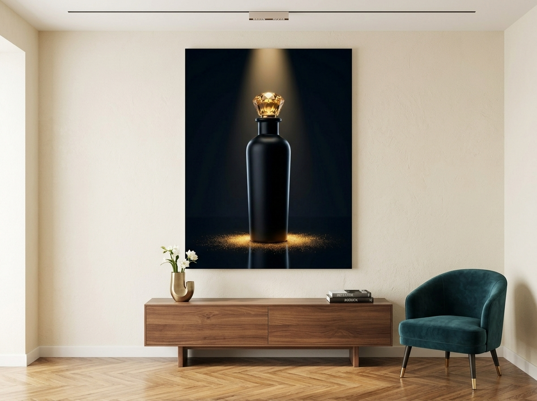
Shop This Piece2. Perfume Bottle: Luxury Black Gold Dark Glamour
This is the piece for anyone who wants baroque drama without baroque clutter. A singular luxury perfume bottle rendered in black and gold against a deep atmospheric background, it captures the essence of what we call "quiet opulence": the kind of rich, restrained beauty that signals taste rather than excess. The black and cream color palette means it transitions seamlessly between rooms and wall colors. We find it works especially well in bedrooms, where its intimate scale and jewel-like quality create a sense of personal sanctuary. It pairs exceptionally with linen bedding in ivory or champagne, and with brushed-gold lighting fixtures. Available at 30 x 40 cm (12 x 16 inches) for compact walls or up to 60 x 80 cm (24 x 32 inches) for a true statement impact.
Shop This Piece3. Gold King Portrait: Editorial Metallic Black Decor
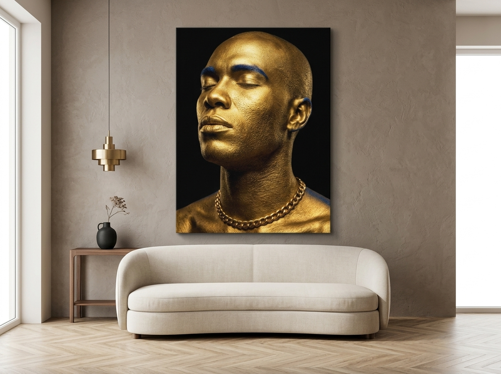
Power, poise, and absolute presence: this editorial portrait channels the baroque tradition of portraiture as authority, where every visual choice communicated status and character. The dominant gold tones read differently in every light, moving from warm amber in morning sun to deep burnished bronze in evening lamplight. In our experience, this piece is transformative in home offices and studies, where the visual language of authority is genuinely useful. It also works brilliantly in entryways: hung at eye level on a dark wall, it greets visitors with an immediate sense that this home has a point of view. The gold, black, and navy palette is remarkably versatile, pairing equally well with warm wood tones and cool-gray contemporary furniture. Scale matters here: the piece rewards generous sizing, with 50 x 70 cm (20 x 28 inches) being our recommended minimum for real impact.
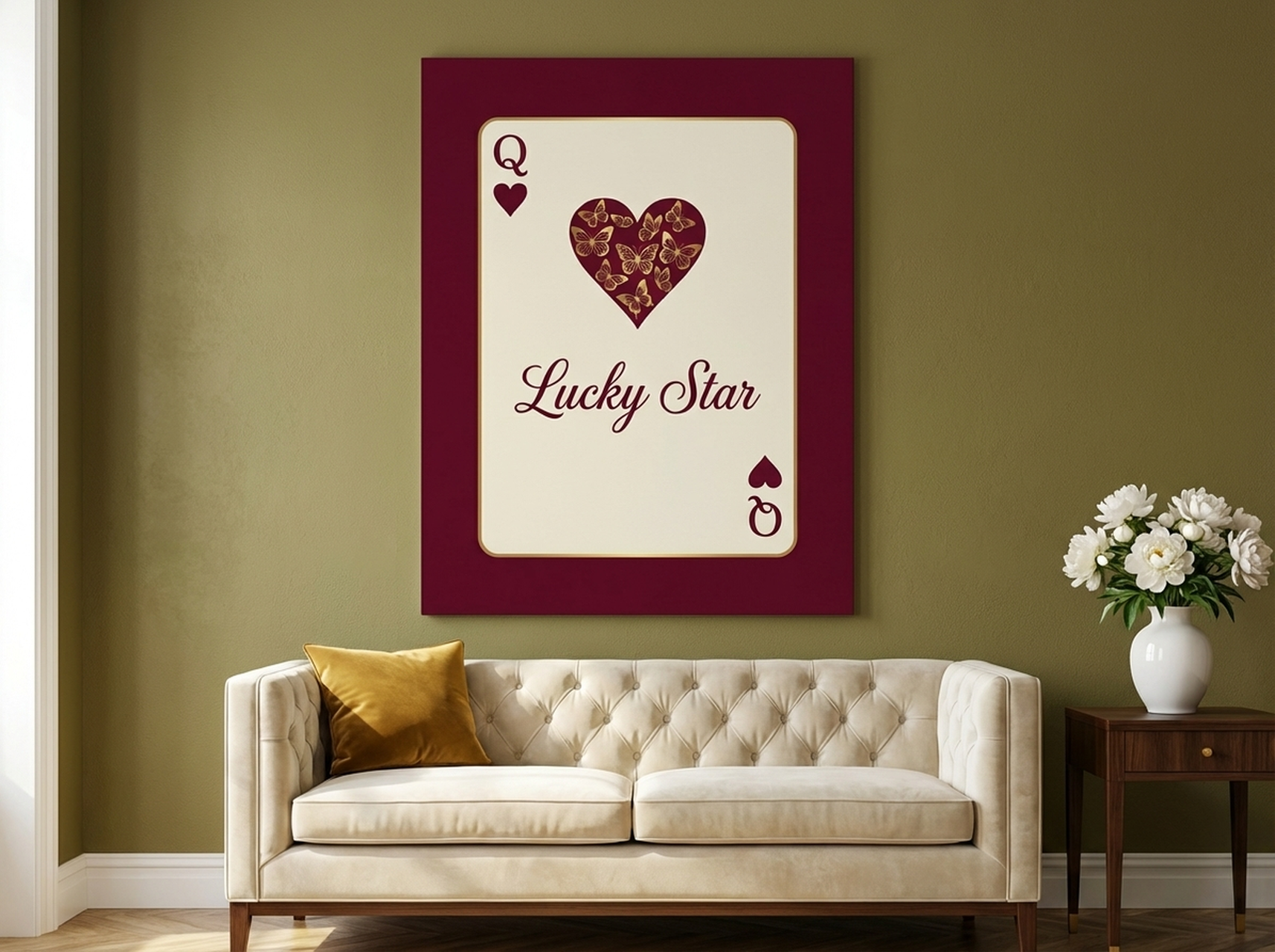
Shop This Piece4. Coquette Butterfly: Burgundy Gold Feminine Baroque
The baroque tradition was not only about grand religious and royal subjects: it also encompassed still-life compositions of extraordinary delicacy, butterfly studies, playing cards, flowers, and objects of beauty rendered with meticulous attention to surface and light. This piece brings that tradition into the contemporary feminine aesthetic, combining burgundy, cream, and gold in a composition that feels both whimsical and genuinely opulent. The coquette aesthetic that has dominated social media and interior design over the past two years has strong baroque roots, and this is one of the pieces we recommend most often to customers who describe their style as "romantic maximalist." It is particularly at home in bedrooms and dressing rooms, where its intimate jewel-like quality rewards close viewing and creates a deeply personal atmosphere.
Shop This Piece5. Geometric Texture Panels: Walnut Gold Abstract Modern Baroque
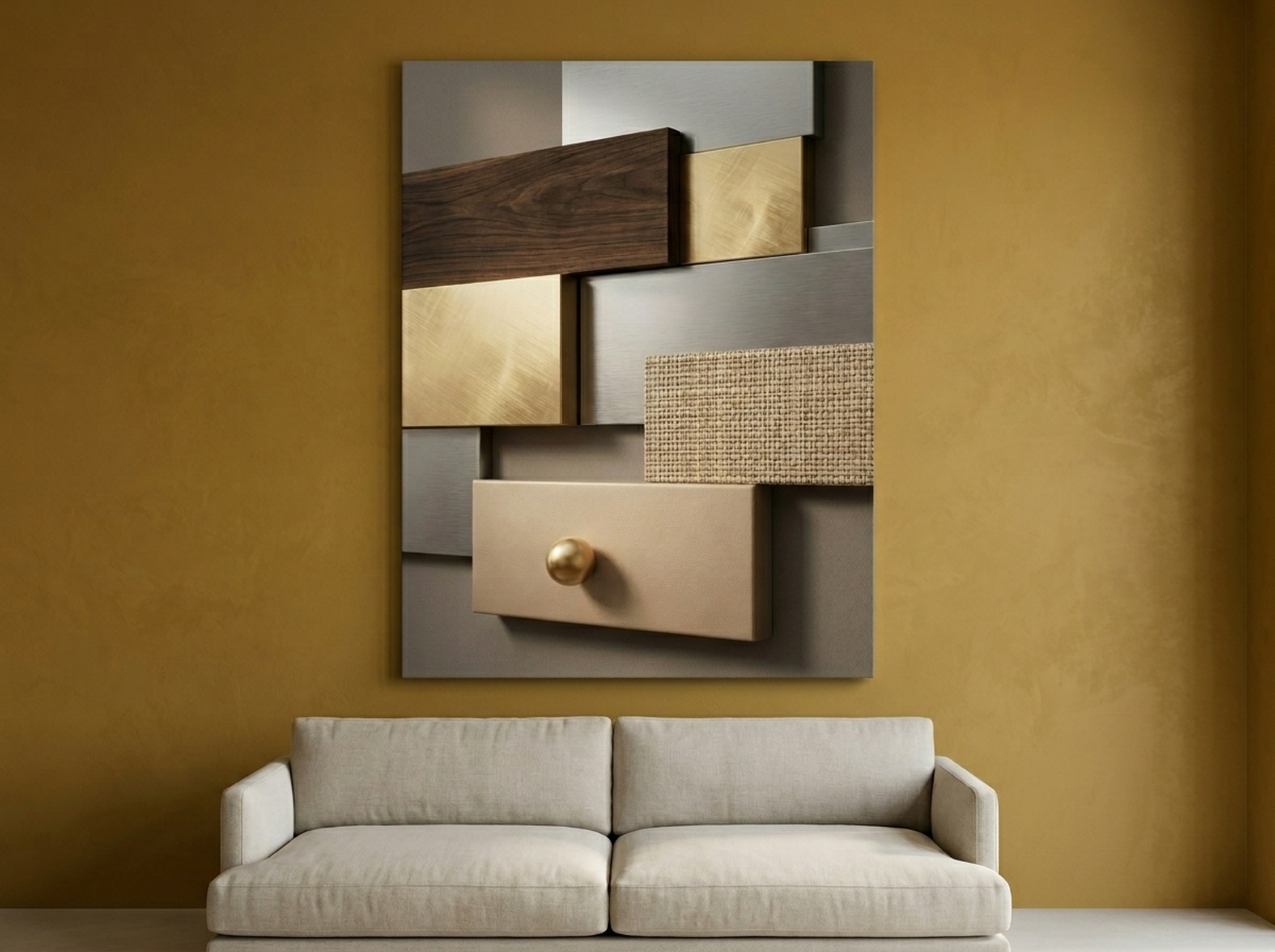
Not every baroque-inspired piece needs a figurative subject. The geometric texture tradition within baroque and Art Deco design shares the same commitment to surface richness, material depth, and visual layering that defines the whole movement. This walnut and gold abstract panel series translates that tradition into a format that works comfortably in contemporary and transitional interiors. The warm brown and gold tones echo natural materials (wood, leather, aged brass) with remarkable ease. We have installed this in hallways, above dining sideboards, and as flanking panels on either side of a bedroom headboard, and it performs well in all three contexts. At 50 x 70 cm (20 x 28 inches) per panel, two pieces placed 5 to 8 cm (2 to 3 inches) apart create a sophisticated diptych effect that reads as a single cohesive statement.
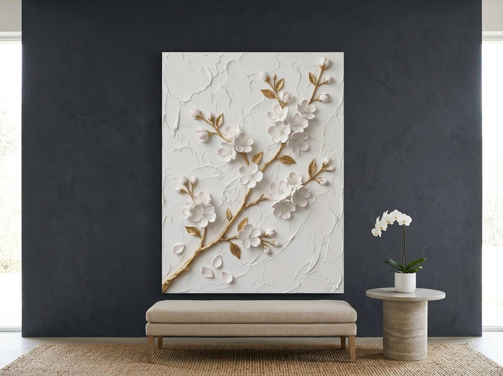
Shop This Piece6. Cherry Blossom Sculptural Relief: White Gold Luxury Floral
The baroque love of sculptural relief, of art that projects from its surface and catches light at multiple angles, reaches its contemporary expression in this extraordinary cherry blossom piece. The white and cream tones with gold accents give it a rare quality: it reads as opulent without being dark or heavy, making it one of the few truly baroque-influenced pieces that works equally well in light airy rooms and dramatic dark interiors. In our experience, this is the most universally flattering baroque-adjacent piece we carry. It functions as a feminine focal point in bedrooms, as an unexpected luxury moment in all-white bathrooms, and as the "light note" in a gallery wall that also features darker more dramatic pieces. The sculptural quality means the image changes throughout the day as natural light moves across its surface, giving you effectively a different artwork at different hours.
Shop This PiecePlacement Guide with Measurements
Correct placement transforms a great piece into a defining room moment. Poor placement can make even the most stunning baroque artwork feel like an afterthought. Here are the precise measurements and principles we use when placing ornate and gold accent wall art.
Standard Hanging Height
Hang the visual center of your piece at 145 to 152 cm (57 to 60 inches) from the floor. This corresponds to average eye level and is the standard used by professional galleries worldwide. For very large canvases (above 80 cm / 32 inches tall), this measurement applies to the center of the canvas, not the top edge. If you are placing art above furniture, ensure the bottom edge of the canvas is 15 to 25 cm (6 to 10 inches) above the furniture's top surface.
Sizing for the Wall
For a single statement piece on a large wall (above a sofa, above a fireplace), the artwork should occupy between 55% and 65% of the available horizontal wall space. For a wall 240 cm (94 inches) wide, that means a canvas between 132 and 156 cm (52 to 61 inches) wide, or a grouping of smaller pieces that together reach that proportion. Baroque art benefits from scale: these are compositions designed to make an impression, and undersizing them is the most common mistake we see. A piece that looks "almost right" at 40 x 50 cm (16 x 20 inches) will look genuinely commanding at 60 x 80 cm (24 x 32 inches).
Gallery Walls with Baroque Pieces
When incorporating baroque art into a gallery wall, treat the baroque piece as the anchor: place it first, at eye level and roughly centered on the wall, then build outward. Leave 5 to 8 cm (2 to 3 inches) between frames. Pair baroque pieces with simpler, quieter works that give the eye somewhere to rest: a small botanical study, a typographic print, or a black-and-white photograph. Avoid mixing multiple heavily ornate pieces at the same scale, as they will compete rather than converse. For complete gallery wall guidance, see our gallery wall layout ideas and rules.
Room-Specific Guidance
- Dining Room: 60 x 80 cm (24 x 32 inches) minimum above a sideboard. Gold baroque art is especially effective here, as warm tones amplify dining-room candlelight and create a sense of occasion.
- Bedroom: For above-bed placement, the artwork width should be 50% to 75% of the headboard width. A queen headboard at 150 cm (59 inches) pairs well with a canvas 75 to 112 cm (30 to 44 inches) wide.
- Entryway/Hallway: In narrow spaces, a single tall piece (portrait orientation, at least 60 cm / 24 inches high) placed at exact eye level creates the immediate impression you want. Dark baroque art works brilliantly here because the drama reads in a single glance.
- Living Room Above Sofa: Leave a minimum of 15 cm (6 inches) between the sofa's back cushions and the bottom edge of the frame. For sofas 200 cm (79 inches) wide, a single canvas 110 to 130 cm (43 to 51 inches) wide or a diptych at those combined dimensions is ideal.
5 Common Mistakes to Avoid with Baroque Wall Art
- Hanging too small. Baroque art is inherently theatrical: it needs scale to deliver its emotional impact. A 20 x 25 cm (8 x 10 inch) baroque piece on a large wall will look lost and inconsequential. Default to one size larger than you think you need. In our experience, customers who size up are never disappointed, while those who size down often return for a larger version within months.
- Placing too high. This is the single most common hanging mistake in residential spaces. Art hung at crown-molding level feels disconnected from the room and from the viewer. Bring it down to the 145 to 152 cm (57 to 60 inch) center-height rule, and the entire room will feel more cohesive and intentional.
- Overcrowding with other ornate elements. Baroque art needs visual breathing room. If you have an ornately patterned rug, heavily textured wallpaper, and a baroque canvas all competing for attention simultaneously, nothing wins. Give the art at least one plain neutral surface to rest against.
- Ignoring lighting. Gold accents and dark baroque compositions respond dramatically to directional light. A clip-on picture light or a strategically placed floor lamp aimed at the canvas can triple its visual impact. Without intentional lighting, a stunning piece can read as flat and lifeless in evening conditions.
- Mixing too many metallic finishes in the room. If your baroque piece features warm gold tones, ensure any hardware, lighting, or frame accents in the room also lean warm (brushed brass, antique gold, warm bronze) rather than cool (silver, chrome, brushed nickel). Mixed metallic temperatures create visual noise that undermines the baroque effect. A coordinated metallic palette, even using just one or two finishes, makes the whole room feel considered and intentional.
Frequently Asked Questions
What exactly is baroque wall art?
Baroque wall art refers to prints and canvases inspired by the Baroque art movement of 17th and 18th century Europe, characterized by dramatic lighting, rich colors (particularly deep reds, golds, and blacks), ornate detail, and emotional intensity. Today, the term also encompasses Art Nouveau-influenced pieces (like those inspired by Klimt), dark glamour compositions, and any wall art that prioritizes richness, depth, and opulent visual texture over minimalist simplicity.
Does baroque wall art work in modern homes?
Yes, emphatically. The key is using baroque art as a focal accent rather than trying to recreate an entire historic interior. One or two well-chosen baroque pieces in a contemporary room create compelling contrast. Interior designers consistently recommend pairing ornate high-drama art with clean architectural backgrounds and contemporary furniture for a result they describe as "Modern Baroque."
What room is baroque wall art best suited for?
All rooms can benefit from baroque art, but dining rooms and bedrooms tend to show the most dramatic transformation. Dining rooms benefit from gold baroque's warm celebratory quality that amplifies candlelight. Bedrooms benefit from the sanctuary feeling that opulent rich-toned art creates. Living rooms and home offices can be elevated with dark baroque compositions that add gravitas and depth.
How do I mix baroque wall art with modern furniture?
Find at least one shared color element between your furniture and the art. If your sofa is a warm camel tone, choose a baroque piece with warm gold or tan accents. Treat the baroque canvas as your room's focal anchor, and let it inform your accent color choices in textiles and accessories going forward. The pairing works best when the surrounding room is relatively restrained, giving the baroque piece room to breathe and command attention.
What size baroque canvas should I choose for my living room?
For above a standard sofa (180 to 220 cm / 71 to 87 inches wide), aim for a single canvas 90 to 130 cm (35 to 51 inches) wide, or a diptych that reaches similar combined dimensions. The artwork's width should represent roughly 55% to 65% of the sofa's width. For large open walls, do not hesitate to go larger: baroque art was designed for grand spaces and scales up with extraordinary grace.
Can I use baroque wall art in a small room or apartment?
Absolutely. In small spaces, a single well-chosen baroque piece has an outsized effect because there are fewer elements competing for attention. Choose portrait-orientation canvases for narrow walls and hallways. Keep surrounding decor minimal. One baroque statement in a small room will feel intentional and confident rather than overwhelming, especially if you keep the art at proper eye level and ensure the rest of the wall is clean and uncluttered.
Quick Reference Table
| Product | Best For | Dominant Colors | Link |
|---|---|---|---|
| Klimt Mosaic Portrait | Dining room, bedroom, entryway | Gold, teal, emerald, burgundy | Shop Now |
| Perfume Bottle Black Gold | Bedroom, dressing room, office | Black, gold, cream, navy | Shop Now |
| Gold King Portrait | Home office, entryway, living room | Gold, black, navy, white | Shop Now |
| Coquette Butterfly Burgundy Gold | Bedroom, dressing room, feminine space | Burgundy, gold, cream, tan | Shop Now |
| Geometric Texture Panels Walnut Gold | Hallway, living room, dining room | Brown, gold, silver, cream, tan | Shop Now |
| Cherry Blossom Sculptural Relief | Bedroom, bathroom, gallery wall | White, cream, gold, beige | Shop Now |
Baroque wall art is not a decorating trend in the trend-cycle sense. It is a return to a fundamental human desire: spaces that feel rich, meaningful, and alive. Whether you are drawn to the golden mosaic tradition of Klimt, the editorial black-and-gold glamour of contemporary dark luxury design, or the delicate ornate quality of sculptural relief florals, there is a baroque piece that belongs in your home right now.
We have seen firsthand how a single well-chosen piece transforms not just a wall, but the entire emotional register of a room. Your walls are the largest canvases in your home, and they deserve art that tells a story.
Browse our full baroque and gold accent wall art collection and find the piece that makes your space feel like the home you have always imagined.
For more inspiration on creating luxurious spaces, explore our guides on luxury wall art that makes a room look expensive, jewel tone wall art for rich dramatic decor, and dark academia wall art decor ideas.