Art Deco Wall Art for Living Room: Glamour Returns
The Heva Team
Art Curators & Interior Design Enthusiasts · April 1, 2026 · 18 min read
Art Deco wall art is making its biggest comeback in decades. Gold geometry, bold symmetry and jewel-toned contrast are reshaping living rooms, bedrooms and entryways in 2026.
Art Deco wall art is having its most significant revival in a generation. Searches for Art Deco interiors on Houzz rose 22% in the first three quarters of 2025, and the centenary of the 1925 Paris Exposition has pushed the style back into every major design conversation. Gold geometry, bold symmetry and jewel-toned contrast are not nostalgic curiosities. They are the defining visual language of 2026 interiors.
If you have been watching your feed fill with fluted brass, sunburst mirrors and deep emerald walls, you are seeing the same shift. Art Deco wall art sits at the centre of it. A single well-chosen geometric print can anchor an entire room in the way that a gallery wall of soft abstracts simply cannot.
Ready to browse? Shop the full geometric art collection or keep reading for room-by-room placement advice, the six Art Deco prints we recommend most in 2026, and the five decorating mistakes that undermine even the best pieces.
Art Deco Origins: From 1920s Paris to 2026
The movement started not with a manifesto but with a trade fair. On 29 April 1925, the Exposition Internationale des Arts Décoratifs et Industriels Modernes opened along the banks of the Seine in Paris. Over six months, more than 16 million visitors from 20 countries moved through pavilions displaying architecture, jewellery, furniture and graphic work that shared a single ambition: to make modernity look magnificent. The name Art Deco did not even exist at the time. Historians coined it decades later, compressing the Exposition's full title into two words.
What those visitors saw was a decisive break from Art Nouveau's organic curves. The new style was geometric, symmetrical and unapologetically luxurious. It borrowed the bold colour blocking of African textiles, the stepped forms of Aztec temples, the angular precision of Cubism and the sleek optimism of the machine age. The result was a visual language that felt both ancient and radically new at the same time.
The centenary of that exhibition, marked throughout 2025 at institutions including the Musée des Arts Décoratifs in Paris, has reignited serious interest in the style. But the 2026 version is not a museum-piece recreation. Designers are taking the geometric vocabulary and restating it with warmer materials, softer edges and contemporary colour combinations. The sunburst is still there. The velvet is still there. But the room breathes differently now.
For wall art specifically, this means prints that carry the structural confidence of 1920s design without the rigidity. Bold silhouettes. Gold that glows rather than shouts. Geometric framing that organises a room rather than dominating it. In our experience, pieces that blend geometric structure with a strong figurative element, a woman, an animal, a botanical form, land the best in modern interiors because they give the eye somewhere to settle within the pattern.
Art Deco Colour Palette: Gold, Black and Emerald
The classic Art Deco palette is a study in contrast. Black creates the architectural spine. Gold provides warmth and luminosity. Deep jewel tones, emerald green, midnight blue, burgundy red, supply richness without sweetness. This combination works because each colour performs a specific psychological function rather than simply looking attractive together.
Gold is the engine of the palette. Research from colour psychology confirms that gold triggers associations with achievement, authority and warmth simultaneously, a combination that most colours cannot achieve. In interior design, the critical distinction is between gold used as a field colour and gold used as an accent. As a field, gold quickly becomes oppressive. As an accent against black or deep green, it reads as refined rather than excessive. A canvas with gold line work on a black ground demonstrates this principle precisely: the eye is drawn to the luminous detail, and the contrast gives the composition genuine weight.
Black in Art Deco interiors is not the same as black in a dark academia scheme. Art Deco black is structural. It is the ground that makes gold pop, the frame that sharpens geometric forms and the signal that the room is serious about its aesthetic. Pair it with brass hardware, lacquered surfaces and a single jewel-toned textile and the effect reads as deliberate rather than gloomy.
Emerald green entered the Art Deco palette through the influence of ancient Egyptian motifs, particularly after the discovery of Tutankhamun's tomb in 1922. Three years later, those motifs were everywhere at the Paris Exposition. Today, emerald and forest green remain the most versatile alternatives to black within the palette. They provide depth without the full commitment of black, and they work in rooms that receive natural light where pure black walls would flatten the space entirely.
For a 2026 update on the classic palette, consider terracotta as a fourth element. Warm amber-orange complements the cool geometry of gold and black the same way it does in traditional Moroccan tilework, another of Art Deco's historical reference points. The combination of black, gold, emerald and terracotta gives you the full visual weight of Art Deco without the period-room feeling that comes from strict historical faithfulness. You can explore the full colour logic in our wall art colour guide.
Art Deco in Every Room: Living Room, Bedroom and Entryway
Art Deco wall art is more room-specific than most styles. The scale, framing and colour balance that works in a living room will read as too formal in a bedroom and too grand for an entryway. Getting placement right matters as much as getting the right piece.
Living Room
The living room is the natural home for Art Deco's most ambitious pieces. A canvas that runs 90 to 120 cm wide (35 to 47 inches) works above a sofa, centred horizontally and hung so that the bottom edge sits 20 to 25 cm (8 to 10 inches) above the cushion line. This keeps the piece visually anchored to the furniture rather than floating on the wall. For rooms with ceilings above 270 cm (106 inches), you can scale up to 150 cm (59 inches) wide without losing proportion.
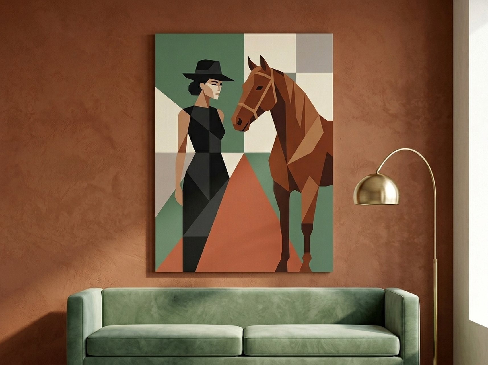
Art Deco wall art in living rooms works best when it functions as the room's single dominant colour statement. If your sofa is neutral, one geometric print in black and gold gives you everything you need. Resist the urge to add more bold pieces around it. Art Deco is about confident restraint, not maximalist accumulation. The Woman and Horse Geometric Print in sage and terracotta is a strong example: the figurative subject anchors the eye while the geometric framing does the structural work. See our broader guide on how luxury wall art changes the feel of a home for the underlying principle.
Bedroom
The bedroom calls for Art Deco's softer registers. Geometric structure is still present, but the colour temperature should shift warmer. Gold with champagne, deep blue with soft ivory or terracotta with blush all carry the Art Deco vocabulary without the full formality of black and gold. Hang above the bed headboard with the bottom edge 15 to 20 cm (6 to 8 inches) above the headboard's top edge. For a king-size bed measuring 193 cm (76 inches) wide, aim for a canvas between 120 and 150 cm (47 to 59 inches) wide so it fills roughly two-thirds of the wall space above the headboard without overshooting the mattress edges. Our bedroom wall art guide covers this in more detail.
Entryway
Entryways reward bold, vertical compositions. A narrow canvas 40 to 60 cm wide (16 to 24 inches) and 80 to 100 cm tall (31 to 39 inches) fills a typical entry wall without overwhelming the space. Gold and black combinations work particularly well here because they make a strong first impression while remaining versatile enough to carry through into adjacent rooms. Hang at true eye level: the centre of the canvas at 145 to 150 cm (57 to 59 inches) from the floor. This applies whether you hang a single piece or a vertical pair.
Our 2026 Art Deco Wall Art Picks
We selected these six pieces because each one captures a distinct register of the Art Deco vocabulary while working in contemporary interiors. None of them require you to redecorate around them. They are Art Deco in structure and spirit, livable in practice.
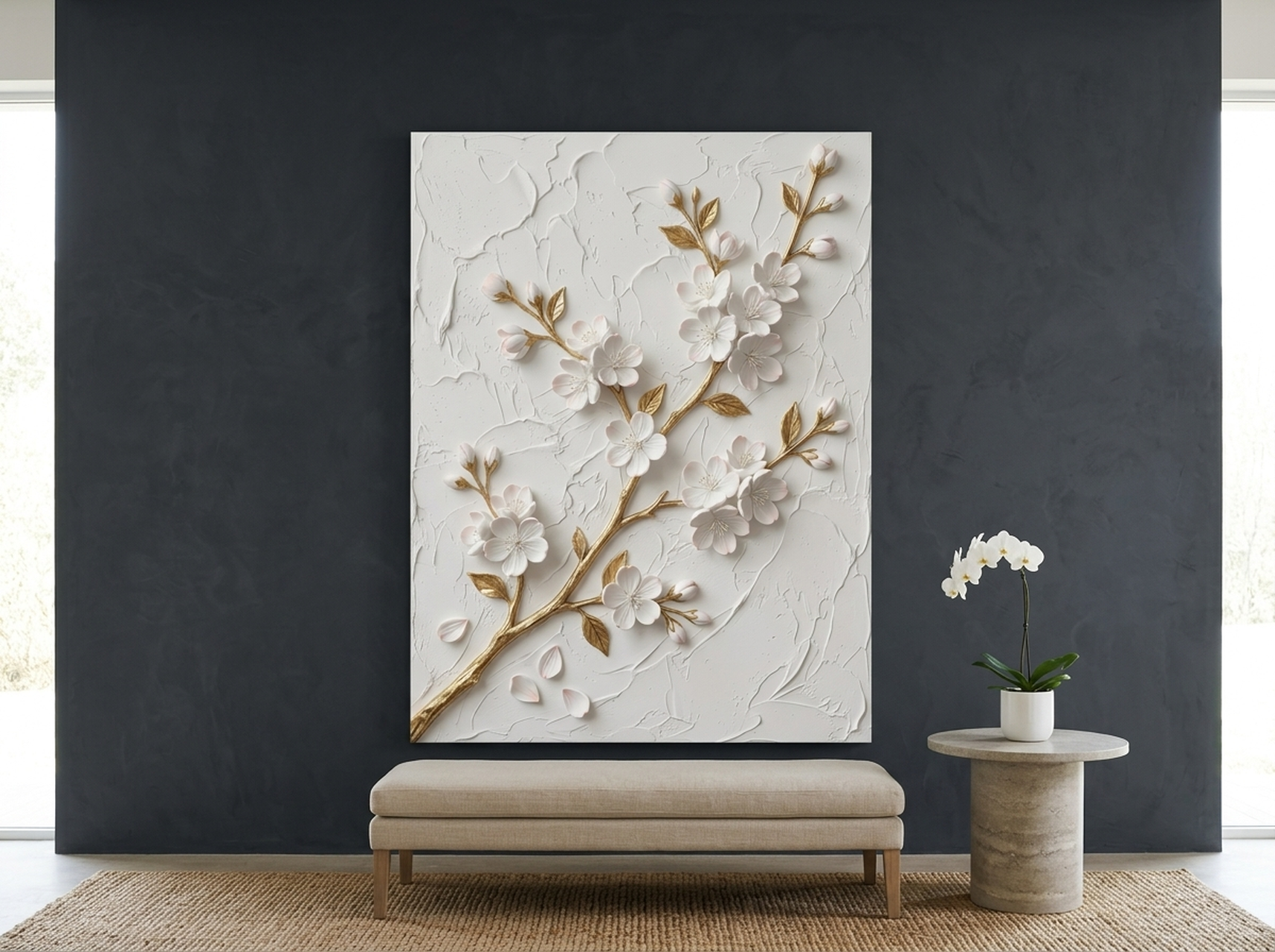
1. Cherry Blossom Sculptural Relief Print
The Cherry Blossom Sculptural Relief Canvas translates Art Deco's fascination with natural motifs rendered in geometric form into a print that feels both timeless and 2026-current. The white and gold palette is the softest entry point into the Art Deco canon, making it suitable for rooms that already carry warm neutrals or cream tones. The sculptural quality of the design, high contrast between the raised-effect branches and the flat ground, gives it the visual weight of a much larger piece even at modest sizes. It is our first recommendation for bedrooms and light-filled living rooms where the full black and gold treatment would overwhelm the natural light.
View the Cherry Blossom Relief Canvas
2. Leopard Print Terracotta Luxury Canvas
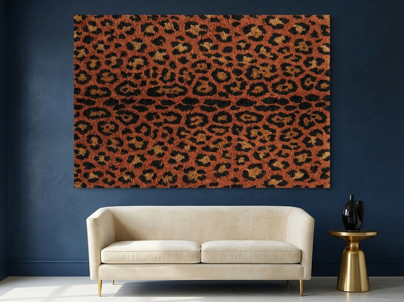
Animal print has been part of the Art Deco visual language since the 1920s, when designers drew on African and exotic motifs to signal worldliness and confidence. The Leopard Print Terracotta Canvas updates this tradition with a warm terracotta ground that makes the piece genuinely versatile for 2026 interiors, where earthy tones have replaced the black-dominated grounds of earlier Art Deco revivals. The strong graphic quality of the leopard mark creates the bold symmetry that Art Deco demands without requiring a formal geometric motif. In our experience, this piece converts well in bedrooms that already have warm textiles, brass hardware or rattan furniture because it ties those elements together under a single visual idea.
View the Leopard Terracotta Canvas
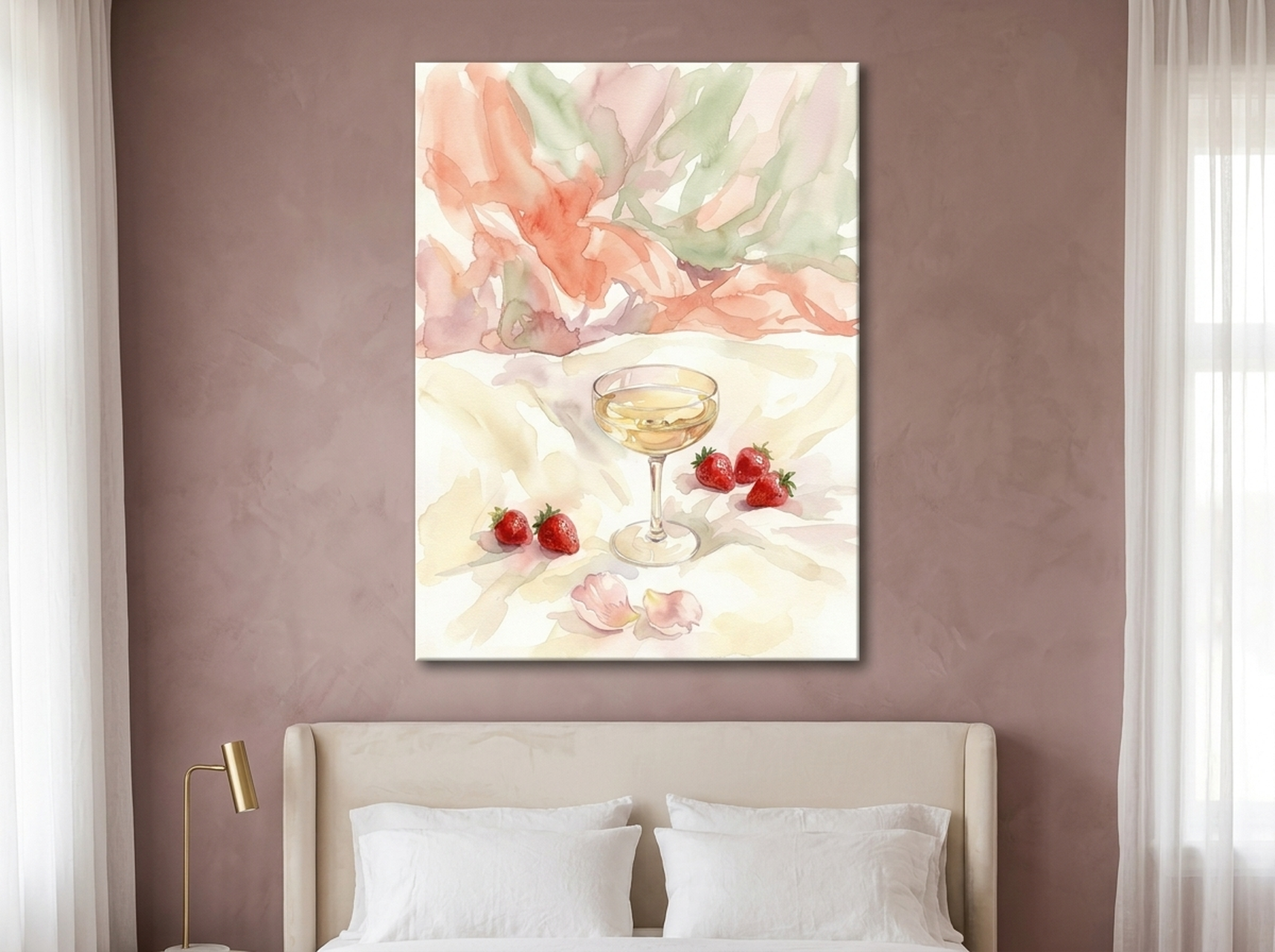
3. Champagne Strawberry Watercolour Romantic Print
The Champagne Strawberry Canvas represents the softer, more romantic strand of Art Deco that ran parallel to the movement's harder geometric work. Designers in the 1920s did not all work in steel and marble. Many worked in silk, watercolour and pastel, applying the same compositional rigour to delicate subjects. The champagne and blush palette here sits perfectly against ivory walls or grey-toned linens, and the botanical subject matter reads as both Art Deco and contemporary at once. For bedrooms where the mood should lean warm rather than bold, this is the piece to reach for first. It also pairs well with the dark-ground prints in this list as a bedroom diptych, one on each side of the headboard, where the contrast between light and dark creates its own geometric drama.
View the Champagne Strawberry Canvas
4. Disco Ball Forest Green Dark Moody Canvas
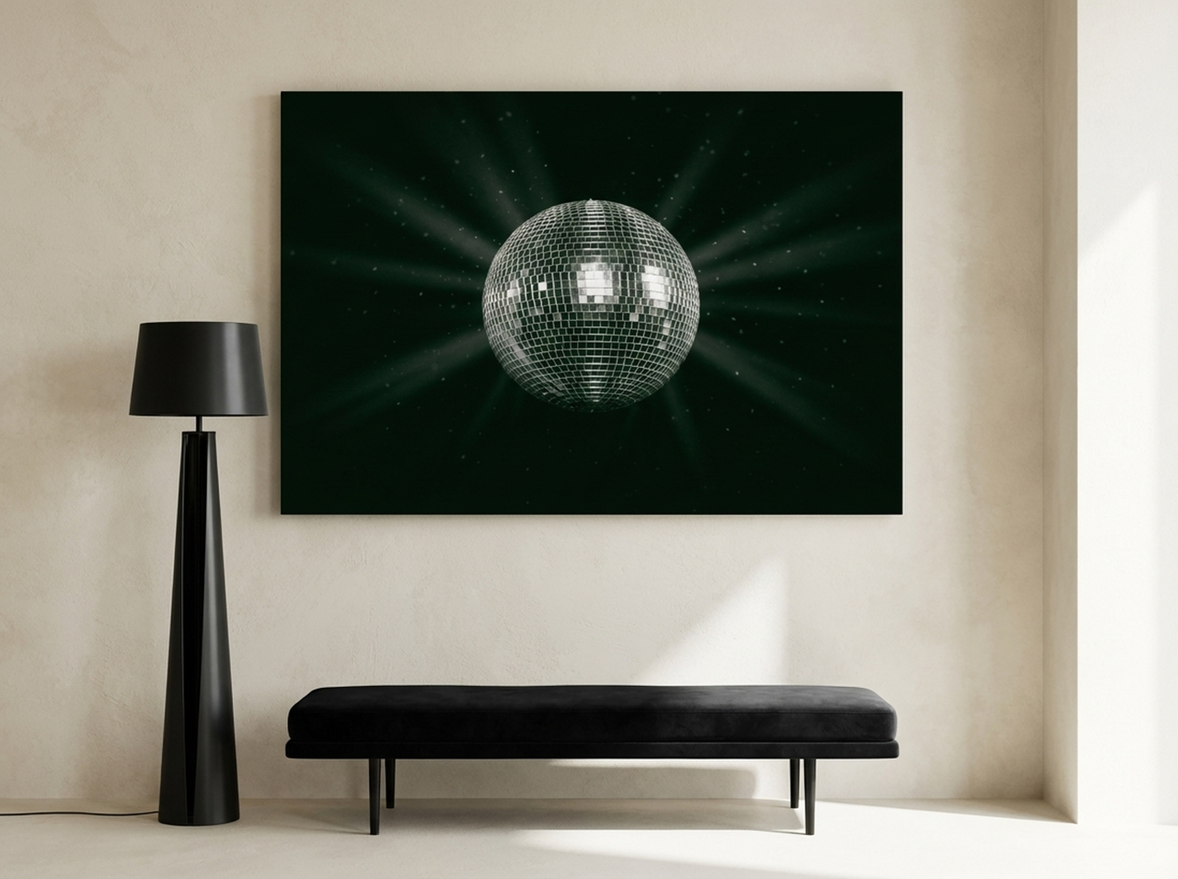
Forest green and silver is one of the most compelling 2026 updates to the classic Art Deco palette. The Disco Ball Forest Green Canvas channels the Art Deco love of reflective surfaces and geometric repetition into a contemporary image that feels current without being trendy. The deep green ground gives it the jewel-tone intensity that Art Deco demands. The silver geometry provides the luminosity that gold provides in the classic palette but with a cooler, more contemporary tone. This piece works particularly well in living rooms with dark-painted walls, concrete floors or rooms where the owner has already committed to a moody, low-light aesthetic. For more on this direction, see our dark academia wall art guide.
View the Disco Ball Forest Green Canvas
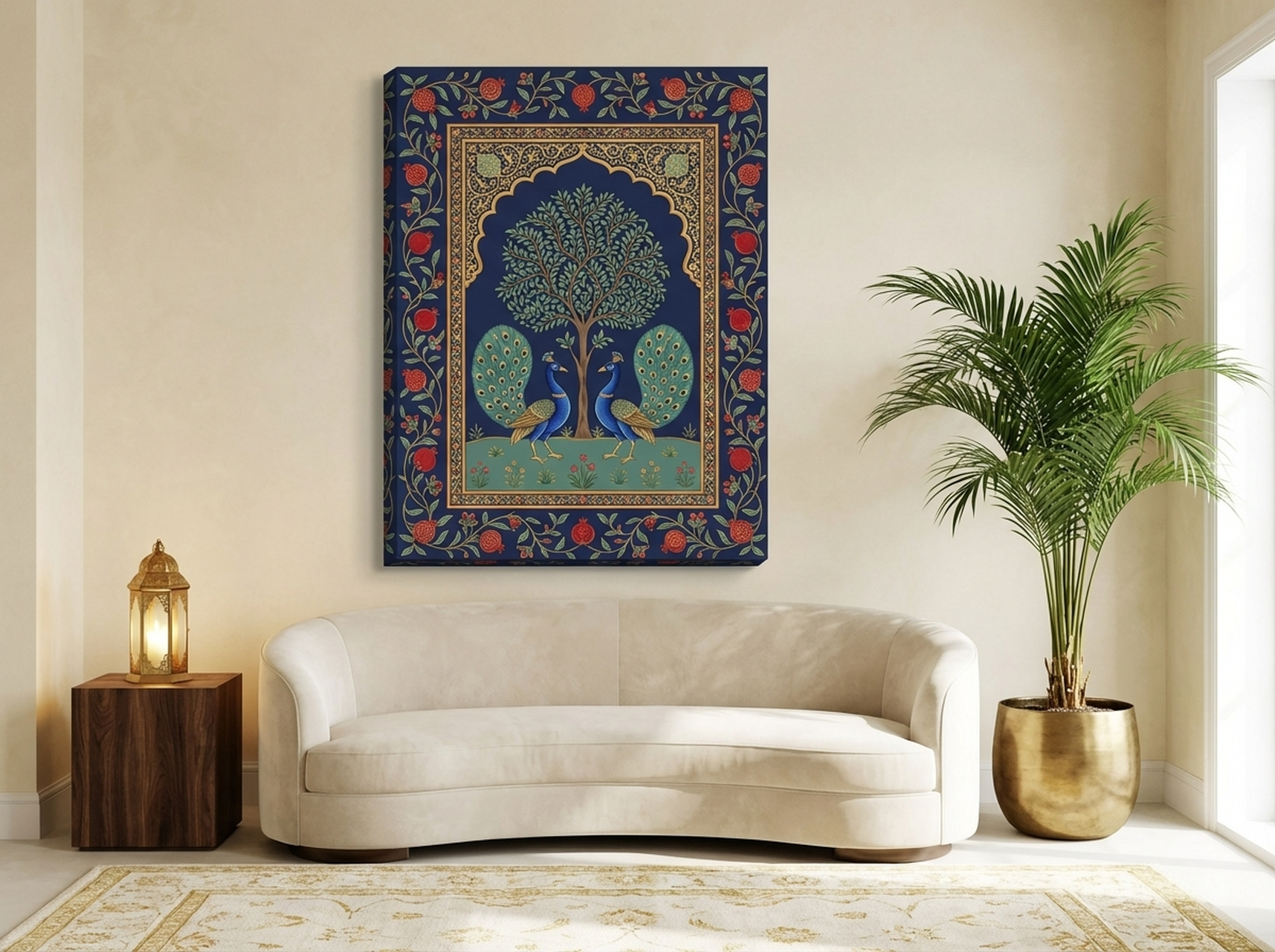
5. Mughal Peacock Royal Blue Indian Art Print
Art Deco drew heavily from non-Western sources, Indian, Egyptian, Aztec and Japanese motifs all fed into the movement's visual language at the 1925 Exposition. The Mughal Peacock Canvas sits directly in this tradition. The Pichwai format with its radial symmetry, the deep royal blue ground and the intricate Tree of Life structure all carry the same architectural confidence that made Art Deco so compelling in the first place. What makes this piece significant for 2026 is that the current interest in roots-and-origins aesthetics has created a market for precisely this kind of globally informed decorative work. It reads as Art Deco to a Western eye and as traditional Pichwai to a South Asian eye, which means it works across a wider range of home contexts than a straightforwardly geometric print would. Browse more work in this tradition in our Roots and Origins collection.
View the Mughal Peacock Canvas
6. Woman Peony Fashion Editorial Canvas
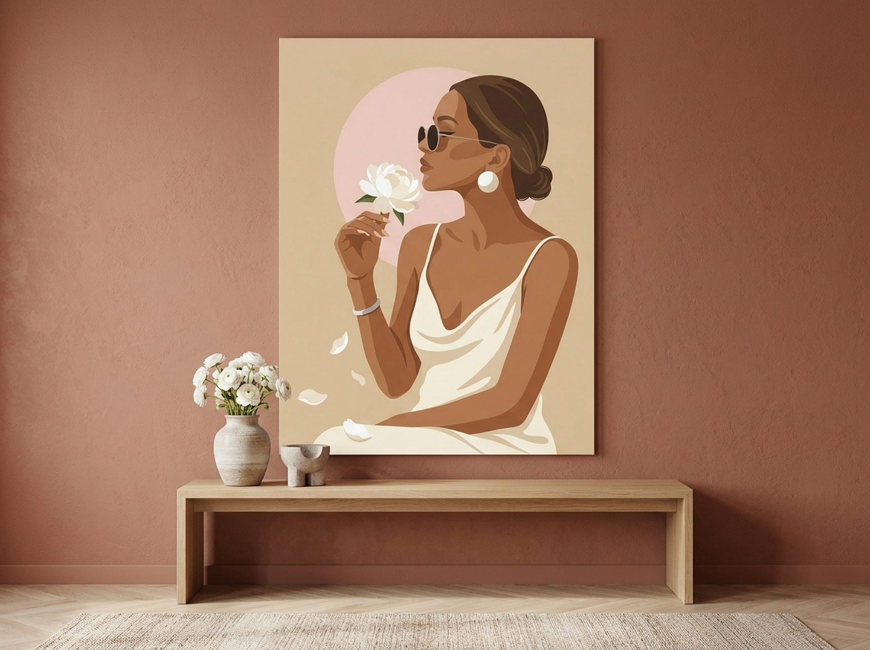
The Woman Peony Canvas works through the same visual logic as the iconic Art Deco poster tradition: a bold, flat silhouette of a fashionable figure against a structured botanical background. The champagne palette places it firmly in the softer, more livable register of contemporary Art Deco. It carries the movement's signature combination of feminine elegance and geometric discipline without the severity that can make harder-edged Art Deco pieces feel cold. For bedrooms built around quiet luxury, it is the single most versatile piece in this selection. It sits well against cream, warm white, blush or pale sage walls. Our quiet luxury wall art guide explains the broader aesthetic context.
Placement Guide for Art Deco Statement Pieces
Art Deco wall art requires more precise placement than abstract or organic work because its geometric structure creates strong visual lines that interact with the room's architecture. Hanging a geometric print even 5 cm (2 inches) off-centre is more noticeable than the same error with a fluid abstract piece.
The Centre-of-Artwork Rule
Hang all statement pieces so the centre of the canvas sits at 145 to 150 cm (57 to 59 inches) from the floor. This places it at the average eye level of a standing adult and ensures the piece reads at full impact when you enter the room. The single most common placement error in Art Deco interiors is hanging pieces too high, which severs the visual connection between the art and the furniture below it.
The Two-Thirds Rule for Sofas and Headboards
When hanging above a sofa or bed, the canvas should span no more than two-thirds of the furniture's width. For a three-seat sofa measuring 220 cm (87 inches) wide, that means a canvas up to 147 cm (58 inches) wide. Going wider makes the art look cramped against the furniture. Going narrower than half the furniture width makes it look like an afterthought. The sweet spot is 55 to 65% of the furniture width.
Entryway and Corridor Placement
Narrow entryways suit vertical compositions strongly. A single canvas 40 to 50 cm wide (16 to 20 inches) and 80 to 100 cm tall (31 to 39 inches) creates impact without competing with doors, switches and coat hooks. In corridors, a series of same-size prints spaced evenly at 10 to 15 cm (4 to 6 inches) apart creates a gallery effect. The geometric regularity of Art Deco prints makes them ideal for this treatment because the repetition reinforces rather than fights the rhythm of the architectural space. For the perfume bottle canvas shown at the top of this article, the tall vertical format makes it a natural corridor piece as well as a strong focal point above a console table.
View the Perfume Bottle Black Gold Canvas
Framing Considerations
Art Deco prints are one of the few styles where a frame can significantly enhance the piece. A slim brass or gold-leaf frame on a black-ground geometric print reinforces the palette without interfering with the composition. For lighter pieces, a warm walnut or white frame keeps the period character without the full formality of gold. Avoid grey or silver frames on warm-toned Art Deco prints: the cool metal undercuts the warmth of the gold and terracotta tones. For canvas prints, a gallery-wrap with 3.8 cm (1.5 inch) deep sides is the contemporary standard. The clean edge without a frame works particularly well for Art Deco pieces displayed in minimalist or Scandinavian-influenced rooms where additional ornamentation would clash with the existing aesthetic.
5 Art Deco Decorating Mistakes to Avoid
1. Treating Art Deco as an All-or-Nothing Commitment
The most paralysing misconception is that Art Deco requires a full room transformation. It does not. One large-scale geometric print on a neutral wall, paired with existing furniture and one or two metallic accessories, reads clearly as Art Deco. You do not need fluted plasterwork, velvet sofas and a bar cart to make the style work. The art does the heavy lifting when it is strong enough. Start with the wall art and see how much further you want to take it.
2. Scaling Down Too Much
Art Deco is a bold style that requires physical presence on the wall. A canvas smaller than 60 by 60 cm (24 by 24 inches) will look hesitant in most rooms. The geometric structure that gives Art Deco prints their power only reads at scale. In our experience, people who buy an Art Deco print and find it underwhelming have almost always bought the smaller size. For living rooms, 90 cm (35 inches) minimum in the longest dimension. For entryways, 80 cm (31 inches) tall minimum. Go bigger than feels comfortable. The prints justify it.
3. Mixing Too Many Metallic Finishes
Gold, brass, silver, chrome and copper all read as metallic but they do not all read the same. Gold and brass are warm. Silver and chrome are cool. Copper sits in between. Art Deco's palette is built on warm metallics. Introducing silver-toned hardware or chrome fixtures into a room anchored by gold and black art creates a tonal inconsistency that is difficult to diagnose but immediately felt. Commit to one metallic family and apply it to frames, hardware and accessories consistently. The rule of consistent metallics is one of the most reliable tools in luxury interior design.
4. Ignoring Ceiling Height
Art Deco prints with strong vertical elements, arches, columns, tall silhouettes, are calibrated for rooms with ceiling heights of at least 250 cm (98 inches). In a room with standard 240 cm (94 inch) ceilings and a large vertical canvas, the piece can make the room feel lower rather than taller. For lower-ceilinged rooms, choose horizontal or square compositions. The geometry still delivers the Art Deco effect, but without the compression.
5. Hanging Above a Fireplace Without Accounting for the Mantel
Fireplaces are the most common location for large Art Deco statement pieces, and the mantel height changes the placement mathematics. Hang the bottom edge of the canvas 10 to 15 cm (4 to 6 inches) above the mantel surface, not above the fireplace opening. For a mantel at 120 cm (47 inches), a canvas 60 cm (24 inches) tall will have its centre at 150 cm (59 inches), which is exactly right. A canvas 90 cm (35 inches) tall would have its centre at 165 cm (65 inches), which starts to look too high. Measure before you hang.
Frequently Asked Questions
What makes wall art "Art Deco" rather than just geometric?
Art Deco combines geometric structure with luxurious materials and a sense of bold symmetry. Pure geometric art uses shape as the primary subject. Art Deco uses geometry as a framework for something else: a figure, a motif, a natural form rendered in structured lines. The palette is also specific. Art Deco relies on high-contrast combinations, gold and black, emerald and ivory, deep blue and champagne, rather than the monochrome or pastel palettes that define other geometric traditions. The overall effect should feel glamorous and confident, not simply orderly.
What size Art Deco canvas should I hang above a sofa?
Aim for a canvas that spans 55 to 65% of your sofa's width. For a standard three-seat sofa at 220 cm (87 inches) wide, that means a canvas between 120 and 143 cm (47 to 56 inches) wide. Hang it so the bottom edge sits 20 to 25 cm (8 to 10 inches) above the cushion tops, and the centre of the canvas lands at approximately 145 to 150 cm (57 to 59 inches) from the floor.
Can Art Deco wall art work in a modern or minimalist interior?
Yes, and it works particularly well. A single Art Deco geometric print gives a minimalist room the focal point that otherwise requires a large investment in furniture. The key is choosing a piece with a restrained palette, black and white, black and gold, or a single jewel tone against cream, rather than a multi-coloured composition. The geometric structure aligns with the clean lines of minimalist furniture rather than fighting them. One large piece against a white wall in a room with simple wooden furniture is a highly effective combination.
What is Neo Deco and how is it different from classic Art Deco?
Neo Deco takes the geometric framework and symmetrical confidence of 1920s Art Deco and softens it with warmer colours, more tactile materials and slightly less rigid forms. Where classic Art Deco favoured hard-edged geometry and cool lacquered surfaces, Neo Deco incorporates warm terracotta, blush, forest green and amber alongside velvet, warm wood and natural linen. The result carries the same sense of deliberate glamour but feels more livable in contemporary homes. Most Art Deco wall art made for the 2026 market sits closer to Neo Deco than to strict historical Art Deco.
Which rooms suit Art Deco wall art best?
Living rooms and entryways suit Art Deco's boldest and most formal pieces. Bedrooms suit the warmer, softer end of the palette, pieces in champagne, blush, terracotta or dusty blue rather than pure black and gold. Home offices and studies can handle more graphic, architectural pieces because the formal quality of Art Deco supports a working environment. Kitchens and bathrooms are the most challenging spaces, not because Art Deco cannot work there but because the scale of those rooms typically limits you to pieces under 60 cm (24 inches) wide, which is too small for most Art Deco compositions to read at full impact. Browse the hallway and entryway art collection for pieces calibrated to those spaces.
Is Art Deco wall art still fashionable in 2026 or is it a passing trend?
Art Deco has shown more staying power than most design revivals because it is not a single look but a set of principles: geometric structure, bold contrast, luxurious materials and confident symmetry. These principles do not become dated the way a specific colour trend does. The centenary of the 1925 Paris Exposition has brought renewed cultural attention to the style in 2025 and 2026, with major exhibitions at institutions including the Musee des Arts Decoratifs in Paris. The 2026 version, often called Neo Deco, incorporates warmer palettes and more tactile finishes that make it more adaptable to contemporary homes than any previous revival. The evidence suggests this is a lasting shift rather than a seasonal moment. For more on how luxury and restraint coexist in current interior design thinking, see our quiet luxury wall art guide.
Quick Reference: Art Deco Wall Art by Room and Style
| Canvas | Best Room | Palette | Mood | Link |
|---|---|---|---|---|
| Cherry Blossom Relief | Bedroom, living room | White, gold | Soft, sculptural | View |
| Leopard Terracotta | Bedroom, lounge | Terracotta, warm brown | Bold, warm | View |
| Champagne Strawberry | Bedroom | Champagne, blush | Romantic, light | View |
| Disco Ball Forest Green | Living room, study | Forest green, silver | Moody, glamorous | View |
| Mughal Peacock | Living room, entryway | Royal blue, gold | Regal, intricate | View |
| Woman Peony | Bedroom, dressing room | Champagne, ivory | Elegant, editorial | View |
| Perfume Bottle Black Gold | Entryway, bedroom | Black, gold | Dark, luxurious | View |
| Woman and Horse Geometric | Living room, hallway | Sage, terracotta | Structured, earthy | View |
Art Deco wall art is not a trend you adopt and abandon. The geometric vocabulary of the 1925 Paris Exposition has outlasted every decorating movement that came after it because it is built on structural principles rather than stylistic preferences. Gold creates warmth. Geometric order creates calm. Bold contrast creates confidence. Those are not seasonal values. If you are ready to make one investment in your walls this year, an Art Deco print is the one that will still be earning its place in ten years. Browse the full geometric art collection to find the piece that fits your room and your palette.
For further reading on Art Deco's historical significance, the Metropolitan Museum's essay on French Art Deco provides authoritative context on the movement's origins and key designers. The House Digest's 2026 Art Deco trend report documents how contemporary designers are applying these principles in current interiors.