Retro Pop Art Prints for Fun Spaces: Bold Wall Decor Ideas
The Heva Team
Art Curators & Interior Design Enthusiasts · April 17, 2026 · 14 min read
Your walls deserve more than neutral beige and forgettable prints. Retro pop art wall prints bring a surge of nostalgic energy, bold color, and unmistakable personality to any room you dare to decorate differently. Born from the rebellious spirit of the 1950s and 1960s, pop art imagery has never really left us, and right now it is having its most exciting revival yet. Whether you are decorating a game room, a home studio, a lively living space, or a teen bedroom, retro pop art prints transform blank walls into conversation starters. If you are tired of generic decor and ready for something that genuinely reflects your love of vintage culture, bold graphics, and joyful nostalgia, you are in exactly the right place.
Ready to shop bold retro wall art? Browse the collection.
What Is Retro Pop Art?
Retro pop art is one of the most recognizable and beloved visual styles in modern decorating, but its roots go back much further than the current trend cycle. Pop art emerged in Britain during the mid-1950s and exploded into mainstream American culture through the late 1950s and into the 1960s. According to Tate Modern, pop art was defined as "Popular (designed for a mass audience), Transient (short-term solution), Expendable (easily forgotten), and Young (aimed at youth)," a description coined by British artist Richard Hamilton in 1957.
The movement was a deliberate rebellion against the serious, introspective world of abstract expressionism. Artists like Andy Warhol and Roy Lichtenstein drew on commercial advertising, comic book panels, product packaging, and mass media imagery to create work that was vibrant, accessible, and intentionally provocative. Warhol's Campbell's Soup Cans (1962) and Lichtenstein's Whaam! (1963) both challenged the art establishment's idea of what could be considered "serious" art, as noted by Britannica.
Retro pop art today draws on that same visual vocabulary but expands it into new territories. Vintage travel posters with their streamlined lettering and idealized destinations, synthwave and vaporwave aesthetics with their neon grids and pastel gradients, and classic Americana imagery all fall under the broader retro pop umbrella. Each style shares the same core DNA: bold graphic shapes, high contrast colors, a sense of playful nostalgia, and a refusal to take itself too seriously.
Why is retro pop trending so strongly in 2026? Partly it is the nostalgia economy at work. Researchers studying consumer behavior have found that nostalgia-driven design creates a powerful emotional connection, making spaces feel more personal and less like generic rental units or showroom floors. Partly it is also a reaction against the sterile minimalism that dominated decor for much of the 2010s. People want color. They want personality. They want their walls to tell a story about who they are and what they love. Retro pop art wall prints deliver exactly that.
Best Rooms for Retro Pop Art
One of the great misconceptions about retro pop art is that it only belongs in very specific, niche spaces. In reality, retro prints work beautifully across a wide variety of rooms when chosen and placed thoughtfully.
Living rooms are perhaps the most natural home for bold retro art. A large canvas featuring a vintage travel scene or a vivid neon cityscape instantly becomes the focal point of the room, pulling the eye and setting the tone for everything else. For maximum impact, hang a single statement piece above the sofa, centered both horizontally and vertically relative to the furniture below.
Man caves and game rooms are legendary territory for retro pop art. This is where vintage arcade machines, vinyl record prints, and neon-drenched Miami Vice aesthetics truly thrive. There are no rules in a game room, which makes it the perfect laboratory for building a gallery wall of complementary retro prints. Mix formats and subjects freely, a vintage airplane next to an arcade machine next to a neon cityscape, and let the energy build.
Home studios and creative spaces benefit enormously from art that sparks inspiration. Retro prints featuring bold graphic design history, vintage audio equipment, or travel imagery keep the creative energy high and remind you why the work matters.
Home bars and entertainment spaces love the retro aesthetic. Think cruise ship sunset prints, vintage cocktail imagery, and neon palettes that echo the golden age of lounge culture. These spaces are designed for enjoyment, and retro art reinforces that mood immediately.
Teen bedrooms and college dorms are natural fits for pop art energy. The boldness, the humor, the nostalgia for eras the occupant may never have personally lived through, all of these create a sense of identity and individuality that is exactly what young people want from their personal spaces. See our guide on college dorm wall art for pairing ideas that work on any budget.
Small spaces can handle retro art just as well as large rooms. The key in a small space is to use one carefully chosen statement piece rather than crowding multiple prints together. A single bold canvas in a compact home office or entryway creates drama without overwhelming the room. In larger spaces, a gallery wall approach using three to five coordinated retro prints in complementary frames builds a cohesive display that reads as intentional rather than cluttered.
6 Bold Retro Prints to Shop Now
These six pieces from Heva Unique Art Gallery represent the very best of the retro pop art aesthetic, each one a celebration of bold color, vintage character, and joyful nostalgia.
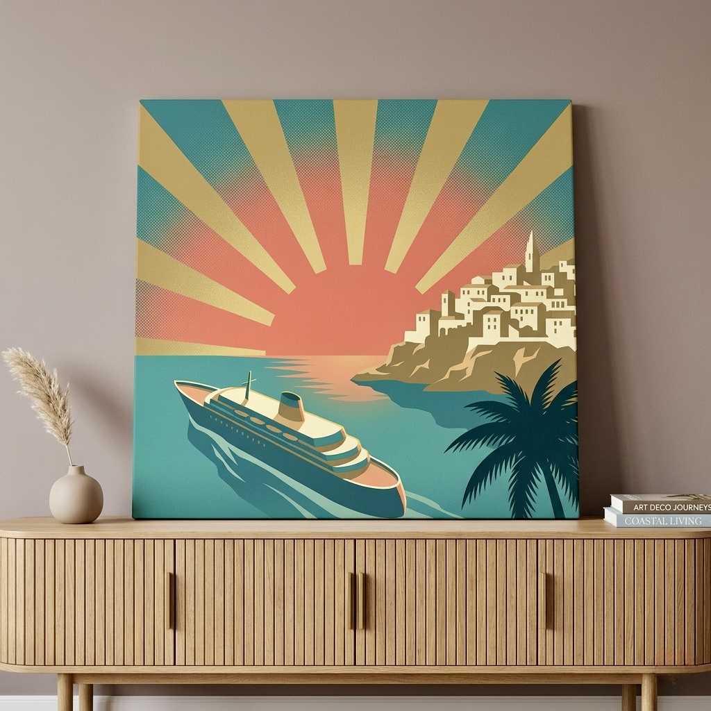
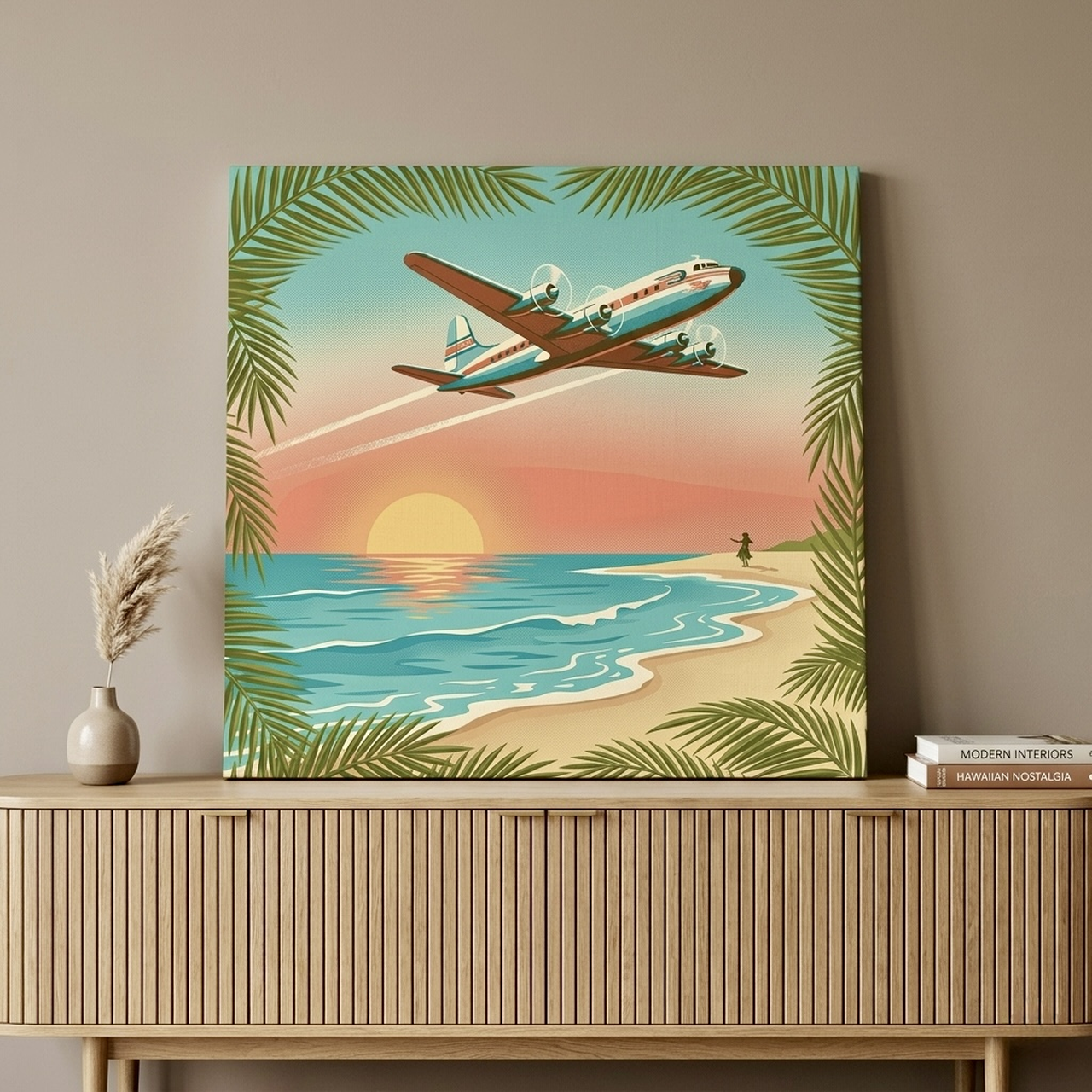
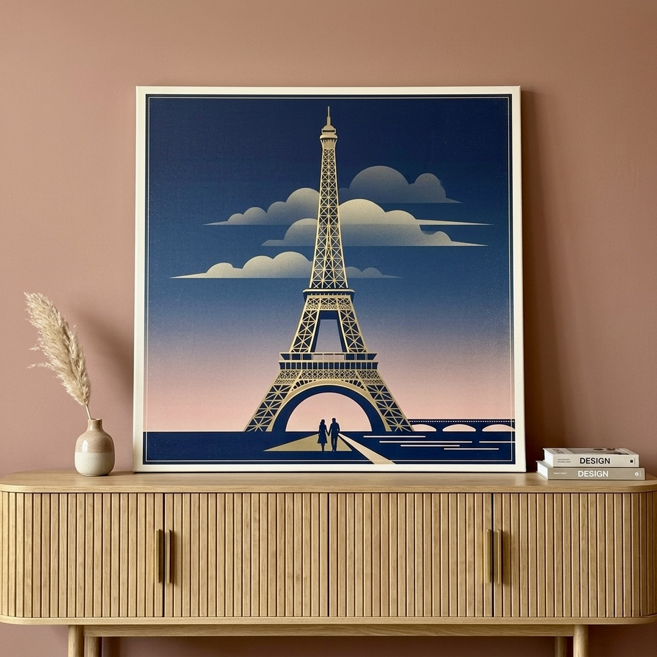
Travel-themed retro prints like these two work brilliantly as a pair. The shared warm color palette and vintage graphic style create a cohesive story across two pieces, ideal for a long hallway wall or the space above a bar shelf. If you love the travel theme, our post on man cave wall art bold statement picks explores more adventurous options for high-energy spaces.
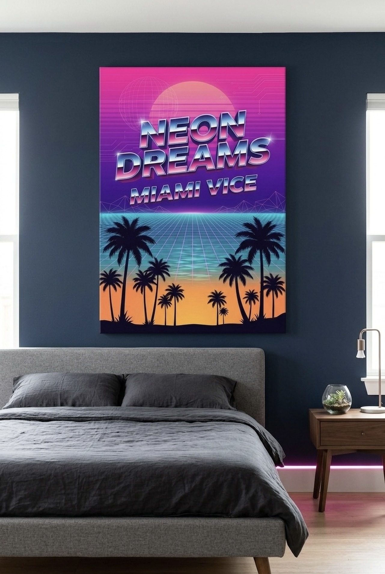
The neon pop and the vintage travel poster styles complement each other more than you might expect. Both are graphic-forward, color-saturated, and rooted in a specific era's visual language. Placed on opposite walls of a room or separated by a doorway, they create a cohesive retro-forward atmosphere without being matchy-matchy. For more inspiration on pairing bold abstract styles, see our guide to abstract canvas art styles explained.
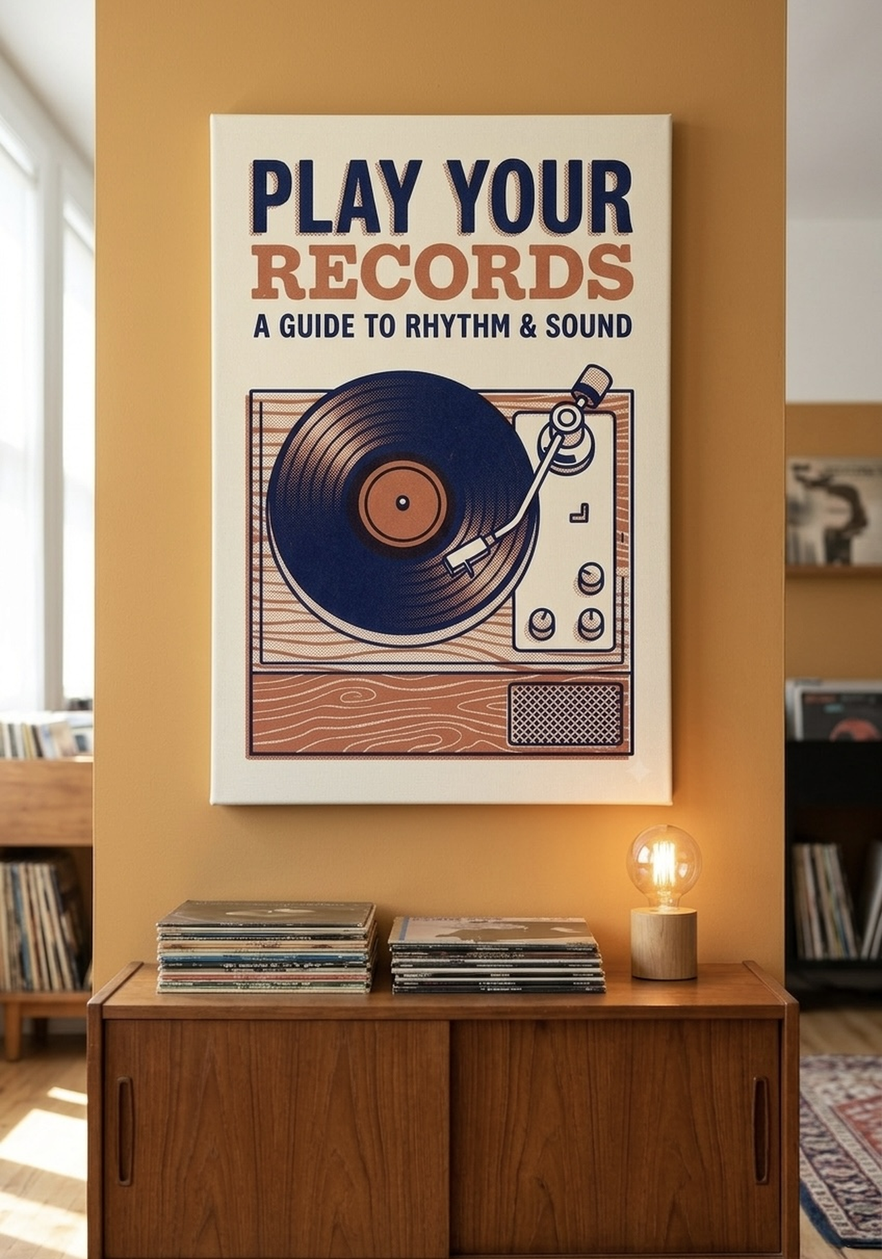
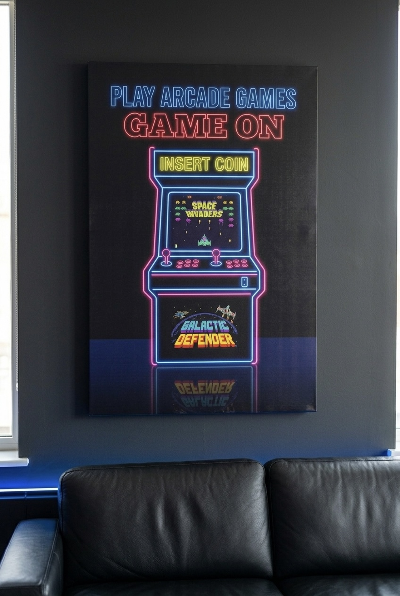
The vinyl record and arcade machine prints are natural companions for any space built around entertainment and personal passion. Together they form a gallery wall duo that celebrates the analog pleasures of music and gaming, two things that never really go out of style.
Placement and Sizing Guide
Bold retro pop art prints reward thoughtful placement. Unlike subtle watercolor landscapes that can disappear into a wall, a vivid retro print commands attention and needs breathing room to reach its full impact.
Height: The center of any canvas should hang at approximately 57 to 60 inches (145 to 152 cm) from the floor. This is standard gallery height and puts the visual center at natural eye level for most adults. If you are hanging above a sofa or console table, leave 6 to 8 inches (15 to 20 cm) of space between the top of the furniture and the bottom of the frame.
Size for impact: Retro pop art prints benefit from going larger than feels comfortable. A canvas that seems too big in the store will almost always look perfectly proportioned on your wall. As a general guideline, aim for art that spans 60 to 75 percent of the width of the furniture or wall section below it. For a standard 84-inch sofa, that means a canvas or grouping that runs 50 to 63 inches (127 to 160 cm) wide.
Single statement piece: One large canvas, 24x36 inches (61x91 cm) or bigger, hung alone on a wall creates maximum drama. This works especially well in living rooms, entryways, and above beds. The single-piece approach lets the art speak without competition.
Gallery wall groupings: For game rooms and studios where the energy is meant to be high and layered, a grouping of three to five retro prints in complementary sizes creates an immersive wall. Start by laying the pieces on the floor to test arrangements before committing to nail holes. Maintain consistent spacing between frames, ideally 2 to 3 inches (5 to 8 cm), for a curated rather than chaotic look.
Frame colors for retro pop art: Black frames are the gold standard for pop art and neon-themed prints. The high contrast between a dark frame and a vivid canvas amplifies the graphic punch. Natural wood frames work beautifully with vintage travel poster aesthetics, softening the look while keeping it warm. White frames suit lighter, more pastel-toned retro prints. For a curated gallery wall, mixing black and natural frames adds intentional variety without feeling mismatched.
Styling Tips: Mix Retro with Modern
The most interesting interiors are rarely all one era. The art of blending retro pop prints with contemporary furniture is one of the most rewarding decorating challenges, and it is far more achievable than it looks.
Use the print as your color anchor. Start with the dominant colors in your retro print and pull one or two of them into your textiles, throw pillows, or a single accent piece. If your neon print carries turquoise and hot pink, a single turquoise throw or a set of blush cushions creates a bridge between the vintage art and your contemporary furniture without making the room feel costume-like.
Pair bold art with clean furniture. Interior designers consistently recommend placing bold, high-energy art against simple, low-profile furniture. A sleek gray sofa or a clean-lined wood coffee table provides the visual quiet that allows a retro pop canvas to dominate the way it should. Competing patterns on upholstery and a busy retro print create visual chaos rather than style.
What NOT to mix with pop art: Avoid layering retro pop prints with heavily patterned wallpapers, busy area rugs in clashing colors, or multiple other bold art pieces competing on the same wall. The print itself is the star; everything else plays a supporting role.
Plants and lighting amplify the effect. A tall fiddle-leaf fig or a trailing pothos next to a vibrant retro canvas creates a pleasing contrast between the organic and the graphic. Directional lighting, such as a simple picture light mounted above the canvas or a floor lamp angled toward it, adds depth and drama, especially for neon-themed prints that look spectacular when spot-lit.
Layer eras intentionally. According to interior design guidance published by Architectural Digest, the key to mixing vintage and modern successfully is to treat the vintage element as a deliberate choice rather than an accident. A retro arcade print in a room with modern furniture reads as confident and curated. The same print among mismatched thrift finds reads as unintentional. Commit to the retro art as your design statement and let the rest of the room support it.
For more ideas on bringing bold art into your space, see our guide on colorful wall art for vibrant room energy.
5 Common Mistakes to Avoid
- Going too small. The most common mistake with retro pop art is choosing a canvas that gets lost on the wall. Bold, graphic prints need scale to deliver their full impact. When in doubt, size up by one size increment and you will rarely regret it.
- Hanging too high. Many people instinctively hang art too high on the wall, especially in rooms with tall ceilings. Keep the center of the canvas at 57 to 60 inches from the floor regardless of ceiling height. Art that floats near the ceiling feels disconnected from the room.
- Overcrowding a gallery wall. More is not always more with retro pop art. Five prints with consistent 2 to 3 inch spacing between them look curated. Ten prints crammed together with no breathing room look chaotic. Edit ruthlessly and let each piece have its moment.
- Ignoring frame color. A retro pop print in the wrong frame can lose half its impact. Mismatched or flimsy-looking frames undermine the graphic strength of the art. Invest in frames that complement the print's era and color palette, especially black frames for neon and graphic pop art styles.
- Mixing too many unrelated styles on one wall. Retro pop art has a strong visual personality. Placing it next to fine art photography, botanical watercolors, or abstract expressionist prints on the same wall creates a confused narrative. If you are building a gallery wall, keep all pieces within the retro or vintage graphic universe for a cohesive result.
Frequently Asked Questions
What is the difference between pop art and retro art?
Pop art is a specific art movement from the 1950s and 1960s that used commercial and mass media imagery as subject matter. Retro art is a broader term that describes any visual style that deliberately evokes a past era. Retro pop art combines both, using the bold graphic language of pop art to capture the nostalgia of a specific decade, from 1950s Americana to 1980s neon culture.
Is retro pop art suitable for a living room?
Absolutely. Retro pop art works beautifully in living rooms when chosen thoughtfully. Opt for a single large statement canvas above the sofa or a curated grouping of three to five coordinated pieces. The key is to let the art be the focal point and keep surrounding decor relatively simple.
What size canvas is best for retro pop art?
For maximum impact, choose a canvas that spans 60 to 75 percent of the width of the wall or furniture below it. For most living room walls, that translates to a canvas between 24x36 and 36x48 inches. In smaller spaces like a home office or bedroom, an 18x24 or 20x30 inch canvas still delivers bold energy without overwhelming the room.
What frame color works best with retro pop art?
Black frames are the classic choice for pop art and neon-themed prints, amplifying the graphic contrast. Natural wood frames work well with vintage travel poster styles, adding warmth without competing with the art. White frames suit softer pastel retro prints. For a gallery wall, mixing black and natural frames adds intentional variety.
Can I mix retro pop art with modern furniture?
Yes, and the combination is often stunning. The trick is to use the retro print as your design anchor and keep furniture clean and simple. A bold neon or vintage travel canvas above a sleek modern sofa creates a compelling contrast between eras that feels intentional and sophisticated rather than mismatched.
Does Heva Unique Art Gallery ship internationally?
Yes. Heva Unique Art Gallery Ships within the US. All canvas prints are produced on demand with premium materials and arrive ready to hang. Visit the collection to explore the full range of retro pop art prints available in multiple sizes and frame options.
Quick Reference Guide
| Room Type | Recommended Style | Ideal Size | Best Frame Color |
|---|---|---|---|
| Living Room | Vintage travel poster or neon cityscape | 24x36 to 36x48 in | Black or Natural |
| Game Room / Man Cave | Arcade machine, vinyl record, neon pop | 20x30 to 36x48 in | Black |
| Home Studio / Office | Music, travel, or graphic pop art | 18x24 to 24x36 in | Black or White |
| Home Bar / Entertainment | Cruise ship, cocktail culture, neon | 20x30 to 30x40 in | Natural or Black |
| Teen Bedroom / Dorm | Arcade, music, vintage aviation | 16x20 to 24x36 in | Black or Natural |
| Entryway / Hallway | Bold single statement print | 16x20 to 20x30 in | Black |
Retro pop art wall prints are one of the most rewarding investments you can make in your home's personality. They bring instant energy, conversation, and a genuine sense of who lives there to any space you hang them in. Whether you gravitate toward the golden age of ocean travel, the electric glow of neon nights, the crackle of a vinyl record, or the pixelated thrill of the arcade era, there is a retro print that captures exactly what you love. Explore the full retro and abstract art collection at Heva Unique Art Gallery and find the piece that makes your wall finally feel like yours. Shop retro pop art prints now.