Fall Wall Art: Cozy Autumn Vibes for Your Home in 2026
The Heva Team
Art Curators & Interior Design Enthusiasts · April 3, 2026 · 13 min read
When the air turns crisp and leaves begin to blush with amber, sienna, and gold, your home deserves art that captures that same seasonal magic. Fall wall art transforms any room into a warm, inviting sanctuary where the beauty of autumn lives year-round. Whether you crave the drama of a moody forest scene, the charm of harvest-season still life, or the quiet majesty of wildlife in their element, the right canvas on your wall can shift your entire living space into a cozy autumn retreat.
Ready to browse our Nature and Wildlife collection? Explore fall-perfect wall art here.
Why Fall Wall Art Creates Cozier Homes
Autumn is the season of turning inward. Days grow shorter, temperatures drop, and instinctively we nest. Interior designers call this the hygge effect, a Danish concept of cozy contentment, and studies in environmental psychology confirm that warm-toned art, nature scenes, and earthy textures significantly increase feelings of comfort and relaxation in a space.
Fall wall art works on multiple sensory levels. Warm amber, deep burgundy, burnt sienna, and forest green tones activate the brain's reward centers similarly to the experience of physical warmth. Wildlife scenes featuring animals in natural habitats create a sense of connection to the larger world. Still-life compositions of harvest produce, rich foliage, and woodland creatures tell a story of abundance and gratitude.
Beyond psychology, fall art is incredibly versatile. The palette of autumn, which spans from pale gold through deep crimson to earthy brown, pairs naturally with a huge range of interior color schemes. Beige walls, white walls, sage green, navy, and even charcoal all harmonize beautifully with autumnal tones. This makes seasonal art one of the smartest long-term investments in your decor: you do not need to change it when trends shift. A stunning forest landscape or wildlife portrait looks as current in 2030 as it does today.
The key is choosing art with visual weight and soul. Mass-produced prints lack the richness that makes fall decor feel truly cozy. Look for art that uses painterly techniques, layered textures, and genuine emotional resonance. At Heva Unique Art Gallery, every piece is crafted for exactly this: rich, vivid, depth-filled imagery printed on premium canvas and available in framed or unframed options. You can also find complementary styling tips in our guide to wildlife wall art for the living room and our post on rustic wall art for country homes.
The Autumn Color Palette: What Works Best
Choosing fall wall art is as much about color as it is about subject matter. The best autumn palettes for home decor tend to fall into three categories, and understanding which one suits your space will save you from costly decorating mistakes.
Warm Amber and Gold: These are the classic autumn tones: golden birch forests, amber-lit meadows, and honey-toned still life compositions. Amber and gold art creates an immediate sense of warmth and sophistication. It pairs especially well with cream, off-white, taupe, and warm greige walls. In living rooms, a large amber-toned landscape above the sofa creates the effect of a roaring fireplace, warm, inviting, and deeply comforting.
Deep Burgundy and Crimson: These richer, wine-dark tones add drama and intimacy. Perfect for dining rooms, libraries, or any space where you want to create a gathering atmosphere. Burgundy pairs beautifully with dark walnut furniture, antique brass hardware, and jewel-tone upholstery. A bold red-tinged wildlife portrait or a moody burgundy-gold abstract becomes the anchor piece that the whole room is designed around.
Forest Green and Earthy Brown: The quieter palette of autumn, mossy greens, umber browns, tawny ochres, and slate speaks to the grounded, natural side of the season. This palette works beautifully in home offices, reading nooks, and bedroom spaces where calm is the priority. Forest green art promotes focus and reduces anxiety according to chromotherapy research, making it a smart choice for productive spaces.
When combining fall art with existing decor, choose art that picks up at least one color already present in the room. If your sofa has rust-colored throw pillows, look for art with similar rust or sienna tones. If your curtains are sage green, a forest landscape with deep green foliage will create a cohesive, designer-level look without hiring a decorator.
Room-by-Room Fall Art Guide
Different rooms call for different approaches to autumn art. Here is how to think about each key space in your home.
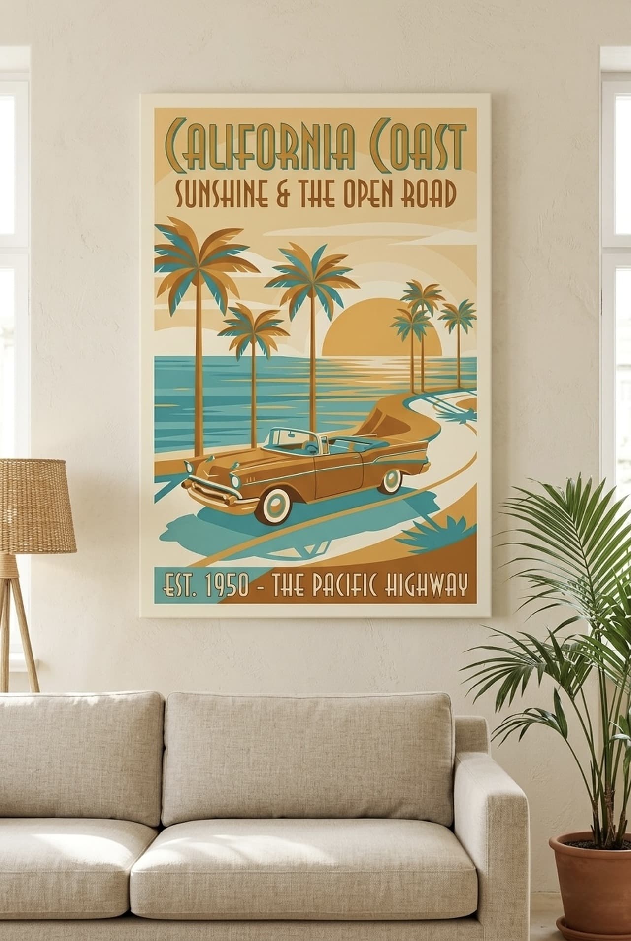
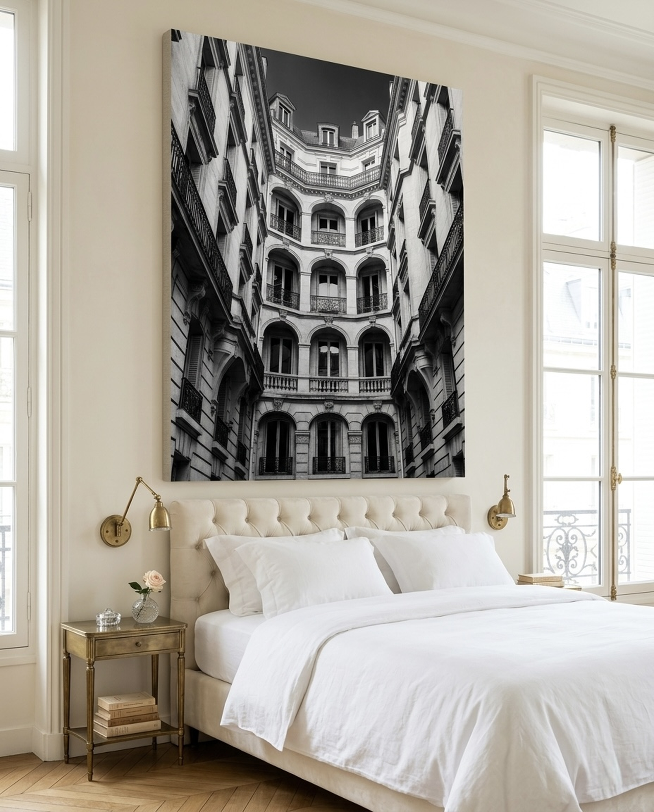
Living Room: This is your showcase wall, the space where you can go large and bold. An oversized canvas of wildlife, a sweeping autumn landscape, or a moody forest scene works beautifully above the sofa or fireplace. Scale matters here: aim for art that is two-thirds the width of the sofa or furniture below it. For an 8-foot (244 cm) sofa, look for art between 60 and 66 inches (152 to 168 cm) wide. A single large statement piece creates more impact than a cluster of small prints in a living room.
Dining Room: Harvest themes shine here. Still-life compositions of fruits, botanicals, and rich produce create a mood of abundance that enhances the pleasure of sharing meals. The dining room is also ideal for art with warm candlelight tones, golds and ambers, since these tones make food look more appetizing. There is genuine science behind why restaurants use warm lighting and warm-toned art in dining spaces.
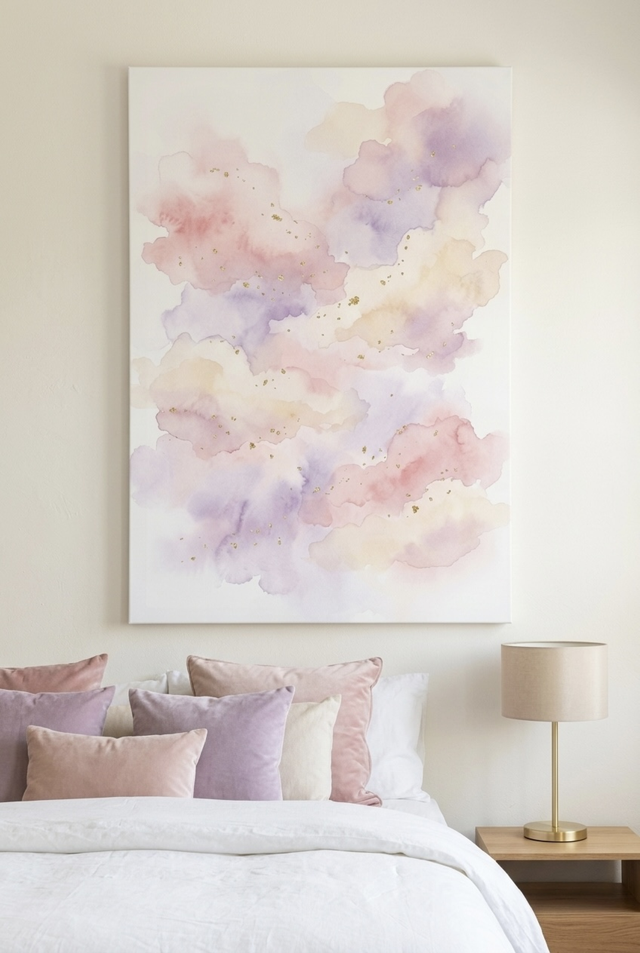
Bedroom: Opt for calmer autumn tones in the bedroom. Soft sage, dusty rose with amber accents, and watercolor nature scenes create a serene atmosphere for rest. Avoid very dark or dramatic pieces above the bed, as these can feel oppressive from the lying-down perspective. Instead, use bold fall art on the accent wall to the side of the bed, where it frames the space without hovering over your sleep.
Entryway: First impressions set the emotional tone of your entire home. A striking wildlife portrait or atmospheric forest scene in the entryway signals warmth, beauty, and a love of nature the moment guests step through the door. Keep scale proportional to your entryway: a narrow hallway calls for vertically-oriented art, while a wide foyer can accommodate a horizontal landscape or even a diptych.
Home Office: Autumn-toned nature art in the home office promotes focus without sterility. Research on biophilic design confirms that natural imagery reduces cortisol levels and improves cognitive performance. A forest landscape or wildlife portrait in deep teal, copper, or amber creates a productive yet comfortable workspace that feels far removed from the blank walls of a typical office.
6 Fall Wall Art Picks for Your Home
These six pieces offer something for every autumn aesthetic, from peaceful nature scenes to bold wildlife portraits to harvest-season still life compositions. All are available on premium framed canvas with free shipping across the US, UK, Canada, and Australia.
Placement Guide: Size and Position
Getting the placement right is as important as choosing the perfect piece. Here are the key measurements and rules for hanging fall wall art in every room.
Standard Height: Hang art so the vertical center of the frame sits at eye level, which is approximately 145 to 152 cm (57 to 60 inches) from the floor. This is the gallery standard and works in most rooms. In dining rooms where guests are seated, you can drop this to 130 to 140 cm (51 to 55 inches) so the art is naturally in the sightline when seated.
Above Sofa: Leave 20 to 30 cm (8 to 12 inches) of space between the top of the sofa back and the bottom of the frame. Art should be 50 to 75 percent of the sofa's width. For a standard 2.1 m (84-inch) sofa, aim for art between 105 and 158 cm (42 to 62 inches) wide.
Above Fireplace: Center the art over the fireplace opening, leaving at least 15 cm (6 inches) of space above the mantel to protect the artwork from heat. The art should be no wider than the mantel itself. A tall vertical canvas can help draw the eye upward and make low ceilings feel taller.
Gallery Wall: When creating a fall gallery wall, keep the space between frames consistent: 5 to 8 cm (2 to 3 inches) between small frames, and up to 10 cm (4 inches) between larger pieces. Anchor the gallery around one large hero piece in the center and build outward with complementary smaller works.
Empty Hallways: In narrow hallways, vertical art that is at least 50 cm (20 inches) tall creates visual interest without crowding. Use a series of related prints spaced 10 to 15 cm (4 to 6 inches) apart for a gallery effect that makes the hallway feel like a curated art experience.
5 Common Mistakes to Avoid
- Hanging Art Too High: The most common decorating error, by far. Art hung at ceiling height disconnects from the furniture and the people in the room. Always aim for the 57 to 60-inch center-of-frame rule and your space will immediately look more polished.
- Choosing Art That Is Too Small: A small print on a large wall looks timid and unfinished. If in doubt, go larger. A single oversized canvas almost always looks better than several small ones competing for attention on the same wall.
- Ignoring Undertones: Autumn art should harmonize with your room's existing colors, not clash. Before purchasing, identify whether your wall color is warm (yellow or orange undertones) or cool (blue or green undertones), then choose art that complements rather than fights those undertones.
- Using Low-Quality Prints: Cheap prints look cheap, especially up close. Autumn themes deserve rich, saturated color and tactile texture. Invest in premium canvas printing where the ink is absorbed into the fabric, creating depth that flat paper prints cannot match.
- Forgetting to Account for Furniture: Art does not exist in isolation. It needs to relate to the furniture below or beside it. Always measure your furniture first, then choose art that complements the scale and color of what surrounds it.
Frequently Asked Questions
What colors work best for fall wall art?
The best fall wall art colors are warm amber, burnt sienna, deep burgundy, forest green, and earthy brown. These tones mirror the natural autumn palette and create warmth and coziness in any room. Amber and gold are the most versatile, pairing beautifully with white, beige, sage, navy, and gray walls.
Can I use fall wall art year-round?
Absolutely. Wildlife portraits, forest landscapes, and harvest still-life compositions are timeless rather than strictly seasonal. The warm tones of autumn art complement virtually any interior style year-round and do not look out of place in spring or summer settings. Only overtly festive motifs like carved pumpkins or Halloween imagery feel season-specific.
What size fall wall art should I choose for my living room?
For a living room, choose art that is 50 to 75 percent of the width of your sofa or main furniture piece. A standard 2.1 m (84-inch) sofa pairs best with art between 105 and 158 cm (42 to 62 inches) wide. Single large statement pieces create more impact than clusters of small prints in open living spaces.
What fall wall art themes work best for a bedroom?
For bedrooms, choose calmer autumn themes: soft watercolor nature scenes, gentle wildlife portraits, misty forest landscapes, or botanical prints in muted gold and sage tones. Avoid very dark or high-contrast compositions above the bed. Instead, place bolder fall art on the accent wall beside the bed for drama without visual weight pressing down during sleep.
Is canvas wall art better than framed prints for fall decor?
Canvas wall art typically gives a richer, more textured result for autumn themes because the paint-on-canvas texture mimics traditional oil paintings. Framed prints behind glass can create a slight glare and feel more graphic than painterly. For cozy fall decor, canvas is usually the better choice, especially with a wood or ornate gold frame to enhance the seasonal warmth.
How do I style fall wall art with existing furniture?
Pick up at least one color from your existing furniture or decor in your chosen wall art. If your sofa has rust or amber throw pillows, choose art with similar warm tones. If your rug has a cream and brown pattern, a forest landscape with those tones will tie the room together. The key is harmony: art should feel like a natural extension of the room, not an afterthought.
Quick Reference Table
| Room | Best Fall Theme | Ideal Size | Key Colors |
|---|---|---|---|
| Living Room | Wildlife portrait or forest landscape | 100 to 150 cm wide (40 to 60 in) | Amber, burgundy, forest green |
| Dining Room | Harvest still life or botanical | 60 to 90 cm wide (24 to 36 in) | Deep purple, gold, sienna |
| Bedroom | Soft watercolor nature or wildlife | 70 to 120 cm wide (28 to 47 in) | Sage, dusty gold, muted sienna |
| Entryway | Bold wildlife portrait or landscape | 50 to 80 cm wide (20 to 32 in) | Warm amber, teal, earthy brown |
| Home Office | Atmospheric forest or mountain scene | 60 to 100 cm wide (24 to 40 in) | Forest green, copper, deep teal |
Autumn is not just a season. It is a feeling: warm, grounded, rich with color and life. The right fall wall art can hold that feeling in your home every single day of the year. Browse the full Nature and Wildlife collection at Heva Unique Art Gallery to find the perfect piece for your space, with Free US shipping and premium framed canvas options available in every size. Visit hevauniqueartgallery.com today.